Shrinking Spaces, Expanding Horizons: Navigating Tiny Living in an Off-Grid Houseboat
CategoriesArchitecture

Shrinking Spaces, Expanding Horizons: Navigating Tiny Living in an Off-Grid Houseboat

The judging process for Architizer’s 12th Annual A+Awards is now away. Subscribe to our Awards Newsletter to receive updates about Public Voting, and stay tuned for winners announcements later this spring.   

“Water is central to these kinds of desirable ecologies that can reshape cities,” says Ham Dong, co-founder and partner of Crossboundaries. The firm contributes to creating “vital built environments” via architecture, and project blueprints are often defined by location.

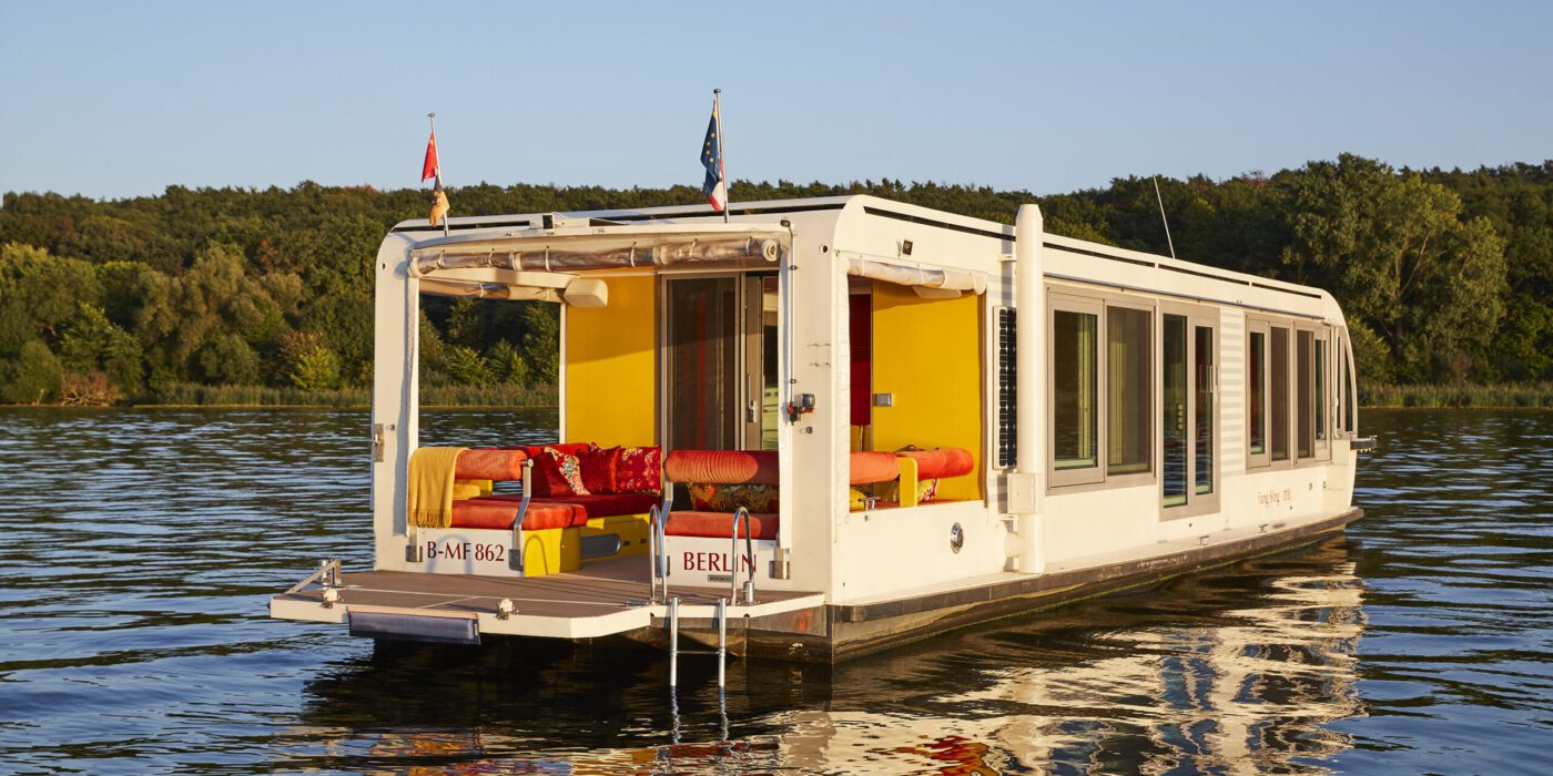
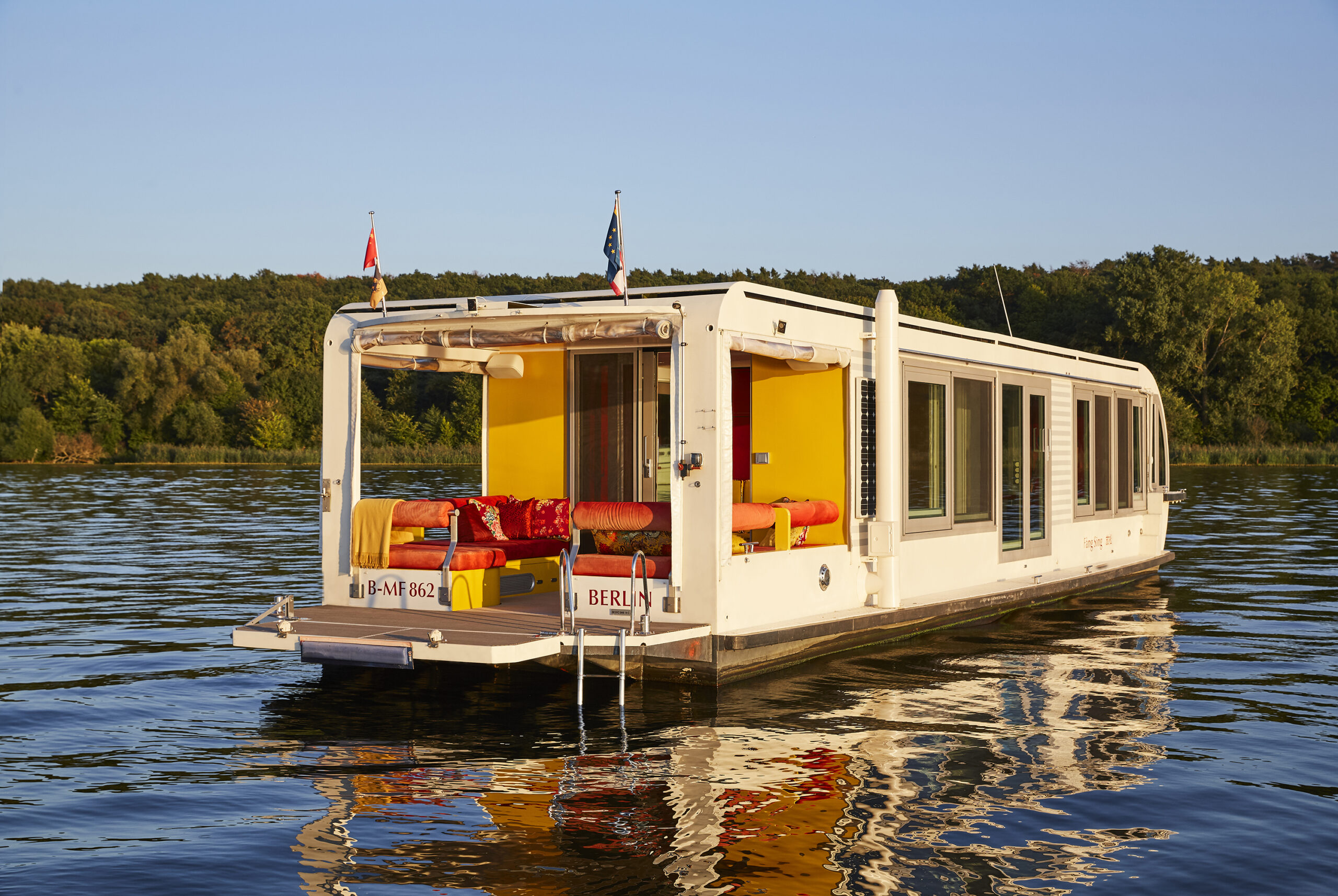
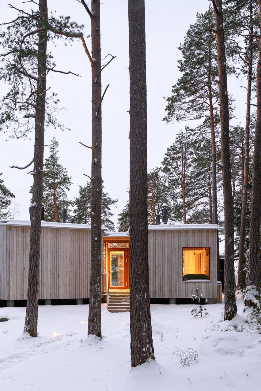
In some ways, you could say the opposite is true of the firm’s latest undertaking, Solar + Design = Tiny Home on the Water. The clue is very much in the name — a modified houseboat offering the freedom of canal, lake and river life with high-end, modern specifications. Less obvious: the vessel runs entirely on solar power, making it a groundbreaking example of alternative fuel for transport, off-grid heating and cooking. 

Solar + Design = Tiny Home on the Water by Crossboundaries, Germany

Putting things into perspective, around 1% of the UK population has no grid connection and uses bottled gas for power. In the US, around 12 million use propane as a primary energy source. Off-grid fuels are recognized as a substantial challenge to green transition. Solar Houseboat SYC 1415 is a unique example of renewable solutions applied to a situation that presents particular challenges in this area.

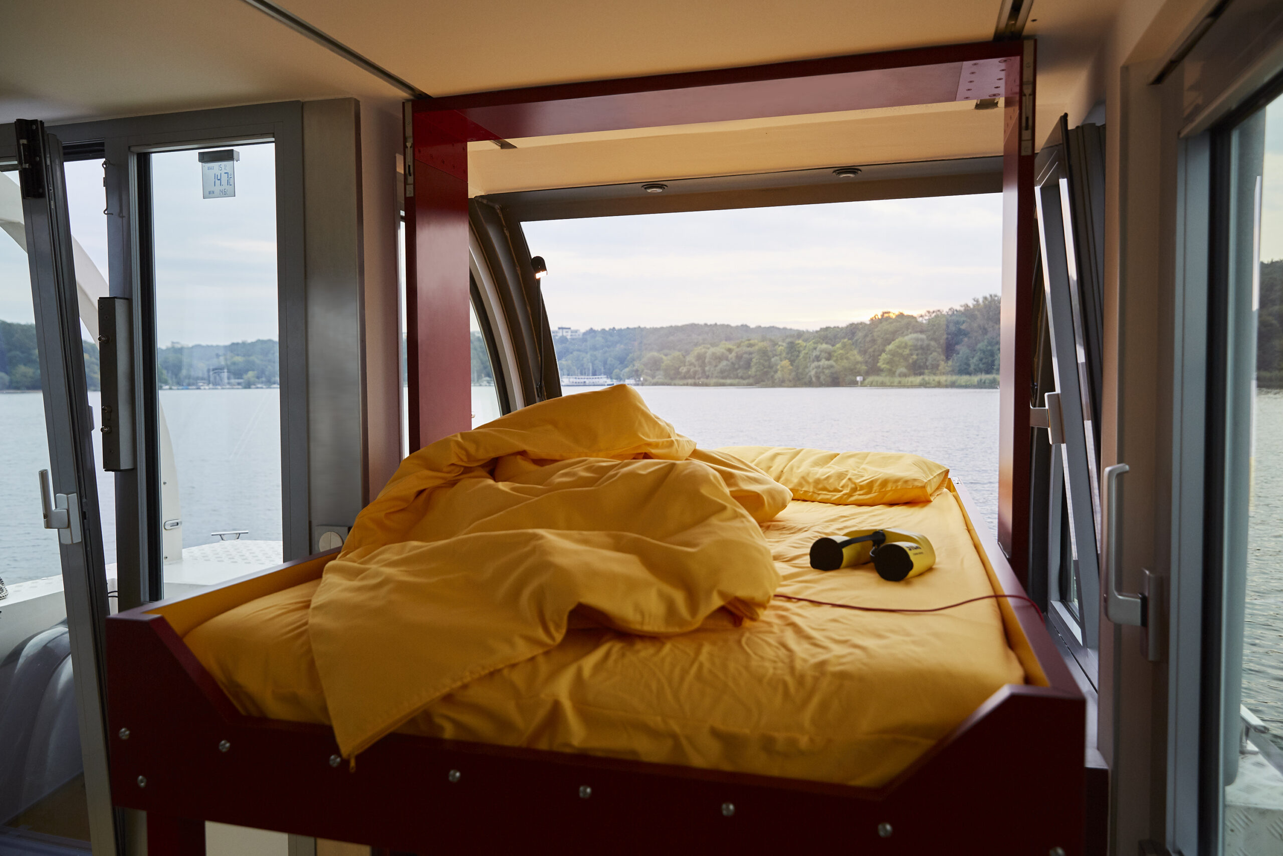
Currently floating in Germany, from March to November, the boat is entirely self-reliant. An entire roof of panels and an additional one on either side powers everything needed. That includes traveling up to 50 kilometers per day, at 7 KM/H, around the same speed as a standard canal barge.

Solar + Design = Tiny Home on the Water by Crossboundaries, Germany

On the inside, climate considerations are more hidden. A biological sewage treatment unit can be converted to drinking water, and a purification system is capable of turning river and lake water into potable. 

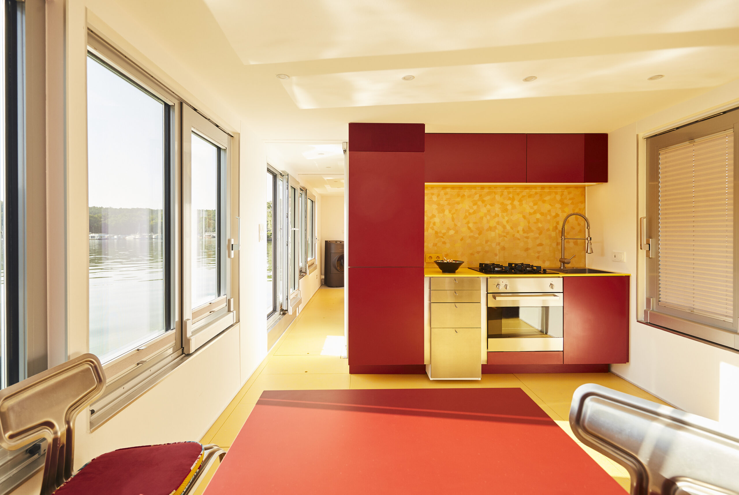
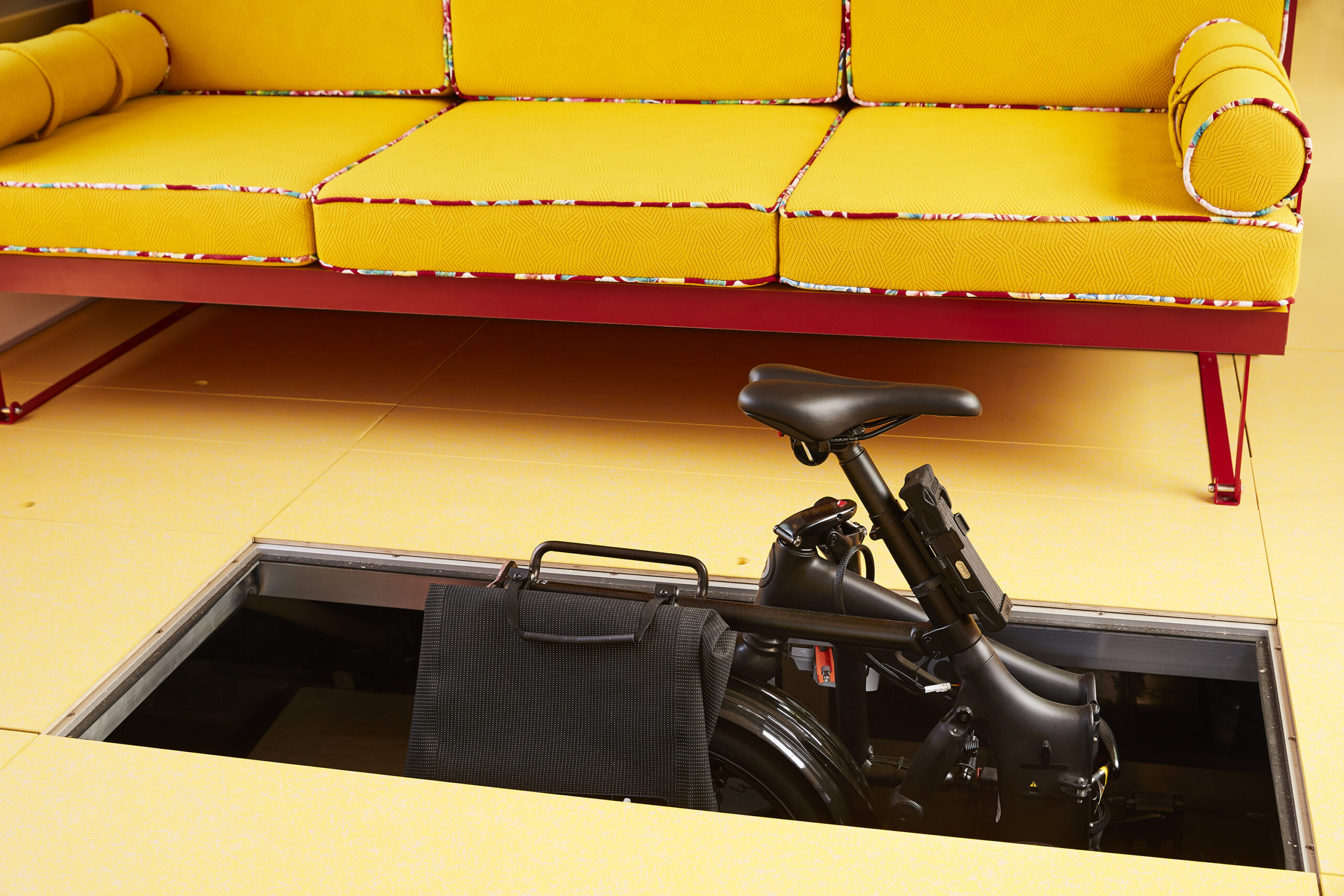
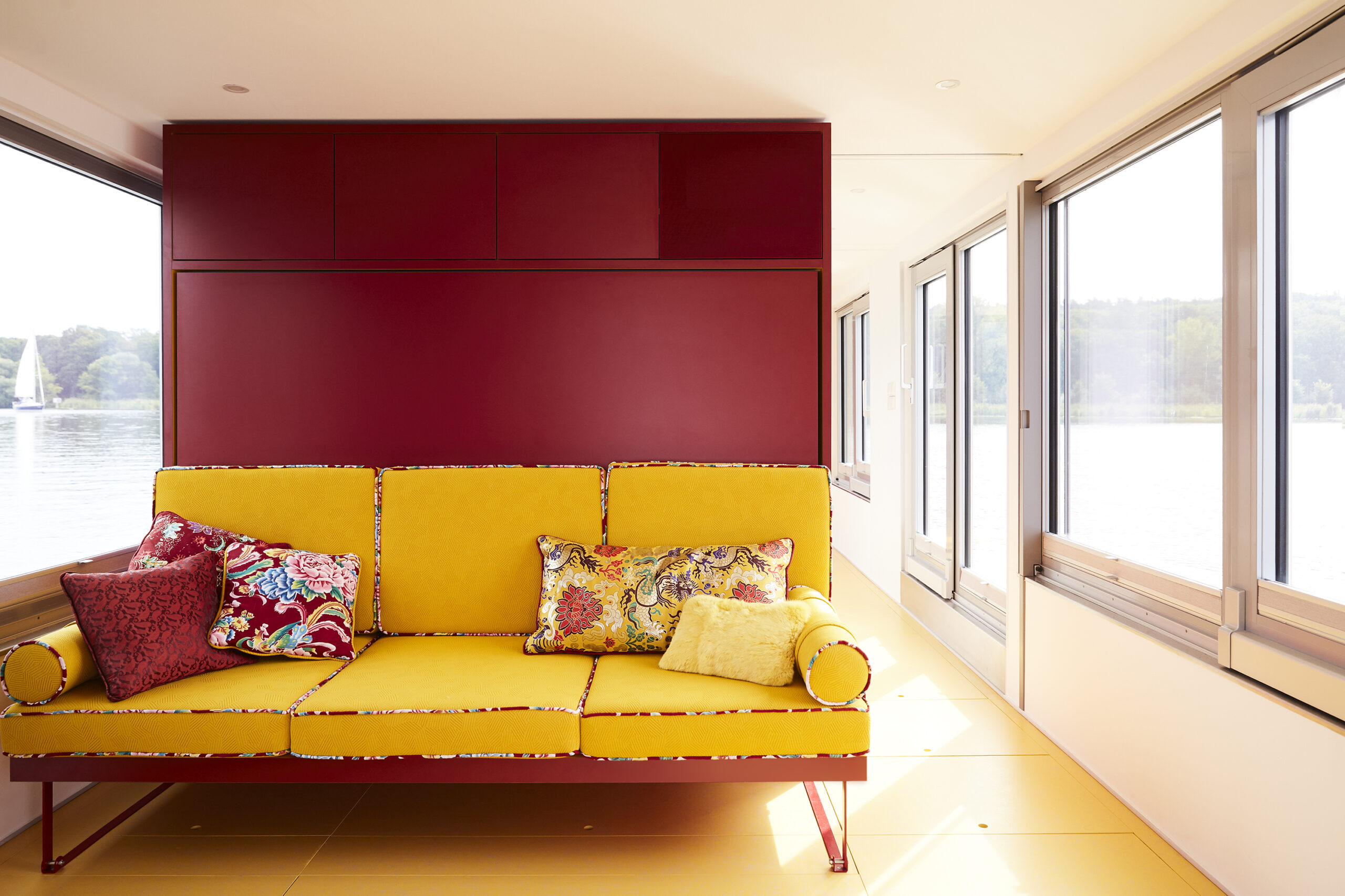
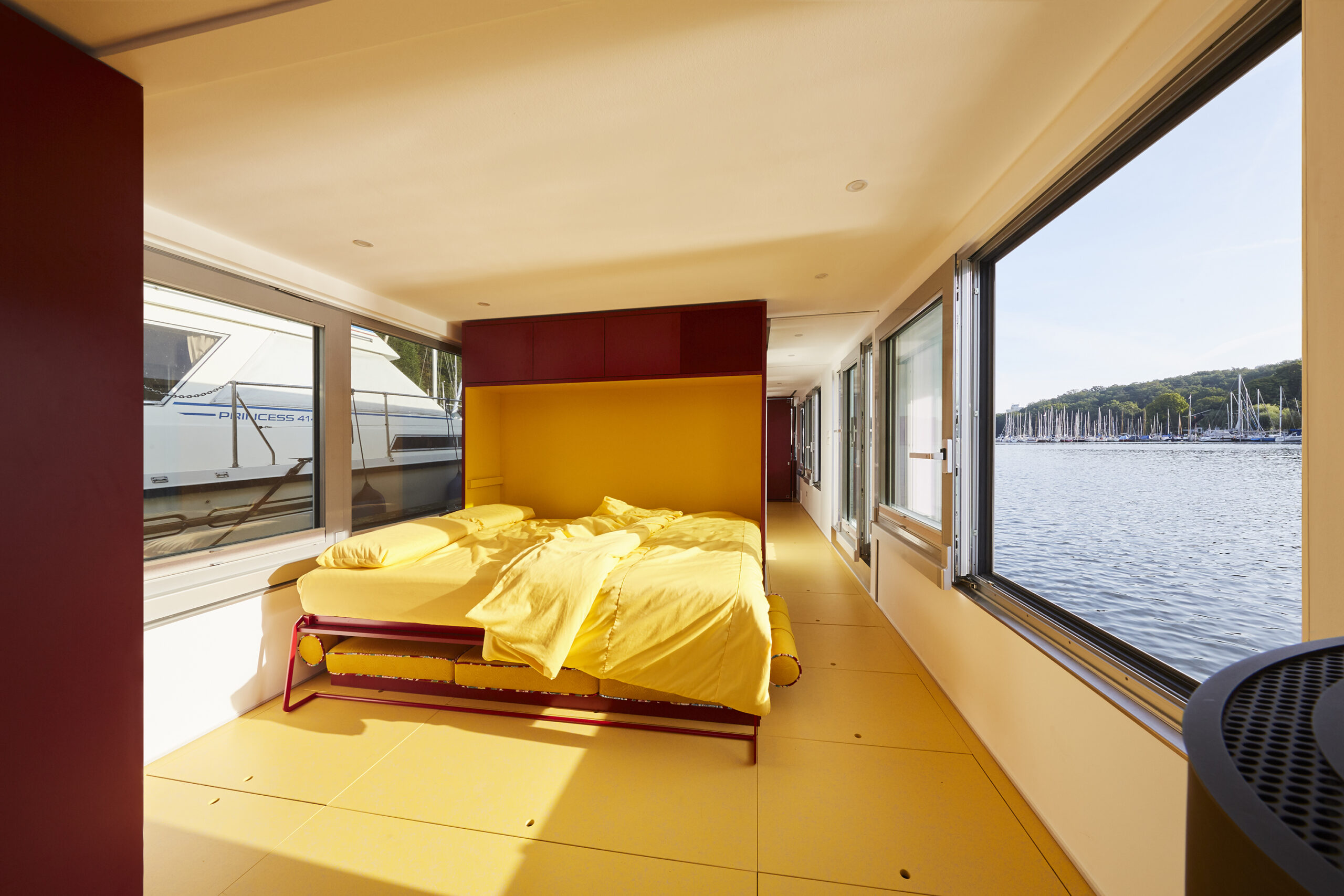
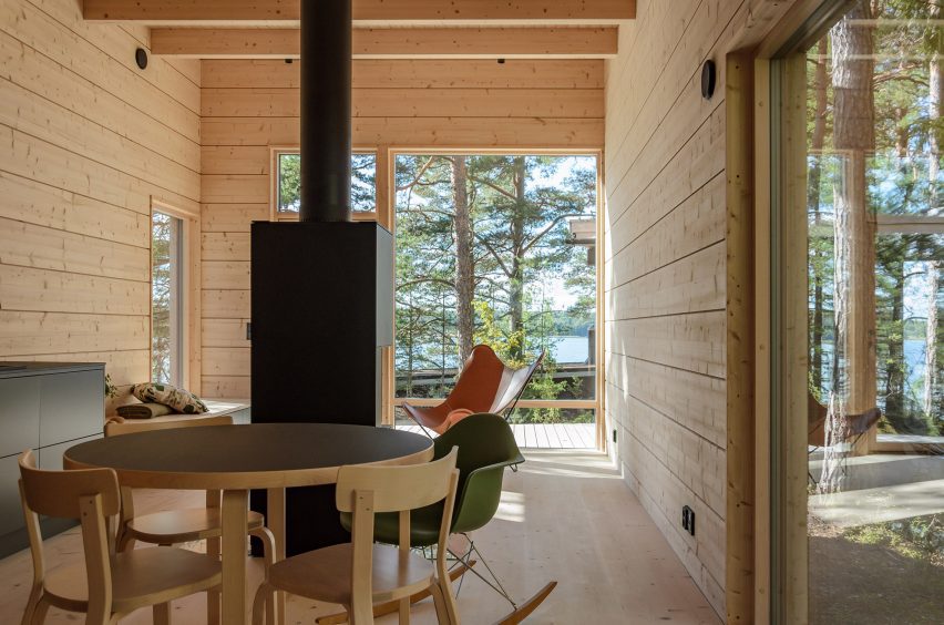
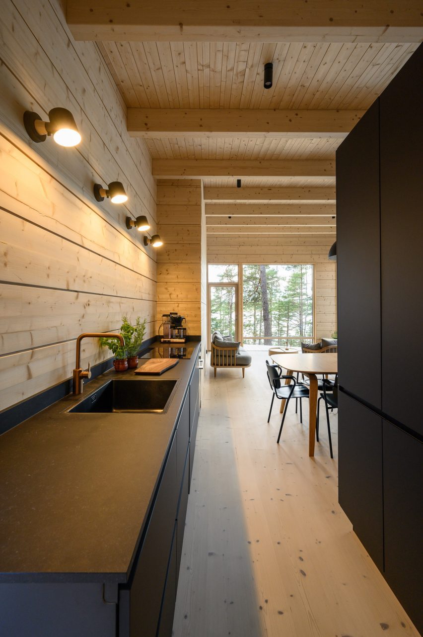
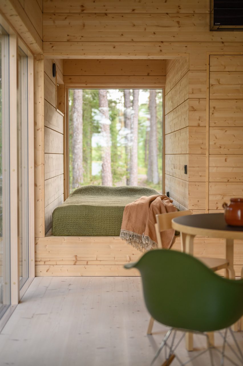
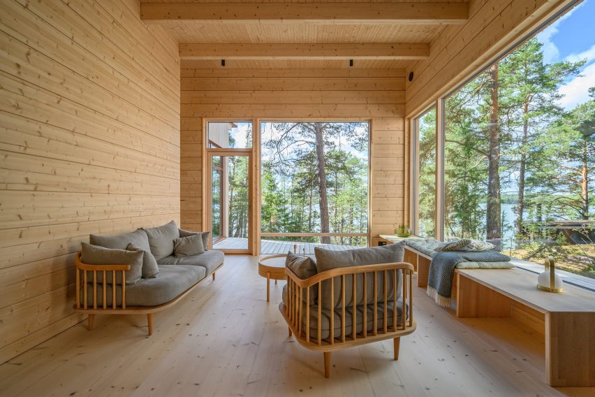
With just 15 meters in length and 4 meters in width to realize a bold vision combining transport, architecture and interior design, a series of interlinked but distinct areas guide you through the lower deck from a charming rear ‘terrace.’ These are almost as adaptable as the boat itself. Living areas become personal gyms, with equipment hidden beneath floor tiles that perfectly complement a simple, primary color scheme and functional finish. Beds recede before vanishing, opening more space.

Solar + Design = Tiny Home on the Water by Crossboundaries, Germany

Extensive research was conducted into material quality, taking into account local and regional landscapes, and seasonal weather on a continent known for real variation in temperatures. Lessons in design have clearly been learned from the development of tiny homes in recent decades, with every inch maximized through innovative solutions.

The result recalls memories of a trip to the iconic Rietveld Schroder House, in Utrecht, Netherlands. The 1920s home is an interiors landmark, carefully conceived in a way that introduced incredible flexibility to each area inside its modest sized building. De Stijl style governed aesthetics, a school defined by bold ‘pure’ colors and right angles.

Solar + Design = Tiny Home on the Water by Crossboundaries, Germany

Back onboard, another sleeping area appears from within the helmstead — the core technical controls of the craft itself — as if to emphasize the point that this is a deftly engineered home. In doing so, we’re given a truly spectacular view to wake up to. And this could be anywhere, because the project is made for absolute mobility and designed for relocation. Simply cast off and leave when you need a change of scenery.

We can’t remember another live-in vehicle which is so closely aligned in design with more permanent, fixed dwellings. And this hybrid speaks to our emerging needs. Like the ability to move without sacrificing the notion of ‘home’, immerse ourselves in new places but not lose identity. Others are more urgent, for example developing new forms of resilience to a changing world. Or returning to others we had, in the West at least, almost abandoned.

Solar + Design = Tiny Home on the Water by Crossboundaries, Germany

For the boat’s owner, Marianne, travel was the key driver in all this. Having spent her life living in cities, most recently moving from Beijing to Berlin, her dream of navigating Europe by water makes sense. There’s always something beautifully peaceful about being on a boat, whether that’s the lone barge on a quiet canal or sole ship on the ocean. 

In Europe, lack of access to green space is an increasing concern among urban populations, with a recent poll suggesting 1/3 of residents in Britain’s biggest metropolitan areas planned to leave in the future to get closer to the countryside. And yet, if the pandemic taught us the value of nature, it also made a point about the importance of connections and communities. The joy of Solar Houseboat SYC 1415 is the fact we don’t need to commit to either. We can be remote, or find ourselves on the busier channels coursing through our great cities. As such, it speaks to our current age in clear terms — a time when adaptability is becoming currency.  

The judging process for Architizer’s 12th Annual A+Awards is now away. Subscribe to our Awards Newsletter to receive updates about Public Voting, and stay tuned for winners announcements later this spring.   

Reference

an ethereal lightness takes over studio gameiro's VAULT apartment in lisbon
CategoriesArchitecture

an ethereal lightness defines studio gameiro’s the VAULT in lisbon

inside the vault apartment by studio gameiro


Studio Gameiro completes The VAULT as an integrated residential project, spanning approximately 157 sqm in size and located in a singular building on the historic and creative Rua de São Bento street in Lisbon. ‘As good and long lasting stories go, we wanted to take this challenge a bit further as a unique opportunity to go that extra mile, and were extremely fortunate to find such an interesting couple moving into the city who handed us the challenge to design and build something completely unique which played, and twisted, with the usual notions and principles of space,’ shares the studio. 

an ethereal lightness takes over studio gameiro's VAULT apartment in lisbon
all images © Francisco Nogueira


mimicking the Arch of São Bento in lisbon


The perfect metaphor for the VAULT apartment by Studio Gameiro (see more here) is that the inside of the apartment mimics what the street has lacked for decades, and which used to define it as a starting and finishing point: the Arch of São Bento. The fact that the arch still exists nowadays in another square of Lisbon, and that the marks of this ‘uncoupling’ are still deeply visible on the street itself (and on the tiny rocky side which connects it to the National Parliament), gave the team an extra shot of energy to create something deeply rooted on the notion of the unexpected/unusual. This historic but grounded reference to arched forms is now perceived throughout its operational/logistics framework, and its visual identity.

an ethereal lightness takes over studio gameiro's VAULT apartment in lisbon
The VAULT living area


curved ceilings and ethereal atmospheres


As residents enter from the living room, the social area is revealed in full display, with a corridor leading to the dining room. Here, a bespoke dining table with a Travertine Creme top occupies the center of the space. It rests on a solid Iroko wood structure which evokes the traditional style of centuries-old dining tables, and which is accompanied by six restored chairs designed by Gianfranco Frattini for Cassina. A classic revisited, something borrowed from memory, something pushing forward. This space is then smoothly connected to a breakfast corner, casual and chic as it could be. This small room, almost like a roundabout, gives one of the structural elements of this project: a strong character embedded with an almost floating, ethereal lightness. This contradiction of sorts permeates the entire apartment.

an ethereal lightness takes over studio gameiro's VAULT apartment in lisbon
Studio Gameiro designs ethereal curved ceilings throughout


The continuation of the curved ceiling leads us to the bespoke kitchen, where Moleanos countertops, a brass pendant element and extensive storage units (which aesthetically and structurally follow the tone of the walls) stand out. Bespoke brass handles, in the shape of hooks, make magical appearances as playing hide and seek. The kitchen provides access to a small patio, ideal for a short break (and a good book on cold Winter nights). The opposite path leads to the private area of the apartment which is traversed by a corridor that begins and ends with a stone arch. Full circle and the perfect metaphor for the project itself.

an ethereal lightness takes over studio gameiro's VAULT apartment in lisbon
breakfast corner


This corridor leads to the bedrooms and a family bathroom, ultimately leading to the impressive entrance of the master suite. This room, with its incredible scale and width, has an almost cinematic visual flair that defines what we were very keen to have as a foundation stone: space as playful and functional as it could. These layers work as different ‘levels’ to create smooth transitions between each area, allowing us to create quiet spaces, reminiscent of the Roman aqueducts which had basins to calm and re-direct the water’s flow. It is as if all these historical references came together to create ‘free flow’ areas to promote smooth transitions between each room.

an ethereal lightness takes over studio gameiro's VAULT apartment in lisbon
detailed view of breakfast corner


a deep and rich material palette by studio gameiro


The use of materials such as Moleanos limestone and brass is a nod to the aqueduct’s heritage and technical expertise as an Architecture and Design wonder. As textures go, the stone permeates all prominent areas like the arches which divide the spaces, the kitchen countertops and the bathroom sinks, while shiny brass represents a much more industrial character, alluding to the hooks that held lighting cables in the tunnels. This material, which sometimes wrongly rhymes with brash, is poetically edited into signature pieces, as it is discreetly incorporated into the project with a functional purpose. From the entrance there are two side paths which ‘divide’ the apartment into complementary ‘half moons’.

an ethereal lightness takes over studio gameiro's VAULT apartment in lisbon
corridor leading to the bedrooms and a family bathroom


From the common areas of both kitchen and dining room, the same sense of openess permeates the acess to the sleeping rooms, accessed through another set of arched corridors. This ‘suspension’ framework is intricately connected to the apartment’s storyline. As the arch was part of the same technical design of the Aqueduto das Águas Livres which used to supply water to Lisbon, the curved ceilings and arches guide us through it like a meander/path, much like water was guided through the arches of the aqueduct to people’s homes for centuries. Similar to the soft and mysterious lighting of those tunnels (which have an almost cinematic and stage/set display), light is skillfully designed to illuminate warm-textured surfaces coated with lime stucco stone.


Reference

Timber exterior of Two Sisters holiday home in Finland
CategoriesArchitecture

MNY Arkitekter completes “down-to-earth” house for two sisters in Finland

Finnish studio MNY Arkitekter has completed Two Sisters, a timber holiday home in Salo that is designed to allow two siblings to live “together separately”.

To create a dedicated space for each of the two sisters, MNY Arkitekter divided the home into two standalone units joined by a central terrace overlooking the surrounding rocks and pine trees on Finland’s west coast.

Timber exterior of Two Sisters holiday home in FinlandTimber exterior of Two Sisters holiday home in Finland
The two units are joined by a central terrace

“In many ways the site is one of typical Finnish inner archipelago terrain and vegetation, and one of the main goals was to preserve as many trees and visible rocks as possible,” MNY Arkitekter founder Mathias Nyström told Dezeen.

“Equality of the views from the two units was also important and had a significant impact on the layout.”

Living area within Two Sisters in FinlandLiving area within Two Sisters in Finland
Each unit has large windows. Photo by Mathias Nyström

The home’s two units “fan out” to provide privacy and avoid the surrounding trees, while making space for an existing sauna, utility room and overnight shelter on the site.

Each block features large windows at its western end, looking towards the sea and pine trees to the west. Openings facing the central terrace have been placed to minimise overlooking.

Kitchen interior of holiday home by MNY ArkitekterKitchen interior of holiday home by MNY Arkitekter
Black kitchen counters feature in each living space

“Being in one of the units you can only see the other from certain points, otherwise you mostly sense the existence of the other part,” said Nyström.

“You are on your own, but feel part of a bigger entity,” he added.

Each living space at Two Sisters has been finished with black kitchen counters, a dining table and a large freestanding fireplace. Built-in bench seating provides space to sit and look out over the landscape.

In the northern block, a bed is housed in a small nook off this living space backed by a full-height window, while to the south the slightly larger unit provides a double bedroom and two single bedrooms alongside the living space.

Bedroom interior within timber holiday home in Finland by MNY ArkitekterBedroom interior within timber holiday home in Finland by MNY Arkitekter
A small bed is backed by a full-height window in the larger unit

Two Sisters has a prefabricated structure of glue-laminated timber, finished externally with vertical planks of spruce. Internally, pale timber walls, floors and ceilings are treated with lye.

“The aim for the atmosphere was to create a uniform, serene space where nature plays a big part – the end result is very uplifting,” said Nyström.

“The weathered silver-grey wood will fuse the building in the landscape with rocks and pines. All in all it is a down to earth and subtle building,” he added.

Living space interior within Two Sisters holiday homeLiving space interior within Two Sisters holiday home
The home is constructed from glued-laminated timber

Elsewhere in Finland, MNY Arkitekter created a home on the shoreline of a small lake in Tenala using seven different varieties of timber.

Other recent projects in the country include a sauna and restaurant on the edge of Lake Saimaa by Studio Puisto and the steel-clad Dance House by JKMM and ILO architects in Helsinki.

The photography is by Multifoto Ab unless otherwise stated.

Reference

Bc-biermann-geneva
CategoriesArchitecture

Augmented Drawing: Redefining Sketching for the Digital Age

Calling all architects to join the conversation! Rate and review your favorite design softwares and hardwares on Architizer’s Tech Directorya new library of tech tools for designers.

“Imagine if you could see your ideas materialize in a matter of seconds, onsite and without waiting for construction to be finalized to evaluate and experience your design.”

Augmented drawing involves overlaying digital content onto the physical world through the lens of augmented reality. This process smoothly integrates digital elements, such as 3D models, animations or interactive effects, into real-world environments. Unlike traditional drawing methods confined to paper or canvas, augmented drawing liberates architects and designers from spatial limitations, enabling them to interact with their creations dynamically.

One of its most exciting aspects of augmented drawing is its interactive nature. Unlike static sketches on paper, augmented drawings can come to life through animations, sound effects and interactive elements. Architects can create dynamic compositions that respond to user input or change over time, transforming passive viewers into active participants. This level of interactivity adds a new layer of engagement and immersion to the creative process, captivating audiences in ways that traditional sketches cannot. By overlaying digital models onto physical environments in real-time, architects can explore spatial relationships, evaluate design proposals and visualize concepts with unprecedented clarity.

Admittedly, Augmenter Reality’s (AR) most groundbreaking quality is its ability to connect each specific architectural design with its site context. Consequently, augmented drawing offers architects a powerful toolkit for site analysis and contextual integration, enabling them to overlay digital models onto real-world environments to assess factors such as sunlight exposure, topography and surrounding architecture. By contextualizing designs within their physical surroundings, architects can ensure that their proposals harmonize with existing landscapes and urban contexts, enhancing the overall sustainability and livability of built environments.

Explore Architizer’s Tech Directory

Augmented drawings also facilitate collaboration among stakeholders throughout the design and construction phases. By creating shared virtual environments, architects, clients, engineers and contractors can collectively visualize and interact with design proposals, fostering consensus and alignment on project objectives. It also provides intuitive tools for marking, highlighting and annotating design elements within the augmented environment. This visual communication not only promotes clarity but also reduces the potential for misinterpretation, leading to more efficient decision-making and smoother project workflows during construction.

Still, apart from these more “obvious” applications of AR, there have been numerous innovative projects where augmented drawings are used to access environments and spaces, which so far have been out of reach. One example is CapitolaVR’s Rembrant Reality App in Mauritshuis museum, which allows visitors to literally enter Rembrandt van Rijn’s painting The Anatomy Lesson of Dr. Nicolaes Tulp.

The painting’s virtual environment was made through 3D scanning techniques and actors, who posed as the subjects of the painting, creating a portal to a past, fictional setting. This revolutionary merging of art and technology suggests countless possibilities for architects and uncovers ways of accessing, experiencing and even redesigning spaces that were not only physically but also conceptually perceived.

Several tools and platforms have emerged to facilitate augmented drawing experiences. Techniques for augmented drawing vary depending on the desired outcome and the chosen platform. Architects may begin by sketching outlines on paper before overlaying digital elements using AR-enabled devices. Alternatively, they can directly draw within AR environments, leveraging tools like gesture recognition and spatial tracking to refine their compositions with precision. The one thing that remains constant, however, is that augmented drawing not only expands the possibilities of artistic expression but also transforms the creative process itself.

By bridging the gap between the physical and digital worlds, AR fosters a symbiotic relationship between the artist and their creation, blurring the lines between creator and spectator. It also democratizes creativity by lowering barriers to entry and fostering inclusivity. With accessible tools and intuitive interfaces, individuals from diverse backgrounds can engage in the artistic process, transcending traditional skill barriers to unleash their creative potential.

Since the beginning of the profession, sketching has been the most freeing tool for architectural drawing. It translates ideas, concepts and intentions to lines, textures and experiences, becoming the mediator between inception and reality. Ironically, augmented drawing blurs these boundaries even more. Its constant improvement on producing accurate spatial mappings and high-resolution augmented overlays leads to the creation of countless highly realistic augmented environments, which become backdrops for pioneering architectural designs, architectural conservation practices and real-time assembly processes.

Calling all architects to join the conversation! Rate and review your favorite design softwares and hardwares on Architizer’s Tech Directorya new library of tech tools for designers.

Reference

Modern Minarets: 6 Contemporary Mosques Celebrating Cultural Diversity
CategoriesArchitecture

Modern Minarets: 6 Contemporary Mosques Celebrating Cultural Diversity

The judging process for Architizer’s 12th Annual A+Awards is now away. Subscribe to our Awards Newsletter to receive updates about Public Voting, and stay tuned for winners announcements later this spring.   

“Islam is like a crystal-clear river that takes the color of the riverbed it flows over.”

Through those words, Dr. Umar Faruq Abd’Allah described the religion of Islam and the way it reflects the different cultures and regions it spreads in and flows through. In architectural terms, this analogy extends to mosques and their designs. Over time, mosque designs have been influenced by the diverse cultures, climates, building materials and traditions of the various regions in which mosques were built.

This amalgamation has led to a multitude of designs and typologies for mosques worldwide, evolving alongside cultures, populations and advancements in building technologies. These designs preserve core Muslim values while simultaneously celebrating the diversity of the different cultures and communities. Through this collection, six mosques from around the world are showcased to show how the design of Muslim sacred buildings has evolved and what mosques look like in this time and age.


Al Musalla – The Mosque – Al Hosn Area

By CEBRA and DCT Abu Dhabi, Abu Dhabi, United Arab Emirates

Jury Winner, 2020, A+ Awards, Architecture +Ceilings

Photo by Department of Culture and Tourism, DCT Abi Dhabi

Inspired by the geology of the area, this mosque has the design of what could be described as manmade nature, appearing as a group of rocks emerging out of water. To enter the mosque, worshippers traverse a network of pathways that wind around the water, symbolically cleansing them before prayer while also shielding them from the noise and commotion of the nearby streets.

The mosque is located within a historically significant site with a number of landmarks, managing to calmly integrate into the park while also offering a remarkable experience to its users. Inside, the distinctive geometrical shapes of the exterior are reflected on different elements of the design including the ceiling, complemented by lighting design that aimed to represent a desert sky adorned with stars, in a manner that does not only connect the mosque with earth and water, but also with the sky and what’s beyond.


BRICK VEIL

By LUCA POIAN FORMS, Preston, United Kingdom

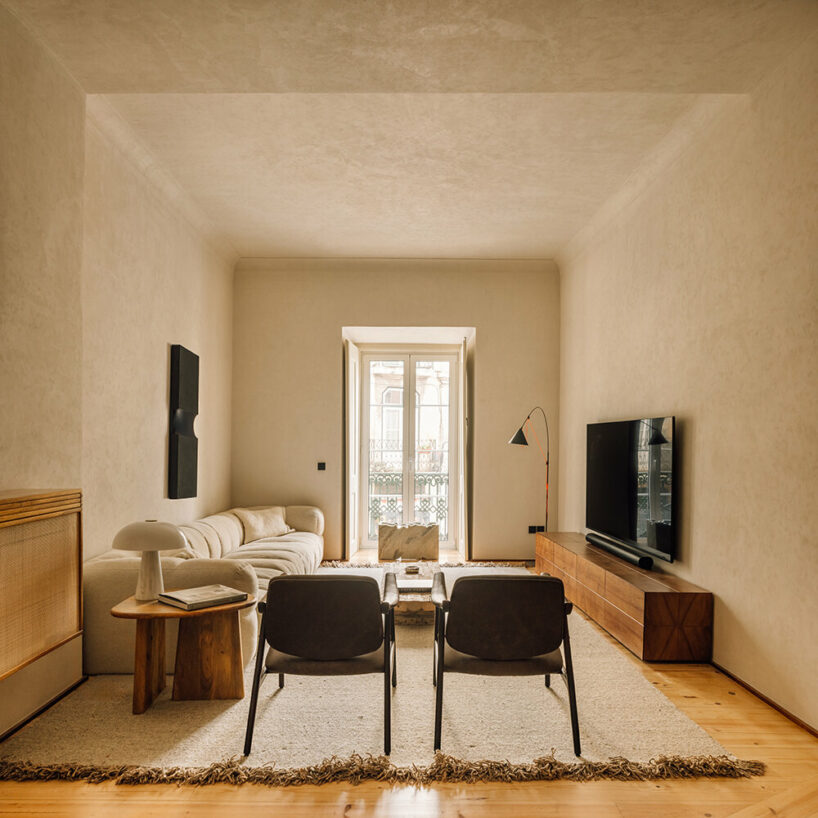
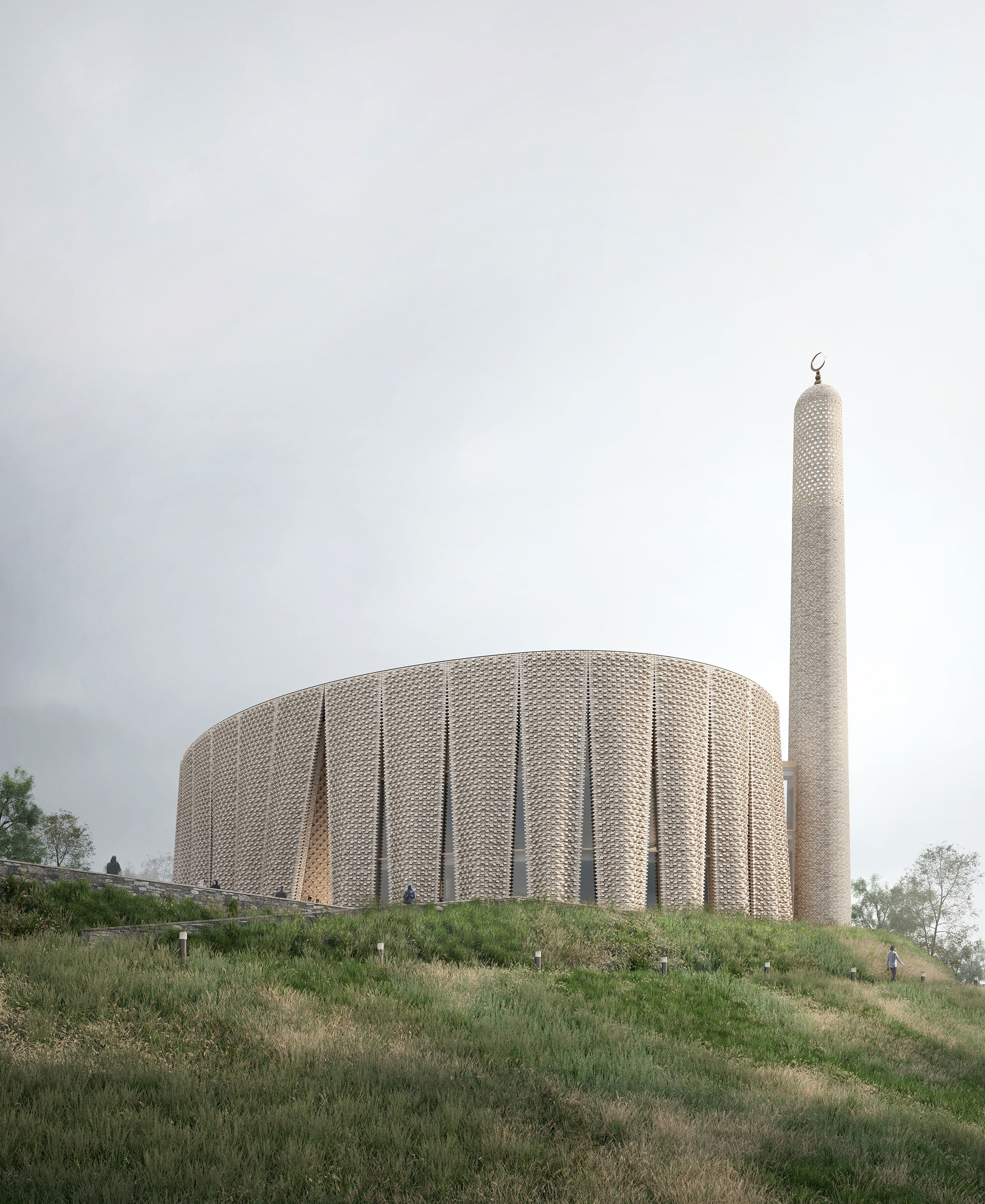
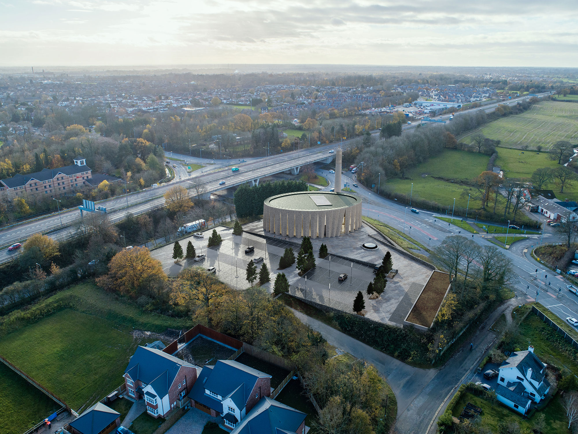
Produced through an artful stitching between the Islamic traditions and the history of the area, between the universal values and the local culture, this mosque design was conceptualized as a landmark within the existing site, through its scale, meticulous façade design, building materials and relationship with the surrounding.

Inspired by the textile manufacturing history of the region, the pleated brick façade gives the building a strong sculptural appearance, while also referencing the traditional design of Mashrabiyas, which is a traditional element in Islamic architecture used to enhance privacy. Erected at the south western end of the hill, the mosque is reached through a processional ramp that slowly disconnects the arriving worshippers from the city and the gradually welcomes them into the sacred space of the mosque.


Yesilvadi Mosque

By Adnan Kazmaoğlu Mimarlık Araştırma Merkezi, İstanbul, Turkey

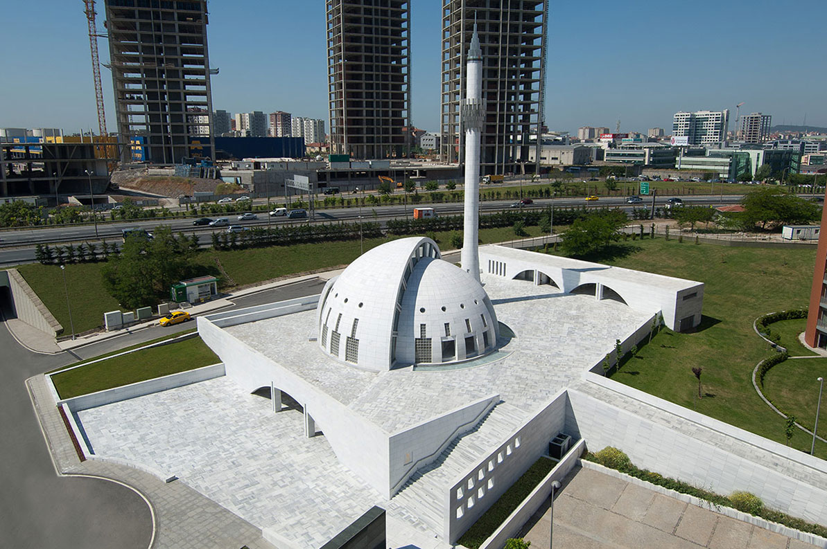
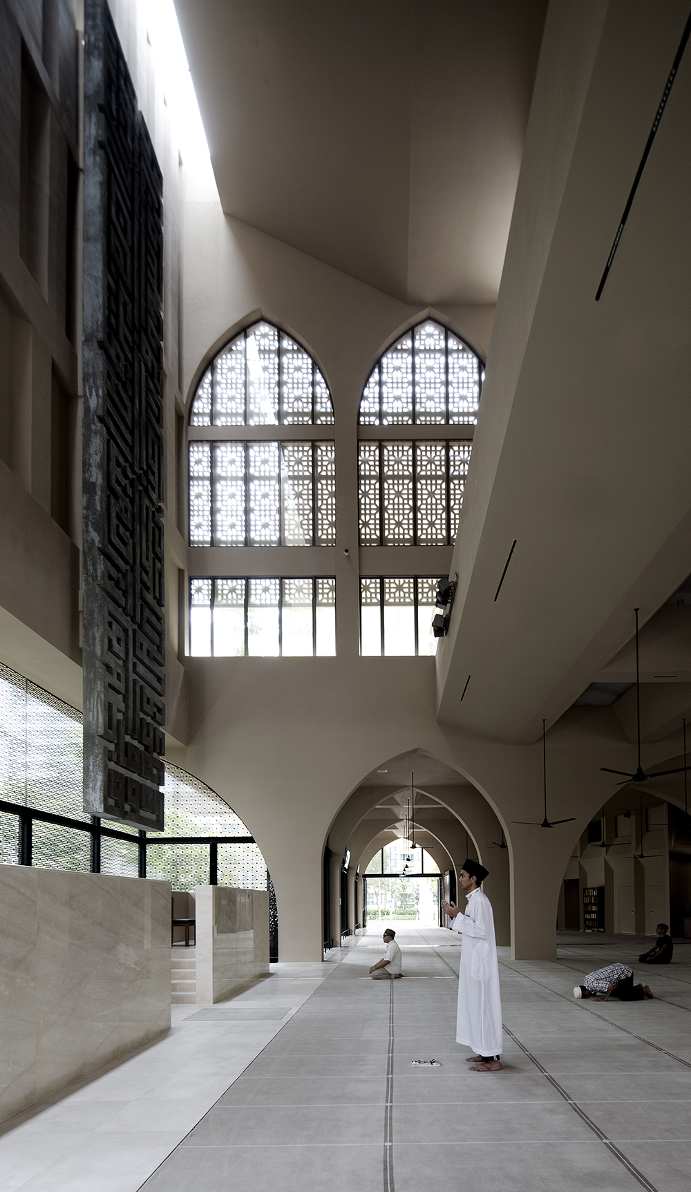
Harmoniously nested into the site, the Yesilvadi Mosque is conceptualized as a social space that gathers people and brings them together, through its variety of functions that include the prayer hall, a meeting hall, a library, a courtyard and a square, inspired by the social role mosques and their courtyards have traditionally played in the design of Islamic cities.

The bold geometry of the mosque, where the volume of the dome is also the volume of the building, is inspired by Ottoman mosques which typically have circular forms, while also symbolically using the shape of the circle to represent infinity and unity. The seamless use of white for the building’s exterior was achieved through the use of White Marmara marble, which aimed to represent purity and good virtue, standing in contrast with the green landscaping and the complexity of the surrounding context.


Al-Islah Mosque

By Formwerkz Architects, Punggol, Singapore

Photo by Albert Lim Koon Seng

Situated in a densely populated residential area, this mosque demonstrates a harmonious connection with its surroundings, achieved through a meticulously crafted façade adorned with a range of openings and perforations These features serve to regulate indoor climate and invite worshippers inside, while also reflecting the difference in functions in each building.

Comprising three distinct volumes, the mosque includes facilities such as a seminar building and an administrative center, in addition to the main prayer hall that flows dynamically with its open design and vast area. These architectural elements are thoughtfully designed to mirror the permeability of Islamic principles and aspirations within the context of Singapore today.


Mohammad Rasul- Allah Mosque

By Paya Payrang Architectural Group, Shiraz, Iran

Photo by Ahmad Mirzaee

Photo by Samaneh Motaghipishe

The new volume of this mosque grew in the space between an array of old trees and the existing historic prayer hall at the center of the site, delicately engaging in a conversation between the old and the new, the natural and the built, the communal and the religious, as well as solidity and openness.

A long spine connects the two entrances at the opposite sides, encompassing the traditional “Riwagh” element that is common in the design of mosques in Iran, adorned with two minarets that vertically extend parallel to the huge old trees, and generously welcoming prayers in from the busy main road. Built out of stone, the design of the mosque is simple yet sculptural, standing out within its context and making a statement with its dynamic geometry and copper dome.


Al Rawda Mosque

By Uraiqat Architects, Amman, Jordan


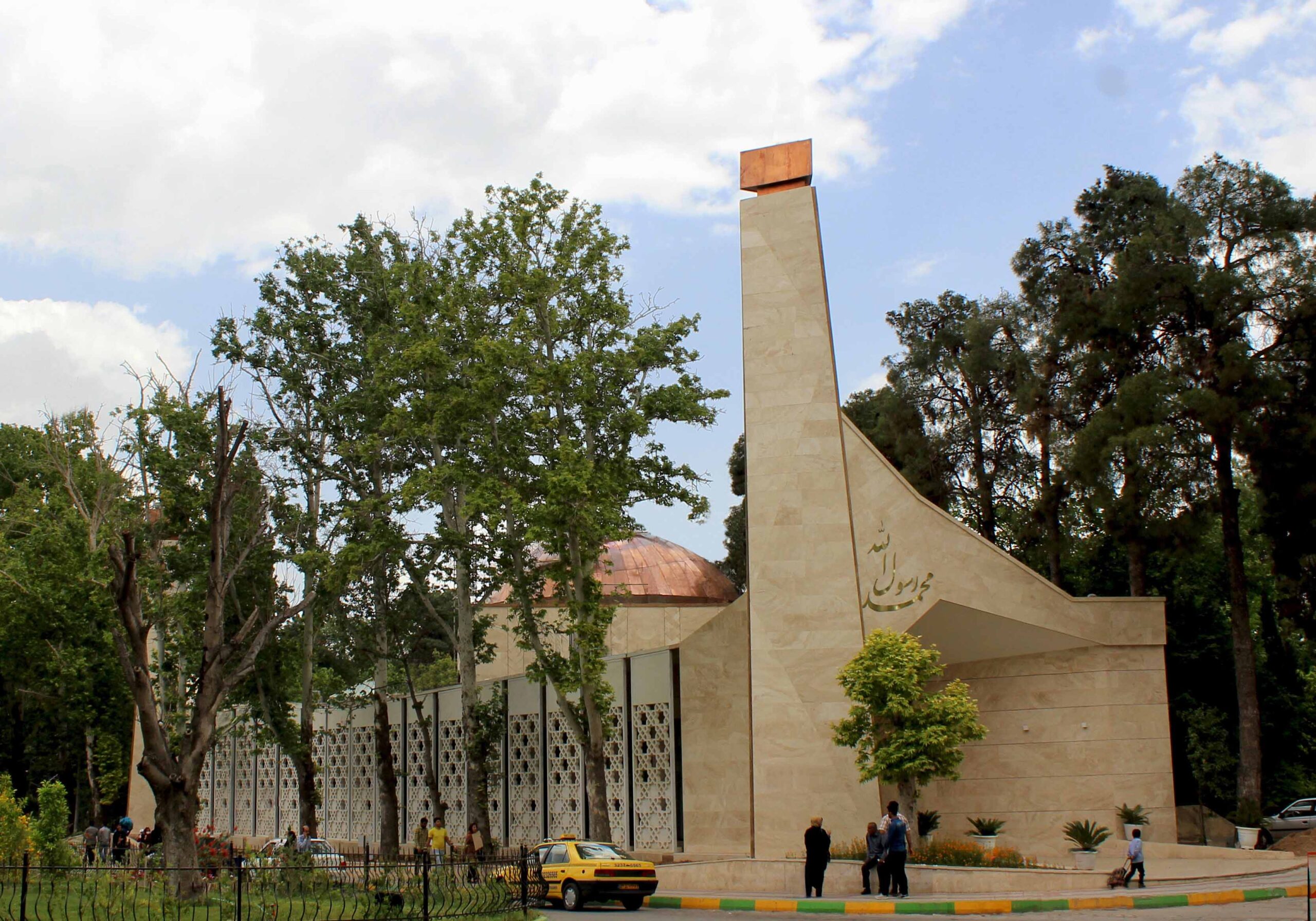
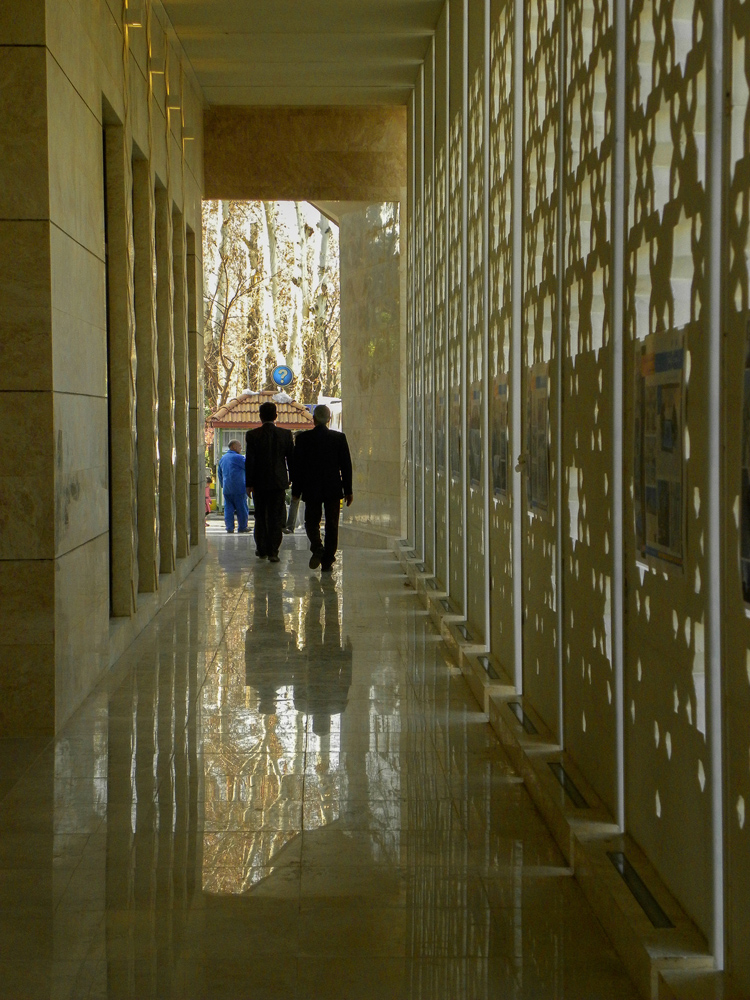
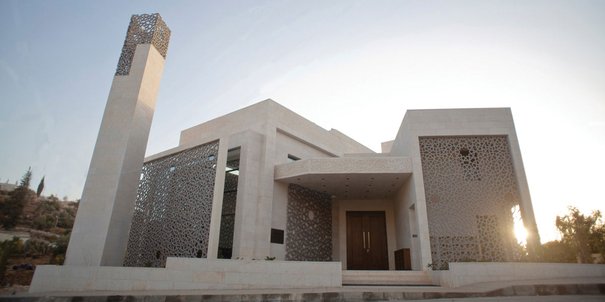
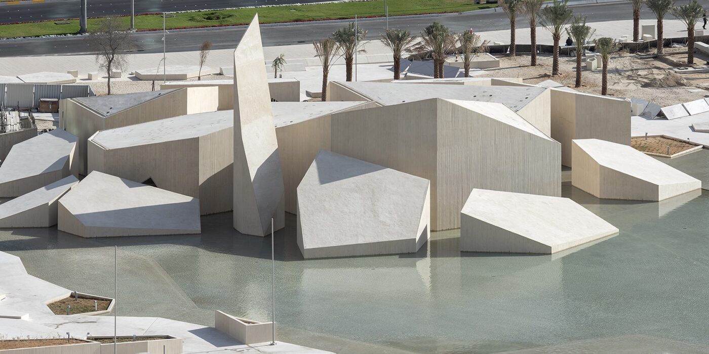
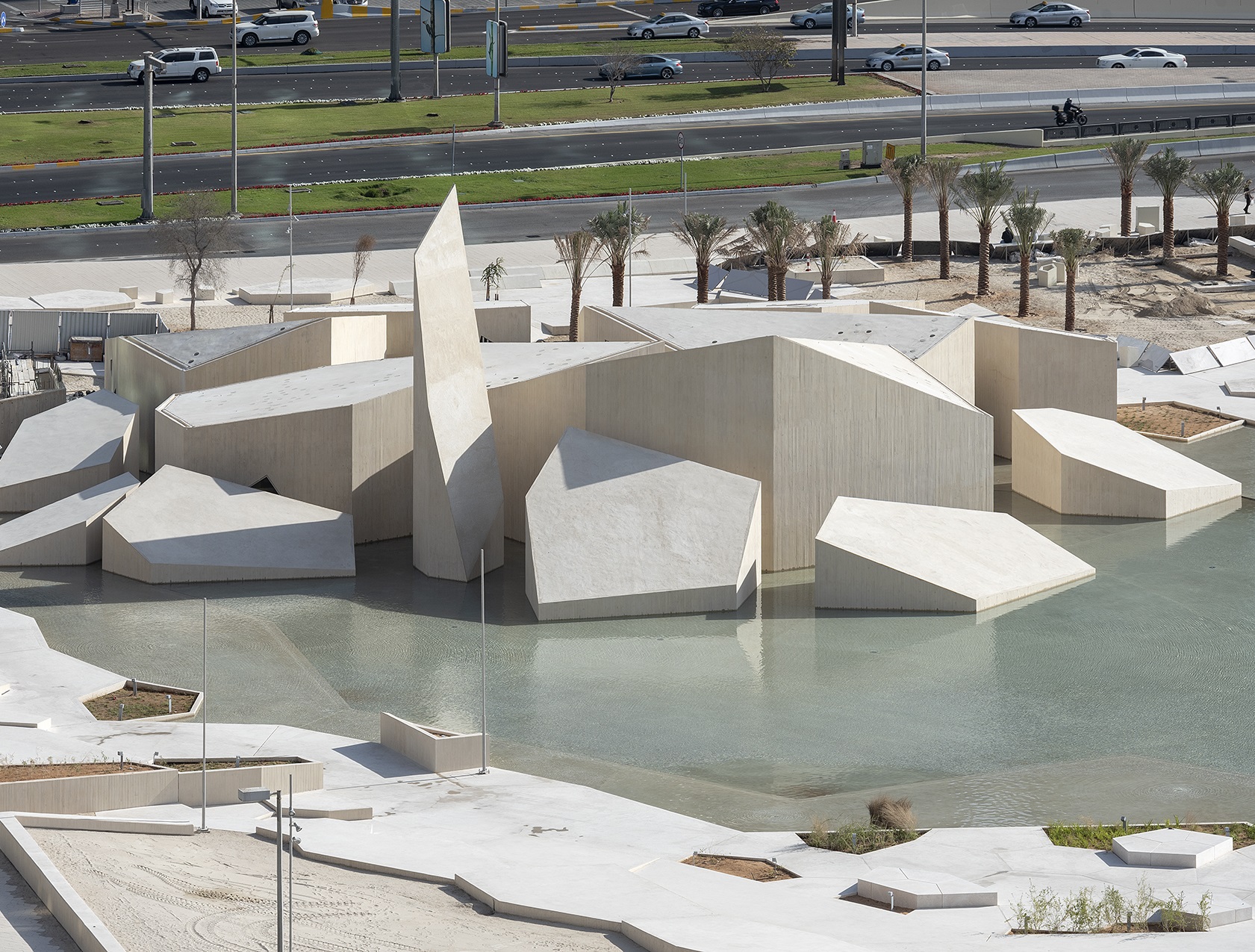
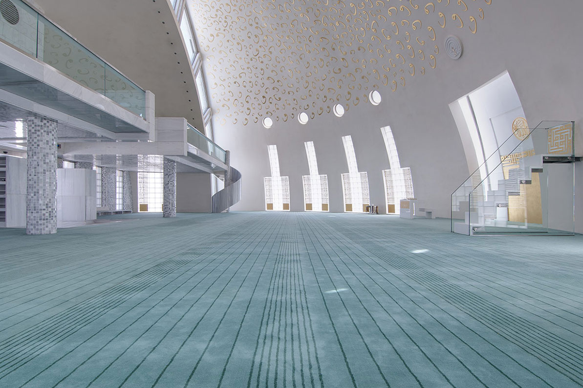
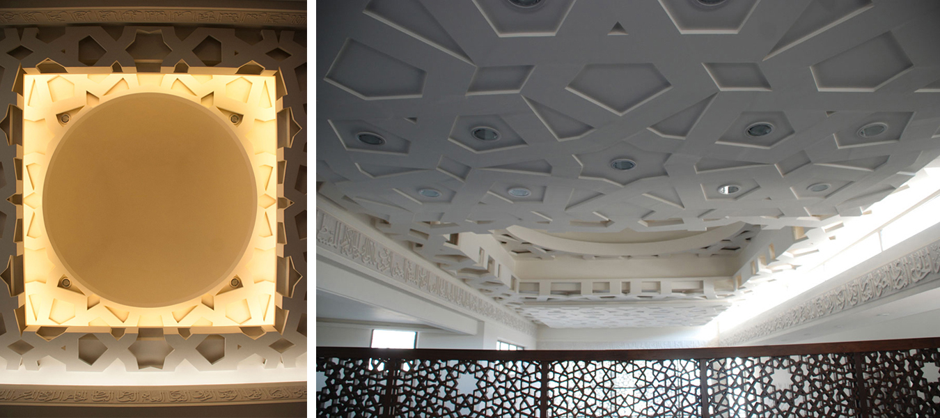
The dynamic design of Al Rawda Mosque in Amman aimed to move beyond the limitations of the traditional mosque designs of the region and envision what a contemporary mosque could look like. Through a process of extensive research, the designing team engaged in an intellectual pursuit that studied and abstracted the different elements of a mosque, before reinterpreting them and combining them in this design.

The ornamented screens on the inside and the outside of the building created a rich interplay of shade and shadow and blurred the boundary between the inside and the outside, while also having environmental benefits that enhanced the indoor climate and user experience.

The judging process for Architizer’s 12th Annual A+Awards is now away. Subscribe to our Awards Newsletter to receive updates about Public Voting, and stay tuned for winners announcements later this spring.   

Reference

colburn school breaks ground on frank gehry-designed campus expansion in LA
CategoriesArchitecture

frank gehry designs new center for young artists at LA’s colburn school

frank gehry-designed school: breaking ground ceremony


The Colburn School in Los Angeles, one of the world’s leading schools for music and dance, held a groundbreaking ceremony for its 100,000-square-foot expansion designed by Frank Gehry. The new Colburn Center will dramatically increase the school’s elite training and performance facilities and provide much-needed performance space, including a 1,000-seat, state-of-the-art concert hall, for young artists across LA. The groundbreaking ceremony took place adjacent to the construction site at 130 Olive Street, located within Downtown Los Angeles’s Bunker Hill area diagonally across the street from Colburn’s existing campus on Grand Avenue. The expansion will stand as an important addition to the cultural corridor which includes Gehry Partners’ Walt Disney Concert Hall, the Music Center, the Museum of Contemporary Art, and the Diller Scofidio + Renfro-designed broad. Anticipated completion is expected for the first quarter of 2027.

colburn school breaks ground on frank gehry-designed campus expansion in LA
left to right: Sel Kardan, Carol Colburn Grigor, Andrew Millstein, Jerry Kohl, Terri Kohl, Maeesha Merchant, Toby Mayman, Merle Mullin, and Terry Greene at Colburn Center groundbreaking ceremony, April 5, 2024 | image © Loreen Sarkis


a hall for all


Designed by Frank Gehry (see more), the Colburn Center at the Colburn School (see more) will be a ‘hall for all,’ giving artists and students a place to shine. the center will stand at the crossroads of culture, education, and landmark architecture — marking frank gehry’s third project within three blocks to become the world’s greatest concentration of his architecture. The colburn school welcomes over 2,000 students from across los angeles and around the world, with ages ranging from seven months to adult. the new center will make the colburn campus an even livelier hub of artistic activity and enable the school to expand its mission of presenting programs for the public, which include performance and educational collaborations with acclaimed local and touring artists and ensembles. it will also provide much needed performance space in a mid-sized hall for the region’s established and emerging performing arts organizations.

frank gehry colburn school
view from hill street west towards dance school entrance | image © Gehry Partners


the 1,000 seat theater, ‘terri and jerry kohl hall’


Frank Gehry’s Colburn Center will welcome students and audiences alike, with a dynamic composition of transparent and opaque interlocking blocks that step down into the natural contour of the site. A 1,000-seat concert hall uses an in-the-round design to create intimacy between the performers and the audience and removes the stage lip, putting front-row seats at eye-level with the performers. Orchestra, opera, dance, and musical theater will all be at home in the hall, which is equipped with an orchestra pit and a stage large enough to accommodate the grandest works and the largest orchestrations.

colburn school breaks ground on frank gehry-designed campus expansion in LA
branded shovels used for groundbreaking ceremony | image © Loreen Sarkis


the theater and dance studios


Four professional-sized dance studios and a 100-seat flexible studio theater are enveloped in glass and provide a literal window into the beauty and rigor of dance training and performance. Qith a separate entrance and distinct architectural character, the light-filled dance facilities will have their own identity while harmonizing with the larger project. The Colburn Center will be equipped to take a modern approach to multi-media technology and production. The facilities include commercial-quality recording and streaming capabilities, and performance spaces will be outfitted with state-of-the-art lighting. Public spaces include an outdoor plaza, giving visitors a front-row seat to the performing arts, and gardens which provide much-needed green space and pedestrian access to nearby public transit hubs.

frank gehry colburn school
view from Hill Street and 2nd Street intersection


colburn president sel kardan comments:With great joy and excitement, we share the design of Frank Gehry’s multi-dimensional project, which will welcome our students, performing artists, and audiences from across los angeles.The Colburn Center is a physical manifestation of the school’s founding principle of ‘access to excellence,’ allowing Colburn to continue and expand our educational and performance activities in a design which breaks down barriers between audience and performer and reveals the educational process. We look forward to collaborating with our artistic partners in Terri and Jerry Kohl hall, which complements the other stellar performance spaces in Downtown Los Angeles.’

colburn school breaks ground on frank gehry-designed campus expansion in LA
performance by the Colburn Conservatory’s Pep Band | image © Loreen Sarkis

frank gehry colburn school
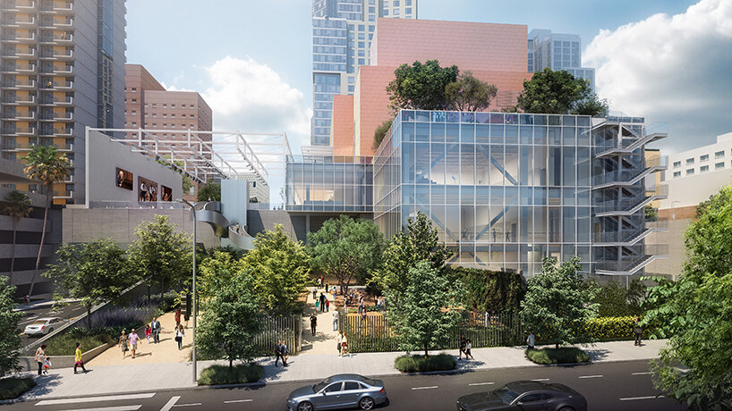
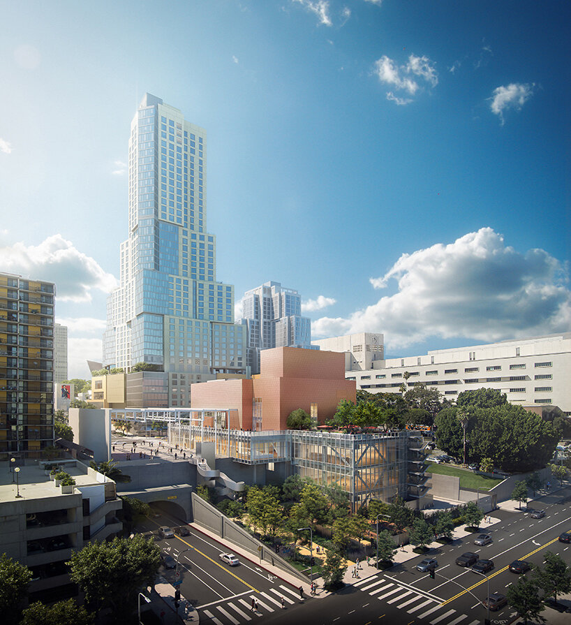
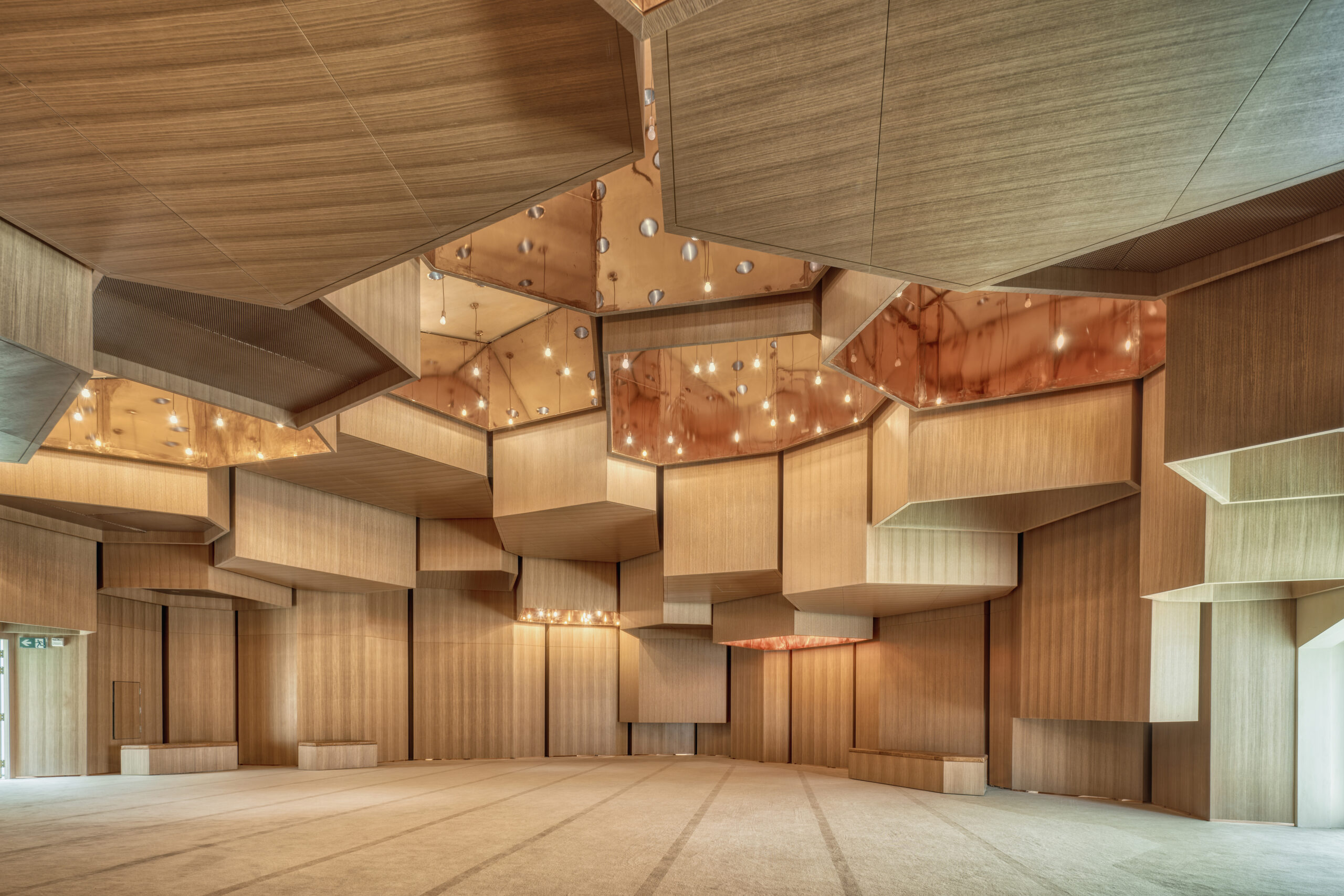
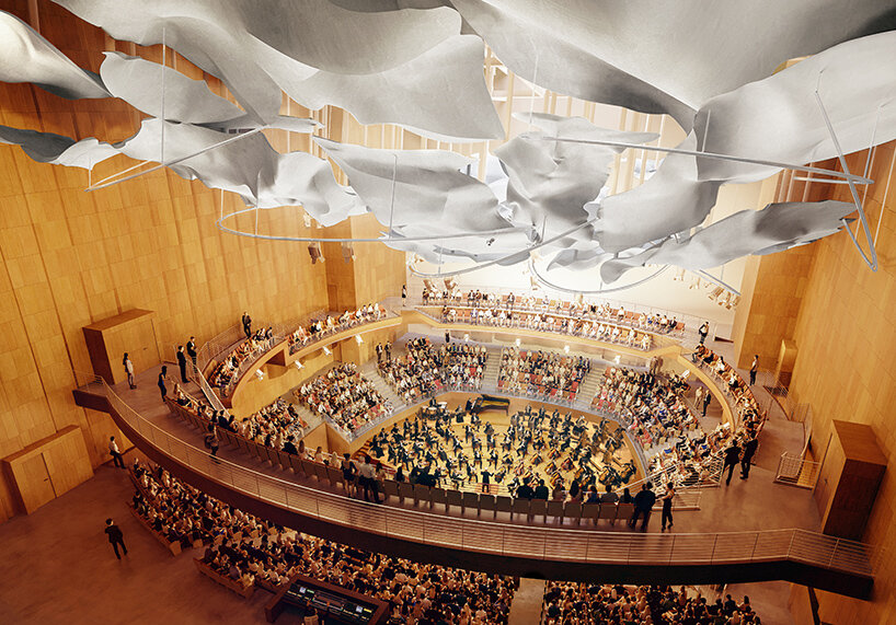
inside the 1,000-seat Terri and Jerry Kohl Hall | image © Gehry Partners


Reference

Exterior view of home by Wallmakers
CategoriesArchitecture

Wallmakers uses discarded toys to construct Toy Storey home in Kerala

Architecture studio Wallmakers has repurposed approximately 6,200 discarded toys to construct the walls of Toy Storey, a circular home in Kerala, India.

The aptly named residence by Wallmakers uses toys discarded in the area, which are unsuitable for recycling, as structural components and decoration within the external walls.

Exterior view of home by WallmakersExterior view of home by Wallmakers
A cantilevered verandah wraps around the circular home

“The main concept of Toy Storey revolves around the idea of using discarded toys and effectively conveying a message through this,” studio founder Vinu Daniel told Dezeen.

“By repurposing around 6,200 discarded toys, the residence in Kerala becomes a living monument to nostalgia and childhood, while addressing environmental concerns,” he added.

View of exterior wall of Toy Storey homeView of exterior wall of Toy Storey home
Approximately 6,200 discarded toys are used in the home’s walls

Toy Storey is wrapped by perforated, curved walls composed of compressed stabilised earth blocks, Mangalore tiles and toys, designed to draw in light and enable cross ventilation through the home. A ferrocement roof sits on top.

Four evenly-spaced entrances puncture the facade, which is wrapped by a cantilevered verandah offering outdoor space overlooking the surrounding greenery.

Living space within Kerala home Living space within Kerala home
Perforated walls draw light and ventilation through the interior

Inside, the home’s first floor is divided into public and private segments. The public half is defined by a large living room while the private half contains an open-plan kitchen and dining area flanked by bedrooms.

“One of the things that the client mentioned was they often host their neighbours and members of the community, which means there are often many people in the house,” Daniel said.

“Hence we decided to make the area the people frequented separate from that of the client’s family’s personal spaces,” he continued.

Japanese-style shoji screens are used as partitions throughout the interior to enable light into each space and connectivity between the private and public areas.

Kitchen interior within Toy Storey home in IndiaKitchen interior within Toy Storey home in India
An open-plan kitchen and dining area are flanked by bedrooms

The site’s topography enabled the addition of a secluded basement level containing a library and bedroom, accessed from the upper floor by a central staircase.

An internal courtyard topped with a glass ceiling slices through the building providing additional daylight for the interior.

Bedroom interior within Toy Storey in IndiaBedroom interior within Toy Storey in India
Japanese-style shoji screens are used as internal partitions

Wallmakers is an architecture studio established by Daniel in 2007. Elsewhere in India, Wallmakers has also recently completed an arts centre with rooftop seating and a house that resembles “snake curling up under a rock”.

Last year, Daniel faced criticism on social media for his studio’s use of unpaid internships, which he claims have an important educational benefit.

The photography is by Syam Sreesylam and Althaf Rasheed.

Reference

Beauty in the Grain: How a Colorado Mountain Home Was Brought to Life With Redwood Cladding
CategoriesArchitecture

Beauty in the Grain: How a Colorado Mountain Home Was Brought to Life With Redwood Cladding

A home’s materials tell a story of how we live. Nestled in the picturesque mountains of Colorado stands a remarkable testament to sustainable material sourcing. Brought to fruition by Colorado Springs-based architect-engineer Scott Harvey, this mountain home was made to connect with the natural surroundings as an expansive and open retreat. In turn, the project’s redwood cladding reflects a family’s values as they built a home of their own.

A Family Home in the Mountains

Located in the mountains north of Colorado Springs in the town of Monument, this home was made for an active family with five children. The family was hoping for a home that embraced natural light and views out onto the landscape. Working together with builder Palmer Ridge Construction, the team brought the new, 10,538 square-foot home to life with seven bedrooms and expansive glazing. Outside, the home features an unadorned stucco finish and a continuous, seamless band of wood cladding. This warm, redwood band runs non-stop from the exterior through the interior.

The Colorado Mountain Home features an extensive use of redwood from Humboldt Sawmill. Humboldt Sawmill manufactures a full line of redwood and Douglas-fir wood products. Logs are sourced from nearly 450,000 acres of company-owned timberlands, where harvest levels are consistently below the forests’ annual growth rate and harvested trees are replanted. Logs are then processed into lumber.

For this home, the builder had Humboldt Sawmill transport the raw lumber to a dealer in Colorado where it was milled locally to the desired shiplap pattern. Local availability kept the cost within budget. In addition, it was easier to install than tropical hardwoods and no stain was required; only two coats of clear sealer. Redwood, known for its durability, beauty and sustainability, adds warmth to the design and creates a seamless transition from the interior to the exterior of the home.


Sustainable Sourcing

Photo by Kelly Edmondson

What sets this mountain home apart is not just its design but also its commitment to sustainability. The redwood from Humboldt Sawmill was sourced from company-owned Forest Stewardship Council® (FSC® C013133) certified timberlands in Northern California, where it is grown and harvested to the highest environmental standards in the world. FSC certification ensures that products come from forests that provide environmental, social and economic benefits. The FSC Principles and Criteria provide a foundation for all forest management standards globally, including the FSC® US National Standard (v1.0) that guides forest management certification in the U.S.

This commitment to sustainability not only reduces the home’s carbon footprint but also supports the conservation of forests for future generations.


Key Properties of Redwood

Photo by Kelly Edmondson

Redwood is renowned for its natural beauty and resilience, making it an ideal choice for this mountain home. Redwood is also native to the U.S., not imported. There are several key properties of redwood that make it a preferred building material:

Durability: Redwood heartwood from the center of the tree is naturally resistant to decay and insects, making it an excellent choice for outdoor applications such as siding, decking and fencing. As the team for the Colorado Mountain Home explain, “natural durability through tannins in the redwood heartwood render the wood resistant to termites and decay, an important factor in the home’s mountain environment.”

Aesthetic Appeal: Redwood’s rich color and grain patterns add a touch of elegance and warmth to homes and commercial projects alike. Its natural beauty only enhances over time, developing a patina that adds to the charm of a building.

Sustainability: Redwood is a renewable resource, with the ability to regrow from the stump after harvesting. When sourced from responsibly managed forests, redwood is a sustainable building material that helps reduce the environmental impact of construction.

Workability: Redwood is easy to work with, making it a favorite among architects and builders. It can be easily cut, shaped and installed, allowing for intricate designs and detailing that enhance the overall aesthetics of the home.


Built to Last: A Home for Future Generations

Photo by Kelly Edmondson

At the heart of this Colorado home is the contrast between materials: the natural white Brauer veneer stone and stark white stucco stand out against the warmth of the redwood. Expansive windows open up to views of ponderosa pines and scrub oaks, while inside, the home features white oak flooring and custom cabinets. From these rooms, multiple patios and decks flow together to bring the family outside and create connections to their surroundings.

Photo by Kelly Edmondson

The Colorado mountain home stands as a testament to the harmonious relationship between nature and design. Through the use of Humboldt Sawmill’s redwood sourced from responsibly managed forests, this home not only showcases the beauty and durability of this remarkable material but also highlights the importance of working with the right manufacturers and builders. Today, the home tells a story of family, warmth and connectedness through its details and construction.

To learn more about how you can harness the unique qualities of redwood for your next project, reach out to the experts at Humboldt Sawmill.

Reference

Building Health: How an Old Jailhouse in Toronto Became the Heart of Patient-Centered Care
CategoriesArchitecture

Building Health: How an Old Jailhouse in Toronto Became the Heart of Patient-Centered Care

The judging process for Architizer’s 12th Annual A+Awards is now away. Subscribe to our Awards Newsletter to receive updates about Public Voting, and stay tuned for winners announcements later this spring.   

In the realm of healthcare, where compassion intersects with cutting-edge medical science, lies a crucial element of healing: the environment itself. The Hennick Bridgepoint Hospital stands as a testament to the transformative power of architecture in nurturing wellness. Described as a “Village of Care,” this facility transcends being merely a structure of concrete and steel; it is a sanctuary meticulously crafted with the singular aim of nurturing healing and well-being, catering to individuals grappling with complex chronic diseases and disabilities.

A few years ago, I had the opportunity to visit the building and chat with a couple of nurses. One of them guided me through the building to the rooftop garden and shared an intriguing observation: patients who frequented the outdoor garden tended to experience faster healing. I found this insight quite fascinating.

The hospital’s design fully embraces the healing potential of nature and the surrounding landscape, with intentional efforts aimed at immersing patients in their surroundings. The hospital is intricately linked to prominent features of some of Toronto’s finest neighborhoods, including the Don River Valley, Riverdale Park, the downtown skyline, and Riverdale itself.

The site where the building stands holds its own narrative waiting to be told, embodying a narrative of transformative rehabilitation that mirrors the very mission of the hospital. Right next to the hospital, and central to the project’s significance is the historic 148-year-old Don Jail, occupying a prominent position on the site. Remarkably, the theme of wellness has been woven into the fabric of this site since its inception. From its inception as a reform prison in 1864, the liberal view of physical and mental wellness embedded in the building’s design led it to be nicknamed “Palace for Prisoners.”

Bridgepoint Active Healthcare by Diamond Schmitt Architects, HDR Architecture, KPMB Architects, Stantec Architecture

The historic Don Jail, adjacent to the new hospital, was restored and repurposed into the hospital’s administrative offices.

While a jail is not a flawless representation of wellness, and this theme may not have endured throughout its entire operational history, it is evident that a lasting theme has persisted over time. Fast forward to the present day, the Don Jail has undergone a remarkable transformation, now serving as the administrative and educational hub of the hospital — a key facility central to fostering interdisciplinary collaboration to address patients’ physical and emotional needs.

The design and layout of the hospital was driven by the aspiration to establish a unique community hub — a hospital that not only prioritizes healthcare and wellness but also fosters a deep sense of connection to the community. This vision aimed to create an urban center that served as a beacon for health and well-being. It was intended to evoke a strong sense of belonging for both the patients and the surrounding neighborhood. While hospitals often carry weighty connotations, Hennick Bridgepoint was purposefully designed to embody an open, airy and, above all, welcoming community village for its patients.

Upon entering, the space greets visitors with an abundance of natural light streaming through expansive windows and glass panels, creating a bright and inviting atmosphere — feelings often associated with health and vitality. The light and bright atmosphere undoubtedly establishes a strong connection to the outdoors. Coupled with the incorporation of warm hues and natural materials, the space evokes feelings of comfort and tranquility.

As I toured the building, I learned additional finer details that underscored the thoroughness of the building’s design and attention to detail. I discovered that ensuring indoor air quality was a top priority throughout the design process, with the architects making extensive efforts to maximize it. This included implementing measures such as controlling scents within the building, utilizing low-to-no VOCs in adhesives, sealants, paints, and coatings, and enforcing a strict no-smoking policy in the vicinity of the building.

Furthermore, the hospital’s layout has been fine-tuned to encourage physical activity and mobility. Wide hallways and spacious areas encourage patients to navigate freely, thereby supporting their rehabilitation journey. The incorporation of accessible design features guarantees that individuals of varying abilities can effortlessly navigate the building, promoting a feeling of independence and empowerment. Moreover, every detail of the architectural design, ranging from the placement of amenities to the selection of materials, has been intentionally chosen to enhance the patient’s experience.

But perhaps the most profound impact of the Hennick Bridgepoint Hospital, lies in its ability to instill hope in its patients. The very sight of the building serves as a beacon of optimism, a symbol of possibility in the face of adversity. By creating a space that is conducive to healing, the architects behind Hennick Bridgepoint Hospital have given patients more than just a place to receive medical treatment, but a sanctuary that truly supports their journey towards wellness.

At its core, this building is a refuge of healing, exemplifying a commitment to patient-centered care that has been designed to address the holistic needs of its residents — both physical and emotional. Its environment is designed to inspire patients to leave their rooms, instilling motivation to confront their illnesses directly. The building has been thoughtfully crafted to facilitate patients’ access to nature, offering design elements like outdoor terraces, rooftop gardens and adjacency to a sprawling public park, all aimed at reconnecting them with the natural world.

Each individual room design includes 40% glazing, featuring a distinctive vertical window that subtly projects from the building’s exterior, spanning floor to ceiling in every treatment area. From the corridors to the corners, this intentional architectural decision strengthens the connection to nature, granting patients an unobstructed view of the outdoors, even from their beds, giving them direct access to the outside world. A patient can step up and into the window and feel as though they are virtually outdoors. Patient rooms are generously spaced to provide privacy, while communal areas are strategically positioned to promote social interaction and support among patients.

Bridgepoint Active Healthcare by Diamond Schmitt Architects, HDR Architecture, KPMB Architects, Stantec Architecture

The building’s design demonstrates a profound comprehension of the hurdles individuals encounter on their journey toward healing, encompassing everything from navigating intricate medical procedures to coping with chronic illness. This is where the healing garden and rooftop terrace truly demonstrate their power. As highlighted in this article, abundant research has showcased the therapeutic benefits of exposure to nature, ranging from stress and anxiety reduction to expediting healing processes. Indeed, each element spotlighted in that article represents design features that have been integrated into the hospital’s layout in their own unique manner, striving to harness the healing potential that architecture holds for its occupants.

In my opinion, the rooftop terrace at Hennick Bridgepoint Hospital stands as the apex of the building, harmonizing many of the aspects of healing and wellness into one space — a meticulously landscaped green roof covering 50% of the rooftop’s surface area. With lush gardens and pathways, patients have daily access to the outdoors, fostering a semblance of normalcy in their lives. The direct access to nature creates a highly therapeutic environment for both patients and staff alike, enabling them to engage not only in physical activity but in daily social interaction.

Rooftop Garden and Terrace at the Hennick Bridgepoint Hospital

Rooftop Garden and Terrace at the Hennick Bridgepoint Hospital with views over the city of Toronto, Canada

While many gardens rely on chemicals and fertilizers, the building employs native and highly resilient plants that require minimal maintenance, thus eliminating the necessity for additional chemicals. Having the opportunity to spend time outdoors in a nurturing garden environment, akin to one’s own backyard, can offer patients a comforting sense of familiarity and routine during their hospitalization. In fact, in 2013, Bridgepoint succeeded in reducing the average stay for rehabilitation patients by 20%, with a remarkable 100% of patients expressing their willingness to recommend the hospital to their friends and family.

This hospital is a shining example of the transformative power of architecture in healthcare. Through thoughtful design and careful consideration of the needs of its inhabitants, it has redefined the concept of what a hospital and healing space can be. From fostering a sense of calmness and serenity to promoting physical activity and social interaction, every aspect of the building has been optimized to nurture wellness. As we continue to explore the connection between architecture and health, the Hennick Bridgepoint Hospital serves as a beacon of inspiration, reminding us of the profound impact that the built environment can have on the lives of those who inhabit it.

The judging process for Architizer’s 12th Annual A+Awards is now away. Subscribe to our Awards Newsletter to receive updates about Public Voting, and stay tuned for winners announcements later this spring.   

Reference

christian kerez's house okamura unfolds as a cluster of circular brick volumes in czechia
CategoriesArchitecture

christian kerez’s house okamura unfolds as circular brick columns in czechia

insnde the all-brick house okamura by christian kerez in prague


In Prague 6, within close proximity to Villa Müller by Adolf Loos, architect Christian Kerez completes House Okamura as a clear example of a very traditional, almost archaic method of constructing brick ‘circles’. The project, designed as an aggregate of column-like volumes, hosts three apartments with 39 rooms, combined. Kerez omitted dividing walls from the interior layout, making the outline of every single space visible from the outside. More so, thanks to their unique configuration, the apartments shift positions from floor to floor so that rooms in the vertical shafts belong to different owners. The rooms vary from 4 sqm to 18 sqm in size and 2.35 meters to 4.9 meters in height, with an additional 19 spaces in between the circular rooms, making it a total of 58 rooms.

christian kerez's house okamura unfolds as a cluster of circular brick volumes in czechia
all images © Maxime Delvaux


circular rooms with varying sizes, openings, and layouts


All spaces within one apartment of House Okamura are open to each other, with areas varying between 90 sqm and 110 sqm. As Christian Kerez (see more here) explains, the different sizes of the overlapping circular rooms create unpredictable changes in the direction of these openings. The latter seem to be randomly positioned and create a labyrinth-like movement. ‘It is a space that opens in on itself, generating an impression of expansion within actually limited boundaries, as intended by the rigorous geometrical arrangement. The layout of the circular rooms changes from one level to another,’ continues the Czechian architect. 

christian kerez's house okamura unfolds as a cluster of circular brick volumes in czechia
House Okamura in Prague 6


Meanwhile, the elevator, storage, and sanitary area are all tucked between the circular rooms of House Okamura. These intermediate spaces, which can be entirely closed off with doors, are minimal, fragmented, and convex, as opposed to the open, perfectly concave main zones. Concluding his thoughts, Christian Kerez highlights how the spatial concept of autonomous rooms aggregated to a sequence of spaces feels radical and new while the whole project resorts to traditional brick construction, which is easier to build on site than orthogonal spaces.

christian kerez's house okamura unfolds as a cluster of circular brick volumes in czechia
the project reveals a cluser of brick circles

christian kerez's house okamura unfolds as a cluster of circular brick volumes in czechia
the interiors host three apartments, with 39 rooms in total

christian kerez's house okamura unfolds as a cluster of circular brick volumes in czechia
circular living room with no dividing walls

christian kerez's house okamura unfolds as a cluster of circular brick volumes in czechia
the direction of openings constantly changes from room to room, and floor to floor

Reference