Downtown LA Proper
CategoriesInterior Design

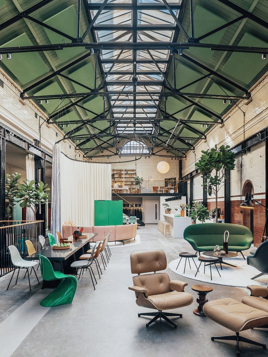
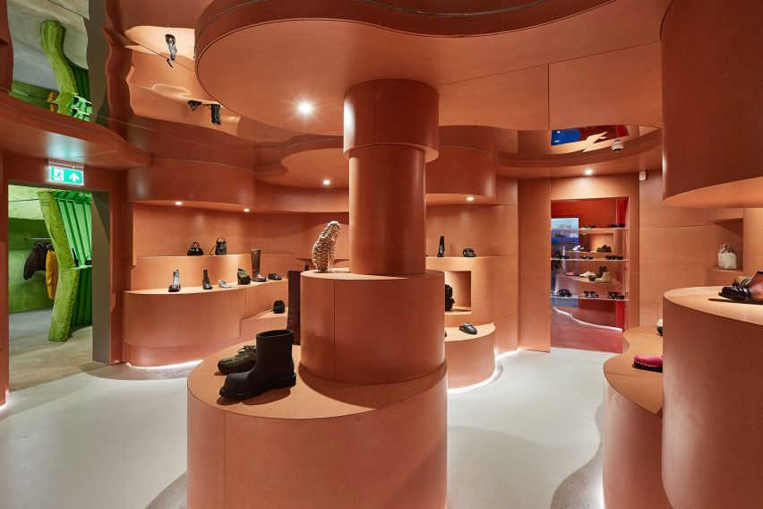
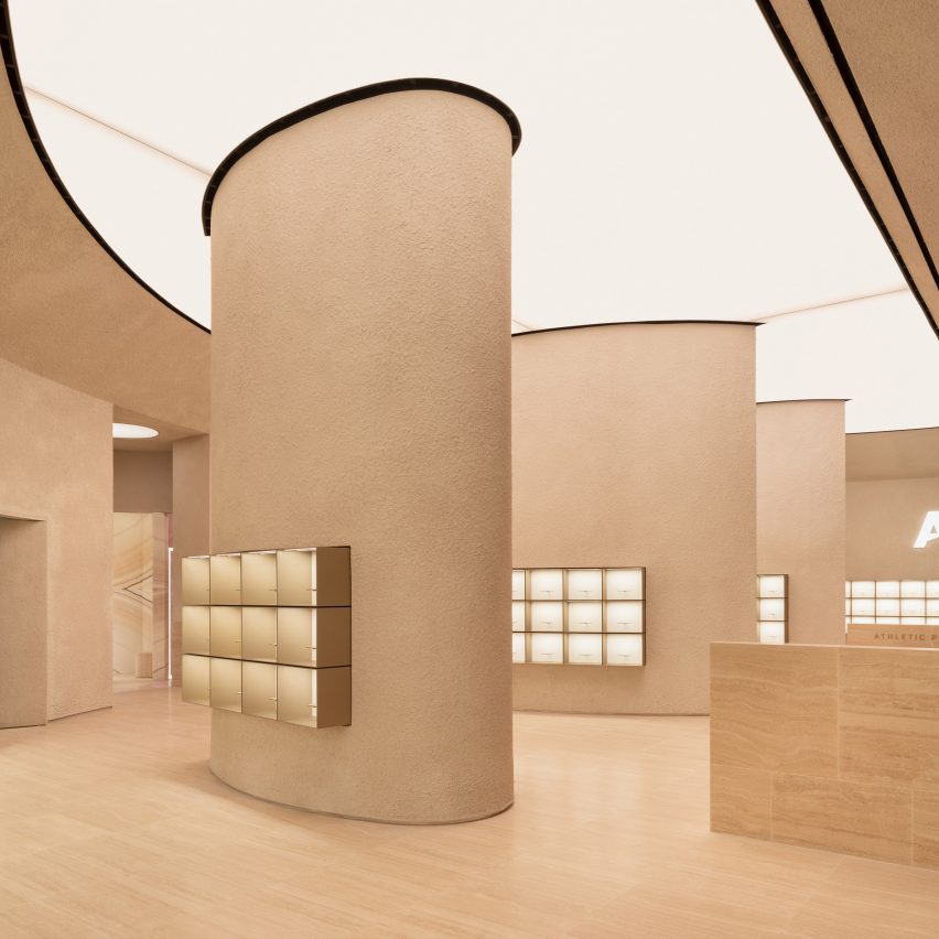
Eight hotel interiors characterised by eclectic designs

From guest rooms filled with fashion designer Christian Louboutin’s personal antique collection to Ibiza’s oldest hotel where handmade masks are mounted on the walls, our latest lookbook features eight eclectic hotel interiors.

Eclectic design brings together objects and styles from a range of sources – often mixing contemporary and vintage pieces.

While many hotels are characterised by uniform luxury, others celebrate unlikely combinations of furniture, colours and patterns.

Here are eight eclectic hotel interiors from around the world defined by contrasts and clashes.

This is the latest in our lookbooks series, which provides visual inspiration from Dezeen’s archive. For more inspiration, see previous lookbooks featuring residential mezzanines, Mexican holiday homes and minimalist bathrooms.


Downtown LA ProperDowntown LA Proper
Photo courtesy of Kelly Wearstler

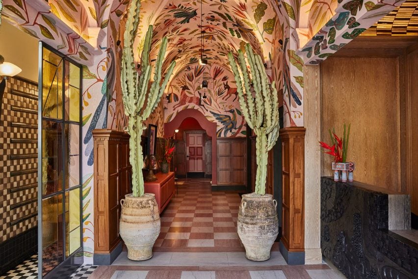
Downtown LA Proper, USA, by Kelly Wearstler

American designer Kelly Wearstler has created the interiors for all four of the Proper Hotel Group’s branches across North America.

The Downtown LA Proper is anchored by “bold and eclectic choices”, including a chunky graphite reception desk and a hand-painted archway flanked by leaning column-like cacti in rustic pots.

Find out more about Downtown LA Proper ›


Montesol Experimental hotel in Ibiza by Dorothée MeilichzonMontesol Experimental hotel in Ibiza by Dorothée Meilichzon
Photo by Karel Balas

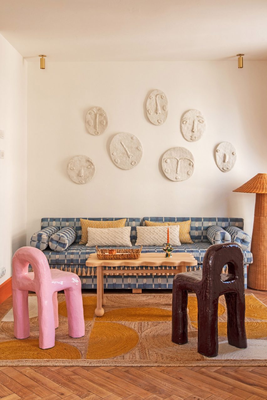
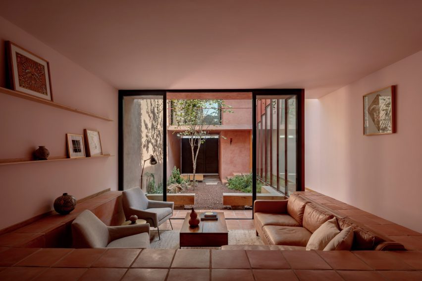
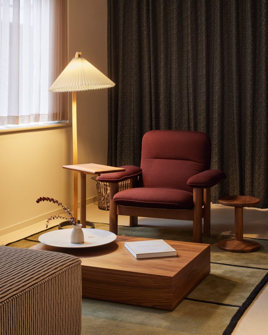
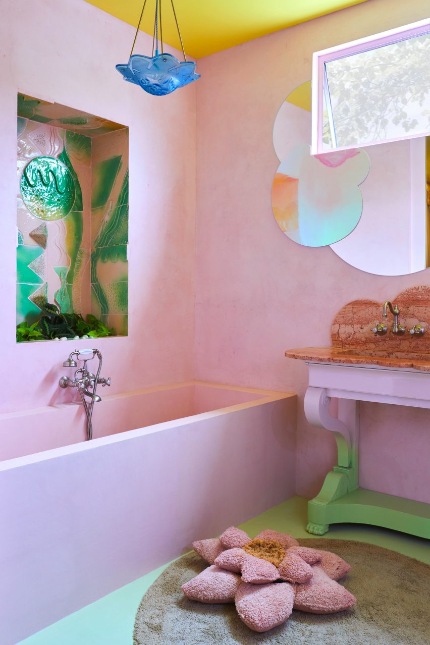
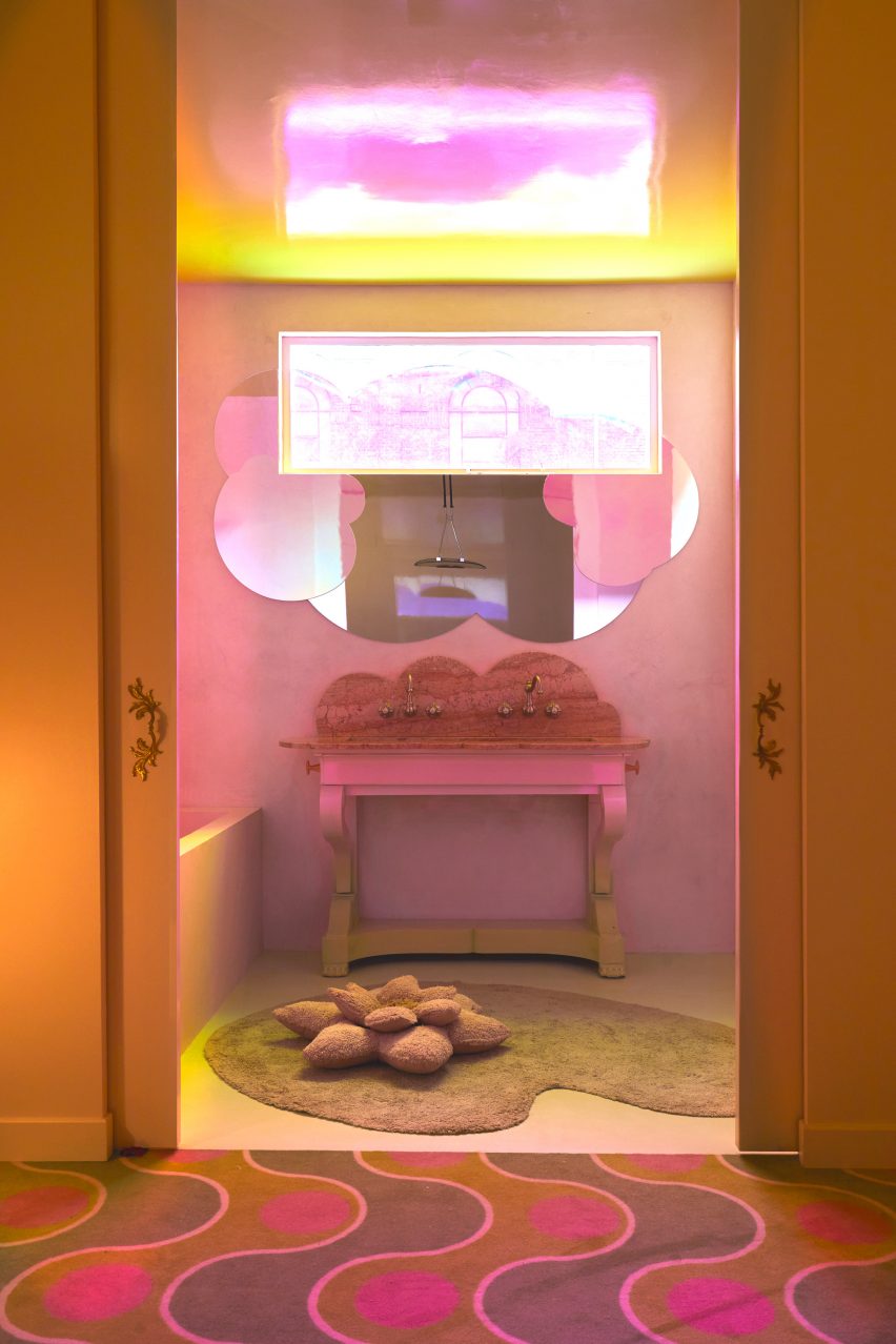
Montesol Experimental, Ibiza, by Dorothée Meilichzon

Dorothée Meilichzon of French interior design studio Chzon renovated Montesol – the oldest hotel in Ibiza, originally built in the 1930s.

Meilichzon transformed the renamed Montesol Experimental with “a bohemian overtone” that draws on the hotel’s rich history. Among its interior elements are lumpy Playdough Stools by artist Diego Faivre, hand-crafted masks and an abundance of tassels.

Find out more about Montesol Experimental ›


Monkey side table in Vermelho Hotel bedroomMonkey side table in Vermelho Hotel bedroom
Photo by Ambroise Tézenas

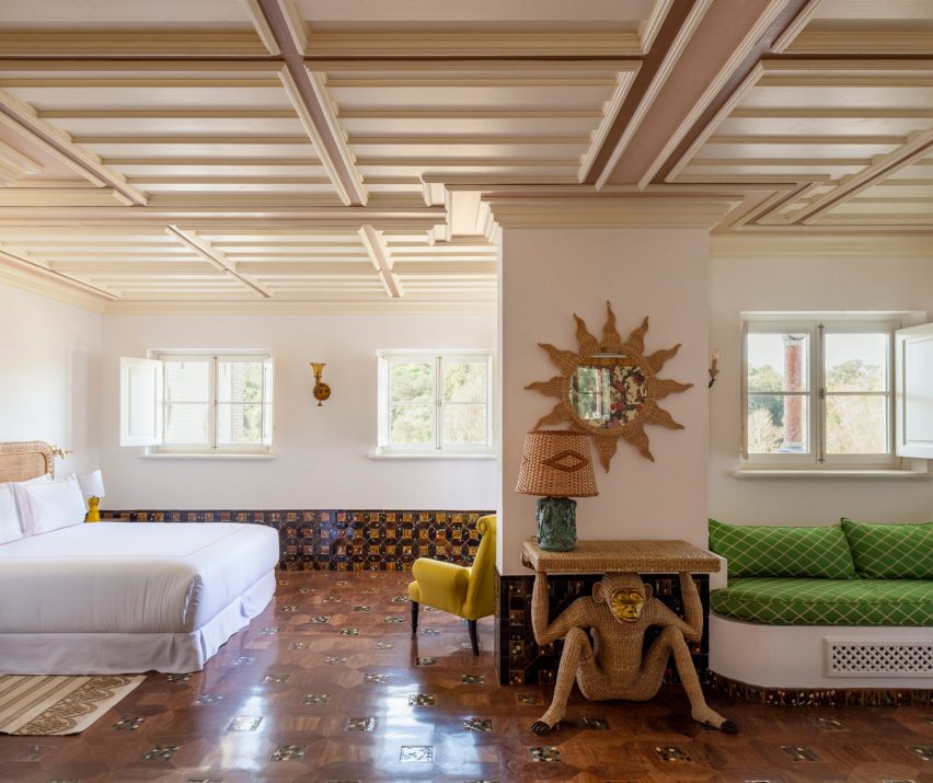
Vermelho, Portugal, by Christian Louboutin and Madalena Caiado

Louboutin filled his first hospitality project with furniture and materials from his personal antique collection.

The fashion designer worked with architect Madalena Caiado to create the Vermelho boutique hotel in the Portuguese village of Melides. The guest rooms feature unexpected elements such as a rattan monkey-shaped side table and striking hand-painted frescoes.

Find out more about Vermelho ›


Palm Heights Grand Cayman by Gabriella KhalilPalm Heights Grand Cayman by Gabriella Khalil
Photo by Brooke Shanesy

Palm Heights, Grand Cayman, by Gabriella Khalil

Collectible design pieces characterise Palm Heights in Grand Cayman, the island’s first boutique hotel.

Creative director Gabriella Khalil sought to style the project like a 1970s Caribbean mansion, selecting sandy yellows and bold blue hues to complement the many original artworks that adorn the walls.

Find out more about Palm Heights ›


Kelly Wearstler-designed hotel in AustinKelly Wearstler-designed hotel in Austin
Photo by The Ingalls

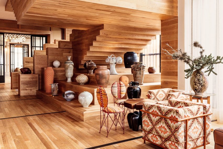
Austin Proper Hotel and Residences, USA, by Kelly Wearstler

Among the Proper Hotel Group’s other locations is an Austin branch. Wearstler inserted a sculptural oak staircase into the lobby that doubles as a plinth for a varied collection of glazed earthenware pots and vases.

Locally sourced art and textiles characterise the hotel, which has cypress wood walls that were charred using the traditional Japanese technique of Shou Sugi Ban to create a tiger-striped effect.

Find out more about Austin Proper Hotel ›


Bedroom with patterned headboardBedroom with patterned headboard
Photo by Simon Brown

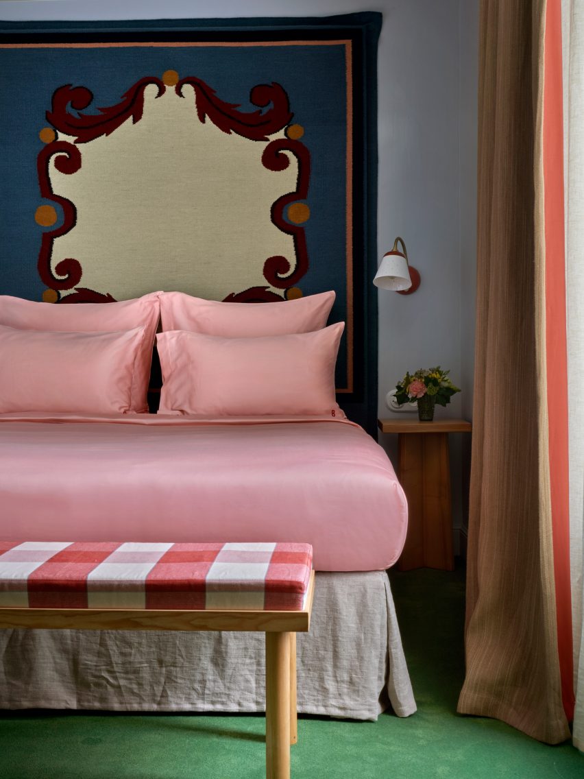
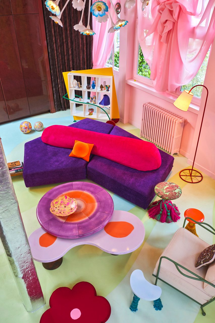
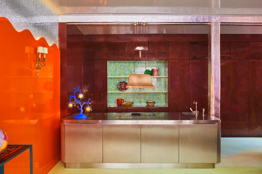
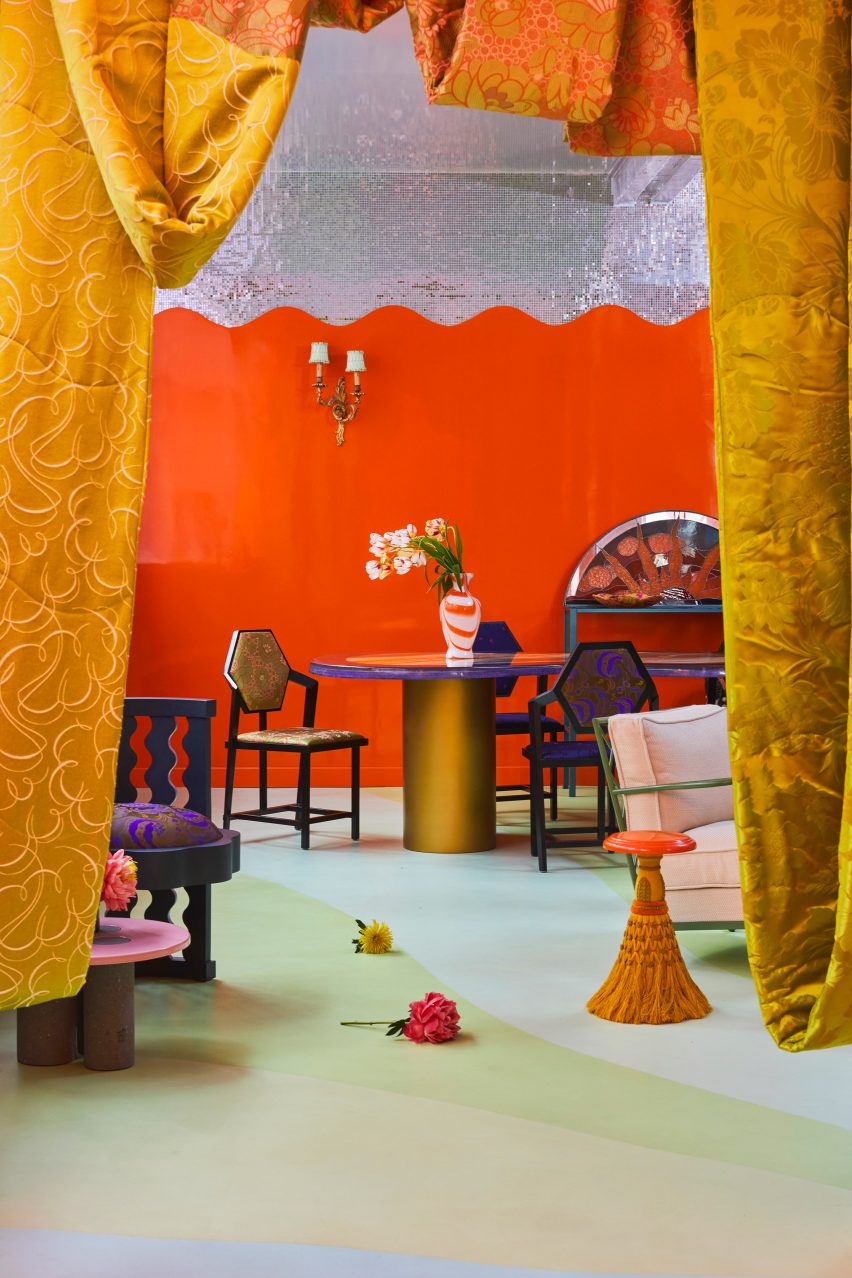
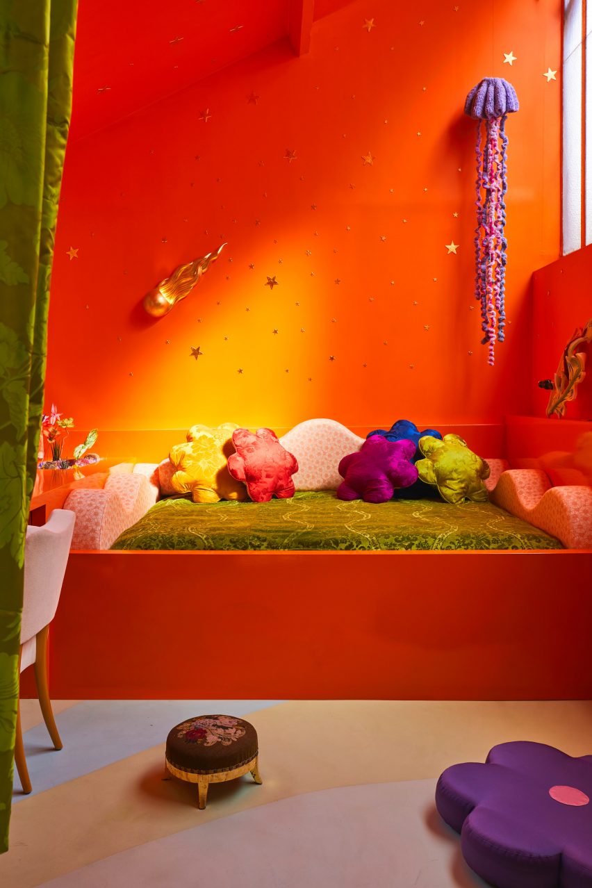
Hôtel de la Boétie, France, by Beata Heuman

Swedish designer Beata Heuman created the Hôtel de la Boétie in Paris to be “a bit like a stage set”.

Heuman chose contrasting elements for the colour-drenched interiors. Bedrooms feature a mixture of dark-hued woven headboards and pale pink sheets, while downstairs, the reception area’s jumbo flower lamps balance the steely silver of the lounge walls.

Find out more about Hôtel de la Boétie ›


Château Royal hotel in Berlin by Irina Kromayer, Etienne Descloux and Katariina MinitsChâteau Royal hotel in Berlin by Irina Kromayer, Etienne Descloux and Katariina Minits
Photo by Felix Brueggemann

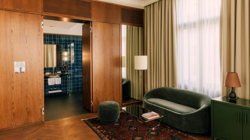
Château Royal, Germany, by Irina Kromayer

A series of eclectic spaces make up the Château Royal in Berlin, which references the heyday of the German capital at the turn of the 20th century.

Interior architect Irina Kromayer designed the hotel to be “authentic” rather than retro, choosing art noveau tiles and brass and nickel hardware in a nod to the finishes commonly found in Berlin’s historic buildings.

Find out more about Château Royal ›


A green hotel barA green hotel bar
Photo by Christian Harder

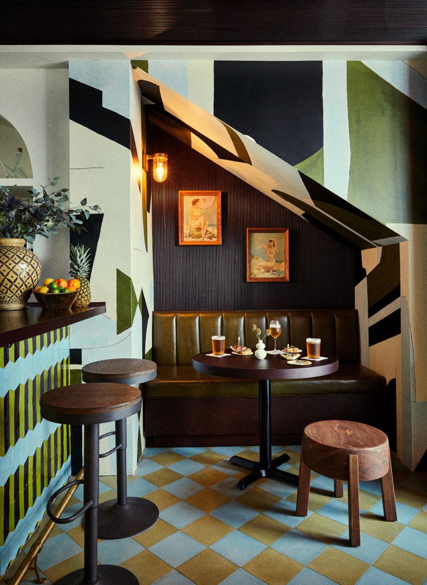
Esme Hotel, USA, by Jessica Schuster Design

Plush velvet flooring, textural tassels and plants in wicker pots come together at the Esme Hotel in Miami, renovated by New York studio Jessica Schuster Design.

The interiors draw on the “bohemian grandeur” of the hotel’s 1920s history, with decadent alcoves clad with contrasting patterns.

Find out more about Esme Hotel ›

This is the latest in our lookbooks series, which provides visual inspiration from Dezeen’s archive. For more inspiration, see previous lookbooks featuring residential mezzanines, Mexican holiday homes and minimalist bathrooms.

Reference

Oslo Vitra showroom
CategoriesInterior Design

Vitra extends European presence with showroom openings

Promotion: Swiss furniture brand Vitra is expanding its European presence through a programme of showroom openings in renovated, distinctive historic buildings.

The brand, which is known for high-end office and home furniture by leading designers, has embarked on a programme of showroom expansion and renovation to add to its global presence.

“All Vitra showrooms reflect an agile and flexible platform to showcase our office and home concepts, including both Vitra and Artek,” said the brand.

“We are keen to present the collaboration and synergies with our partners in spaces designed for communal work, activities and events.”

It has recently opened or renovated showrooms in Amsterdam, London, Madrid, Oslo and Stockholm.

Oslo Vitra showroomOslo Vitra showroom
Vitra recently opened a showroom in Oslo

Vitra’s latest showroom opened last month in Oslo. Set within a 1930s metal factory in the resurgent Skøyen district, the understated interior was designed to contrast the industrial structure and set the base for the brand’s curated furniture collections.

The space contains offices for Vitra local staff and also functions as a place for the brand to host architects and designers.

Vitra Madrid showroomVitra Madrid showroom
It also opened a showroom in renovated building in Madrid

Earlier this year in Madrid’s bustling Salamanca district, Vitra opened a showroom within a 1920s art nouveau building originally designed by Spanish architect Antonio Palacios as a power supply facility for the city’s metro system.

The space was renovated by Spanish studio Carlos Manzano Arquitectos to create a bright and open space that showcases many of the building’s original features.

Topped by a distinctive steel and glass roof, the space combines office space for Vitra’s Madrid staff along with a showroom space, Vitra Colour & Material Library and a Task Chair Lab.

“One of our main goals was to peel off added elements to reveal the beauty of the spacious interior,” said Till Weber, creative director interiors and scenography.

“We also tried to maintain as much as possible of the original structure. For example, we tore out an entire kitchen installed by the former tenant to reveal wonderfully preserved brick walls.”

Vitra Amsterdam showroomVitra Amsterdam showroom
Its Amsterdam showroom overlooks the city’s port

In Amsterdam, Vitra recently opened another showroom on the dockside in the city’s Houthavens district within an old industrial munitions complex.

Vitra’s Amsterdam home was designed by London-based interiors studio SevilPeach, which was shortlisted for interior designer of the year at Dezeen Awards 2019.

Described as “breathtaking” by Vitra chairman Rolf Fehlbaum, the pared-back space features several showrooms, a shop, offices, canteen, a workshop and warehouse spaces.

Vitra showroom in ShoreditchVitra showroom in Shoreditch
Vitra’s London showroom opened in the Tramshed in Shoreditch

In London, Vitra recently opened a showroom in another heritage building – the Grade II-listed Tramshed in Shoreditch.

Originally built as a power station for the East London Tramway in 1905, the building was renovated to draw attention to its original features including the central roof light.

Along with the showroom openings, Vitra also recently renovated its Stockholm showroom. The brand also has European showrooms in Brussels, Copenhagen, Frankfurt, Prague and Paris as well as outside Europe in Los Angeles, New York and Tokyo.

Herzog & de Meuron-designed VitraHaus flagship storeHerzog & de Meuron-designed VitraHaus flagship store
The Herzog & de Meuron-designed VitraHaus is its flagship store

The target audience for Vitra’s showrooms are B2B professionals, dealers, artists and designers. For its private clients, Vitra caters via its authorised dealer network and its own online shops.

Additionally, there is the Vitra Campus in Weil Am Rhein in Germany, which contains the Herzog & de Meuron-designed VitraHaus flagship store.

“The VitraHaus is a unique building that we have been working on for more than a decade,” said Nora Fehlbaum, CEO of Vitra.

“During this time, we have learned more about the building and about interiors in general: what does the building want? What suits it? What are the recipes for a good room? What is missing from our collection to make an interior even more meaningful or appealing? The interior we have now created reflects our answers to these questions and it is an ongoing project.”

Vitra creative director interiors and scenography Till Weber said: “In addition to the Vitra Campus, the Vitra brand should also be tangible and visible at a local level.”

“Depending on the location and surroundings there is a tailored concept, different colour scheme, a different product selection – but the Vitra DNA can always be experienced.”

Find out more about Vitra’s showrooms on its website.

Partnership content

This article was written by Dezeen for Vitra as part of a partnership. Find out more about Dezeen partnership content here.

Reference

LN-CC store in east London
CategoriesInterior Design

Gary Card redesigns LN-CC store with orange tunnel and LED-lit club

Designer Gary Card has given London’s LN-CC boutique a redesign that includes a sci-fi-looking wooden tunnel and a room “shaped like the inside of a foot”.

Card, who designed the original interior of the east London store in 2011, said the challenge for him was using the knowledge he has accumulated since then to create something new.

LN-CC store in east LondonLN-CC store in east London
The LN-CC store in east London has a red facade

“The question for myself this time was – can I use everything I’ve learned over the last decade to reimagine one of my most recognized projects,” he told Dezeen.

“Each room has a very different concept,” he added. “It’s become part of the tradition now to change the temperature and colour palette with each room and encourage a journey of identity and discovery.”

Wooden orange tunnel inside London fashion storeWooden orange tunnel inside London fashion store
An octagonal wooden tunnel welcomes visitors

The store is the only physical shop for LN-CC, which is mainly an online business, and is spread across the ground and lower-ground floor of a former tie factory.

Visitors enter via an orange wooden tunnel with an octagonal shape reminiscent of the architecture in director Stanley Kubrick’s film 2001: A Space Odyssey.

Calisto room inside LN-CCCalisto room inside LN-CC
Each room in the store has different colours and materials

It is the third tunnel that Card has designed for the store, following its original orange tunnel and a later white version.

“The tunnel is LN-CC’s icon,” Card explained. “It’s been with us for over a decade now, so it had to be a significant feature.”

“We decided early on to bring it to street level and make the entrance something that had never been seen before as part of the store space,” he added.

“It’s a brand-new design and construction. We’ve brought back the orange from the first tunnel; the white is a nod to the second version from 2014.”

Blue room by Gary Card at LN-CCBlue room by Gary Card at LN-CC
A cobalt-blue room sits on the lower-ground floor

Each of the six rooms in the store has a different feel and different colours, which Card chose together with LN-CC’s buying and creative director Reece Crisp.

“The colours we settled on really amplify what we’re showcasing, the brand’s unique edit,” the designer said.

Cave-like Callisto room at LN-CCCave-like Callisto room at LN-CC
The store is LN-CC’s only physical space

Among them is the Callisto room, which has a cave-like feel and a design that was influenced by the building’s existing structures.

“In the Callisto room, there was a circular part of a helter-skelter that used to be in the building – this used to be a tie factory and it was in the corner,” Crisp told Dezeen. “When we stripped the space back, we saw this sort of circle and that fed into how we wanted that space to be.”

In the Atrium, Card used tile adhesive to create the structures and patterns on the room’s wide lime-green pillars, which provide shelving for the store’s accessories.

Green pillars inside LN-CC Atrium Green pillars inside LN-CC Atrium
The Atrium room has green pillars decorated with tile adhesive

For LN-CC’s shoe room, known as the Midtarsal, Card drew on the anatomy of the human body to create an undulating, flesh-coloured interior.

“The shoe space, the Midtarsal room, that’s engineering to an incredible degree,” Crisp said. “We love the shape – like the inside of the foot – and how that warps the room.”

Throughout LN-CC, Card used a variety of different materials to bring the rooms to life.

“The space is a juxtaposition of lots of different materials,” he said. “So MDF, perspex, wood and concrete – I sought to take small cues from the original while innovating with a refreshed lens exploring the interplay between texture, colour and materials within the newly imagined rooms.”

Midtarsal room at London fashion storeMidtarsal room at London fashion store
The Midtarsal room has undulating shapes in a beige colour

The last room of the store is a club space, which features LED walls that can be used to turn the room into different colours or display messages.

“The club has always been a huge part of LN-CC’s identity, ” Card said. “It was never about selling clothes – the brand was an online business after all – it was about delivering experiences. So we wanted to do something really special with the new club.”

Club space at LN-CCClub space at LN-CC
The LN-CC club space is lit by an LED wall

“It was a bit dark and gritty before, which was cool, but we knew we needed to raise the stakes for the latest store design without it losing its edge,” Card added.

“My right-hand man, Richard Wilkins, was the tech wizard for the space who created the lighting and amazing LED wall. The lighting totally transforms the space.”

Other recent London store interiors include a boutique sprayed with recycled newspaper pulp and a colourful Marylebone store with handpainted murals.

Reference

Bookshelf wealth lookbook
CategoriesInterior Design

True trends always answer a need

As TikTok and other platforms become increasingly flooded with home-styling ideas, Michelle Ogundehin shares advice on how to navigate changing trends in the era of ubiquitous social media.


Newspaper journalists are often keen for a quote on “the latest trends”. What do I think of polka dots? What about red paint: hot right now, non? It depends. Or recently, what could I say about the TikTok trend “bookshelf wealth”? Hmmm, interesting.

Obviously, just because images of a lot of spotty things have been cobbled together by someone on Instagram, or an influencer declares in breathless tones that poppy has surpassed magnolia in the paint stakes, does not make it universally true. But this is not to flagellate the notion of “trends” per se – the stylistic movements that visualise our cultural climate can be genuinely intriguing.

Here-today-over-tomorrow fads can be noxious

True trends always answer a need. Emerging from an alchemy of desire, available resources, and cultural resonance, they have the power to make visible unspoken truths. However, the here-today-over-tomorrow fads can be noxious. The thing is, true trends don’t occur in a vacuum; you can always trace their roots. In short, no roots = no relevance = fad. And I’ll come back to the bookshelves.

Alternatively, it’s called marketing. Because someone, somewhere will make money from you feeling compelled to throw out your perfectly good cushion, frock, phone, or sofa to replace it with a newer, more “on-trend”, faster, smaller, prettier, or any other adjective you care to insert here, model.

Social media platform-time is bought to advance the cause and propel the message. Whether it has staying power though, is entirely another matter. This is where the aforementioned relevance and roots come in.

Arguably there are moments when it seems as if one creative camp has agreed on a singular approach. The spring special April issues of the fashion magazines collectively trill that “it’s all about pastels!” But is it? Or did the picture desks just pull together all the sugary-coloured images from across the collections of 20 different designers and call it a moment?

After all, it’s habitual for colours to lighten in the spring and darken as we approach winter. More of note would be if everyone went grey for April. But that probably wouldn’t make for an uplifting (ie sales-savvy) coverline.

It’s the same in interiors. When I was editor-in-chief of ELLE Decoration, occasionally I’d receive a letter from a disgruntled reader bemoaning the season’s hot new look. Why had it changed from last month’s look, which they loved?

As consumers and designers, we must self-interrogate

My reply was always the same: my job is to show you what’s out there, your job is to decide what you like, and then stick to it. Or change if you want to. But the key is that it’s your choice. What I always wanted to add was: and don’t devolve the responsibility for your taste!

It’s also true that there used to be a bit of a journalistic mantra that went along the lines of: one’s an oddity, two’s a coincidence, but three’s a trend! So, if three of a similar thing plopped into the inbox, then it was worth looking into.

However, the follow-up question is always: why? Why is this happening? Is there anything behind it? Just because something is new doesn’t make it news. And, crucially, is it adding anything to the cultural conversation?

I think this latter point is ever more relevant today. It can no longer be justified to create for the sake of it (that is arguably the purpose of art). Instead, as consumers and designers, we must self-interrogate.

Has this product genuinely improved the models that precede it by using less resources, demanding less energy, eradicating plastic, and thus being less likely to end up as waste? If not, then why make it?

That aside, sometimes a “trend” reflects more of a mood than a whole “moment”. Take the unexpected red “trend”. We could post-rationalise this as being rooted simply in a feeling of dark times drawing us to colour. It makes us happier.

Engaging your own inner critic becomes ever more vital

On the other hand, red is a deeply emotive hue, one of the most visible of the spectrum, thus a colour that intrinsically demands our attention. This is why it’s used for both stop and sale signs. We’re literally hardwired to see it. So, is this a verifiable trend, or merely the power of colour theory? Maybe it doesn’t matter?

However, when considering social-media trends, we generally only see more of what we think we already like. This is fine when we’re talking pops of colour, a lot less so regarding deep fakes deliberately designed to thwart opinions.

Bottom line, engaging your own inner critic becomes ever more vital. The platforms will always deliver a constant stream of fodder, but to paraphrase the inimitable Coco Chanel: content is what’s out there – but it’s up to you to choose what to believe.

Now back to those bookshelves. The images themselves are irrelevant. If someone was to go out and buy books by the metre to “get the look” then they’ve missed the point entirely; let’s not reduce the notion of home to a mere backdrop – it should be your personalised space from which to thrive.

Thus, to me, “bookshelf wealth” is the visual expression of the authenticity that we’re currently craving in a world that appears to have gone right royally tits up. Homes with shelves bursting with well-read tomes, curiosities and the talismans of life, however quirky, are an antidote to the virtual.

It dwells firmly in the tactile and tangible world of the analogue as so beautifully depicted recently in Wim Wenders’ latest film, Perfect Days, wherein the main protagonist lives contentedly in his chosen world of flip phones, cassette tapes and simple routine.

Stop the press! A trend that reflects the rejection of the maelstrom of modern life

It’s about honouring yourself, your journey, your interests, and proudly displaying it all. It stands on the shoulders of the movements we’ve seen already towards fermenting, knitting, and baking sourdough. It’s about truth-telling and slowing-down; renovating not relocating; ditching the work/spend cycle and stepping off the consumer conveyor belt.

It’s not so much a look as a potent signifier of a shifting of priorities. It’s back-to-basics and living on a human-needs-first scale, as an antidote to the prevalent norm of life being voraciously consumed at technological pace to maximise productivity for someone else.

Stop the press! A trend that reflects the rejection of the maelstrom of modern life, indicating long-term thinking and emotional evolution to be the way forward. That may not make for a super snappy soundbite, but it certainly bodes better for our future than crimson walls, or polka dots.

Michelle Ogundehin is a thought leader on interiors, trends, style and wellbeing. Originally trained as an architect and the former editor-in-chief of ELLE Decoration UK, she is the head judge on the BBC’s Interior Design Masters, and the author of Happy Inside: How to Harness the Power of Home for Health and Happiness, a guide to living well. She is also a regular contributor to publications including Vogue Living, FT How to Spend It magazine and Dezeen.

The photo, showing House M by Studio Vaaro, is by Scott Norsworthy.

Dezeen In Depth
If you enjoy reading Dezeen’s interviews, opinions and features, subscribe to Dezeen In Depth. Sent on the last Friday of each month, this newsletter provides a single place to read about the design and architecture stories behind the headlines.

Reference

backlit colourful marble "vanity rooms"
CategoriesInterior Design

Al-Jawad Pike creates marble store for APL in NYC

British architecture studio Al-Jawad Pike has used colourful marble for the interiors of trainer brand Athletic Propulsion Labs’ second flagship store in Soho, New York City.

The interior of the 3,900-square-foot space (1,188 square metre) was laid out in a curving amphitheatre design, which the studio designed to be “simple yet severe” while creating a “completely immersive experience,” Al-Jawad Pike studio co-founder Jessam Al-Jawad told Dezeen.

The centrepiece of the Athletic Propulsion Labs (APL) store is five “vanity rooms” in a radial design, each clad in different-coloured onyx or marble stone with matching stone stools and back-lit mirrors.

The rainbow-colour array of stone, chosen by the client from different quarries, was “intended to represent the five boroughs of New York,” Al-Jawad said.

backlit colourful marble "vanity rooms"backlit colourful marble
Five vanity rooms are each clad in distinctive coloured onyx or marble

A teardrop-shaped column is located in the centre of the store, while boulder-like plinths positioned around the space are used for product displays.

The textured display plinths were developed with a bespoke fabricator based in New York, who CNC-carved the forms.

The studio incorporated various other materials into the scheme such as textured sprayed plaster on the walls, Romano travertine for the floor, and champagne-coloured anodised aluminium for the display boxes.

Athletic Propulsion Lab flag ship store by Al Jawad PikeAthletic Propulsion Lab flag ship store by Al Jawad Pike
Al Jawad Pike completed the interiors for Athletic Propulsion Lab’s flagship store in New York

The aim of the store layout was to allow customers to see all the products from all parts of the store.

“We approached this by creating an architectural form that displays the product in a pan-optical array to provide visibility in completeness from almost any part of the store; whilst maintaining a seamless link between staff back-of-house functions at the basement level with the main retail space,” the studio explained.

Athletic Propulsion Lab flag ship store by Al Jawad PikeAthletic Propulsion Lab flag ship store by Al Jawad Pike
The space features a layout designed in a curvilinear amphitheatre style

The shoes are displayed in simple box frames, which are raised and lit up like artwork in a gallery. Ensuring that the trainers on display were the focal point was a main objective for the architects.

“The goal was to make sure the products were the main attraction in the store, while also making everything work smoothly for both customers and staff,” Al-Jawad Pike said.

Athletic Propulsion Lab flag ship store by Al Jawad PikeAthletic Propulsion Lab flag ship store by Al Jawad Pike
The studio devised a store layout enabling customers to view all products from any part of the store

The store’s semi-circular layout has street-facing windows that let in the light, and the studio also added adjustable warm lighting from the back-lit, semi-circular ceiling to provide additional illumination.

“We wanted to create a wash of light from above to bath the space in a warm and comfortable ambience,” said Al-Jawad.

“At its top, the perimeter wall banks into a semi-circular, back-lit stretch ceiling with adjustable warmth to dramatically alter the atmosphere in the space.”

Athletic Propulsion Lab flag ship store by Al Jawad PikeAthletic Propulsion Lab flag ship store by Al Jawad Pike
Sculpted boulders are dotted around the store space

Al-Jawad Pike was founded in 2014 by Al-Jawad and Dean Pike and aims to create spaces that “engender a sense of well-being and intrigue, as well as fun”.

Other retail interiors recently featured on Dezeen include Bottega Veneta’s Avenue Montaigne flagship store in Paris and Cúpla’s design for a boutique in central London.

The photography is by Ståle Eriksen.

Reference

Casa Mola, Mexico, by Estudio Atemporal
CategoriesInterior Design

Homes where flooring enhances connection between indoors and outdoors

Our latest lookbook explores homes where flooring details and materials help to create the impression that a living space extends out beyond a house’s exterior walls.

A range of different techniques can be used to create the sense of a continuous floor surface.

The most obvious is to use the same flooring material, or one that looks very similar, for both interior and exterior spaces.

However, this isn’t always necessary. By combining level thresholds with floor-to-ceiling glazing, it’s also possible to create that sense of continuation by simply maintaining a consistent surface.

Here, we look at 10 examples that use one or more of these methods to create different effects, ranging from a forest home in Mexico’s Valle de Bravo to a waterside villa in Denmark.

Many of these examples use continuous floor surfaces to connect a living room with a garden or patio, but some explore other rooms where the effect can be applied.

This is the latest in our lookbooks series, which provides visual inspiration from Dezeen’s archive. For more inspiration, see previous lookbooks featuring chocolate-brown interiors and minimalist bathrooms.


Casa Mola, Mexico, by Estudio AtemporalCasa Mola, Mexico, by Estudio Atemporal
Photography is by LGM Studio

Casa Mola, Mexico, by Estudio Atemporal

Mexico City-based Estudio Atemporal designed this house in a densely forested area of Valle de Bravo with the aim of allowing residents to live “more organically”.

The large-format flooring tiles inside the house give way to brickwork paving outside, but sliding glass doors with level thresholds create a clean junction that allows the two spaces to feel connected.

Find out more about Casa Mola ›


The Saddlery, UK, by Studio OctopiThe Saddlery, UK, by Studio Octopi
Photo is by Agnese Sanvito

The Saddlery, UK, by Studio Octopi

Terrazzo flooring features both inside and outside this extension to a Georgian house in southeast London, designed by architecture office Studio Octopi.

Sourced from British manufacturer Diespeker, this material is speckled with colours that complement the mint-green tone of the building’s metal walls.

Find out more about The Saddlery ›


Proctor & Shaw design London home extension with continuous flooringProctor & Shaw design London home extension with continuous flooring
Photo is by Nick Deardon

Dulwich House, UK, by Proctor & Shaw

Kitchen and terrace become a single space divided only by levels in this extension to a home in Dulwich, London, designed by architecture studio Proctor & Shaw.

Glass doors slide open on two sides – with one disappearing into a wall – to completely open up the building’s corner. The sliding mechanism is set into a continuous porcelain tile floor surface, resulting in a flush threshold.

Find out more about Dulwich House ›


Exterior patio with stone paving at Maison Hercourt by Studio Guma in NormandyExterior patio with stone paving at Maison Hercourt by Studio Guma in Normandy
Photo is by Maxime Delvaux

Maison Hercourt, France, Studio Guma

Minimal glazing plays a key role in connecting the kitchen of this renovated stone farmhouse in Normandy with an adjoining patio.

Designed by Paris-based Studio Guma, the renovation involved installing the kitchen in a space that previously functioned as a cart shed. Although the floor surface changes from concrete to stone from inside to outside, the slender-framed glass doors help the two surfaces to be read as one.

Find out more about Maison Hercourt ›


Brick flooring in Fjord Boat HouseBrick flooring in Fjord Boat House
Photo is by Jonas Bjerre-Poulsen

Fjord Boat House, Denmark, by Norm Architects

Copenhagen-based Norm Architects chose handmade ceramic bricks for the flooring of this vacation house, built on the edge of a fjord just outside the city.

They form stairs that lead down from the main house to a terrace, then continue inside to give the interior living spaces a casual, rustic feel. At the main entrance, the linearity of the brickwork pattern acts to draw the eye.

Find out more about Fjord Boat House ›


Square saltillo tile flooringSquare saltillo tile flooring

Ederlezi, Mexico, Práctica Arquitectura

Using the same flooring surface for both indoors and outdoors can become costly, but this low-cost infill house in Monterrey offers a clever solution.

Designed by locally based Práctica Arquitectura, the house features a stepped living space with an adjoining courtyard.

Most of the courtyard is landscaped, but the edges are lined with the same square saltillo tiles that provide interior flooring. This helps to extend the living space outdoors without requiring quite as many tiles.

Find out more about Ederlezi ›


The Maker's Barn by Hutch Design with timber end-grain flooringThe Maker's Barn by Hutch Design with timber end-grain flooring
Photo is by Helen Cathcart

The Maker’s Barn, UK, by Hutch Design

Full-height glazing features in many of the rooms of this rural holiday rental on the outskirts of London, a former pig shed renovated by Hutch Design. This results in a strong connection with the surrounding patio.

The effect is particularly effective in the primary bedroom, which features a bath set into the floor. Here, it’s possible to observe the clean line running between the end-grain timber flooring inside and the paving tiles outside.

Find out more about The Maker’s Barn ›


Tiled flooring in bathroom of Mossy Point House by Edition OfficeTiled flooring in bathroom of Mossy Point House by Edition Office
Photo is by Rory Gardiner

Mossy Point, Australia, by Edition Office

Melbourne-based Edition Office selected very different surfaces for the shower room of this house in Mossy Point, New South Wales, but they appear to merge thanks to the use of frameless glazing.

A similar effect can be found throughout the house, but the contrast between the wooden decking and the blue tiles of this room is the most striking.

Find out more about Mossy Point ›


Shift House, Spain, by Nomo Studio

Roughly polished white concrete flooring unites both the interior and exterior of this house on the island of Menorca, designed by Barcelona-based Nomo Studio.

This creates a feeling of continuity from the building’s entrance, located on the uppermost storey, all the way across to a balcony terrace on the opposite side of the main living room.

Find out more about Shift House ›


House by Richard ParrHouse by Richard Parr
Photo is by Brotherton Lock

A Modern Oasis, UK, by Richard Parr Associates

The level thresholds of this house in Oxfordshire, England, create a visual connection between the polished concrete flooring inside and the paving tiles outside.

Architecture office Richard Parr Associates carefully matched the colours of these two surfaces so that they appear to be made of the same material.

Find out more about A Modern Oasis ›

This is the latest in our lookbooks series, which provides visual inspiration from Dezeen’s archive. For more inspiration, see previous lookbooks featuring chocolate-brown interiors and minimalist bathrooms.

Reference

Ground floor of Roca living in Liverpool by SODA
CategoriesInterior Design

SODA explores office-to-residential conversions with Roco in Liverpool

London studio SODA has converted a 1970s office block in Liverpool city centre into a residential building that  includes co-working and wellness facilities.

The adaptive reuse project sees the 10-storey block, which spent decades as an office for HM Revenue and Customs, transformed into rental homes managed by operator Livingway.

Ground floor of Roca living in Liverpool by SODAGround floor of Roca living in Liverpool by SODA
Communal spaces take up most of the ground floor

Roca contains 120 one- and two-bedroom apartments, plus two floors of co-living-style amenities for residents. These include workspaces, a large kitchen, cinema room, gym and treatment rooms and a planted roof terrace.

Russell Potter, co-founding director at SODA, believes the project can serve as a model for office-to-residential conversions in city-centre locations.

Lounge in Roca living in Liverpool by SODALounge in Roca living in Liverpool by SODA
The design includes mix of flexible lounge and workspaces

“The leaps that office design has made over the past decade or two have meant that certain period properties from the 1960s and 70s are perhaps not the most desirable from a commercial point of view,” he told Dezeen.

“But if they occupy prime city-centre locations, they can offer amazing opportunities to adapt and re-use, to reinvigorate city centres with genuinely flexible and crafted spaces.”

Desk in Roca living in Liverpool by SODADesk in Roca living in Liverpool by SODA
A timber “activity wall” provides surfaces, seating and storage

Livingway’s model is a version of co-living. By offering Roca residents access to communal spaces, in addition to their apartments, it aims to foster a sense of community.

Many of these shared spaces can be found on the ground floor. Here, various work, lounge and dining spaces are organised around a timber “activity wall” that provides surfaces, storage and seating.

Kitchen dining room in Roca living in Liverpool by SODAKitchen dining room in Roca living in Liverpool by SODA
A communal kitchen is often used for cooking classes and demonstrations

Other interior details, such as folding screens, curtains and fluted glass windows, allow the space to be casually divided into different activity zones when required.

Sometimes these spaces host workshops or classes, allowing residents to engage with local businesses.

“We’re introducing an element of communal activity to act as a hub at ground floor, in a similar fashion to what’s been happening in other co-living arrangements,” said Potter.

“It means you have the opportunity to create a genuine sense of community within a city centre.”

Former office building in LiverpoolFormer office building in Liverpool
The building was previously an office block

On the apartment floors, the existing floorplates made it possible to create larger homes than typical co-living units, arranged on opposite sides of a central corridor.

Apartments come fully furnished, with bedrooms and bathrooms separate from the living areas.

Apartment kitchen in Roca living in Liverpool by SODAApartment kitchen in Roca living in Liverpool by SODA
The renovation provides 120 apartments in total

“Office buildings typically have slim floor plates with decent floor spans and high proportions of glazing-to-floor area, so make ideal opportunities for residential conversion,” Potter explained.

“Likewise, floor-to-ceiling heights don’t tend to pose an issue for residential,” he added. “Typically, commercial floor heights are higher than what you expect in residential, meaning that you get better aspects of light into the spaces.”

Apartment bedroom in Roca living in Liverpool by SODAApartment bedroom in Roca living in Liverpool by SODA
The apartments are larger than is typical for co-living

Livingway offers five of these units as hotel rooms, available for short stay. But guests don’t have access to all of the communal facilities; most are reserved for residents.

Technology plays an important role in the building management. An app allows residents to book certain rooms or sign up for workshops and classes, while digital locks allow access to be controlled.

Red armchair in Roca living in Liverpool by SODARed armchair in Roca living in Liverpool by SODA
The communal spaces feature colours and patterns that reference the 1970s

The interior design approach reflects the building’s 1970s heritage, with furniture and finishes that don’t shy away from colour and pattern.

Standout spaces include the cinema room, an all-red space featuring large upholstered chairs, tubular wall lights and art-deco-style mouldings.

Across the rest of the ground floor, the exposed concrete waffle-slab overhead brings an industrial feel that contrasts with the warmth of the wood surfaces and soft furnishings.

Cinema room in Roca living in Liverpool by SODACinema room in Roca living in Liverpool by SODA
Standout spaces include a cinema screening room

The homes feature a more subtle palette, with muted tones rather than white, to allow residents to bring their own personalities into the design.

A similar level of care was brought to the outdoor spaces. These include an informal courtyard on the ground floor and the seventh-floor roof terrace, which incorporates a trio of hot tubs.

Roof terrace in Roca living in Liverpool by SODARoof terrace in Roca living in Liverpool by SODA
A planted roof terrace includes three hot tubs

The project builds on SODA’s experience of designing shared spaces. The studio has designed various spaces for workplace provider The Office Group (TOG), including Liberty House and Thomas House.

The collaboration with Livingway came about after the company reached out to the studio via Instagram.

“It is amazing to see what a beautiful result has been produced and how much our residents truly enjoy calling Roco their home,” added Samantha Hay, CEO for Livingway.

The photography is by Richard Chivers.

Reference

Orange desk in Univers Uchronia apartment
CategoriesInterior Design

Uchronia founder designs own home as “love letter to French craft”

Glossy walls, ruched curtains and oversized flower-shaped cushions characterise this eclectic 1970s-style Paris apartment, designed and owned by Uchronia founder Julien Sebban.

Called Univers Uchronia, the apartment is in the city’s 18th arrondissement, close to the Uchronia office – a Parisian architecture and interiors studio known for its bold application of shape, colour and reflective surfaces.

Orange desk in Univers Uchronia apartmentOrange desk in Univers Uchronia apartment
Julien Sebban designed Univers Uchronia as his home

Sebban designed the dwelling as his home, which he shares with his husband and Maison Royère artistic director Jonathan Wray.

The Uchronia founder created the apartment as an extension of his studio – “it’s truly a manifesto of our universe,” he told Dezeen.

Colourful living room with pink curtainsColourful living room with pink curtains
Colourful interiors anchor the apartment

Sebban worked with local studio Atelier Roma to create all the walls and ceilings, which are either lacquered and glossy or made of matte pigmented concrete, respectively reflecting or absorbing light throughout the day.

Finished in hues ranging from cloud-like pale blue to lemony yellow, the walls and ceilings complement the poured-in-place resin floor that spans the apartment and features a bold motif that “waves and moves in relation to the architecture”.

Open-plan kitchen in Univers UchroniaOpen-plan kitchen in Univers Uchronia
A metallic island features in the open-plan kitchen

The home is anchored by a predominantly pink living space, which includes Uchronia-designed pieces such as low-slung interlocking coffee tables made from walnut burl and orange resin.

Translucent and gathered pink curtains were paired with a geometric vintage bookshelf and a blocky but soft sofa finished in purple and orange.

Onyx dining tableOnyx dining table
A bespoke onyx dining table was created for the home

“The apartment is very colourful with ’60s and ’70s inspirations and a mix of our contemporary pieces and vintage objects,” said Sebban.

In the open-plan kitchen and dining room, a veiny Van Gogh onyx table was positioned next to a metallic kitchen island, illuminated by a blobby seaweed-shaped table lamp.

Home office with orange and yellow wallsHome office with orange and yellow walls
Ornamental jellyfish decorate the home office

A portion of the otherwise orange wall was clad with tiny, mirrored tiles. Reflected in the gleaming ceiling, the tiles have the same effect as a shimmering disco ball.

Opposite the dining area is Sebban and Wray’s home office, characterised by a bright orange, built-in day bed topped with silk flower-like cushions and a wave-shaped backrest.

Bathroom with pink bathtub Bathroom with pink bathtub
The dwelling’s bathrooms follow a similar design

Above the bed, ornamental jellyfish were suspended like planets against a constellation of gold stars, which decorate the ombre orange and yellow wall that nods to the colour-drenched interior of the city’s Cafe Nuances – also designed by Uchronia.

The dwelling’s bathrooms follow a similar design. Accents include dusty pink alcoves and ceramic tiles depicting underwater scenes, as well as a lily pad-shaped rug and a mirror resembling a cluster of clouds.

“The apartment defines the codes we have tried to develop at Uchronia over the last four years,” concluded Sebban.

“It’s a play on colours, textures and materials, and a love letter to French craft.”

Pink-hued bathroom by UchroniaPink-hued bathroom by Uchronia
Univers Uchronia is “a love letter to French craft”

Uchronia was named emerging interior designer of the year at the Dezeen Awards 2023. The studio previously renovated a Haussmann-era apartment for a pair of jewellery designers with multifaceted furniture pieces created to mirror the appearance of precious stones.

Various architects have designed their own homes, such as John Pawson, who created this minimalist second home in the Cotswolds in the UK.

The photography is by Félix Dol Maillot

Reference

Interior of Maison Les Jours Meilleurs house by Jean Prouvé
CategoriesInterior Design

Jean Prouvé’s Maison Les Jours Meilleurs shown at Galerie Patrick Seguin

An exhibition at Galerie Patrick Seguin in Paris allows visitors to experience the Jean Prouvé-designed Maison Les Jours Meilleurs in both real life and virtual reality.

The gallery is exhibiting the most significant element of the demountable prefabricated house, its load-bearing service core, in a full-scale installation that doubles as a virtual reality (VR) experience.

Interior of Maison Les Jours Meilleurs house by Jean ProuvéInterior of Maison Les Jours Meilleurs house by Jean Prouvé
The load-bearing service core is key to the design of the original Maison Les Jours Meilleurs (above and top image)

Prouvé, the French architect best known for applying mass-production principles to both buildings and furniture, developed the design for the 57-square-metre house in 1956.

Known as Maison Les Jours Meilleurs, or “better days house”, the house was designed to tackle a homelessness crisis in the French capital.

Exhibition on Maison Les Jours Meilleurs by Jean Prouvé at Galerie Patrick SeguinExhibition on Maison Les Jours Meilleurs by Jean Prouvé at Galerie Patrick Seguin
This core is the centrepiece of the exhibition at Galerie Patrick Seguin

In the winter of 1954, temperatures dropped so low that a woman and child died from the cold.

After being denied a request for funding to provide emergency housing, Abbé Pierre – a Catholic priest who was the founder of the Emmaüs movement against poverty – put out a plea on the radio for aid.

Prouvé responded immediately and, in a few weeks, had developed a design he felt could offer the solution.

The design centres around the service core, a steel cylinder painted olive green. This provides all the kitchen and bathroom services and carries the weight of the building’s roof.

Exhibition on Maison Les Jours Meilleurs by Jean Prouvé at Galerie Patrick SeguinExhibition on Maison Les Jours Meilleurs by Jean Prouvé at Galerie Patrick Seguin
It is installed on a full-scale sketch floor plan

Prouvé first exhibited a prototype of the Maison Les Jours Meilleurs on Quai Alexandre-III in February 1956.

This was described by fellow architect Le Corbusier as “the handsomest house I know of, the most perfect object for living in, the most sparkling thing ever constructed”.

However, the model never made it to production and only a handful were ever built.

Maison Les Jours Meilleurs by Jean Prouvé in virtual realityMaison Les Jours Meilleurs by Jean Prouvé in virtual reality
A VR headset transforms the scene into a 3D visualisation of the house

Galerie Patrick Seguin owns the world’s largest collection of Prouvé houses, which it has installed in exhibitions around the world. In 2015, it commissioned architect Richard Rogers to put a new spin on one.

This exhibition marks the first time the gallery has allowed a Prouvé house to be experienced in virtual reality.

Maison Les Jours Meilleurs by Jean Prouvé in virtual realityMaison Les Jours Meilleurs by Jean Prouvé in virtual reality
It shows the house installed on the banks of the Seine in Paris

The installation places the service core inside a full-scale sketch floor plan that reveals the house’s layout.

A VR headset transforms the scene into a visualisation of the house, placing it back on the spot where it was installed in 1956, on the banks of the Seine.

The photography is courtesy of Galerie Patrick Seguin.

Jean Prouvé, Maison Les Jours Meilleurs is on show at Galerie Patrick Seguin from 14 March to 20 April 2024. See Dezeen Events Guide for more architecture and design events around the world.

Reference

Interior of Casa Inversa by Destudio
CategoriesInterior Design

Destudio inverts day and night zones at redesigned Valencia apartment

Architecture office Destudio has remodelled an apartment in Valencia for a couple of empty nesters, swapping the positions of the living and sleeping areas so they perform better for the owners’ lifestyles.

The clients, who recently worked with Destudio to design their pharmacy in the Spanish city, invited the studio to oversee the renovation of the 150-square-metre apartment that had been their home for two decades.

The couple’s grown-up children no longer live with them and Destudio saw this change in circumstances as an opportunity to create an entirely new and more appropriate layout.

Interior of Casa Inversa by DestudioInterior of Casa Inversa by Destudio
Destudio swapped the positions of living and sleeping areas in Casa Inversa

“We worked with the owners to convince them to make a ‘tabula rasa’ of how they lived in this house for the last 20 years and find a better distribution for their actual needs,” Destudio creative director Gabi Ladaria told Dezeen.

“It was tough for the family to recognise that every wall had to be demolished,” he added, “but when they saw the first plans and 3Ds they realised there were better ways to live in their house, being more honest with their needs in the coming years.”

An initial survey of how the existing spaces were used informed the decision to switch the position of the private and communal areas so the main living space receives the best of the available sunlight. This act gave the project its name, Casa Inversa.

Dining room in Casa Inversa by DestudioDining room in Casa Inversa by Destudio
The dining area was positioned in the corner of the living room

Conversations with the clients revealed that they wanted the kitchen to be the heart of the house as this is where they spend a lot of time preparing and eating meals throughout the day.

This informed the decision to reduce the size of the dedicated dining area by incorporating it into a corner of the living room.

Grey kitchen in a Valencia homeGrey kitchen in a Valencia home
The kitchen was designed as the heart of the home

A cantilevered bench minimises the floor area used so the adjacent lounge feels more generous.

“We use this strategy in our restaurant projects to maximise the number of diners,” Ladaria pointed out, “but here it is used to maximise the space in the other part of the corner bench where the living room is located.”

The studio added that the table is likely to be used infrequently, mostly when friends or family come to visit, so it was designed like a restaurant booth to make the dining experience feel like eating out.

The kitchen opens onto a terrace with outdoor seating, while on the opposite wall a wine display backed with semi-opaque glass provides a visual connection with the adjoining utility space. Sliding glass doors can be closed to separate the kitchen and the adjacent sitting room if required.

Living room in Casa Inversa with a glass partition wallLiving room in Casa Inversa with a glass partition wall
Sliding glass doors separate the living area and kitchen

The apartment’s three bedrooms were relocated to the opposite end of the floor plan, where they overlook the building’s internal courtyards.

The principal bedroom and one of the guest rooms are accommodated in an angular corner that previously housed the living room. The main bedroom’s dressing area features cupboards that extend along one wall, making the most of the space.

A material palette consisting of clay-rendered walls, oak joinery and porcelain tiles acts as a warm backdrop for the clients’ art collection.

Bedroom in Casa Inversa Valencia apartmentBedroom in Casa Inversa Valencia apartment
Clay render covers the walls

Where possible, Destudio specified furniture from local brands, including the sofa, armchairs and the living room’s library shelving.

Destudio was founded in 2014 by architects Gabi Ladaria and Nacho Díaz, who studied together at Valencia’s Polytechnic University.

Other recent residential projects in Valencia include the renovation of a former fisherman’s house using geometric blue-and-white tiling and a copper-toned home in an olive grove.

The photography is courtesy of Destudio.

Reference