LN-CC store in east London
CategoriesInterior Design

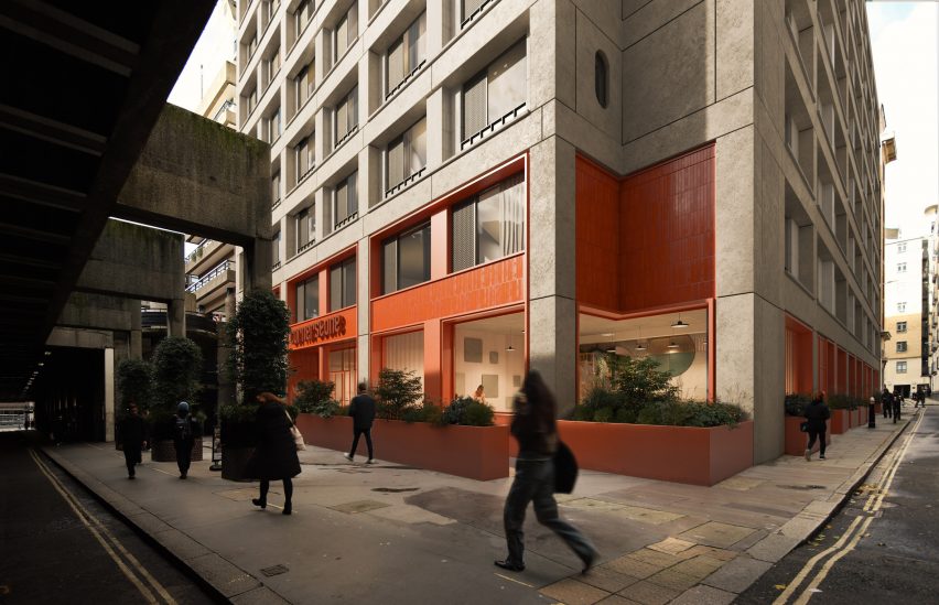
Gary Card redesigns LN-CC store with orange tunnel and LED-lit club

Designer Gary Card has given London’s LN-CC boutique a redesign that includes a sci-fi-looking wooden tunnel and a room “shaped like the inside of a foot”.

Card, who designed the original interior of the east London store in 2011, said the challenge for him was using the knowledge he has accumulated since then to create something new.

LN-CC store in east LondonLN-CC store in east London
The LN-CC store in east London has a red facade

“The question for myself this time was – can I use everything I’ve learned over the last decade to reimagine one of my most recognized projects,” he told Dezeen.

“Each room has a very different concept,” he added. “It’s become part of the tradition now to change the temperature and colour palette with each room and encourage a journey of identity and discovery.”

Wooden orange tunnel inside London fashion storeWooden orange tunnel inside London fashion store
An octagonal wooden tunnel welcomes visitors

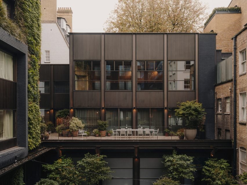
The store is the only physical shop for LN-CC, which is mainly an online business, and is spread across the ground and lower-ground floor of a former tie factory.

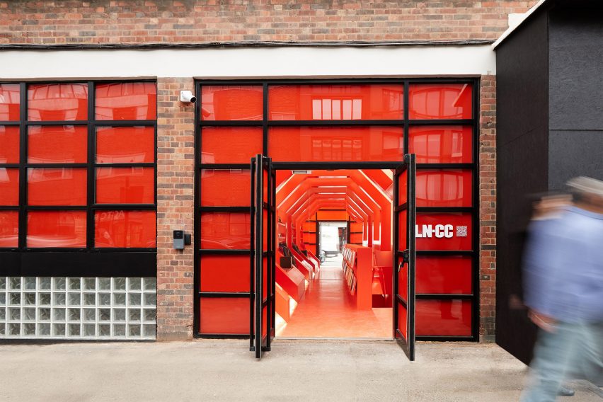
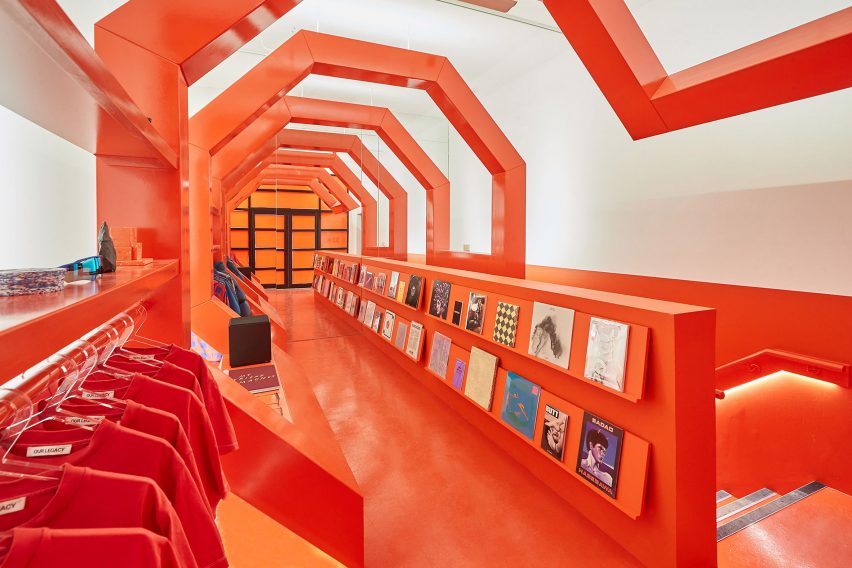
Visitors enter via an orange wooden tunnel with an octagonal shape reminiscent of the architecture in director Stanley Kubrick’s film 2001: A Space Odyssey.

Calisto room inside LN-CCCalisto room inside LN-CC
Each room in the store has different colours and materials

It is the third tunnel that Card has designed for the store, following its original orange tunnel and a later white version.

“The tunnel is LN-CC’s icon,” Card explained. “It’s been with us for over a decade now, so it had to be a significant feature.”

“We decided early on to bring it to street level and make the entrance something that had never been seen before as part of the store space,” he added.

“It’s a brand-new design and construction. We’ve brought back the orange from the first tunnel; the white is a nod to the second version from 2014.”

Blue room by Gary Card at LN-CCBlue room by Gary Card at LN-CC
A cobalt-blue room sits on the lower-ground floor

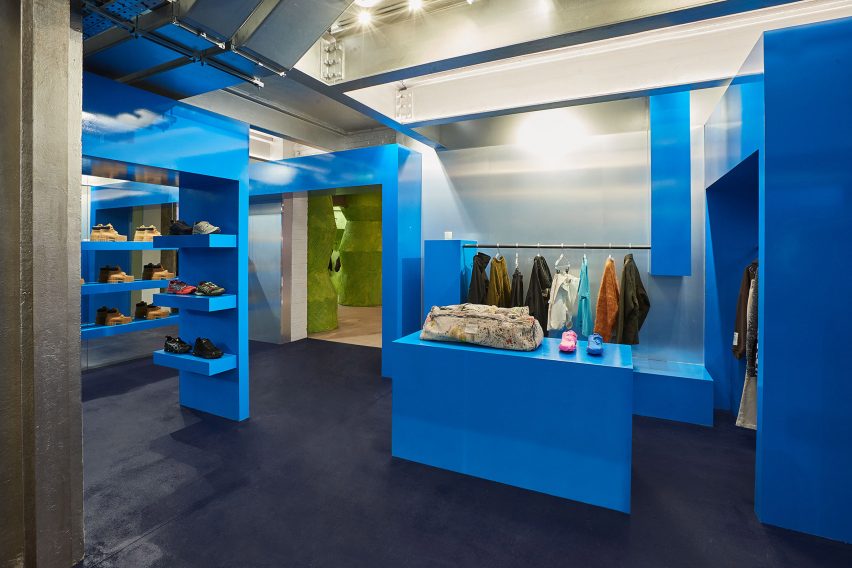
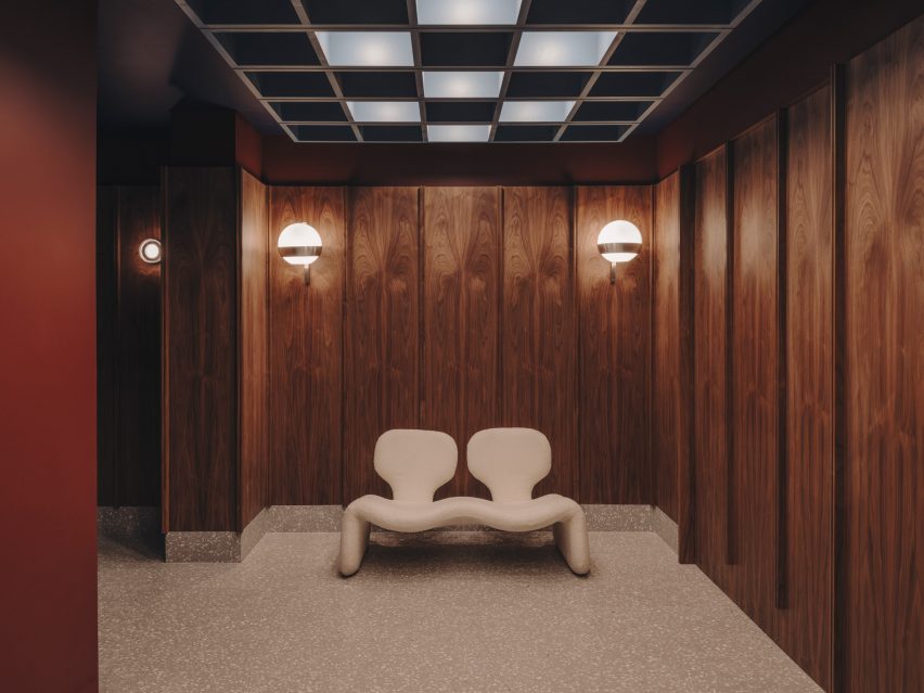
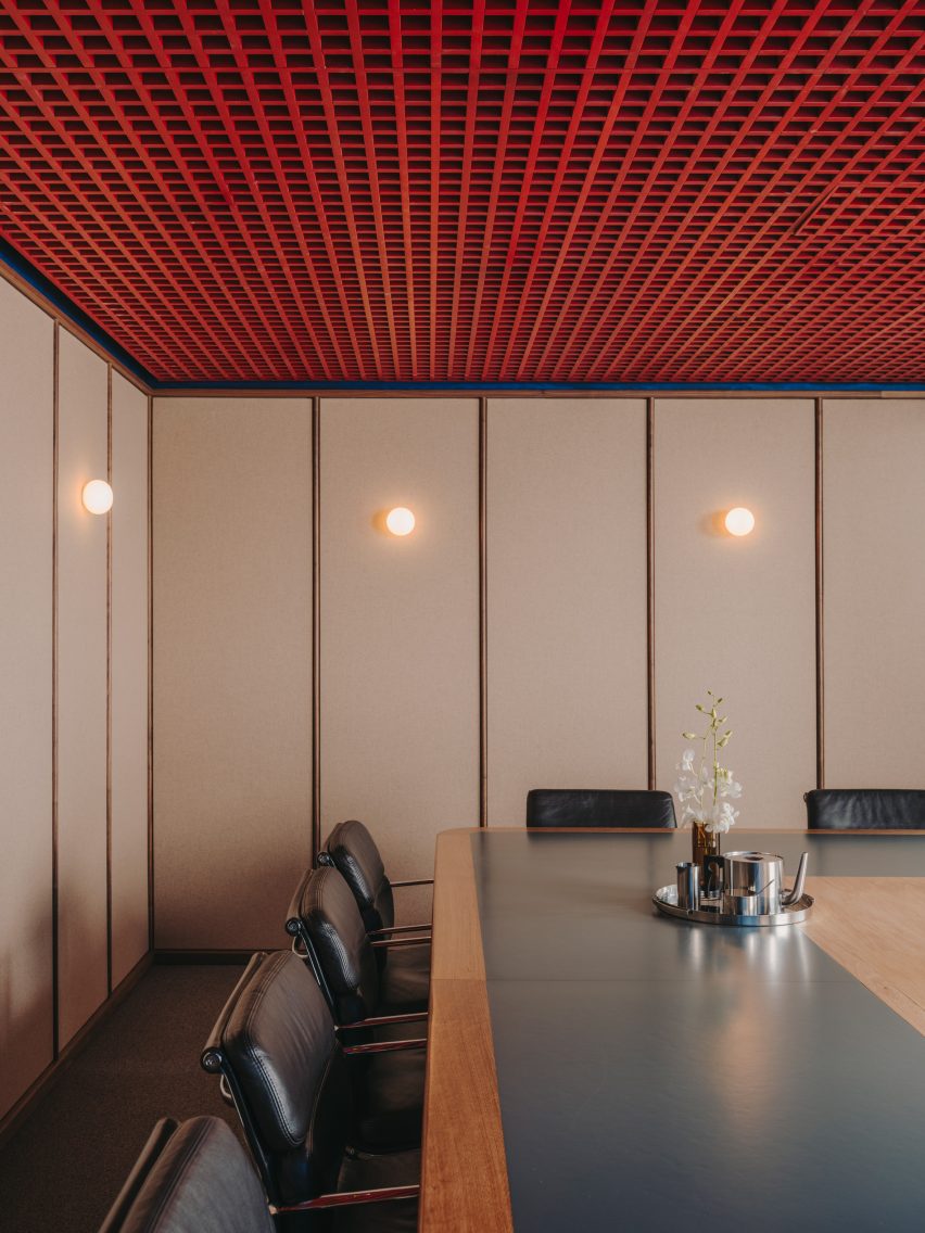
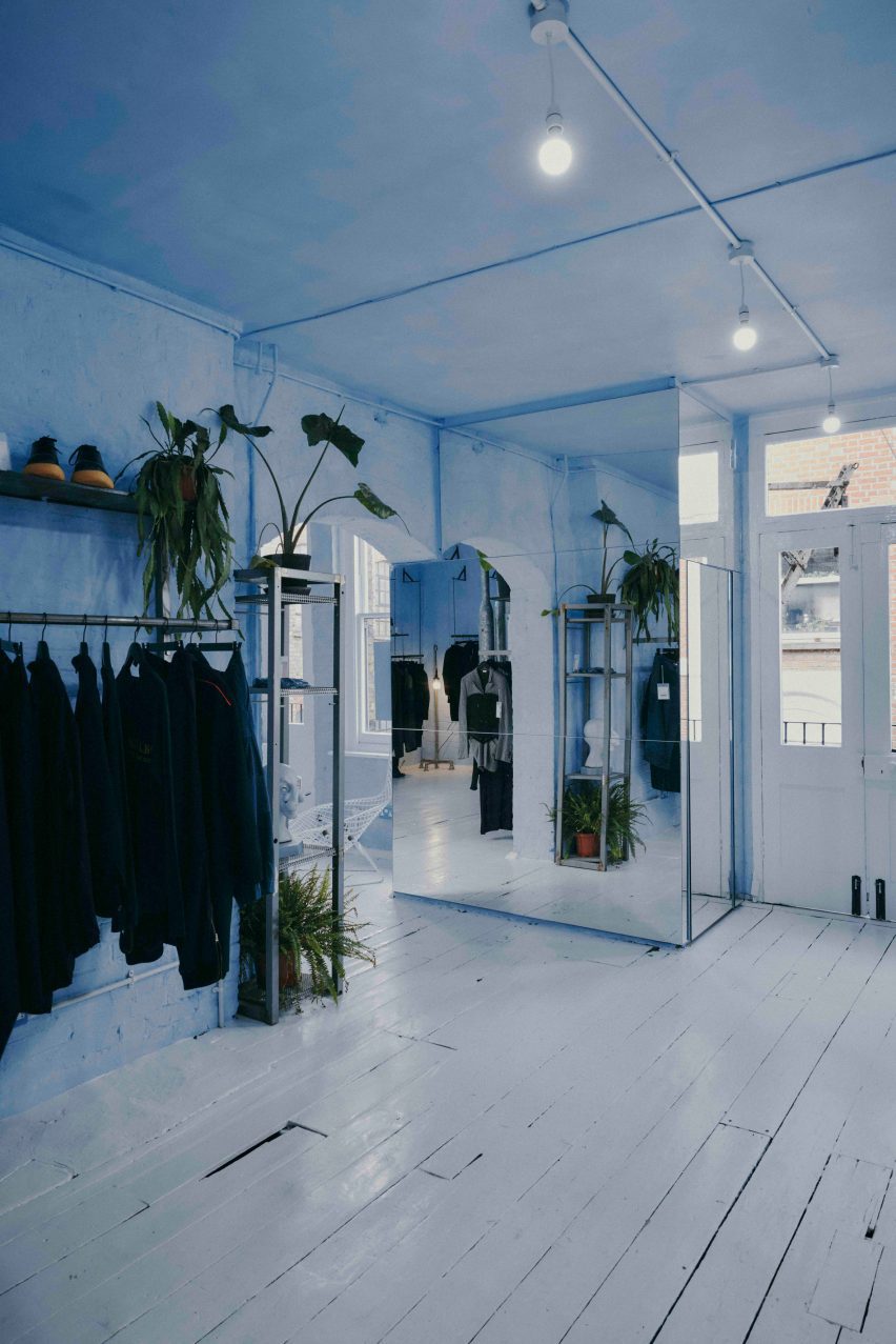
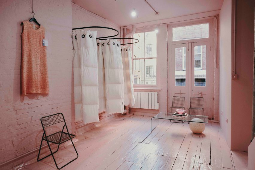
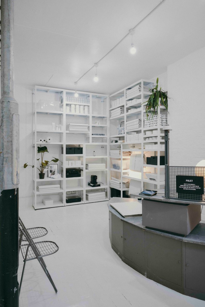
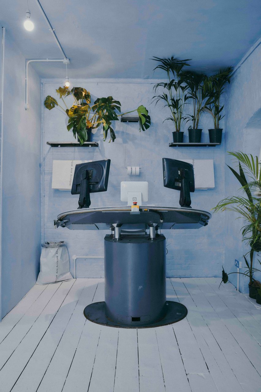
Each of the six rooms in the store has a different feel and different colours, which Card chose together with LN-CC’s buying and creative director Reece Crisp.

“The colours we settled on really amplify what we’re showcasing, the brand’s unique edit,” the designer said.

Cave-like Callisto room at LN-CCCave-like Callisto room at LN-CC
The store is LN-CC’s only physical space

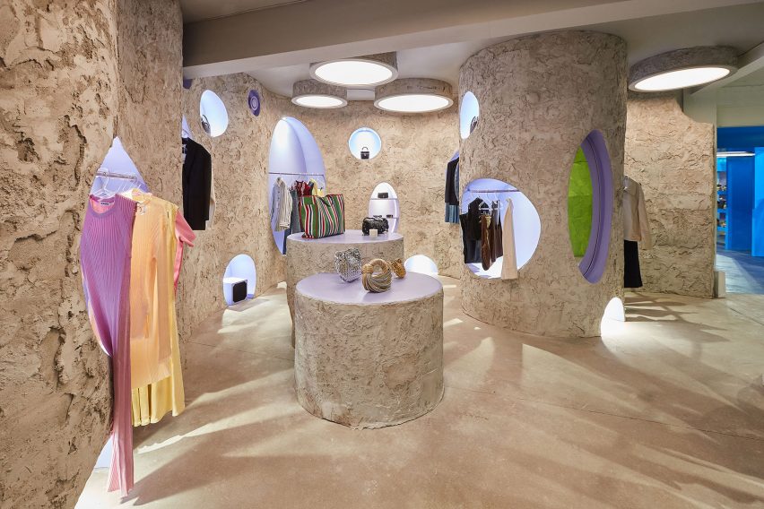
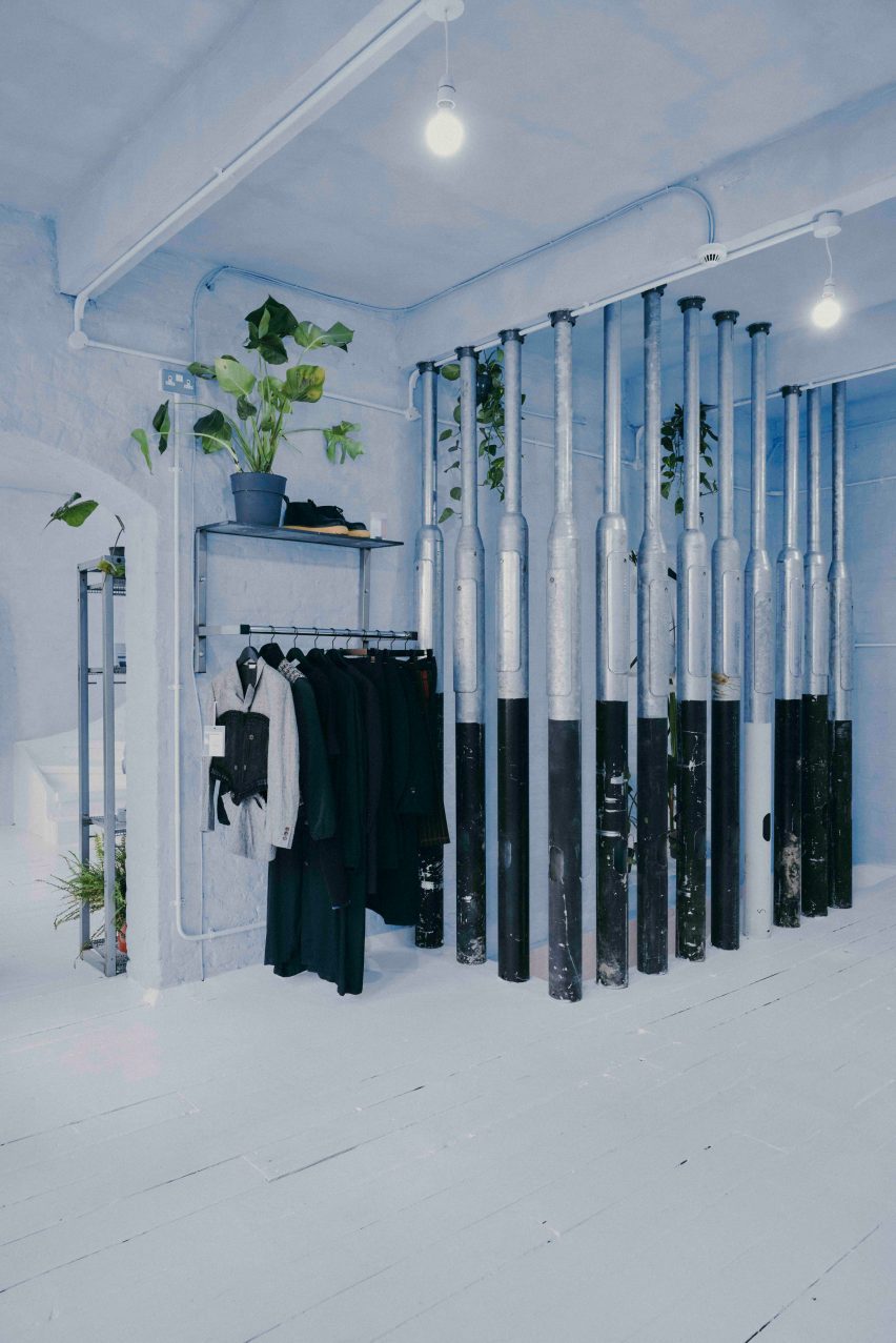
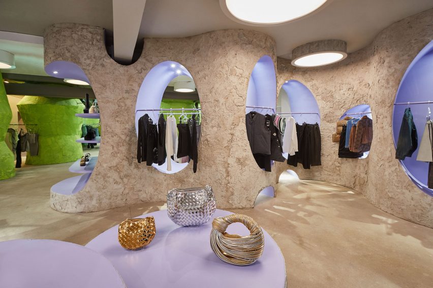
Among them is the Callisto room, which has a cave-like feel and a design that was influenced by the building’s existing structures.

“In the Callisto room, there was a circular part of a helter-skelter that used to be in the building – this used to be a tie factory and it was in the corner,” Crisp told Dezeen. “When we stripped the space back, we saw this sort of circle and that fed into how we wanted that space to be.”

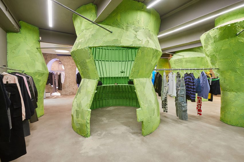
In the Atrium, Card used tile adhesive to create the structures and patterns on the room’s wide lime-green pillars, which provide shelving for the store’s accessories.

Green pillars inside LN-CC Atrium Green pillars inside LN-CC Atrium
The Atrium room has green pillars decorated with tile adhesive

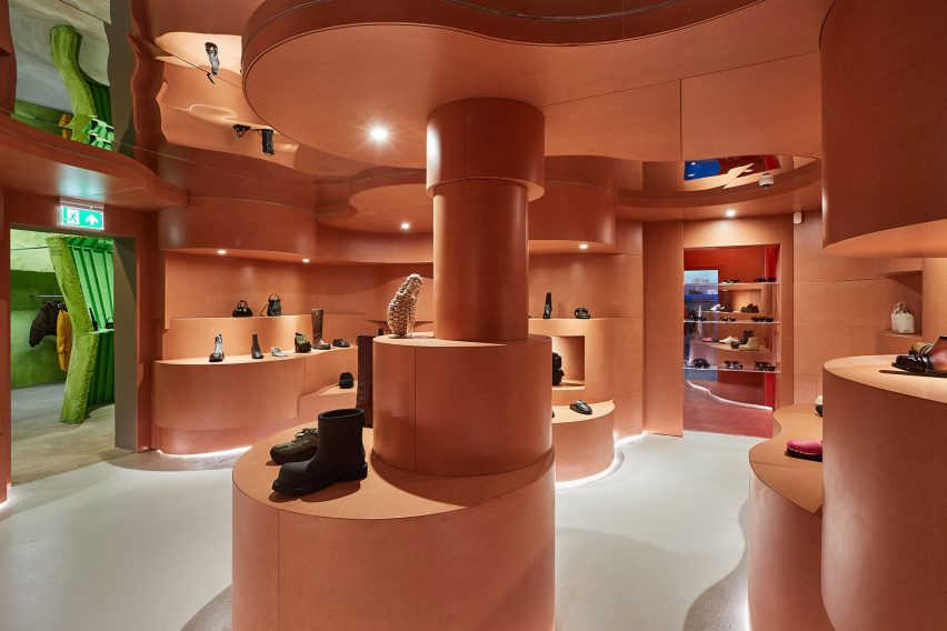
For LN-CC’s shoe room, known as the Midtarsal, Card drew on the anatomy of the human body to create an undulating, flesh-coloured interior.

“The shoe space, the Midtarsal room, that’s engineering to an incredible degree,” Crisp said. “We love the shape – like the inside of the foot – and how that warps the room.”

Throughout LN-CC, Card used a variety of different materials to bring the rooms to life.

“The space is a juxtaposition of lots of different materials,” he said. “So MDF, perspex, wood and concrete – I sought to take small cues from the original while innovating with a refreshed lens exploring the interplay between texture, colour and materials within the newly imagined rooms.”

Midtarsal room at London fashion storeMidtarsal room at London fashion store
The Midtarsal room has undulating shapes in a beige colour

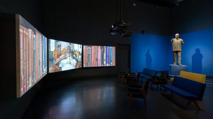
The last room of the store is a club space, which features LED walls that can be used to turn the room into different colours or display messages.

“The club has always been a huge part of LN-CC’s identity, ” Card said. “It was never about selling clothes – the brand was an online business after all – it was about delivering experiences. So we wanted to do something really special with the new club.”

Club space at LN-CCClub space at LN-CC
The LN-CC club space is lit by an LED wall

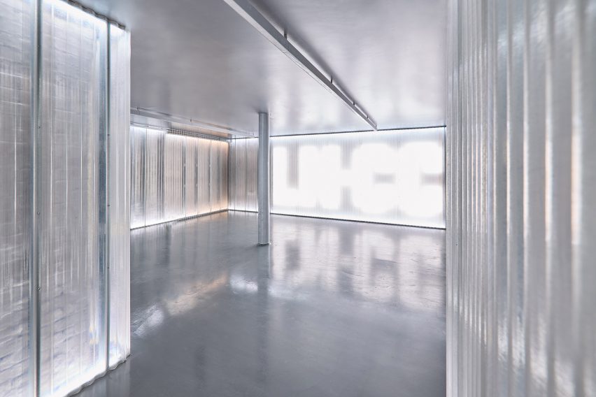
“It was a bit dark and gritty before, which was cool, but we knew we needed to raise the stakes for the latest store design without it losing its edge,” Card added.

“My right-hand man, Richard Wilkins, was the tech wizard for the space who created the lighting and amazing LED wall. The lighting totally transforms the space.”

Other recent London store interiors include a boutique sprayed with recycled newspaper pulp and a colourful Marylebone store with handpainted murals.

Reference

Barbican's Unravel exhibition explores the subversive power of textiles
CategoriesInterior Design

Barbican’s Unravel exhibition explores the subversive power of textiles

Curator Lotte Johnson discusses the transformative power of textiles in this video produced by Dezeen for the Barbican’s latest exhibition.

Titled Unravel: The Power and Politics of Textiles in Art, the exhibition examines how textiles have been employed to explore themes spanning power, oppression, gender and belonging.

It features over 100 works that make use of textile, fibre and thread from over 50 artists from across the globe, spanning from the 1960s to the present day.

The exhibition explores how artists have used textiles to express their lived experience

The exhibition is designed to challenge the perception of textiles being solely domestic or craft practices and instead features textile works that relate a story of resistance and rebellion as well as pieces that present narratives of emancipation and joy.

Johnson explained that textiles offer a meaningful medium to express personal and political issues due to their tactile nature and intimate connection to daily life.

“Textiles are one of the most under-examined mediums in art history and in fact history itself,” Johnson said. “They are an intrinsic part of our everyday lives. When we’re born, we’re shrouded in a piece of fabric. Everyday we wrap ourselves in textiles,” she continued.

“They’re really this very intimate, tactile part of our lives and therefore perhaps the most intrinsic, meaningful way to express ourselves.”

Judy Chicago Birth ProjectJudy Chicago Birth Project
Feminist artist Judy Chicago’s Birth Project depicts birth as a mystical and confrontational process

The exhibition is structured into six thematic sections. The first, called Subversive Stitch, presents works that challenge binary conceptions of gender and sexuality.

The section includes feminist artist Judy Chicago’s Birth Project, which vividly depicts the glory, pain and mysticism of giving birth, as well as a piece from South African artist Nicholas Hlobo, which, despite initially appearing as a painting, is made using ribbon and leather stitched into a canvas.

Another section of the exhibition is titled Bearing Witness, which brings together artists who employ textiles to confront and protest political injustices and systems of violent oppression.

Teresea Margolles tapestry Teresea Margolles tapestry
Artist Teresa Margolles creates collective tapestries that trigger conversations on police brutality

Included in this section are tapestries by Mexican artist Teresa Margolles that commemorate the lives of individuals including Eric Garner and Jadeth Rosano López.

Garner was an African-American man killed in 2014 by NYPD police officer Daniel Pantaleo, who put Garner into a chokehold during arrest. López was a seventeen-year old-girl assassinated in Panama City.

Margolles used fabric that had been placed in contact with the victims’ deceased bodies and collaborated with embroiderers from their respective local communities to create the tapestries.

The Wound and Repair sections includes work from American artist and activist Harmony Hammond’s Bandaged Grid series, in which layered fabric is used to evoke imagery reminiscent of an injured body.

Tau Lewis tapestryTau Lewis tapestry
Tau Lewis’ fabric assemblages offer new narratives of black histories

While violence and brutality are key themes examined in the exhibition, it also showcases how textiles can be used to create narratives of hope. The final, most expansive section of the exhibition is titled Ancestral Threads, which encompasses works created to inspire a sense of optimism and reconnect with ancestral practices.

“This section not only explores artists processing exploitative and violent colonial and imperialist histories, but also celebrates the artists who are re-summoning and relearning ancient knowledge systems to imagine a different kind of future,” Johnson explained.

Canadian multimedia artist Tau Lewis’s work titled The Coral Reef Preservation Society is a patchwork assemblage of recycled fabrics and seashells including fragments of textured denim.

The work pays homage to the enslaved women and children thrown overboard in the Middle Passage, the historical transportation route used during the Atlantic slave trade. These women and children have been reimagined as underwater sea creatures to transform the narrative into one of regeneration.

Vicuña revives the art of the quipu in her installation Quipu Austral

A large installation by Chilean artist Cecilia Vicuña titled Quipu Austral is situated towards the end of the exhibition. The installation takes the form of billowing ribbons hanging from the ceiling.

Vicuña references quipu, a form of recording used by a number cultures in Andean South America. Quipu was a ancient writing system which used knotted textile cords to communicate information.

Other sections in the exhibition include Fabric of Everyday, which explores the daily uses of textiles, as well as Borderlands, which examines how textiles have been used to challenge ideas around belonging.

These sections feature works such as Shelia Hicks’ colourful woven bundles and Margarita Cabrera’s soft sculpture cacti crafted from reclaimed US border patrol uniforms.

Mexican-American artist Margarita Cabrera uses reclaimed border patrol uniforms in her work

“We hope that people might come out of this exhibition feeling invigorated and moved by the stories of resilience and rebellion embedded in the work but also hope and emancipation,” Johnson said.

“I hope that the show might inspire people to pick up a needle and thread themselves and use it to express their own lived experience.”

The show is a partnership between the Barbican and the Stedelijk Museum in Amsterdam and was co-curated by Barbican curators Johnson, Wells Fray-Smith and Diego Chocano, in collaboration with Amanda Pinatih from the Stedelijk.

Unravel: The Power and Politics of Textiles in Art is at the Barbican Centre until 26 May 2024. See Dezeen Events Guide for an up-to-date list of architecture and design events taking place around the world.

Partnership content

This video was produced by Dezeen for the Barbican Centre as part of a partnership. Find out more about Dezeen’s partnership content here.

Reference

Colourful illustrations in Rixo Marylebone
CategoriesInterior Design

Cúpla decorates Rixo Marylebone store with hand-painted murals

Interior design studio Cúpla has completed a boutique for fashion brand Rixo in central London that features hand-painted illustrations and colourful zellige tiles.

The clothing store on Marylebone High Street was revamped by Cúpla, whose creative director Gemma McCloskey is the twin sister of Rixo co-founder Orlagh McCloskey.

The interior designer had previously designed the brand’s flagship store on the King’s Road and wanted the refurbished Marylebone location to have a similar feel.

Colourful illustrations in Rixo MaryleboneColourful illustrations in Rixo Marylebone
Rixo’s Marylebone store is covered in hand-painted murals

“We wanted the store to embody everything we had previously created for Rixo’s flagship store but within its own right,” Gemma McCloskey told Dezeen.

“A sense of escapism paired with a welcoming warmth within a boutique setting were the key emotions we wanted the customer to feel.”

As the brand sells hand-painted prints, the designer wanted the store’s interior to feature illustrations to reflect the style of the clothes.

Blue patterned sofa and archways in London fashion storeBlue patterned sofa and archways in London fashion store
It features modified vintage furniture

“Understanding Rixo’s roots and the fact their USP is hand-painted prints, it felt tangible to represent the brand’s values and beginnings with the illustrations,” Gemma McCloskey said.

“Given the space is quite small, we treated it almost like a living room space within a home and felt we could make it all-encompassing and personal.”

Mirror in London clothing storeMirror in London clothing store
Artist Sam Wood created colourful illustrations for the store

Artist Sam Wood hand-painted murals and illustrations throughout the store, which has a bright and playful colour palette and also features traditional glazed Moroccan zellige tiles.

“We wanted the colour palette to feel really fresh and bright,” the designer explained.

“Although there is an abundance of colours used, every line of the mural or the ‘random’ coloured zellige tile layout was methodically composed to ensure a right balance between the colours was struck.”

The studio added decorative arches and classical mouldings to the store in a nod to the architecture and heritage of its Marylebone neighbourhood.

The store also features bespoke fitting room curtains with pickle-green and flora-pink stripes by fabric brand Colours of Arley.

Zellige tiles in Rixo MaryleboneZellige tiles in Rixo Marylebone
Moroccan zellige tiles add to the playful interior

Cúpla used vintage furniture pieces throughout the store, which sells Rixo’s full collection including ready-to-wear and bridalwear.

“We actually modified existing pieces of vintage furniture, which had been previously sourced by [Rixo founders] Orlagh and Henrietta years ago in the early days of Rixo,” Gemma McCloskey said.

“They were the perfect fit for the space but didn’t have the functionality we required, so we decided to alter these instead or replace them.”

Illustrations at Marylebone storeIllustrations at Marylebone store
The store is located on Marylebone High Street

“It was much more sustainable and because the pieces were from the early years of Rixo, they had sentimental value so we didn’t want to replace them,” she added.

Other recent London stores featured on Dezeen include a Camper store with a giant foot sculpture and a stationery store with a demountable interior.

The photography is courtesy of Rixo.


Reference

Archival Image in Tropical Modernism exhibition at the V&A London
CategoriesInterior Design

Tropical Modernism exhibition explores “the politics behind the concrete”

London’s Victoria and Albert Museum has launched its Tropical Modernism exhibition, which highlights the architectural movement’s evolution from colonial import to a “tool of nation building”.

According to the Victoria & Albert Museum (V&A), the exhibition aims to examine the complex context, power dynamics and post-colonial legacy of tropical modernism – an architectural style that developed in South Asia and West Africa in the late 1940s – while also centralising and celebrating its hidden figures.

Archival Image in Tropical Modernism exhibition at the V&A LondonArchival Image in Tropical Modernism exhibition at the V&A London
London’s V&A museum has opened a major exhibition exploring tropical modernism

“Tropical modernism is experiencing something of a modish revival as an exotic and escapist style popular in verdant luxury hotels, bars and concrete jungle houses,” the exhibition’s lead curator Christopher Turner told Dezeen.

“But it has a problematic history and, through an examination of the context of British imperialism and the de-colonial struggle, the exhibition seeks to look at the history of tropical modernism before and after Independence, and show something of the politics behind the concrete,” he continued.

Installation shot of Tropical Modernism exhibition at the V&A LondonInstallation shot of Tropical Modernism exhibition at the V&A London
The exhibition traces the evolution of tropical modernism within a South Asian and West African context

The exhibition follows the V&A’s Tropical Modernism exhibition at the 2023 Venice Biennale, which revealed the team’s precursory research on tropical modernism in a West African setting.

For the in-house iteration of the exhibition, additional architectural models, drawings and archival imagery have been introduced to interrogate tropical modernism in India alongside the African perspective.

Exhibition materials line a series of rooms within the V&A’s Porter Gallery, divided by brightly coloured partitions and louvred walls referencing tropical modernist motifs.

Installation shot of Tropical Modernism exhibition at the V&A LondonInstallation shot of Tropical Modernism exhibition at the V&A London
Archival imagery, architectural drawings and physical models line the gallery rooms

The exhibition begins by tracing tropical modernism back to its early development by British architects Jane Drew and Maxwell Fry. Stationed together in Ghana from 1944, Drew and Fry adapted international modernism to the African climate, proposing functional over ornamental design.

Drew and Fry would also become part of the Department of Tropical Studies at the Architectural Association (AA), which exported British architects to the colonies from 1954 in a bid to neutralise calls for independence.

Installation shot of Tropical Modernism exhibition at the V&A LondonInstallation shot of Tropical Modernism exhibition at the V&A London
The exhibition aims to centralise local professionals who have gone widely unrecognised for their contributions to the movement

The exhibition continues by spotlighting local Ghanaian figures who worked with Fry and Drew, noting the power shifts that were taking place behind the scenes to reappropriate the architectural style for an emerging era of colonial freedom.

Influential political leaders Jawaharlal Nehru in India and Kwame Nkrumah in Ghana are the exhibition’s key personas, framing the evolution of tropical modernism from conception to regionalisation.

Installation shot of Tropical Modernism exhibition at the V&A LondonInstallation shot of Tropical Modernism exhibition at the V&A London
Gallery rooms are divided by brightly coloured partitions informed by tropical modernist motifs

“The heroes of our exhibition are Nehru and Nkrumah, the first prime ministers of India and Ghana,” Turner explained. “Tropical modernism, a colonial invention, survived the transition to Independence and was appropriated and adapted by Nehru and Nkrumah as a tool of nation building.”

“Nkrumah, who sometimes sketched designs for the buildings he wanted on napkins, created the first architecture school in sub-Saharan Africa to train a new generation of African architects, and this institution has partnered with us on a five-year research project into tropical modernism.”

Archival image of University College Ibadan used in Tropical Modernism exhibition at the V&A LondonArchival image of University College Ibadan used in Tropical Modernism exhibition at the V&A London
According to the V&A’s research, tropical modernism shifted from its western Bauhaus roots towards a localised vernacular styles

Through a host of physical models and artefacts, the city of Chandigarh becomes the exhibition’s narrative focal point for tropical modernism in India.

Under prime minister Jawaharlal Nehru, Chandigarh was the first large-scale modernist project, recruiting Drew and Fry along with French architect Le Corbusier to plan the ideal utopian urban centre.

As with Nkrumah – who saw how the Africanisation of architecture could become a symbol of progress and change – the exhibition also aims to highlight Nehru’s ambitions for a localised modernism drawing from the Indian vernacular, rather than the Western Bauhaus style.

The display culminates in a video featuring 16 key tropical modernist structures, interspersed with interviews and footage explaining the social and political context behind each building’s realisation.

“We made a three-screen 28-minute film, shot in Ghana and featuring panoramic portraits of over a dozen buildings, cut with archive footage from the time and interviews with architects like John Owusu Addo and Henry Wellington, and Nkrumah’s daughter, the politician Samia Nkrumah,” said Turner.

Archival image of Maxwell Fry and John Noah used in Tropical Modernism exhibition at the V&A LondonArchival image of Maxwell Fry and John Noah used in Tropical Modernism exhibition at the V&A London
The exhibition aims to address gaps in the museum’s African and South Asian studies

According to Turner, the exhibition begins to address gaps in the V&A’s collections and archives pertaining to architecture and design in the global south.

“Archives are themselves instruments of power, and West African and Indian architects are not as prominent in established archives, which many institutions have now realised and are working to address,” Turner explained.

“Tropical modernism was very much a co-creation with local architects who we have sought to name – all of whom should be much better known, but are excluded from established canons.”

Installation shot of Tropical Modernism exhibition at the V&A LondonInstallation shot of Tropical Modernism exhibition at the V&A London
The display will inhabit the V&A’s Porter Gallery until 22 September 2024

Bringing tropical modernism back into contemporary discourse was also important to the V&A as a timely investigation of low-tech and passive design strategies.

“Tropical modernism was a climate responsive architecture – it sought to work with rather than against climate,” Turner said.

“As we face an era of climate change, it is important that tropical modernism’s scientifically informed principles of passive cooling are reexamined and reinvented for our age,” he added.

“I hope that people will be interested to learn more about these moments of post-colonial excitement and opportunity, and the struggle by which these hard-earned freedoms were won.”

Image of video used in the Tropical Modernism exhibition at the V&A LondonImage of video used in the Tropical Modernism exhibition at the V&A London
A 28-minute video captures footage of remaining tropical modernist structures at the end of the exhibition

The V&A museum in South Kensington houses permanent national collections alongside a series of temporary activations and exhibitions.

As part of London Design Festival 2023, the museum hosted a furniture display crafted from an Alfa Romeo car by Andu Masebo and earlier in the year, architect Shahed Saleem created a pavilion in the shape of a mosque at the V&A as part of 2023’s Ramadan Festival.

The photography is courtesy of the Victoria & Albert Museum.

Tropical Modernism: Architecture and Independence will run from 2 March to 22 September 2024 at the V&A Museum in London. For more events, exhibitions and talks in architecture and design visit the Dezeen Events Guide.

Reference

Wood panelled walls and display cases
CategoriesInterior Design

“Subtle luxury” defines Rachel Boston jewellery store

Interior design studio Hollie Bowden Interiors has created fine jeweller Rachel Boston’s flagship store and showroom in London.

Located in Shoreditch’s Redchurch Street, the store is split into four main areas – the retail space, private appointment area, workshop and office space for the jeweller’s team of 12.

Wood panelled walls and display casesWood panelled walls and display cases
The space blends a neutral palette of glass, steel and sycamore wood veneer

The store aims to blend a neutral material palette of glass and steel with sycamore wood veneer and velvet mohair upholstery.

“Jewellery stores can be read as quite uninviting and exclusive,” Hollie Bowden Interiors founder Bowden told Dezeen. “I wanted to create the opposite experience to that, something that felt open and un-intimidating, yet special and elevated.”

Cantilever display case Cantilever display case
Bowden and designer EJR Barnes have created bespoke displays from mirror polished steel

Placing the jewellery centre stage was a key objective for Rachel Boston when briefing Bowden’s team.

“Even though our pieces are striking, they are ultimately small objects by nature, so I didn’t want a huge amount of fussy furniture or bold colours to detract from the experience of customers viewing our pieces,” Rachel Boston told Dezeen.

In response to the brief, Hollie Bowden created a compact 19-square-metre front retail space “inspired by the concept of a jewellery box that draws your attention into the small, intricate objects within”.

jewellery retail space jewellery retail space
The store on Redchurch street is split into four main areas

Sycamore veneer wall-cladding, limestone flooring and lining the display cases with ivory silk combine to create the jewellery-box effect, “emphasising this feeling of being cocooned in the space” Bowden told Dezeen.

“I wanted to focus on materials that have a quiet beauty about them, that you have to get up close to really appreciate,” she continued.

Steel window displaySteel window display
Bowden employs a refined approach to materials for this retail project in London

This process of refinement has been a hallmark of Bowden’s style since establishing her London-based studio in 2013.

“Not over-designing projects with too many materials is very important – to give objects the space to sing,” she explained. “I’m always trying to reduce and simplify.”

Jewellery is displayed in floating window vitrines and a cantilever display desk, designed in collaboration with London-based artist and designer, EJR Barnes.

Made from mirror polished steel, these bespoke displays introduce a “vertiginous moment that makes the space feel unique,” according to Bowden.

For these cabinets, Bowden and Barnes drew on the utilitarian design language of archives which “display, protect, and organise what they contain in quite a neutral way”.

A shop front A shop front
Hollie Bowden’s retail space in Shoreditch has been designed in reference to jewellery boxes

Rather than using big ornamental gestures more common in jewellery retail, Bowden says this approach “represents a unique and original way of presenting jewellery”.

“The idea of ‘subtle luxury’ feels like a great counterpoint to retail design at the moment that can feel like you’re in a casino,” she added.

The frames of the cases are simple and uninterrupted, maximising the display of the jewellery and encouraging guests to roam freely around any area.

Red chairRed chair
The red cab chair placed at the front of the store is by Mario Bellini

A Mario Bellini Cab Chair in a deep wine red, placed at the front of the store, works along the lines of the unexpected-red-theory interior trend, featured in our recent lookbook.

Through a stainless steel-lined open doorway, the rear space is curtained off for private appointments. This larger 42-square-metre showroom in the back has a more relaxed and intimate feel that mirrors the art-deco style of Boston’s jewellery.

Four chairs around a carpeted floor Four chairs around a carpeted floor
The rear of the store is reserved for private appointments

Upon entering the rear space, a brown short-pile carpet and bespoke sofa upholstered in Claremont mohair signals the transition from the storefront.

“We wanted to create two distinct spaces, independent of each other yet with a subtle link that reflects Rachel’s jewellery,” Bowden said.

“While the spaces contrast, the continuations of steel and limestone allow for a striking continuity throughout.”

A brown mohair velvet sofa A brown mohair velvet sofa
The rear showroom features a bespoke sofa upholstered in Claremont mohair

Other projects by Hollie Bowden Interiors featured on Dezeen include a pared-back jewellery showroom and a London office space inspired by the sultry lighting of gentlemen’s clubs.

The photography is by Richard Round-Turner.

Reference

Elevation view of Cornerstone by AHMM in London
CategoriesInterior Design

AHMM to transform office into co-living space next to Barbican estate

Developer HUB and investor Bridges Fund Management have revealed plans to convert a 1950s office building in London into Cornerstone, a co-living residential scheme designed by Allford Hall Monaghan Morris.

Located on the edge of the Barbican estate, the Cornerstone project will draw from the iconic Barbican architecture to transform 45 Beech Street into 174 co-living residences along with street-level commercial spaces and amenities.

“Building on the success of our previous London projects with HUB, we are joining forces again to transform an underloved office building in the heart of the city,” Allford Hall Monaghan Morris (AHMM) director Hazel Joseph said.

Elevation view of Cornerstone by AHMM in LondonElevation view of Cornerstone by AHMM in London
AHMM has revealed plans for a co-living retrofit next to London’s Barbican estate

AHMM’s proposal aims to re-use as much of the building’s existing structure and facade as possible, taking a “retrofit-first approach” to minimise the need for new building works.

The studio will also primarily work within the geometric parameters defined by the original envelope, while updating the rectilinear language to create uniform apertures for each co-living apartment.

Referencing the Barbican estate, a series of arched, double-height extrusions will be introduced across the crown of the building to house additional co-living apartments.

Barbican context and facade of Cornerstone by AHMM in LondonBarbican context and facade of Cornerstone by AHMM in London
The design will adapt the existing building’s form and insert a series of arched spaces at the top

“The architectural approach has been carefully considered, responding sensitively to the much-loved Barbican context, completing the northern frontage of the estate,” Joseph said.

The arches will be partially set back from the building’s facade and lined with an asymmetric patchwork of glazed and tile panels underneath the curved overhangs.

At street level, warm red panel accents will contrast against the building’s neutral concrete finishes to highlight commercial and collective functions.

The scheme will integrate a public cafe, a co-working space and community-focused amenities at its lower levels to improve the public realm for those who live and work in the area.

“The existing structure of 45 Beech Street will be re-used and extended, creating a new residential community with shared amenities and breathing new life into the local streetscape,” Joseph explained.

street level activation of Cornerstone by AHMM in Londonstreet level activation of Cornerstone by AHMM in London
At street level, new commercial and public amenities will seek to activate the ground plane

According to HUB and Bridges Fund Management, AHMM’s proposal was developed in collaboration with the community – including Barbican residents – who were consulted through a series of workshops and events.

A website was also established to solicit viewpoints about the redevelopment, reiterating the design vision to establish a “vibrant community” that will adapt the original building and holistically contribute to the neighbourhood.

AHMM was established in 1989 by Simon Allford, Jonathan Hall, Paul Monaghan and Peter Morris in London. The studio has previously converted a 1930s block into New Scotland Yard’s headquarters in London and completed a mixed-use building in Southwark with interlocking flats.

Also adjacent to the Barbican estate, Diller Scofidio & Renfro’s proposal for a pyramidal music centre was recently scrapped when the City of London Corporation revealed its plans for a “major renewal” of the Barbican.

The images are courtesy of HUB and Bridges Fund Management.

Reference

Mayfair office by Oskar Kohnen
CategoriesInterior Design

Oskar Kohnen fills London office with mid-century modern furniture

London studio Oskar Kohnen has outfitted a Mayfair office with mid-century modern furniture and contemporary pieces, which “are so well curated that no one would ever dare to throw them away”.

Spread across three floors, the office is housed within a rectilinear building in London’s Mayfair neighbourhood with a gridded facade.

Mayfair office by Oskar Kohnen Mayfair office by Oskar Kohnen
Oskar Kohnen designed the office in London’s Mayfair area

“It has a townhouse feeling,” studio founder Oskar Kohnen told Dezeen of the office, which he designed for developer Crosstree Real Estate.

At its ground level, Kohnen clad the entrance hall with dark-stained wooden panels and added sconce lights to subtly illuminate the space.

Djinn sofa by Oliver MourgeDjinn sofa by Oliver Mourge
A cream Djinn sofa was placed in the entrance hall

An amorphous Djinn sofa, created by industrial designer Olivier Mourge in 1965, was placed in one corner.

“We worked a lot with vintage furniture, and as for the new pieces we sourced, we hope they are so well curated that no one would ever dare to throw them away,” said Kohnen.

Living room-style space with an L-shaped sofaLiving room-style space with an L-shaped sofa
The first floor features a living room-style space

“Warm and inviting” interiors characterise a living room-style space on the first floor, which was created in direct contrast to the industrial appearance of the exterior.

An L-shaped velvet and stainless-steel sofa finished in a burnt orange hue was positioned next to white-stained brise soleil screens and a bright resin coffee table.

Kitchen with terrazzo worktopsKitchen with terrazzo worktops
Terrazzo accents were chosen for the kitchen

“The social spaces have an earthy and calm colour palette – yet they are lush and dramatic,” explained Kohnen.

A pair of low-slung 1955 Lina armchairs by architect Gianfranco Frattini also features in this space, while floor-to-ceiling glazing opens onto a residential-style terrace punctuated by potted plants.

Bright gridded ceiling in a meeting roomBright gridded ceiling in a meeting room
Oskar Kohnen added a bright gridded ceiling to one of the meeting rooms

Similar tones and textures were used to dress the rest of the rooms on this level.

These spaces include a kitchen with contemporary terrazzo worktops and a meeting room with a red gridded ceiling that was set against cream-coloured panels and modernist black chairs.

The second floor holds the main office, complete with rows of timber desks and an additional meeting room-library space characterised by the same reddish hues as the low-lit entrance hall.

“The idea was to create an office space that had soul to it and would offer a more personal take on a work environment, rather than the usual corporate spaces we are so familiar with in London,” Kohen concluded.

Desks within the main office areaDesks within the main office area
The second floor holds the main office

Founded in 2011, Kohnen’s eponymous studio has completed a range of interior projects, including a mint-green eyewear store in Berlin and a pink-tinged paint shop in southwest London.

The photography is by Salva Lopez.


Reference

Pastel-coloured fashion store
CategoriesInterior Design

Aro Archive store in Shoreditch features pastel-coloured rooms

Fashion retailer Aro Archive’s pastel-hued east London store was designed by founder Ariana Waiata Sheehan to evoke “a sense of otherworldliness”.

The store, located in Shoreditch, replaces the brand’s previous, more industrial store on nearby Broadway Market and was intended to have a frivolous feel.

Pastel-coloured fashion storePastel-coloured fashion store
The Aro Archive store has pastel-coloured floors in pink and blue

The interior has “a sense of otherworldliness, escapism and fun,” Waiata Sheehan explains, comparing it to “a mixture between a mushroom trip and going to visit someone’s rich aunty who runs a gallery”.

“We’ve always had very neutral industrial spaces,” she told Dezeen. |But you can get an industrial Zara these days, so time to switch it up and go full personality, which has been scary but so worth it.”

Pink floor in Aro ArchivePink floor in Aro Archive
It is located inside an old Victorian warehouse

Located inside a five-storey former Victorian warehouse, Aro Archive, which sells pre-owned clothing by avant-garde designers, was organised so that each floor has a different colour.

Monochrome pastel pink, blue and white hues decorate the different levels, which also feature a wide range of reclaimed and recycled materials, furniture and artworks.

Blue floor in Aro ArchiveBlue floor in Aro Archive
Founder Ariana Waiata Sheehan created the interior design

“The pink floor is supposed to feel very warm, womb-like and enclosed,” Waiata Sheehan said. “The blue floor is more light and otherworldly. And the two white floors are very ethereal and calm.”

White duvet covers by fashion house Maison Martin Margiela were used to create curtains for the changing rooms, while interior pillars are made from reclaimed 1990s metal lamp posts that the designer sourced from a scrapyard in Preston.

Martin Margiela duvet-changing roomsMartin Margiela duvet-changing rooms
Duvet covers by Maison Martin Margiela frame the changing rooms

“The building and surrounding area feel very London, so we did want to bring in a sense of that for example with the lamp posts, metal works and details, bright neon lights and so forth,” Waiata Sheehan said.

She sourced a number of unusual furnishings for the Aro Archive store, including an industrial control station from a paper-manufacturing plant that is now used as a till.

“The industrial paper control station I’ve been watching on eBay for nearly 4 years, waiting for a time I had the space to buy it,” Waiata Sheehan explained. “I wanted something different to the normal till, they’re all so boring and square.”

The store also has another large metal till and metal drawers that originally came from a 1980s Mary Quant store and were rescued from a squat in Hackney Wick.

Metal till from Mary QuantMetal till from Mary Quant
A large metal till was originally from a Mary Quant store

Waiata Sheehan also sourced several smaller pieces for the boutique, where customers can purchase everything down to the artwork, furniture and accessories.

“I do all the buying so everything is here because I love it in some way,” she explained. “But in terms of favourite pieces in store right now?”

“For fashion, it’s the Rick Owens orange shearling gimp mask gilet, for objects the Shirin Guild ceramic incense holders and for furniture the wobbly glass table with magazine racks.”

Industrial control stationIndustrial control station
Waiata Sheehan bought an old industrial control station from eBay

Waiata Sheehan hopes the Aro Archive boutique will feel like a home away from home and help to create a community feel in the area.

“I think Shoreditch is lacking a sense of community and I wanted to work that into the space,” she said. “The feeling of a chaotic family home and a feeling of togetherness.”

Pillars made from lampposts at Aro ArchivePillars made from lampposts at Aro Archive
Lampposts from a scrapyard form pillars inside the store

Other London stores with notable interior design recently covered on Dezeen include Swedish fashion brand Toteme’s newly-opened Mayfair store and a Coach pop-up store at Selfridges that had fixtures made from recyclable materials.

The photography is by John Munro.

Reference

Interior of Totême store in London
CategoriesInterior Design

Halleroed references Swedish Grace for Toteme flagship store

Stockholm studio Halleroed has designed fashion brand Toteme’s flagship store in London, which features a sculpture by artist Carl Milles and a steel sofa by designer Marc Newson.

Halleroed designed the store, located on Mount Street in the upmarket Mayfair area, together with Toteme founders Elin Kling and Karl Lindman. The duo wanted its third flagship to feature nods to the brand’s heritage.

“We like the idea of keeping certain elements that we find in our Swedish heritage,” Lindman told Dezeen at the store’s launch event.

“It can be by using certain vintage pieces, or like in [the brand’s Mercer Street store] in New York, we had a collaboration with Svenskt Tenn,” he added. “It’s about lifting this notion of Scandinavian design or Swedish design.”

Interior of Totême store in LondonInterior of Totême store in London
A metal sofa by Marc Newson is among the sculptural details in the store

Halleroed drew on the space itself when designing the interior, focussing on how the light falls.

“We were inspired by the space itself with beautiful original windows letting the daylight in,” Halleored co-founder Ruxandra Halleroed told Dezeen.

“The upper part of the windows was partly hidden, which was a shame, so we redesigned the ceiling with a half vault towards the front to show the full height of the windows.”

Totême London storeTotême London store
A piece by sculptor Carl Milles sits by the entrance

The design also references the work of Italian architect Carlo Scarpa as well as the Swedish Grace movement.

“We were also inspired by the Swedish Grace period – around 1920-30s – that has an elegant and pure design, something we think works well for Toteme as a brand,” Halleroed co-founder Christian Halleroed told Dezeen.

“Also the work of Carlo Scarpa we find interesting, more as a mindset on how to work with details and textures to create a subtle elegance and luxury.”

Cube inside fashion store in MayfairCube inside fashion store in Mayfair
A black mirrored cube features at the rear of the store

Kling and Lindman wanted to keep the feel of “very posh” Mount Street where the store is located, while also underlining the space’s minimalist feel.

To do so, a lot of effort was put into the colour palette and different textured materials used for the flagship store.

“We worked with an off-white palette in different tones and different textures,” Ruxandra Halleroed said.

“The textures are as important as colour and materials. For walls, we have a glossy, off-white stucco, ceiling in same colour but matte. The floor is in a beige, honed limestone with a so-called Opus pattern.”

Milles sculpture inside Totême storeMilles sculpture inside Totême store
Halleroed chose to redesign the store’s ceiling to reveal its windows

In the middle of the Toteme shop, Halleroed created a stone-clad cube that holds shelves, vitrines and niches filled with artworks.

“The volume in the middle is clad with the same limestone, but in three different textures: honed, bush hammered and spiked texture, combined with oxidised dark brass,” Christian Halleroed said.

The store also features a square black volume in the back made from high-gloss stucco and dark brass.

Beige and white interior of London fashion storeBeige and white interior of London fashion store
The minimalist interior has a beige, white and black colour palette

To contrast the minimalist interior, the store is decorated with multiple artworks, including a sculpture by Milles and Newson’s intricately woven steel Random Pak Twin sofa, which Lindman found online.

“He’s a slave to auction houses,” Kling told Dezeen.

“So he found it and sent it to me and I loved it, and we also have a Marc Newsom piece in every store,” she added. “So we thought, ‘this one’s for the Mount Street store’. At that time we only had the signed contract, nothing else.”

Sign outside Mount Street storeSign outside Mount Street store
The store is located on Mount Street in central London

The two founders and Halleroed decided on the gypsum Milles sculpture for the Toteme store together, with Halleroed designing a custom niche to place it in that is made from black high-gloss stucco to contrast the pale artwork.

Halleroed also added vintage Swedish Grace furniture to the store, including armchairs and a coffee table by furniture designer Otto Schulz, a daybed and a mirror in pewter made for the Stockholm Exhibition 1930.

The studio has designed a number of other store interiors, including a Paris boutique for French brand L/Uniform and an Acne Studios store in Chengdu that aimed to combine the futuristic and primitive.

Reference

Proctor & Shaw design London home extension with zinc roof
CategoriesArchitecture

Proctor & Shaw tops London home extension with serrated zinc roof

Architecture studio Proctor & Shaw has topped a home extension with a steeply-angled roof clad with red pigmented zinc in East Dulwich, London.

Home to a family of seven, Proctor & Shaw designed the project as an extension to an existing Edwardian house, extending the ground-floor kitchen and dining room.

Proctor & Shaw design London home extension with zinc roofProctor & Shaw design London home extension with zinc roof
Proctor & Shaw has designed a serrated roof edge for a London home extension

In order to restrict potential onlooking from neighbours, the studio crafted a unique serrated-edged roof with exposed rafter tails to run alongside the extension – enhancing both privacy and daylight access.

“From the side, the serrated edge blocks oblique views from the principal first-floor neighbouring windows,” Proctor & Shaw director John Proctor told Dezeen. “It is designed to be pulled back (with the shortest overhang) at the mid-window point to allow the maximum amount of light directly from above.”

Serrated roof edge designed for Edwardian house extensionSerrated roof edge designed for Edwardian house extension
The unique roof design features exposed rafter tails lined with Douglas fir

A newly built porcelain-tiled living space sits adjacent to the kitchen and dining room and is also sheltered by the roof’s large overhangs.

Deep skylights punctured into the roof draw daylight into the space below, while sliding doors seamlessly connect the interior with an outdoor patio.

View from newly built living space in London home extensionView from newly built living space in London home extension
Deep skylights draw daylight into the newly built living space

The interior space is defined by kitchen units and seating lined with warm-toned Douglas fir, which are contrasted by cool-toned concrete flooring and countertops.

A centralised services unit nestled behind the kitchen provides a bathroom and utility space defined by bold, pink-hued walls and matching floor tiles.

Built into a sloping site, level changes pose as thresholds – dividing the open-plan interior and exterior spaces.

Externally, metal steps lead down to the landscaped garden, which comprises a paved outdoor kitchen, seating area and outbuilding, designed in collaboration with Barbara Samitier Garden Design.

London home extension with Douglas fir interiorLondon home extension with Douglas fir interior
The kitchen and dining room have a largely concrete and wooden interior

According to the studio, drainage from the gutter-less zinc roof, as well as the home’s existing pitched roof, is provided at ground level to allow for a finely detailed roof edge.

“[The gutter-less roof] required careful navigation of regulatory requirements for rainwater drainage, which was ultimately achieved with the side roofs being kept small,” Proctor said.

Services unit within Proctor & Shaw's home extensionServices unit within Proctor & Shaw's home extension
The services unit is defined by bold-coloured walls

Other London home extensions completed by Proctor & Shaw include a glazed extension added to Sky Lantern House and a micro-apartment with a translucent “sleeping cocoon”.

The photography is by Nick Deardon.


Project credits:

Architect and interior designer: Proctor & Shaw
Structural engineer: Constant Structural Design
Landscape designer: Barbara Samitier Landscape and Garden Design
Contractor: R & D Nunes (trading as Yorkland Stone)
Building control: Cook Brown Buildings Control Ltd

Reference