Living room designed by Furnishing Futures
CategoriesInterior Design

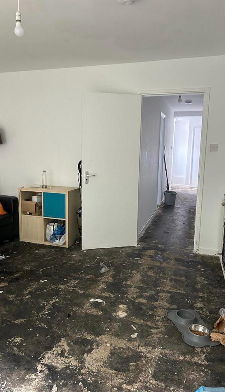
Children in social housing “sleeping on a blanket on a concrete floor”

Increasing numbers of people in social housing are living in inhospitable conditions because they are unable to afford even basic furniture and flooring, Dezeen reports as part of our Social Housing Revival series.

In the UK, social-rented homes are usually handed over to new residents in a sparse state – lacking basic elements of decoration and furnishings, as well as essential appliances.

As the cost of living continues to rise and the availability of crisis-support services diminishes, a growing number of people are unable to afford to furnish these homes, meaning they are sometimes forced to live in a harsh environment for months at a time.

Living room designed by Furnishing FuturesLiving room designed by Furnishing Futures
Top: before – many UK social-housing residents live with furniture poverty. Above: after – London charity Furnishing Futures makes new interiors for women who have fled domestic abuse

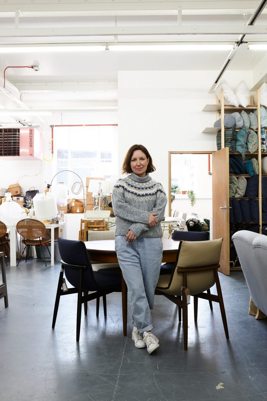
“For the families who we work with, the point that is most distressing is the void condition – the homes are given and [social landlords] don’t bother painting the walls, and there’s absolutely no flooring down,” said Emily Wheeler, founder and CEO of Furnishing Futures.

“Most people over time can manage to get some furniture together that’s gifted to them from the local church or friends or family or whatever, but it costs thousands and thousands of pounds to put flooring down, even in a one-bedroom flat.”

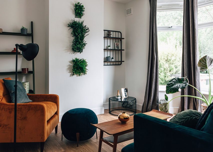
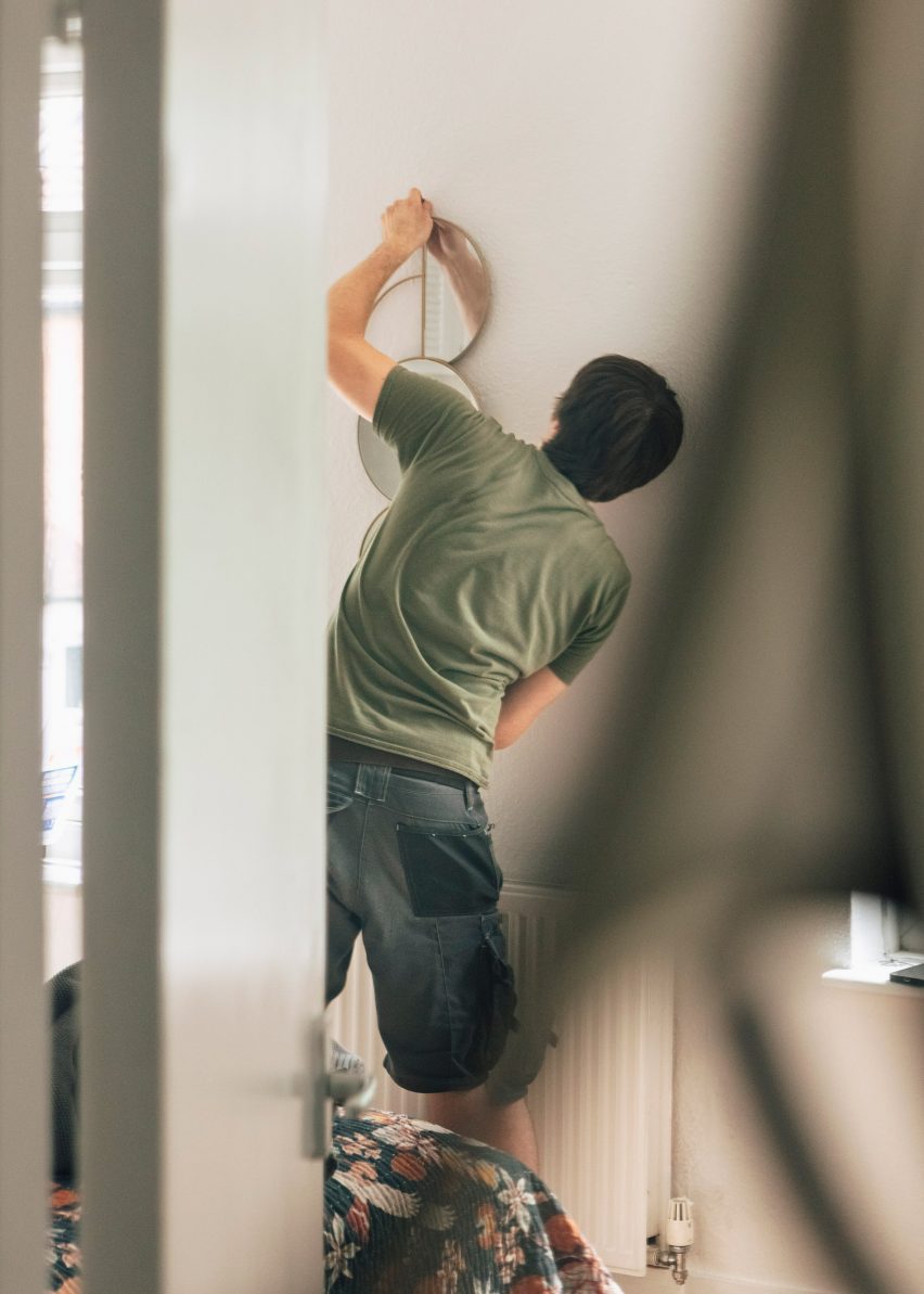
London charity Furnishing Futures was recently established to address the issue among women fleeing domestic abuse, creating interiors to a high standard using furniture donated from brands.

Furnishing Futures CEO and founder Emily WheelerFurnishing Futures CEO and founder Emily Wheeler
Emily Wheeler founded Furnishing Futures after realising that the poor condition of social housing was driving women back to abusive partners. Photo by Penny Wincer

Domestic-abuse survivors and people leaving care or who were previously homeless are particularly at risk of furniture poverty since they are less likely to have items to bring with them.

Wheeler said Furnishing Futures is seeing increasing demand for its services as more people come under financial pressure.

“Initially we were only working with women who were in receipt of benefits or experiencing severe poverty or destitution,” explained Wheeler.

“But now we’re working with families who are using the food bank but the woman is a midwife, or she’s a teaching assistant, or she is a teacher, and that is new.”

Social home in dilapidated conditionSocial home in dilapidated condition
The charity increasingly encounters families living in destitute conditions

Sometimes the conditions the charity witnesses are shocking, Wheeler told Dezeen.

“People are experiencing real hardship,” she said. “We’ve frequently come across people who have no food, no clothes, no shoes for their children.”

“The kids are sleeping on a blanket on a concrete floor – there’s nothing in the flat whatsoever,” she continued. “And those people might even be working as care assistants, or teaching assistants. So it’s really, really difficult at the moment for people.”

Interior created by Furnishing FuturesInterior created by Furnishing Futures
Furnishing Futures seeks to deliver interiors that “look like show homes”. Photo by Michael Branthwaite

According to the campaigning charity End Furniture Poverty, more than six million people in the UK lack access to essential furniture, furnishings and appliances – including 26 per cent of those living in social housing.

Only two per cent of social-rented homes in the UK are let as furnished or partly furnished, the charity’s research has found.

Wheeler is a trained interior designer who formerly worked in child safeguarding.

Furnishing Futures volunteer working on a homeFurnishing Futures volunteer working on a home
The charity decorated and furnished 36 homes in 2023. Photo by Michael Branthwaite

She was prompted to set up Furnishing Futures after discovering that many women in social housing who had left dangerous homes were driven back to their abuser by poor living conditions.

“When women were placed in new housing after having escaped really high-risk situations, they sometimes felt that they had no choice but to return because they couldn’t look after their children in those conditions – there’d be no fridge, no cooker, no washing machine, no bed, no curtains on the windows,” she explained.

“People are expected to go to those places at a time of great trauma and distress, and recover, but those places are often not conducive to that because of the design and the environment.”

Shot of interior by Furnishing FuturesShot of interior by Furnishing Futures
Wheeler said the interiors industry could be doing more to have a bigger social impact. Penny Wincer

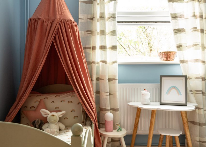
The charity overhauled 36 homes in 2023, helping 99 women and children. It takes a design-led approach with an emphasis on finishing interiors to a high standard.

“We professionally design them and they look like beautiful homes – they look like show homes when they’re finished,” Wheeler said.

“And the reason we do that is because it’s really important that the women feel that they have a beautiful home and they feel safe there, that they feel for the first time that someone really cares about them,” she added.

“It also supports the healing and the recovery journey for those women.”

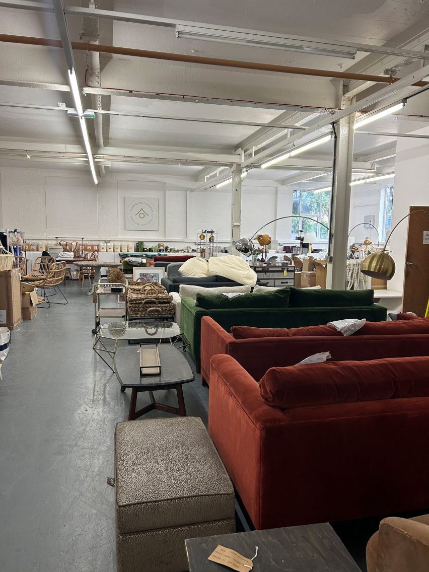
To help ensure quality, the charity only works with new or as-new furniture. It works with brands to source items that would otherwise be sent to landfill – usually press samples or items used at trade shows, in showrooms or on shoots.

Donating partners include Soho Home, BoConcept, Romo Fabrics and House of Hackney.

Wheeler is keen for Furnishing Futures to expand beyond London but the charity is currently held back by limited warehouse capacity and funding.

“If we had more money and more space we could help more people, it’s as simple as that, really,” she said.

Furnishing Futures warehouseFurnishing Futures warehouse
The charity relies on donations from furniture brands

The charity continues to seek donations from brands, particularly for bedroom furniture and pieces for children.

As well as calling for social-housing providers to let their properties in a better state, Wheeler believes the design industry could be doing more to help people facing furniture poverty.

“I do think that where the industry could catch up a little bit is working with organisations like ours,” she said.

For example, charities are unable to take furniture lacking a fire tag – which tend to be removed – so imprinting this information onto the items themselves would make more usable.

Children's bedroom designed by Furnishing FuturesChildren's bedroom designed by Furnishing Futures
The charity is often in need of items for children’s bedrooms. Photo by Michael Branthwaite

In addition, donating excess items as an alternative to sample sales could be a way to reduce waste with much greater social impact, she suggests.

“There’s probably millions of people across the country living without basic items and yet there’s massive overproduction, but the waste isn’t necessarily coming to people who actually need it,” Wheeler said.

“There are things that the industry could be doing that will create a huge social impact very easily.”

The photography is courtesy of Furnishing Futures unless otherwise stated.


Social Housing Revival artwork by Jack BedfordSocial Housing Revival artwork by Jack Bedford
Illustration by Jack Bedford

Social Housing Revival

This article is part of Dezeen’s Social Housing Revival series exploring the new wave of quality social housing being built around the world, and asking whether a return to social house-building at scale can help solve affordability issues and homelessness in our major cities.

Reference

Archival Image in Tropical Modernism exhibition at the V&A London
CategoriesInterior Design

Tropical Modernism exhibition explores “the politics behind the concrete”

London’s Victoria and Albert Museum has launched its Tropical Modernism exhibition, which highlights the architectural movement’s evolution from colonial import to a “tool of nation building”.

According to the Victoria & Albert Museum (V&A), the exhibition aims to examine the complex context, power dynamics and post-colonial legacy of tropical modernism – an architectural style that developed in South Asia and West Africa in the late 1940s – while also centralising and celebrating its hidden figures.

Archival Image in Tropical Modernism exhibition at the V&A LondonArchival Image in Tropical Modernism exhibition at the V&A London
London’s V&A museum has opened a major exhibition exploring tropical modernism

“Tropical modernism is experiencing something of a modish revival as an exotic and escapist style popular in verdant luxury hotels, bars and concrete jungle houses,” the exhibition’s lead curator Christopher Turner told Dezeen.

“But it has a problematic history and, through an examination of the context of British imperialism and the de-colonial struggle, the exhibition seeks to look at the history of tropical modernism before and after Independence, and show something of the politics behind the concrete,” he continued.

Installation shot of Tropical Modernism exhibition at the V&A LondonInstallation shot of Tropical Modernism exhibition at the V&A London
The exhibition traces the evolution of tropical modernism within a South Asian and West African context

The exhibition follows the V&A’s Tropical Modernism exhibition at the 2023 Venice Biennale, which revealed the team’s precursory research on tropical modernism in a West African setting.

For the in-house iteration of the exhibition, additional architectural models, drawings and archival imagery have been introduced to interrogate tropical modernism in India alongside the African perspective.

Exhibition materials line a series of rooms within the V&A’s Porter Gallery, divided by brightly coloured partitions and louvred walls referencing tropical modernist motifs.

Installation shot of Tropical Modernism exhibition at the V&A LondonInstallation shot of Tropical Modernism exhibition at the V&A London
Archival imagery, architectural drawings and physical models line the gallery rooms

The exhibition begins by tracing tropical modernism back to its early development by British architects Jane Drew and Maxwell Fry. Stationed together in Ghana from 1944, Drew and Fry adapted international modernism to the African climate, proposing functional over ornamental design.

Drew and Fry would also become part of the Department of Tropical Studies at the Architectural Association (AA), which exported British architects to the colonies from 1954 in a bid to neutralise calls for independence.

Installation shot of Tropical Modernism exhibition at the V&A LondonInstallation shot of Tropical Modernism exhibition at the V&A London
The exhibition aims to centralise local professionals who have gone widely unrecognised for their contributions to the movement

The exhibition continues by spotlighting local Ghanaian figures who worked with Fry and Drew, noting the power shifts that were taking place behind the scenes to reappropriate the architectural style for an emerging era of colonial freedom.

Influential political leaders Jawaharlal Nehru in India and Kwame Nkrumah in Ghana are the exhibition’s key personas, framing the evolution of tropical modernism from conception to regionalisation.

Installation shot of Tropical Modernism exhibition at the V&A LondonInstallation shot of Tropical Modernism exhibition at the V&A London
Gallery rooms are divided by brightly coloured partitions informed by tropical modernist motifs

“The heroes of our exhibition are Nehru and Nkrumah, the first prime ministers of India and Ghana,” Turner explained. “Tropical modernism, a colonial invention, survived the transition to Independence and was appropriated and adapted by Nehru and Nkrumah as a tool of nation building.”

“Nkrumah, who sometimes sketched designs for the buildings he wanted on napkins, created the first architecture school in sub-Saharan Africa to train a new generation of African architects, and this institution has partnered with us on a five-year research project into tropical modernism.”

Archival image of University College Ibadan used in Tropical Modernism exhibition at the V&A LondonArchival image of University College Ibadan used in Tropical Modernism exhibition at the V&A London
According to the V&A’s research, tropical modernism shifted from its western Bauhaus roots towards a localised vernacular styles

Through a host of physical models and artefacts, the city of Chandigarh becomes the exhibition’s narrative focal point for tropical modernism in India.

Under prime minister Jawaharlal Nehru, Chandigarh was the first large-scale modernist project, recruiting Drew and Fry along with French architect Le Corbusier to plan the ideal utopian urban centre.

As with Nkrumah – who saw how the Africanisation of architecture could become a symbol of progress and change – the exhibition also aims to highlight Nehru’s ambitions for a localised modernism drawing from the Indian vernacular, rather than the Western Bauhaus style.

The display culminates in a video featuring 16 key tropical modernist structures, interspersed with interviews and footage explaining the social and political context behind each building’s realisation.

“We made a three-screen 28-minute film, shot in Ghana and featuring panoramic portraits of over a dozen buildings, cut with archive footage from the time and interviews with architects like John Owusu Addo and Henry Wellington, and Nkrumah’s daughter, the politician Samia Nkrumah,” said Turner.

Archival image of Maxwell Fry and John Noah used in Tropical Modernism exhibition at the V&A LondonArchival image of Maxwell Fry and John Noah used in Tropical Modernism exhibition at the V&A London
The exhibition aims to address gaps in the museum’s African and South Asian studies

According to Turner, the exhibition begins to address gaps in the V&A’s collections and archives pertaining to architecture and design in the global south.

“Archives are themselves instruments of power, and West African and Indian architects are not as prominent in established archives, which many institutions have now realised and are working to address,” Turner explained.

“Tropical modernism was very much a co-creation with local architects who we have sought to name – all of whom should be much better known, but are excluded from established canons.”

Installation shot of Tropical Modernism exhibition at the V&A LondonInstallation shot of Tropical Modernism exhibition at the V&A London
The display will inhabit the V&A’s Porter Gallery until 22 September 2024

Bringing tropical modernism back into contemporary discourse was also important to the V&A as a timely investigation of low-tech and passive design strategies.

“Tropical modernism was a climate responsive architecture – it sought to work with rather than against climate,” Turner said.

“As we face an era of climate change, it is important that tropical modernism’s scientifically informed principles of passive cooling are reexamined and reinvented for our age,” he added.

“I hope that people will be interested to learn more about these moments of post-colonial excitement and opportunity, and the struggle by which these hard-earned freedoms were won.”

Image of video used in the Tropical Modernism exhibition at the V&A LondonImage of video used in the Tropical Modernism exhibition at the V&A London
A 28-minute video captures footage of remaining tropical modernist structures at the end of the exhibition

The V&A museum in South Kensington houses permanent national collections alongside a series of temporary activations and exhibitions.

As part of London Design Festival 2023, the museum hosted a furniture display crafted from an Alfa Romeo car by Andu Masebo and earlier in the year, architect Shahed Saleem created a pavilion in the shape of a mosque at the V&A as part of 2023’s Ramadan Festival.

The photography is courtesy of the Victoria & Albert Museum.

Tropical Modernism: Architecture and Independence will run from 2 March to 22 September 2024 at the V&A Museum in London. For more events, exhibitions and talks in architecture and design visit the Dezeen Events Guide.

Reference

Concrete Hoji Gengneung houses in South Korea
CategoriesArchitecture

Concrete ring connects Hoji Gangneung homes by AOA Architects

Seoul studio AOA Architects has created Hoji Gangneung, a series of uniquely shaped concrete dwellings linked by a raised, circular path in the South Korean countryside.

Located in Gangwon-do, Hoji Gangneung includes a family house for the owner and three guesthouses, along with a communal building.

Concrete Hoji Gengneung houses in South KoreaConcrete Hoji Gengneung houses in South Korea
Five buildings are arranged around a raised concrete ring

AOA Architects designed one of the four homes with an octagonal shape and central courtyard while another, named the Round House, has a semi-circular end.

The remaining two dwellings and the communal building have rectangular floor plans and differ from each other by their roof shape.

Hoji Gangneung houses in South KoreaHoji Gangneung houses in South Korea
AOA Architects designed each structure with a different shape

The communal building has a mono-pitch roof and one rectangular house has a regular gable roof. The final house, named the Long House, features a gable roof with a raised central section topped with a skylight, creating an elongated light well.

“Every building has its own shape, size and character, allowing guests to enjoy each space distinctly through shadow play,” said AOA Architects principal Jaewon Suh.

Hoji Gangneung by AOA ArchitectsHoji Gangneung by AOA Architects
Hoji Gangneung is located in the countryside in South Korea

AOA Architects took cues from countryside structures, such as warehouses and cabins, when designing Hoji Gangneung, aiming to create a project that references its surroundings while establishing itself as something new.

“The main concept and goal of the design is to build something familiar and also unfamiliar in a rural area,” Suh told Dezeen.

“For some, the Octagonal House looks like a nomadic tent and feels like an octagonal pavilion, the Long House looks like a milk carton or a grain warehouse, and the Round House looks like a slender piece of wood or a face with a hat, but these associations do not matter.”

A concrete ring elevated above the grassy landscape connects the five buildings, a decision the studio made to prevent the need for multiple paths.

“A circular shape was the best gesture to connect the five buildings at once,” Suh said. “As a result, while avoiding typical countryside alley shape and showing the main concept of the design, an artificial circular raised walkway was created.”

Concrete house in South Korea by AOA ArchitectsConcrete house in South Korea by AOA Architects
The buildings are made from textured concrete

According to the studio, the choice of concrete also deliberately juxtaposes the grassy landscape below.

“By raising a walkway slightly from the land, a tension between the gently floated concrete walkway and weak grasses of the land occurs,” said Suh.

Concrete home interior with a pitched roof and light wellConcrete home interior with a pitched roof and light well
AOA Architects covered the interiors of the homes in wood

The buildings are all built from textured concrete and topped by corrugated metal roofs.

In the communal building, the concrete structure is left exposed. Large glass doors spanning one wall open onto the concrete walkway and give views of the dwellings.

Communal dining area with a concrete structureCommunal dining area with a concrete structure
The concrete structure of the communal building is left exposed inside

The interiors of the houses are finished with wood to add a sense of warmth and “make one feel that they have entered a box of musical instruments”, according to Suh.

AOA Architects was founded in 2013 by Jaewon Suh and Euihaing Lee. The studio previously designed a Minecraft-themed apartment in Seoul with a stepped roof and red- and white-tiled exterior.

Elsewhere in South Korea, architecture studio Atelier Koma recently created a concrete chapel and YounghanChung Architects designed a two-storey study space for a retired university lecturer.

The photography is by Chin Hyosook.


Reference

Interior of brutalist Cantabrian Maritime Museum restaurant in Spain by Zooco Estudio
CategoriesInterior Design

Zooco Estudio unveils Cantabrian Maritime Museum restaurant

Madrid-based Zooco Estudio has created a striking restaurant within the Cantabrian Maritime Museum in Santander, Spain, that celebrates the building’s brutalist architecture.

The restaurant is set within a dramatic vault of concrete paraboloids that were unearthed during the renovation, while a slatted timber ceiling pays homage to the area’s shipbuilding legacy.

Interior of brutalist Cantabrian Maritime Museum restaurant in Spain by Zooco EstudioInterior of brutalist Cantabrian Maritime Museum restaurant in Spain by Zooco Estudio
Zooco Estudio added a restaurant to the second floor of the Cantabrian Maritime Museum

Overlooking the tranquil waters of Santander Bay, the restaurant is located on the second floor of the landmark Cantabrian Maritime Museum, which was designed in the mid-1970s by architects Vicente Roig Forner and Ángel Hernández Morales.

The paraboloids were an original fixture of the structure and supported the roof of what was once the museum’s patio.

Interior of brutalist Cantabrian Maritime Museum restaurant in Spain by Zooco EstudioInterior of brutalist Cantabrian Maritime Museum restaurant in Spain by Zooco Estudio
Oak details were designed to contrast the restaurant’s concrete arches

The studio focused on restoring the historic fabric of the space and reviving the paraboloids, which had been concealed for around 20 years, as “a vestige of the past”.

“In 2003, the building was renovated and as part of this intervention, the paraboloids were covered with a new roof and the space between them and the perimeter of the building was closed with glass, generating a covered space where there was previously a terrace,” Zooco Estudio co-founder Javier Guzmán told Dezeen.

“We wanted the concrete paraboloids to be the absolute protagonists of the space and by removing the paint and the coating, the paraboloids are visible again and regain their full prominence.”

Interior of brutalist restaurant in Spain by Zooco EstudioInterior of brutalist restaurant in Spain by Zooco Estudio
The renovation exposed the raw concrete surface of the paraboloids

The previous renovation also altered the dimensions of the space and reconfigured the volume as a square.

To promote symmetry, four additional concrete triangles were added to balance out the original paraboloids in the brutalist restaurant.

Timber ceiling panels and concrete paraboloids inside a brutalist restaurantTimber ceiling panels and concrete paraboloids inside a brutalist restaurant
Slatted wooden ceiling panels bridge the gaps between the arches

Overhead, a false ceiling of slatted timber panels frames the concrete arches.

The studio designed theses triangular boards to reference the arrangement of timber across the hull of a boat, a nod to the museum and the area’s nautical past.

The panels also serve the purpose of concealing the restaurant’s mechanical systems.

“The wooden slats bring warmth and friendliness to the space while allowing us to solve all the technical needs for air conditioning, heating and lighting, leaving them hidden,” Guzmán said.

“In this way, we ensure that all these elements do not interfere with the dialogue of concrete and wood, which are presented as continuous and clean elements.”

Dining tables overlooking views of the Santander bayDining tables overlooking views of the Santander bay
Walls of floor-to-ceiling glazing offer views across the bay

The interior layout was largely dictated by the low arches of the elliptic paraboloids that dominate the brutalist restaurant.

“The geometry of the existing structure conditions the space, because its height in its lower part is impractical, so a large bench is arranged around the entire contour that allows us to take advantage of that space and organise the distribution of the rest of the floor plan,” added Guzmán.

Concrete paraboloid and dining tables inside brutalist restaurant in Spain by Zooco EstudioConcrete paraboloid and dining tables inside brutalist restaurant in Spain by Zooco Estudio
Grey porcelain floors mirror the concrete paraboloids

Like the ceiling panels, the interior finishes and furnishings allude to the maritime history that the building commemorates.

“The use of wood and steel for all the furniture is reminiscent of the materials used in shipbuilding – the furniture has slight curvatures that are reminiscent of the aerodynamic shapes of boats,” explained Guzmán.

“Likewise, the lamps are inspired by the masts for ship sails.”

Dining tables at Cantabrian Maritime Museum restaurantDining tables at Cantabrian Maritime Museum restaurant
Zooco Estudio also designed the restaurant’s curved timber furniture

Another key change was the replacement of the perimeter glass wall.

The inclined glazing was swapped for vertical glass, a decision that reclaimed external space for the patio, which stretches the length of the restaurant and overlooks the harbour below.

“When we are inside, the feeling is the same as when we are inside a boat, there is only water around, and that is why we used clean glass from floor to ceiling, generating a perimeter terrace as happens on boats,” said Guzmán.

Terrace at Cantabrian Maritime MuseumTerrace at Cantabrian Maritime Museum
The terrace features green curvilinear outdoor furniture

Other projects by Zooco Estudio include a renovated house in Madrid and a co-working space with a kids’ play area in California.

The photography is by David Zarzoso.


Project credits:

Architect: Zooco Estudio
Construction:
Rotedama Constructora SL
Lighting: Zooco Estudio
Furniture: Zooco Estudio

Reference

casa attico atelier matteo arnone 2
CategoriesArchitecture

a brick tower rises from a concrete base inside matteo arnone’s caso attico

casa attico by atelier matteo arnone


In the north-east of Brazil, on the shore of São Miguel do Gostoso, Casa Attico emerges as one of the recent and characteristic projects of architecture and urban design studio Atelier Matteo Arnone. Made of brickwork and concrete, the residence takes on a unique, circular morphology and position, both influenced by the regional winds. Its concrete foundation reveals an exposed, almost labyrinthine layout with a brick core shaped like a tower that rises just enough from the dunes to capture scenic views of the Brazilian sea, becoming a reference point for the landscape. 

casa attico atelier matteo arnone 2
all images © Federico Cairoli


a sweeping morphology inspired by the movement of wind


Observing both sections and plans of Casa Attico, one understands Matteo Arnone’s willingness (see more here) to capture the natural ventilation coming from the east and drive it across every corner of the living spaces. On the ground floor, the house is shaped like a wind machine. From the east, the wind penetrates the patios and circulates geometrically according to the shape of the walls, breaking strength and aerating the four symmetric bedrooms. At the tower level, the wind rises in between the two layers of brickwork composing its wall structures. The central kitchen, positioned to overlook four patios, serves as the focal point of the ground floor. Its symmetrical placement creates the core of the house, connecting with the living spaces.

casa attico atelier matteo arnone 3
Casa Attico by Atelier Matteo Arnone rises amid dunes in Brazil


Matteo Arnone and his team mainain visual continuity between the kitchen and first floor of Casa Attico through a circular opening that leads to the living room and office area. ‘As one ascends, a sense of privacy intensifies, offering a feeling of seclusion amidst the expansive natural surroundings. This sensation culminates on the top floor, where a compact space provides a panoramic view of the landscape, allowing for quiet contemplation,’ concludes the architect. 

casa attico atelier matteo arnone 4
a circular morphology inspired by eastern winds

casa attico atelier matteo arnone 7
a brick tower rises from the core

casa attico atelier matteo arnone 5
cicular openings and layouts take over the design of Casa Attico

casa attico atelier matteo arnone 10

Reference

Front elevation view of concrete maritime academy in Denmark by EFFEKT and CF Moller Architects
CategoriesArchitecture

Concrete grid defines Svendborg International Maritime Academy

Danish studios EFFEKT and CF Møller Architects have completed the Svendborg International Maritime Academy in Denmark, using an exposed concrete frame to echo its industrial surrounds.

Overlooking the harbour in the North Quay of the former port city Svendborg, the 12,500-square-metre centre unites several previously separate departments of Svendborg International Maritime Academy (SIMAC), providing combined study spaces for 1,000 students.

Front elevation view of concrete maritime academy in Denmark by EFFEKT and CF Moller ArchitectsFront elevation view of concrete maritime academy in Denmark by EFFEKT and CF Moller Architects
EFFEKT and CF Møller Architects have created a building for Svendborg International Maritime Academy

EFFEKT and CF Møller Architects designed a “resilient grid” for the building formed of prefabricated concrete elements, which nods to the surrounding architecture and is divided with glass partitions to create teaching spaces that can be easily modified or adapted in future.

“We set out with the desire to create an extremely raw and transparent grid structure, contextually adapted to its industrious setting while capable of staging the school’s workshop-based content,” explained CF Møller Architects partner Mads Mandrup.

Facade dusk view of concrete maritime academy in Denmark by EFFEKT and CF Moller ArchitectsFacade dusk view of concrete maritime academy in Denmark by EFFEKT and CF Moller Architects
It is characterised by an exposed concrete grid

“[It is] a scaffolding of spatial possibilities, centred around encouraging young people to encounter and exchange ideas through informal meetings, both within and out towards its surroundings, activating the whole harbour front of Svendborg,” Mandrup added.

SIMAC’s teaching spaces are organised across five storeys around a central 20-metre-high atrium. Lined with balconies, this atrium visually connects each level to a communal seating area on the ground floor.

Internal frame of concrete maritime academy in Denmark by EFFEKT and CF Moller ArchitectsInternal frame of concrete maritime academy in Denmark by EFFEKT and CF Moller Architects
Five storeys of educational facilities surround a 20-metre-high atrium

Double-height spaces house specialist workshops alongside conventional offices and classrooms, with the glass partitions intended to “stimulate communication and informal exchange” between areas, said the studios.

On the roof is a communal terrace for students and staff, providing both internal and external spaces with expansive views out across the harbour framed by the hollow concrete grid.

Taking cues from the raw concrete structure, interior finishes have been kept minimal and unfinished, with exposed ducting and steel balustrades. Social areas are visually softened by wooden details, including an area of tiered seating.

On the building’s exterior, panels of glazing and corrugated metal have been pulled back to express the concrete structure. In each corner, the grid is cut away to create sheltered external areas for the cafe and canteen, which are open to the public.

Stairs and frame of concrete maritime academy in Denmark by EFFEKT and CF Moller ArchitectsStairs and frame of concrete maritime academy in Denmark by EFFEKT and CF Moller Architects
An area of tiered communal seating is among those with wooden detailing

“You see the same raw, minimalist exposed column-girder structure both from the outside and the inside,” said EFFEKT co-founder Sinus Lynge.

“The space essentially flows through the building’s structure, and the intriguing aspect concerning the concrete elements is that SIMAC’s structure is the architecture,” he added.

Education space in concrete maritime academy in Denmark by EFFEKT and CF Moller ArchitectsEducation space in concrete maritime academy in Denmark by EFFEKT and CF Moller Architects
Exposed ducting contributes to the raw interior aesthetic

SIMAC is the first project to be completed as part of a wider masterplan for a new district in Svendborg, which is set to transform 5.5 hectares of industrial area with new education, business and residential buildings.

Elsewhere, EFFEKT also recently completed Denmark’s first treetop walkway at the Hamaren Activity Park in Fyresdal and CF Møller Architects created the headquarters for Lego in Billund with a bright yellow atrium.

The photography is by Rasmus Hjortshøj.

Reference

Reef Rocket by Mary Lempres
CategoriesSustainable News

Reef Rocket is a bio-cement reef grown from plant enzymes

Industrial designer Mary Lempres has created a bio-cement structure developed to mimic naturally occurring oyster reefs that tackle coastal flooding, filter seawater and promote biodiversity.

Called Reef Rocket, the structure comprises a duo of bio-cement modules with ridged surfaces that can be stacked in two directions and create a rocket-like shape when assembled.

Reef Rocket by Mary LempresReef Rocket by Mary Lempres
Reef Rocket is a bio-cement structure formed from two modules

Norwegian-American designer Lempres drew on biomimicry for the project, a practice that looks to nature to solve human design challenges.

The ridged modules were created to be placed underwater and emulate coastal oyster reefs, which naturally filter algae from seawater as well as attract and provide shelter for other aquatic organisms.

Bio-cement man-made oyster reefBio-cement man-made oyster reef
Mary Lempres designed Reef Rocket to emulate oyster reefs

Oyster reefs also dissipate wave energy, mitigate storm surges and manage eroding coastlines, explained the designer.

Lempres collaborated with bio-geotechnical specialist Ahmed Miftah to develop a method for growing plant-derived cement that makes up the modules, which she described as “similar to the irrigation systems required for growing a plant”.

Close-up of textured oyster reef-like structureClose-up of textured oyster reef-like structure
The designer drew on biomimicry for the project

The pair poured a bio-based, non-toxic solution containing a crude extract from globally grown plants over crushed aggregate.

Sourced in New York City, the aggregate was created from crushed glass and oyster shells salvaged from local restaurants and New York Harbour.

“The packed substrate grows similarly to a plant,” Lempres told Dezeen.

Oysters attached to the structureOysters attached to the structure
Reef Rocket was created to attract oysters

Saturated for three to nine days, the substance becomes natural concrete after the extracted biocatalyst causes minerals to form “mineral bridges” between the glass and shell waste.

“The resulting product is water-resistant, durable and comparable with standard concrete containing the same amount of aggregate,” explained the designer.

Shells and blocks of bio-cementShells and blocks of bio-cement
Lempres created the bio-cement with bio-geotechnical specialist Ahmed Miftah

“It can be grown in any environment without heat or otherwise burning fossil fuels and is derived from waste products, making it an affordable and scalable alternative to cement,” she continued.

“Bio-concrete is chemically identical to the material oysters produce to grow their reefs. The key difference is the bio-concrete we’ve developed grows in just several days, while oyster reefs take millennia to grow.”

This process closely mimics the natural processes that occur when oyster shells and coral reefs are grown, according to the designer.

“I was inspired by the ability of this reef-growing material to withstand extreme wave energy and corrosive saltwater,” she said.

Bio-cement structure in New York CityBio-cement structure in New York City
The structure was designed to be placed underwater

When creating the modules, Lempres and her team made “hundreds” of prototypes.

Eventually, they settled on prefabricated moulds, which the bio-cement can be packed into and set – “like sand” – without the need for heat or chemicals.

Bio-cement samplesBio-cement samples
Lempres and her team created “hundreds” of prototypes

Reef Rocket was deliberately developed to be small in size, lightweight and easy to assemble, making the design accessible to as many people as possible, according to the designer.

“Nature has the incredible ability to grow intricate and durable material, like shells and coral, without polluting its surrounding environment,” said Lempres.

“Reef Rocket harnesses the natural process of growing durable minerals to re-grow vital reef structures, benefiting humans and our ecology from the worsening effects of climate change,” she added.

“This paves the way for a future where hard and durable material can be grown like a crop, regenerating waste rather than polluting our environment.”

Previously, US design workshop Objects and Ideograms conducted a research project that involves 3D printing with calcium carbonate to create sustainable underwater “houses” for coral reefs and marine life to grow. Chinese materials company Yi Design developed a porous brick made from recycled ceramic waste that could be used to prevent flooding in urban areas.

The photography is courtesy of Mary Lempres


Reference

Cafe with concrete walls, ceiling and floor
CategoriesInterior Design

Commoncraft draws on “beauty in imperfection” for New York cafe

Distressed concrete, rowlock bricks and worn plasterwork create an intentionally unfinished appearance at this cafe in New York City’s East Village neighbourhood, designed by Brooklyn studio Commoncraft.

For its expansion into Manhattan, New Jersey-based Kuppi Coffee Company secured a 350-square-foot space on bustling St Marks Place – its second location.

Cafe with concrete walls, ceiling and floorCafe with concrete walls, ceiling and floor
Textured concrete plaster envelops the interior of Kuppi Cafe in the East Village

The compact interior has just enough space for a customer area and the cafe counter, plus a prep area and a WC for staff at the back.

Commoncraft approached the front-of-house space with an ethos akin to wabi-sabi, the Japanese art of “flawed beauty”.

Cafe counter faced with rowlock-course bricksCafe counter faced with rowlock-course bricks
Commoncraft chose materials for the space that appear purposefully rough and unfinished

“Employing a range of rough and raw materials, Commoncraft’s design of Kuppi Cafe seeks out the beauty in imperfection,” said the studio, which was founded by Zach Cohen and Tony-Saba Shiber.

Textured concrete plaster curves up from two perpendicular walls and over the ceiling, enveloping the room together with the concrete floor.

Concrete interior with small brick bench against a wallConcrete interior with small brick bench against a wall
The compact space features a small bench for customers awaiting their orders

Where these walls meet, a vertical element is wrapped in bluish plaster that’s peeling away to reveal a whitewash beneath.

The Kuppi logo is applied faintly at the top, and stainless-steel shelves for displaying merchandise are cut into part of the pillar’s corner.

Brick cafe counter facing a glass facadeBrick cafe counter facing a glass facade
The cafe counter is faced in bricks stacked on their sides to expose their “guts”

Zones for customer interaction – including the service counter and a small bench – are defined by terracotta bricks, which are stacked on their sides in rowlock courses “to expose their core and mortar ‘guts’.”

“Each terracotta volume is terminated by a course of cut bricks, further revealing the rough, imperfect cores,” Commoncraft said.

In such a compact space, the designers have ensured that their concept carries through each of the cafe’s elements.

“The material honesty of the space is further reinforced by a number of small details,” said Commoncraft.

A corner element is wrapped in bluish plasterA corner element is wrapped in bluish plaster
A corner element is wrapped in bluish plaster that’s distressed to reveal a whitewash underneath

These include floating stainless steel shelves behind the counter, a freestanding glass splash guard for baked goods and spherical concrete pendant lights suspended at different heights above the bench.

The cafe is highly visible from the high-traffic street through its fully glazed facade.

A counter terminated by a course of cut bricks, with a glass enclosure for pastries on topA counter terminated by a course of cut bricks, with a glass enclosure for pastries on top
The counter is terminated by a course of cut bricks

New York City is home to thousands of cafes and coffee shops, including many independent establishments with unique interiors intended to entice customers inside.

Among them is another Commoncraft project: a Williamsburg eatery named Gertie designed as a playful tribute to the owner’s grandmother.

The photography is by Andrew Fu.


Project credits:

Client: Kuppi Coffee Company (Kevin and Vivian Kim)
Architecture and interior design: Commoncraft
Plumbing engineer: Alan R Schwartz
General contractor: LTI Construction Corp

Reference

Carpark interior in Germany by Mono Architekten
CategoriesArchitecture

Mono Architekten tops perforated concrete car park with public plaza

Berlin studio Mono Architekten has combined a perforated concrete viewing tower with a car park topped by a public park to create a new entrance to the town of Neuenburg am Rhein, Germany.

Located close to the border with France and Switzerland, the project is situated between the town itself and the recently redeveloped green spaces a Stadtpark am Wuhrloch, a meeting point which was previously difficult to traverse due to a nine-metre height difference.

Bridging these two conditions, Mono Architekten sought to complement the functional need for a 231-space car park with more public facilities, including a new public plaza and a 36-metre-high viewing tower.

Carpark interior in Germany by Mono ArchitektenCarpark interior in Germany by Mono Architekten
The connecting tower and carpark offer a new entrance into the nearby town

“The aim was to develop independent typologies from the functional requirements of parking and barrier-free access to the city park,” Mono co-founder André Schmidt told Dezeen.

“Together they create an identity-forming urban ensemble,” he continued.

“The parking garage roof was thus designed as a public square – Münsterplatz – and the vertical access structure to the city park was designed as a tower – Bertholdturm – with a publicly accessible viewing platform.”

Interior view of carpark with public park in GermanyInterior view of carpark with public park in Germany
Spiralling ramps provide vehicle access to the carpark

Using the site’s level change as an advantage, the new car park meets the level of the town to allow it to connect seamlessly to the new public square, which is finished with planting and paved seating areas.

Two spiralling ramps at either end of the carpark provide access for vehicles, while the perimeter of the structure curves to meet the existing road with its perforated concrete facade.

In the nearby viewing tower, an elevator core links the ground floor entrance with the rooftop, where 360-degree views of the landscape are accompanied by corten steel panels on the parapet that detail landmarks and their distances.

A bridge of corten steel links the car park roof with an upper entrance to the tower, and in future there is a plan to extend this bridge to create a ramp down to the adjacent parkland, creating a step-free, accessible route between it and the town.

Mono Architekten top carpark with public park in GermanyMono Architekten top carpark with public park in Germany
Both structures were made using blocks of tamped concrete

The two structures were united by their matching exterior finish, with blocks of tamped concrete arranged to create square perforations that allow air to flow freely.

“The sedimentary tamped concrete layers at the entrance to the city are inspired by the city’s former location on the banks of the Rhine,” explained Schmidt.

“The reddish pigmentation harmonizes with the sandstone traditionally used in this area,” he continued. “The monolithic construction emphasizes the archaic character of the buildings.”

Exterior view of perforated tower and bridge by Mono ArchitektenExterior view of perforated tower and bridge by Mono Architekten
A corten steel bridge provides expansive views of the landscape

Mono Architekten took a similar approach to blending infrastructure with public facilities in their design for a service station in Thuringia, which also includes an exhibition space about the site’s nearby bronze-age burial mound.

The photography is by Gregor Schmidt. 

Reference

Community centre by WORKac and Ignacio Urquiza Architects
CategoriesArchitecture

Mexico City community centre has blue-tinted concrete walls

Design firms WORKac and Ignacio Urquiza Architects have created a multi-level, concrete community centre in an underserved neighbourhood that is meant to “promote the regeneration of social life”.

The building by New York’s WORKac and local studio Ignacio Urquiza Arquitectos – officially called PILARES Lomas de Becerra — is located in a hilly area and rises up from a dense intersection surrounded by active streets.

Community centre by WORKac and Ignacio Urquiza ArchitectsCommunity centre by WORKac and Ignacio Urquiza Architects
The community centre is located in Mexico City

Located in Mexico City’s Lomas de Becerra neighbourhood, the building was created as part of a government initiative called PILARES, which stands for Points of Innovation, Freedom, Art, Education and Knowledge.

For a slender, irregularly shaped site, the team devised a multi-storey facility that encompasses 5,059 square feet (470 square metres).

Blue concrete walls within the community centreBlue concrete walls within the community centre
WORKac and Ignacio Urquiza Architects designed the multi-level structure

“In appearance, the volume is simple and compact, with a strong character that confirms its presence as a public building,” the team said.

Walls are made of concrete – a material chosen for its construction and structural efficiencies, as well as its thermal and aesthetic qualities, the team said.  The concrete was dyed blue, a decision informed by the vibrant colours found in the surrounding area.

Coloured concrete building in Mexico CityColoured concrete building in Mexico City
The team devised the building for a slender, irregularly shaped site

Launched in 2018, the PILARES programme aims to create opportunities for residents in underserved areas.

“Each PILARES building is designed to support various kinds of classes and workshops in support of skill building, as well as bringing cultural programming, learning opportunities, and safe spaces for leisure and cross-generational gathering to each neighbourhood,” said New York’s WORKac.

“The sites selected for their construction create new landmarks in the urban fabric, enabling the population to identify them as community meeting centres that promote the regeneration of social life.”

Blue concrete walls and a geometric skylightBlue concrete walls and a geometric skylight
Walls are made of blue concrete

Mexico City’s government enlisted local and international design studios to create 26 facilities under the programme.

Buildings are meant to respond to the local context and follow programming guidelines developed through extensive community engagement.

Blue concrete wallsBlue concrete walls
The building is meant to respond to its local context

The team tried to reflect the community and its values in the architecture.

“The use of colour in Mexican architecture is an element that has been transformed and reinterpreted in the hands of many artists and architects across generations,” the team said.

The building is fronted by a plaza that is shaded by pre-existing trees.

Street with trees outside Mexico City community centreStreet with trees outside Mexico City community centre
The building is fronted by a plaza with trees

Part of the ground floor is sliced away to form an angled, glazed entry wall, which helps “the transition between exterior and interior spaces”, the team said.

“The diagonal opening on the ground floor provides clear and free-flowing pedestrian routes in every direction, inviting users to walk around the plaza and enter the building,” the team said.

Inside, the building contains three split levels, all of which are connected by a central staircase. Rooms are designed to be fluid and adaptable.

“This flexible approach leaves open the possibility for changes to the programme over the lifetime of the building and allows it to freely evolve and adapt,” the team said.

Central staircase from an aerial viewCentral staircase from an aerial view
Three split levels are connected by a central staircase

WORKac and Ignacio Urquiza Architects have designed a second PILARES building, in the borough of Azcapotzalco, that follows a similar design vocabulary.

Other PILARES buildings include a community centre in Iztapalapa by Rozana Montiel Estudio de Arquitectura that features a series of bridges, walkways and exterior staircases.

The photography is by Arturo Arrieta and Ramiro del Carpio.


Project credits:

Architect: WORKac and Ignacio Urquiza Architects (IUA)
Team: Amale Andraos, Dan Wood, Ignacio Urquiza Seoane, Michela Lostia di Santa Sofía, Eder Hernández, María del Mar Carballo, Ana Laura Ochoa, Anet Carmona, Noé García, León Chávez, Fernando Tueme, Sacha Bourgarel
Interior design and lighting: WORKac, IUA and APDA
Structure and engineering: BVG (César Barquera, Eduardo Barquera); Ecomadi
Landscape: Genfor Landscaping (Tanya Eguiluz)
Development: Mexico City government and ZV Studio (Carlos Zedillo)
Digital visualizations: Israel Levy
Client: Mexico City government

Reference