Glass and bronze modules form an arch of light over a dining booth
CategoriesInterior Design

Rockwell Group creates “cathedral of fried chicken” for NYC restaurant

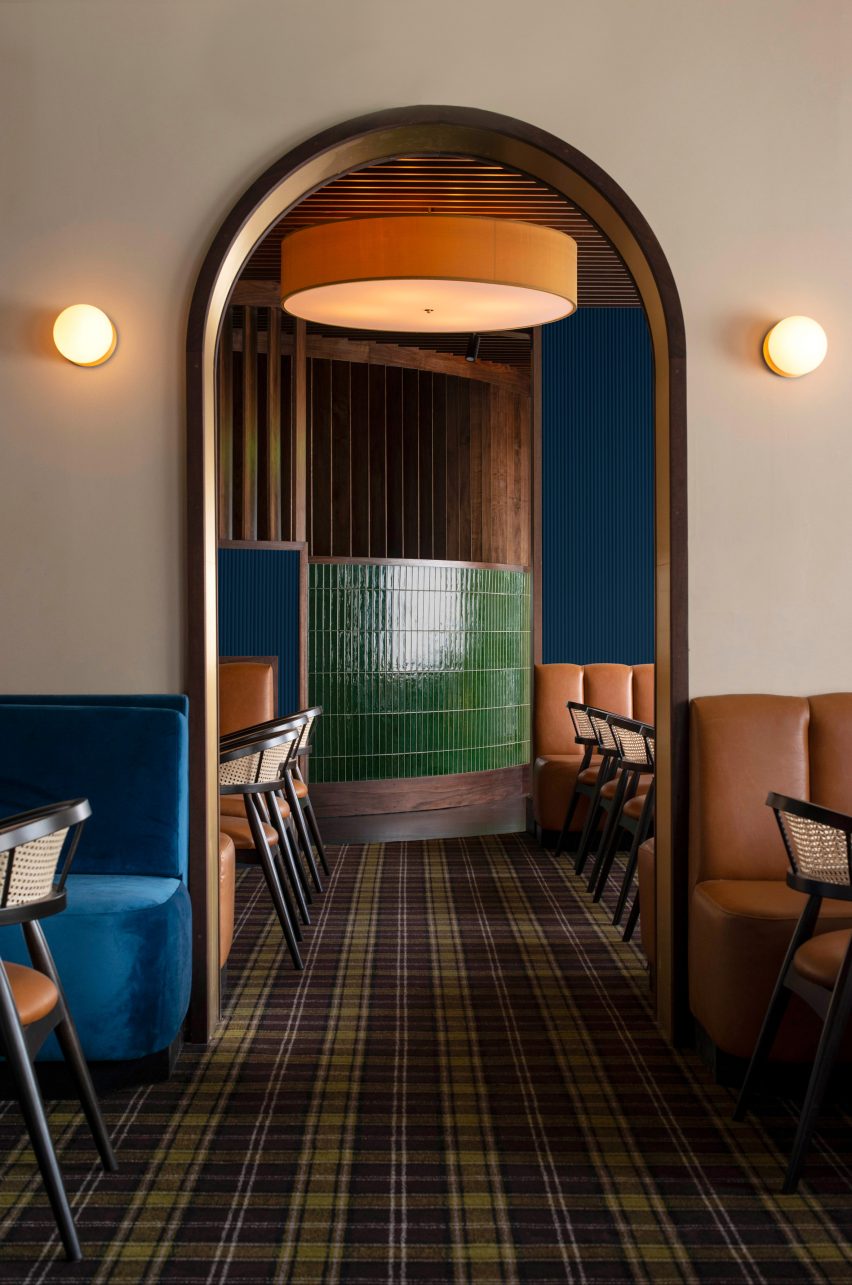
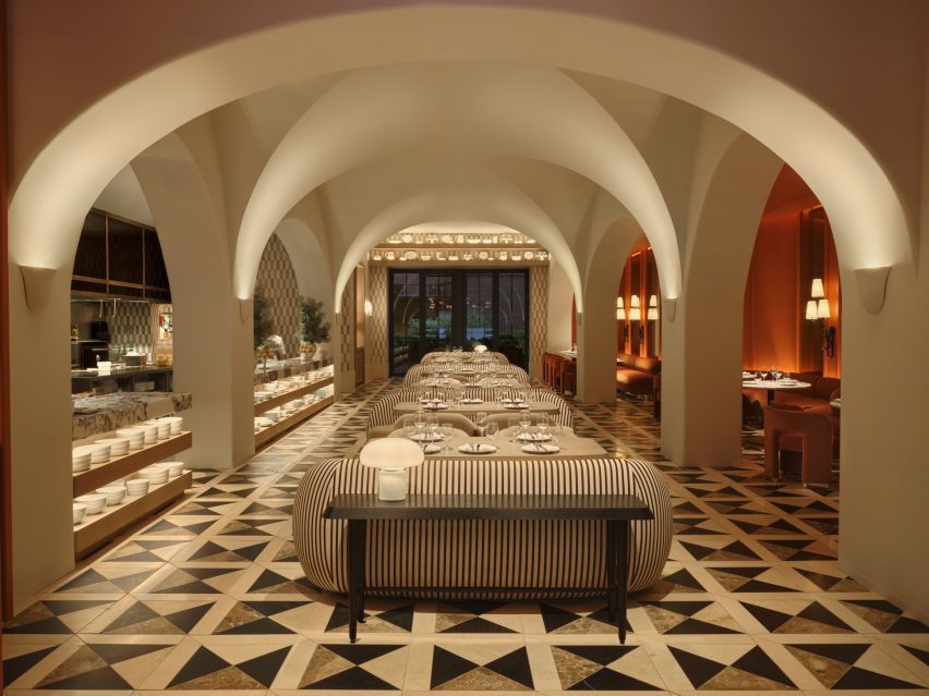
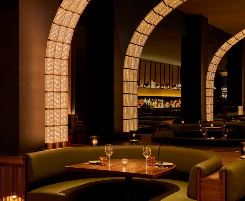
Arches of light warmly illuminate this Korean fried chicken restaurant in New York’s Flatiron district, designed by Rockwell Group.

Coqodaq is the brainchild of restauranteur Simon Kim’s Gracious Hospitality Management, the group behind the Michelin-starred and James Beard-nominated COTE Korean Steakhouse.

Glass and bronze modules form an arch of light over a dining boothGlass and bronze modules form an arch of light over a dining booth
At Cododaq, glass and bronze modules form arches of light over diners

The new restaurant offers an elevated take on traditional Korean-style fried chicken, encouraging diners to indulge in nuggets topped with caviar and to pair its “bucket” dishes with champagne.

“Designed by Rockwell Group as ‘the cathedral of fried chicken’, the restaurant design delivers a daring, yet refined dining experience that skillfully integrates Korean and American influences, placing them at the forefront of this enticing culinary adventure,” said the restaurant team.

Restaurant interior with moody material palette and warm lightingRestaurant interior with moody material palette and warm lighting
The restaurant’s moody material palette and warm lighting set the tone for an elevated take on Korean fried chicken

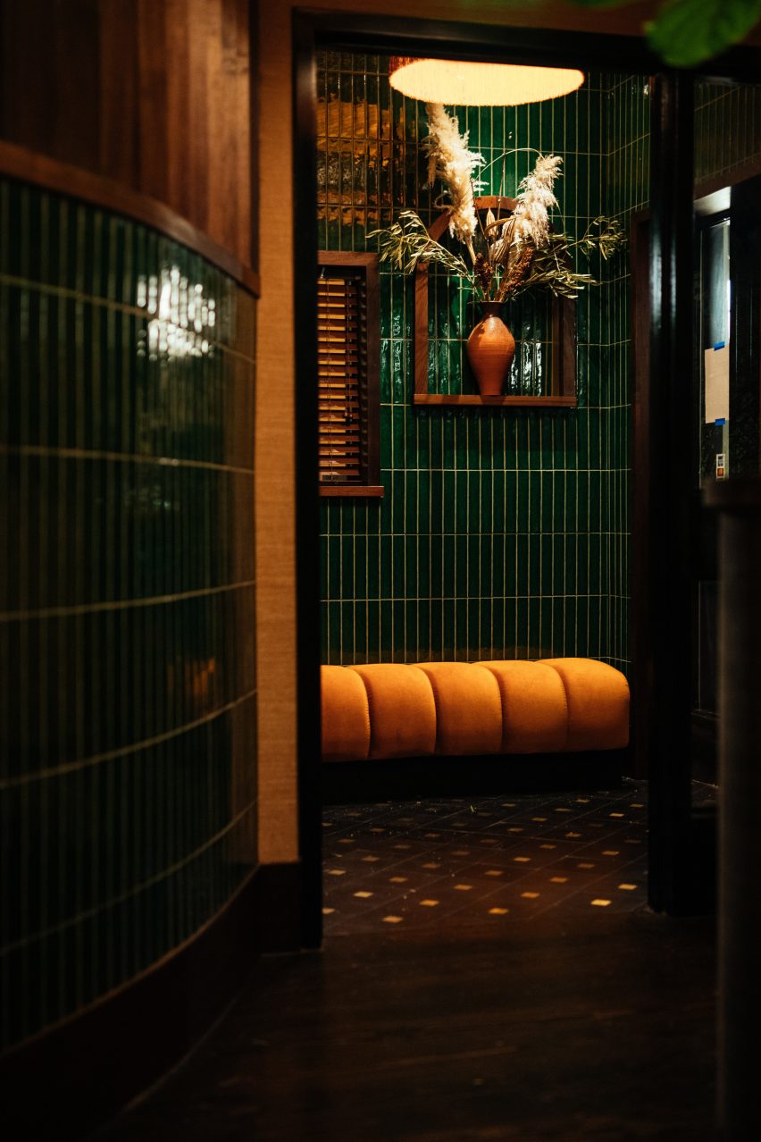
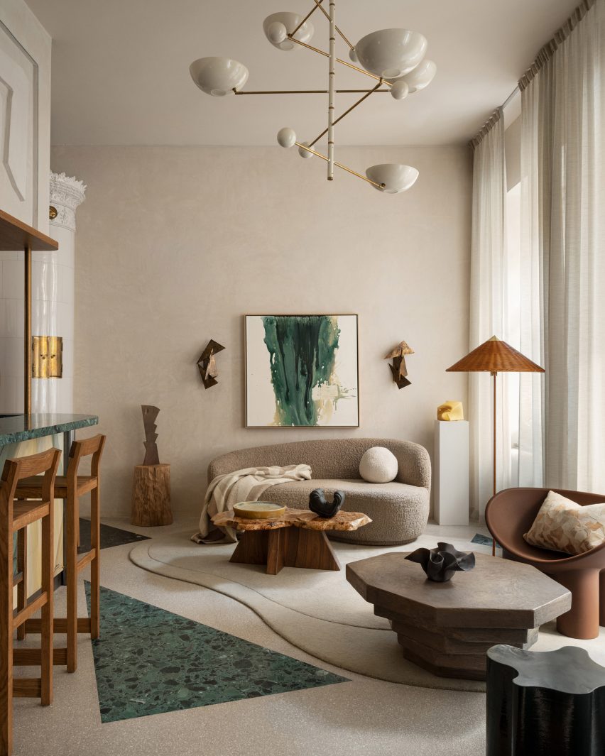
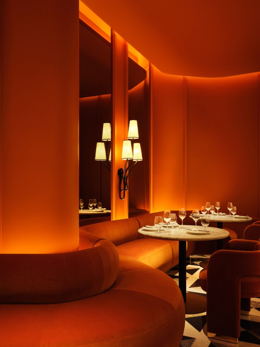
To create the right atmosphere for this experience, Rockwell Group opted for a dark and moody interior of rich materials and low, warm lighting.

“Our goal was to capture the essence of this unique concept and innovative approach to fried chicken and translate it into a memorable dining experience,” said founder David Rockwell.

Booth seating with crackled plaster wall panels aboveBooth seating with crackled plaster wall panels above
Plaster wall panels feature a crackled effect akin to fried chicken skin

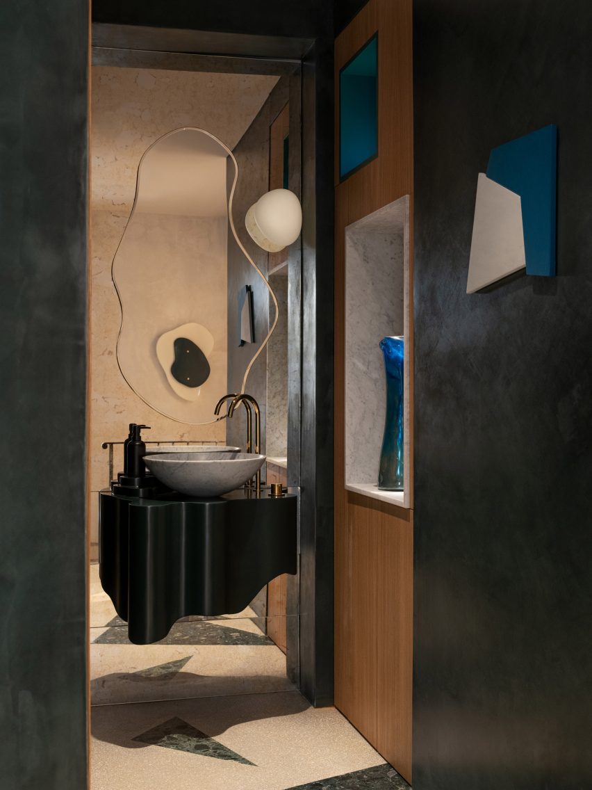
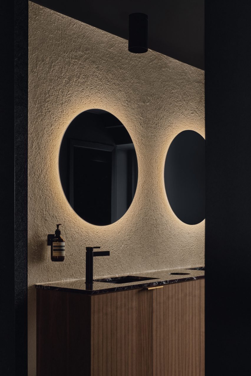
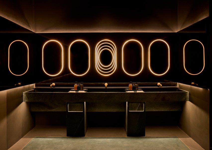
Upon entry, guests are invited to wash their hands in leathered soapstone basins, above which a row of pill-shaped light bands glow within a bronzed mirror that also wraps onto the side walls.

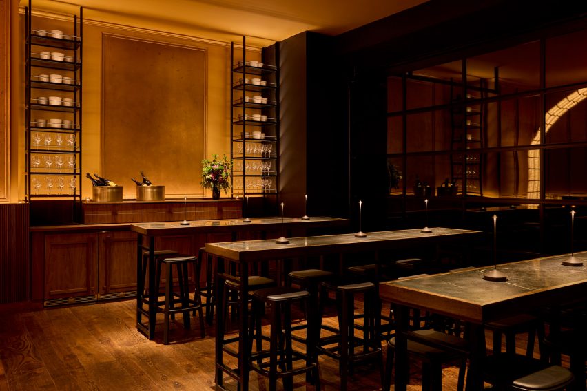
Past the host stand, an area with four high-top tables offers a space reserved for walk-ins in front of garage-style windows.

A long bar topped with black soapstone and fronted with tambour woodA long bar topped with black soapstone and fronted with tambour wood
The long bar is topped with black soapstone and fronted with tambour wood

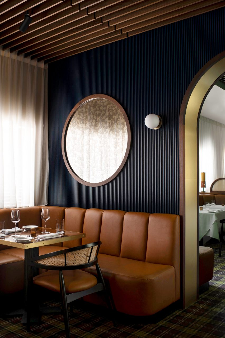
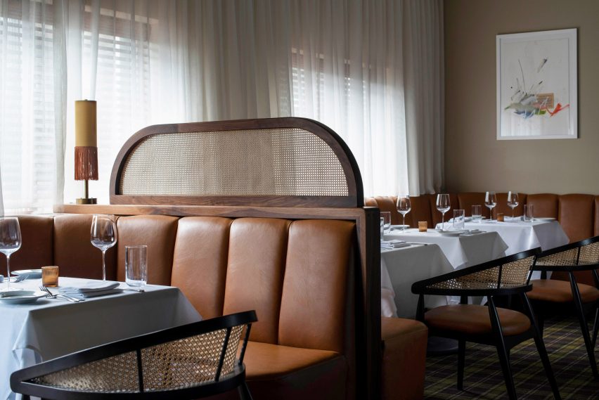
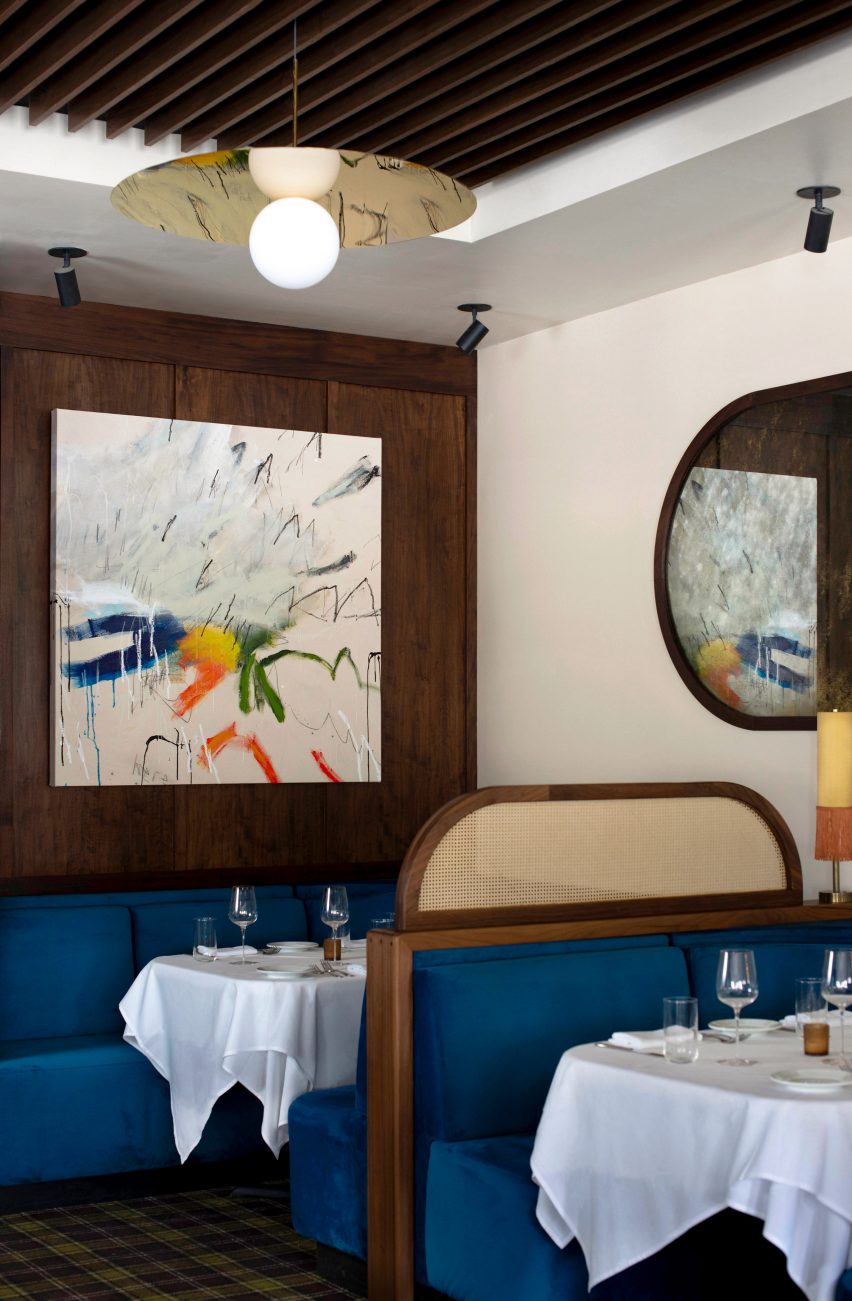
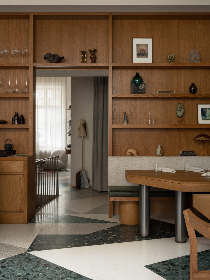
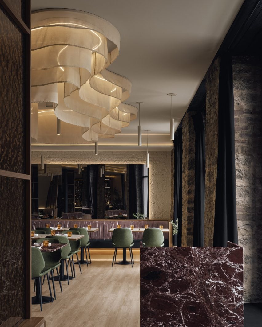
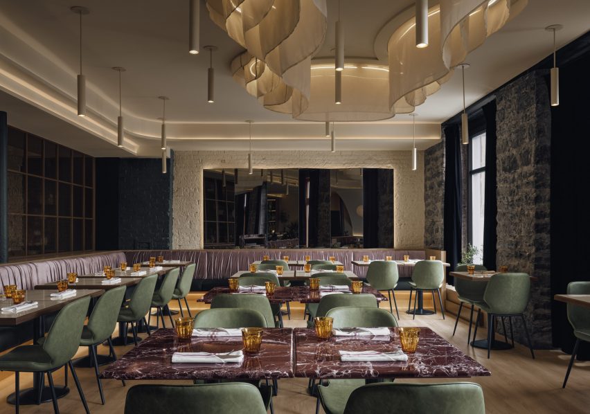
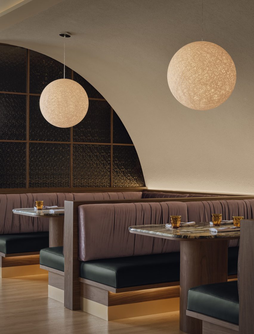
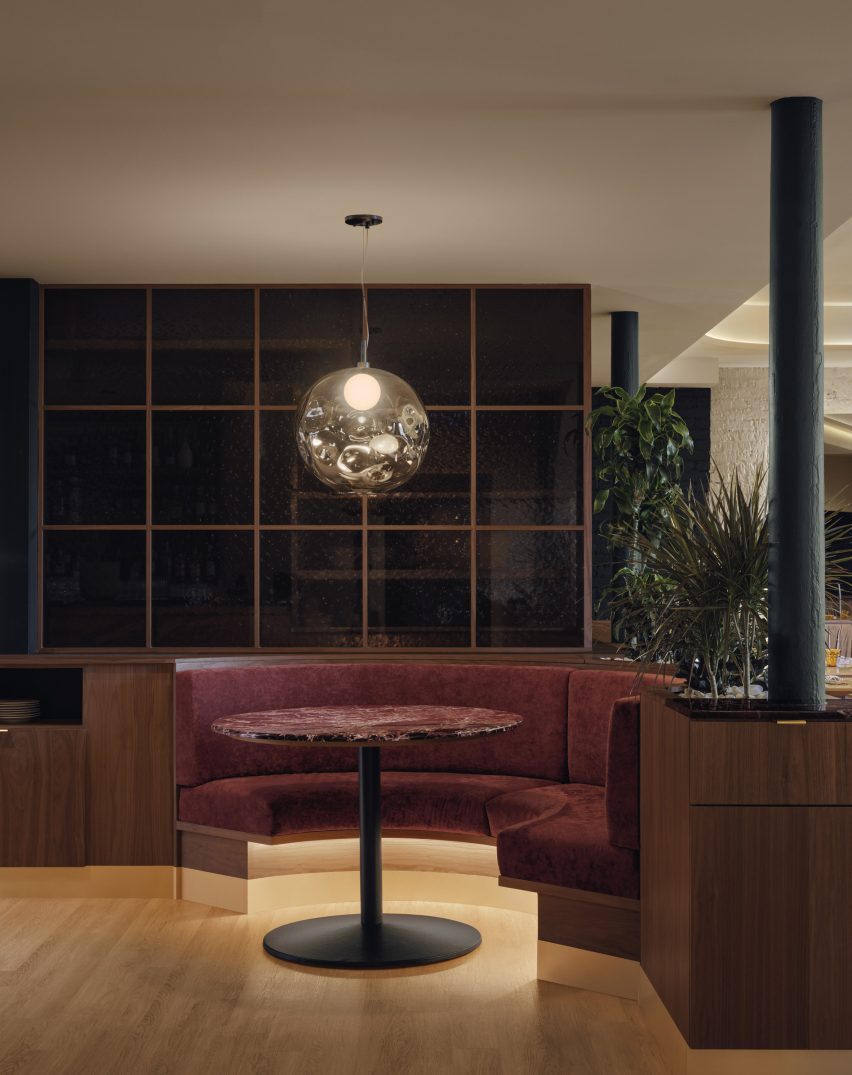
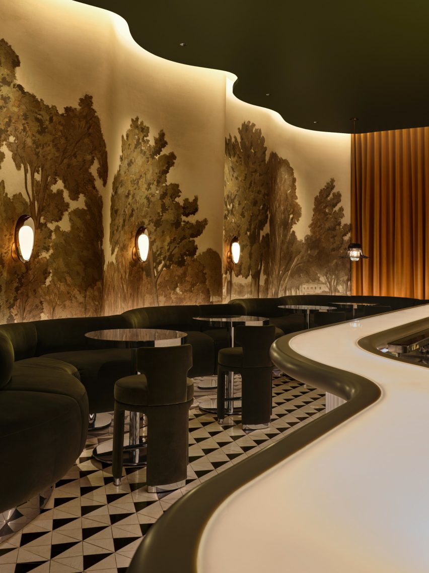
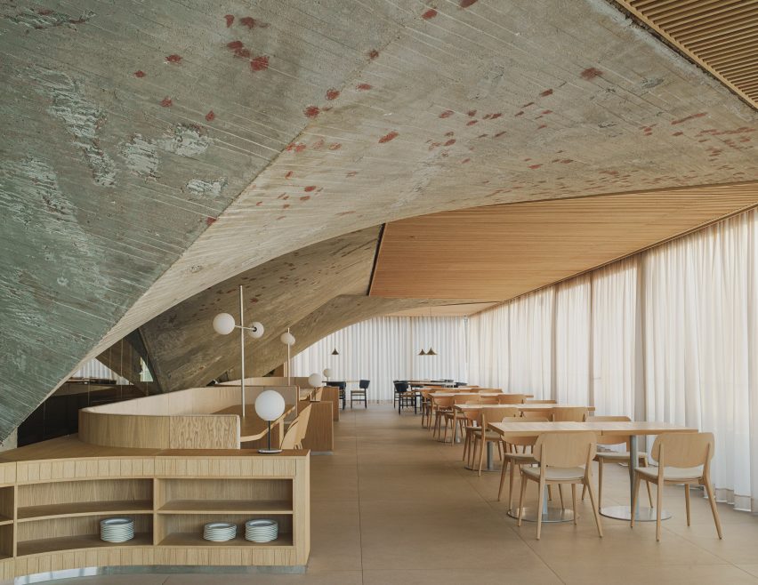
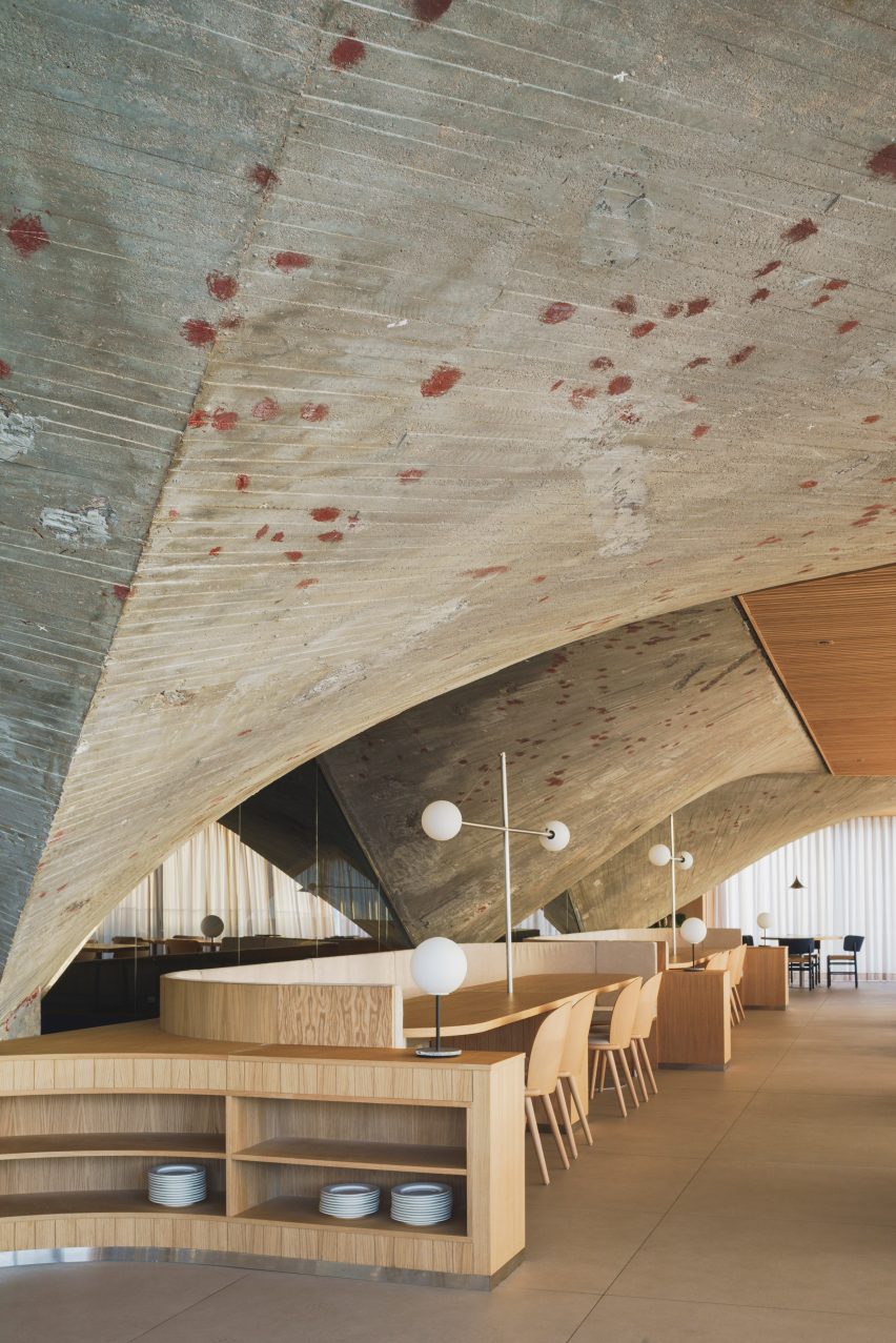
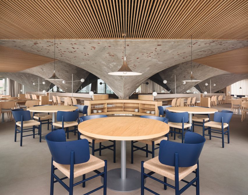
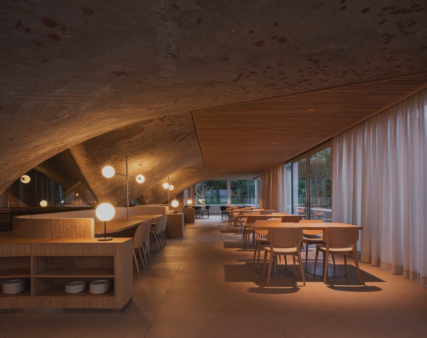
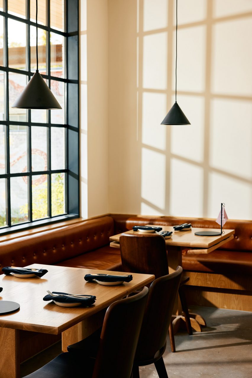
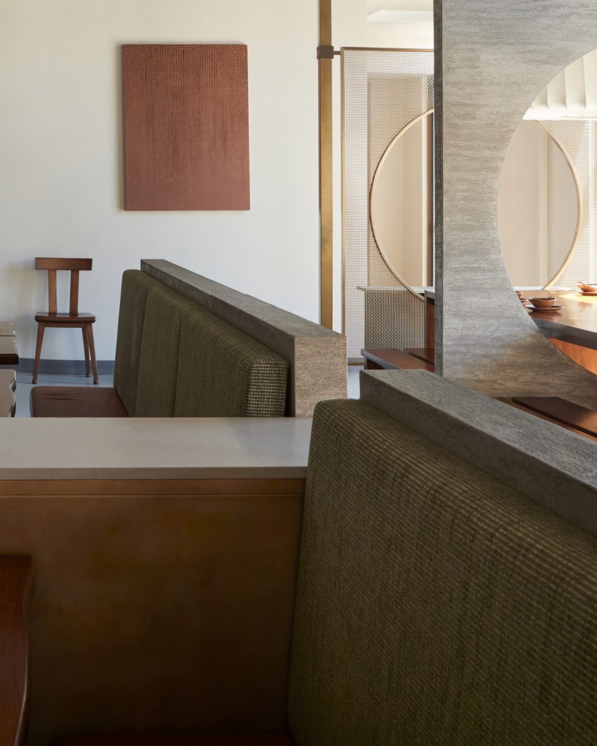
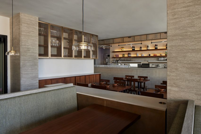
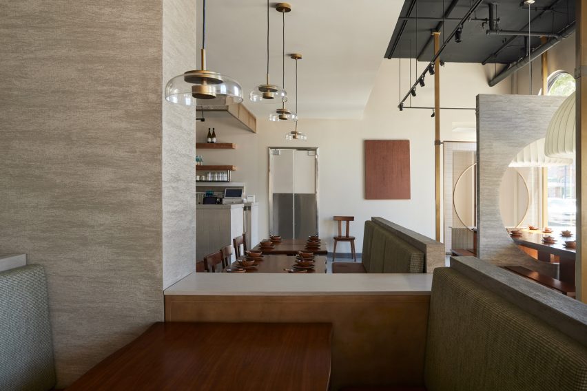
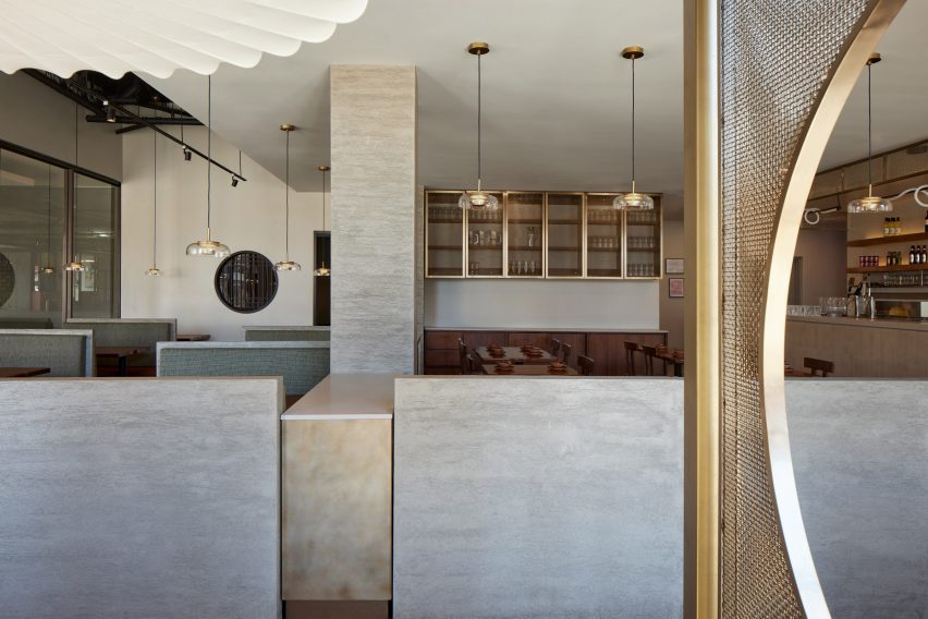
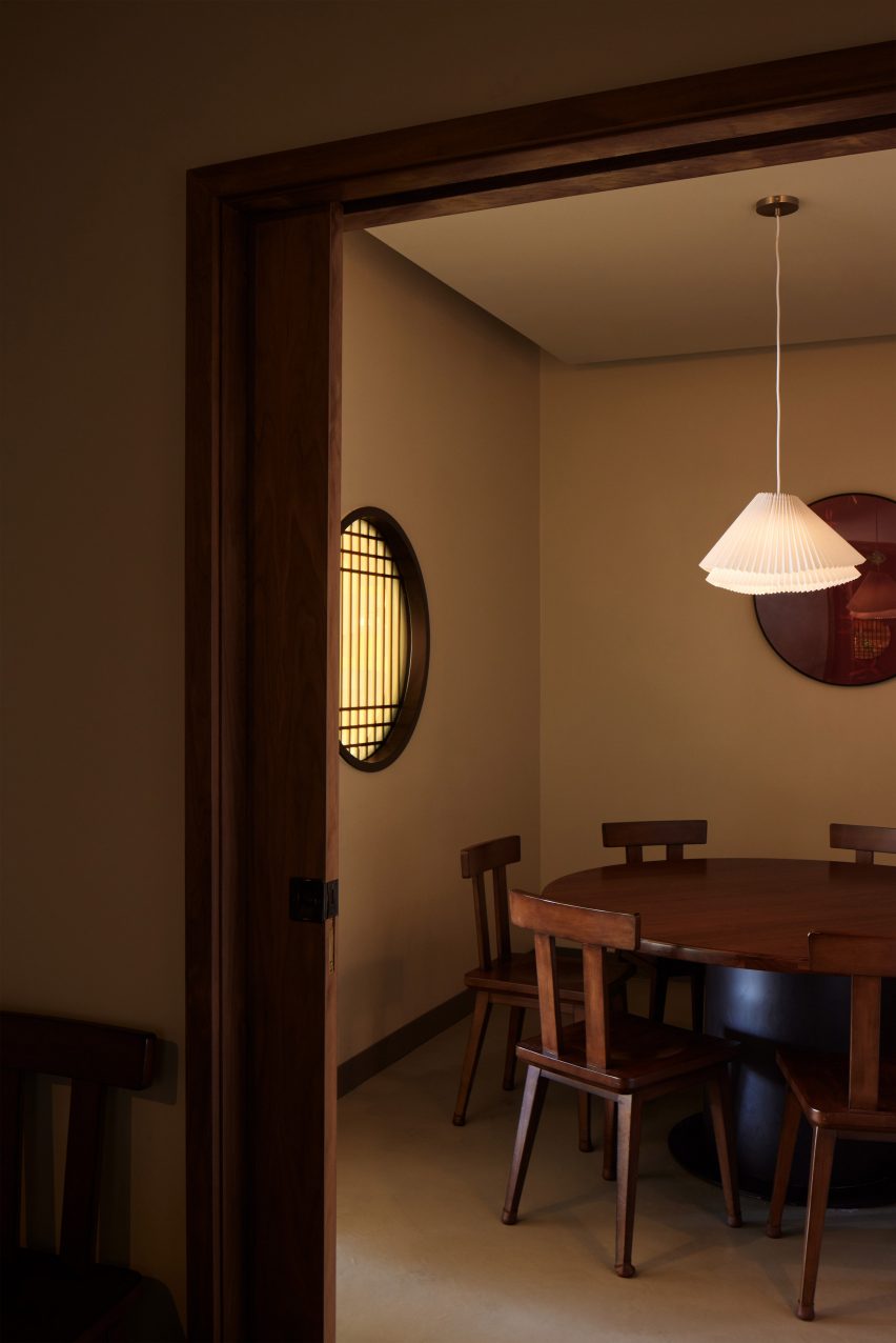
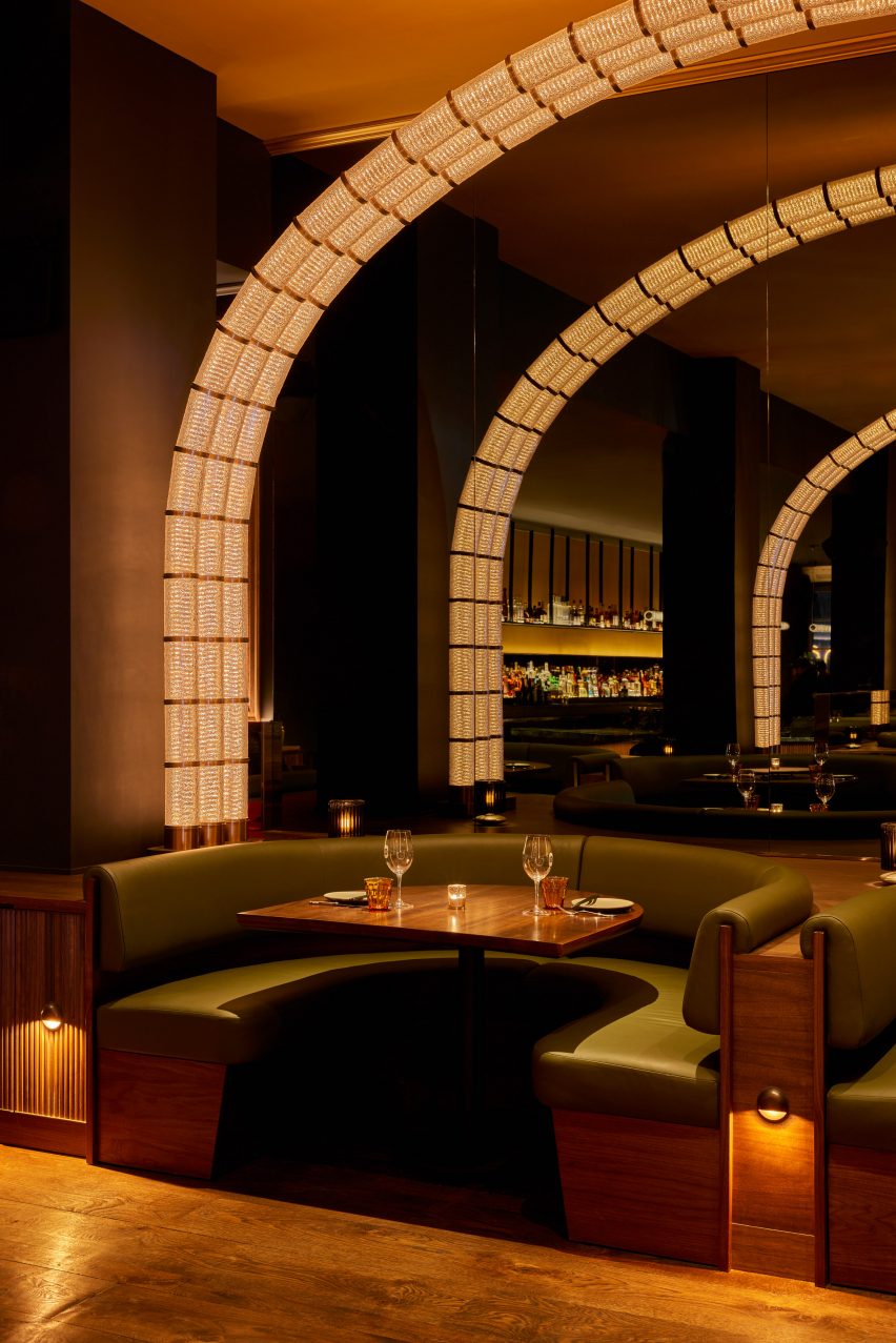
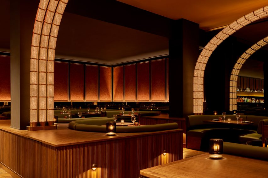
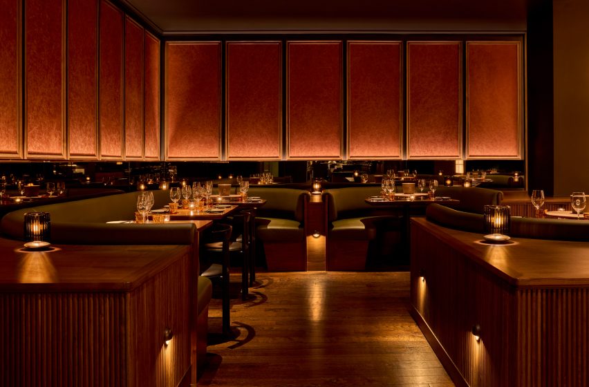
The main dining area is formed by a series of green leather and dark walnut booths on either side of a central walkway.

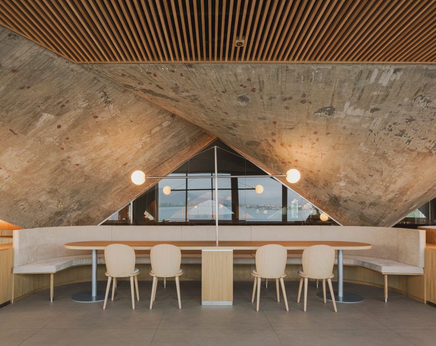
A series of illuminated arches soar overhead, formed from rippled glass and bronze modules that resemble bubbling oil in a deep-fat fryer.

Champagne collection displayed in glass cases with bubble-like lightingChampagne collection displayed in glass cases with bubble-like lighting
The restaurant’s extensive champagne collection is displayed in glass cases with bubble-like lighting

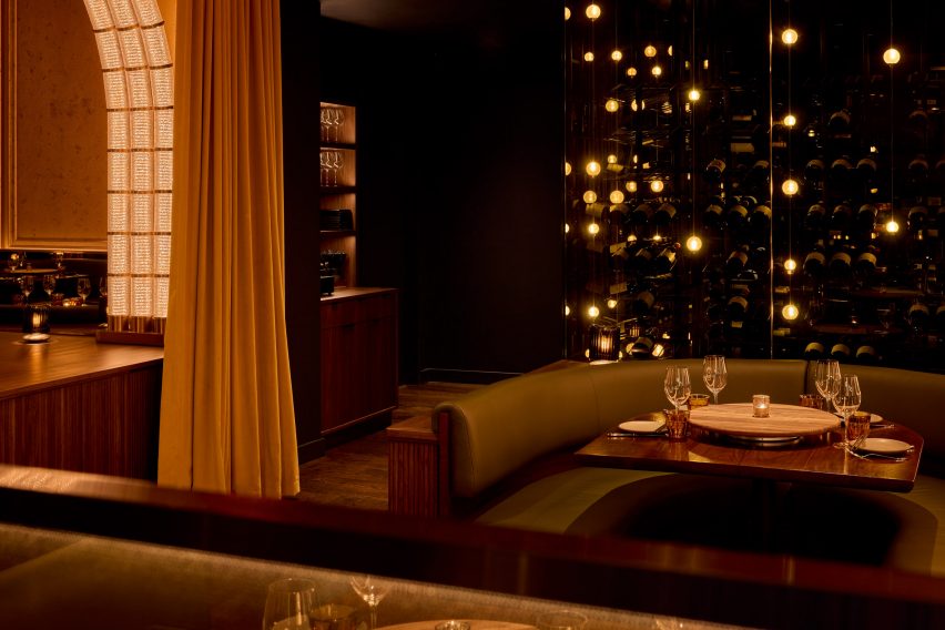
At the end of this procession, a mirrored wall reflects glowing arches and creates the illusion of doubled space. Meanwhile, plaster wall panels feature a crackled effect, nodding to the crispy skin of the fried chicken.

“The material palette was driven by a desire to surround diners in an envelope of warmth, creating a joyful place to be at any time,” Rockwell said.

Rockwell Group creates atmospheric interiors for Perelman Center in New York

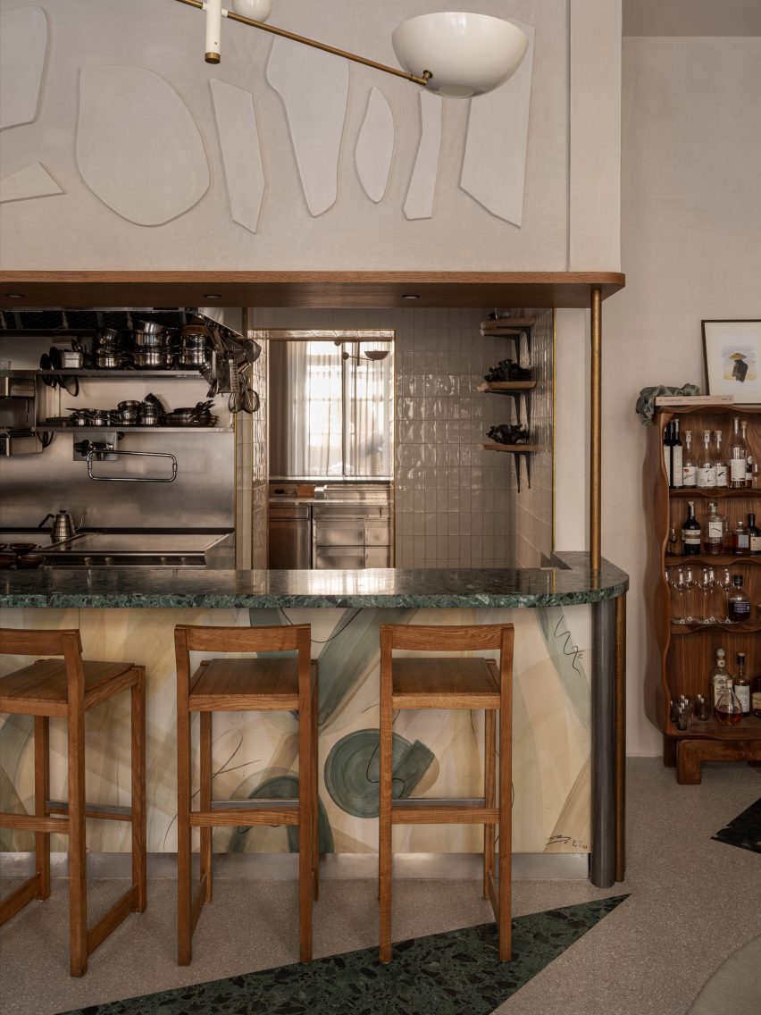
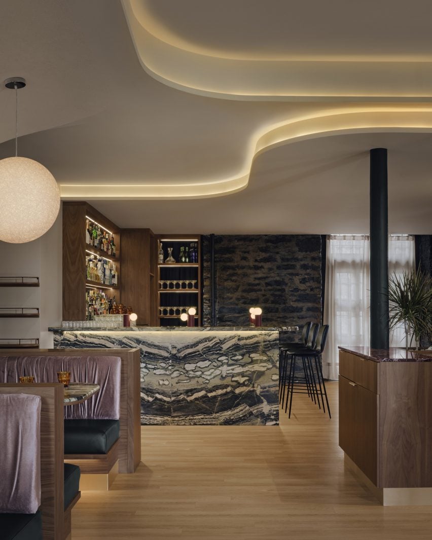
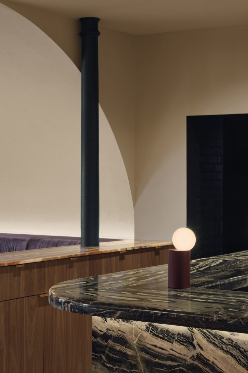
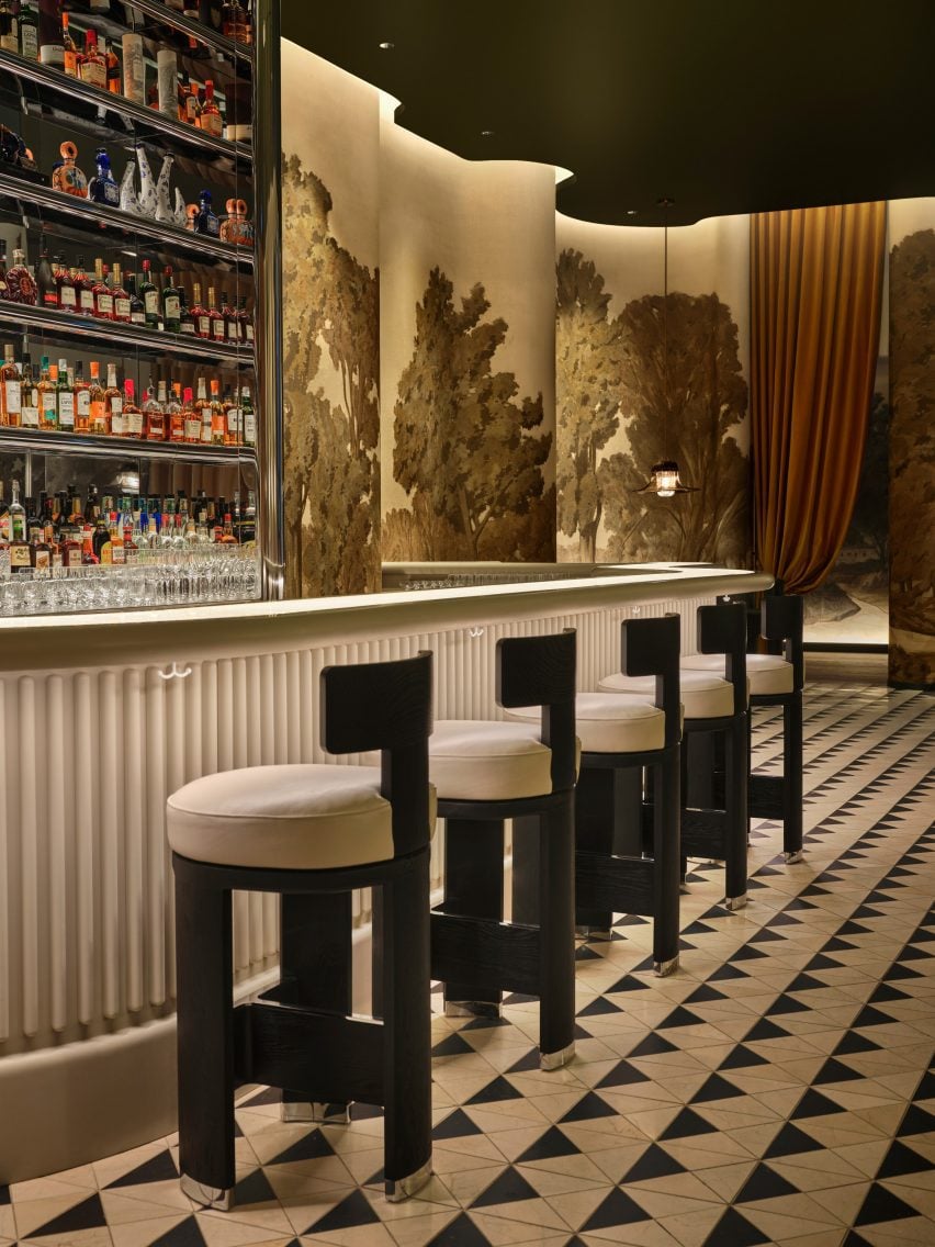
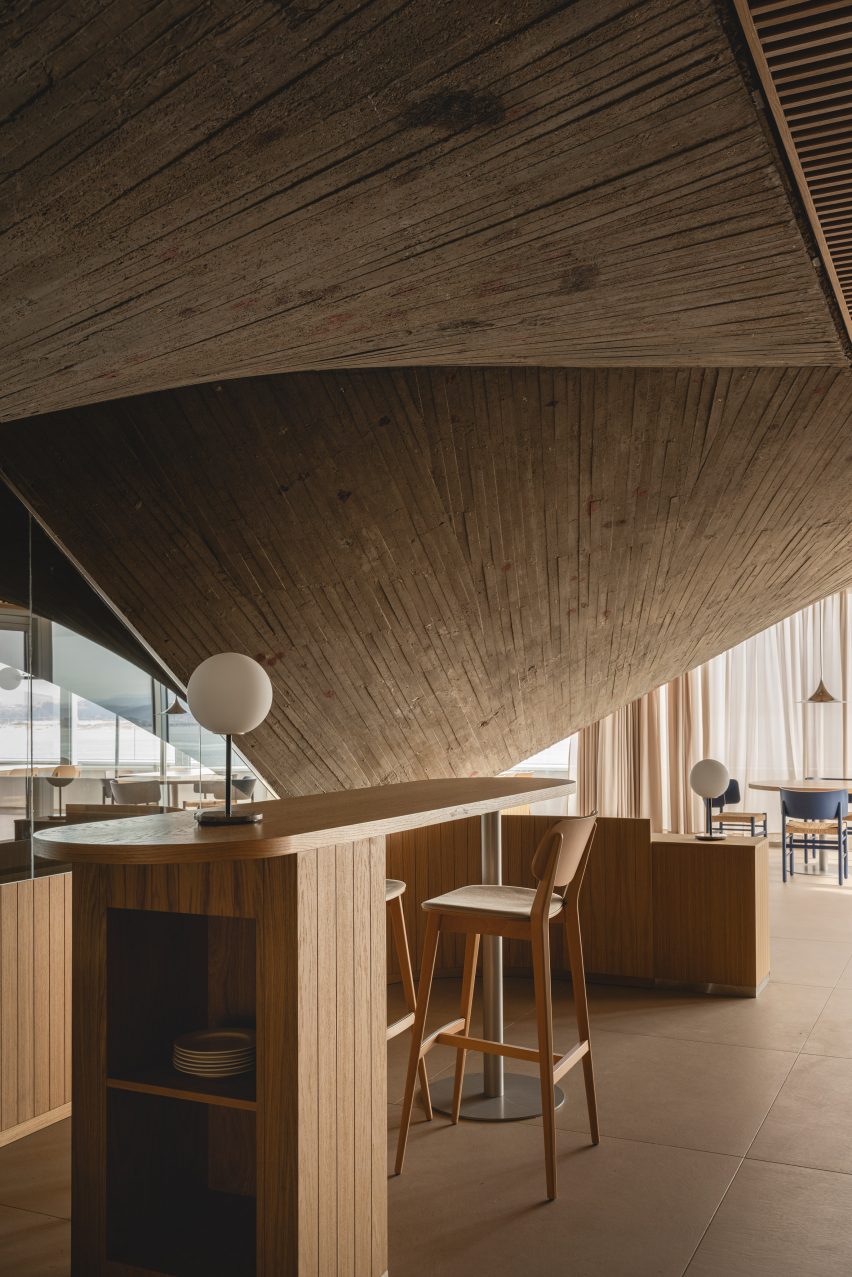
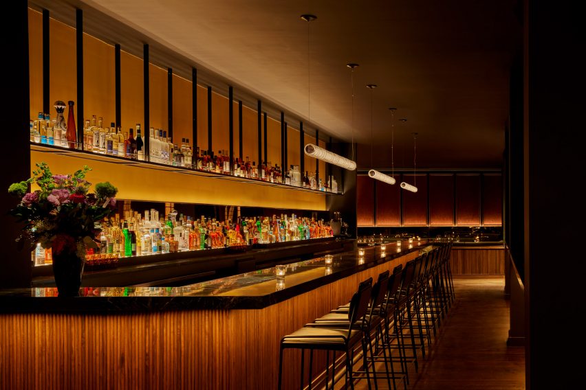
Additional booth seating to one side is followed by the long bar, topped with black soapstone, fronted by tambour wood and backed by a luminous black liquor shelf.

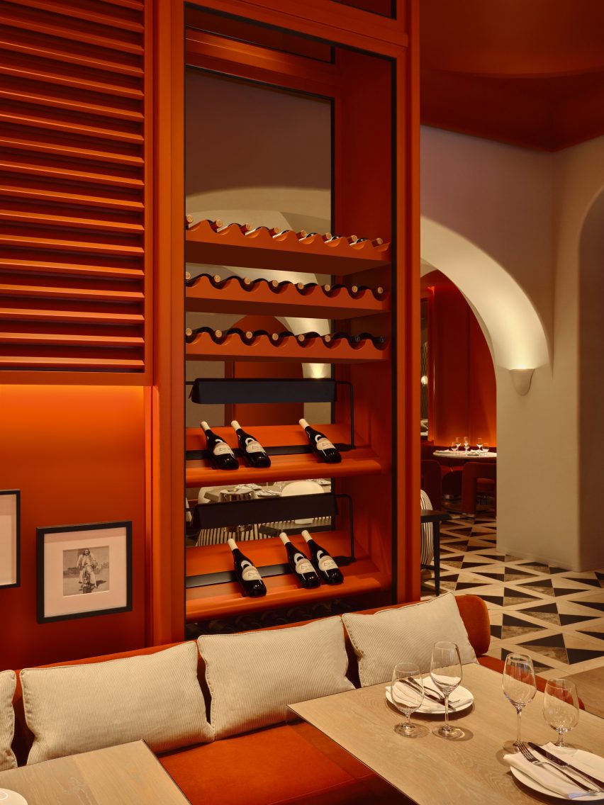
The restaurant’s extensive champagne collection – which it claims is the largest in America – is displayed inside glass cabinets installed with globe-shaped lights that look like giant bubbles.

Area with high-top tables reserved for walk-in dinersArea with high-top tables reserved for walk-in diners
At the front of the restaurant is an area with high-top tables reserved for walk-in diners

“Simon and I share the belief that the most important thing about restaurants is how they ritualise coming together for a shared, celebratory experience and Coqodaq provides the perfect template for that,” said Rockwell.

Since Tony Award-winning designer founded his eponymous firm in New York 40 years ago, the studio has grown to a 250-person operation with additional offices in Los Angeles and Madrid.

Hand-washing station with leathered soapstone basins and rings of light aboveHand-washing station with leathered soapstone basins and rings of light above
Upon arrival, guests are encouraged to wash their hands in leathered soapstone basins

Among Rockwell Group’s recent hospitality projects are the Metropolis restaurant and lobby spaces at the Perelman Arts Center (PAC NYC) and Zaytina inside the Ritz-Carlton Hotel.

We’ve featured a few fried chicken restaurants recently, including a 1960s-influenced spot in Los Angeles and a neon-illuminated eatery in Calgary.

The photography is by Jason Varney.

Reference

Inflatable restaurant in Winnipeg
CategoriesInterior Design

Pearce+ create temporary sub-zero restaurant in Canada

UK architecture studio Pearce+ and Canadian designer Joe Kalturnyk have created a temporary inflatable restaurant for subzero temperatures in Winnipeg, Canada.

The barrel-vaulted restaurant has space for 48 guests dining in temperatures as low as -30 degrees Celsius during the 10th annual RAW:almond fine dining food festival, which celebrates both Canadian cuisine and the harsh winter.

Inflatable restaurant in WinnipegInflatable restaurant in Winnipeg
The temporary restaurant was designed by Pearce+

Each year, the food festival commissions the construction of a temporary structure that responds to its environment and incorporates sustainable reuse.

“[The shelter] mirrors the ethos of the food served within by minimizing waste, discovering elegance in simplicity, creatively celebrating local identity, and incorporating a global outlook,” said the team.

Vaulted dining roomVaulted dining room
It featured a vaulted dining room

Pearce+, based in Herfordshire and London, constructed the 220-square metre (2,370-square foot) restaurant in just a few weeks, and it was in use for 22 days early in 2024.

The snow-surrounded structure had a cruciform plan with a 140-square metre (1,500-square foot) vaulted dining room that contained two linear tables.

Custom inflatable restaurantCustom inflatable restaurant
Pearce+ developed custom inflatable panels

Employing a Diagrid framework, the vault was constructed from 18-meter-long, 15-millimetre reinforced steel bars.

“These bars were bundled in groups of three, with varying plywood spacers, to create exceptionally lightweight trusses,” the team said.

Reflective foil interior panelsReflective foil interior panels
Interior diamond-shaped panels featured a reflective foil layer

The team – with the help of inflatable specialists at Inflate Ltd – developed custom inflatable panels that mitigated the potential pressure to decrease the cold temperature’s lower air density. It was stretched over the framework.

The diamond-shaped panels featured a gold-coloured foil layer that reflected heat into the space.

Restaurant entranceRestaurant entrance
Festival goers entered through a smaller vaulted lobby tunnel

Along the ridge line, the gold panels were swapped with transparent ones, offering a view to the snowy sky.

The panels were connected with Velcro – rather than glue due to the extreme temporal variation – and were disassembled and stored for future uses.

Rectangular kitchenRectangular kitchen
Directly across from the entrance was the rectangular kitchen

Capping each end of the dining area were trapezoidal buttressing structures, designed to resist strong winds and offer emergency egress.

Festival goers entered through a smaller vaulted lobby tunnel at the centre of the plan. A gabled wooden vestibule transitioned into the dining area.

Directly behind the structure was the rectangular kitchen.

Separated by a small hallway, the kitchen was constructed with a Structurally Insulated Panels (SIP) flat-pack and outfitted with high-quality appliances.

Rectangular dining tableRectangular dining table
Rectangular dining tables featured inside

The structure was meant to be a demonstration of ways to conserve space by utilising temporary structures.

“I think it’s necessary to start re-envisioning how we use space, for what and for how long,” said RAW:almond co-founder Joe Kalturnyk.

“In the beginning I was interested in seeing if you can temporarily build a city within a city – and what better way to test the idea than with food? RAW:almond was a huge leap – would people embrace the winter and eat outdoors? Would they do it on a frozen river? And ultimately, could we even pull this off?”

In 2015, the RAW:almond pop-up restaurant was constructed on the surface of a frozen river with an X-shaped plan lying over the connection between the Assiniboine and Red rivers.

Pop-up restaurant interiorPop-up restaurant interior
The restaurant was designed for subzero temperatures

Also in Winnipeg, Canadian studio KPMB revealed a horticultural centre with a Fibonacci spiral roof.

The photography is by Simeon Rusnak.

RAW:almond 2024 took place from 24 January to 18 February. For more events, talks and exhibitions involving architecture and design visit Dezeen Events Guide.


Project credits:

Project founders: Joe Kalturnyk & Mandel Hitzer
Architect/designer: Pearce+ and Joe Kalturnyk
Architect of record: AtLrg Architecture
Project management: Joe Kalturnyk
Structural engineers: Wolfrom Engineering
Inflatable specialists: Inflate
Visualisations: Pearce+
Construction: RAW:Almond team, Pearce+ and Hi-Rise

Reference

Restaurant and bar in Durham, North Carolina
CategoriesInterior Design

North Carolina practice Sundholm Studio revamps Durham restaurant

Interiors practice Sundholm Studio has refreshed the 30-year-old Nanas restaurant in Durham, North Carolina, with strong colours, bespoke timber joinery and metalwork.

Previously named Nana’s, the restaurant was renamed Nanas, in tribute to “not one nana, but rather the entire genre,” Sundholm Studio creative director Shaun Sundholm told Dezeen.

The space – intended to capture the hospitable “spirit of grandmothers” – comprises a bar, salon, dining room and an outdoor patio.

Restaurant and bar in Durham, North CarolinaRestaurant and bar in Durham, North Carolina
Navy fluted walls form the backdrop to the salon

Sundholm’s aim was to update the space with “modern details that bring the outside in”.

The existing curved walls in the entryway were retained and reworked with wooden slats, which light passes through to evoke “a walk through the woods”.

Wooden window blinds and sheer drapes in the dining room help with acoustic absorption and adjusting the natural light levels.

Restaurant and bar interiors in Durham, North CarolinaRestaurant and bar interiors in Durham, North Carolina
The seating is a mixture of banquette booths and chairs

The dimly lit entrance was contrasted with the bar, dining area and salon, where jewel-toned colours like emerald green, sapphire blue, and rich amber orange have been used.

“I aimed to pay homage to aspects of the previous design where possible, accentuating some of the interesting bits of the existing physical space, such as the curved wall at the entrance and the hints of orange throughout – recalling the bright, blaze orange walls of the past,” Sundholm explained.

In line with the jewel-toned colour palette, Sundholm selected a variety of textures to use across the restaurant, including glossy green handmade Italian tiles and brass finishes.

Blue velvet upholstery covers the banquettes in the bar, while “vintage luggage” orange leather covers the banquettes in the salon and dining area.

Nanas, Durham, North Carolina, USA, by Sundholm StudioNanas, Durham, North Carolina, USA, by Sundholm Studio
The dark entrance leads into a curved passage, through to the dining room

Brass archways designed by local metal art studio Andrew Preiss Designs feature across the restaurant, including as a portal between the salon and dining area. This arch motif is echoed in the bathroom mirrors.

Earth-toned grasscloth wallpaper and a plaid-patterned carpet contrast the solid colours and textures.

“For this restaurant, our initial mood boards culled from a diverse range – from The Golden Girls and vintage Ralph Lauren textiles to 1970s Cadillacs and abstract impressionist art inspired by the Smoky Mountains,” Sundholm said.

Nanas bar and restaurant in Durham, North Carolina, USANanas bar and restaurant in Durham, North Carolina, USA
Bold colour is used for the restaurant seating

The studio’s goal was to “distill these inspirations into their core elements” and use them to inform the interiors in a “non-gimmicky” way.

A collection of mixed-media artworks by local artist Jason Craighead featured across the restaurant add to this aesthetic.

Tartan carpet introduces a pattered counterpoint to the block colours

Other recently renovated restaurants featured on Dezeen include Aino and Alvar Aalto’s Savoy restaurant in Helsinki restored after 80 years and The Bird in Montauk designed by Home Studios.

The photography is by Lissa Gotwals and D L Anderson.

Reference

Terrazzo floor at Persona
CategoriesInterior Design

Erik Bratsberg fills Persona restaurant with tactile materials

Interior designer Erik Bratsberg has created unique artwork for the interior of the Persona restaurant in Stockholm, which also features asymmetrical terrazzo and patinated brass details.

Bratsberg, who worked in finance before moving into interior design, wanted the fine dining restaurant in Stockholm’s upmarket Östermalm neighbourhood to have a warm and welcoming feel.

Terrazzo floor at PersonaTerrazzo floor at Persona
Persona is located in Stockholm’s Östermalm area

“The inspiration is drawn from a mix of personal experiences, subconscious imprints from admired styles, particularly mid-century Italian design, and a desire to integrate a homely warmth into a hospitality environment,” he told Dezeen.

“The design philosophy centres around creating a timeless, inviting space that enhances the dining experience while maintaining a sense of personal touch and intimacy.”

Bar in Stockholm restaurantBar in Stockholm restaurant
Green tones feature throughout the interior

Green hues are used throughout Persona‘s 120-square-metre interior, complementing its cream-coloured walls and numerous wooden furniture pieces and panelling.

“Green is my go-to when I want to arouse a sense of calmness and comfort,” Bratsberg explained.

Soft white chairs in front of curtained windowSoft white chairs in front of curtained window
Designer Erik Bratsberg used furniture pieces with rounded and organic shapes

“It’s a tertiary colour, a mix of a cold and a warm colour, which allows it to go well with both warmer and colder hues and materials – a yin and yang of colours somehow,” he added.

“Green also brings the mind to nature and I guess my love for green relates to the joy of seeing the leaves back on the trees after a long Swedish winter.”

Wood-panelled wall in Östermalm restaurantWood-panelled wall in Östermalm restaurant
“Honey-tinted” oak shelving is filled with crockery and art

The restaurant, which feels more like a living room than an eatery in parts, also features plenty of natural materials such as stone and wood, which are interspersed with terrazzo and brass to create tactile interest.

This material mix was chosen to evoke a sense of “casual elegance”, Bratsberg said.

“For the floor I played around with the possibilities of terrazzo, using shades of green and warm greys and whites forming an asymmetrical pattern,” the designer explained.

Bratsberg clad the walls of the Persona restaurant in an off-white plaster with a mottled surface, designed to contrast the “silky honey-tinted oak” used for the wall shelving and tables.

“Patinated brass together with details in yellow ochre acts as an accent,” Bratsberg added. “Sheer curtains, patinated leather and textured textiles round it all off.”

Living-room like corner in Persona eateryLiving-room like corner in Persona eatery
Bratsberg created his own artworks for the restaurant

Custom-made abstract artworks also decorate the interior. Bratsberg made these himself from watercolour paintings that he had made, which were then screen-printed onto acoustic panels.

“In my multidisciplinary practice I strive to interrelate my art, design and interior work – why not make a lamp into sculpture, or a bar front as a painting, or a plain wall a relief?” Bratsberg said.

Jagged shapes decorate Stockholm restaurantJagged shapes decorate Stockholm restaurant
Cut-out geometric details add extra interest to the bar

Also notable in the interior is the variation of shapes, with the angular tables and counters contrasting against round and jagged lamps, cut-out geometric details and smaller tables made from organically shaped burl wood and stone.

“Perfectly straight lines and symmetry bring order and calmness for the eye, but never have I been particularly intrigued by squares and straight lines,” Bratsberg said.

“On the other hand, too much asymmetrical geometries and organic shapes can bring the feeling of disorder. But balancing the two – as with many opposites or contrasts – can create an interesting harmony,” he added.

Bathroom of Persona restaurantBathroom of Persona restaurant
The bathroom features undulating mirrors and a mix of different shapes

In the bathroom, undulating mirrors match a wavy sink and are juxtaposed against square wall niches and angled, jagged cut-out wall decorations.

“Forms, lines, colours and materiality speak to us in mysterious ways, but an interior without any sculptural form and asymmetries is like a language without exclamation marks, gestures or emotional expression to me,” Bratsberg concluded.

Other Stockholm restaurants with interesting interiors featured on Dezeen include an “unexpected” restaurant in a historic food hall and a decadent Italian restaurant located in a former cinema.

The photography is by Erik Lefvander.


Reference

Entrance to Hayat restaurant with marble host stand in foreground
CategoriesInterior Design

Ivy Studio installs colourful marbles in Montreal’s Hayat restaurant

Montreal-based Ivy Studio has chosen a variety of dramatic marble to outfit a Middle Eastern restaurant, which features a colour palette influenced by “the earthy tones of the Syrian deserts”.

In Montreal’s Old Port neighbourhood, the 1,500-square-foot (140-square metre) Hayat restaurant is designed to reflect the cuisine served by chef Joseph Awad.

Entrance to Hayat restaurant with marble host stand in foregroundEntrance to Hayat restaurant with marble host stand in foreground
The marble host stand at Hayat sets the tone for the restaurant’s Middle Eastern-influenced colour palette

“This Middle Eastern restaurant’s colour palette was inspired by the earthy tones of the Syrian deserts and their surrounding greenery,” said Ivy Studio.

Upon entering is a screen of black hammered-glass panels, which also conceals the kitchen in the far corner.

Dining room with marble topped tables, green chairs and cream wallsDining room with marble topped tables, green chairs and cream walls
In the main dining space, banquette seating runs along two walls below a fabric ceiling installation

In the main dining room, built-in benches form an L along two walls, while a pair of U-shaped booths sit against another that arches over them.

The seat backs are upholstered in mauve velvet and the cushions are wrapped in contrasting deep green leather.

Private booths positioned below an arched ceiling and behind a partition of black hammered glassPrivate booths positioned below an arched ceiling and behind a partition of black hammered glass
Private booths are positioned below an arched ceiling and behind a partition of black hammered glass

Closer to the kitchen is another small, semi-circular booth built into the walnut millwork.

Here the cushioned seats are covered in ruby-toned velvet, and a metallic light fixture is suspended above.

The bar counter made from teal, pistachio and cream-coloured marbleThe bar counter made from teal, pistachio and cream-coloured marble
The bar is made from a dramatic marble variety with streaks of teal, pistachio and cream colours

Ivy Studio selected a wide variety of striking, richly veined marbles, “each contributing their own touch of colour into the space” according to the team.

The bar is made from a dramatic stone with teal, cream and pistachio striations, while the host stand and dining table tops in the main area are purple and white.

A red-hued semicircular booth tucked into walnut millworkA red-hued semicircular booth tucked into walnut millwork
A red-hued semicircular booth is tucked into the walnut millwork close to the kitchen

The building’s exposed brickwork is painted cream to match the other walls, while the original historic stone between the large windows is left exposed.

“The ancient stone walls at the front and rear facades were left intact to showcase the building’s history,” Ivy Studio said.

Curved layers across the ceiling, which hide indirect lighting, are designed to evoke the smooth landscapes of the Middle East.

A fabric installation suspended above the dining tables curves around more strips of lighting, diffusing the light to create a warm glow.

Bar made from a dramatic marble variety with streaks of teal, pistachio and cream coloursBar made from a dramatic marble variety with streaks of teal, pistachio and cream colours
The bar is made from a dramatic marble variety with streaks of teal, pistachio and cream colours

Walnut, stone and cream walls are also found in the bathrooms, which echo the colour and material scheme throughout the restaurant.

“The overall intention of the palette was to bring together the worlds of Middle Eastern nature and Old Montreal construction,” the studio said.

Hayat restaurant by Ivy StudioHayat restaurant by Ivy Studio
The same material palette continues in the moody bathrooms

Ivy Studio has completed several interiors across Montreal that include colourful marble.

These include the Italian restaurant Piatti where the dark green stone contrasts the building’s rough walls and co-working office Spatial where purple surfaces pop against mint green millwork.

The photography is by Alex Lesage.


Project credits:

Architecture and design: Ivy Studio
Construction: Groupe Manovra

Reference

Arched metal gates leading to fountain Kaimakk Istanbul Airport designed by Sanayi313
CategoriesInterior Design

Totem-pole colonnade encloses Kaimakk restaurant at Istanbul Airport

A stone and glass fountain, totem pole-like columns and gilded arches characterise the Kaimakk bar and dining space by local studio Sanayi313 inside Istanbul Airport.

The 600-square-metre space was created by Sanayi313 as a place of refuge from the bustle of the airport.

“The challenge of this project was to create a place where people would feel secluded and relaxed in the hectic environment of one of Europe’s busiest airport terminals,” Sanayi313 founder Enis Karavil told Dezeen.

Arched metal gates leading to fountain Kaimakk Istanbul Airport designed by Sanayi313Arched metal gates leading to fountain Kaimakk Istanbul Airport designed by Sanayi313
Kaimakk is an Istanbul Airport restaurant designed by Sanayi313

Two large, L-shaped serving counters with canopies above enclose the seating space inside. Between the counters, an archway with intricate metalwork gates leads to a “frozen” fountain at the centre of the project.

The fountain was made from traditional travertine stone with individually made, mouth-blown glass pieces.

Kaimakk bar and dining area by Sanyayi313Kaimakk bar and dining area by Sanyayi313
A fountain made of stone and glass sits at the centre of the space

Completed in two stages, the fountain was first carved and assembled before contemporary Turkish glass artist Derya Geylani crafted the glass pieces to create the “frozen” expression.

According to Kaimakk’s Lian Beraha, the fountain “took shape from the idea of life, joy, abundance and the eruption of cream”.

Mouth-blown glass pieces in fountain by Derya GeylaniMouth-blown glass pieces in fountain by Derya Geylani
Mouth-blown glass pieces were made by Turkish glass artist Derya Geylani

Surrounding the fountain, a series of tall archways are supported on sculptural, totem-pole-like  columns that form a colonnade enclosing the restaurant.

“The studio stacked a variety of recurring forms into totem-like pillars with gold discs between them and placed arched blocks on top, as if playing with Lego,” Karavil explained.

“Each arched unit is equipped with built-in blinds made of translucent material to diffuse the light transmitted into the space at different times during the day,” he continued.

“Coated in micro-topping, the four-metre-high structure pays homage to the architecture and stoneworks in the Turkish city of Mardin.”

Tall totem pole-like columns throughout Kaimakk by Sanayi313Tall totem pole-like columns throughout Kaimakk by Sanayi313
Large sculptural columns and arches are a recurring motif throughout the project

This idea of drawing upon heritage was central to the concept behind the project, which, according to Beraha, “draws inspiration from the traditional Mesopotamian culture” of places in southeastern Turkey like Mardin, Diyarbakır and Gaziantep.

“One of the key features of the project is the handcrafted mosaic floors incorporating an intricate geometrical pattern with stars,” Karavil described.

“It draws inspiration from the One Thousand and One Nights – a collection of Middle Eastern folktales also known as Arabian Nights.”

Columns and benches in dining area by Sanyayi313Columns and benches in dining area by Sanyayi313
Sanayi313 used a colour palette of beige, cream and gold

Built-in booth seating is positioned alongside barstools and a mixture of both round and rectangular marble-topped tables, with views out over the airport runway.

Other projects in Istanbul include Renzo Piano’s Istanbul Modern museum wrapped in a facade of “evocative fish scales” and an Apple Store by Foster + Partners that is characterised by two travertine walls.

The photography is by İbrahim Özbunar.

Reference

Neutral-toned dining room with dramatic vaulted ceilings and a checkered floor
CategoriesInterior Design

Studio Paolo Ferrari designs Toronto restaurant as a “world unto itself”

Toronto-based Studio Paolo Ferrari has created cinematic interiors for a restaurant in the city’s Downtown area, combining influences from filmmakers that range from Stanley Kubrick to Nancy Meyers.

Unlike a typical restaurant layout, Daphne unfolds as a series of rooms with distinct identities, each borrowing references from different cinema styles.

Neutral-toned dining room with dramatic vaulted ceilings and a checkered floorNeutral-toned dining room with dramatic vaulted ceilings and a checkered floor
Daphne is laid out across several spaces, including a Great Room designed to feel like Nancy Meyers movie

Studio Paolo Ferrari intended each space to offer a different experience for guests, and custom-designed all of the furniture and lighting for the restaurant to make it feel even more unique.

“Daphne is an elevated and exceedingly creative take on the American bistro, fusing the nostalgia of New England prep with wonder and eccentricity,” said Studio Paolo Ferrari. “At once intimate and grand, eccentric and sculptural, convivial and experimental, the deeply imaginative space is reminiscent of a great residence that’s evolved over time.”

Burnt orange dining area with a wavy banquetteBurnt orange dining area with a wavy banquette
Studio Paolo Ferrari designed custom furniture and lighting throughout the restaurant

Guests arrive into an intimate space that features a transparent full-height wine cabinet, which offers glimpses of the dining area beyond.

They then move through to the Great Room, a cavernous room framed by a dramatic vaulted ceiling and decorated in a warm neutral palette.

Dining room fully enveloped in a burnt orange hueDining room fully enveloped in a burnt orange hue
The Drawing Room is fully enveloped in a burnt orange hue

Through the centre is a line of dining tables, each paired with a rounded striped sofa and two boucle-covered chairs.

The open kitchen is fully visible through the arches on one side, while a darker, cosier dining area coloured a burnt orange hue runs along the other.

A mirrored corridor with a hand-painted landscape muralA mirrored corridor with a hand-painted landscape mural
A mirrored corridor with a hand-painted landscape mural leads to a separate bar area

“The grand space is reminiscent of the warmly luxurious spirit of a Nancy Meyers film, with custom furnishings that are deeply residential in feel and varsity-inspired checkerboard tiling,” said Studio Paolo Ferrari.

The Drawing Room beyond continues the burnt orange colour, fully enveloping the walls, ceiling and seating upholstery to create a monochromatic space.

Bar with wavy walls and green banquetteBar with wavy walls and green banquette
The mural continues across the wavy walls of the bar room and green banquette seating follow the curves

Cove lighting is installed behind louvres that cover the upper walls, adding texture and shadows as well as hint of “Cape Cod Americana”.

The bar area is reached via a long corridor that’s mirrored from floor to ceiling along one wall, and is lined with a hand-painted landscape mural across the opposite side.

Bar with glass countertop and fluted frontBar with glass countertop and fluted front
The glass bar countertop is illuminated from within, while the counter front is fluted

This verdant rural scene continues across the wavy surfaces in the bar room, above green banquettes that follow the flow of the wall.

“Daphne is a world unto itself, awaiting discovery,” the studio said. “Stepping into the bar is almost akin to stepping into an exquisitely-designed film set.”

The snaking glass-topped bar counter is illuminated from within, as a nod to the bar in the fictional Overlook Hotel from Stanley Kubrick’s movie The Shining.

The counter front is fluted in reverence to Beaux-Arts architect Henry Bacon, while reflective stainless steel across the back bar matches the circular tables and chair feet in the room.

Outdoor dining area between two brick buildingsOutdoor dining area between two brick buildings
An adjacent dilapidated building was razed to create an expansive outdoor terrace

A dilapidated building adjacent to the restaurant was demolished to make way for an expansive outdoor Garden Terrace with a dining area and bar.

Sandwiched between two brick structures, this exterior space features comfy yellow and white-striped seating surrounded by plants, and a row of tall trees in the centre – continuing the botanical theme from inside.

Yellow and white-striped seating running along a brick walYellow and white-striped seating running along a brick wal
Plants behind the yellow and white-striped seating continue the botanical theme from inside

A separate entrance from the street leads guests between tall columns clad in dark blue-purple iridescent tiles into the alley-like space.

“It was important that the space had depth and a quality of experimentation,” said Paolo Ferrari, founder of his eponymous firm. “Daphne is truly an active experience of discovery, where guests can uncover thoughtful and innovative details throughout.”

Columns of blue-purple iridescent tiles form a gateway into an alley-like outdoor terraceColumns of blue-purple iridescent tiles form a gateway into an alley-like outdoor terrace
Columns of blue-purple iridescent tiles form a gateway from the street into the alley-like outdoor terrace

The designer’s earlier projects in Canada have included a lake house with wood and granite interiors, and a showroom for a development in Ottawa that appears more like a home than a sales gallery.

Other recent additions to Toronto’s dining scene include Prime Seafood Palace, which features a vaulted-wood interior by Omar Gandhi Architect.

The photography is by Joel Esposito.

Reference

Interior of brutalist Cantabrian Maritime Museum restaurant in Spain by Zooco Estudio
CategoriesInterior Design

Zooco Estudio unveils Cantabrian Maritime Museum restaurant

Madrid-based Zooco Estudio has created a striking restaurant within the Cantabrian Maritime Museum in Santander, Spain, that celebrates the building’s brutalist architecture.

The restaurant is set within a dramatic vault of concrete paraboloids that were unearthed during the renovation, while a slatted timber ceiling pays homage to the area’s shipbuilding legacy.

Interior of brutalist Cantabrian Maritime Museum restaurant in Spain by Zooco EstudioInterior of brutalist Cantabrian Maritime Museum restaurant in Spain by Zooco Estudio
Zooco Estudio added a restaurant to the second floor of the Cantabrian Maritime Museum

Overlooking the tranquil waters of Santander Bay, the restaurant is located on the second floor of the landmark Cantabrian Maritime Museum, which was designed in the mid-1970s by architects Vicente Roig Forner and Ángel Hernández Morales.

The paraboloids were an original fixture of the structure and supported the roof of what was once the museum’s patio.

Interior of brutalist Cantabrian Maritime Museum restaurant in Spain by Zooco EstudioInterior of brutalist Cantabrian Maritime Museum restaurant in Spain by Zooco Estudio
Oak details were designed to contrast the restaurant’s concrete arches

The studio focused on restoring the historic fabric of the space and reviving the paraboloids, which had been concealed for around 20 years, as “a vestige of the past”.

“In 2003, the building was renovated and as part of this intervention, the paraboloids were covered with a new roof and the space between them and the perimeter of the building was closed with glass, generating a covered space where there was previously a terrace,” Zooco Estudio co-founder Javier Guzmán told Dezeen.

“We wanted the concrete paraboloids to be the absolute protagonists of the space and by removing the paint and the coating, the paraboloids are visible again and regain their full prominence.”

Interior of brutalist restaurant in Spain by Zooco EstudioInterior of brutalist restaurant in Spain by Zooco Estudio
The renovation exposed the raw concrete surface of the paraboloids

The previous renovation also altered the dimensions of the space and reconfigured the volume as a square.

To promote symmetry, four additional concrete triangles were added to balance out the original paraboloids in the brutalist restaurant.

Timber ceiling panels and concrete paraboloids inside a brutalist restaurantTimber ceiling panels and concrete paraboloids inside a brutalist restaurant
Slatted wooden ceiling panels bridge the gaps between the arches

Overhead, a false ceiling of slatted timber panels frames the concrete arches.

The studio designed theses triangular boards to reference the arrangement of timber across the hull of a boat, a nod to the museum and the area’s nautical past.

The panels also serve the purpose of concealing the restaurant’s mechanical systems.

“The wooden slats bring warmth and friendliness to the space while allowing us to solve all the technical needs for air conditioning, heating and lighting, leaving them hidden,” Guzmán said.

“In this way, we ensure that all these elements do not interfere with the dialogue of concrete and wood, which are presented as continuous and clean elements.”

Dining tables overlooking views of the Santander bayDining tables overlooking views of the Santander bay
Walls of floor-to-ceiling glazing offer views across the bay

The interior layout was largely dictated by the low arches of the elliptic paraboloids that dominate the brutalist restaurant.

“The geometry of the existing structure conditions the space, because its height in its lower part is impractical, so a large bench is arranged around the entire contour that allows us to take advantage of that space and organise the distribution of the rest of the floor plan,” added Guzmán.

Concrete paraboloid and dining tables inside brutalist restaurant in Spain by Zooco EstudioConcrete paraboloid and dining tables inside brutalist restaurant in Spain by Zooco Estudio
Grey porcelain floors mirror the concrete paraboloids

Like the ceiling panels, the interior finishes and furnishings allude to the maritime history that the building commemorates.

“The use of wood and steel for all the furniture is reminiscent of the materials used in shipbuilding – the furniture has slight curvatures that are reminiscent of the aerodynamic shapes of boats,” explained Guzmán.

“Likewise, the lamps are inspired by the masts for ship sails.”

Dining tables at Cantabrian Maritime Museum restaurantDining tables at Cantabrian Maritime Museum restaurant
Zooco Estudio also designed the restaurant’s curved timber furniture

Another key change was the replacement of the perimeter glass wall.

The inclined glazing was swapped for vertical glass, a decision that reclaimed external space for the patio, which stretches the length of the restaurant and overlooks the harbour below.

“When we are inside, the feeling is the same as when we are inside a boat, there is only water around, and that is why we used clean glass from floor to ceiling, generating a perimeter terrace as happens on boats,” said Guzmán.

Terrace at Cantabrian Maritime MuseumTerrace at Cantabrian Maritime Museum
The terrace features green curvilinear outdoor furniture

Other projects by Zooco Estudio include a renovated house in Madrid and a co-working space with a kids’ play area in California.

The photography is by David Zarzoso.


Project credits:

Architect: Zooco Estudio
Construction:
Rotedama Constructora SL
Lighting: Zooco Estudio
Furniture: Zooco Estudio

Reference

The exterior of a small, modern grocery store
CategoriesInterior Design

Side Angle Side transforms Austin post office into restaurant

Texas architecture studio Side Angle Side has adapted a 1960s post office into a food market and restaurant in Austin.

Opened in October 2023 in the Hyde Park area, Tiny Grocer serves as a speciality market, bar and cafe while Bureau de Poste is a modern French bistro led by celebrity chef Jo Chan.

The exterior of a small, modern grocery storeThe exterior of a small, modern grocery store
Side Angle Side has transformed a 1960s post office into a food market and restaurant

Austin-based commercial and residential architecture firm Side Angle Side renovated the 3,500-square foot (325-square metre) 1967 US Post Office building and added a 1,500-square foot (140-square metre) outdoor dining patio.

“The Hyde Park U.S. Post Office was an important neighborhood hub in the 1960s – so we were especially careful to keep the integrity and spirit of the mid-century-utilitarian design,” Arthur Furman, founding partner of Side Angle Side, told Dezeen.

A grocery market with green shelvingA grocery market with green shelving
The team sought to preserve the building’s history as a community hub

“As the anchor tenant in the space, Tiny Grocer continues to be the centre of the community, a place to gather, shop, eat and drink.”

The shell of the white brick building was left intact, but the street-facing facade was previously used as a loading dock so the team transformed the back-of-house edge into a welcoming patio for the neighbourhood by removing the asphalt and adding two large live oak trees and a steel trellis and planters.

A bar in a grocery and marketA bar in a grocery and market
The exterior of the building was kept intact

A cast-in-place concrete banquette holds the edge of the patio that is paved with antique red brick.

The steel planter forms a boundary between the parking area and the dining space, while the other edge is held by a light grey-coloured stucco restroom building. White metal furniture from Isimar and Portofino was used to furnish the patio.

“The patio and wine garden is the real heart of the project,” the team said, mentioning that it wasn’t within the original scope of the project but added later when its larger value was realized. “This is where all the care and thought of the interior spills to the outside, creating a lively environment.”

Wooden tables in front of a black framed windowWooden tables in front of a black framed window
The renovated building has exposed concrete floors from the original building

On the interior, Side Angle Side complemented the original ceiling and open web joists with metal decking and industrial warehouse pendants by AQ Lighting. The polished concrete floors expose the weathered imperfections and show the history of the building.

Upon entering, shoppers take in the colourful selection of curated products displayed on white oak mercantile shelving. Green millwork hugs one wall and the space widens to an open interior plan.

A patio with white metal seating and plantsA patio with white metal seating and plants
A patio and wine garden is at the heart of the project

A central deli and coffee bar floats in the middle of the room and creates a transition from the market to the bistro. The bar is wrapped in Seneca terracotta tile and topped with grey and white quartz countertops. Wooden Soule barstools are tucked under the waterfall counter.

The back-of-house spaces hold a kitchen office, storage, and bar equipment.

“Working closely with the owner, design finishes hint at the building’s midcentury past,” the team said, referencing the custom, built-in leather banquette by Undercover Austin Upholstery that lines the bistro’s back wall.

Above the banquette and Second Chance Custom wooden dining tables hang black cone light pendants by All Modern.

A patio with white metal seatingA patio with white metal seating
The patio features brick flooring and white metal furniture

“The single biggest sustainable feature of this project is one that is often overlooked,” the team said, noting the adaptation of the structure. “The ‘loose fit, long life’ style of these old buildings leads to more reuse and far less waste.”

Recent adaptive reuse projects in Austin include a 1900s house converted to a luxury office by Michael Hsu and commercial units converted to an architecture studio by Baldridge Architects.

The photography is by Likeness Studio and Mackenzie Smith Kelly.


Project credits:

Structural engineer: Creative Engineering
MEP engineer: ATS Engineers
Builder: Archive Properties
Commercial interior design: Side Angle Side
Architects: Side Angle Side
Building shell: Thought Barn Studio
Landscape design: Side Angle Side & Wild Heart Dirt
Owner: Steph Steele


Reference

Restaurant interior with a pared-back palette
CategoriesInterior Design

Jialun Xiong creates intricate Sichuanese restaurant in LA

Subtle nods to traditional Chinese architecture can be found throughout this restaurant in California, designed by LA-based Jialun Xiong.

Sichuan Impression‘s third outpost, located in Alhambra, occupies a 2,000-square-foot (186-square-metre) space that “takes an elegantly pared-down approach to family-style dining”.

Restaurant interior with a pared-back paletteRestaurant interior with a pared-back palette
Jialun Xiong chose a pared-back palette for the Sichuan Impression interiors, creating a relaxed atmosphere

Jialun Xiong took an equally relaxed approach to the interiors, combining warm and soft colours with walnut furniture and metal accents.

“For Sichuan Impression, I chose a muted palette and natural materials to encourage guests to look a little longer and see the intricacies and textures that aren’t so obvious at first glance,” said Xiong.

A free-seating area beside a bar featuring walnut furniture and floating metal cabinetsA free-seating area beside a bar featuring walnut furniture and floating metal cabinets
A free-seating area beside the bar features walnut furniture and floating metal cabinets

The restaurant is roughly divided into four dining areas, each open to one another but defined by the style of seating.

To the left of the entrance is a sequence of partitions that alternate between heavy grey plaster and delicate metal mesh screens supported by antique brass frames.

Plaster partition separating different sections of the restaurantPlaster partition separating different sections of the restaurant
Plaster partitions separate the various sections of the restaurant

Each has a circular opening, which align to provide a continuous view along the minimalist walnut tables and benches that run along the same axis.

One table extends through an opening, accommodating larger parties when needed, and each compartment features an oversized, raw silk cloth light shade suspended above.

Restaurant interior with walls and screens of different heights and thicknessRestaurant interior with walls and screens of different heights and thickness
Walls and screens of different heights and thickness create a hierarchy of spaces

“The custom chandeliers nod to traditional Chinese lanterns and reflect Xiong’s skeletal furniture designs,” said the restaurant team.

In front of the bar is a free-seating space furnished with more wooden tables and chairs, which match the cabinetry against the far wall, while glass-fronted metal cabinets are mounted above.

A pair of chunky plaster-wrapped columns and low partitions separate a collection of booths with leather seats and upholstered cushioned backs on the other side.

The green fabric was chosen to resemble bamboo – a common material used in Sichuanese design.

Two rows of booth seating either side of a walkwayTwo rows of booth seating either side of a walkway
Booth seating is upholstered with a green fabric chosen to evoke bamboo

At the back of the restaurant is the private dining area, which can accommodate 16 guests altogether, or two groups of eight when a sliding partition is closed.

A circular window offers a glimpse into the private space, where the pared-back material palette is continued.

Private dining room with an intimate feelPrivate dining room with an intimate feel
A private dining room at the back has an intimate feel and can be spied through a circular window

“The secluded space is designed to feel like home with its bespoke circular dining table and ambient lighting,” said Xiong. “I believe good design doesn’t always have to be instantly recognisable, it can simply blend in.”

Xiong, who is originally from Chongqing, has also completed the retro-futuristic Chinese restaurant 19 Town close to Downtown LA. The designer recently showed her furniture and lighting pieces as part of the INTRO/LA showcase in November 2023, and at the Alcova exhibition during Art Basel in Miami in December.

Reference