an ethereal lightness takes over studio gameiro's VAULT apartment in lisbon
CategoriesArchitecture

an ethereal lightness defines studio gameiro’s the VAULT in lisbon

inside the vault apartment by studio gameiro


Studio Gameiro completes The VAULT as an integrated residential project, spanning approximately 157 sqm in size and located in a singular building on the historic and creative Rua de São Bento street in Lisbon. ‘As good and long lasting stories go, we wanted to take this challenge a bit further as a unique opportunity to go that extra mile, and were extremely fortunate to find such an interesting couple moving into the city who handed us the challenge to design and build something completely unique which played, and twisted, with the usual notions and principles of space,’ shares the studio. 

an ethereal lightness takes over studio gameiro's VAULT apartment in lisbon
all images © Francisco Nogueira


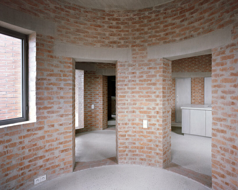
mimicking the Arch of São Bento in lisbon


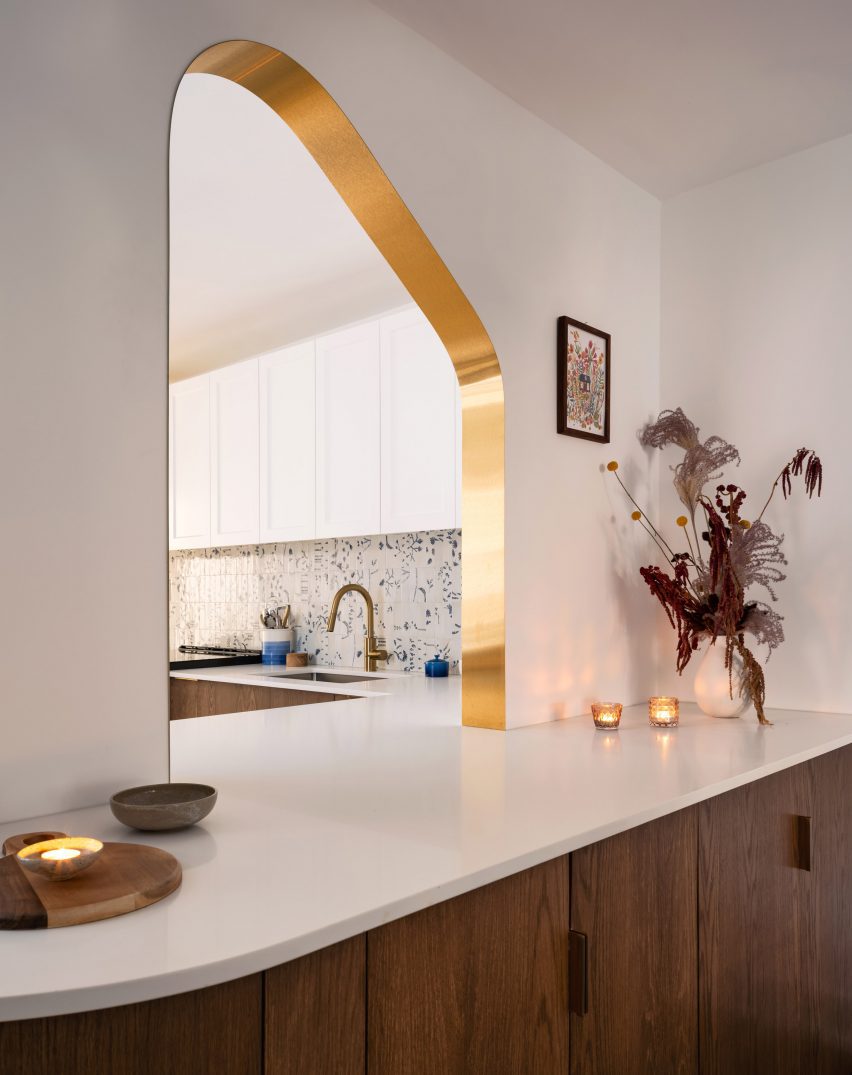
The perfect metaphor for the VAULT apartment by Studio Gameiro (see more here) is that the inside of the apartment mimics what the street has lacked for decades, and which used to define it as a starting and finishing point: the Arch of São Bento. The fact that the arch still exists nowadays in another square of Lisbon, and that the marks of this ‘uncoupling’ are still deeply visible on the street itself (and on the tiny rocky side which connects it to the National Parliament), gave the team an extra shot of energy to create something deeply rooted on the notion of the unexpected/unusual. This historic but grounded reference to arched forms is now perceived throughout its operational/logistics framework, and its visual identity.

an ethereal lightness takes over studio gameiro's VAULT apartment in lisbon
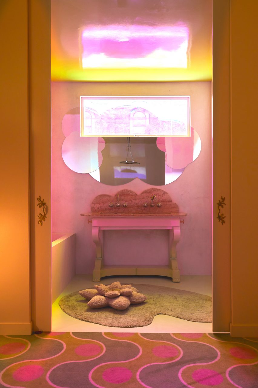
The VAULT living area


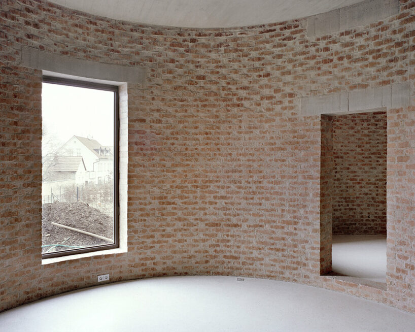
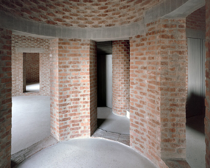
curved ceilings and ethereal atmospheres


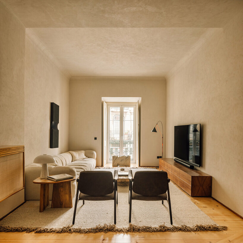
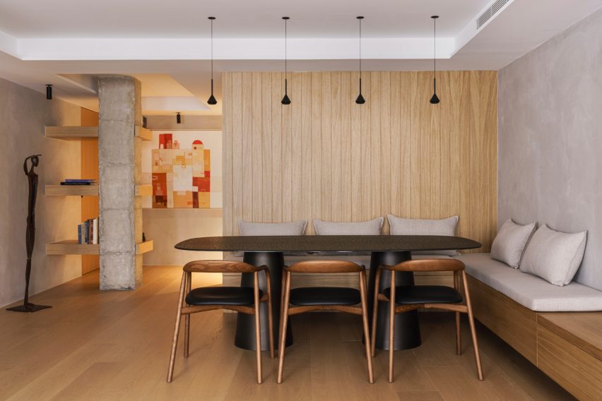
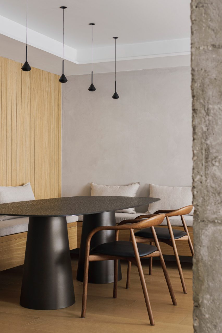
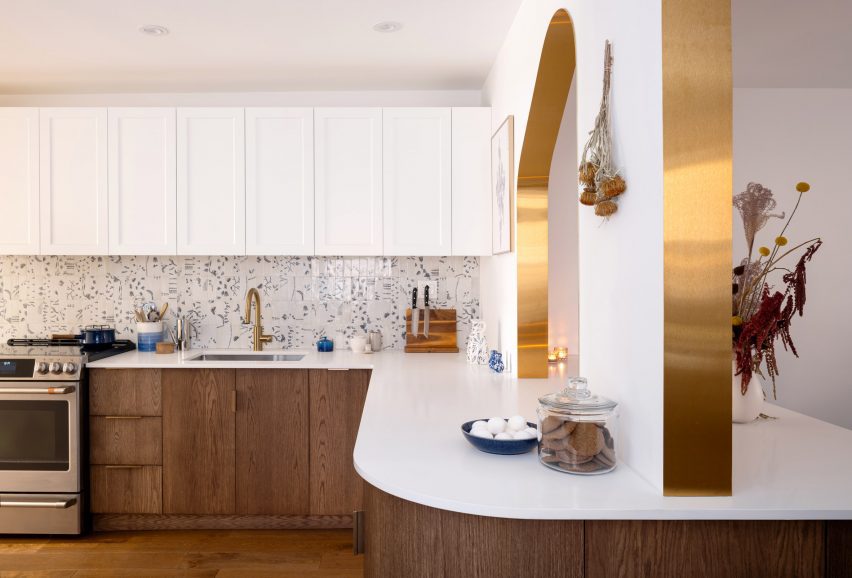
As residents enter from the living room, the social area is revealed in full display, with a corridor leading to the dining room. Here, a bespoke dining table with a Travertine Creme top occupies the center of the space. It rests on a solid Iroko wood structure which evokes the traditional style of centuries-old dining tables, and which is accompanied by six restored chairs designed by Gianfranco Frattini for Cassina. A classic revisited, something borrowed from memory, something pushing forward. This space is then smoothly connected to a breakfast corner, casual and chic as it could be. This small room, almost like a roundabout, gives one of the structural elements of this project: a strong character embedded with an almost floating, ethereal lightness. This contradiction of sorts permeates the entire apartment.

an ethereal lightness takes over studio gameiro's VAULT apartment in lisbon
Studio Gameiro designs ethereal curved ceilings throughout


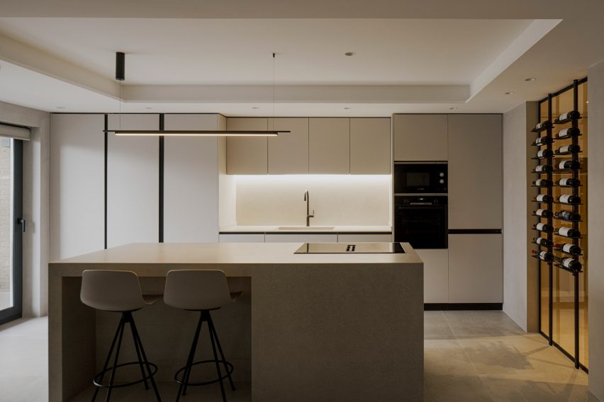
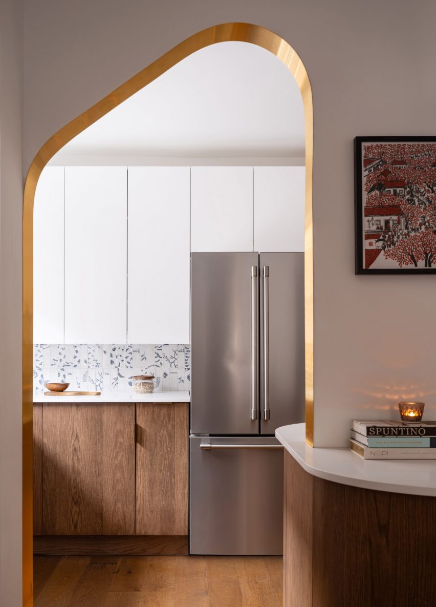
The continuation of the curved ceiling leads us to the bespoke kitchen, where Moleanos countertops, a brass pendant element and extensive storage units (which aesthetically and structurally follow the tone of the walls) stand out. Bespoke brass handles, in the shape of hooks, make magical appearances as playing hide and seek. The kitchen provides access to a small patio, ideal for a short break (and a good book on cold Winter nights). The opposite path leads to the private area of the apartment which is traversed by a corridor that begins and ends with a stone arch. Full circle and the perfect metaphor for the project itself.
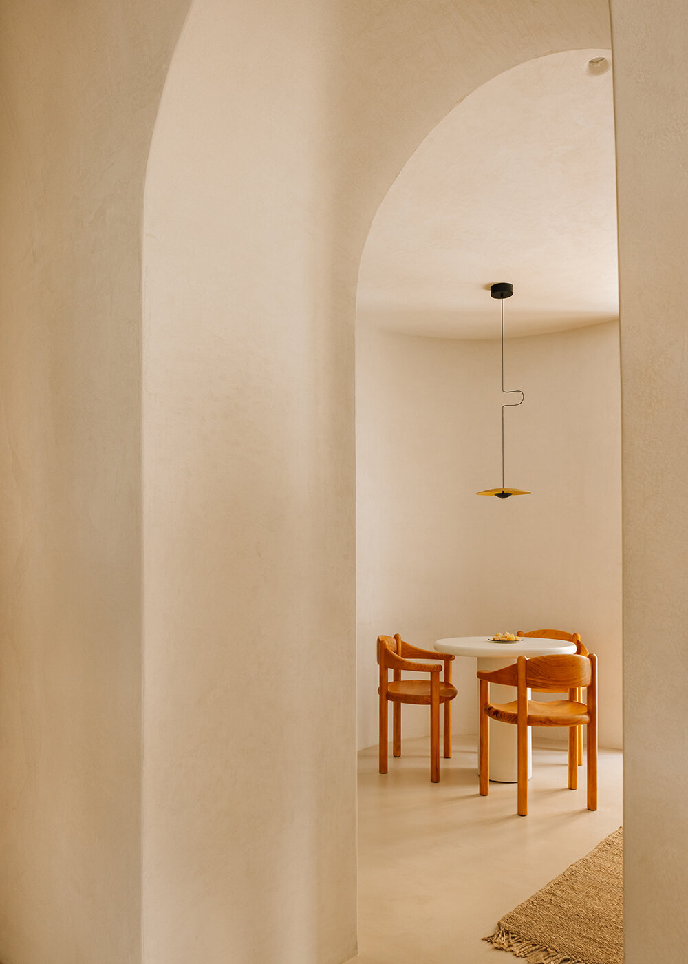
an ethereal lightness takes over studio gameiro's VAULT apartment in lisbon
breakfast corner


This corridor leads to the bedrooms and a family bathroom, ultimately leading to the impressive entrance of the master suite. This room, with its incredible scale and width, has an almost cinematic visual flair that defines what we were very keen to have as a foundation stone: space as playful and functional as it could. These layers work as different ‘levels’ to create smooth transitions between each area, allowing us to create quiet spaces, reminiscent of the Roman aqueducts which had basins to calm and re-direct the water’s flow. It is as if all these historical references came together to create ‘free flow’ areas to promote smooth transitions between each room.

an ethereal lightness takes over studio gameiro's VAULT apartment in lisbon
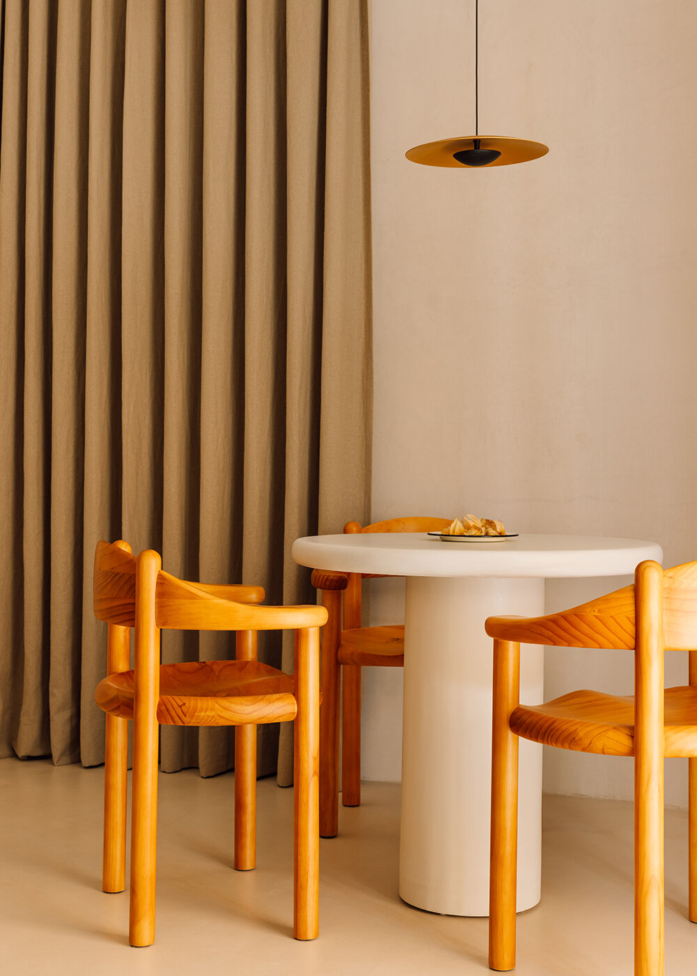
detailed view of breakfast corner


a deep and rich material palette by studio gameiro


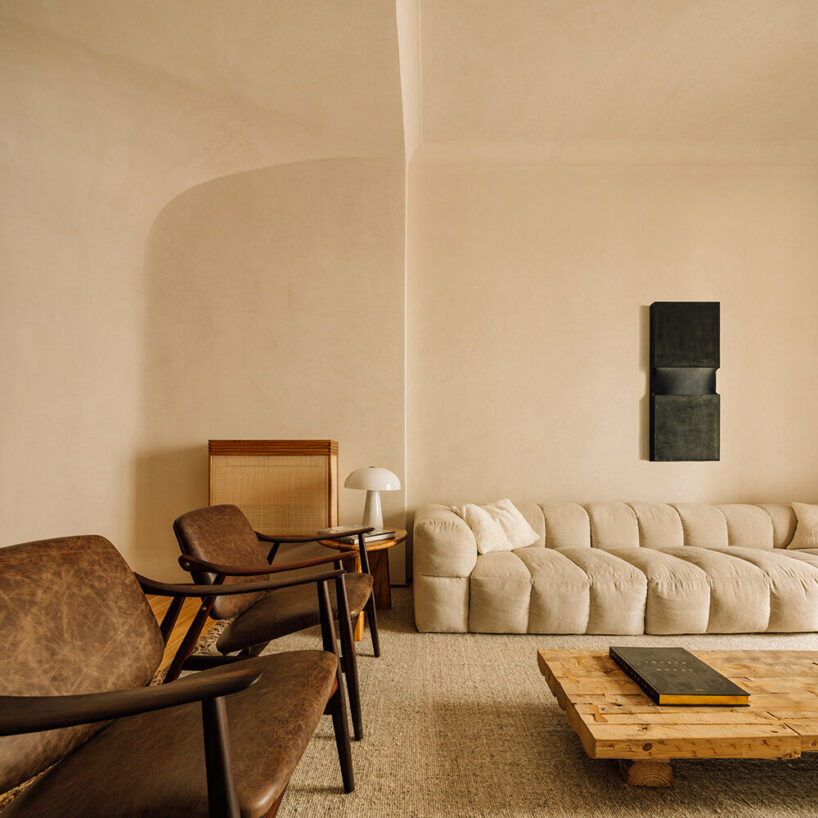
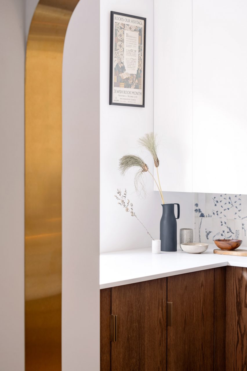
The use of materials such as Moleanos limestone and brass is a nod to the aqueduct’s heritage and technical expertise as an Architecture and Design wonder. As textures go, the stone permeates all prominent areas like the arches which divide the spaces, the kitchen countertops and the bathroom sinks, while shiny brass represents a much more industrial character, alluding to the hooks that held lighting cables in the tunnels. This material, which sometimes wrongly rhymes with brash, is poetically edited into signature pieces, as it is discreetly incorporated into the project with a functional purpose. From the entrance there are two side paths which ‘divide’ the apartment into complementary ‘half moons’.

an ethereal lightness takes over studio gameiro's VAULT apartment in lisbon
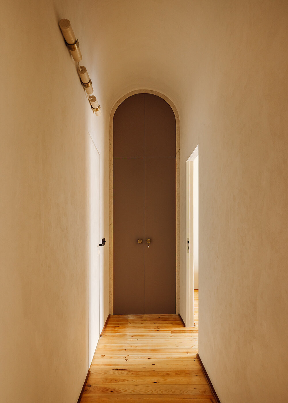
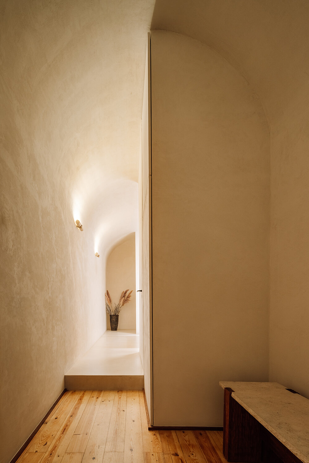
corridor leading to the bedrooms and a family bathroom


From the common areas of both kitchen and dining room, the same sense of openess permeates the acess to the sleeping rooms, accessed through another set of arched corridors. This ‘suspension’ framework is intricately connected to the apartment’s storyline. As the arch was part of the same technical design of the Aqueduto das Águas Livres which used to supply water to Lisbon, the curved ceilings and arches guide us through it like a meander/path, much like water was guided through the arches of the aqueduct to people’s homes for centuries. Similar to the soft and mysterious lighting of those tunnels (which have an almost cinematic and stage/set display), light is skillfully designed to illuminate warm-textured surfaces coated with lime stucco stone.


Reference

Timber exterior of Two Sisters holiday home in Finland
CategoriesArchitecture

MNY Arkitekter completes “down-to-earth” house for two sisters in Finland

Finnish studio MNY Arkitekter has completed Two Sisters, a timber holiday home in Salo that is designed to allow two siblings to live “together separately”.

To create a dedicated space for each of the two sisters, MNY Arkitekter divided the home into two standalone units joined by a central terrace overlooking the surrounding rocks and pine trees on Finland’s west coast.

Timber exterior of Two Sisters holiday home in FinlandTimber exterior of Two Sisters holiday home in Finland
The two units are joined by a central terrace

“In many ways the site is one of typical Finnish inner archipelago terrain and vegetation, and one of the main goals was to preserve as many trees and visible rocks as possible,” MNY Arkitekter founder Mathias Nyström told Dezeen.

“Equality of the views from the two units was also important and had a significant impact on the layout.”

Living area within Two Sisters in FinlandLiving area within Two Sisters in Finland
Each unit has large windows. Photo by Mathias Nyström

The home’s two units “fan out” to provide privacy and avoid the surrounding trees, while making space for an existing sauna, utility room and overnight shelter on the site.

Each block features large windows at its western end, looking towards the sea and pine trees to the west. Openings facing the central terrace have been placed to minimise overlooking.

Kitchen interior of holiday home by MNY ArkitekterKitchen interior of holiday home by MNY Arkitekter
Black kitchen counters feature in each living space

“Being in one of the units you can only see the other from certain points, otherwise you mostly sense the existence of the other part,” said Nyström.

“You are on your own, but feel part of a bigger entity,” he added.

Each living space at Two Sisters has been finished with black kitchen counters, a dining table and a large freestanding fireplace. Built-in bench seating provides space to sit and look out over the landscape.

In the northern block, a bed is housed in a small nook off this living space backed by a full-height window, while to the south the slightly larger unit provides a double bedroom and two single bedrooms alongside the living space.

Bedroom interior within timber holiday home in Finland by MNY ArkitekterBedroom interior within timber holiday home in Finland by MNY Arkitekter
A small bed is backed by a full-height window in the larger unit

Two Sisters has a prefabricated structure of glue-laminated timber, finished externally with vertical planks of spruce. Internally, pale timber walls, floors and ceilings are treated with lye.

“The aim for the atmosphere was to create a uniform, serene space where nature plays a big part – the end result is very uplifting,” said Nyström.

“The weathered silver-grey wood will fuse the building in the landscape with rocks and pines. All in all it is a down to earth and subtle building,” he added.

Living space interior within Two Sisters holiday homeLiving space interior within Two Sisters holiday home
The home is constructed from glued-laminated timber

Elsewhere in Finland, MNY Arkitekter created a home on the shoreline of a small lake in Tenala using seven different varieties of timber.

Other recent projects in the country include a sauna and restaurant on the edge of Lake Saimaa by Studio Puisto and the steel-clad Dance House by JKMM and ILO architects in Helsinki.

The photography is by Multifoto Ab unless otherwise stated.

Reference

Bookshelf wealth lookbook
CategoriesInterior Design

True trends always answer a need

As TikTok and other platforms become increasingly flooded with home-styling ideas, Michelle Ogundehin shares advice on how to navigate changing trends in the era of ubiquitous social media.


Newspaper journalists are often keen for a quote on “the latest trends”. What do I think of polka dots? What about red paint: hot right now, non? It depends. Or recently, what could I say about the TikTok trend “bookshelf wealth”? Hmmm, interesting.

Obviously, just because images of a lot of spotty things have been cobbled together by someone on Instagram, or an influencer declares in breathless tones that poppy has surpassed magnolia in the paint stakes, does not make it universally true. But this is not to flagellate the notion of “trends” per se – the stylistic movements that visualise our cultural climate can be genuinely intriguing.

Here-today-over-tomorrow fads can be noxious

True trends always answer a need. Emerging from an alchemy of desire, available resources, and cultural resonance, they have the power to make visible unspoken truths. However, the here-today-over-tomorrow fads can be noxious. The thing is, true trends don’t occur in a vacuum; you can always trace their roots. In short, no roots = no relevance = fad. And I’ll come back to the bookshelves.

Alternatively, it’s called marketing. Because someone, somewhere will make money from you feeling compelled to throw out your perfectly good cushion, frock, phone, or sofa to replace it with a newer, more “on-trend”, faster, smaller, prettier, or any other adjective you care to insert here, model.

Social media platform-time is bought to advance the cause and propel the message. Whether it has staying power though, is entirely another matter. This is where the aforementioned relevance and roots come in.

Arguably there are moments when it seems as if one creative camp has agreed on a singular approach. The spring special April issues of the fashion magazines collectively trill that “it’s all about pastels!” But is it? Or did the picture desks just pull together all the sugary-coloured images from across the collections of 20 different designers and call it a moment?

After all, it’s habitual for colours to lighten in the spring and darken as we approach winter. More of note would be if everyone went grey for April. But that probably wouldn’t make for an uplifting (ie sales-savvy) coverline.

It’s the same in interiors. When I was editor-in-chief of ELLE Decoration, occasionally I’d receive a letter from a disgruntled reader bemoaning the season’s hot new look. Why had it changed from last month’s look, which they loved?

As consumers and designers, we must self-interrogate

My reply was always the same: my job is to show you what’s out there, your job is to decide what you like, and then stick to it. Or change if you want to. But the key is that it’s your choice. What I always wanted to add was: and don’t devolve the responsibility for your taste!

It’s also true that there used to be a bit of a journalistic mantra that went along the lines of: one’s an oddity, two’s a coincidence, but three’s a trend! So, if three of a similar thing plopped into the inbox, then it was worth looking into.

However, the follow-up question is always: why? Why is this happening? Is there anything behind it? Just because something is new doesn’t make it news. And, crucially, is it adding anything to the cultural conversation?

I think this latter point is ever more relevant today. It can no longer be justified to create for the sake of it (that is arguably the purpose of art). Instead, as consumers and designers, we must self-interrogate.

Has this product genuinely improved the models that precede it by using less resources, demanding less energy, eradicating plastic, and thus being less likely to end up as waste? If not, then why make it?

That aside, sometimes a “trend” reflects more of a mood than a whole “moment”. Take the unexpected red “trend”. We could post-rationalise this as being rooted simply in a feeling of dark times drawing us to colour. It makes us happier.

Engaging your own inner critic becomes ever more vital

On the other hand, red is a deeply emotive hue, one of the most visible of the spectrum, thus a colour that intrinsically demands our attention. This is why it’s used for both stop and sale signs. We’re literally hardwired to see it. So, is this a verifiable trend, or merely the power of colour theory? Maybe it doesn’t matter?

However, when considering social-media trends, we generally only see more of what we think we already like. This is fine when we’re talking pops of colour, a lot less so regarding deep fakes deliberately designed to thwart opinions.

Bottom line, engaging your own inner critic becomes ever more vital. The platforms will always deliver a constant stream of fodder, but to paraphrase the inimitable Coco Chanel: content is what’s out there – but it’s up to you to choose what to believe.

Now back to those bookshelves. The images themselves are irrelevant. If someone was to go out and buy books by the metre to “get the look” then they’ve missed the point entirely; let’s not reduce the notion of home to a mere backdrop – it should be your personalised space from which to thrive.

Thus, to me, “bookshelf wealth” is the visual expression of the authenticity that we’re currently craving in a world that appears to have gone right royally tits up. Homes with shelves bursting with well-read tomes, curiosities and the talismans of life, however quirky, are an antidote to the virtual.

It dwells firmly in the tactile and tangible world of the analogue as so beautifully depicted recently in Wim Wenders’ latest film, Perfect Days, wherein the main protagonist lives contentedly in his chosen world of flip phones, cassette tapes and simple routine.

Stop the press! A trend that reflects the rejection of the maelstrom of modern life

It’s about honouring yourself, your journey, your interests, and proudly displaying it all. It stands on the shoulders of the movements we’ve seen already towards fermenting, knitting, and baking sourdough. It’s about truth-telling and slowing-down; renovating not relocating; ditching the work/spend cycle and stepping off the consumer conveyor belt.

It’s not so much a look as a potent signifier of a shifting of priorities. It’s back-to-basics and living on a human-needs-first scale, as an antidote to the prevalent norm of life being voraciously consumed at technological pace to maximise productivity for someone else.

Stop the press! A trend that reflects the rejection of the maelstrom of modern life, indicating long-term thinking and emotional evolution to be the way forward. That may not make for a super snappy soundbite, but it certainly bodes better for our future than crimson walls, or polka dots.

Michelle Ogundehin is a thought leader on interiors, trends, style and wellbeing. Originally trained as an architect and the former editor-in-chief of ELLE Decoration UK, she is the head judge on the BBC’s Interior Design Masters, and the author of Happy Inside: How to Harness the Power of Home for Health and Happiness, a guide to living well. She is also a regular contributor to publications including Vogue Living, FT How to Spend It magazine and Dezeen.

The photo, showing House M by Studio Vaaro, is by Scott Norsworthy.

Dezeen In Depth
If you enjoy reading Dezeen’s interviews, opinions and features, subscribe to Dezeen In Depth. Sent on the last Friday of each month, this newsletter provides a single place to read about the design and architecture stories behind the headlines.

Reference

Exterior view of home by Wallmakers
CategoriesArchitecture

Wallmakers uses discarded toys to construct Toy Storey home in Kerala

Architecture studio Wallmakers has repurposed approximately 6,200 discarded toys to construct the walls of Toy Storey, a circular home in Kerala, India.

The aptly named residence by Wallmakers uses toys discarded in the area, which are unsuitable for recycling, as structural components and decoration within the external walls.

Exterior view of home by WallmakersExterior view of home by Wallmakers
A cantilevered verandah wraps around the circular home

“The main concept of Toy Storey revolves around the idea of using discarded toys and effectively conveying a message through this,” studio founder Vinu Daniel told Dezeen.

“By repurposing around 6,200 discarded toys, the residence in Kerala becomes a living monument to nostalgia and childhood, while addressing environmental concerns,” he added.

View of exterior wall of Toy Storey homeView of exterior wall of Toy Storey home
Approximately 6,200 discarded toys are used in the home’s walls

Toy Storey is wrapped by perforated, curved walls composed of compressed stabilised earth blocks, Mangalore tiles and toys, designed to draw in light and enable cross ventilation through the home. A ferrocement roof sits on top.

Four evenly-spaced entrances puncture the facade, which is wrapped by a cantilevered verandah offering outdoor space overlooking the surrounding greenery.

Living space within Kerala home Living space within Kerala home
Perforated walls draw light and ventilation through the interior

Inside, the home’s first floor is divided into public and private segments. The public half is defined by a large living room while the private half contains an open-plan kitchen and dining area flanked by bedrooms.

“One of the things that the client mentioned was they often host their neighbours and members of the community, which means there are often many people in the house,” Daniel said.

“Hence we decided to make the area the people frequented separate from that of the client’s family’s personal spaces,” he continued.

Japanese-style shoji screens are used as partitions throughout the interior to enable light into each space and connectivity between the private and public areas.

Kitchen interior within Toy Storey home in IndiaKitchen interior within Toy Storey home in India
An open-plan kitchen and dining area are flanked by bedrooms

The site’s topography enabled the addition of a secluded basement level containing a library and bedroom, accessed from the upper floor by a central staircase.

An internal courtyard topped with a glass ceiling slices through the building providing additional daylight for the interior.

Bedroom interior within Toy Storey in IndiaBedroom interior within Toy Storey in India
Japanese-style shoji screens are used as internal partitions

Wallmakers is an architecture studio established by Daniel in 2007. Elsewhere in India, Wallmakers has also recently completed an arts centre with rooftop seating and a house that resembles “snake curling up under a rock”.

Last year, Daniel faced criticism on social media for his studio’s use of unpaid internships, which he claims have an important educational benefit.

The photography is by Syam Sreesylam and Althaf Rasheed.

Reference

Orange desk in Univers Uchronia apartment
CategoriesInterior Design

Uchronia founder designs own home as “love letter to French craft”

Glossy walls, ruched curtains and oversized flower-shaped cushions characterise this eclectic 1970s-style Paris apartment, designed and owned by Uchronia founder Julien Sebban.

Called Univers Uchronia, the apartment is in the city’s 18th arrondissement, close to the Uchronia office – a Parisian architecture and interiors studio known for its bold application of shape, colour and reflective surfaces.

Orange desk in Univers Uchronia apartmentOrange desk in Univers Uchronia apartment
Julien Sebban designed Univers Uchronia as his home

Sebban designed the dwelling as his home, which he shares with his husband and Maison Royère artistic director Jonathan Wray.

The Uchronia founder created the apartment as an extension of his studio – “it’s truly a manifesto of our universe,” he told Dezeen.

Colourful living room with pink curtainsColourful living room with pink curtains
Colourful interiors anchor the apartment

Sebban worked with local studio Atelier Roma to create all the walls and ceilings, which are either lacquered and glossy or made of matte pigmented concrete, respectively reflecting or absorbing light throughout the day.

Finished in hues ranging from cloud-like pale blue to lemony yellow, the walls and ceilings complement the poured-in-place resin floor that spans the apartment and features a bold motif that “waves and moves in relation to the architecture”.

Open-plan kitchen in Univers UchroniaOpen-plan kitchen in Univers Uchronia
A metallic island features in the open-plan kitchen

The home is anchored by a predominantly pink living space, which includes Uchronia-designed pieces such as low-slung interlocking coffee tables made from walnut burl and orange resin.

Translucent and gathered pink curtains were paired with a geometric vintage bookshelf and a blocky but soft sofa finished in purple and orange.

Onyx dining tableOnyx dining table
A bespoke onyx dining table was created for the home

“The apartment is very colourful with ’60s and ’70s inspirations and a mix of our contemporary pieces and vintage objects,” said Sebban.

In the open-plan kitchen and dining room, a veiny Van Gogh onyx table was positioned next to a metallic kitchen island, illuminated by a blobby seaweed-shaped table lamp.

Home office with orange and yellow wallsHome office with orange and yellow walls
Ornamental jellyfish decorate the home office

A portion of the otherwise orange wall was clad with tiny, mirrored tiles. Reflected in the gleaming ceiling, the tiles have the same effect as a shimmering disco ball.

Opposite the dining area is Sebban and Wray’s home office, characterised by a bright orange, built-in day bed topped with silk flower-like cushions and a wave-shaped backrest.

Bathroom with pink bathtub Bathroom with pink bathtub
The dwelling’s bathrooms follow a similar design

Above the bed, ornamental jellyfish were suspended like planets against a constellation of gold stars, which decorate the ombre orange and yellow wall that nods to the colour-drenched interior of the city’s Cafe Nuances – also designed by Uchronia.

The dwelling’s bathrooms follow a similar design. Accents include dusty pink alcoves and ceramic tiles depicting underwater scenes, as well as a lily pad-shaped rug and a mirror resembling a cluster of clouds.

“The apartment defines the codes we have tried to develop at Uchronia over the last four years,” concluded Sebban.

“It’s a play on colours, textures and materials, and a love letter to French craft.”

Pink-hued bathroom by UchroniaPink-hued bathroom by Uchronia
Univers Uchronia is “a love letter to French craft”

Uchronia was named emerging interior designer of the year at the Dezeen Awards 2023. The studio previously renovated a Haussmann-era apartment for a pair of jewellery designers with multifaceted furniture pieces created to mirror the appearance of precious stones.

Various architects have designed their own homes, such as John Pawson, who created this minimalist second home in the Cotswolds in the UK.

The photography is by Félix Dol Maillot

Reference

christian kerez's house okamura unfolds as a cluster of circular brick volumes in czechia
CategoriesArchitecture

christian kerez’s house okamura unfolds as circular brick columns in czechia

insnde the all-brick house okamura by christian kerez in prague


In Prague 6, within close proximity to Villa Müller by Adolf Loos, architect Christian Kerez completes House Okamura as a clear example of a very traditional, almost archaic method of constructing brick ‘circles’. The project, designed as an aggregate of column-like volumes, hosts three apartments with 39 rooms, combined. Kerez omitted dividing walls from the interior layout, making the outline of every single space visible from the outside. More so, thanks to their unique configuration, the apartments shift positions from floor to floor so that rooms in the vertical shafts belong to different owners. The rooms vary from 4 sqm to 18 sqm in size and 2.35 meters to 4.9 meters in height, with an additional 19 spaces in between the circular rooms, making it a total of 58 rooms.

christian kerez's house okamura unfolds as a cluster of circular brick volumes in czechia
all images © Maxime Delvaux


circular rooms with varying sizes, openings, and layouts


All spaces within one apartment of House Okamura are open to each other, with areas varying between 90 sqm and 110 sqm. As Christian Kerez (see more here) explains, the different sizes of the overlapping circular rooms create unpredictable changes in the direction of these openings. The latter seem to be randomly positioned and create a labyrinth-like movement. ‘It is a space that opens in on itself, generating an impression of expansion within actually limited boundaries, as intended by the rigorous geometrical arrangement. The layout of the circular rooms changes from one level to another,’ continues the Czechian architect. 

christian kerez's house okamura unfolds as a cluster of circular brick volumes in czechia
House Okamura in Prague 6


Meanwhile, the elevator, storage, and sanitary area are all tucked between the circular rooms of House Okamura. These intermediate spaces, which can be entirely closed off with doors, are minimal, fragmented, and convex, as opposed to the open, perfectly concave main zones. Concluding his thoughts, Christian Kerez highlights how the spatial concept of autonomous rooms aggregated to a sequence of spaces feels radical and new while the whole project resorts to traditional brick construction, which is easier to build on site than orthogonal spaces.

christian kerez's house okamura unfolds as a cluster of circular brick volumes in czechia
the project reveals a cluser of brick circles

christian kerez's house okamura unfolds as a cluster of circular brick volumes in czechia
the interiors host three apartments, with 39 rooms in total

christian kerez's house okamura unfolds as a cluster of circular brick volumes in czechia
circular living room with no dividing walls

christian kerez's house okamura unfolds as a cluster of circular brick volumes in czechia
the direction of openings constantly changes from room to room, and floor to floor

Reference

Interior of Casa Inversa by Destudio
CategoriesInterior Design

Destudio inverts day and night zones at redesigned Valencia apartment

Architecture office Destudio has remodelled an apartment in Valencia for a couple of empty nesters, swapping the positions of the living and sleeping areas so they perform better for the owners’ lifestyles.

The clients, who recently worked with Destudio to design their pharmacy in the Spanish city, invited the studio to oversee the renovation of the 150-square-metre apartment that had been their home for two decades.

The couple’s grown-up children no longer live with them and Destudio saw this change in circumstances as an opportunity to create an entirely new and more appropriate layout.

Interior of Casa Inversa by DestudioInterior of Casa Inversa by Destudio
Destudio swapped the positions of living and sleeping areas in Casa Inversa

“We worked with the owners to convince them to make a ‘tabula rasa’ of how they lived in this house for the last 20 years and find a better distribution for their actual needs,” Destudio creative director Gabi Ladaria told Dezeen.

“It was tough for the family to recognise that every wall had to be demolished,” he added, “but when they saw the first plans and 3Ds they realised there were better ways to live in their house, being more honest with their needs in the coming years.”

An initial survey of how the existing spaces were used informed the decision to switch the position of the private and communal areas so the main living space receives the best of the available sunlight. This act gave the project its name, Casa Inversa.

Dining room in Casa Inversa by DestudioDining room in Casa Inversa by Destudio
The dining area was positioned in the corner of the living room

Conversations with the clients revealed that they wanted the kitchen to be the heart of the house as this is where they spend a lot of time preparing and eating meals throughout the day.

This informed the decision to reduce the size of the dedicated dining area by incorporating it into a corner of the living room.

Grey kitchen in a Valencia homeGrey kitchen in a Valencia home
The kitchen was designed as the heart of the home

A cantilevered bench minimises the floor area used so the adjacent lounge feels more generous.

“We use this strategy in our restaurant projects to maximise the number of diners,” Ladaria pointed out, “but here it is used to maximise the space in the other part of the corner bench where the living room is located.”

The studio added that the table is likely to be used infrequently, mostly when friends or family come to visit, so it was designed like a restaurant booth to make the dining experience feel like eating out.

The kitchen opens onto a terrace with outdoor seating, while on the opposite wall a wine display backed with semi-opaque glass provides a visual connection with the adjoining utility space. Sliding glass doors can be closed to separate the kitchen and the adjacent sitting room if required.

Living room in Casa Inversa with a glass partition wallLiving room in Casa Inversa with a glass partition wall
Sliding glass doors separate the living area and kitchen

The apartment’s three bedrooms were relocated to the opposite end of the floor plan, where they overlook the building’s internal courtyards.

The principal bedroom and one of the guest rooms are accommodated in an angular corner that previously housed the living room. The main bedroom’s dressing area features cupboards that extend along one wall, making the most of the space.

A material palette consisting of clay-rendered walls, oak joinery and porcelain tiles acts as a warm backdrop for the clients’ art collection.

Bedroom in Casa Inversa Valencia apartmentBedroom in Casa Inversa Valencia apartment
Clay render covers the walls

Where possible, Destudio specified furniture from local brands, including the sofa, armchairs and the living room’s library shelving.

Destudio was founded in 2014 by architects Gabi Ladaria and Nacho Díaz, who studied together at Valencia’s Polytechnic University.

Other recent residential projects in Valencia include the renovation of a former fisherman’s house using geometric blue-and-white tiling and a copper-toned home in an olive grove.

The photography is courtesy of Destudio.

Reference

Portal House by Svima
CategoriesInterior Design

Portal House by Svima features brass details and curved oak ribbons

Brass ribbons line the asymmetric portals that connect the kitchen and dining room of this Toronto residence, renovated by local architecture and art studio Svima.

The Portal House was designed for a couple who had wanted to refresh their home for 10 years, but have very different aesthetic tastes.

Portal House by SvimaPortal House by Svima
Two portals connect the renovated kitchen and dining areas of this Toronto home

Toronto-based studio Svima found a compromise by combining his desire for “tenebrous minimalism” and her love of “bright French country kitchens” into the design.

The resulting “denlike cosiness” pairs dark oak across the lower half of the ground-floor spaces and clean white surfaces on the upper half.

Brass-edged asymmetric portal looking into a kitchenBrass-edged asymmetric portal looking into a kitchen
The curved, asymmetric portal over the deep counter acts as a pass-through

The snaked kitchen layout is tight, so Svima curved the corners of cabinetry and counter surfaces to steal extra space for circulation.

This theme continues to the living room millwork: a bookcase is filleted at the corner and meets the wall at an angle, while a built-in sofa beneath the window also softly angles inward.

Open doorway with brass edges looking into the kitchenOpen doorway with brass edges looking into the kitchen
The other portal, mirrored in shape, forms a doorway between the two spaces

“The design hinges on ‘ribbons’ flowing through the space, guiding the motion through the rooms,” said Svima.

“The ribbons curve in areas where sharp corners would not fit, or would stop the flow of movement.”

Detail of a brass-lined portal with a kitchen counter behindDetail of a brass-lined portal with a kitchen counter behind
Brass edges around the portals were artfully installed to perfectly fit the curved drywall

In the kitchen, the curved oak doors were handmade by a cabinetmaker who created a special jig to kerf-bend the oak into a radius.

Tiles that offer a contemporary take on Dutch Delft porcelain form the backsplash, adding small touches of blue to the otherwise neutral space.

Kitchen with white upper cabinets, blue and white tiled backsplash, and dark oak lower cabinetsKitchen with white upper cabinets, blue and white tiled backsplash, and dark oak lower cabinets
To add touches of colour to the dark oak and bright white palette, tiles influenced by Delft porcelain were added to the backsplash

Two portals provide connections between the kitchen and adjacent dining room, both with a mirrored asymmetric shape and edged in brass.

One acts as a doorway, while the other over the deep counter is used as a pass-through for food, drinks and tableware.

“It was an artful process for the contractor to lay the brass into the wall, as it had to fit into the curved drywall perfectly with no tolerance for error,” the architects said.

The living room, located at the front of the house, was furnished with mid-century pieces such as a chair, a coffee table and a media console.

Hallway with dark oak flooring and a staircaseHallway with dark oak flooring and a staircase
Dark oak flooring throughout the home’s ground floor matches the other millwork

The closed and open shelving unit organises the family’s books and possessions, and its shape allows more light to enter from a side window.

Opposite, the built-in sofa helps to resolve an awkward space under a bay window and orients the sitter towards the TV to one side.

Living room featuring a dark oak storage unit with a filleted sideLiving room featuring a dark oak storage unit with a filleted side
In the living room, the curved kitchen cabinetry is translated as a storage unit with a filleted side

“The custom sofa sweeps into the space to provide seating at precisely the right sideways angle for viewing the media unit, for lounge reading, and for gathering,” Svima said.

The floors throughout the home match the other millwork, grounding the spaces with a rich dark hue.

A built-in sofa under a living room bay windowA built-in sofa under a living room bay window
A built-in sofa under the living room’s bay window similarly features softly curved angles

Svima, founded by architects Anamarija Korolj and Leon Lai, is not the only studio that’s had to get creative with a tight Toronto floor plan.

When Studio Vaaro overhauled a house in the city, the firm created a series of volumes with minimally detailed millwork to form kitchen cabinetry, the staircase and a feature bookcase in the living room.

The photography is by Scott Norsworthy.

Reference

mwworks longbranch house
CategoriesArchitecture

mwworks hides longbranch house in the pacific northwest woods

longbranch house: Architecture Embracing Nature


The Key Peninsula in Washington state sees a transformation on a once-neglected plot of land with this Longbranch House by architecture studio mwworks. Previously marred by a series of retaining walls and an outdated home, the site has been given a new lease on life with the clients’ long-standing love for the area. Having frequented a nearby beach cabin for thirty-five years, they dreamt of a new home that would accommodate their family, foster dogs, horses, and visiting loved ones. But their vision extended beyond simple construction — they desired a dwelling that harmonizes with the surrounding landscape.

mwworks longbranch houseimages © Andrew Pogue


mwworks opens the home onto the forest


Following this vision, mwworks created a home that is anything but ostentatious. Approaching from the road, visitors are greeted by a gravel driveway that winds past an unassuming barn. The house itself remains concealed until the very last moment. Only a glimpse of its planted roof peeks through the rolling hills, mimicking the natural meadow and creating a sense of continuity. This subtle design prioritizes the landscape, allowing the natural world to take center stage.


The architects took great care to ensure minimal disruption to the existing environment. Towering fir trees were incorporated into the design, acting as grand pillars at the entrance. The building itself rests on carefully positioned pin piles and grade beams, allowing the roots of these giants to flourish undisturbed. A bridge leading into the house further opens the interiors onto the forests and views beyond, emphasizing the intended harmony.

mwworks longbranch house
the Longbranch House by mwworks replaces an outdated home on a neglected plot in Key Peninsula


a contemporary frame for nature beyond


Stepping inside the Longbranch House is akin to stepping into a framed landscape vista. The open floor plan offers unobstructed views of the surrounding meadows and the Case Inlet beyond. Each room is designed to foster a unique connection with the outdoors, ranging from intimate nooks to expansive living spaces. The materials used throughout the house echo the natural surroundings. The main structure is cast from a rough concrete mix, mirroring the fluidity of the landscape. This contrasts with the dark-stained cedar cladding in private areas, while exposed Douglas Fir beams create a pavilion-like feel in the living space. Large windows are delicately framed, minimizing their visual impact and emphasizing the honest construction methods.

mwworks hides this longbranch house among the pacific northwest woods
designed for a family and their animals, the house prioritizes integration with the surrounding landscape


With the completion of the Longbranch House, the once-fragmented land has been brought back together. The forest and meadow now embrace the dwelling, creating a calming retreat in the woods. The use of natural materials and attention to detail further enhance the sense of timelessness. This way, the home exemplifies a successful relationship between built space and the beauty of the natural world.

mwworks longbranch house
a gravel driveway leads past a barn, revealing only glimpses of the house that blends with the meadow mwworks hides this longbranch house among the pacific northwest woods
towering fir trees are prominent features, with the house built around them to minimize disruption

Reference

Black house by Michael Hennessey Architecture
CategoriesArchitecture

Michael Hennessey Architecture clads renovated California house in cedar

US studio Michael Hennessey Architecture has revitalised an ageing suburban house near San Francisco, adding black cladding and bright finishes to form a family home that bridges the past, present and future.

The residence is located in Mill Valley, a town just north of San Francisco that is known for its natural terrain and cultural offerings.

Black house by Michael Hennessey ArchitectureBlack house by Michael Hennessey Architecture
Michael Hennessey Architecture created Courtyard Hous

Designed for a couple with two young children, the budget-conscious project involved the renovation of a suburban-style house that was “in sore need of upgrades”.

The aim was to create a dwelling that supported the family’s current needs while being mindful of what might be needed in the future.

Courtyard House living spaceCourtyard House living space
The home is U-shaped in plan

“The home was thought not only as a shelter, but also as a bridge: from past to present, from one landscape condition to another, and from what a family wanted to what they could have,” said Michael Hennessey Architecture, which is based in San Francisco.

Built into a hillside, the home is U-shaped in plan, with gabled volumes organised around a central courtyard.

Vertical cedar sidingVertical cedar siding
Vertical cedar siding that adds a sense of gravitas

The team opted to preserve certain elements while adding contemporary interventions.

The building’s beige exterior was replaced with black, vertical cedar siding that adds a sense of gravitas, the studio said. The roof is covered in standing-seam metal.

Open-plan kitchen Open-plan kitchen
Inside there is a clear division between public and private zones

Inside, the 1,870-square-foot (174-square-metre) house features a clear division between public and private zones.

On the main level, one side holds an open-concept kitchen, dining area, and living room, while the other encompasses three bedrooms. The ground level contains a family room and a garage.

South-facing deckSouth-facing deck
A south-facing deck features outside

“Clearly delineated programmatic areas work in harmony with each other, the outside and the family’s needs,” the team said.

Interior finishes include ash cabinetry, large-format porcelain floor tiles, and ceramic tiles around the fireplace. Lofty ceilings and large stretches of glass provide an airy feel.

The outdoor spaces include a spacious, south-facing deck that receives bright sunlight. Softer light flows in through the courtyard on the north.

Proving a connection to the forested, hilly landscape was a guiding concern for the team.

Outdoor showersOutdoor showers
Outdoor showers were also included in the design

“Every part of the house is oriented towards the landscape thanks to carefully framed views of the lush immediate vegetation, as well as the more distant valleys, resulting in a comprehensive, thoughtful and sensitive approach to creating an extraordinary daily life,” the team said.

Other projects by Michael Hennessey Architecture include a townhouse with modern bay windows that was designed to offer alternatives to “conventional building strategies” and the refurbishment of a 1960s house that was originally built by Joseph Eichler, known for his modernist housing subdivisions.

The photography is by Adam Rouse.


Project credits:

Architect: Michael Hennessey Architecture
Architecture team: Michael Hennessey, Claudia Merzario, Jason Laudat
Contractor: New Dimension Builders (Dirk Von Rueben)
Structural engineer: Berkeley Structural Design (Bill Lynch)
Landscape architect: George Loew
Title 24 consultant: EnergySoft, LLC (Hayley Monahan)
Sustainability consultant: Arcturus HD (Jeff Aalfs)

Reference