Interior AI Screenshot
CategoriesArchitecture

7 Top AI Tools for Interior Design

Architizer’s Tech Directory is a database of tech tools for architects — from the latest generative design and AI to rendering and visualization, 3D modeling, project management and many more. Explore the complete library of categories here.

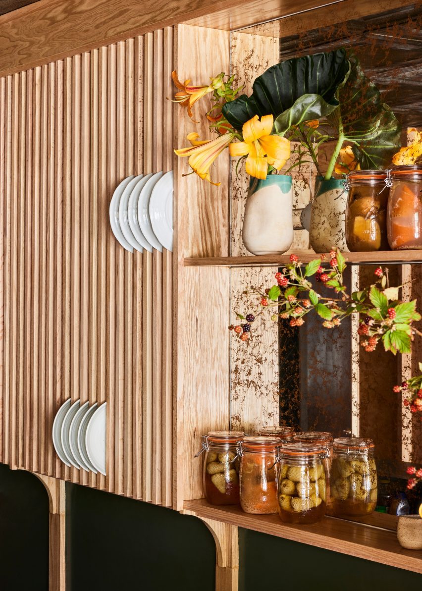
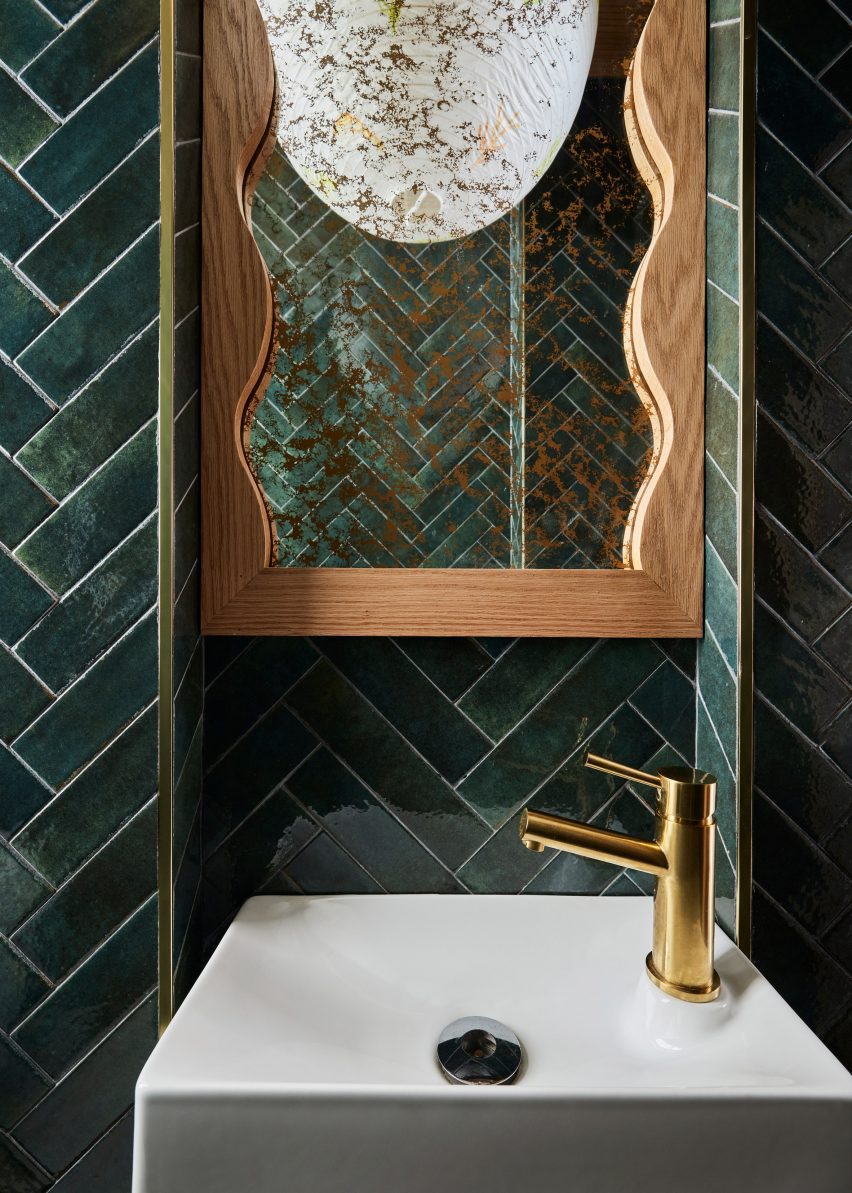
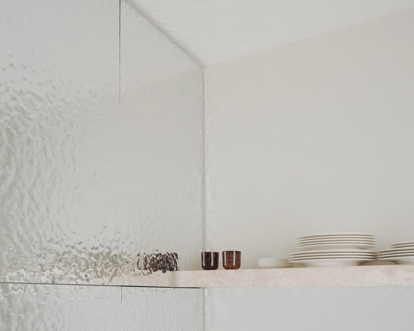
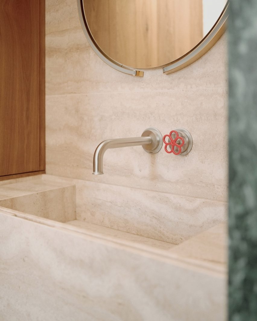
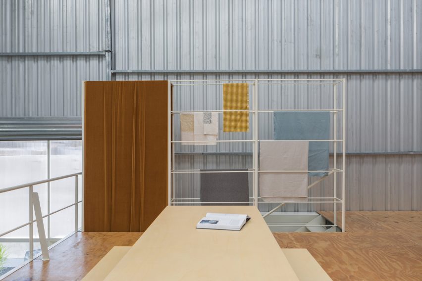
Interior design holds one of the most “intimate” scales of space. It focuses on ambiance, color, materials and textures, lighting as well as the objects and furniture that people interact with on a daily basis. With AI technologies rapidly evolving, designers now have access to an array of innovative tools that streamline processes, enhance creativity and revolutionize the way spaces are conceptualized and brought to life.

From generating design inspirations to optimizing layouts and recommending color schemes, AI tools can become integrated into every designer’s workflow, allowing them to create stunning visual imagery, produce 3D flythroughs and videos and even design custom 3D objects and furniture to populate their designs. So, which AI tools should an architect lean on when designing interior spaces?

Without further ado, here are the top seven AI tools that unlock unprecedented capabilities in interior design.


Best AI Tool for Highly Detailed Iterations

Prome AI is one of the most versatile tools for interior design. From turning sketches to fully realistic renders to using text prompts for producing stunning imagery, Prome AI is the ideal tool for generating an array of design proposals in a few clicks. Features such as Creative Fusion and Image Variation allow interior designers to preserve the structural integrity of their initial sketch, while testing different styles, perspectives and layouts of their design. PromeAI also includes post-production tools for image editing such HD Upscaler, Erase & Replace and Outpainting (i.e., image resizer). Finally, it can transform static images to breathtaking videos, using both image and text prompts.


Best AI Tool for Ideation

Interior AI Screenshot
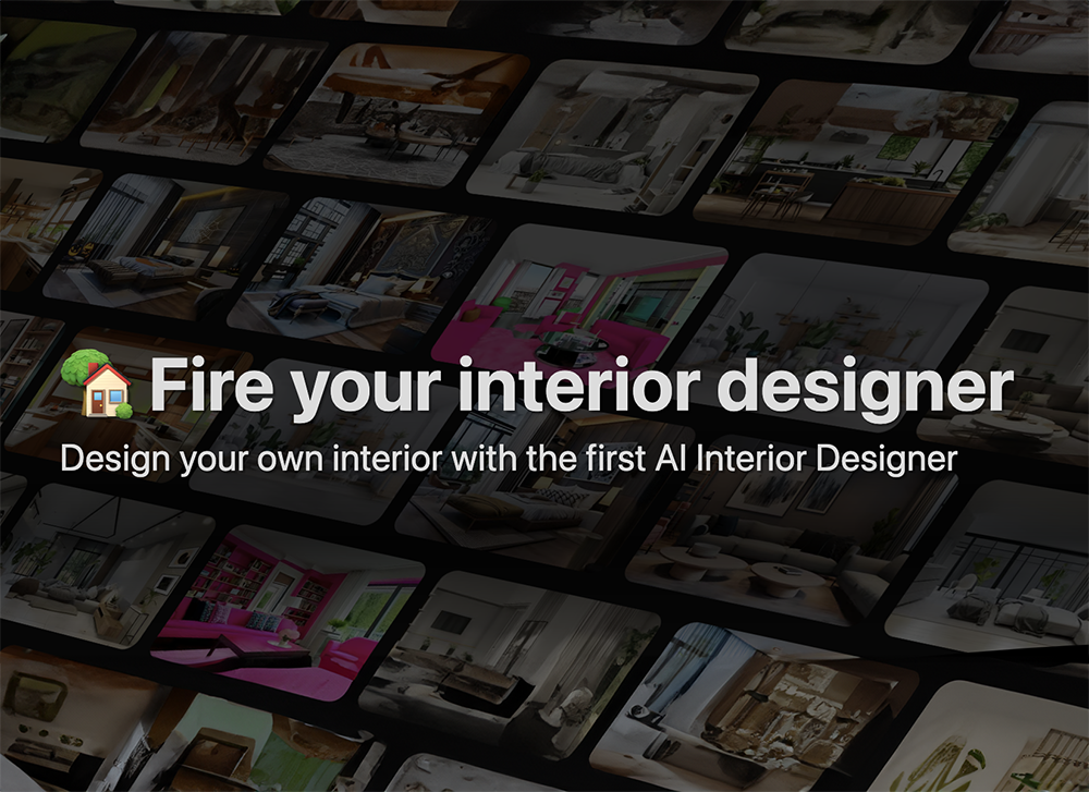
Interior AI is considered the best AI tool for ideation. Interior designers can “feed” the software photos of an existing space, select specific styles — such as minimalist, bohemian etc. — and let it generate a series of design proposals. Virtual Staging is one of its most powerful tools, through which interior designers can quickly furnish empty spaces through text prompts. Interior AI can also transform sketches as well as SketchUp models into photorealistic renders and 3d flythrough videos.


Best AI Tool for Customisation

Gaia_Generative AI Architect Screenshot
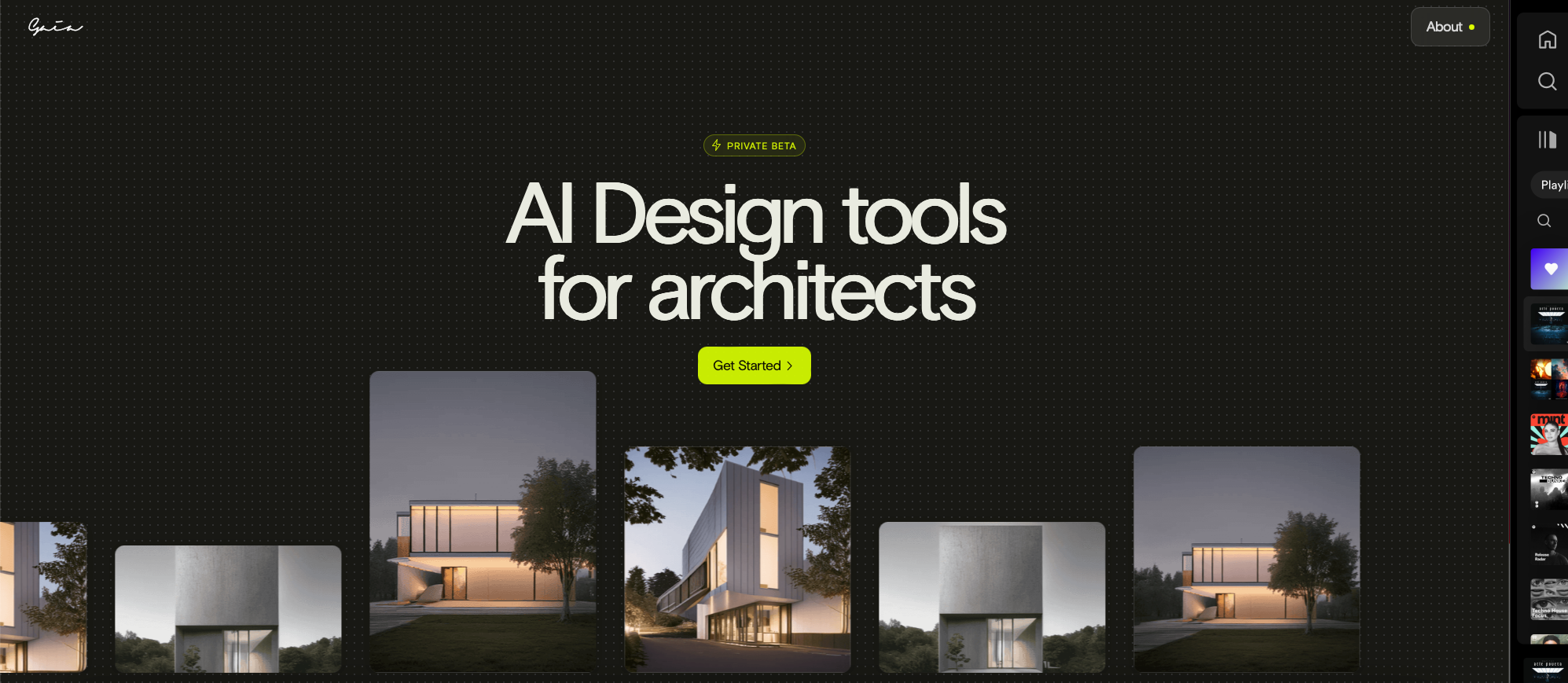
Created by a team from Cornell University, Gaia: Generative AI Architect redefines the concept of AI as a tool. It is an innovative artificial intelligence system that becomes the designer’s personal assistant. By using its Sketch-to-Render capabilities, text prompts and predefined templates, Gaia gradually learns the distinct style of its users as well as each project’s unique requirements, becoming the designer’s “right-hand AI tool”. Using Gaia’s AI prompt guide along with its community feature, architects and interior designers can communicate effectively and exchange ideas for using AI technology to improve their workflow. Finally, Gaia’s future ambition is to become integrated with existing architecture software such as AutoCAD.


Best AI Tool for Turning 2D Plans to 3D Renders

Coohom is an AI tool that seamlessly transforms 2d drawings into 3d renders. Through its simple, interactive interphase, interior designers can draw plans that can be viewed in both 2D and 3D. Furthermore, using Coohom’s extensive 3D model library, designers can furnish each room and produce multiple layout iterations, which can then automatically become realistic images, videos and 360-degree panoramas.


Best AI Tool for Space Remodeling

MyArchitectAI Screenshot
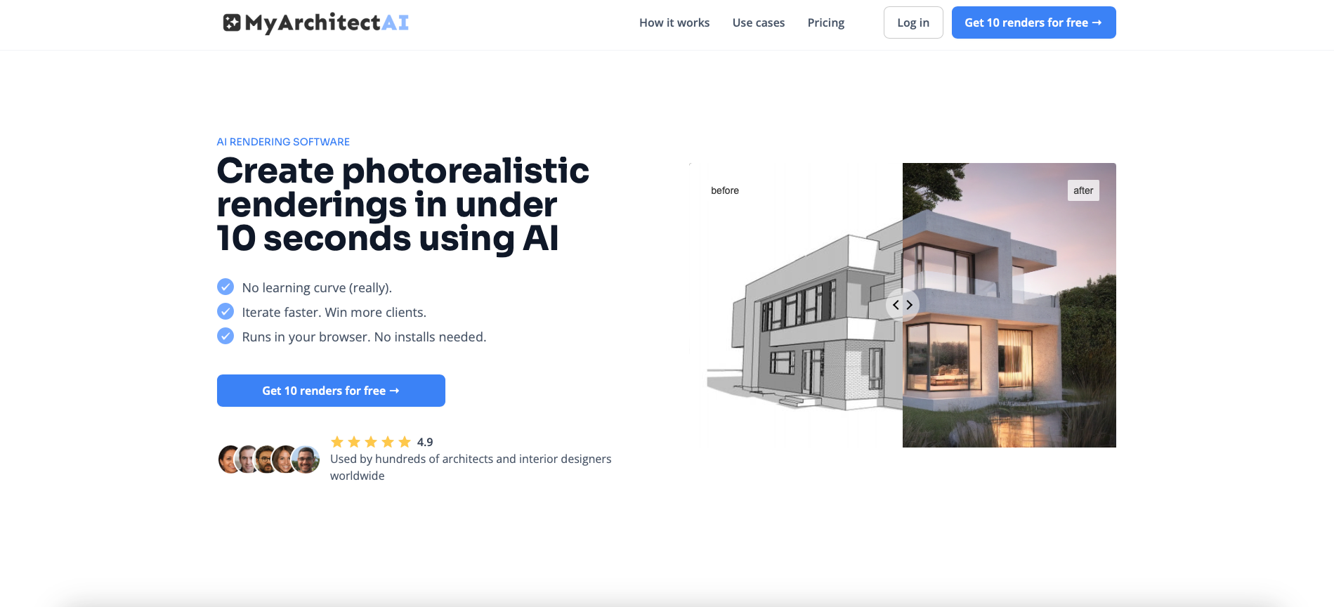
MyArchitectAI is an AI tool that creates photorealistic renderings through a combination of quick sketching and the use of predefined prompts. Interior designers can upload their sketch onto the platform and select specific styles, materials and even locations to create their renders. For example, they can specify the building’s type (e.g. apartment or villa), their preferred style (e.g. industrial loft or beach house) and even lighting setup (e.g. task or ambient) to set up the scene for their proposal.


Best AI Tool for 3D Modeling

Even through Kaedim is primarily used for game design, it is an excellent AI tool for creating custom 3D models of both spaces as well as objects (e.g. furniture). With its powerful Image-to-Model feature, Kaedim can transform static sketches, precedents or AI generated imagery into editable 3D models, which can then be imported into existing software. Its models are low poly meshes made by quads and separated into watertight parts that can be seamlessly edited by most available 3D modeling programs.


Best AI Tool for Image Editing

Adobe Photoshop is the bread and butter of interior designers. For many decades, its image editing capabilities have surpassed any other software tool on the market. Powered by Adobe Firefly, Photoshop’s new, groundbreaking AI integration is a game changer. With features such as Generative AI, Content-Aware Fill and Object Selection, Interior designers can add elements to their compositions, experiment with different background using text prompts as well as remove or replace content from their images.


How to Better Leverage AI Tools in Architecture

The following tips and considerations will help you maximize the potential of AI in interior design, as well as avoiding common pitfalls associated with this fast-emerging technology.

Beware of Technology Over-reliance: Sometimes automation can become creativity’s killer. Without a doubt, these AI tools offer an array of possibilities to interior designers. Nevertheless, when working in such a small and “intimate” scale it is important to try and preserve originality in each design. Although features such as style selection, 3D model libraries and predefined templates can be a useful to quickly visualize design iterations, it is imperative for interior designers to not forget their own individual, human creativity.

Aspire for a Level of Detail: Another challenge when working with small scale projects is the amount of detail interior designers have to address in order to produce high quality and fully resolved designs. Although AI tools often generate impressive visualizations in a matter of seconds, interior designers need to essentially play a game of ‘spot the difference’, where they closely identify potential issues that may arise during design implementation.

Take Advantage of Customization: Admittedly, the most immediate use of AI technology is to use it directly for generating design iterations and impressive visualizations. Nevertheless, AI tools can become great assets for designing and creating personalized libraries with custom-made materials, color pallets, furniture and even lighting systems. In other words, instead of relying on predetermined templates found on the market, AI technology allows interior designers to easily design and update their own unique “kit of parts” to use in their designs.

Architizer’s Tech Directory is a database of tech tools for architects — from the latest generative design and AI to rendering and visualization, 3D modeling, project management and many more. Explore the complete library of categories here.

Reference

three panel showing quick kitchen retrofit: before, post-demolition, and after completion including refrigerator, sink, cabinets, induction cooktop, and oven - photos and text reading Monday, Tuesday, Wednesday
CategoriesSustainable News Zero Energy Homes

Kit Switch Accelerates Interior Rehabs

The United Nations estimates that the world will add about 2.6 trillion sqft of new floor area to the global building stock. This equates to adding an entire New York City, every month, for 40 years. A large proportion will be housing. Specifically, housing is needed in already dense urban areas and existing structures. So the way we build and maintain our housing stock needs to change drastically.

  • Renovating existing and functional buildings takes time. Yet the US has 44 million multifamily units. A full  50% were built before 1980.
  • Rehabilitating vacant and obsolete buildings seems cost prohibitive. Yet, the US has 6 billion sqft of commercial real estate sitting vacant.
  • New construction has improved in energy efficiency. But current designs do not sufficiently address the need for easy maintenance and future rehabilitation.

How can these time and cost challenges be solved? By creating standardized, simpler processes.

Simpler means faster

Kit Switch, a California-based, women-owned construction business, offers a simple approach to designing and constructing apartment interiors. Kit Switch replaces fragmented, uncertain, and time-consuming on-site retrofit processes with an end-to-end, design-build solution. These modular systems for apartment interiors streamline existing building rehabilitations and new construction build-outs.

Rehabilitating and retrofitting existing residential buildings will significantly reduce ongoing emissions. This will include replacing inefficient and gas-powered appliances with electric ones and making homes more energy efficient through weatherization and other upgrades. The overall mission of Kit Switch is to help close the housing gap through sustainable building reuse.

The products are kits-of-parts, ready-to-install apartment interiors, such as kitchen and bathroom kits. The company manages a digital library of components. Architects drag-and-drop 3D models to instantly generate layouts and quotes. Local manufacturers produce the modules concurrently with on-site work. Then contractors install and connect products in a few hours instead of weeks of site coordination.

Kit Switch benefits housing, both new construction and rehabs:

  1. streamlines schedules from design through coordination and construction
  2. cuts on costs, especially on prevailing-wage projects
  3. offers a more sustainable and durable alternative to traditional interior builds

With durable materials and low-waste assembly, they expect to reduce embodied carbon by a third, compared to traditional on-site construction.

three panel showing quick kitchen retrofit: before, post-demolition, and after completion including refrigerator, sink, cabinets, induction cooktop, and oven - photos and text reading Monday, Tuesday, Wednesday

Kitchens first

Kit-Kitchen is the first product to debut. It comprises three standard products:  Kit-Cook, Kit-Clean, and Kit-Store. This modular system for kitchen installations is assembled on-site in less than 1 day, compared to 4 to 5 days of labor for a traditional install. The innovative design consolidates plug-and-play electrical and plumbing systems inside the kits. This further reduces drywall, plumbing, and electrical work.

And while Kit Switch products are standard, the system is modular. So developers can customize the design needed for each project.

Kit Switch was formed as a public-benefit corporation, with a mission statement around affordability, sustainability, and opportunity. Co-Founders Armelle Coutant and Candice Delamarre envision a future where cities can achieve greater circularity and resiliency. Easily deployable and reconfigurable building interiors better meet the housing needs of communities.

Kit Switch is partnering with affordable housing developers across California to support ground-up and acquisition-rehab projects. Asset managers seek out Kit Switch to meet renovation and maintenance needs. The potential impact for the Los Angeles region was recently recognized with the Trailblazer Award from USGBC-LA.

USGBC-LA Net Zero Accelerator

Kit Switch joined the 2023 cohort of Net Zero Accelerator (NZA) in 2022. Since then, the team has exhibited at the MyGBCE conference, Net Zero Conference, and VERGE, sharing their work with the green building industry and generating leads for pilot projects based in the Los Angeles area.

The NZA, a program of the U.S. Green Building Council–Los Angeles (USGBC-LA), pairs cohort members with expert advisors, promotes their solutions to high value prospects, and places pilot projects. The goal is to help these growing companies better prepare for scaled adoption.

Since its founding in 2018, the accelerator has guided the success of 85 growth-stage companies in the cleantech space across the US and Canada. The accelerator leverages the insights, expertise, and relationships of partners and community members to speed the development and commercialization of sustainable innovations. The program brings thought leadership and broad awareness to high-potential pilot projects. It is the only one of its kind focused on the built environment. Targeting solutions for net zero carbon, energy, water, and waste, the program advances building decarbonization, occupant wellness, sustainable infrastructure, and clean construction.

The author:

Candice Delamarre is the Co-Founder and COO of Kit Switch, a women-owned construction company that has developed a modularized system for apartment interiors. Kit Switch streamlines schedules, cuts costs, and improves durability for multifamily housing developments and rehabilitations. Delamarre has long been passionate about circular and sustainable practices, and equitable access to housing. Before Kit Switch, she worked as a strategy and sustainability consultant to real estate and corporate stakeholders. Delamarre holds a master’s in civil engineering from École Centrale Paris and a master’s in Sustainable Design & Construction from Stanford University.

Our team researches products, companies, studies, and techniques to bring you the best of zero building. Zero Energy Project does not independently verify the accuracy of all claims regarding featured products, manufacturers, or linked articles. Additionally, product and brand mentions on Zero Energy Project do not imply endorsement or sponsorship unless specified otherwise.

Reference

American interior designer Iris Apfel dies aged 102
CategoriesInterior Design

American interior designer Iris Apfel dies aged 102

American interior designer, fashion influencer and “geriatric starlet” Iris Apfel has passed away at the age of 102.

The death of the multidisciplinary creative, who was recognised for her flamboyant personal style, was announced on her Instagram account with an image of Apfel in her trademark oversized glasses.

Apfel, who worked in the interiors and fashion industries throughout her career, shot to international fame in her 80s and 90s after New York’s Metropolitan Museum of Art exhibited a show of her eclectic clothes and accessories in 2005.

Titled Rara Avis: Selections From the Iris Apfel Collection, it was the first time the museum had dedicated an exhibition to someone’s wardrobe.

Born Iris Barrel in 1921 in Queens, Apfel studied art history at New York University and art at the University of Wisconsin.

After graduating, she worked for fashion magazine Women’s Wear Daily before interning for interior designer Elinor Johnson.

Together with her late husband Carl Apfel, whom she married in 1948, she set up the brand Old World Weavers – a company that specialised in striking textiles informed by things found on the Apfels’ travels.

Under Old World Weavers, the duo completed high-profile projects such as restoring the White House interiors for nine presidents including Harry Truman and Bill Clinton.

The designer became a visiting lecturer at the University of Texas in 2011, where she taught fashion students about textiles and crafts.

In later life, Apfel became a staple of the fashion industry.  In 2018, toy manufacturer Mattel created a Barbie doll in the designer’s image, although it was not for sale. At the age of 97, she signed a modelling contract with IMG Models.

Apfel playfully called herself a “geriatric starlet” and described the prospect of retirement as “a fate worse than death” shortly after turning 100.

Following the news of her passing, designers around the world paid tribute to Apfel’s legacy. “Iris Apfel has become a world-famous fashion icon because of her incredible talent not only as an artist but as an influencer,” said fashion designer Tommy Hilfiger.

The photography is by Ron Adar courtesy of Shutterstock.


Reference

Paul Smith LA store interior is stone-clad partitions and exposed rafters
CategoriesInterior Design

Standard Architecture refreshes interior of pink Paul Smith store in LA

British fashion label Paul Smith’s iconic pink store in Los Angeles has received an interior makeover from Standard Architecture.

Standard Architecture collaborated with the Paul Smith design team to reimagine the 4,740-square-foot (440 square metres) store on Melrose Avenue, West Hollywood.

Paul Smith LA store interior is stone-clad partitions and exposed raftersPaul Smith LA store interior is stone-clad partitions and exposed rafters
Standard Architecture and the Paul Smith team reorganised the LA store to better define the brand’s different collections

The studios also created a new VIP entrance patio for the building, which is notorious for its bright pink exterior that has become a pilgrimage spot for amateur photoshoots.

“The primary goal was to enhance the overall customer experience within the store, which was achieved by creating a more cohesive and immersive shopping environment across the different brand departments,” said Standard Architecture.

Seating area with clothing displays on either sideSeating area with clothing displays on either side
Stone-clad partitions help to define areas, but don’t reach the exposed timber ceiling

The entrance to the store – the only opening in the giant pink wall that faces the parking lot – leads shoppers through a glossy red metal vestibule into the main retail space.

Clearly defined yet interconnected areas for the menswear, womenswear and homeware collections help with navigation around the store.

Suits displayed in colour order on long brass railsSuits displayed in colour order on long brass rails
Long brass rails are used to present tailoring

Partitions clad in dappled beige stone frame these zones, but don’t reach the exposed timber ceiling, to retain the sense of openness.

In places, the stone walls are inlaid with mosaic-style artworks depicting abstract flora, which add splashes of colour to the warm-toned surfaces.

Paul Smith homeware collaborations displayed in a corner of the storePaul Smith homeware collaborations displayed in a corner of the store
Paul Smith’s collaborations with Gufram and Anglepoise are among the pieces on show

Black track lighting is suspended from the rafters, spotlighting the various clothing displays and lounge areas furnished with midcentury-style sofas and armchairs that are dotted around the store.

Long brass rails that appear to be suspended in midair are used to display suit jackets, which are carefully arranged by colour.

Shoes presented on stepped white ledges that resemble bleacher seatingShoes presented on stepped white ledges that resemble bleacher seating
Shoes are presented on stepped white ledges that resemble bleacher seating

In an area dedicated to accessories, the shoes and bags are lined up on stepped white ledges that resemble bleacher seating.

Walnut is used for accents including shelving, door frames, and podiums, as well as for a large open storage system with compartments for presenting individual products and a row of sculptures by Alexander Calder.

Founded by fashion designer Paul Smith in 1970, his eponymous brand is synonymous with the brightly coloured stripes applied to many of its apparel products and other collaborations.

Many of these appear throughout the store, including a colour-tinted Anglepoise desk lamp and a striped version of Gufram’s cactus-shaped coat stand.

Glossy red metal vestibule with store interior beyondGlossy red metal vestibule with store interior beyond
Entry to the store is via a vestibule wrapped in glossy red metal

“Overall, the design reflects a deep understanding of the brand’s identity, which places a strong emphasis on the use of colour and attention to detail,” Standard Architecture said.

Paul Smith retail spaces around the world are equally playful. On London’s Albemarle Street, its boutique has a patterned cast-iron facade by 6a Architects, while the shop in Seoul is encased in a curving concrete shell by System Lab.

Bright pink exterior of Paul Smith store on Melrose AvenueBright pink exterior of Paul Smith store on Melrose Avenue
The store on Melrose Avenue is an icon in Los Angeles thanks to its bright pink facades

Standard Architecture was founded by Silvia Kuhle and Jeffrey Allsbrook, who discussed their work with Dezeen during our Virtual Design Festival in 2020.

Past projects by the firm include a Hollywood Hills residence with a cantilevered swimming pool and a minimal showroom for fashion brand Helmut Lang – which was located just a few blocks from the Paul Smith store before it shuttered.

The photography is by Genevieve Garruppo.


Reference

A cluster of houses in The Sims 1
CategoriesInterior Design

The Sims is a key part of why I ended up in interior design

The Sims has been allowing players to act out their architecture and interior design fantasies for more than two decades. Jane Englefield finds out how the makers of the iconic life-simulation video game keep up with shifting trends.

“People laugh when I mention playing The Sims, but it was hugely significant in terms of spatial planning and was a key part of how and why I have ended up in the line of interior design work that I have,” interiors stylist and editor Rory Robertson told Dezeen.

“The Sims offered people the opportunity to get a feel for design,” he reflected. “You could be as extravagant and outrageous, or as briefed and restricted as you liked.”

A cluster of houses in The Sims 1A cluster of houses in The Sims 1
The Sims was first released in 2000 with three sequels since developed

Created in 2000 by American game designer Will Wright, The Sims is a video game where players make human characters – or “sims” – and build their virtual houses and lives from scratch, catering to their needs and desires.

With four iterations of the main game and dozens of themed expansion packs focussing on topics such as university, parenthood and cottage living, The Sims is one of the best-selling video-game franchises of all time.

“It’s really accessible”

Architecture and interior design has been a major part of The Sims experience from the very beginning.

Having previously created the city-building game SimCity in 1989 – which itself has been credited with inspiring a generation of urban planners – Wright was originally motivated to develop The Sims after losing his home in the Oakland firestorm of 1991 in California.

In fact, early designs were for an architecture game, with the shift to focus on people a relatively late addition to the concept, according to one of the game’s first art directors, Charles London.

Design remained a core part of the offering, however, and the interface features tools that allow players to instantly build structures and decorate and furnish them from an extensive inventory of items.

Decorated bedroom in a house in The Sims 1Decorated bedroom in a house in The Sims 1
Players can choose from a wide inventory of decor and furnishing options

“It’s really accessible, so I think a lot of people get into it without even realising that they’re playing with architecture and playing with space,” said video-games expert and historian Holly Nielsen.

“While it was like catnip for design budding minds, it was also just a wonderful opportunity for procrastination and frivolity for people who aren’t particularly confident or tuned in to interiors or architecture,” echoed Robertson.

Since the original The Sims, a broad set of options has been available for players to suit their tastes and imaginations.

Possibilities have ranged from minimalist bungalows filled with neutral furniture to more outlandish dwellings, such as castles defined by Dalmatian-print wallpaper or hot tubs parked in the middle of multiple living rooms.

“We’ll take any source”

The team behind these possibilities described how they ensure that the architecture and interior design options stay feeling fresh and contemporary with each new game in the series.

“Since we’re a game about real life, anytime we step outside our door we have inspiration by just looking at what’s in our immediate environment,” game designer Jessica Croft told Dezeen.

Art director Mike O’Connor added that he and his team scour the real world and the web for up-to-date references.

“We’ll take any source,” he said. “We’re looking for patterns. If we start to see round furniture, or bouclé, or whatever the trend is, [we ask] has it already gone?”

“The internet doesn’t scrub old ideas. So you know, it’s seeing if there’s a trend, is it sticking, does it apply to what we’re doing now?”

Minimal Sims kitchenMinimal Sims kitchen
The in-game design possibilities have evolved over time to keep up with trends

Furniture and appliances within the game are regularly revised over time to reflect cultural and technological progression in the real world, Croft explained.

“In Sims 2 [released in 2004] I would not be surprised if there was a landline phone – and there definitely isn’t a landline phone in my own house, or Sims 4,” she said.

“Even things like VR [virtual reality] didn’t really exist back in The Sims 2 days, so things like VR consoles, computers – we just added dual-monitor computers, and LEDs are now in most households,” she continued.

That in turn sees the team take a surprisingly deep dive into how interiors are changing, O’Connor acknowledged.

“Over the life of this game, you see an evolution,” he said. “Electronics are probably the biggest category [of change]. Even just how people use TVs, how they place them, has changed.”

The idea, says Croft, is to ensure that The Sims players feel a close connection to the world they are building for their sims.

“The most fun thing for me is being able to allow players to craft stories that are relatable to them,” she said. “So, looking for opportunities to make players feel seen.”

“An element of freedom and fantasy-building”

But, as Nielsen points out, there is an additional aspect to the game’s architecture and design possibilities that is central to its appeal.

“In one sense, it’s reflective of society, but in another way, it’s aspirational,” she said.

“There’s an element of freedom and fantasy-building to playing The Sims,” she continued. “Homeownership is a thing that a lot of us will not get to do.”

As in real life, everything you build or buy in The Sims has a cost.

However, unlike in real life, punching “motherlode” into The Sims cheat-code bar will immediately add a healthy 50,000 simoleons to your sim’s bank account, putting that luxury sofa easily within reach.

Low-lit house within The Sims 4Low-lit house within The Sims 4
The game offers people “the opportunity to get a feel for design”

That possibility remains central to Robertson’s nostalgia for playing The Sims as a young would-be interior designer.

“Once you double-clicked The Sims graphic on your Microsoft desktop, a multi-roomed mansion cost nothing to design,” he said.

This aspirational element has become an increasingly large part of The Sims’ commercial model over the years.

The Sims 4, as an example, is accompanied by 19 purchasable “Stuff Packs” that expand the options of items available to buy, including “Perfect Patio”, “Cool Kitchen” and one based on the products of Milan fashion label Moschino.

And the latest of the more extensive expansion packs is For Rent, which allows players to build rental houses where some sims are landlords and others are tenants.

Within the game, landlords encounter various true-to-life issues, including the potential for toxic mould build-up in their properties – although, unlike in the real world, the mould feature can be toggled on and off.

Inclusivity has also become an increasing focus of The Sims, with integral features now including options to choose sims’ sexual orientation, for instance.

For Nielsen, that traces back to a significant foundational element of the game’s widespread appeal – as well as being one of the reasons it has had such strong interior-design influence.

“It didn’t feel like it was aiming for anyone,” she explained. “One of the things that people bring up a lot is that it has a very female player base.”

“For me, it was a big turning point – it was getting to create the spaces but also play around with the people inside them. It felt like a socially acceptable way to play dollhouses.”

The images are courtesy of Electronic Arts.

Dezeen In Depth
If you enjoy reading Dezeen’s interviews, opinions and features, subscribe to Dezeen In Depth. Sent on the last Friday of each month, this newsletter provides a single place to read about the design and architecture stories behind the headlines.


Reference

Small restaurant with dark blue-green counters and burl wood walls
CategoriesInterior Design

Bird feathers inform Bar Miller interior by Polonsky & Friends

New York design studio Polonsky & Friends has lined this tiny New York omakase restaurant with burl wood veneer panels, while its counters and cabinetry are coloured to resemble bird feathers.

Designed as a sister location of Rosella, an East Village sushi spot that opened in 2020, Bar Miller is located a few blocks away in Alphabet City.

Small restaurant with dark blue-green counters and burl wood wallsSmall restaurant with dark blue-green counters and burl wood walls
The compact Bar Miller space seats eight covers around a counter made from rare Avocatus stone

The owners brought back Polonsky & Friends to complete the interiors so that the two outposts could share the same “warm, welcoming energy”.

Although the menu borrows from traditional sushi craft, it’s not authentically Japanese, so the designers wanted to steer clear of any tropes that might deceive customers.

Burl wood veneer panels framed in white oak on the wallsBurl wood veneer panels framed in white oak on the walls
Burl wood veneer panels on the walls are framed in white oak, matching the building’s original floors

“The design had to incorporate local and craft-centric elements and honour the food’s Japanese inspiration, but not fall into any folklore since the team isn’t Japanese and the menu is untraditional,” studio founder Anna Polonsky told Dezeen.

The restaurant only seats eight covers, which surround the open kitchen in the centre of the compact space.

Trio of panels with hand-painted wallpaper displaying bird feathersTrio of panels with hand-painted wallpaper displaying bird feathers
Custom wallpaper hand-painted by Hollie M Kelley displays the feathers of an eastern rosella bird

Deep blue-green Avocatus stone – a rare quartzite with a leathered finish – forms the entire bar counter

A custom ceiling pendant by Madrid-based designer Pablo Bolumar is suspended above the counter like a string of pearly beads.

Blue-green counter with ceramic vase and flowers, in front of a wood-panelled wallBlue-green counter with ceramic vase and flowers, in front of a wood-panelled wall
Pieces by several local designers are featured in the restaurant, including ceramic vases by Fefostudio

On the walls, panels of burl wood veneer are framed in white oak, which matches the refinished original parquet floors.

“We were able to sand back [the flooring] after it was hidden for years in the previous restaurant,” Polonsky said.

Glossy maroon kitchen cabinetsGlossy maroon kitchen cabinets
To contrast the blue-green dining area, kitchen cabinetry is coloured maroon as another nod to the rosella bird’s feathers

A trio of panels feature a custom wallpaper drawn by artist Hollie M Kelley, displaying the feathers of an eastern rosella bird.

Kelley also drew the icon for the sister restaurant, a western rosella, which has different colours in its plumage.

The maroon hues in the wallpaper are echoed on the cabinetry behind the kitchen counter, differentiating the food preparation area from the blue-green of the dining space.

Other details include a panel of vertical wood slats for storing plates above the sink and moulded-glass scones shaped like scallop shells.

Vertical wood slats provide spaces for storing dishesVertical wood slats provide spaces for storing dishes
Vertical wood slats provide spaces for storing dishes

The bar stools were crafted by Maderas Collective in Nicaragua and upholstered by Ecua in Queens, while ceramic vases were sourced from New York-based Fefostudio.

In the bathroom, green tiles laid in a herringbone pattern cover the walls and a rice paper pendant light hand-painted by Claire Dufournier hangs from the ceiling.

Bathroom featuring dark green tiles and a hand-painted rice paper pendant lightBathroom featuring dark green tiles and a hand-painted rice paper pendant light
The bathroom features dark green tiles and a hand-painted rice paper pendant light

For those looking for more Japanese restaurants with notable interiors, New York City has plenty of options to choose from.

Check out the Rockwell Group-designed Katsuya close to Hudson Yards, Rule of Thirds by Love is Enough in Greenpoint, and Tsukimi in the East Village designed by Post Company – formerly known as Studio Tack.

The photography is by Nicole Franzen.


Reference

Photo of seven colours of CornWall tile in flatlay, ranging from a warm beige to a a muted reddish brown and a dark greenish grey. The tiles are arranged beside a bare corn cob, a full corn cob and a small bowl of shredded biomass
CategoriesSustainable News

CornWall gives discarded corn cobs new life as interior tiles

Materials companies Circular Matters and StoneCycling have used corn cobs – one of the world’s most plentiful agricultural waste materials – to make interior cladding that is biodegradable and almost entirely bio-based.

Available in the form of tiles and sheets, CornWall is intended as a more sustainable alternative to ceramic interior wall tiles or plastic laminate.

The material is derived from more than 99 per cent renewable, biological sources, is created at low temperatures using mainly solar power and emits less carbon dioxide in its production than was captured by the corn as it grew, the manufacturers claim.

Photo of seven colours of CornWall tile in flatlay, ranging from a warm beige to a a muted reddish brown and a dark greenish grey. The tiles are arranged beside a bare corn cob, a full corn cob and a small bowl of shredded biomassPhoto of seven colours of CornWall tile in flatlay, ranging from a warm beige to a a muted reddish brown and a dark greenish grey. The tiles are arranged beside a bare corn cob, a full corn cob and a small bowl of shredded biomass
CornWall is an interior cladding material that is 99 per cent bio-based

To give the products a long lifespan, Circular Matters and StoneCycling have produced the tiles with a mechanical fixing system, so they can be demounted and reused or given back to the company for cleaning and recycling.

The technology behind CornWall was invented by Circular Matters – a start-up spun out of a lab at Belgium’s KU Leuven University, where founder Pieter Dondeyne and his team found a way to process plants to enhance their natural biopolymers and create durable materials.

The team then partnered with Dutch company StoneCycling to channel their technology into a product.

Photo of a person, close-up on their hands, holding a small pile of bare corn cobs, their kernels removedPhoto of a person, close-up on their hands, holding a small pile of bare corn cobs, their kernels removed
Corn cobs make up most of the composition of the tiles

StoneCycling co-founder Ward Massa told Dezeen that the focus on corn came because it is one of the most grown crops on the planet and its waste is abundant.

“What happens when you grow corn for human consumption is when it’s ready to harvest, you take off the corn and the corn cob is a leftover material because it doesn’t hold any nutritious value,” he said.

“Usually, that means that these corn cobs remain on the field and rot away, or they are burned as biomass to generate energy,” he continued. “In both cases, you release the carbon that was stored in those fibres – it rots away and it gets released, or you burn it and it gets released.”

With CornWall, the carbon is locked away until the tiles reach the end of their life and are left to decompose.

The production process begins with the discarded cobs being collected, dried and shredded into biomass.

This material is then mixed with other agricultural waste, binders and pigments and pressed into a plate material at a relatively low heat of 120 to 150 degrees. As a final step, the tiles are given a thin coating for water resistance.

All of the ingredients are derived from biomass apart from the pigment, which accounts for the 0.5 per cent of the product that is not bio-based – a very low percentage in a field where even products containing small amounts of materials of organic origin are sometimes labelled as bio-based.

Photo of a person at a distance standing in a huge warehouse of bare corn cobs piled high into hillsPhoto of a person at a distance standing in a huge warehouse of bare corn cobs piled high into hills
The agricultural waste material was chosen because of its abundance

According to Massa, the companies were able to keep the product pure by focusing on interior wall applications only.

“If you want to create a product that can also be used on the exterior or as a flooring or in the shower, then you have to start adding chemicals to bind it, to make it more water resistant and stuff like that,” he said.

“We chose to start with this application because it’s relatively easy and the binder and the product is nothing else than the natural polymers that are already part of this biomass. Because of adding heat and pressure, these polymers are activated and bind together.”

Photo of four objects in flatlay — a full corn cob on the left, followed by a bare corn cob, then a small tray of shredded biomass, then a CornWall tilePhoto of four objects in flatlay — a full corn cob on the left, followed by a bare corn cob, then a small tray of shredded biomass, then a CornWall tile
The corn cobs are dried and shredded before being pressed into tiles

CornWall is also biodegradable according to official standards, with Massa saying it could be buried in a field and disintegrate in a couple of months.

The only thing that would remain is the water-resistant coating, which is not biodegradable but makes up less than 0,001 per cent of the total product meaning it does not affect its biodegradability overall, according to Massa.

“Unfortunately there are no 100 per cent biodegradable coatings on the market yet,” he said. “We’re working with our suppliers on this but it’ll take more time.”

Instead, the intent is to keep the product in use for as long as possible.

The companies wants to target retail and hospitality chains that frequently open and close locations – Starbucks is an example Massa gives – and work with them to make sure the tiles stay in a closed loop of material reuse.

He also believes CornWall offers good options for these kinds of businesses in the design stage, as it can be ordered in custom colours and embossed patterns to complement their branding.

Photo of seven colours of CornWall tile in flatlay, ranging from a warm beige to a a muted reddish brown and a dark greenish grey. The tiles are arranged beside a bare corn cob, a full corn cob and a small bowl of shredded biomassPhoto of seven colours of CornWall tile in flatlay, ranging from a warm beige to a a muted reddish brown and a dark greenish grey. The tiles are arranged beside a bare corn cob, a full corn cob and a small bowl of shredded biomass
The tiles are available in a base range of six colours

“As far as we are concerned, this will become the new retail material,” said Massa. “Especially in those places in retail where they now use materials that are either glued or take a lot more energy to make or create a lot of waste when the shops are being renovated or demolished.”

“Production can also be done regionally because you don’t need a very complicated factory for it.”

CornWall is currently available in a base range of six colours and two sizes, developed in collaboration with Dutch design practice Studio Nina van Bart. Massa says additional textures will soon be added to the line.

CornWall is the fourth product from StoneCycling. The first was the WasteBasedBrick, which is made from 60 per cent waste and was used by Dutch architects Nina Aalbers and Ferry in ‘t Veld of Architectuur Maken to build their own house in Rotterdam.

Reference

View of marble partition in Green Nest Apartment by AIM Studio in Milan
CategoriesInterior Design

Monolithic green marble carves apartment interior in Milan by AIM Studio

Italian studio AIM has designed a compact, multi-level apartment interior in Milan organised around a floor-to-ceiling Verde Alpi marble partition.

Created in collaboration with local marble artisans Bianco67, AIM Studio used the wall to divide the various functions of Green Nest, aiming to create an elegant backdrop for a dynamic domestic experience.

View of marble partition in Green Nest Apartment by AIM Studio in MilanView of marble partition in Green Nest Apartment by AIM Studio in Milan
Monolithic green marble carves apartment interior by AIM Studio in Milan

“The design challenge [for] Green Nest was to combine the compact size of the dwelling with the desire to create inviting, functional and representative spaces pleasant to live in at all times of the day,” AIM Studio told Dezeen.

“We were looking for a single gesture to characterise the apartment [and were] inspired by the idea of a majestic wall [running] through the heart of the house,” the studio continued. “This massive element, both because of its solid presence and its intrinsic beauty, is the focal point on which the entire design revolves.”

Full height glass divider in Green Nest Apartment by AIM Studio in MilanFull height glass divider in Green Nest Apartment by AIM Studio in Milan
The fluid living spaces can be divided by an operable ribbed glass door

The marble partition was constructed as a permeable threshold between the apartment’s lower level living spaces and a staircase leading to the habitable roof terrace above.

Designed as a single, fluid area, the main living room and bedroom can be separated by full-height ribbed glass doors. 

Green Nest Apartment by AIM Studio in MilanGreen Nest Apartment by AIM Studio in Milan
The studio used the marble wall system to host functional storage and compartment spaces

AIM Studio sought to meet the practical requirements of small-footprint living by using the Alpi marble to conceal a series of deep storage compartments.

“More than a monolith, the volume is an inhabited wall whose thickness is continuously perforated, crossed and interrupted to host the different functions of living,” AIM Studio said.

“[It] was designed as a precious shell but [leaves] nothing to chance in terms of containment and management of the space. Every compartment, every opening, has been designed [for utility].”

Behind the marble partition, the staircase to the rooftop terrace was completed with a central lightwell to draw natural light into the space below.

The studio also integrated large windows into the main living area to encourage an interplay of light on the reflective marble surface and to evoke a chiaroscuro-like effect.

Suspended kitchen system inside Green Nest Apartment by AIM Studio in MilanSuspended kitchen system inside Green Nest Apartment by AIM Studio in Milan
The compact kitchen was formed by suspended travertine joinery

Tucked into a corner of the living room, the kitchen was demarcated by suspended travertine joinery and an embossed mirror feature wall.

Neutral-toned fixtures and restrained furniture pieces were selected to balance the apartment’s modern aesthetic and emphasise the drama of the green marble.

Green Nest Apartment by AIM Studio in MilanGreen Nest Apartment by AIM Studio in Milan
An embossed mirror feature wall was connected to the kitchen nook

“We conceived this project as a search for authenticity; a minimal but at the same time welcoming and functional design created through natural, precious [and] timeless materials.”

“We hope that this search for authenticity will be perceived by those who will inhabit these spaces and that it will translate into family atmospheres and elegant, but convivial, environments.”

Green Nest Apartment by AIM Studio in MilanGreen Nest Apartment by AIM Studio in Milan
The studio selected a neutral material palette to emphasise the green marble gesture

Founded in 2012 by Claudio Tognacca in Milan, AIM Studio has projects spanning across architecture, interior design and product development both in Italy and internationally.

Other recently completed projects in Italy include Antonino Cardillo’s design for “a miniature palazzo” residence near Lake Garda and Humbert & Poyet’s interior conversion of a 16th-century Milanese chapel into a Beefbar restaurant.

The photography is by Simone Bossi

Reference

Dezeen readers name Casa Tres Árboles best home interior of 2023
CategoriesInterior Design

Dezeen readers name Casa Tres Árboles best home interior of 2023

Dezeen readers name Casa Tres Árboles best home interior of 2023

As part of our review of 2023, Dezeen readers have voted Casa Tres Árboles by Direccion the best home interior of 2023.

After 400 votes, the project in Mexico was the clear winner, with almost 35 per cent of people picking it from the poll that ran throughout December.

Lounge with red sofa, Casa Tres Árboles in Valle de Bravo by DireccionLounge with red sofa, Casa Tres Árboles in Valle de Bravo by Direccion
Dezeen readers named Casa Tres Árboles best home interior of 2023. Photo by Fabian Martinez

Informed by “monastic sanctuaries” and designed to celebrate light and shadows, Casa Tres Árboles is a weekend home in Mexico’s Valle de Bravo.

Mexican studio Direccion, used combined natural materials and an earthy colour palette for the interiors of the split-level home.

Dezeen readers picked the home form a shortlist that included projects from Spain, The Netherlands, UK, Australia, Japan, South Africa and USA.

The rest of the vote was pretty evenly split, with the Hiroo Residence in central Tokyo, the second most popular choice – receiving 12 percent of the vote.

Designed by architect Keiji Ashizawa, the 200-square-metre apartment features numerous wooden finishes combined with subtle tones of grey and beige.

Living room in Hiroo Residence by Keiji AshizawaLiving room in Hiroo Residence by Keiji Ashizawa
Hiroo Residence was readers second favourite project. Photography by Tomooki Kengaku

Four further projects were joint third most popular – Dumbo loft by Crystal Sinclair Designs, House by the Sea by Of Architecture, Torres Blancas apartment by Studio Noju and Domūs Houthaven apartment by Shift Architecture Urbanism – each receiving nine per cent of the vote


Dezeen review of 2023Dezeen review of 2023

2023 review

This article is part of Dezeen’s roundup of the biggest and best news and projects in architecture, design, interior design and technology from 2023.

Reference

warehouse store
CategoriesInterior Design

Florencia Rissotti uses fabric as design element in Buenos Aires shop

Local architect Florencia Rissotti has converted a warehouse into a textile shop in Buenos Aires, using fabric dividers to organise the space.

To house a retail location for fabric shop Tienda Mayor, Rissotti integrated textiles in several ways, lining the store with samples, draping colourful patches over a staircase and using curtains to conceal and create space.

warehouse storewarehouse store
Architect Florencia Rissotti has converted a warehouse into a fabric store in Buenos Aires

The interior is divided into two floors, with a mezzanine above used for storage and office space, and the store’s retail space and lounge areas below.

Cream-coloured curtains hang underneath the mezzanine and above to hide storage areas and create meeting spaces.

A fabric store in Argentina A fabric store in Argentina
A catalogue of fabric hanging from hooks lines the space

“The space was assembled using the raw material of the place: fabric,” said the studio. “A series of curtains divide, set up a meeting room, hide shelves with orders and cover the storage area.”

Along the length of a wall, large material samples are draped from hooks, which will “mutate” over time as the catalogue changes.

A person walking down stairs in a fabric shopA person walking down stairs in a fabric shop
The space was organized and divided using creme coloured curtains

Similarly, fabric samples of various sizes were draped over the railings of a staircase that leads to the mezzanine, in part as a permanent installation and to display the shop’s selections.

“The ladder device was intended as an exhibition element, from which velvet falls and sews the two levels (the totem) together,” said the studio. “This ladder hanger is designed as an internal display window, where the selection/palette can be changed according to the season.”

Various creme tones dominate the space, with colour integrated from fabric samples and bright seating running in a straight line parallel to the fabric samples.

Alamo wood desks and large coffee tables were crafted for the space.

textiles draped over railingstextiles draped over railings
A staircase installation displays a rotating selection of textiles

Outside, a garden area contains a semi-circle metal bench and simple plantings.

Florencia Rissotti is a Buenos Aires-based architect who focuses on interiors and residential architecture.

Elsewhere in Buenos Aires, La Base Studio recently created a delicate wooden privacy screen for a 1970s home renovation and architects Julio Oropel and Jose Luis Zacarias Otiñano created a bio-art installation focused on fungi.

The photography is by Fernando Schapochnik.


Reference