Black house by Michael Hennessey Architecture
CategoriesArchitecture

Michael Hennessey Architecture clads renovated California house in cedar

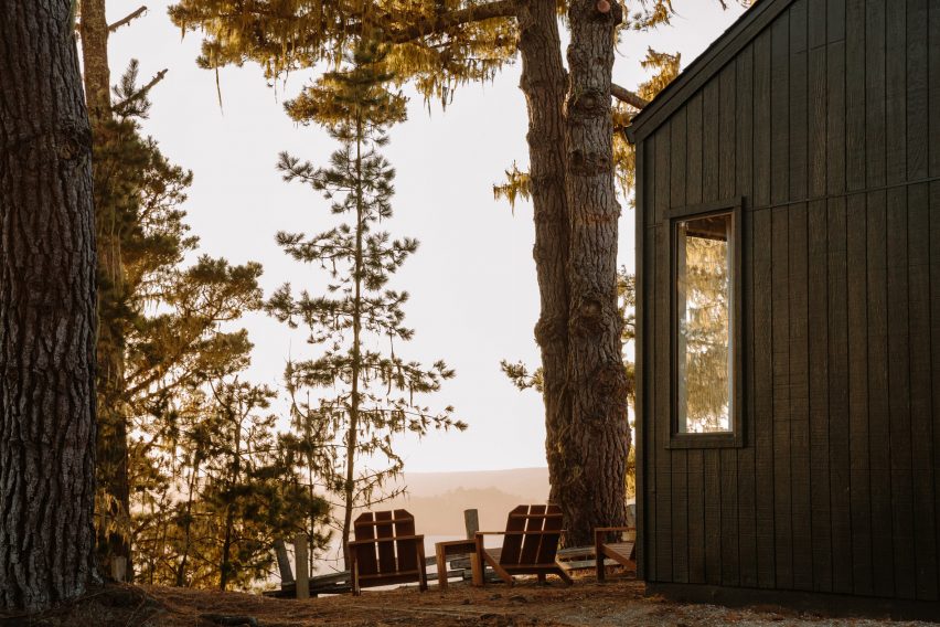
US studio Michael Hennessey Architecture has revitalised an ageing suburban house near San Francisco, adding black cladding and bright finishes to form a family home that bridges the past, present and future.

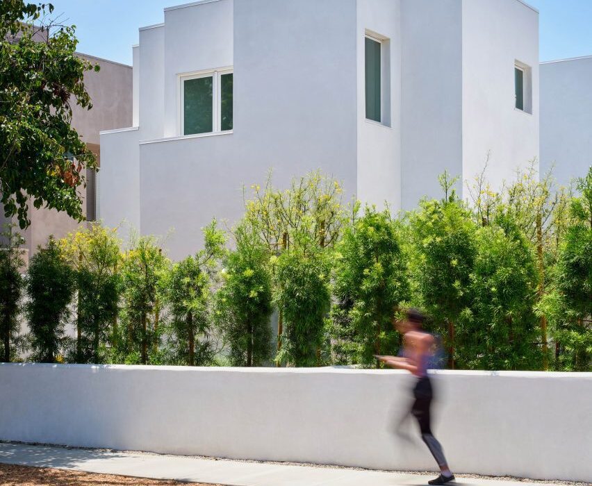
The residence is located in Mill Valley, a town just north of San Francisco that is known for its natural terrain and cultural offerings.

Black house by Michael Hennessey ArchitectureBlack house by Michael Hennessey Architecture
Michael Hennessey Architecture created Courtyard Hous

Designed for a couple with two young children, the budget-conscious project involved the renovation of a suburban-style house that was “in sore need of upgrades”.

The aim was to create a dwelling that supported the family’s current needs while being mindful of what might be needed in the future.

Courtyard House living spaceCourtyard House living space
The home is U-shaped in plan

“The home was thought not only as a shelter, but also as a bridge: from past to present, from one landscape condition to another, and from what a family wanted to what they could have,” said Michael Hennessey Architecture, which is based in San Francisco.

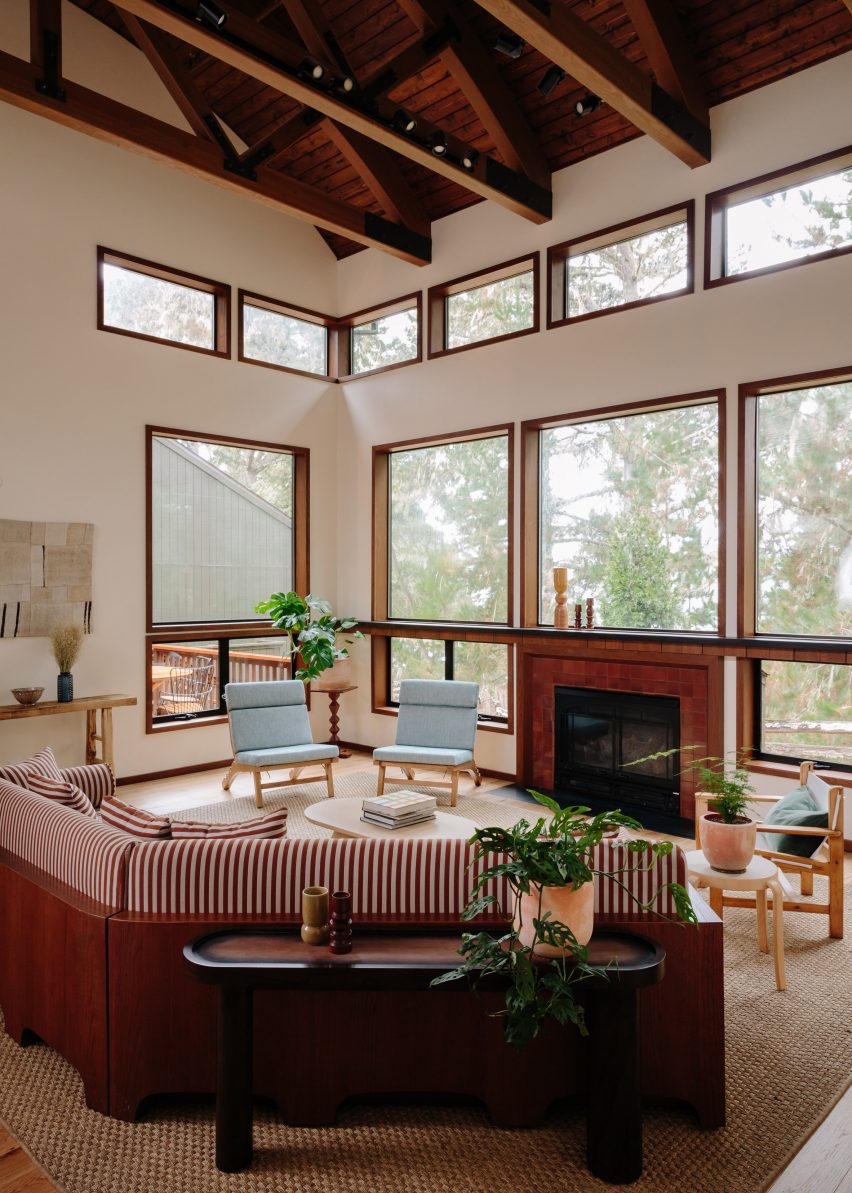
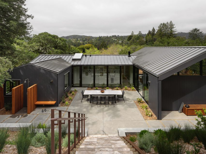
Built into a hillside, the home is U-shaped in plan, with gabled volumes organised around a central courtyard.

Vertical cedar sidingVertical cedar siding
Vertical cedar siding that adds a sense of gravitas

The team opted to preserve certain elements while adding contemporary interventions.

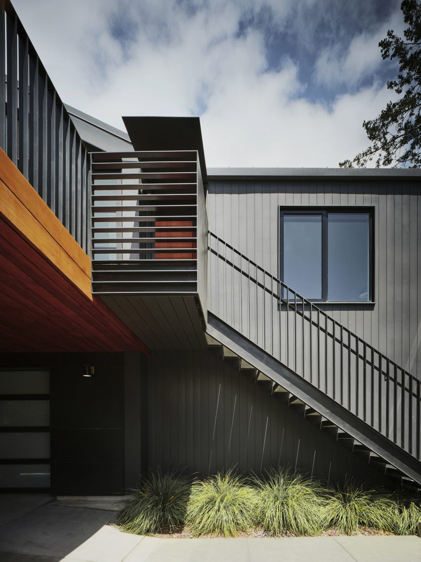
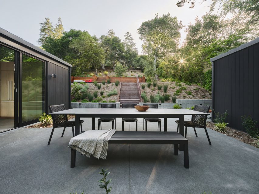
The building’s beige exterior was replaced with black, vertical cedar siding that adds a sense of gravitas, the studio said. The roof is covered in standing-seam metal.

Open-plan kitchen Open-plan kitchen
Inside there is a clear division between public and private zones

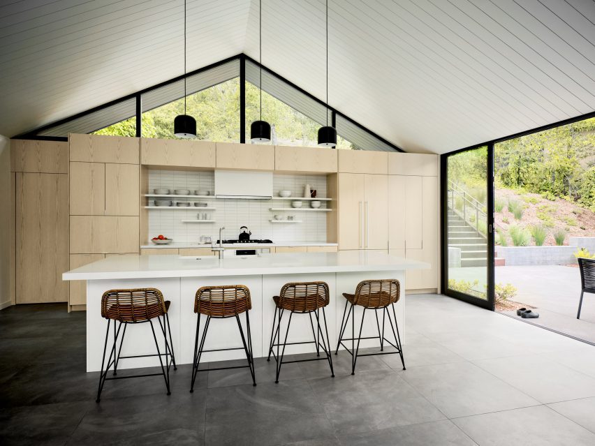
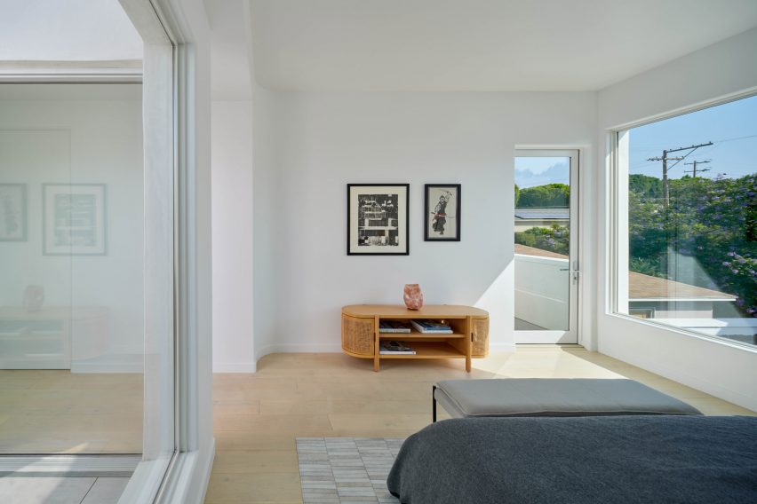
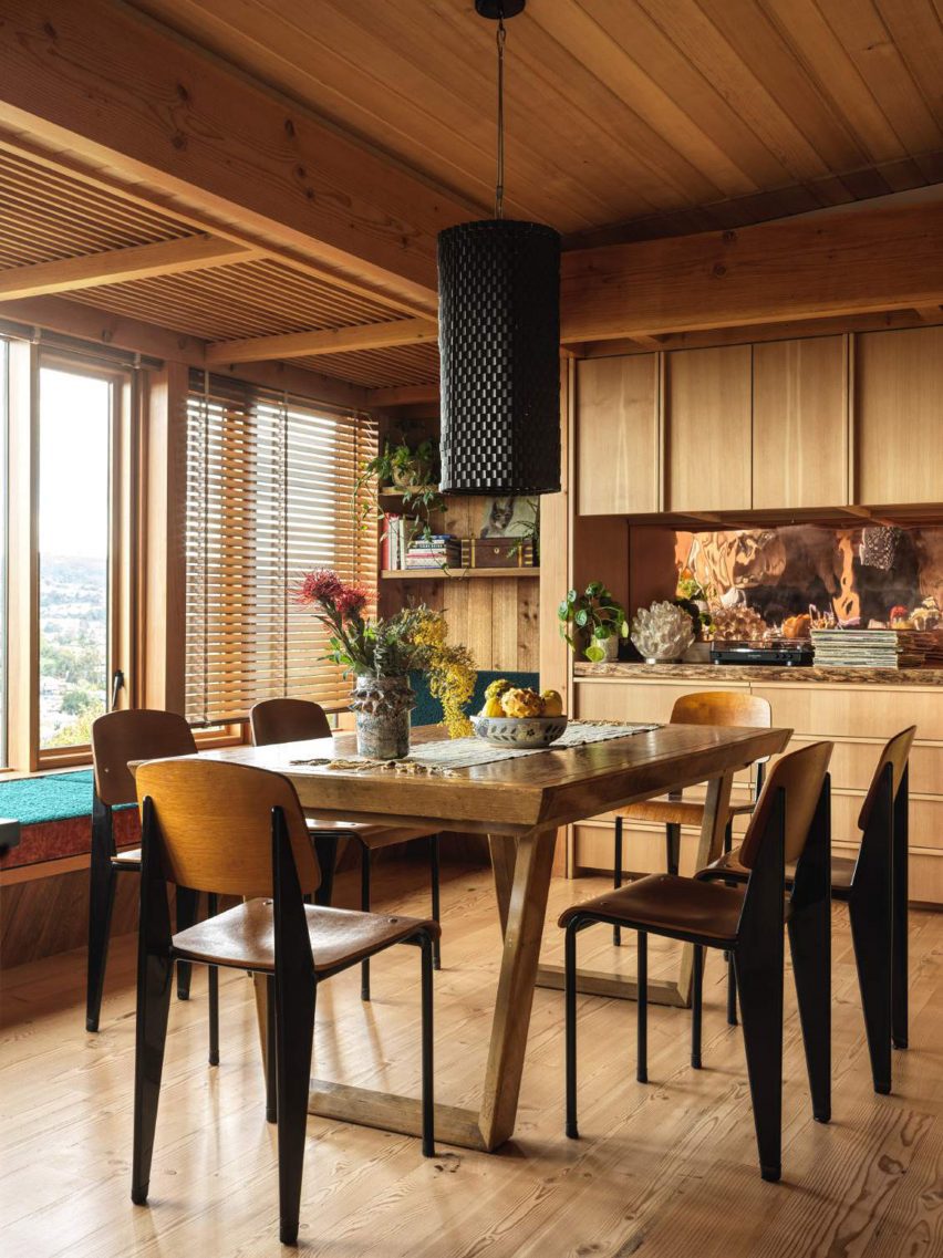
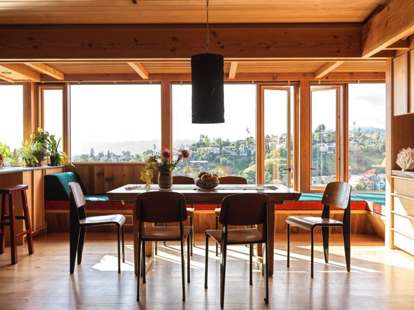
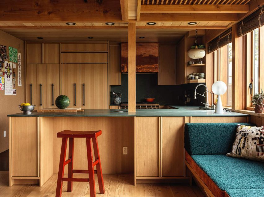
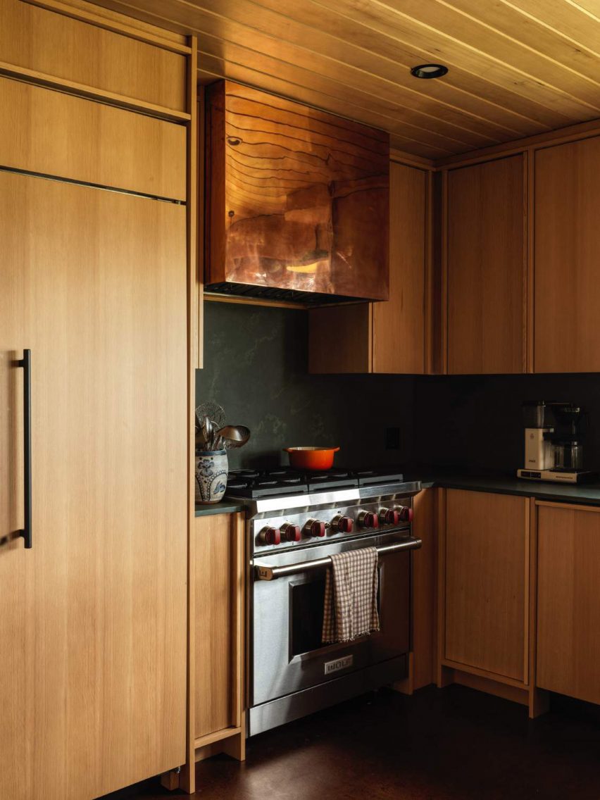
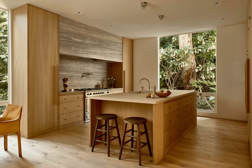
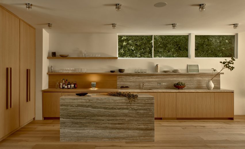
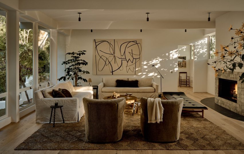
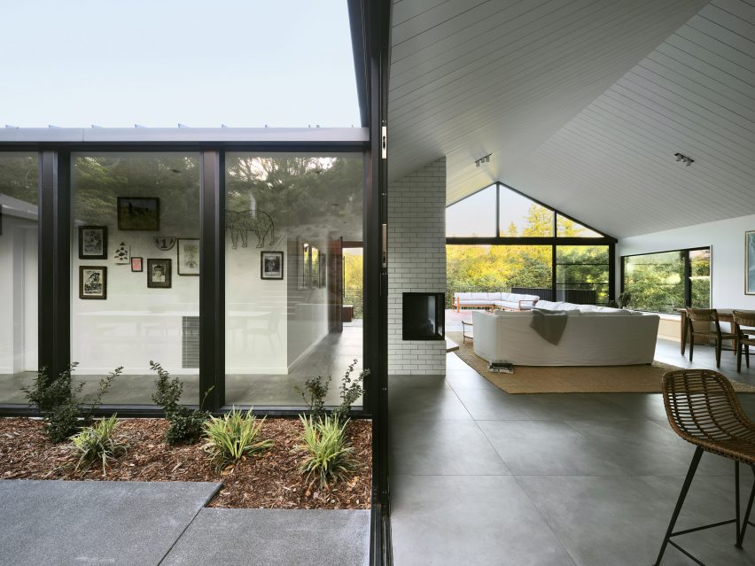
Inside, the 1,870-square-foot (174-square-metre) house features a clear division between public and private zones.

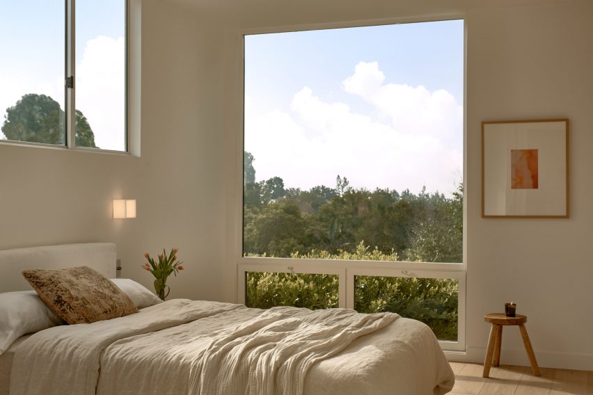
On the main level, one side holds an open-concept kitchen, dining area, and living room, while the other encompasses three bedrooms. The ground level contains a family room and a garage.

South-facing deckSouth-facing deck
A south-facing deck features outside

“Clearly delineated programmatic areas work in harmony with each other, the outside and the family’s needs,” the team said.

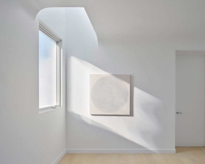
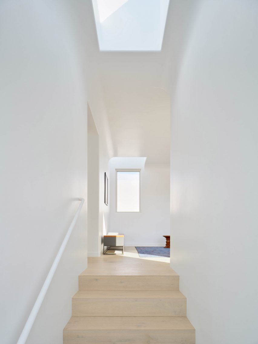
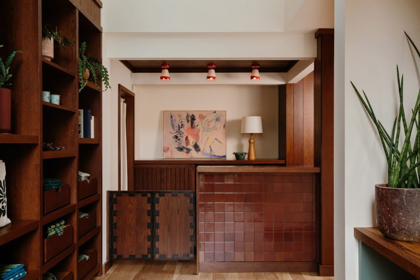
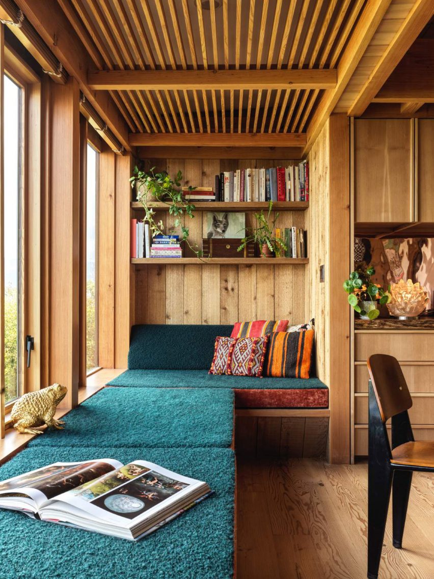
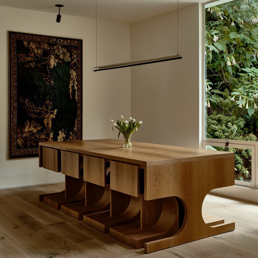
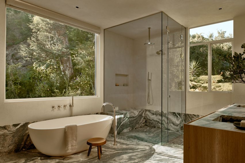
Interior finishes include ash cabinetry, large-format porcelain floor tiles, and ceramic tiles around the fireplace. Lofty ceilings and large stretches of glass provide an airy feel.

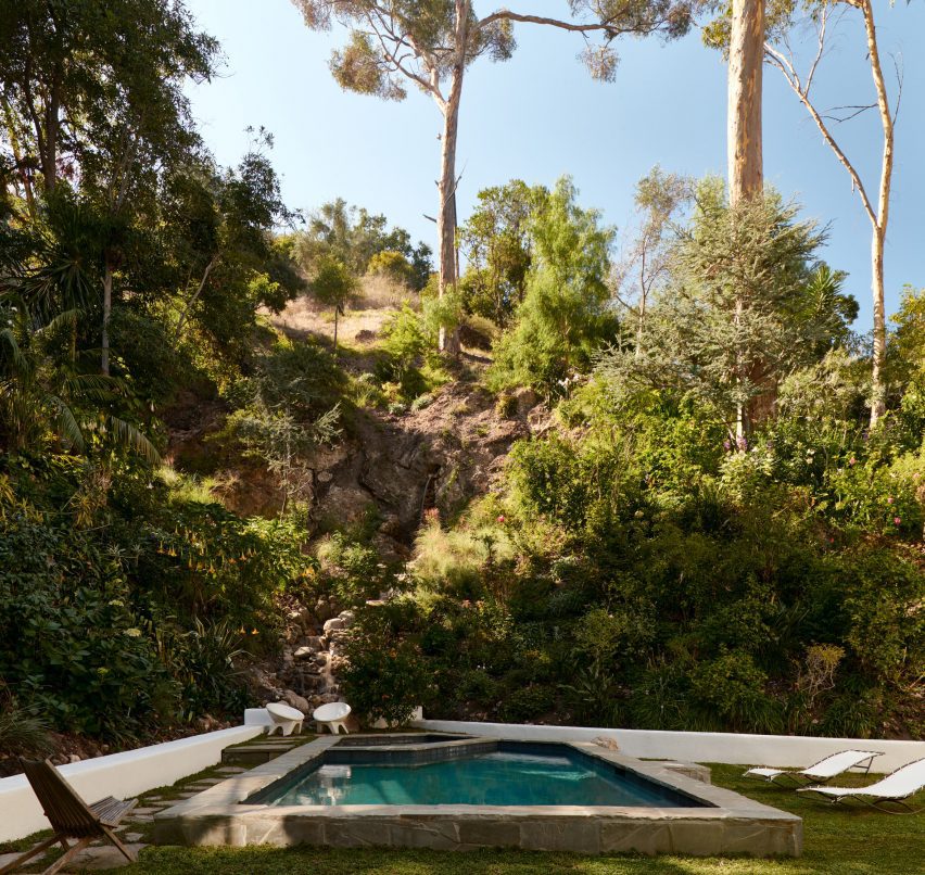
The outdoor spaces include a spacious, south-facing deck that receives bright sunlight. Softer light flows in through the courtyard on the north.

Proving a connection to the forested, hilly landscape was a guiding concern for the team.

Outdoor showersOutdoor showers
Outdoor showers were also included in the design

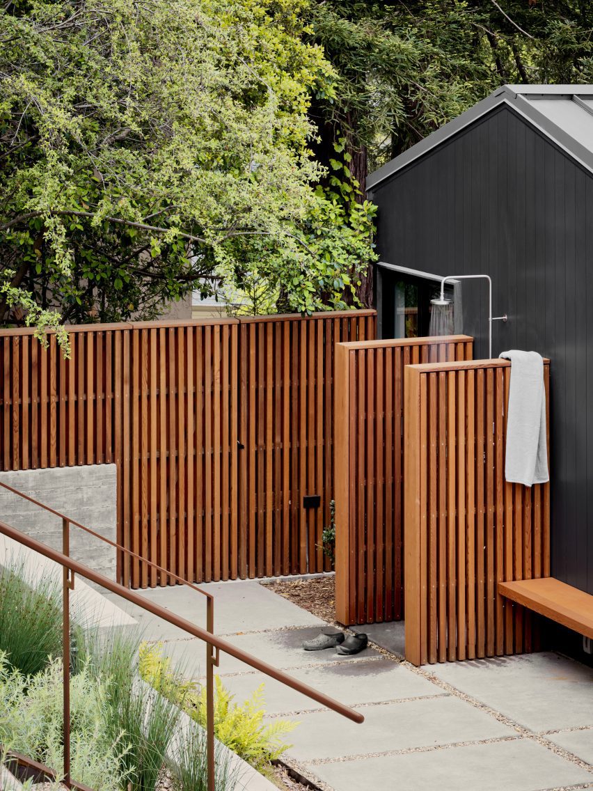
“Every part of the house is oriented towards the landscape thanks to carefully framed views of the lush immediate vegetation, as well as the more distant valleys, resulting in a comprehensive, thoughtful and sensitive approach to creating an extraordinary daily life,” the team said.

Other projects by Michael Hennessey Architecture include a townhouse with modern bay windows that was designed to offer alternatives to “conventional building strategies” and the refurbishment of a 1960s house that was originally built by Joseph Eichler, known for his modernist housing subdivisions.

The photography is by Adam Rouse.


Project credits:

Architect: Michael Hennessey Architecture
Architecture team: Michael Hennessey, Claudia Merzario, Jason Laudat
Contractor: New Dimension Builders (Dirk Von Rueben)
Structural engineer: Berkeley Structural Design (Bill Lynch)
Landscape architect: George Loew
Title 24 consultant: EnergySoft, LLC (Hayley Monahan)
Sustainability consultant: Arcturus HD (Jeff Aalfs)

Reference

Heavily textured walls with hanging pendants
CategoriesInterior Design

Apparatus updates Los Angeles showroom to include a “modernist grotto”

New York-based studio Apparatus has redesigned its Hollywood showroom with multiple material schemas and a range of its lighting and furniture products to evoke a feeling of “discovery” for visitors.

The 5,000-square-foot (464 square metres) Hollywood showroom first opened in 2018 in a former warehouse. Apparatus redesigned the interiors – which previously consisted of bold geometric and neoclassical elements – opting for an experience featuring a progression of materials that create distinct experiences for each room.

Heavily textured walls with hanging pendantsHeavily textured walls with hanging pendants
Apparatus has redesigned the interiors of its LA showroom

Its three adjoining rooms were transformed with distinct finishes and reconfigured displays.

The first room’s walls and adjoining archways were covered in a coarse rock aggregate. Beds of similar stones fill small recessed gaps between the floor and the walls and a large circular mirror sits behind an installation of the Trapeze light configured as a mobile.

Heavily textured walls of Apparatus LA showroomHeavily textured walls of Apparatus LA showroom
The entry program features wall with a rough texture

“Upon entering, you find yourself in our version of a modernist grotto,” said Apparatus.

“Here lights are relatively low, allowing you to experience our collections with slightly subterranean undertones.”

Apparatus trapeze chandelier Apparatus trapeze chandelier
The “grotto”-like room features an installation of the Trapeze chandelier

The pre-existing archways were left intact and lead into the next space, which was finished in a silver-toned plaster custom produced by New York outift Kamp Studios. This surface treatment has a reflective quality meant to contrast the first space.

It has an installation featuring multiple of Appratatus’ iconic Cloud chandeliers that give the space an airiness when contrasted with the earthy textures of the first.

Apparatus LA showroomApparatus LA showroom
The second room has a smooth, silvery finish on the walls

“Silvered walls reflect without revealing, giving the impression of being inside a Renaissance coffer,” said the studio. “After the grounding of the first space, this functions as a release.”

A third room is lined with cork wall panels with intricate grain patterning and includes an unattributed bird-themed tapestry.

Natural light comes in from overhead windows casting shadows on the double-height room, and includes several products arranged sparsely across the room.

“It’s about feeling discovery and moving through layers,” said Apparatus founder Gabriel Hendifar.

Throughout, light fixtures are hung low to emphasize a dream-like characteristic of the reimagined space.

As in Apparatus’s other showrooms in New York and London, the gallery’s interior design resembles the composition of famous paintings and historical architectural styles. Italian artist Giorgio De Chirico’s Surrealist works were referenced for this room.

Apparatus showroomApparatus showroom
The third space features cork-lined walls and a double-height ceiling

According to the company, the space was also redesigned based on a creative narrative of a hypothetical person: a woman living in New York City during the 1960s.

The hypothetical person in this case experiences the cultural tensions of the time, between old world conventions and big changes in society, such as the moon landing, embodying the “tension between modernity and the arcane”.

“What would happen if this woman moved to Los Angeles a decade later to find herself? Our Los Angeles gallery is the answer,” said the studio.

Apparatus LA Apparatus LA
The rooms were ordered to evoke a sense of discovery

Apparatus has displayed its full suite of products in this immersive setting. Collections on view include the Cloud pendant lamp and the Episode Settee sofa.

Other recent showroom designs include the London Camper store by James Shaw and Malbon Golf Coconut Grove store by 22RE.

The photography is by Matthew Placek.

Reference

A long, metallic conference table within an industrial-style building
CategoriesInterior Design

Crosby Studios creates office-themed installation for The Frankie Shop

New York-based Crosby Studios has piled office equipment around a long metallic table as part of a pop-up installation for fashion brand The Frankie Shop in Los Angeles.

The month-long installation titled The Office was launched to coincide with LA Art Week and the Sag-Aftra film festival and marked the New York label The Frankie Shop‘s first presence in the Californian city.

A long, metallic conference table within an industrial-style buildingA long, metallic conference table within an industrial-style building
A long, metallic conference table formed part of The Office installation created by Crosby Studios

The brand’s founder Gaëlle Drevet and Crosby Studios creative director Harry Nuriev met at his studio, talked for 2.5 hours and decided to work together.

The resulting installation occupies a trapezoidal building on Sunset Boulevard wrapped in metallic film on all sides.

Equipment like printers, office chairs and water coolers arranged around a roomEquipment like printers, office chairs and water coolers arranged around a room
Equipment like printers, office chairs and water coolers were arranged around the perimeter of the space

Inside, the warehouse-like space features a long table also covered in a reflective material, with matching cube-shaped stools set along either side.

Articulated desk lamps, microphones and bottles of water were arranged on the table as if set up for delegates at a convention.

Metallic table with water bottles and microphones on topMetallic table with water bottles and microphones on top
The central table featured microphones and water bottles as if set up for a meeting

Around the perimeter, Nuriev placed recycled office equipment, such as a large printer, a stack of binders and a pile of plastic-wrapped office chairs.

A row of water coolers was lined up along one end of the room, encircled with glowing light boxes to create sharp silhouettes of the equipment in front.

Pile of office chairs silhouetted against a bright light boxPile of office chairs silhouetted against a bright light box
Light boxes that encircle the space create sharp silhouettes of the office furniture placed in front

“It’s not really about the office, it’s more about what happens after the office,” Nuriev told Dezeen. “I was thinking it’s time to officially move on from the office and consider the future. However, in this project, we’re uncertain about what the future holds exactly.”

A selection of apparel by The Frankie Shop is interspersed among the vignettes, while a “storage” area in the back serves as a fitting room.

Plastic-wrapped silver furniturePlastic-wrapped silver furniture
Some of the furniture is plastic-wrapped, appearing as though just installed or ready to be shipped away

Together, the industrial style of the building, the silvery materials, the lighting and the equipment served to highlight the brand’s reinterpretation of businesswear.

“The pop-up design blends a dynamic combination of fashion and nostalgia, where the power suits of the past seamlessly align with the modern attitude of The Frankie Shop,” said the team.

Metallics are commonplace in Nuriev’s interior projects, appearing prominently in a Berlin jewellery store, a Moscow restaurant and his own New York apartment amongst others.

However, he is vague about the reasons or intentionality behind this recurring theme.

Exterior of a building on Sunset Boulevard covered in reflective filmExterior of a building on Sunset Boulevard covered in reflective film
The exterior of the building on Sunset Boulevard is also covered in reflective film

“I don’t really think about ‘why’; it’s just my instincts, and I prefer to follow my feelings,” said Nuriev. “For this project, I had a vision of silver, and I think it works perfectly.”

Originally from Russia, the designer founded Crosby Studios in 2014 and is now based between New York and Paris.

Zoomed out view of The Frankie Shop building in LAZoomed out view of The Frankie Shop building in LA
The month-long installation marks The Frankie Shop’s first presence in LA and was timed to coincide with the city’s art week

He recently completed the interiors for New York nightclub Silencio, based on the original location in Paris designed by film director David Lynch.

Nuriev frequently collaborates with fashion brands, on projects ranging from a virtual sofa upholstered with green Nike jackets to a transparent vinyl couch filled with old Balenciaga clothing.

The photography is by Josh Cho.

The Office is on show in Los Angeles from 23 February to 24 March. For more events, talks and exhibitions in architecture and design visit Dezeen Events Guide.

Reference

Woman running in front of white stucco house rising out of hedges
CategoriesSustainable News

Inaba Williams creates mirrored stucco-clad residences in California

US studio Inaba Williams Architects has created two mirrored houses with courtyards in Santa Monica, California that are clad in white stucco and have net-zero energy use, according to the studio.

Completed in 2023, the twin five-bedroom houses measure 3,900 square feet (362 square metres) each and are divided by a privacy wall and rectangular lap pools.

Woman running in front of white stucco house rising out of hedgesWoman running in front of white stucco house rising out of hedges
Inaba Williams Architects has completed two white-stucco-clad houses in Santa Monica

Brooklyn-based practice Inaba Williams Architects followed strategies laid out in Title 24 – California’s Building Energy Efficiency Standards – to create net-zero emissions houses “better suited to our future climate conditions”.

“Having far fewer windows, the buildings reduce heat gain and energy use, while allowing residents to enjoy indoor outdoor living,” the studio told Dezeen. “With less need for air conditioning and generous access to landscaped areas, they offer a more natural, less tempered experience with the environment.”

White stucco home with small tree and soaking pool in courtyardWhite stucco home with small tree and soaking pool in courtyard
The two structures are mirrors of each other and are divided by a courtyard with a privacy wall in the middle

Set on 40-foot (12-metre) wide lots, the linear homes measure only 20 feet (6 metres) at their widest, leaving plenty of space for outdoor areas on either side of the house for residents to enjoy.

Residents enter from a small courtyard on the outside street-edge corner of the lot into a rounded entryway that passes directly into the main exterior courtyard.

White stucco home with open doorWhite stucco home with open door
The studio said the home has achieved net-zero emissions

At the northern end of the site lies a small two-storey volume that holds a media room and a private suite.

Moving deeper into the house, the living, dining and kitchen areas are collected into an open-plan space with windows and sliding doors that look onto the outdoor areas – including a dining patio – which bring daylight in from three sides.

Living room with pool seen through courtyard doorsLiving room with pool seen through courtyard doors
The white of the exterior continues inside

A bedroom suite, garage, and a secluded zen garden hold the southern edge of the site.

Above, a family room and terrace sit at the top of the staircase in the centre of the plan. Two suites are located on the rear of the site, while the primary suite takes up the rest of the level with a private embedded balcony.

Bedroom with white walls and minimalist furnitureBedroom with white walls and minimalist furniture
Wood flooring was used for the top floor

“The courtyards are the focal point of the side-by-side homes,” the team said. “Following the Energy Standards’ option to use glass on just 20 per cent of the exterior surface area, the limited amount of glazing is concentrated around these central outdoor areas. “

Positioned to maximize daylight, the courtyards and auxiliary areas capitalise on the coastal location’s mild climate and can be used every day.

Curved white windowsCurved white windows
Windows were strategically placed to maximise light and limit heat gains and losses

“Similarly, taking into account the solar path, the building massings let ample sunshine into the courtyards over the day and year,” the team said.

The all-white houses have simple materials to accentuate their forms, with stucco on the exterior. White walls and terrazzo and hardwood floors feature on the interiors. The coving along the ceiling is made of glass fibre-reinforced concrete from a local vendor.

Skylight over oak staircase in white Santa Monica homeSkylight over oak staircase in white Santa Monica home
The houses were constructed under California’s Title 24 guidlines

Outside, brick pavers are set in a herringbone pattern that provides a soft geometrical detail to the smooth forms and green planted beds add color and texture.

Combined with the low glass-to-surface area building envelope, root-mounted solar panels help the homes meet California’s Zero Net Energy criteria, however hitting performance metrics wasn’t the team’s driving force.

“We think the more approaches there are to creating a sustainable future the better, and the Standards could have a cumulative climate benefit,” the studio said. “Just as the New York 1916 Zoning Resolution shaped the highrise tower type, California’s Energy Code can help shape the house type by being a framework for experimenting with its form and layout.”

“Its requirements can be guidelines to think inventively about climate-oriented design – to evolve our collective thinking about the type in a positive way.”

White walls along street of Santa Monica houseWhite walls along street of Santa Monica house
Exterior walls provide privacy for extensive outdoor space

Other recently built courtyard houses in Santa Monica include a brick house centred around a decades-old olive tree by Woods + Dangaran and a cedar- and zinc-clad L-shaped home by Walker Warner Architects.

The photography is by Brandon Shigeta.


Project credits:

Design architect: Jeffrey Inaba, Darien Williams, Sharon Leung, Nabila Morales Perez, Yasamin Mayyas, James Brillon, Andre Macias-Yanez
Executive architect and general contractor: Modative
Civil engineer: Obando and Associates
Structural engineer: Gouvis
Title 24 consultant: Title 24 Guys
Landscape architect: Studio H2O

Reference

Double-height lounge space with large windows and a red striped sofa
CategoriesInterior Design

Home Studios uses local materials to renovate Northern California hotel

Brooklyn-based Home Studios has turned a conference centre in Northern California back into a luxury hotel, as originally intended by the property’s founder: the inventor of the radio.

The Lodge at Marconi sits on a 62-acre site next to Tomales Bay, within the picturesque Marconi State Historic Park – a 1.5-hour drive up Highway Route 1 from San Francisco.

Double-height lounge space with large windows and a red striped sofaDouble-height lounge space with large windows and a red striped sofa
Home Studios created a variety of lounge areas across Lodge at Marconi to provide an informal atmosphere

Designed for Nashville-based company Oliver Hospitality, the hotel occupies a historic property that was first built by Guglielmo Marconi, an Italian physicist who invented the radio in 1896.

“Home Studios found inspiration in the property’s storied history – particularly in the pioneering spirit of Guglielmo Marconi, who worked with a New York-based engineering company to build the property’s initial building, a luxury hotel, in 1914,” said the design team, led by Oliver Haslegrave.

Hotel reception counter clad in oxblood-coloured tilesHotel reception counter clad in oxblood-coloured tiles
The reception counter is clad in oxblood-coloured tiles from Heath Ceramics

It took 17 months to overhaul the complex of blackened-wood buildings, which are topped with mono-pitched roofs of different heights and opposing directions.

The architecture is similar to that of The Sea Ranch Lodge further up the coast, which reopened in 2022 after its own extensive renovation.

Dining room featuring brick flooring, blue-green tilework and eclectic contemporary furnitureDining room featuring brick flooring, blue-green tilework and eclectic contemporary furniture
The Redwood Dining Hall features brick flooring, blue-green tilework and eclectic contemporary furniture

Home Studios looked to the iconic site – famed for its modernist style and sensitive land planning – for cues when developing the Lodge at Marconi’s 45 guest rooms and suites, which occupy freestanding buildings across the wooded site.

“Borrowing design language from Sea Ranch’s ‘living lightly on the land’ credo, the rooms blend into the environment and boast a tranquil and peaceful atmosphere,” the team said.

A series of coloured wooden cubes mounted on a wall above banquette seating and dining tablesA series of coloured wooden cubes mounted on a wall above banquette seating and dining tables
Artworks in the restaurant, including a series of coloured wooden cubes, were created in collaboration with Lukas Geronimas Giniotis

The hotel complex is made up of eight indoor and outdoor spaces, laid out “like a summer camp” to accommodate different activities in each area.

In the reception block, guests arrive to a series of lounges and other communal spaces that create a more informal setting than a traditional hotel lobby.

Bright guest suite with a double bed, day bed and blue lounge chairBright guest suite with a double bed, day bed and blue lounge chair
The bedrooms are bright and airy, with materials and colours that subtly reflect the hotel’s natural surroundings

A check-in counter is fronted with oxblood-coloured tiles by Heath Ceramics, which was founded in nearby Sausalito.

More of the company’s tiles, this time in blue-green hues, line the lower walls of the restaurant known as the Redwood Dining Hall.

Shower with colourful patchwork of tiles from the 1960sShower with colourful patchwork of tiles from the 1960s
Three of the guest room bathrooms feature original tiles that date back to the 1960s

Red bricks are laid in a basketweave pattern across the floor, contrasting with the bright blue bases of the custom dining tables, while warm cedar panels and beams cover the ceiling.

A mural comprising four-panel linen screens and a series of wood cubes mounted on a wall was made in collaboration with California-based artist Lukas Geronimas Giniotis.

The guest rooms are bright and airy, with the colours of the natural surroundings subtly reflected in the furnishings.

Some have cosy loft spaces, while larger suites feature a dedicated workspace and sitting area.

Buildings clad in blackened wood and topped with monopitched roofsBuildings clad in blackened wood and topped with monopitched roofs
The accommodations are split across several buildings clad in blackened wood and topped with monopitched roofs

“Northern California’s rugged environment served as a design influence, and is reflected in the natural woods and earth-tone textiles that adorn each room and weave together a cohesive connection throughout the property,” Home Studios said.

“Three guest room bathrooms feature original tile dated to the 1960s when the hotel served as a rehabilitation facility known as Synanon.”

Wooden chairs surrounding a fire pit with blackened wood buildings in the backgroundWooden chairs surrounding a fire pit with blackened wood buildings in the background
The property includes multiple outdoor areas for gatherings and events

Across the property, the indoor spaces are afforded scenic views of the forest and the water through large windows.

A variety of gathering and event spaces are available to guests both inside and out, including wooden chairs positioned around fire pits among the landscape designed by Bay Area firm Dune Hai.

View through the trees to Tomales Bay at sunsetView through the trees to Tomales Bay at sunset
Lodge at Marconi sits atop a hill overlooking Tomales Bay in Northern California

This is Home Studios’ third hotel project, following the Mediterranean-influenced Alsace hotel in Los Angeles and the boutique Daunt’s Albatross motel in Montauk.

The firm’s other recent projects include a revamped bar and restaurant on Nantucket, an Italian eatery close to Harvard University and a townhouse renovation in Fort Greene, Brooklyn.

The photography is by Brian W Ferry.

Reference

Paul Smith LA store interior is stone-clad partitions and exposed rafters
CategoriesInterior Design

Standard Architecture refreshes interior of pink Paul Smith store in LA

British fashion label Paul Smith’s iconic pink store in Los Angeles has received an interior makeover from Standard Architecture.

Standard Architecture collaborated with the Paul Smith design team to reimagine the 4,740-square-foot (440 square metres) store on Melrose Avenue, West Hollywood.

Paul Smith LA store interior is stone-clad partitions and exposed raftersPaul Smith LA store interior is stone-clad partitions and exposed rafters
Standard Architecture and the Paul Smith team reorganised the LA store to better define the brand’s different collections

The studios also created a new VIP entrance patio for the building, which is notorious for its bright pink exterior that has become a pilgrimage spot for amateur photoshoots.

“The primary goal was to enhance the overall customer experience within the store, which was achieved by creating a more cohesive and immersive shopping environment across the different brand departments,” said Standard Architecture.

Seating area with clothing displays on either sideSeating area with clothing displays on either side
Stone-clad partitions help to define areas, but don’t reach the exposed timber ceiling

The entrance to the store – the only opening in the giant pink wall that faces the parking lot – leads shoppers through a glossy red metal vestibule into the main retail space.

Clearly defined yet interconnected areas for the menswear, womenswear and homeware collections help with navigation around the store.

Suits displayed in colour order on long brass railsSuits displayed in colour order on long brass rails
Long brass rails are used to present tailoring

Partitions clad in dappled beige stone frame these zones, but don’t reach the exposed timber ceiling, to retain the sense of openness.

In places, the stone walls are inlaid with mosaic-style artworks depicting abstract flora, which add splashes of colour to the warm-toned surfaces.

Paul Smith homeware collaborations displayed in a corner of the storePaul Smith homeware collaborations displayed in a corner of the store
Paul Smith’s collaborations with Gufram and Anglepoise are among the pieces on show

Black track lighting is suspended from the rafters, spotlighting the various clothing displays and lounge areas furnished with midcentury-style sofas and armchairs that are dotted around the store.

Long brass rails that appear to be suspended in midair are used to display suit jackets, which are carefully arranged by colour.

Shoes presented on stepped white ledges that resemble bleacher seatingShoes presented on stepped white ledges that resemble bleacher seating
Shoes are presented on stepped white ledges that resemble bleacher seating

In an area dedicated to accessories, the shoes and bags are lined up on stepped white ledges that resemble bleacher seating.

Walnut is used for accents including shelving, door frames, and podiums, as well as for a large open storage system with compartments for presenting individual products and a row of sculptures by Alexander Calder.

Founded by fashion designer Paul Smith in 1970, his eponymous brand is synonymous with the brightly coloured stripes applied to many of its apparel products and other collaborations.

Many of these appear throughout the store, including a colour-tinted Anglepoise desk lamp and a striped version of Gufram’s cactus-shaped coat stand.

Glossy red metal vestibule with store interior beyondGlossy red metal vestibule with store interior beyond
Entry to the store is via a vestibule wrapped in glossy red metal

“Overall, the design reflects a deep understanding of the brand’s identity, which places a strong emphasis on the use of colour and attention to detail,” Standard Architecture said.

Paul Smith retail spaces around the world are equally playful. On London’s Albemarle Street, its boutique has a patterned cast-iron facade by 6a Architects, while the shop in Seoul is encased in a curving concrete shell by System Lab.

Bright pink exterior of Paul Smith store on Melrose AvenueBright pink exterior of Paul Smith store on Melrose Avenue
The store on Melrose Avenue is an icon in Los Angeles thanks to its bright pink facades

Standard Architecture was founded by Silvia Kuhle and Jeffrey Allsbrook, who discussed their work with Dezeen during our Virtual Design Festival in 2020.

Past projects by the firm include a Hollywood Hills residence with a cantilevered swimming pool and a minimal showroom for fashion brand Helmut Lang – which was located just a few blocks from the Paul Smith store before it shuttered.

The photography is by Genevieve Garruppo.


Reference

Wood-lined room with dining table and six chairs
CategoriesInterior Design

Lovers Unite revives interiors of mid-century Silver Lake home

California design studio Lovers Unite has reinvigorated a 1950s home with sweeping views of the Los Angeles hills, turning an unused balcony into an extension of the indoor social space.

The wooden dwelling in LA’s Silver Lake neighbourhood belongs to production designer James Chinlund and artist Clare Crespo.

Wood-lined room with dining table and six chairsWood-lined room with dining table and six chairs
Lovers Unite renovated the home for a creative couple in Los Angeles

A “previously a boring, nondescript mid-century house”, according to Lovers Unite, the property required some imagination to bring its interiors up to par with its setting.

Therefore, the studio “introduced a few carefully plotted architectural interventions and material shifts to completely reimagine the interior of the home and take full advantage of its prime site”.

Dining room with large windows that have a view of hills in the distanceDining room with large windows that have a view of hills in the distance
The house has expansive views over the city’s hills

The most impactful of these interventions was to bring an underutilised balcony at the back of the house into the envelope, extending the open-plan living and dining area by several feet.

Beneath the large windows that were installed to fill the gap, Lovers Unite placed built-in seating with teal-upholstered cushions for relaxing and enjoying the panoramic vista.

View of wood-lined kitchen with a peninsula in the foregroundView of wood-lined kitchen with a peninsula in the foreground
Plenty of wood was used throughout the home, particularly in the kitchen

“With a large window wall and generous built-in banquette, the room finally celebrates the expansive views that had always been there,” the studio said.

In the kitchen, dark green soapstone used for counters and the backsplash contrasts with the honey-toned cabinetry, and a shiny copper range hood matches a panel installed at the back of a bar area on the opposite side of the room.

Honey-toned wood kitchen with soapstone surfaces and a copper range hoodHoney-toned wood kitchen with soapstone surfaces and a copper range hood
The honey-toned wood contrasts with soapstone surfaces and a copper range hood

Elsewhere, colourful furnishings, collectible design pieces and bold artworks stand out against the predominantly wood interiors.

A timber-lined lounge area features the classic modular Togo sofa system by Michael Ducaroy, which is wrapped in yellow corduroy fabric.

Meanwhile, in the den, a purple armchair is positioned beside a giant chair that Chinlund used as a prop for a shoot by Italian fashion outfit Roberto Cavalli.

Wood slats were employed to partially screen the staircase opening on the upper level, next to a central fireplace with a raised hearth.

Teal-upholstered window seat with a reading nook at the endTeal-upholstered window seat with a reading nook at the end
As part of the renovation, an unused balcony was incorporated into the social space and a long window seat was installed in its place

Other decor items like vintage rugs, embroidered cushions and plenty of art and design books add even more character to the spaces.

“Ultimately, the mood of the home reflects the spirit and talents of the estimable homeowner,” said Lovers Unite, noting that Chinlund has worked as a production designer for the Avengers movie franchise.

Den with a purple armchair and an oversized chair with a disco ball on its seatDen with a purple armchair and an oversized chair with a disco ball on its seat
Colourful furniture and set props are scattered through the different rooms

Silver Lake is home to a variety of architectural gems, many built on dramatically sloping sites, including residences designed by notable mid-century architects like Richard Neutra and Rudolph Schindler.

Led by Karen Spector and Alan Koch, Lovers Unite is based close to the neighbourhood, and has previously wrapped a bar and restaurant in Pasadena with expressive drapery.

The photography is by Chris Mottalini.

Reference

Cafe interior with white oak tables, burnt orange seats and a wall mural
CategoriesInterior Design

Cafe Kitsuné Los Angeles features Parisian interiors with “Japanese twist”

Paris-based lifestyle brand Kitsuné has opened a cafe next to its boutique in Silver Lake, Los Angeles, both with minimalist interiors featuring white oak and stainless steel.

The interiors of the new Cafe Kitsuné and the renovated Maison Kitsuné store were designed by co-founder Masaya Kuroki to reflect the brand’s French-Japanese culture as well as the West Coast setting.

Cafe interior with white oak tables, burnt orange seats and a wall muralCafe interior with white oak tables, burnt orange seats and a wall mural
The Cafe Kitsuné interior includes a mural by Jeffrey Sinich that imagines the space as an old-school market

Facing Sunset Boulevard on the east side of the city, this is the brand’s fourth cafe in North America – following locations in Manhattan, Brooklyn and Vancouver – and its first in LA.

“A sprawling city of diverse findings, from cutting-edge restaurants to pockets of art and architecture second to none, LA has lent design inspiration and a backdrop to several campaigns for the fashion house,” said the Kitsuné team.

White oak counter front with stainless steel panels behindWhite oak counter front with stainless steel panels behind
White oak tables and surfaces are set against stainless steel counters and panelling for a minimalist look

“Now, it’s the perfect setting for Café Kitsuné, a physical extension of the brand’s Franco-Japanese DNA, and reinvention of the classic Parisian cafe and wine bar experience with a Japanese twist,” they added.

The building’s red-tile exterior and poured concrete flooring were preserved, and hand-painted signage by Californian artist Jeffrey Sincich was added over the large street-facing windows.

Burnt orange dining chairs and upholstered benchesBurnt orange dining chairs and upholstered benches
Burnt orange dining chairs and upholstered benches highlight the colours of the mural

Inside the 700-square-foot (65-square-metre) cafe, white oak tables and brushed stainless-steel counters feature alongside burnt orange dining chairs and upholstered benches.

Another Sincich mural covers the full length of a wall, offering “a whimsical take on Café Kitsuné’s standard appearance” and presenting the space as an “old-school market”.

A speaker system by Japanese audio company Rotel was installed in the cafe “to provide a top-notch sound experience for customers”, according to Kitsuné.

Next door in the boutique, a similar material palette is used for elements including a built-in storage and display unit across the back wall.

Maison Kitsuné boutique with oak panelling and bright blue central tableMaison Kitsuné boutique with oak panelling and bright blue central table
The existing Maison Kitsuné boutique next door has also received a refresh

White oak forms the framing, shelves and doors that lead to the stock and fitting rooms, while ribbed stainless-steel sheets provide a backdrop for the items on show.

More oak was used for the minimalist service counter and panelling behind, and a bright blue table sits in the centre to add a pop of colour.

White oak built-in shelving display for clothing, with bent metal chair in frontWhite oak built-in shelving display for clothing, with bent metal chair in front
White oak and stainless steel are repeated in this space to create a visual connection with the cafe

Kitsuné was founded by 2002 by Kuroki and Gildas Loaëc and encompasses the fashion brand, Maison Kitsuné; a music label, Kitsuné Musique; and its line of cafes, bars and restaurants.

Back in 2017, French designer Mathieu Lehanneur designed the Kitsuné store interior in New York’s Soho, adding snaking metal rails for displaying garments.

The photography is by David Kitz.

Reference

Restaurant interior with a pared-back palette
CategoriesInterior Design

Jialun Xiong creates intricate Sichuanese restaurant in LA

Subtle nods to traditional Chinese architecture can be found throughout this restaurant in California, designed by LA-based Jialun Xiong.

Sichuan Impression‘s third outpost, located in Alhambra, occupies a 2,000-square-foot (186-square-metre) space that “takes an elegantly pared-down approach to family-style dining”.

Restaurant interior with a pared-back paletteRestaurant interior with a pared-back palette
Jialun Xiong chose a pared-back palette for the Sichuan Impression interiors, creating a relaxed atmosphere

Jialun Xiong took an equally relaxed approach to the interiors, combining warm and soft colours with walnut furniture and metal accents.

“For Sichuan Impression, I chose a muted palette and natural materials to encourage guests to look a little longer and see the intricacies and textures that aren’t so obvious at first glance,” said Xiong.

A free-seating area beside a bar featuring walnut furniture and floating metal cabinetsA free-seating area beside a bar featuring walnut furniture and floating metal cabinets
A free-seating area beside the bar features walnut furniture and floating metal cabinets

The restaurant is roughly divided into four dining areas, each open to one another but defined by the style of seating.

To the left of the entrance is a sequence of partitions that alternate between heavy grey plaster and delicate metal mesh screens supported by antique brass frames.

Plaster partition separating different sections of the restaurantPlaster partition separating different sections of the restaurant
Plaster partitions separate the various sections of the restaurant

Each has a circular opening, which align to provide a continuous view along the minimalist walnut tables and benches that run along the same axis.

One table extends through an opening, accommodating larger parties when needed, and each compartment features an oversized, raw silk cloth light shade suspended above.

Restaurant interior with walls and screens of different heights and thicknessRestaurant interior with walls and screens of different heights and thickness
Walls and screens of different heights and thickness create a hierarchy of spaces

“The custom chandeliers nod to traditional Chinese lanterns and reflect Xiong’s skeletal furniture designs,” said the restaurant team.

In front of the bar is a free-seating space furnished with more wooden tables and chairs, which match the cabinetry against the far wall, while glass-fronted metal cabinets are mounted above.

A pair of chunky plaster-wrapped columns and low partitions separate a collection of booths with leather seats and upholstered cushioned backs on the other side.

The green fabric was chosen to resemble bamboo – a common material used in Sichuanese design.

Two rows of booth seating either side of a walkwayTwo rows of booth seating either side of a walkway
Booth seating is upholstered with a green fabric chosen to evoke bamboo

At the back of the restaurant is the private dining area, which can accommodate 16 guests altogether, or two groups of eight when a sliding partition is closed.

A circular window offers a glimpse into the private space, where the pared-back material palette is continued.

Private dining room with an intimate feelPrivate dining room with an intimate feel
A private dining room at the back has an intimate feel and can be spied through a circular window

“The secluded space is designed to feel like home with its bespoke circular dining table and ambient lighting,” said Xiong. “I believe good design doesn’t always have to be instantly recognisable, it can simply blend in.”

Xiong, who is originally from Chongqing, has also completed the retro-futuristic Chinese restaurant 19 Town close to Downtown LA. The designer recently showed her furniture and lighting pieces as part of the INTRO/LA showcase in November 2023, and at the Alcova exhibition during Art Basel in Miami in December.

Reference

Kitchen with white oak island and cabinetry, and travertine backsplash
CategoriesInterior Design

Ome Dezin restores 1960s California residence by A Quincy Jones

US studio Ome Dezin has renovated a large mid-century home in Brentwood, California, using a tonal colour palette and maximising the lush hillside views.

The six-bedroom 12221 Benmore residence was designed and constructed in 1960 by notable local architects A Quincy Jones and Frederick Emmon.

Kitchen with white oak island and cabinetry, and travertine backsplashKitchen with white oak island and cabinetry, and travertine backsplash
Natural materials and neutral colours were chosen throughout the home to highlight the lush views

When Jesse Rudolph and Joelle Kutner of Ome Dezin came to the project, it had undergone a 1990s remodel that had stripped away its character and style.

The team made it their mission to revive the home’s original charm and connection to the outdoors, bringing in natural tones and materials.

White oak and travertine bar areaWhite oak and travertine bar area
White oak and travertine are recurring materials, as seen in the bar area

“We have always been fans of A Quincy Jones and familiar with his work, which is what prompted us to see the home initially,” the duo told Dezeen.

“This one did not disappoint — it had the typical Quincy atrium-like living space centered across from the exterior which includes a 40-foot (12-metre) waterfall.”

Living room with neutral decorLiving room with neutral decor
The main living spaces all flow together and have expansive views onto the garden

Many of the existing fixtures were retained, including the fixed windows and doors, wherever possible.

To keep the focus on the views from the large windows, the interior was designed with “a more muted, streamlined aesthetic”.

Wood dining table with chairs that tuck neatly underneathWood dining table with chairs that tuck neatly underneath
Custom pieces designed for the home include a dining table and chairs created in collaboration with Ben Willett

“We wanted to ensure the intention of Quincy was intact, so we aimed for a bit of brutalism and connection with nature,” said Rudolph and Kutner. “We opted for a limited material and color palette in favour of natural tones.”

The new white oak staircase designed for the three-storey atrium features rectangular forms and has an architectural presence, echoing the shape and style of the building.

Bedroom with a large window overlooking treetopsBedroom with a large window overlooking treetops
Large windows are found in almost every room, so the decor is kept minimal and sparse so as not to draw focus

It sits at the nexus of the living room, dining area, kitchen and bar, which all flow together and enjoy expansive views out the back of the house.

A den adjacent to these open spaces is furnished with a variety of midcentury pieces, in keeping with the building’s history.

Bathroom with stone floor, freestanding tub and corner showerBathroom with stone floor, freestanding tub and corner shower
Dramatically patterned Cipollino stone in the bathroom echoes the grey tones of the rocks outside

Two types of stone were used throughout the home: travertine, which appears in the kitchen, bar area and powder room, and richly patterned Cipollino in the primary bathroom chosen to pick out the colours of the mountains visible through the windows.

In the lower-floor bedrooms and around the fireplace, flagstones and cobblestones were laid to create a grounding quality and to connect the spaces to the rocky landscape outside and pavers around the swimming pool.

Custom pieces designed for the project include the dining table created with furniture designer Ben Willett, which allows all of the chairs to be tucked away neatly underneath.

Two 10-foot-high (three-metre) doors were custom-built for the living space and feature Jean Prouvé-influenced circular window cutouts that allow light to shine through.

Garden featuring a swimming pool and a 40-foot (12-metre) waterfallGarden featuring a swimming pool and a 40-foot (12-metre) waterfall
The garden features a swimming pool and a 40-foot (12-metre) waterfall

“We paid special attention to the lighting in the home, mostly sourcing vintage lights to add charm and character,” the design team said.

“With such a large home, and lots of windows and tall ceilings, warm mood lighting really made the spaces feel intimate and magical, particularly in the evenings.”

Three-storey modernist house seen at duskThree-storey modernist house seen at dusk
The home was designed and constructed in 1960 by A Quincy Jones and Frederick Emmon

Rudolph and Kutner founded Ome Dezin as a design and development studio focused on residential restoration in and around Los Angeles.

California has no shortage of mid-century properties in need of revamping. Other recently completed examples include Studio Schicketanz’s renovation of modernist architect Henry Hill’s former seaside home, and Woods + Dangaran’s overhaul of a residence that once belonged to singer Bing Crosby’s manager.

The photography is by Nils Timm.


Reference