Architizer’s 12th Annual A+Awards are officially underway! Sign up for key program updates and prepare your submission ahead of the Final Entry Deadline on January 26th.
Picture a world where manmade towers not only house vibrant communities but do so with a commitment to energy efficiency and affordability. This may sound too good to be true, but such buildings already exist and are increasingly cropping up in diverse corners of the globe. Indeed, architects worldwide are already imagining a new model for sustainable urban living, where design innovation meets efficiency (energy, monetary and material) in the soaring heights of multiunit residential buildings.
Mitigating the most devastating consequences of our carbon addiction is the overarching challenge of 21st-century society; however, most countries also face housing crises, and affordability is urgent. Can passive house design — long associated with bespoke private single-family homes, both newly built and remodeled — be something of a panacea for affordable housing?
Indeed, the multi-pronged benefits of the following multi-unit projects seem almost too good to be true. Passive House design can reduce energy consumption by up to 90%, leading to substantial savings on energy bills for residents while providing tangible benefits as indoor air quality improves. Standing at the forefront of a green revolution and challenging conventional housing and construction norms, these apartment complexes employ airtight façades, energy recovery systems and innovative insulation, making these buildings pioneers and painting a picture of a future where sustainable architecture is accessible to a broader range of inhabitants.
Timber House
By MESH Architectures, Brooklyn, New York
Jury Winner, 11th Annual A+Awards, Sustainable Multiunit Residential Building


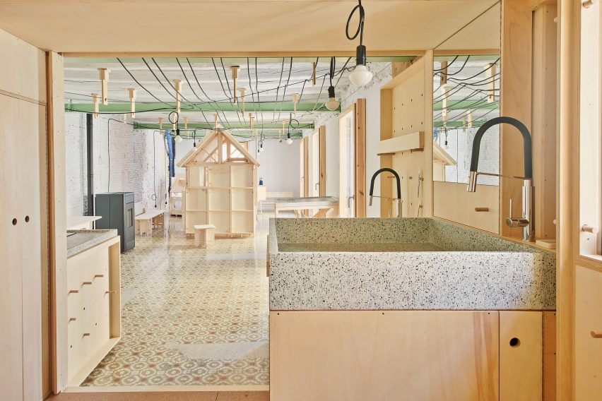
The design for Timber House, New York’s first mass-timber condominium, was principally driven by two things: a high-tech digital model (to generate the wooden components, which were subsequently delivered for assembly) and Passive House design principles. This sustainable haven sets a new standard, uniting nature-inspired aesthetics, energy efficiency and residential comfort in a six-story, fourteen-home marvel. The energy-efficient envelope — sealed with with intensive insulation, “smart” air sealing and triple-glazed windows — wraps around the ingenious structure, which consists of glue-laminated timber columns, beams and floor plates.
Meanwhile, the interior showcases the amazing aesthetic possibilities of specifying low-carbon materials — from hexagonal porcelain tiles to renewable softwoods — all illuminated in the natural light that pours in from multiple skylights. Perhaps most remarkably, the ingenuity of the design ensure that building only relies on the electrical grid (one that is generated by renewable sources) for heating, hot water and cooking.
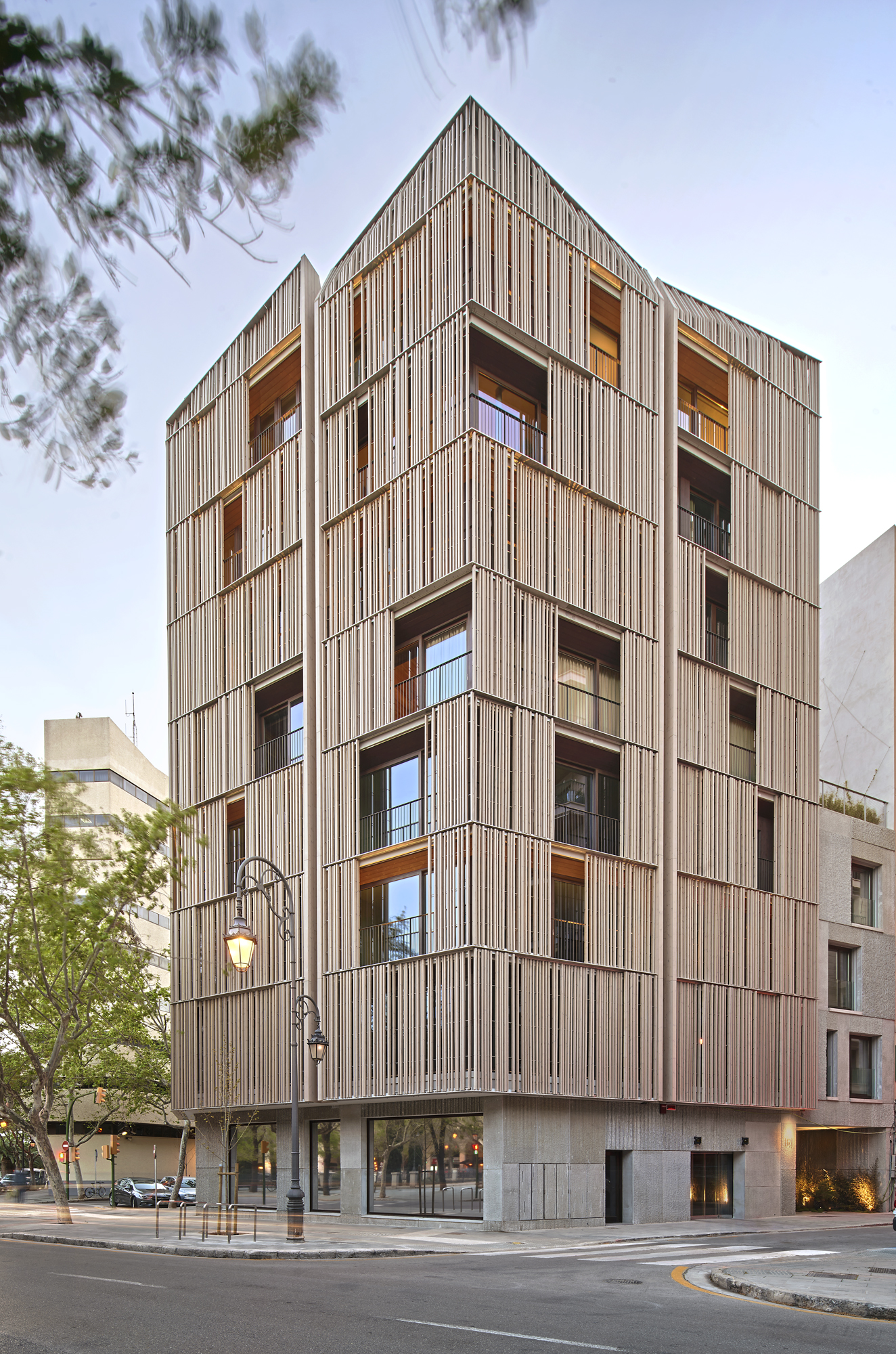
Paseo Mallorca 15
By OHLAB / oliver hernaiz architecture lab, Palma, Spain

 The city of Palma has a new landmark, and it isn’t what the general population might expect from the sun-soaked Mallorcan capital, known for the splendor and intricacy of its massive cathedral and the magnificent concentration of modernismo-style buildings (the Catalan equivalent of Art Nouveau). What sets this new residential complex apart isn’t simply its strikingly delicate façade and palpable material approach, but also the design’s dedication sustainability, energy-efficiency and urban integration.
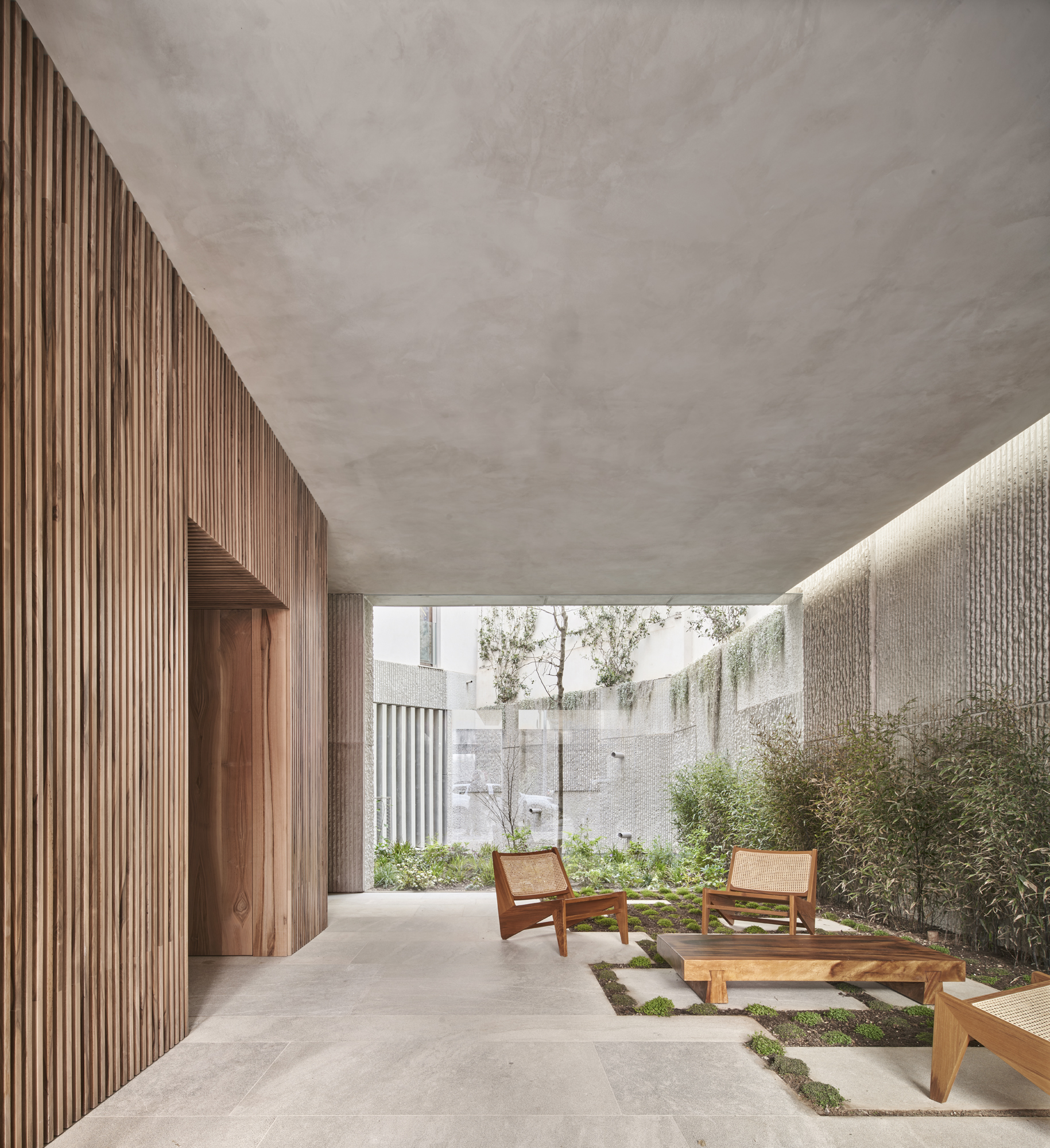
Passive House standards were used to ensure achieve maximum energy savings; in fact, the design boasts a nearly 90% reduction of the air, heating and cooling requirements of conventional buildings in this area. In addition, construction method falls within the nZEB (nearly zero energy building) standard for consumption. Sliding panels made of wooden slats are both practical and aesthetic: they filter the intense Mediterranean sunlight but also generate an ever-changing play of patterns inside. These are part of a distinct double façade, sheathing a solid stone envelope beneath.
The Rye Apartments
By Tikari Works, London, United Kingdom

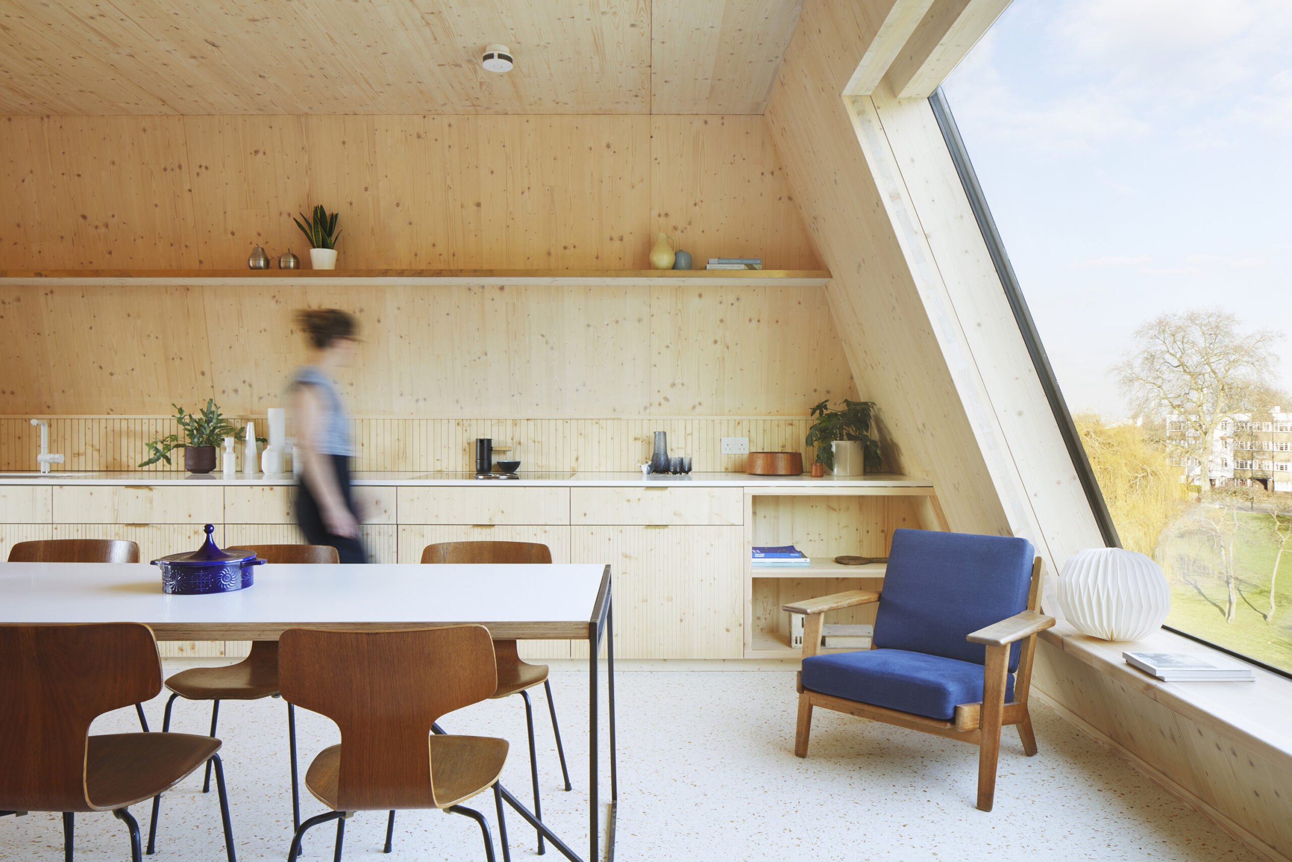
 Like a beacon for the future of design, this ten-unit residential building is proudly perched on a highly visible corner in London. The design, which incorporates a variety of different apartment layouts for families of varying sizes, emerged through a rigorous analysis of privacy, daylight and neighboring building forms. The resulting architectural language complements the surrounding context and history. For example, red masonry shingles create an urban composition which is both reminiscent of the surroundings yet distinct.
Beyond aesthetics, the architects consistently sought to maximize the design’s efficiency, by minimizing material use and waste, embodied energy and cost. Such strategies include a Cross Laminated Timber (CLT) frame and numerous passive principals for energy reduction and saving, such as PV panels, whole-house heat recovery ventilation, and hi-performance solar control glazing, all set within a super air-tight envelope.
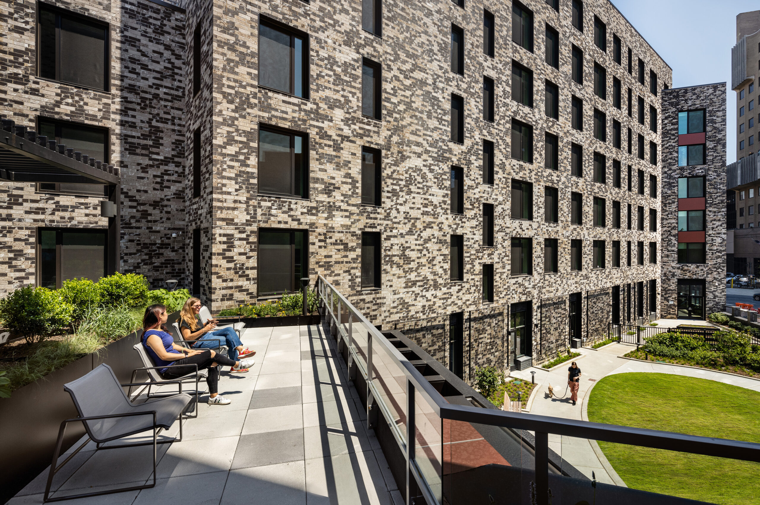
Vital Brookdale
By Dattner Architects, Brooklyn, New York

 Vital Brookdale stands as a prime example of affordable Passive House and community-oriented housing, providing 160 affordable housing units and 25,000 square feet (2,320 square meters) of health-centric community space in Brooklyn’s Brownsville neighborhood. This initiative incorporates a 100kW solar photovoltaic system mounted on the roof, a green roof, advanced mechanical systems, top-tier insulation and windows, LED lighting, water fixtures with low flow, and various other energy-efficient features. Meanwhile, inside, materials were selected according to the ease of installation, cost, maintenance and their impact on resident health. The result is a resounding testament to the untapped power of Passive House design in multifamily housing.
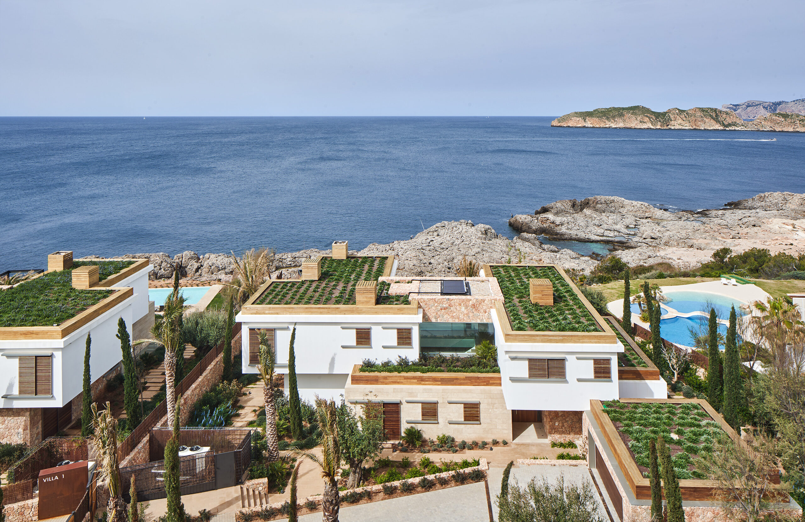
PUNTA PRIMA MALLORCA
By GRAS Reynés Arquitectos, Calvià, Spain

 The challenge: a client’s demand for extensive construction on a limited plot, which left little space for nature. The solution: a strategic blend of architectural elements that minimize visual impact and enhance the natural values of the land, embracing Passive House design to do so.
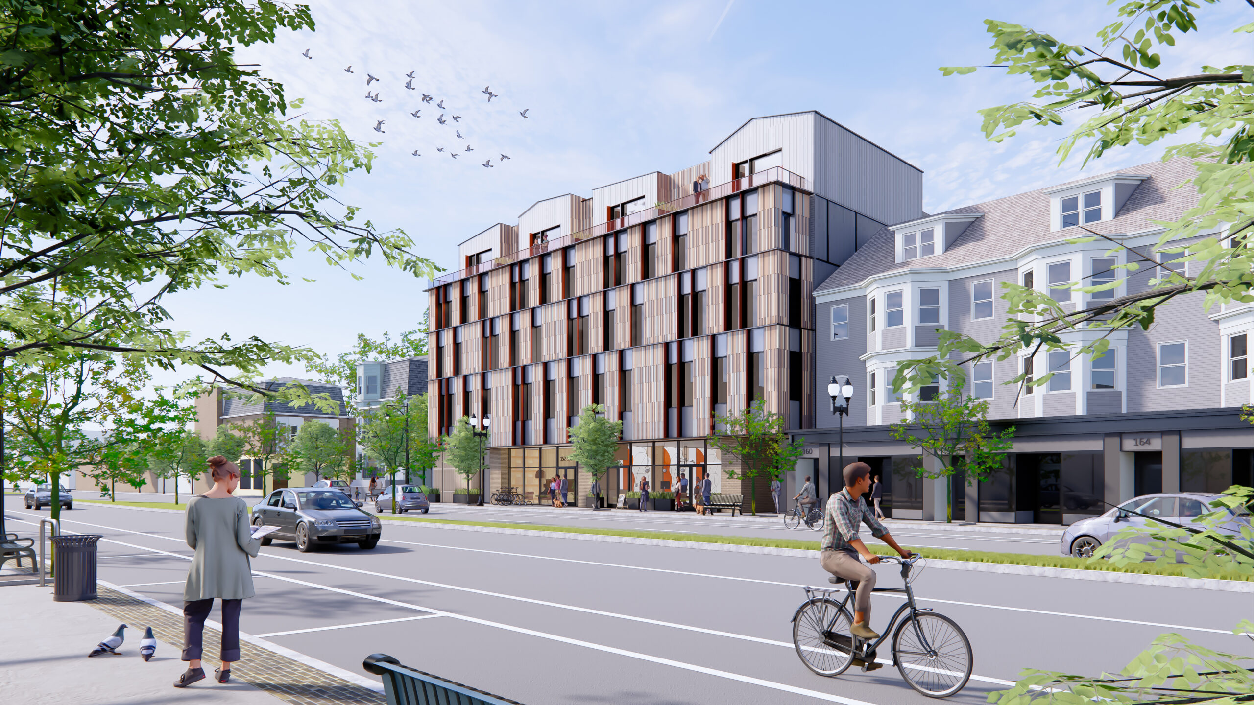
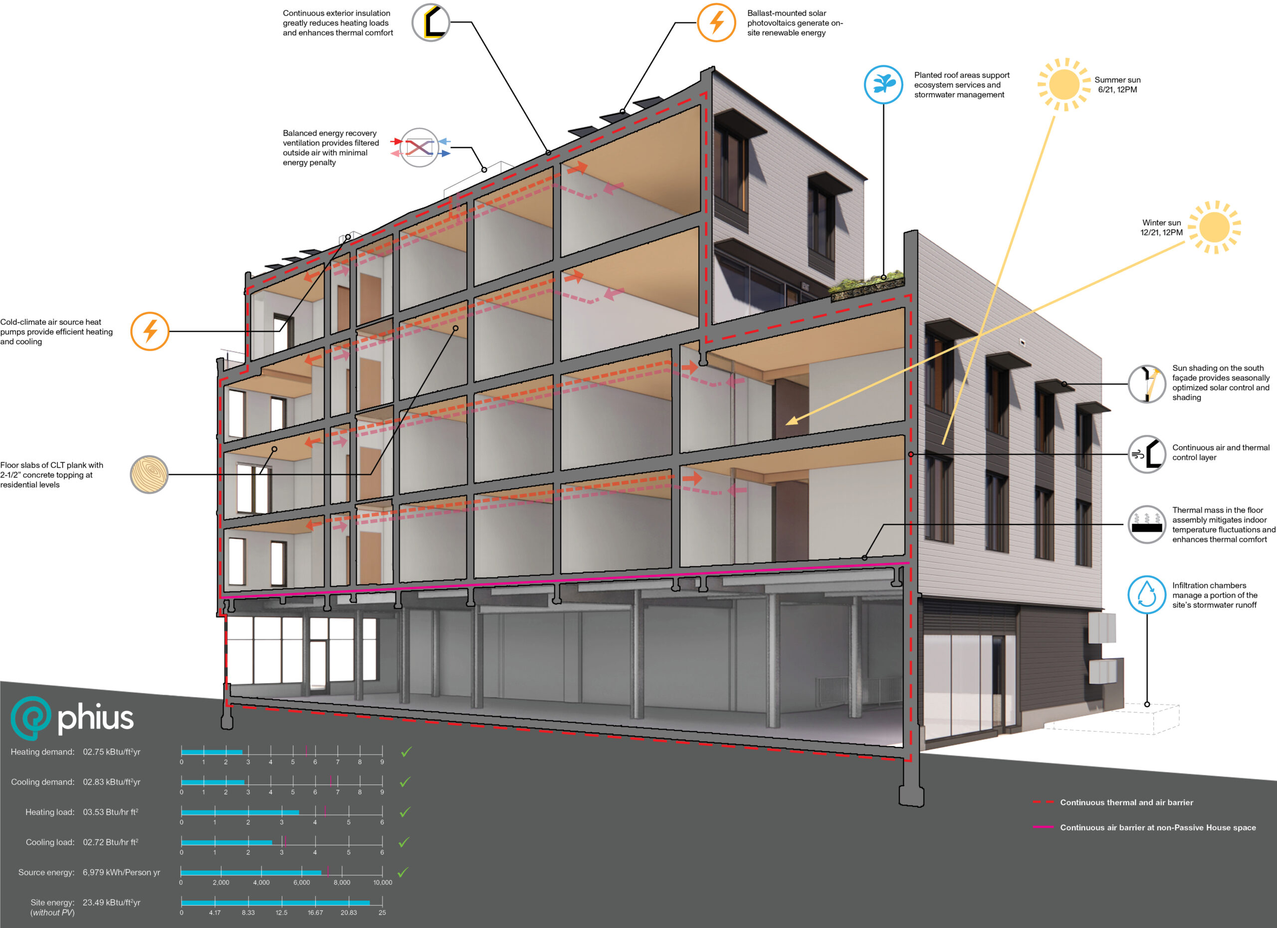
154 Broadway
By Utile, Inc., Somerville, Massachusetts

 A five-story mixed-use development with commercial space on the ground floor and 45 rental units above, this project achieved Passive House certification, utilizes mass timber construction and is an all-electric, Net Zero Ready Building. The upper floors facing Broadway showcase a mosaic of rainscreen siding, reducing massing while providing shading and play of light through deep windows.
As an all-electric initiative, 154 Broadway eliminates on-site fossil fuel combustion and significantly reduces grid demand through an efficient, airtight envelope and advanced ventilation systems. The sizable design comprises 40 studios, 3 one-bedroom and 2 three-bedroom units, including 9 affordable units.
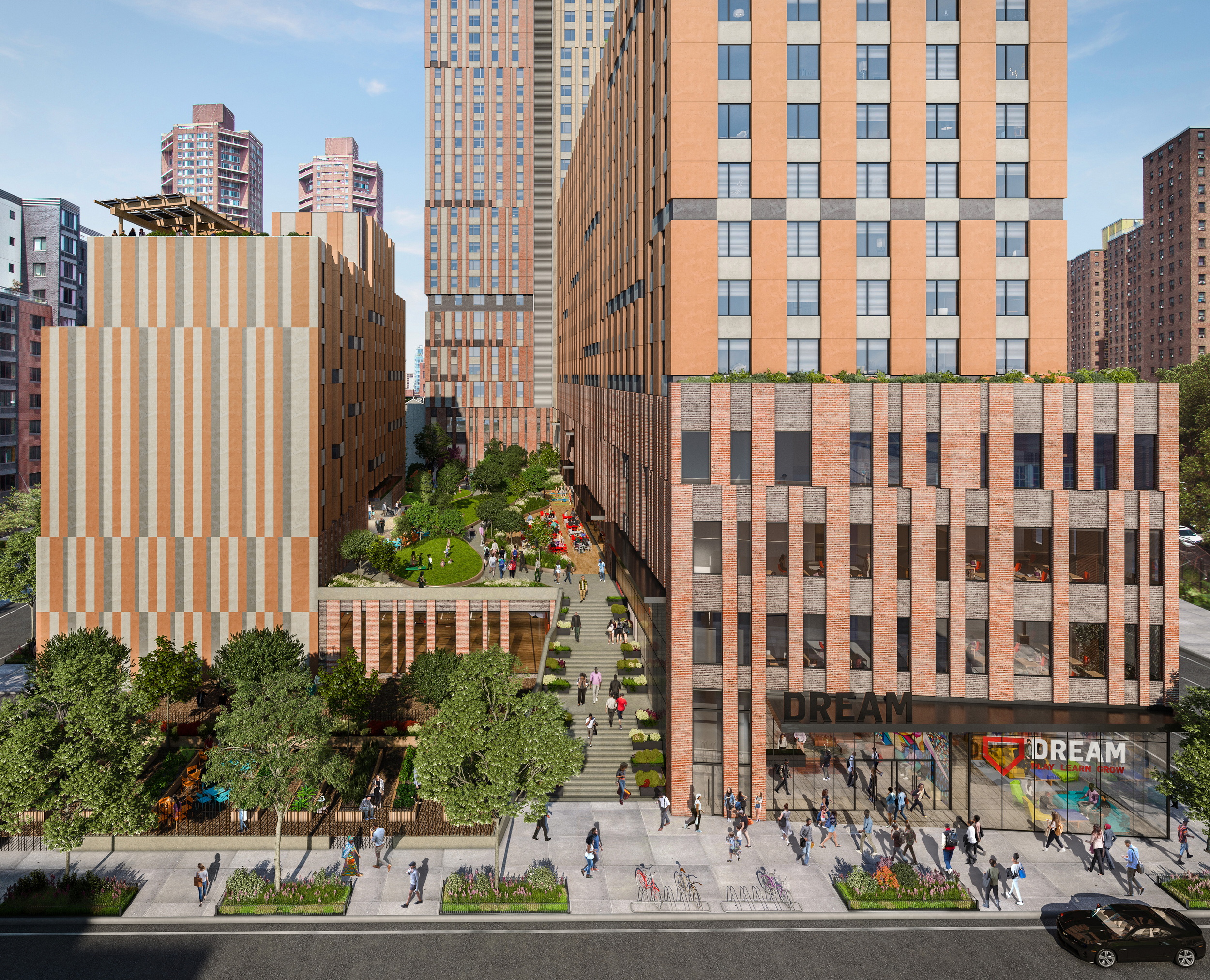
Sendero Verde
By Handel Architects, New York City, New York

 Located in East Harlem, the design for this massive housing complex, home to 709 affordable units, prioritizes Passive House principles without compromising on design excellence. Inspired by a historic trail that once traversed the location, the project organizes itself into three distinct volumes, which frame a central meandering landscaped path. that culminates in a captivating central courtyard. This dynamic space cascades across various levels, fostering the creation of individual community gardens.
Sendero Verde stands as a testament to the fusion of radical architecture and sustainability on a monumental scale. Upon completion, Sendero Verde is poised to redefine architectural boundaries as the world’s largest fully affordable Passive House building.
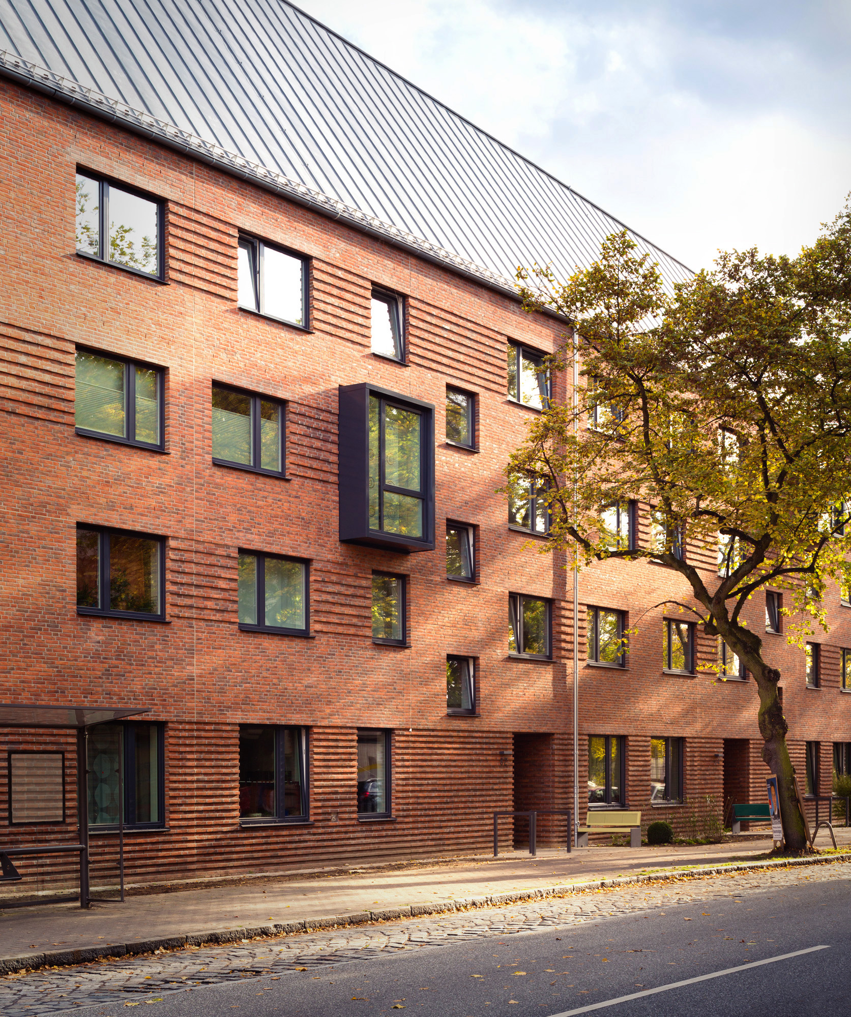
Quarter of Nations
By Gerber Architekten, Hamburg, Germany

 These two new sculptural buildings in Hamberg extend a traditional working class residential area, reinterpreting the original architectural language or the area while simultaneously reconciling them with the high energy efficiency requirements of a passive house building. The resulting complex adds seventy-five publicly funded housing units that vary in size and layout (for single persons, couples and families), thereby extending the principals of the surrounding urban fabric — IBA 2013, an intercultural housing project designed to house over 1,700 people from 30 different nations.
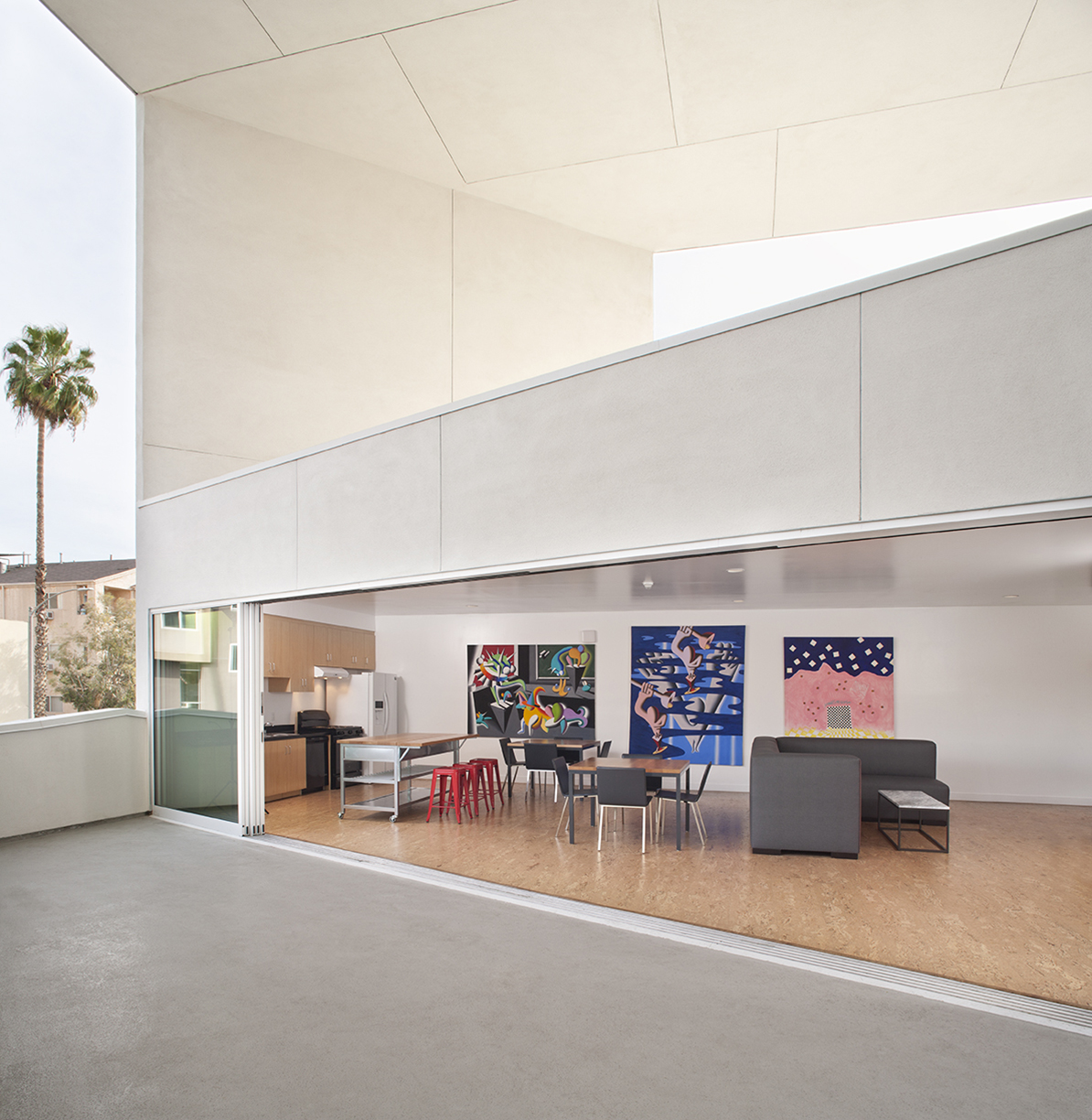
The SIX Veterans Housing
By Brooks + Scarpa Architects, Los Angeles, California

 The SIX, a LEED Gold-certified affordable housing project, redefines shelter for previously homeless veterans in McArthur Park. Breaking from traditional layouts, it prioritizes public areas over private space: four levels of housing units surround a courtyard with green-roofed balconies, visually connecting to the street below.
What truly sets The SIX apart, however, is its commitment to Passive House principles, surpassing standard practices for energy efficiency. From solar control and natural ventilation to daylight optimization and low-flow fixtures, every aspect is meticulously planned. This results in a building 50% more efficient than conventional structures.
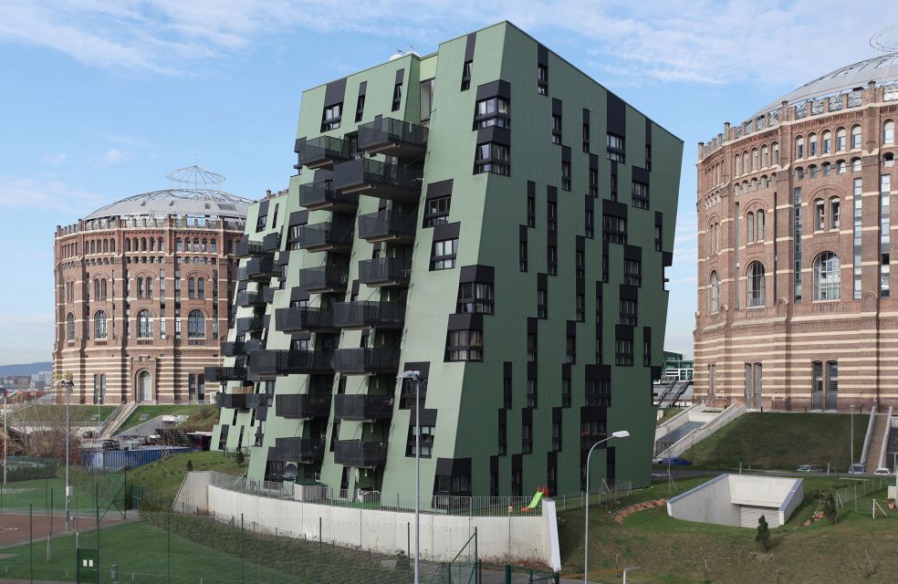
Ville Verdi
By ALBERT WIMMER ZT-GMBH, Vienna, Austria

 Ville Verdi transcends traditional housing, embracing passive house elements to form an eco-friendly haven. Comprising 5 villas with 34 residential units each, the design emphasizes barrier-free accessibility and communal spaces, fostering a sense of community.
The innovative eco-design incorporates a corrugated iron cladding contributes to the three-dimensional shapes while providing for a recyclable and virtually maintenance-free façade. This rear-ventilated façade prevents construction damages and the system can be extended to Passive House standard.
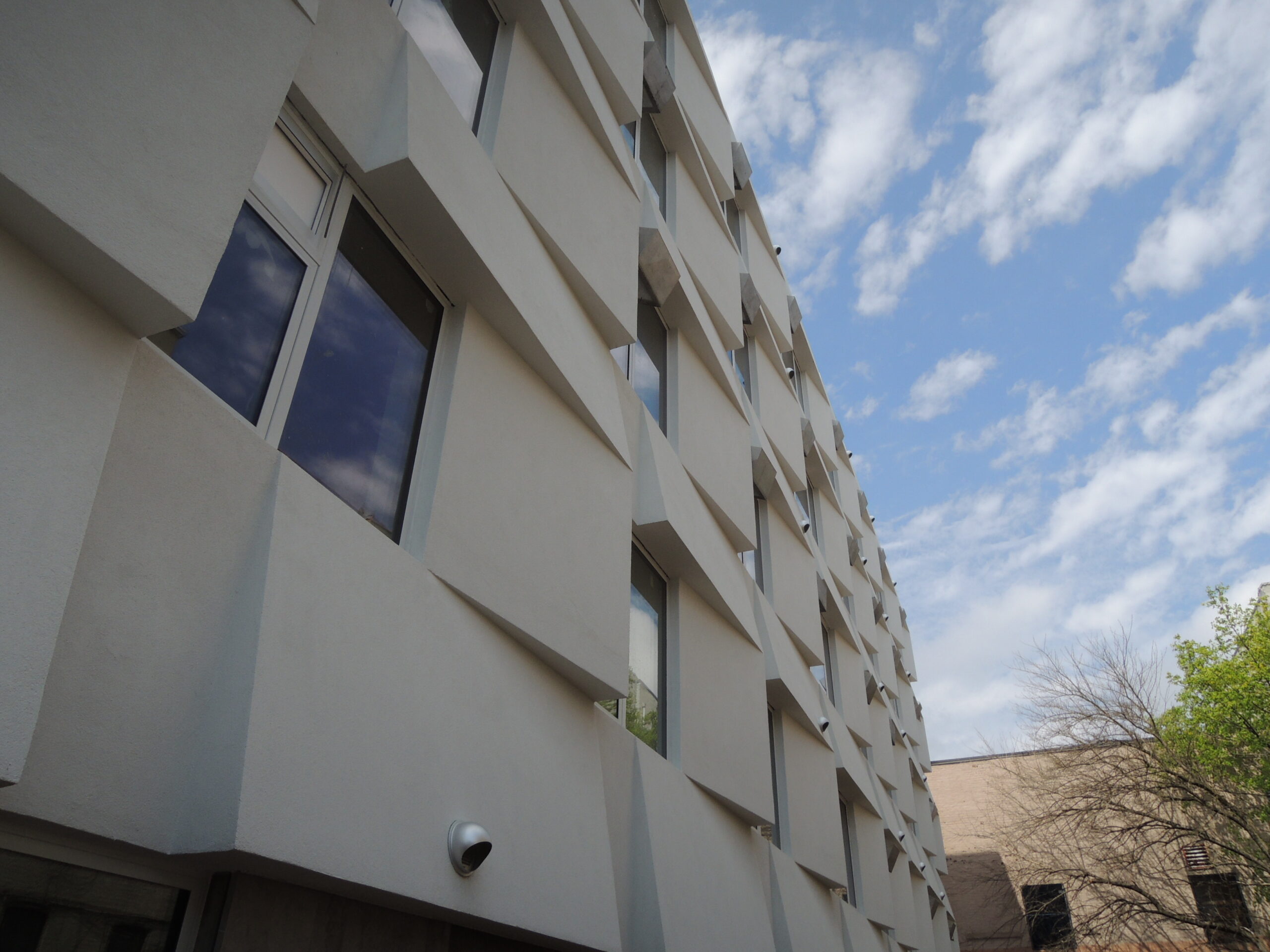
Knickerbocker Commons Passive House Apartment Building
By Chris Benedict R.A., New York City, New York
 Designed to operate with an impressive 85 percent less energy than typical New York City apartment buildings, this groundbreaking six-story residential building in Bushwick was the country’s first mid-sized apartment complex adhering to Passive House design standards. Featuring 24 units of affordable housing, each rental residence incorporates individual ventilation systems, small radiators for heating and airtight window air conditioning units, meeting the stringent Passive House criteria. The triple-paned windows and a sculpted exterior facade utilizing STO EIFS insulation optimize energy performance by minimizing heat loss in winter and reducing solar heat gain in summer.
Architizer’s 12th Annual A+Awards are officially underway! Sign up for key program updates and prepare your submission ahead of the Final Entry Deadline on January 26th.


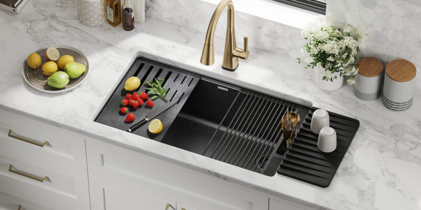
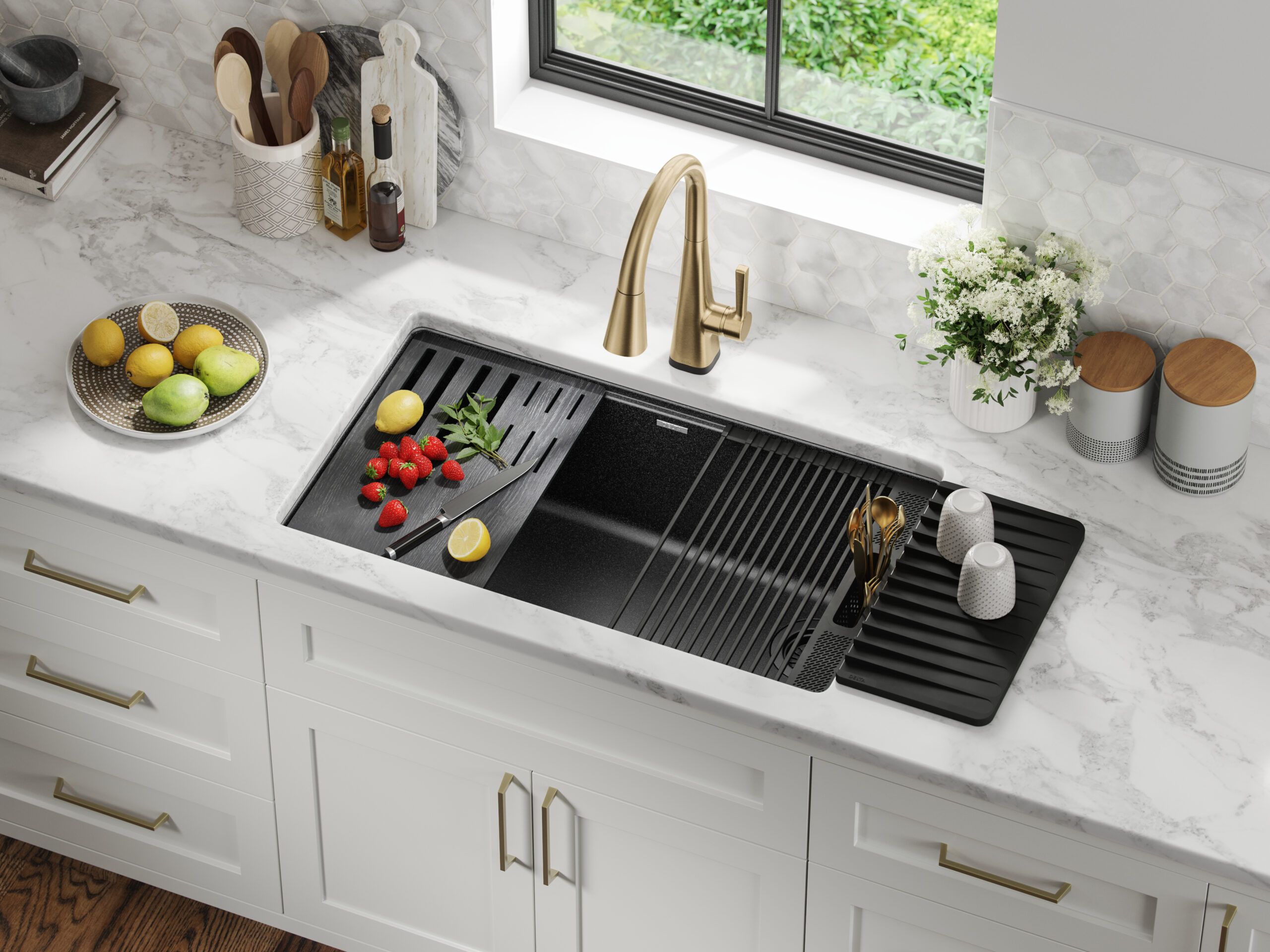 If you’ve been on social media any time in the last year, you’re bound to have seen a workstation sink. The multifunctional units are the envy of every avid home chef, and this version by Delta Faucet is terrific. Designed to meet the evolving needs of modern kitchens, the workstation sinks are a blend of Delta Faucet water-delivery expertise and functional design. Each Workstation sink is sleek in design and offers a multifunctional workspace through its built-in WorkFlow™ ledge. The adaptable sink space is equipped with integrated accessories like cutting boards, dish racks, utensil holders and even a ledge to hold your phone or tablet. Constructed from durable TRU16 gauge stainless steel and featuring noise-reducing soundproofing, these sinks are designed for both durability and quiet operation.
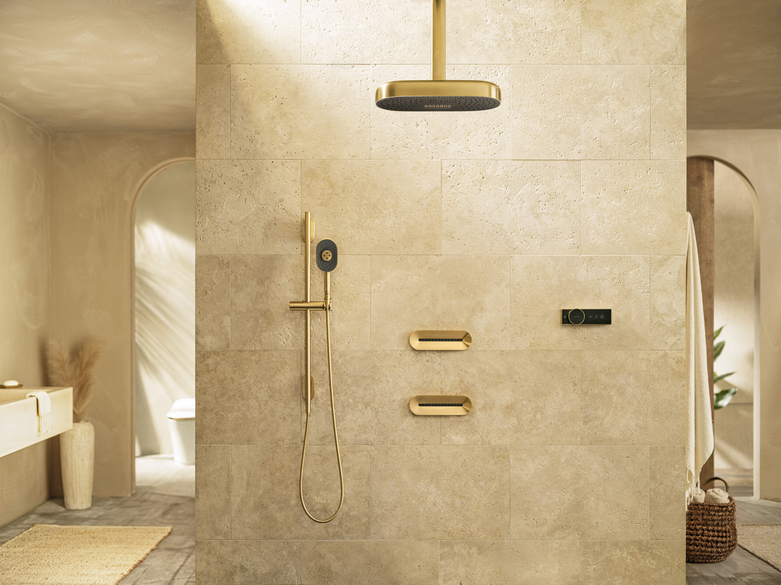 Often, the goal of technology is to increase functionality and make things easier, but sometimes, it’s about pure luxury, and that was Kohler’s goal when creating the Statement Shower Collection—exquisite design paired with innovative performance to create the ultimate well-being experience.
 The average kitchen extractor or cooker hood has never been the most attractive of appliances. While they have a valid purpose in most homes, bulky, shiny and painfully noisy are but a few choice descriptives for the standard extraction system, and because of these unfortunate characteristics, these silver suckers have been rapidly falling out of favor with designers and homeowners alike. But what do you do when you have poor ventilation and a fondness for aromatic foods? The answer— downdraft extractors. A relatively new innovation in kitchen design, downdraft extractors offer a sleek and discreet alternative to traditional overhead cooker hoods. They’re designed to be flush with the kitchen countertop and extract air directly from the hob when in use, making them especially suitable for kitchen islands or where a clear line of sight is preferred.
 A fridge is a fridge, right? Wrong! The 30-inch Column Refrigerator by Dacor is the epitome of refrigerator technology. Placing technology at the forefront, the innovative fridge boasts intuitive features such as the iQ Remove View, which allows users to control temperature and lighting remotely and even view the contents of their refrigerator to simplify grocery shopping and a hidden touch-control display panel regulates temperature, helping to preserve food freshness and extending the lifespan of your groceries.
 There’s nothing quite like sitting in front of the fire on a cold winter’s evening, but the thought of cleaning it out and lighting it, alongside environmental concerns, can quickly take the romance out of the idea of having a fireplace in your home.
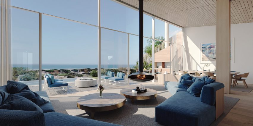
 The city of Palma has a new landmark, and it isn’t what the general population might expect from the sun-soaked Mallorcan capital, known for the splendor and intricacy of its massive cathedral and the magnificent concentration of modernismo-style buildings (the Catalan equivalent of Art Nouveau). What sets this new residential complex apart isn’t simply its strikingly delicate façade and palpable material approach, but also the design’s dedication sustainability, energy-efficiency and urban integration.
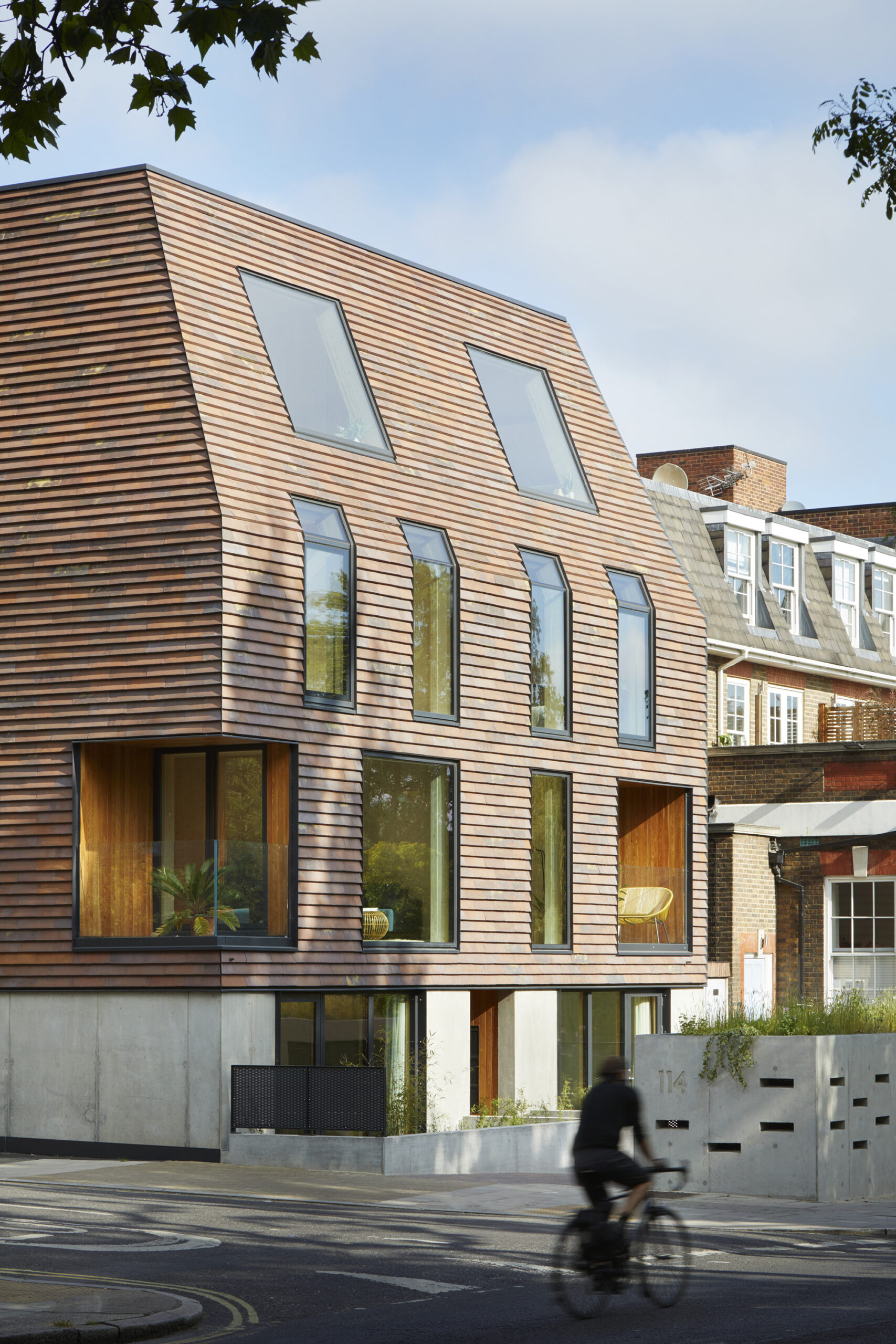
 Like a beacon for the future of design, this ten-unit residential building is proudly perched on a highly visible corner in London. The design, which incorporates a variety of different apartment layouts for families of varying sizes, emerged through a rigorous analysis of privacy, daylight and neighboring building forms. The resulting architectural language complements the surrounding context and history. For example, red masonry shingles create an urban composition which is both reminiscent of the surroundings yet distinct.
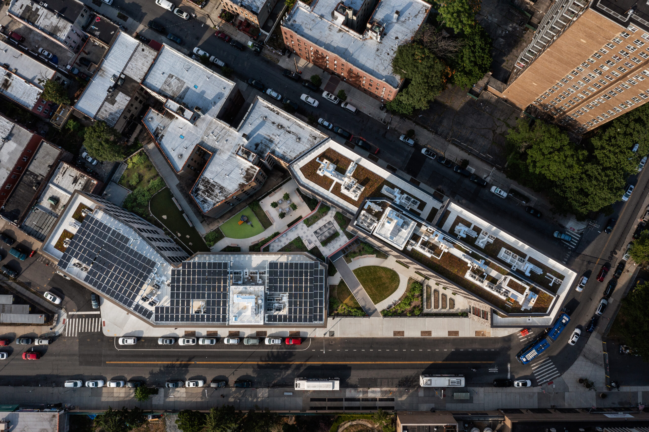
 Vital Brookdale stands as a prime example of affordable Passive House and community-oriented housing, providing 160 affordable housing units and 25,000 square feet (2,320 square meters) of health-centric community space in Brooklyn’s Brownsville neighborhood. This initiative incorporates a 100kW solar photovoltaic system mounted on the roof, a green roof, advanced mechanical systems, top-tier insulation and windows, LED lighting, water fixtures with low flow, and various other energy-efficient features. Meanwhile, inside, materials were selected according to the ease of installation, cost, maintenance and their impact on resident health. The result is a resounding testament to the untapped power of Passive House design in multifamily housing.
 A five-story mixed-use development with commercial space on the ground floor and 45 rental units above, this project achieved Passive House certification, utilizes mass timber construction and is an all-electric, Net Zero Ready Building. The upper floors facing Broadway showcase a mosaic of rainscreen siding, reducing massing while providing shading and play of light through deep windows.
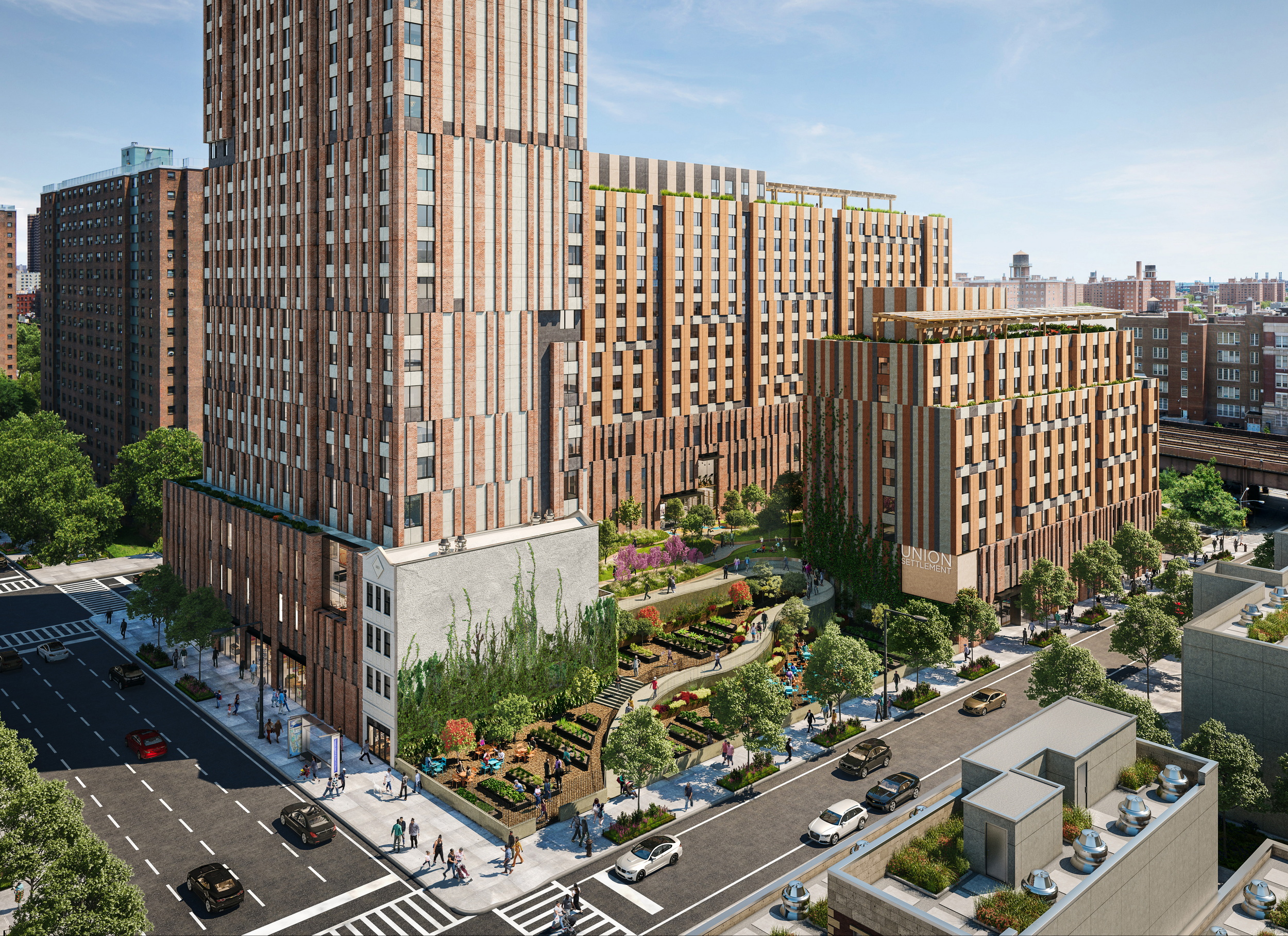
 Located in East Harlem, the design for this massive housing complex, home to 709 affordable units, prioritizes Passive House principles without compromising on design excellence. Inspired by a historic trail that once traversed the location, the project organizes itself into three distinct volumes, which frame a central meandering landscaped path. that culminates in a captivating central courtyard. This dynamic space cascades across various levels, fostering the creation of individual community gardens.
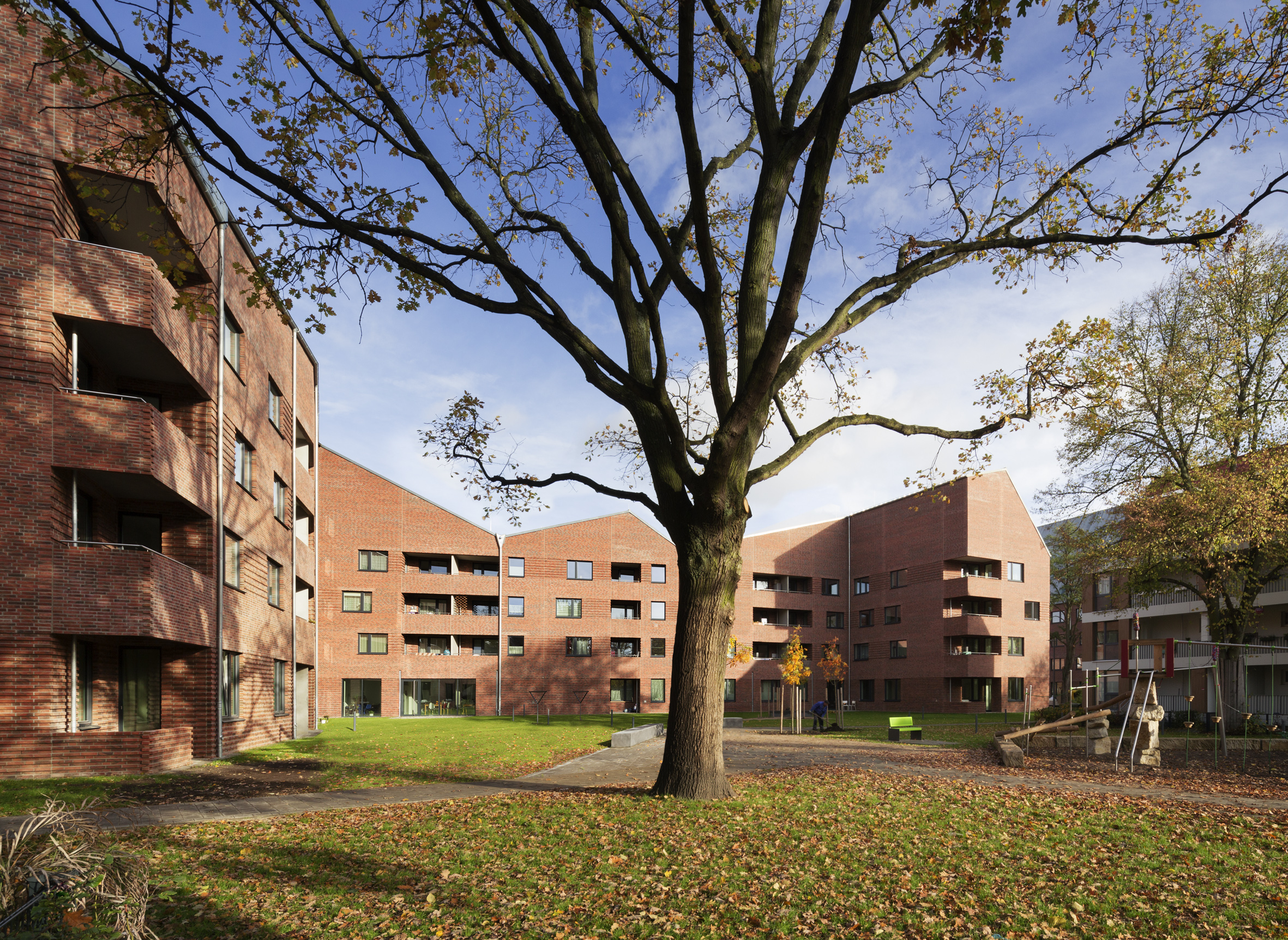
 These two new sculptural buildings in Hamberg extend a traditional working class residential area, reinterpreting the original architectural language or the area while simultaneously reconciling them with the high energy efficiency requirements of a passive house building. The resulting complex adds seventy-five publicly funded housing units that vary in size and layout (for single persons, couples and families), thereby extending the principals of the surrounding urban fabric — IBA 2013, an intercultural housing project designed to house over 1,700 people from 30 different nations.
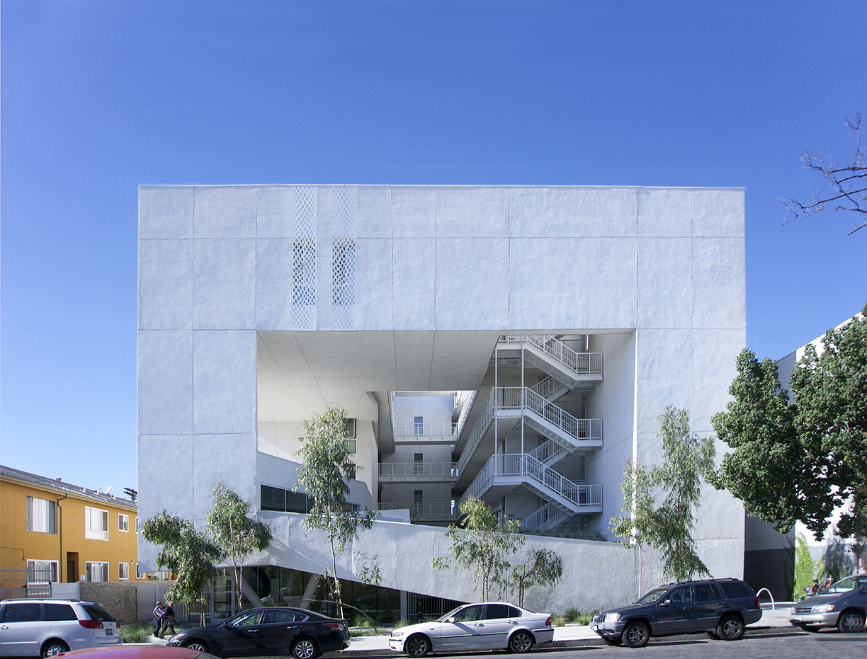
 The SIX, a LEED Gold-certified affordable housing project, redefines shelter for previously homeless veterans in McArthur Park. Breaking from traditional layouts, it prioritizes public areas over private space: four levels of housing units surround a courtyard with green-roofed balconies, visually connecting to the street below.
 Ville Verdi transcends traditional housing, embracing passive house elements to form an eco-friendly haven. Comprising 5 villas with 34 residential units each, the design emphasizes barrier-free accessibility and communal spaces, fostering a sense of community.
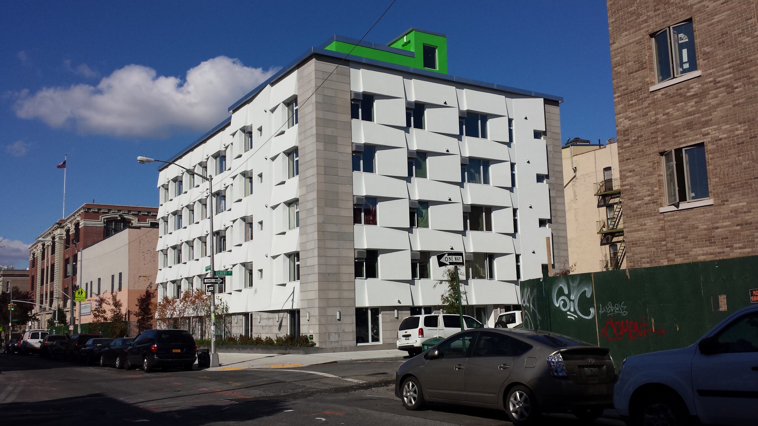
 Designed to operate with an impressive 85 percent less energy than typical New York City apartment buildings, this groundbreaking six-story residential building in Bushwick was the country’s first mid-sized apartment complex adhering to Passive House design standards. Featuring 24 units of affordable housing, each rental residence incorporates individual ventilation systems, small radiators for heating and airtight window air conditioning units, meeting the stringent Passive House criteria. The triple-paned windows and a sculpted exterior facade utilizing STO EIFS insulation optimize energy performance by minimizing heat loss in winter and reducing solar heat gain in summer.