Masquespacio designs colour-blocked restaurant in Turin for burger joint
Spanish design agency Masquespacio has created the interiors of Italian fast food chain Bun’s Turin branch that combines blocks of pink and green with a blue seating area designed to look like a swimming pool.
Bun Turin is a burger joint that takes its bold identity from the first Bun restaurant in Milan, which was also designed by Masquespacio.
“This restaurant’s target customer is the urban lifestyle of people born late in the Millennium and the new Generation Z,” Masquespacio co-founder Christophe Penasse told Dezeen.
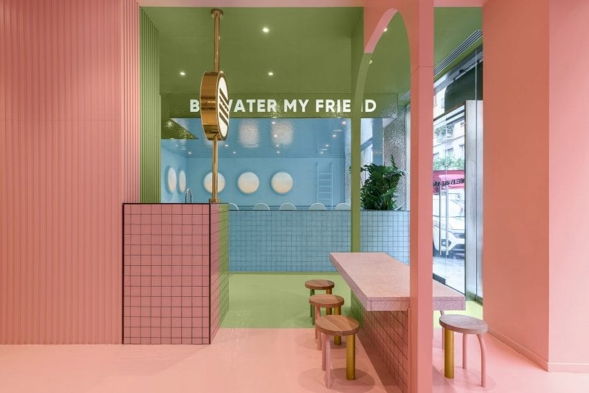
Characterised by three distinct colourful areas, the burger joint uses pink, blue and green in order to playfully carve out different spaces in the restaurant.
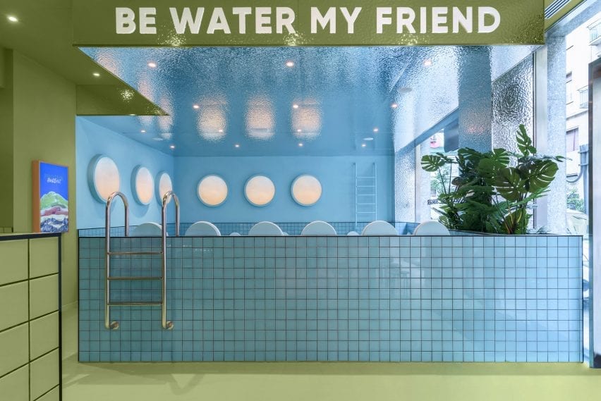
The sections are designed so that the restaurant’s three large windows present each colour as a separate blocked out space from the outside.
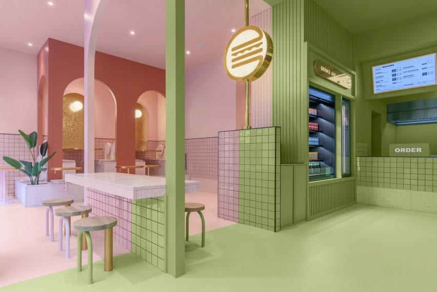
Upon entering Bun Turin, visitors are greeted with an ordering bar and drinks and ice cream fridge coloured in a dusty sage shade of the restaurant’s trademark green.
Lit-up digital menu boards with gold accents display the restaurant’s food options, while a version of the same neon burger logo found in Bun’s Milan branch glows from a nearby pillar.
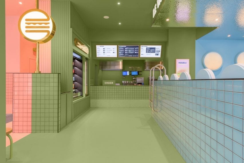
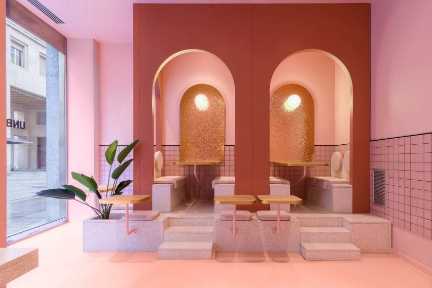
Pink and blue are used for two different seating areas both complete with built-in furniture.
In the pink area, a central table coloured partly in green straddles both the pink and green sections of the restaurant.
Sugary-pink terrazzo steps that double as a planter lead visitors to seats tucked into arched booths in the pink seating area, which also houses the burger joint’s toilets.
Bun Turin’s all-blue seating area is built from pale tiles that are designed to look like a swimming pool.
The area features mock pool ladders which aim to give visitors the impression of floating in water while they eat.
“Once we defined Bun’s identity we developed the project in 3D,” said Penasse.
“At the end of the process, we do a lot of trials to reach the correct combination of colours and materials,” continued the designer.
“In this case, we had several options for colour combinations, all focussed on a younger audience.”
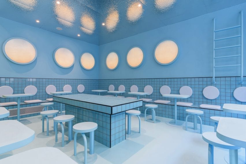
Apart from tiles by Complementto, all of the furniture in Bun Turin was designed by Masquespacio.
“It is important for clients that Bun spaces can be recognised wherever they are located,” explained Penasse.
“For this reason, the design will evolve and be slightly different in each space, but maintain a clear identity.”
Masquespacio is a Valencia-based design agency founded in 2010 by Penasse and Ana Milena Hernández Palacios, known for its use of bright colour.
Other recent projects by the studio include colour-blocked student housing in Bilbao, and a stucco and terracotta restaurant in the Spanish town of Aragon constructed from twisting shapes informed by the nearby Pyrenees mountains.
Photography is by Gregory Abbate.

