Ten homes with net floors for relaxation and play
CategoriesInterior Design

Ten homes with net floors for relaxation and play

In this lookbook, we collect 10 residential interiors where net floors provide an unusual place to sit, recline or jump about.

Nets can be a fun way to link two storeys in the home. Featured below are examples from a New York apartment, a skinny house in Rotterdam and a small family residence in rural Vietnam, among others.

This is the latest in our lookbooks series, which provides visual inspiration from Dezeen’s archive. For more inspiration see previous lookbooks featuring homes with dividing lattice screens, split-level living areas and stylish children’s bedrooms.

Haus L in Austria by DunkelschwarzHaus L in Austria by Dunkelschwarz
Photo by Marcus Rohrbacher

Haus L, Austria, by Dunkelschwarz

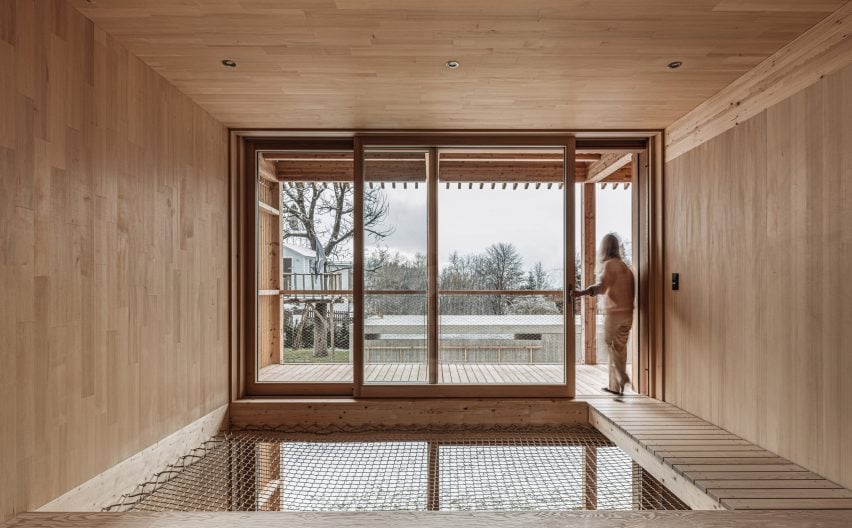
Timber-lined living spaces create a soothing atmosphere inside this house in the Austrian Alps, designed by local architecture studio Dunkelschwarz.

To encourage relaxation, a void above the dining area was covered with netting that can be used for lounging, while an adjacent walkway leads directly to a large balcony.

Find out more about Haus L ›
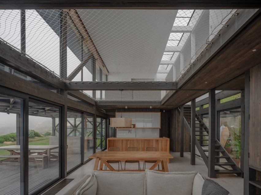

Net floor in Pimeriza HouseNet floor in Pimeriza House
Photo by Marcos Zegers (also top)

Primeriza House, Chile, by Stanaćev Granados

Chilean architecture studio Stanaćev Granados put two large cargo nets at the centre of this seaside house in Chorrillos overlooking the Pacific.

As well as providing an easily visible children’s play space above the open-plan living area, the net allows for a subtle transition between the darker wood cladding of the ground floor and the white-painted timber of the upper level.

Find out more about Primeriza House ›
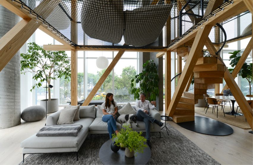

Net hammocks suspended above seating areasNet hammocks suspended above seating areas
Photo courtesy of No Architecture

Urban Tree House, USA, by No Architecture

To make the vast living space of this apartment in New York’s West Village feel less chasmic, No Architecture constructed two “treehouses” from a series of timber beams.

Black netting strung between the beams creates an elevated chill-out space, accessed by a spiral staircase whose balustrade is made of the same mesh material.

Find out more about Urban Tree House ›
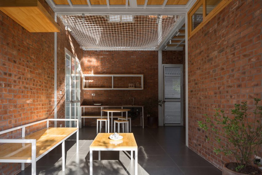

Nets inside the HOUSE by H&P ArchitectsNets inside the HOUSE by H&P Architects
Photo by Le Minh Hoang

HOUSE, Vietnam, by H&P Architects

In this house in Vietnam designed by H&P Architects, a net floor contributes to the humble aesthetic created by its compact, open-plan layout and rough-and-ready materials like exposed brick and corrugated metal.

The net allows air to move freely through the home, helps to instil a sense of spaciousness and creates additional usable floor space.

Find out more about HOUSE ›
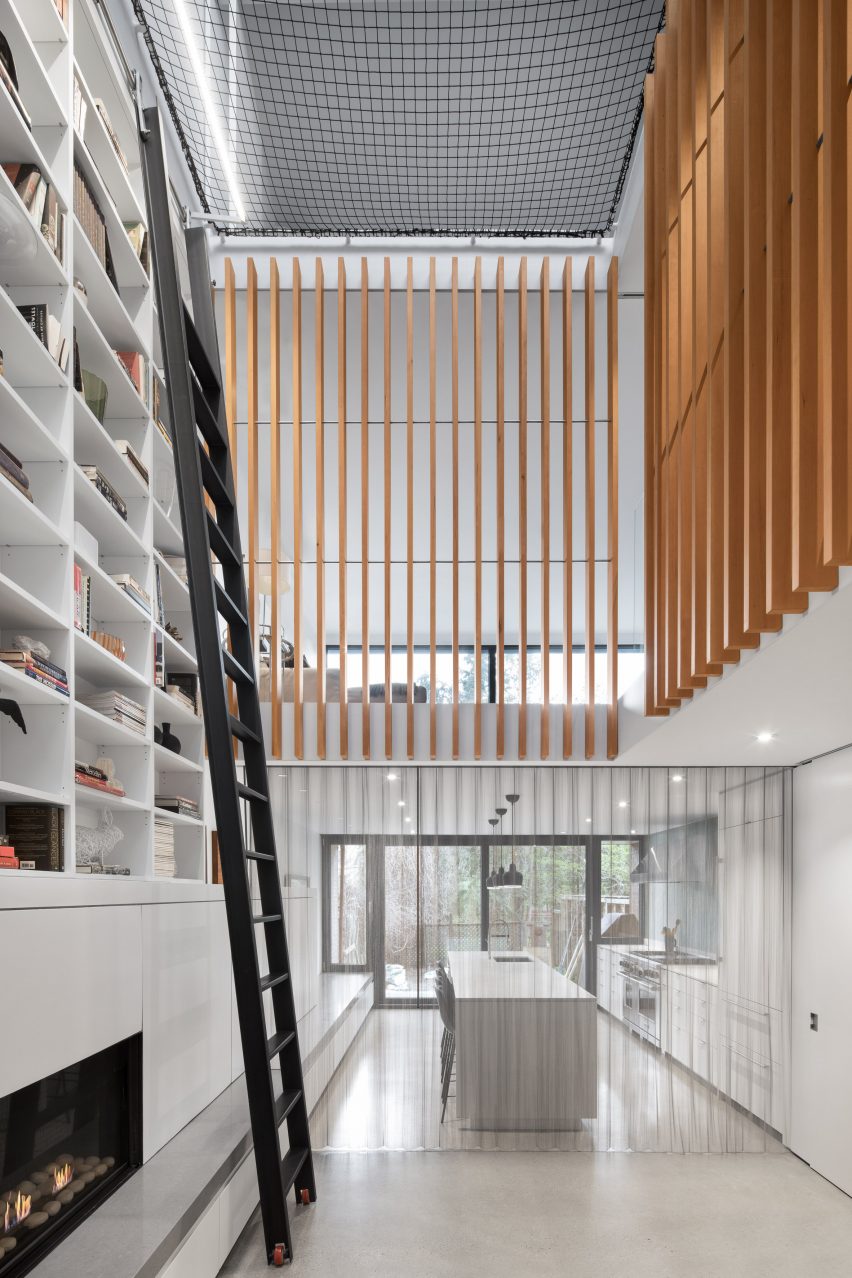

Atrium Townhome by Robitalle CurtisAtrium Townhome by Robitalle Curtis
Photo by Adrien Williams

Atrium Townhome, Canada, by Robitaille Curtis

Canadian studio Robitaille Curtis procured the expertise of famous circus company Cirque du Soleil to rig a trapeze-style net atop the high atrium inside this Montreal home.

The aim was to emphasise the drama of the space, with a tall bookcase accessed by a 5.5-metre ladder and vertical wooden slats also helping to direct the gaze upwards.

Find out more about Atrium Townhome ›
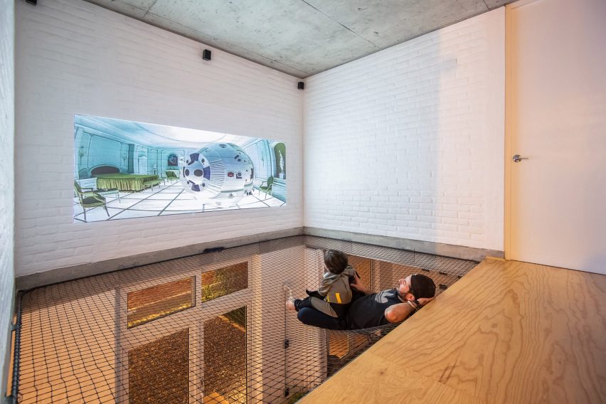

Net floor in Casa Bosque SerenoNet floor in Casa Bosque Sereno
Photo by FRAM Fotografía

Casa Bosque Sereno, Mexico, by Fábrica de Espacios

At Casa Bosque Sereno, residents can use the net floor as a place to watch movies thanks to a projector mounted opposite a white-painted brick wall.

The net also contributes to the pared-back, open-plan design chosen for the house by architecture office Fábrica de Espacios.

Find out more about Casa Bosque Sereno ›
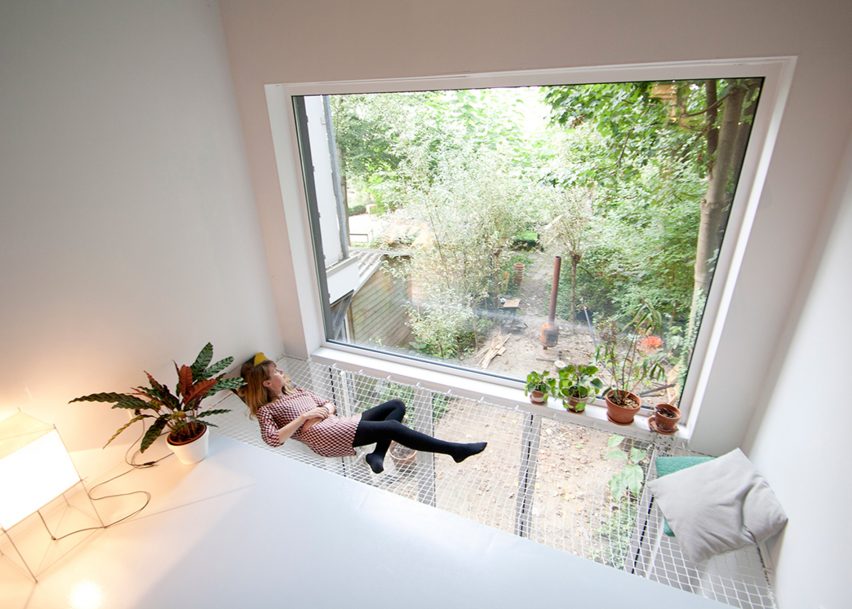

SkinnyScar, Rotterdam, the Netherlands by Gwendolyn Huisman and Marijn BotermanSkinnyScar, Rotterdam, the Netherlands by Gwendolyn Huisman and Marijn Boterman
Photo courtesy of Gwendolyn Huisman and Marijn Boterman

SkinnyScar, Netherlands, by Gwendolyn Huisman and Marijn Boterman

Dutch architects Gwendolyn Huisman and Marijn Boterman wanted to avoid “harsh boundaries” between living spaces in this skinny house in Rotterdam that they designed for themselves to live in.

To that end, they strung a modestly sized net next to a large window overlooking the garden, to act as a kind of static hammock next to the first-floor living room and above the dining room.

Find out more about SkinnyScar ›
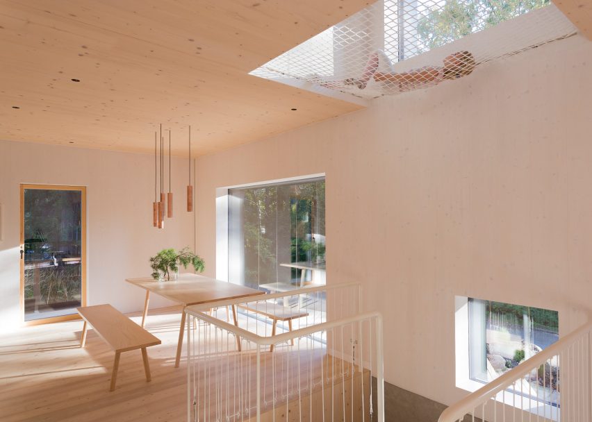

Net floor above living area in house designed by Ortraum ArchitectsNet floor above living area in house designed by Ortraum Architects
Photo by Marc Goodwin

MK5, Finland, by Ortraum Architects

This family house in a forest near Helsinki features a number of child-friendly elements including a climbing wall, gymnastic apparatus and, of course, a net floor.

Local studio Ortraum Architects placed the net in a cut-out next to the first-floor landing, allowing light to filter down into the basement stairwell.

Find out more about MK5 ›
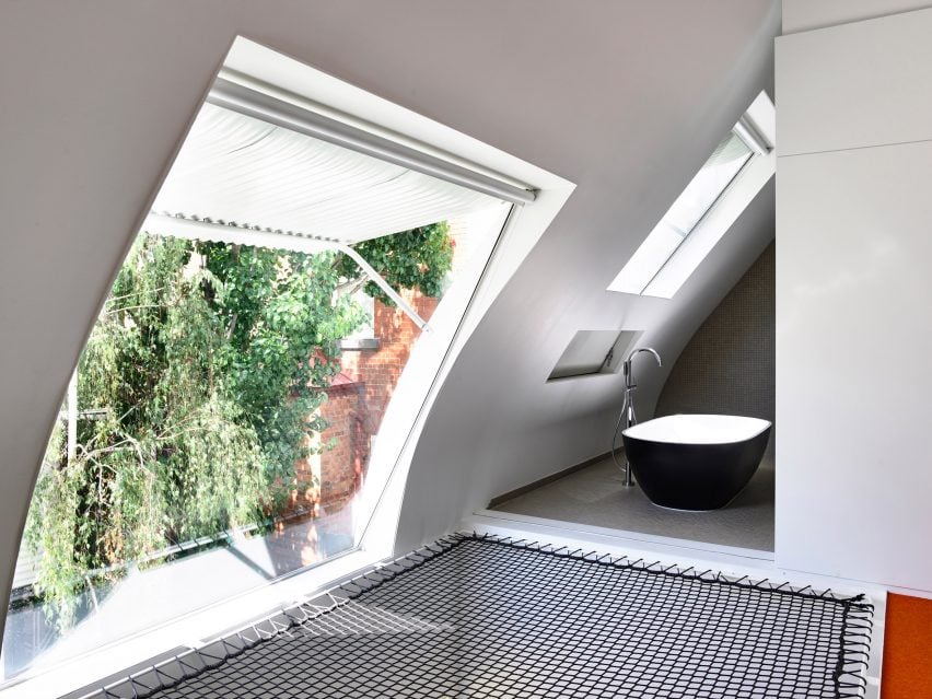

King Bill house by Austin Maynard ArchitectsKing Bill house by Austin Maynard Architects
Photo by Derek Swalwell

King Bill, Australia, by Austin Maynard Architects

Austin Maynard Architects installed a netted platform with a view out of a large window and into the bathroom as part of its renovation of this formerly dilapidated stable in Melbourne.

The black mesh contrasts with the white corrugated metal of the window awning, the grey tiles of the bathroom and the orange carpet on the adjacent floor.

Find out more about King Bill ›

Saigon house by a21 StudioSaigon house by a21 Studio
Photo by Quang Tran

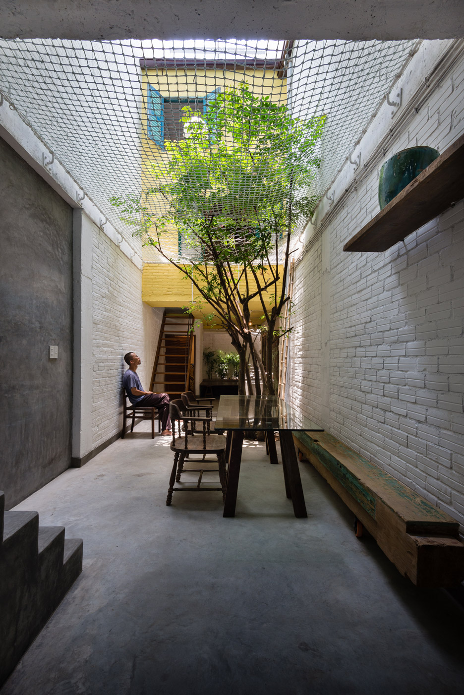
Saigon House, Vietnam, by a21studio

The large net in this Ho Chi Minh City house, designed by Vietnamese architecture office A21studio, is visible from almost everywhere in the four-storey building.

In addition to serving as a children’s play area, it helps create an impression of the ground floor as an outdoor courtyard – particularly as a tree bursts through the textile.

Find out more about Saigon House ›

This is the latest in our lookbooks series, which provides visual inspiration from Dezeen’s archive. For more inspiration see previous lookbooks featuring homes with dividing lattice screens, split-level living areas and stylish children’s bedrooms.

Reference

Dense Cities, Open Homes: 8 Multifamily Housing Projects Built for Modern Life
CategoriesArchitecture

Dense Cities, Open Homes: 8 Multifamily Housing Projects Built for Modern Life

Architects: Want to have your project featured? Showcase your work through Architizer and sign up for our inspirational newsletters.

Housing is central to architecture and cities. Across generations and socio-economic backgrounds, a mix of housing options makes cities more lively, sustainable and human. Amidst global housing scarcity, the need to build more multifamily and affordable housing is widespread. Equitable housing begins with policy and planning, but it’s also tied to design. Architects worldwide are considering this idea and how to create more beautiful, integrated housing that reflects how we live today.

Multifamily housing is key to creating more equitable cities. In this type of housing, multiple separate units are contained within one or several buildings within one complex. A key benefit of multifamily in the current market is that it’s usually more affordable than single-family housing. With real estate today, it’s increasingly difficult for people to buy a home, especially for first-time buyers. In multifamily housing, less land is needed, and it helps to meet the growing demand for households of all ages and income levels. As architects consider the impact of housing, the following projects represent multifamily housing design across the world. Made for residents to either rent or own, they represent a cultural shift and underline the importance of housing in architecture today.


Timber House

MESH Architectures, Brooklyn, NY, United States

Jury Winner, 11th Annual A+Awards, Multi-Unit Residential Building

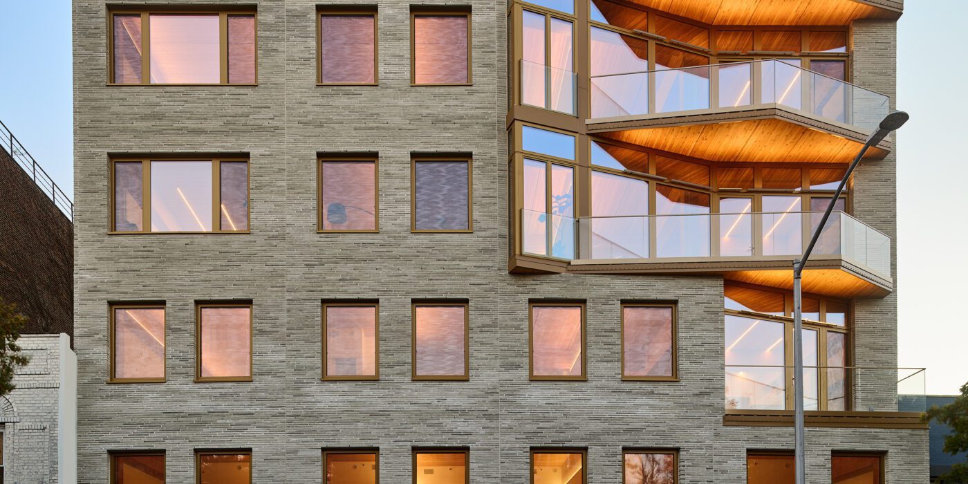
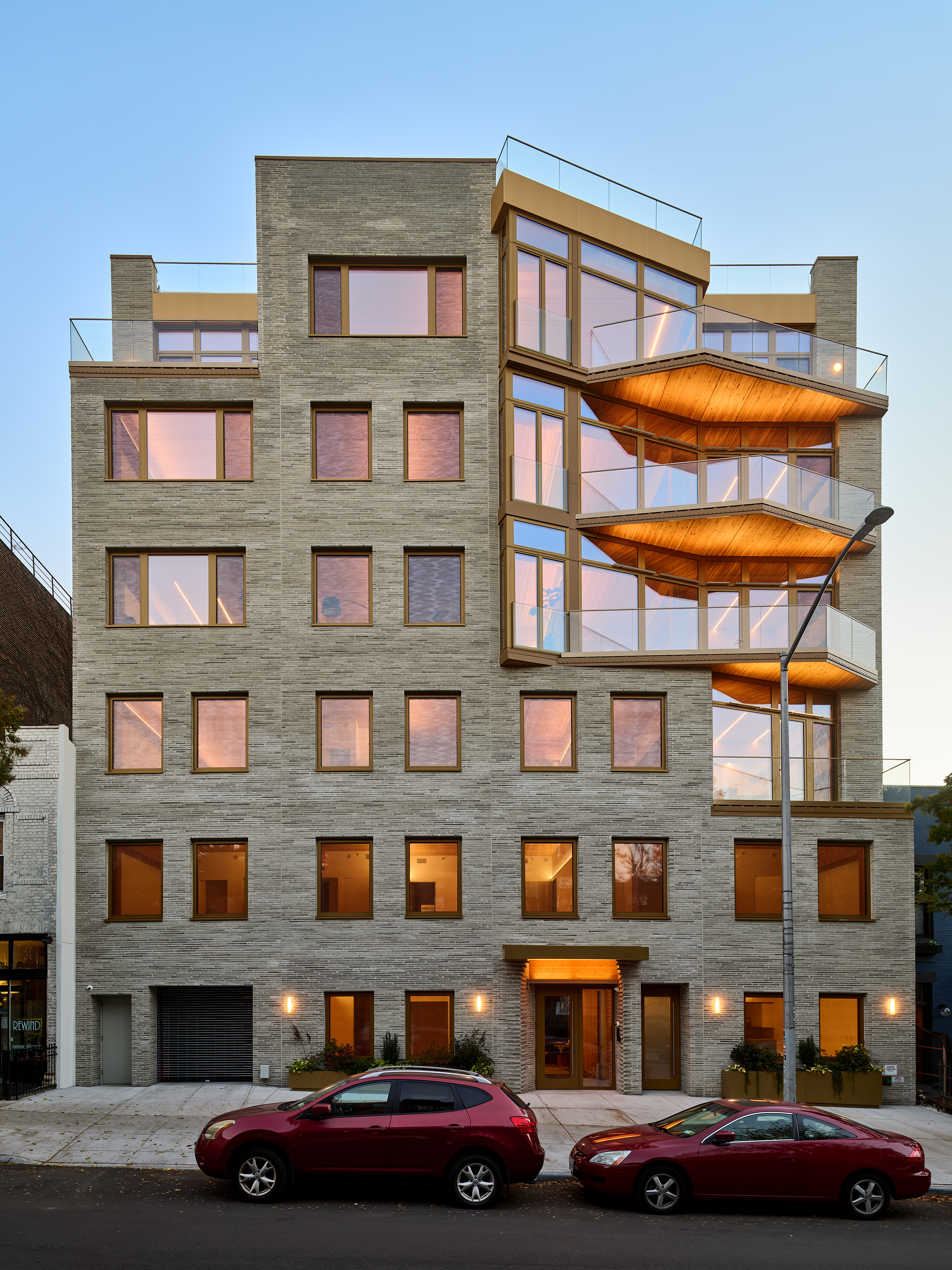
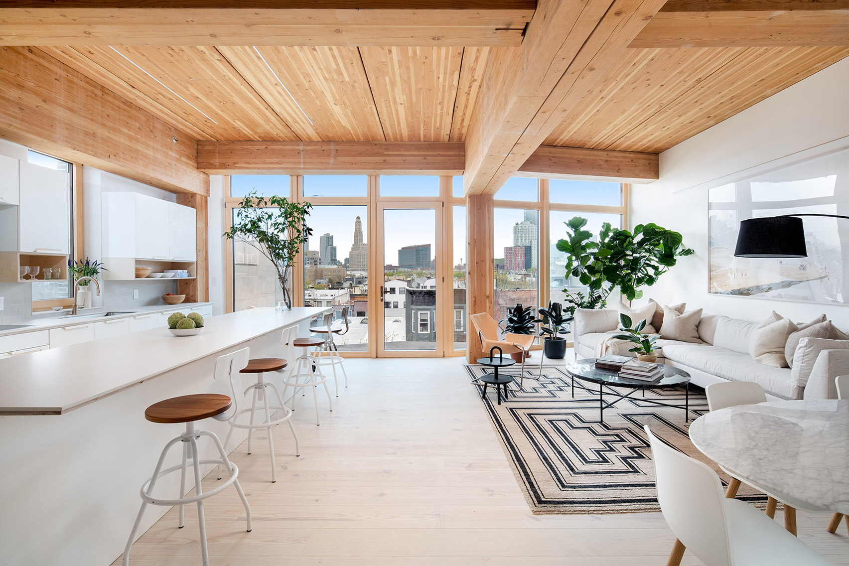
New York is a city known for housing scarcity, and a place that’s defined by reinvention. For Timber House, MESH Architectures was inspired by natural finishes and “botanical architecture.” The idea was not only to foster well-being, but create a new model for timber construction in the city. The project is the first mass-timber condominium in New York, and the structure was built with glue-laminated timber columns, beams, and floor plates. The six-story, multifamily project is comprised of fourteen homes.
Beyond the novel material approaches to construction in Timber House, it was also a test in learning from passive-house design. Those principles informed its high-performance envelope, with “intensive insulation, smart air sealing, and triple-glazed wood windows.” Less interior finishes were required thanks to leaving the wood structure exposed, while the team also prioritized low-carbon material choices. For Timber House, MESH wanted to demonstrate that sustainable multifamily buildings can balance well-being and comfort, as well as beauty.


Valley

MVRDV, Amsterdam, Netherlands

Jury Winner, 11th Annual A+Awards, Architecture +Façades

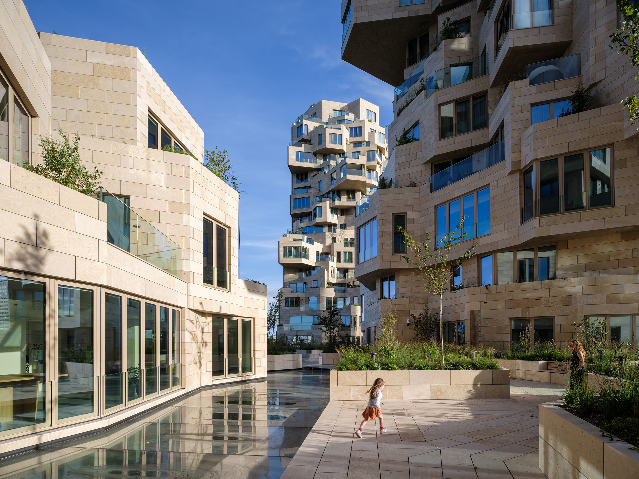
MVRDV has earned a reputation for reinvention and creating new building forms. That same approach extends to housing, where the team designed Valley with a more “green and human” touch. Built for developer Edge, the project is located in Amsterdam Zuidas. Rising to three distinct towers, the façades shift across the complex. The outer edges are mirrored glass, while the inner façades are clad with stone and swaths of greenery.

Valley was built for a mix of residents, as well as workers and visitors. Not only for multifamily housing, the project also includes offices while much of the building is open to the public. For the materials, over 40,000 stone tiles of varying sizes were used throughout the building’s façades. “Each of the 198 apartments has a unique floorplan, made possible by the interior designs by Heyligers Architects.” Outside, the team worked with landscape architect Piet Oudolf on the placement and selection of trees, shrubs and approximately 13,500 smaller plants that are in within the natural stone planters.


One Hundred

Studio Gang, St. Louis, MO, United States

Jury Winner, 9th Annual A+Awards, Multi Unit Housing High Rise (16+ Floors)

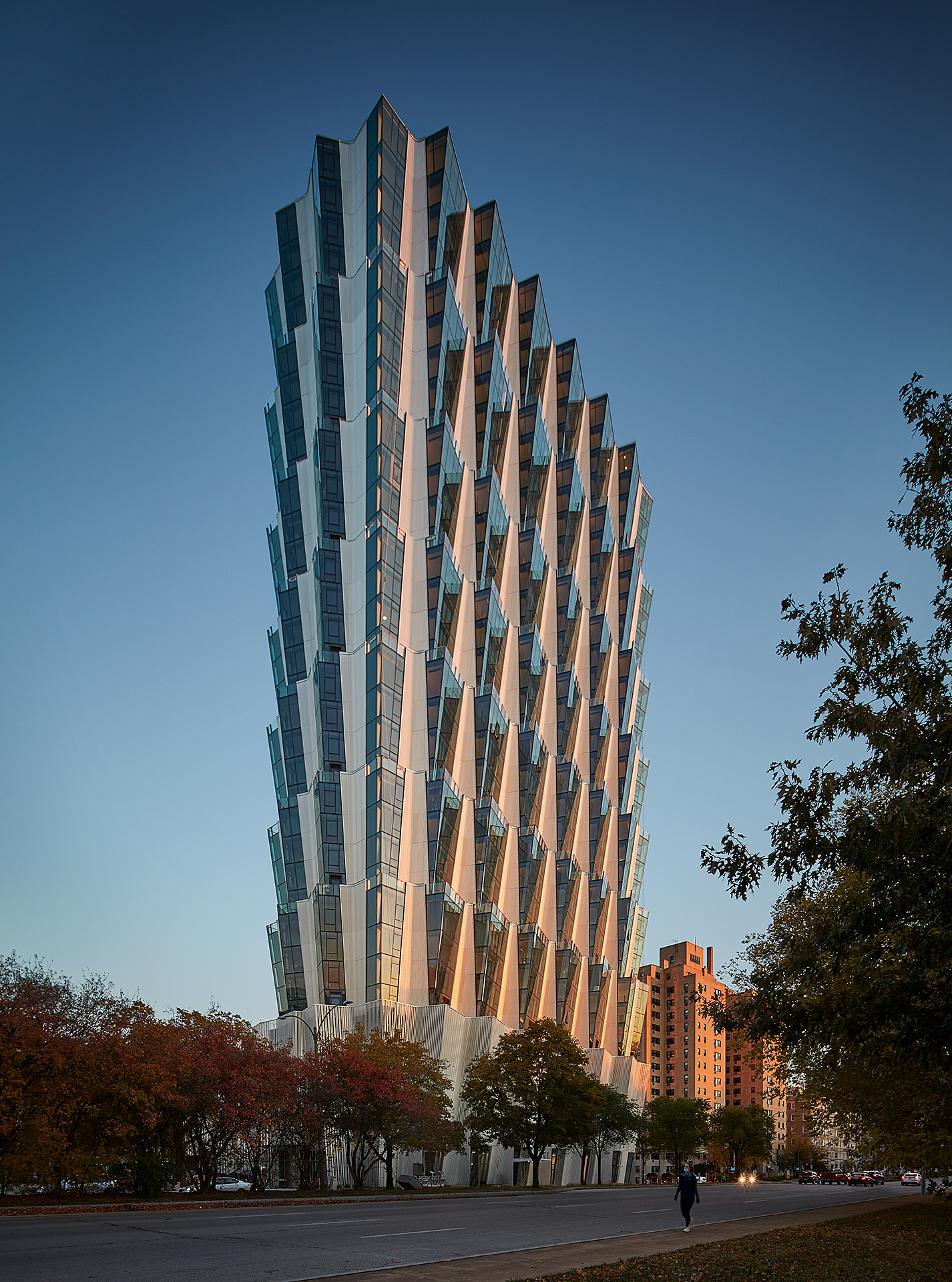
Few locations are more prominent for multifamily housing in St. Louis than Forest Park. Designed by Studio Gang, One Hundred is a residential tower overlooking the park and the studio’s first project in the city. The tower includes a mix of housing, retail and amenities on four-story stacked tiers. The apartments were designed for views of Forest Park and east to the Gateway Arch.
From a formal approach, Studio Gang designed the tower with an angled façade that creates a series of large outdoor spaces atop each tier. This move also produces outdoor space for residents atop the green roof podium. The team notes that, “each apartment features its own corner living room with double exposures that, in addition to offering panoramic views, enhance the amount and quality of daylight within the units.” The tower includes public and retail spaces at ground level adjacent to the park, while establishing a new landmark for St. Louis.


Cirqua Apartments

BKK Architects, Melbourne, Australia

Jury & Popular Choice Winner, 2018 A+Awards, Multi Unit Housing Low Rise (1-4 Floors)

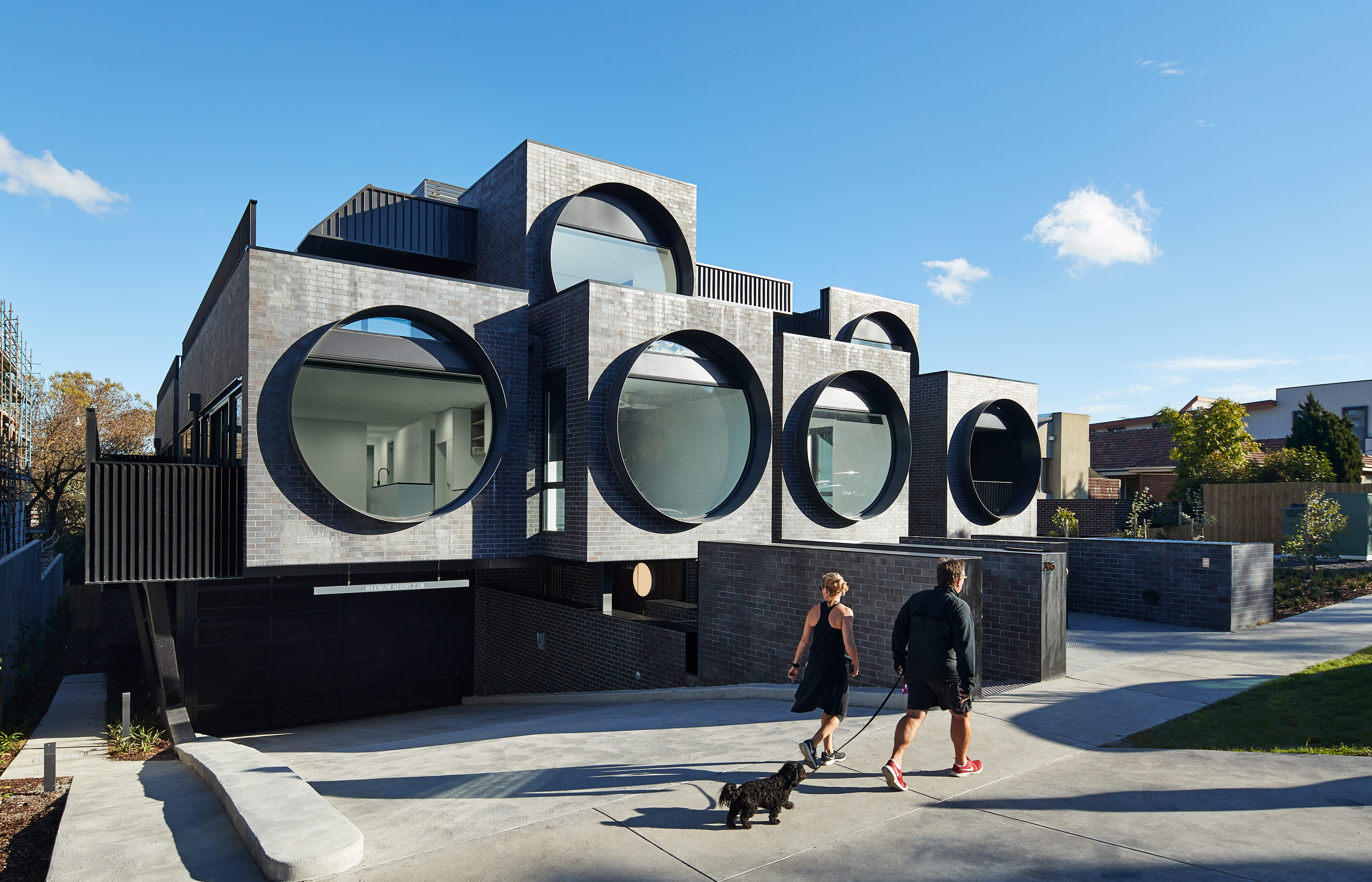
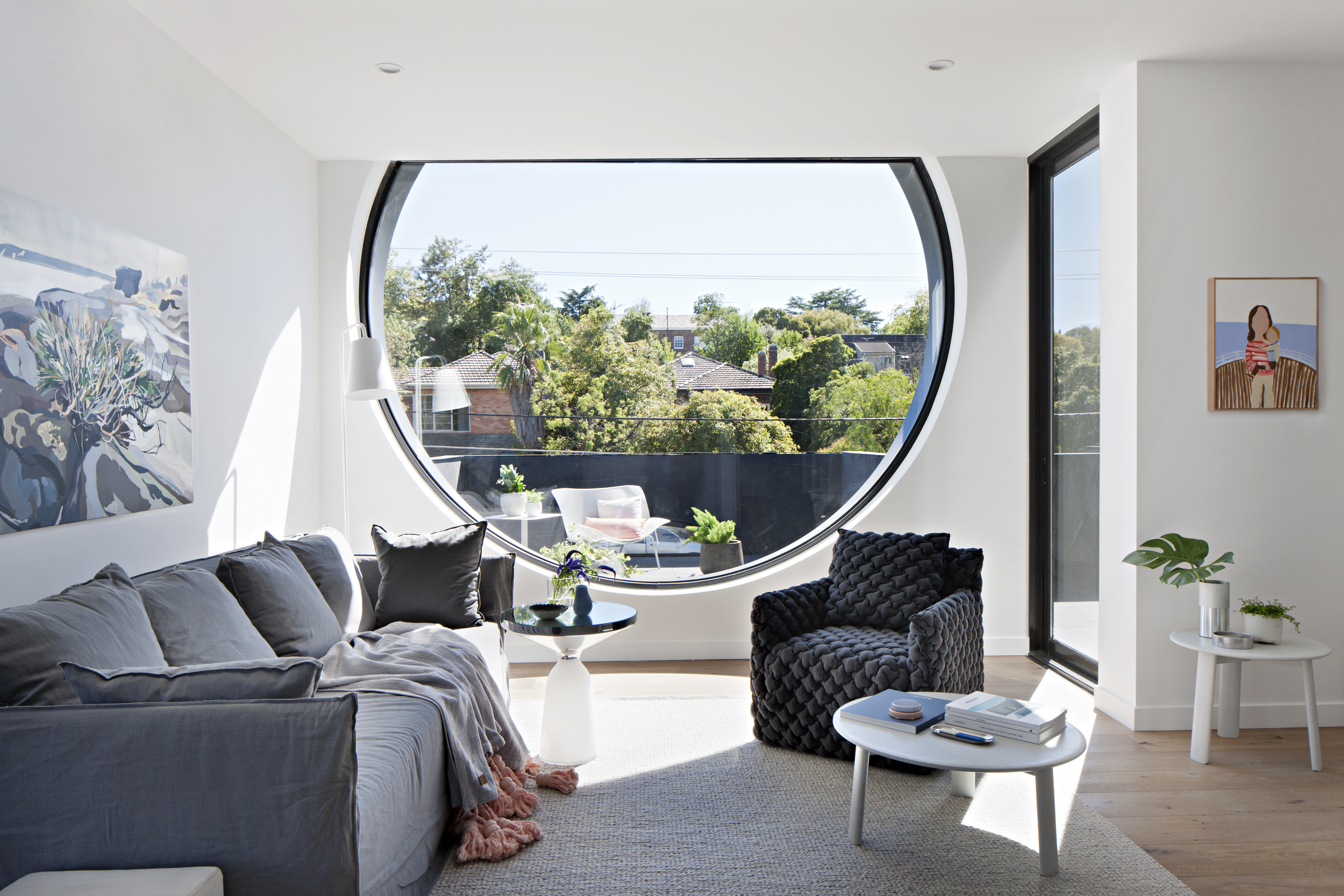
The Cirqua project by BKK gained widespread recognition for creating beautiful, inventive multifamily architecture. The project includes 38 unique unit types out of the 42 total apartments made with spacious balconies and an integrated approach to landscaping. Combining two properties into a single block, the project was formed with careful attention paid to scale and the surrounding context. Cirqua not only showcases a smart, nuanced approach to multifamily housing, but also how to design for accessibility and passive performance.
As the team noted, prospective owners are increasingly buying into the apartment market (over detached housing) as owner-occupiers. A sense of place was a key driver of the design, establishing a neighborly feel. All living areas and bedrooms have direct access to ventilation, natural light and views, while maximizing glazing created connections to the surrounding garden. From the neighborhood scale, a study in massing led to reducing the overall building volume to make the development fit seamlessly into its site.


Caterpillar

Prince Concepts, Detroit, MI, United States

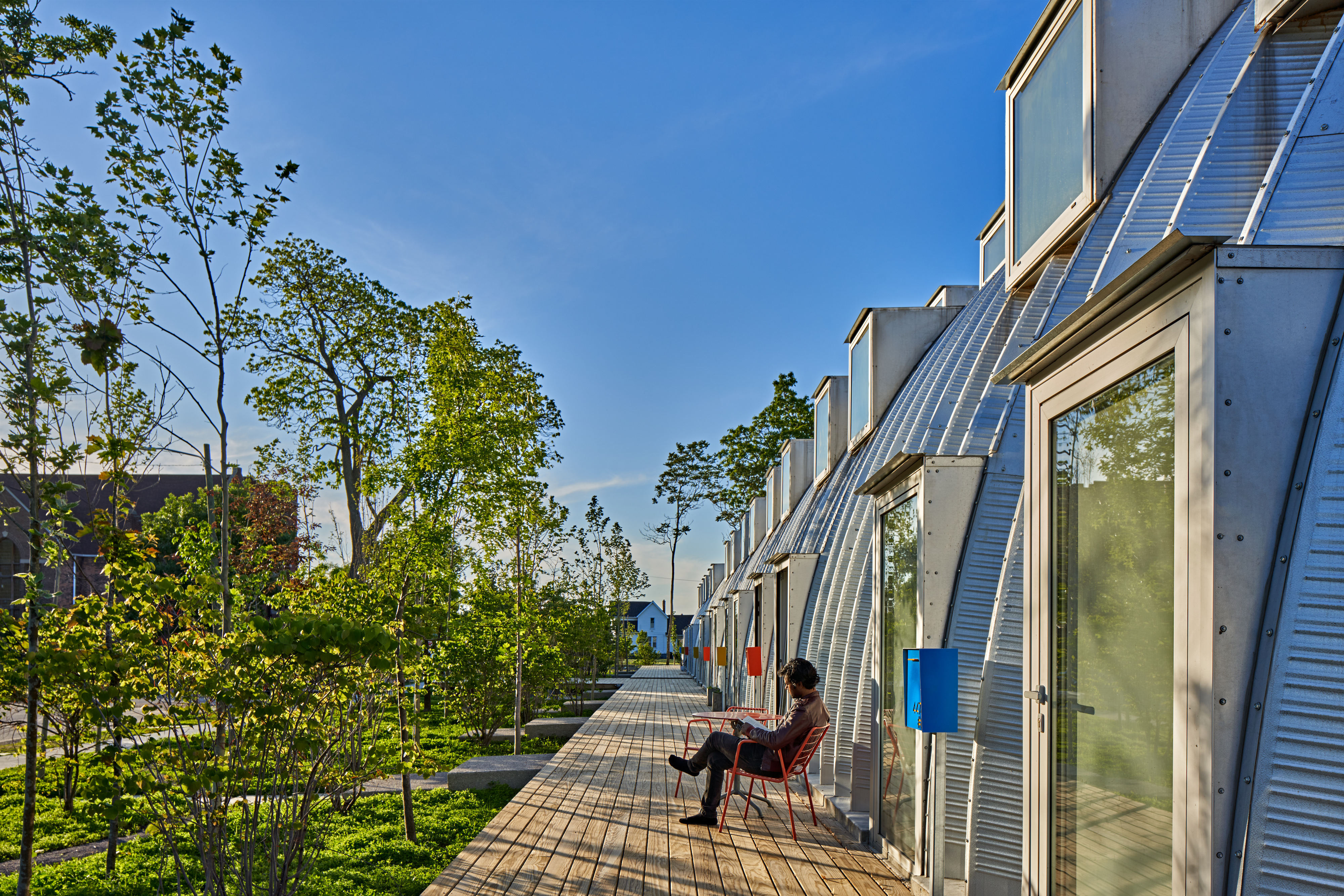
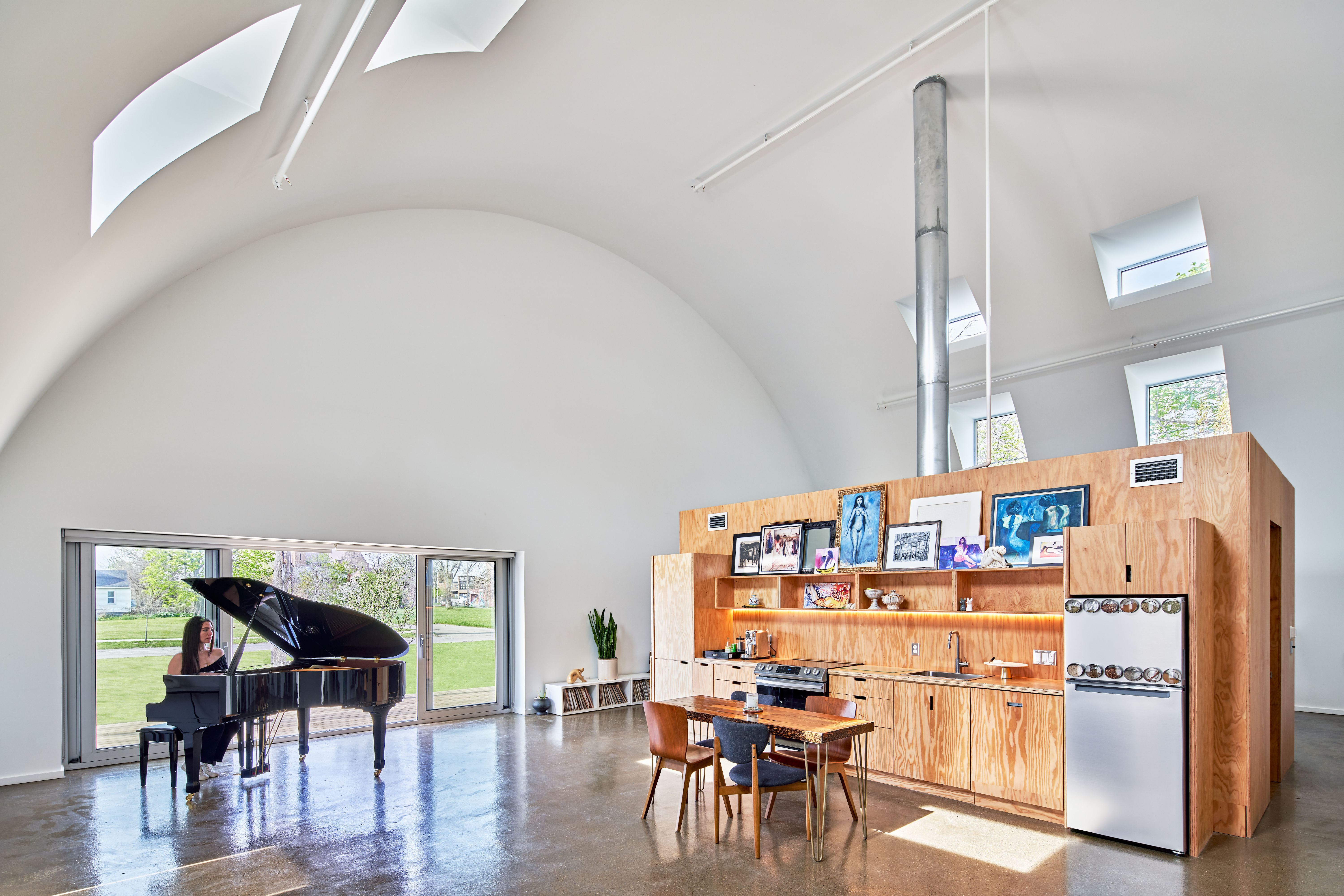
Caterpillar approaches density through a novel construction and design in Core City, Detroit. It utilizes a Quonset Hut structure that holds eight units, all entirely prefabricated. The result is an 8,000 square foot (745 square meter) residential project that prioritizes indoor and outdoor space. Prince Concepts created the project with tall ceilings that rise to 23 feet (7 meters); the units were designed to capture morning light in the bedrooms and evening sunsets in the living room.
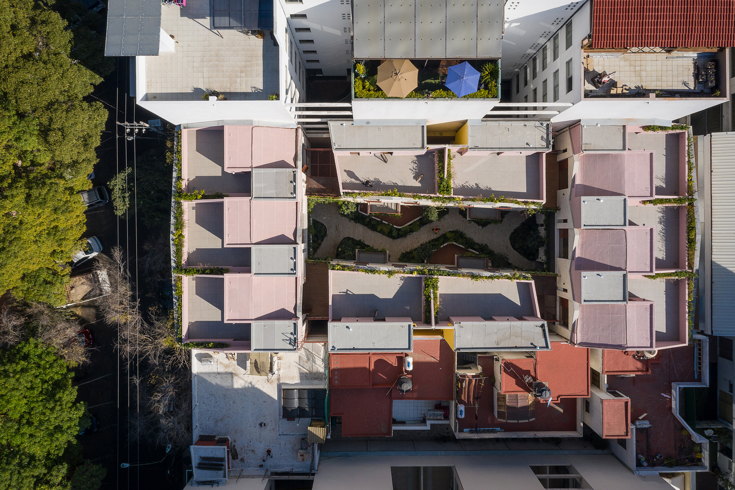
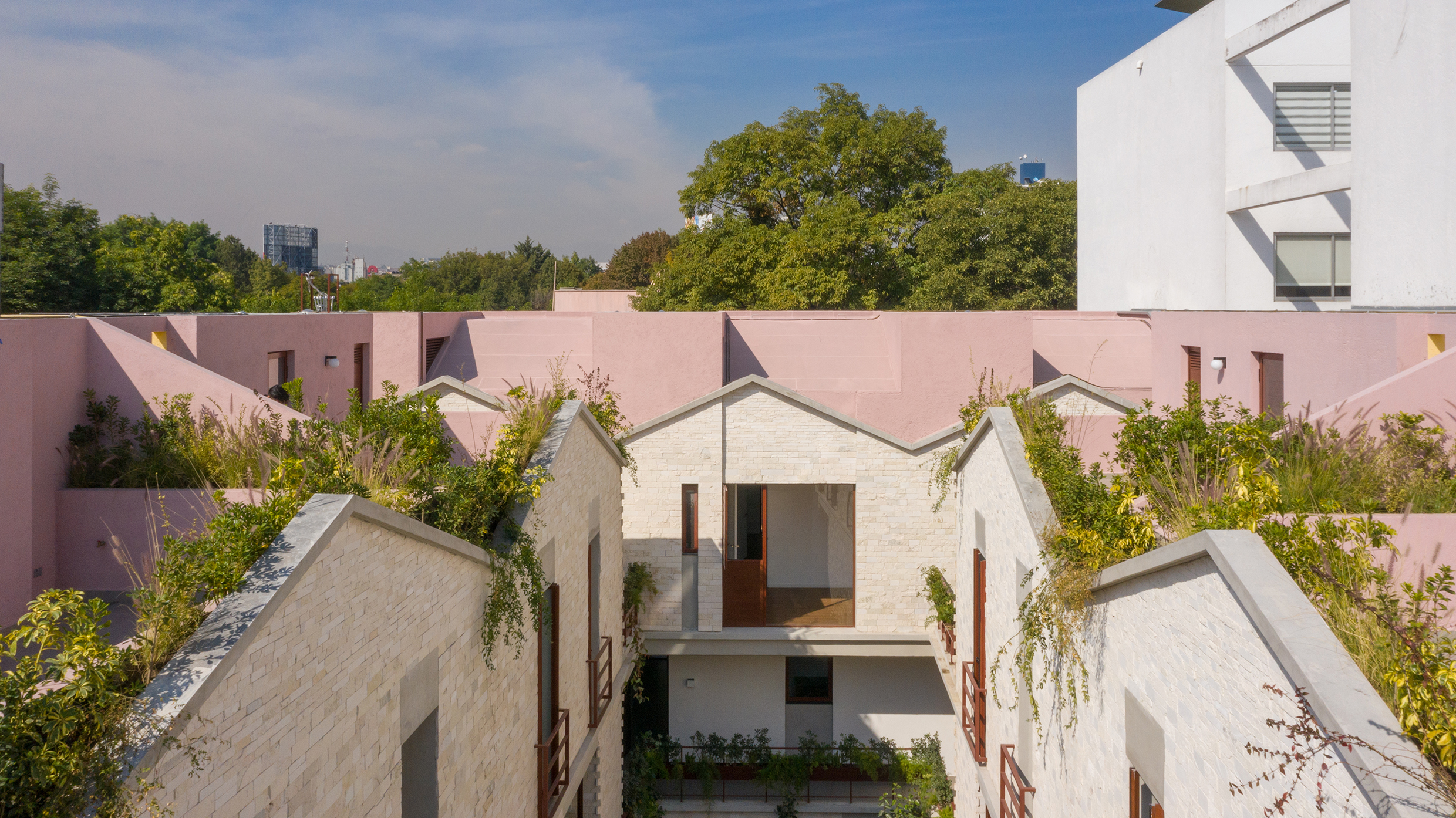
Multifamily housing and density are charged subjects, but they also hold the potential to reimagine everyday life in cities. For Caterpillar, the team wanted to rethink the standard ratios of a multifamily project. To do so, instead of “150 apartments surrounded by eight trees with just one window per room, Caterpillar provides eight apartments surrounded by 150 trees and 12-18 windows per room.” The multifamily project built on the success of True North, completed in 2017. That Prince Concepts development was made with eight Quonset huts and ten leasable units.


Casa Jardin Escandon

CPDA ARQUITECTOS, Mexico City, Mexico

CPDA Architects designed this garden house project as a multifamily development in Mexico City. Located in the Escandón neighborhood, the project includes fourteen residential units. At its heart, a central courtyard is the connective element that defines the housing project, opening up access to natural light and cross ventilation. Ten townhouse units are set up the four ground-floor units below, all of which share a similar material relationship.
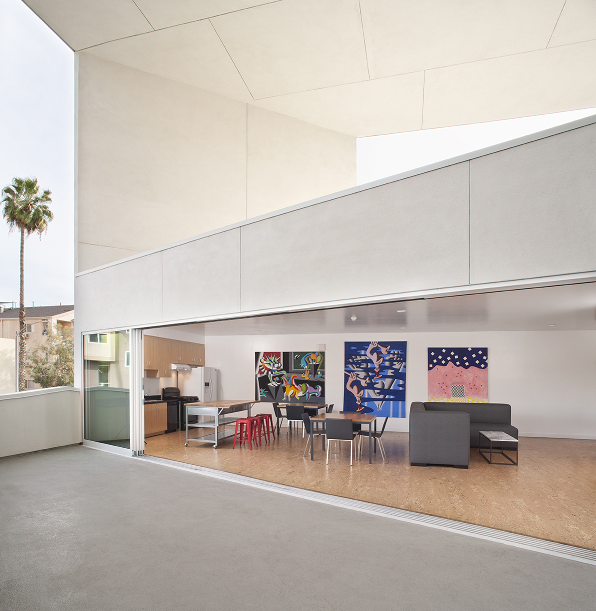
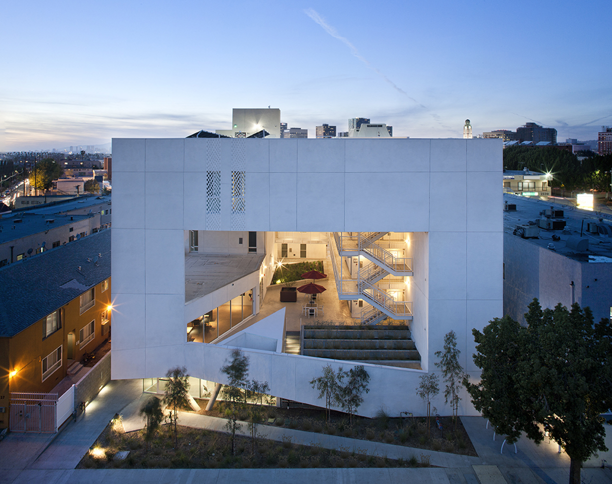
As the Escandón neighborhood has seen rapid growth, new populations moved in across age and income levels. The project provides a mix of unit types, as well as changing faces along its façade. The exterior showcases the concrete slabs that stand out and the gabled façade, while the interior has simple, seamless and integrated forms that define the inside complex. The idea was to create a “secret garden” that residents can enjoy within the city.


The SIX Veterans Housing

Brooks + Scarpa Architects, Los Angeles, CA, United States

Few cities in the world are grappling with homelessness and a severe lack of housing affordability like Los Angeles. Brooks+Scarpa has built a practice addressing issues in the city and across the nation. For this multifamily residential, The SIX was designed as a 52-unit affordable housing project that “provides a home, support services and rehabilitation for previously homeless and/or disabled veterans.”
Located in the MacArthur Park area of Los Angeles, The SIX was made to break the mold of multifamily housing by creating public and private “zones” in which private space was deemphasized to create large public areas. At ground level, the program includes support spaces for veterans, as well as bike storage, parking and offices. The second level is the core of the project, with a large, public courtyard. The idea was to create a community-oriented, interactive space that opens to its surroundings.


Jinshan 9

Steffian Bradley Architects, Shenzhen, China

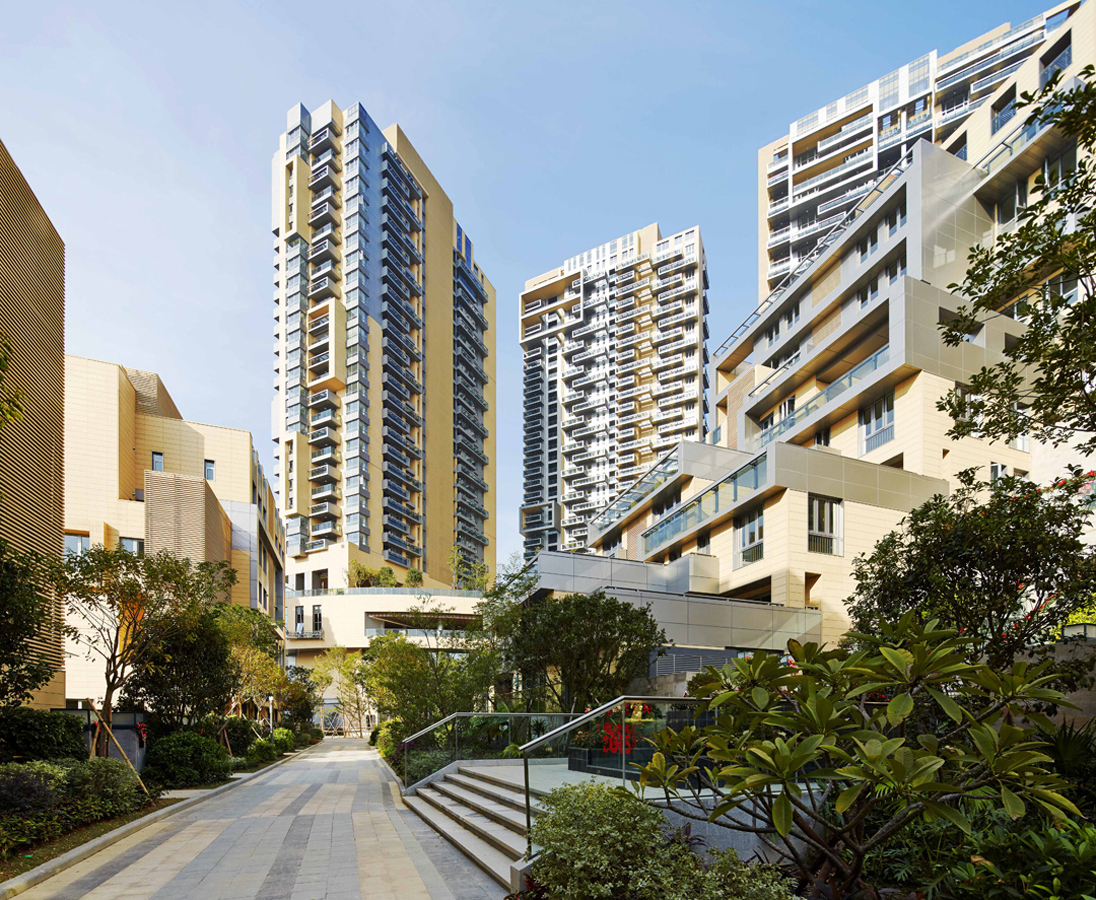
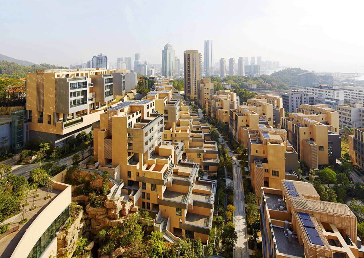
Over the last two decades, development in China has been defined by a dizzying pace and new architecture produce in-mass. For Jinshan 9, this force behind new buildings was directed into a multifamily living community. Located in China’s Shekou mixed-use district, the project looks out west to wild, forested mountains and east to Shenzhen Bay Bridge. With a range of both low-rise and high-rise structures, the development was made for diverse lifestyles and populations.

With 210 townhouse units, the project also has four residential towers rising 32 floors in height. Between integrated pedestrian paths and trails, the development comprises a network of gardens and interconnected terraces. From its material palette, Jinshan 9 includes natural-colored terracotta panels with aluminum trim on the exterior. This combines with marine-inspired imagery and forms, like balcony details echoing sailboat decks.

Architects: Want to have your project featured? Showcase your work through Architizer and sign up for our inspirational newsletters.

Reference

Building greener homes with coconuts and sugarcane
CategoriesSustainable News

Building greener homes with coconuts and sugarcane

Spotted: By 2050, Africa is expected to be home to an additional 1.1 billion people, which is almost 75 per cent of the world’s projected population growth of 1.5 billion people. Analysts believe that 80 per cent of the buildings that will be needed to accommodate that growth have yet to be built. This opens up vast and varied opportunities to develop circularity in urban planning and development, and construction practices.  

Ghanian company Ecovon is already working towards more sustainable building practices by upcycling a common agriwaste product into an all-natural, compostable building material. Ghana is one of the world’s largest coconut producers, something the Ecovon founders wanted to take advantage of. The industry produces upwards of 750,000 tonnes of coconut waste each year. 

Using coconut husks as the basis for wooden building panels allows farmers and processors to earn additional income while also reducing the amount of organic waste needing disposal. Husks are dried, milled, combined with sugarcane, and then pressed into shape. The production process is carbon neutral and the boards can come in a mix of colours and sizes. 

In tests, the resulting panels proved stronger than traditional wood, as well as being much less expensive to produce. They’re also naturally antifungal, flame retardant, and do not use any chemical binding agents. Without those toxins, the boards are fully compostable. 

Using the material reduces demand for hardwood, which helps reduce deforestation. Following decades of deforestation in Asia and South America, attention has shifted to include African forests. They are now in serious danger as deforestation across the continent is happening at twice the global average.  

From seaweed bricks to invisible solar panels that blend in with historic buildings, innovations in Springwise’s library are finding ways to improve many of the most common construction materials.

Written By: Keely Khoury

Reference

Eight homes with stylish and practical built-in window seats
CategoriesInterior Design

Eight homes with stylish and practical built-in window seats

For our latest lookbook, we’ve collected eight window seats in homes across the world including clever custom-made solutions in wood and concrete.

By installing a window seat, interior designers don’t just add extra seating to a room, they also create a peaceful space that can be used for contemplation and relaxation.

Whether it functions as a small nook for reading, a sofa for socialising or even as a daybed, these projects showcase how the built-in furniture piece has been used in homes from Denmark to China.

This is the latest in our lookbooks series, which provides visual inspiration from Dezeen’s archive. For more inspiration see previous lookbooks featuring interiors created on a budget, immersive saunas and light-filled kitchens.


Window seat, Nicolai Paris by NOA
Photo by Antoine Huot

Nicolai Paris, France, by NOA

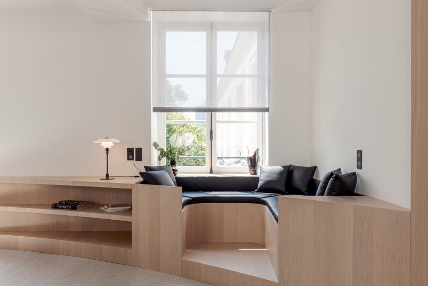
This Network of Architecture-designed Marais apartment inside a converted hotel has been outfitted with a selection of custom-made oak furniture. In the living room, a stylish built-in window seat was designed to function as both seating and storage space.

Its curved shape was enhanced by the addition of black-leather cushions and pillows, which contrast the unadorned white walls and the bleached oak parquet with its decorative chevron pattern.

Find out more about Nicolai Paris ›


Villa Weinberg
Photo by Mikkel Mortensen

Villa Wienberg, Denmark, by Wienberg Architects and Friis & Moltke

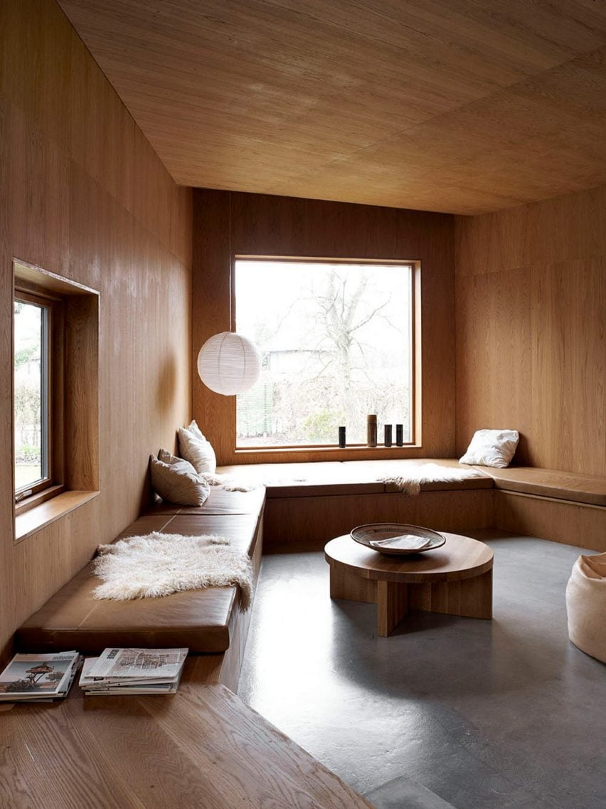
Together with studio Friis & Moltke, Danish architects Mette and Martin Wienberg gave this 1940s cottage an overhaul to turn it into a home for their own family.

The house has wooden panelling throughout and in the living space, the material was also used to form a low-slung window seat that functions as a bench around the room. Cosy pillows and a sheepskin add comfort.

Find out more about Ell House ›


Maison Jericho
Photo by Manon Vandenhoeck

Maison Jericho, France, by Olivia Fauvelle Architecture

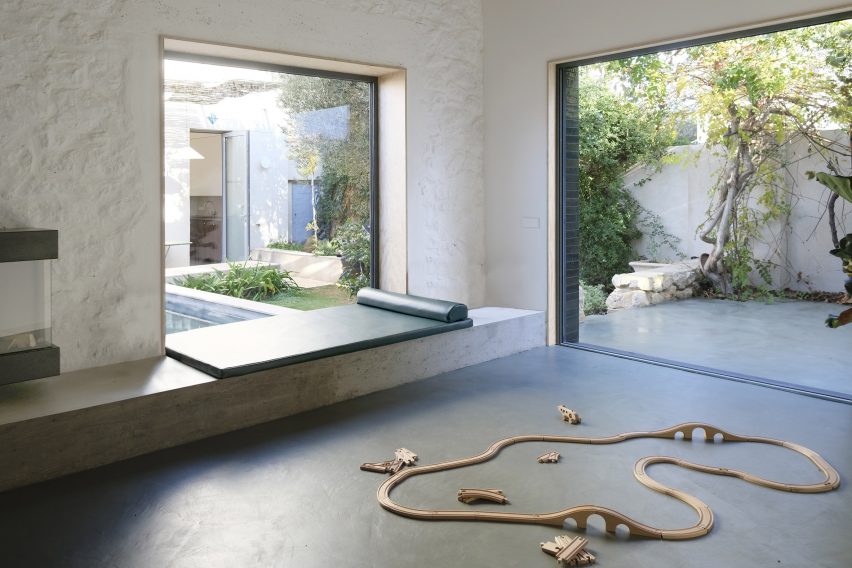
This outbuilding in Marseille was refurbished and extended by French studio Olivia Fauvelle Architecture. In the living room, a concrete window seat was added to help create a connection between the indoors and outdoors.

It overlooks a tiled terrace with a pool and is topped with a leather daybed to create a restful space. A wood-burning stove hangs above the window seat, adding warmth to the room.

Find out more about Maison Jericho ›


First floor window seat in Puppeteers House by REDO Architects
Photo by Do Mal o Menos

Puppeteers House, Portugal, by REDO Architects

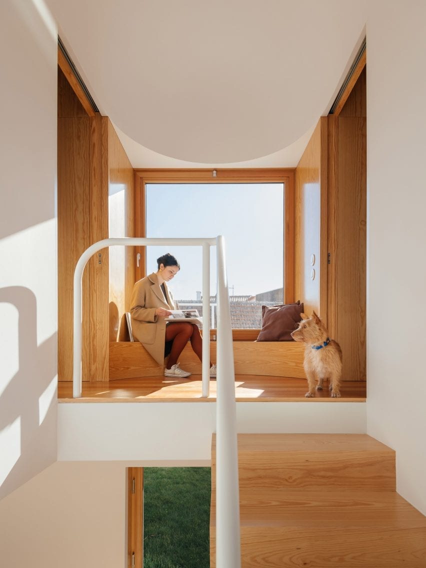
REDO Architects was inspired by stage sets when designing Puppeteers House in Sintra, Portugal, which features wooden joinery constructions intended to evoke theatrical scenography.

This includes a curved wooden bench that functions as a window seat on the first-floor landing, where it is matched by wooden panelling.

“We used a precise quarter of a circle as a tool – like a compass – in different radii, orientations, combinations and materialities,” REDO Architects founder Diogo Figueiredo told Dezeen.

Find out more about Puppeteers House ›


Wooden window seat
Photo (above and main image) by Maxime Brouillet

Ell House, Canada, by Ravi Handa Architect and AAmp Studio

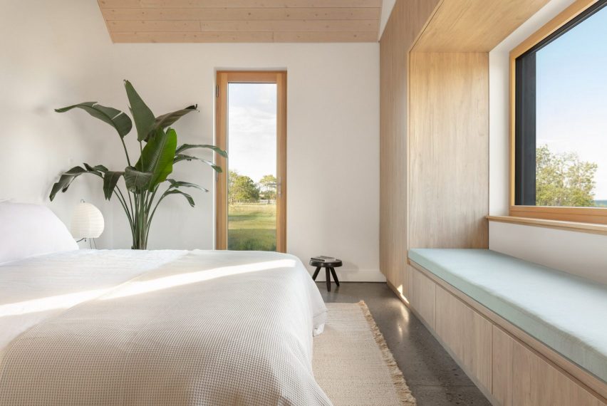
The built-in window seat in the Ell House holiday home in Wellington provides its owners with a picturesque view of Lake Ontario.

The exterior of the house was clad in cedar that was charred using the Japanese yakisugi method while the interior features contrasting light oak millwork.

The same wood was also used to form a window seat in the bedroom, which features clean lines and has a cushion for additional comfort.

Find out more about Ell House ›


Window seat inside Low Energy House designed by Architecture for London
Photo by Lorenzo Zandri and Christian Brailey

Muswell Hill home, UK, by Architecture for London

British studio Architecture for London designed this home in north London for its founder Ben Ridley. Located in an Edwardian house that hadn’t been renovated for almost 40 years, it was designed to be energy-saving and constructed using natural materials.

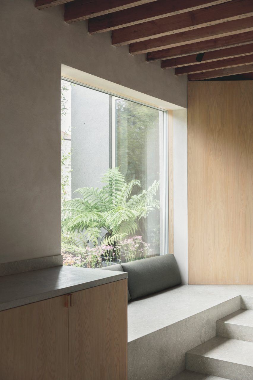
A cosy window seat made from grey limestone can be found in the kitchen, where it connects to a storage cabinet made from pale oak.

Find out more about Muswell Hill home ›


U-shape Room by Atelier Tao+C
Photo by Tian Fang Fang

U-Shape Room, China, by Atelier Tao + C

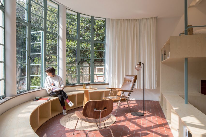
U-shaped window seats are more unusual than rectangular ones. But in this Chinese home, the architects had little choice as the building is dominated by a huge, rounded bay window.

Studio Atelier Tao+C added a curved plywood seat that also has storage spaces. It matches a two-storey plywood volume that houses all the functional rooms of the apartment.

Find out more about U-Shape Room ›


Dining table with green wall and yellow pendant
Photo by Magnus Berger Nordstrand

The Yellow House in the Apple Garden, Norway, by Familien Kvistad

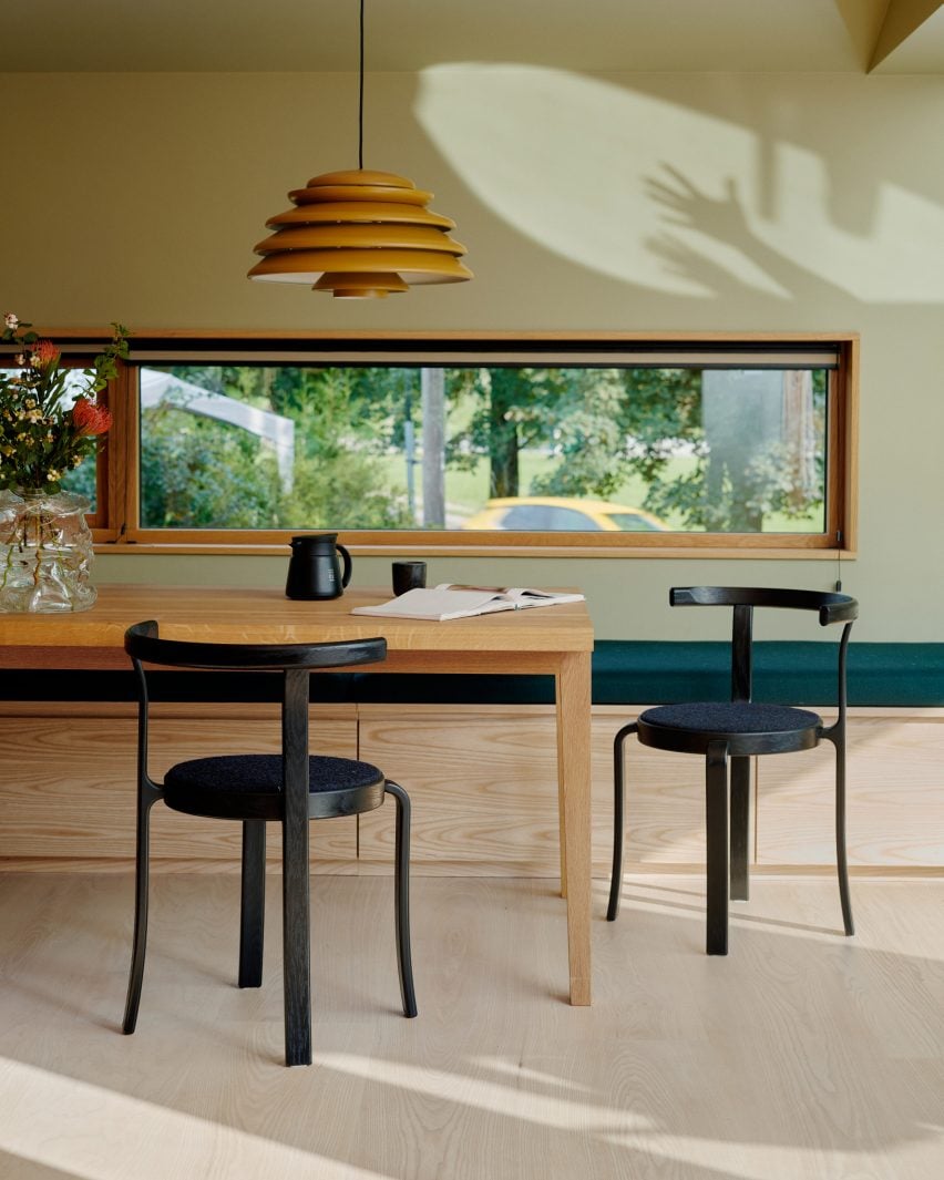
This renovated 1950s house in Oslo was given a colourful interior by locally based duo Familien Kvistad and also features “an abundance of wood”.

While window seats are usually placed under large windows, here the designers chose to add one underneath the smaller, rectangular kitchen window. The long bench is made from ash and has practical storage space hidden underneath a dark green cushion seat.

Find out more about The Yellow House ›

This is the latest in our lookbooks series, which provides visual inspiration from Dezeen’s archive. For more inspiration see previous lookbooks featuring interiors created on a budget, immersive saunas and light-filled kitchens.

Reference

Eight homes with light-filled kitchens from Australia to Slovenia
CategoriesInterior Design

Eight homes with light-filled kitchens from Australia to Slovenia

For our latest lookbook, we’ve chosen eight kitchens in contemporary homes where strategically placed windows and glazing create well-lit spaces for cooking and spending quality time with family and friends.

These light-filled kitchens feature different finishes, including marble, concrete, wood and glass, but are joined together by the sunlight that streams through their large windows, glazed doors or skylights.

This is the latest in our lookbooks series, which provides visual inspiration from Dezeen’s archive. For more inspiration see previous lookbooks featuring interiors with furry walls, sculptural wooden staircases and rustic Italian interiors.


Monroe Street House by TBo
Photo is by Matthew Williams

Monroe Street House, USA, by TBo

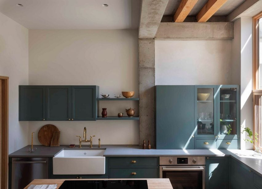
New York studio TBo updated a 124-year-old townhouse in Brooklyn to meet the demands of a modern, multi-generational family’s lifestyle.

Featuring a window that stretches from the worktop to the ceiling and glass doors that lead to an outdoor deck, the kitchen has maximised access to daylight and to the outdoors.

Find out more about Monroe Street House ›


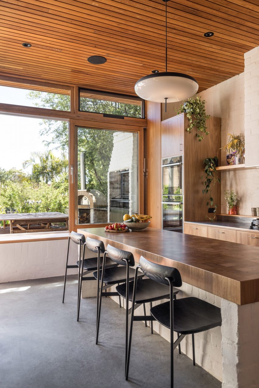
Kitchen with concrete flooring, wood ceiling and a large kitchen island with seating
Photo is by Rohan Venn

Sydney bungalow extension, Australia, by Emily Sandstrom

Australian architect Emily Sandstorm restored this out-of-use 1930s bungalow in Sydney with reclaimed materials from the demolition of its small rear kitchen.

She sees the new kitchen, which features a kitchen island with a worktop of recycled Australian hardwood, as the centre of the home. A window wall creates views of an outdoor dining area and fills the room with light.

Find out more about the bungalow ›


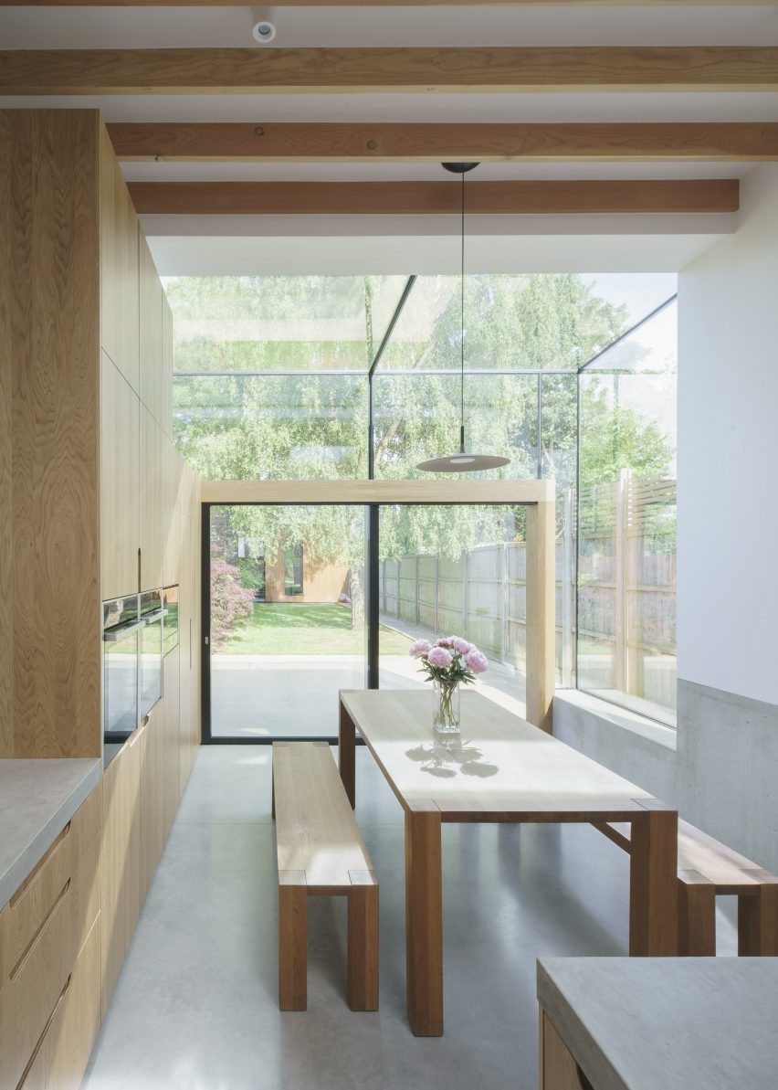
Photo is by Nick Dearden

Glazed house extension, UK, by DHaus

As part of the rear extension to a house in Hertfordshire, UK, London studio DHaus opened up the original dark and cramped kitchen with a material palette of concrete, glass and Douglas fir timber.

The studio lowered the kitchen floor by one metre and connected the interior to the garden, with glazing lining the entire end of the extension to create a bright, welcoming space.

Find out more about the glass extension ›


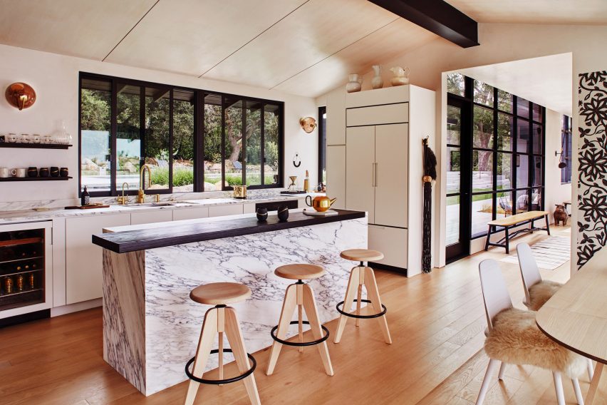
AB design california renovation
Photo is by Jason Rick

Quarry House, USA, by AB Design Studio and House of Honey

West Coast-based architecture practice AB Design Studio renovated the Quarry House in California, a 1954 house that had fallen into disrepair, in collaboration with House of Honey, which was responsible for the interior design.

The kitchen was renewed with textured marble surfaces and a kitchen island, as well as Crittall-style windows and doors.

Find out more about Quarry House ›


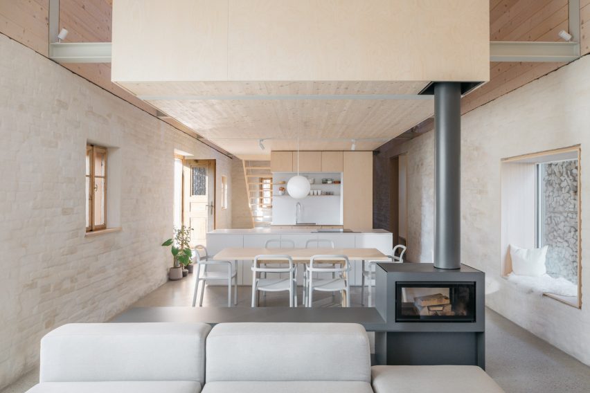
House MM by a202 Arhitekti is a home in Slovenia
Photo is by Ana Skobe

House MM, Slovenia, by A202 Arhitekti

A202 Arhitekti transformed the traditional gabled house in Slovenia by removing all non-structural interior elements and adding a timber extension inside while preserving the shell of the property.

The studio built the kitchen with light-coloured materials in a minimalist style, adding a large window with a comfortable window seat for reading or contemplation.

Find out more about House MM ›


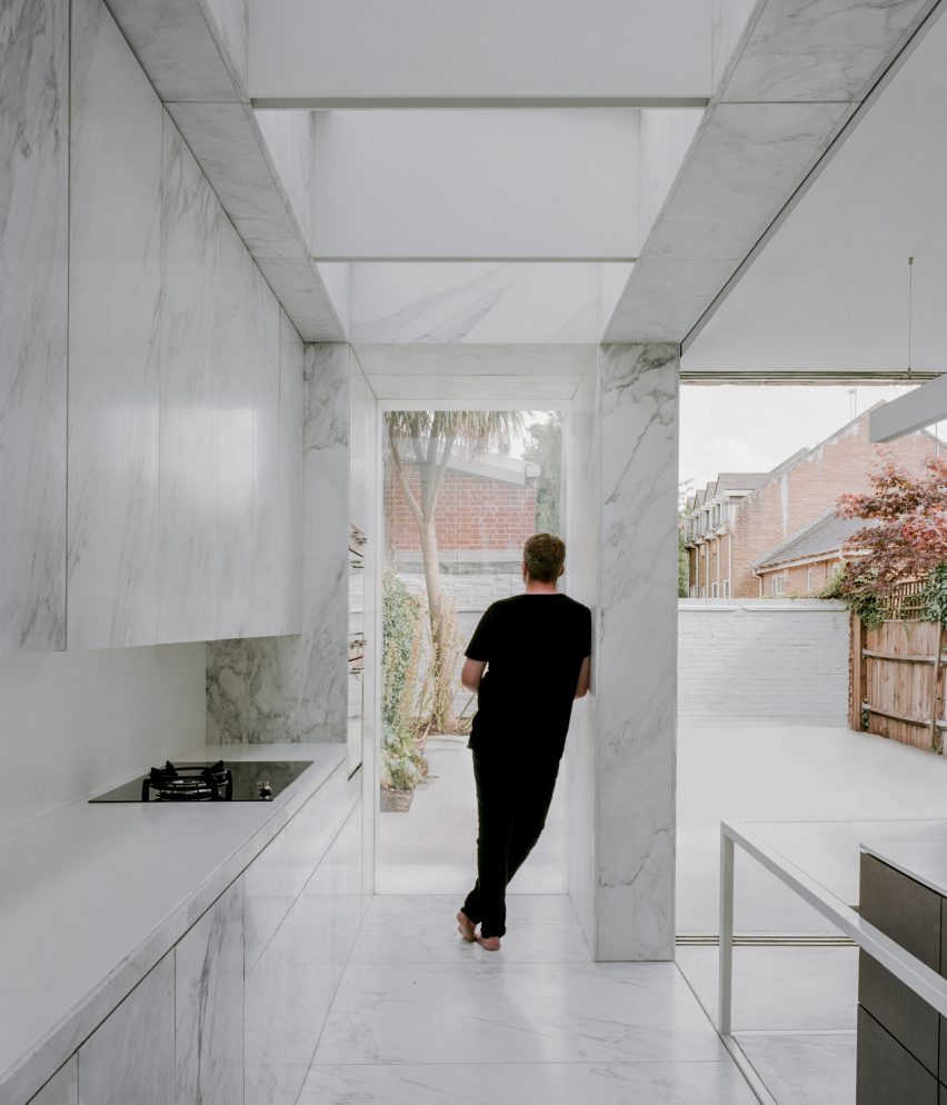
The kitchen is covered with marble clads
Photo is by Lorenzo Zandri

House extension, UK, by ConForm

Designed by ConForm, the light-filled kitchen in this Hampstead home is covered with white marble panels.

The patterns of light grey veins on adjoining surfaces were unmatched to “encourage a natural and textural language”, the studio said. Sliding doors open the room up to the garden.

Find out more about the Hampstead extension ›


Photo is by Peter Bennetts

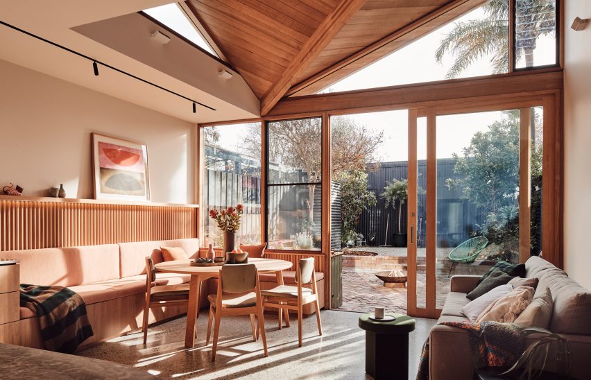
10 Fold House, Australia, by Timmins + Whyte

Australian studio Timmins + Whyte added an extension with a folded roof that brings in extra natural light to this Melbourne home.

The kitchen included in the extended space was combined with the living room through a shared material palette of ribbed wood, marble and grey terrazzo.

Find out more about 10 Fold House ›


Photo is by Jeroen Verrecht

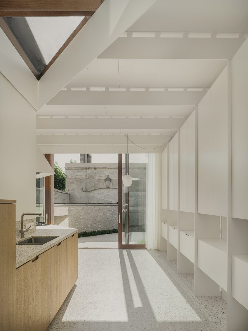
House C-DF, Belgium, by Graux & Baeyens Architecten

Belgian studio Graux & Baeyens Architecten was tasked to maximise the space in a narrow townhouse in Ghent that already had a rear kitchen extension.

The studio changed the gap between the old extension and the original house into a skylight and replaced the wall between the garden and the kitchen with a glass sliding door, which introduced additional light to the ground-floor kitchen.

Find out more about House C-DF ›

This is the latest in our lookbooks series, which provides visual inspiration from Dezeen’s archive. For more inspiration see previous lookbooks featuring interiors with furry walls, sculptural wooden staircases and rustic Italian interiors.

Reference

From 4 to 1 Planet showcases climate-friendly homes of the future
CategoriesSustainable News

From 4 to 1 Planet showcases climate-friendly homes of the future

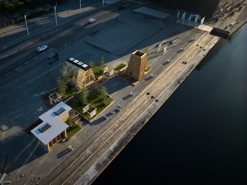
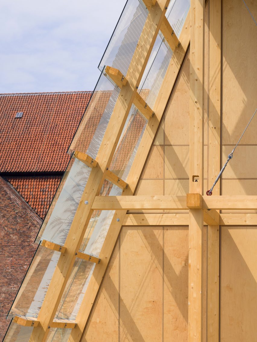
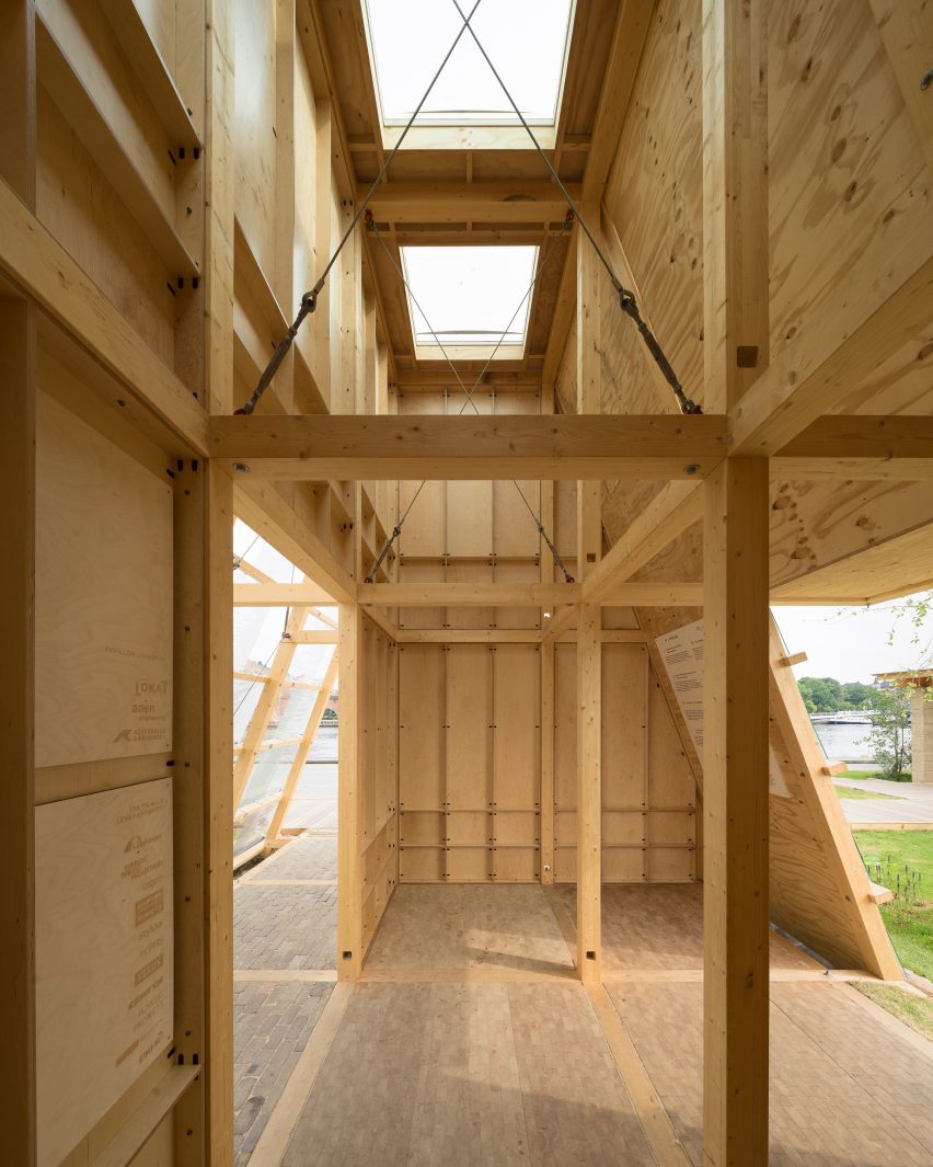
A trio of pavilions have been installed on Copenhagen’s waterfront, showing how radical materials and new ways of living might reduce the carbon footprint of housing construction.

From 4 to 1 Planet offers three visions for the home of the future, each created by a different team of architects, engineers and researchers, in the form of a full-scale built prototype.

From 4 to 1 Planet pavilions in Copenhagen
From 4 to 1 Planet features three proposals for the future of housing. Photo is by Itchy

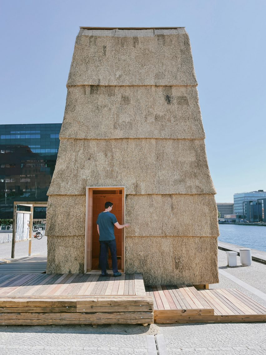
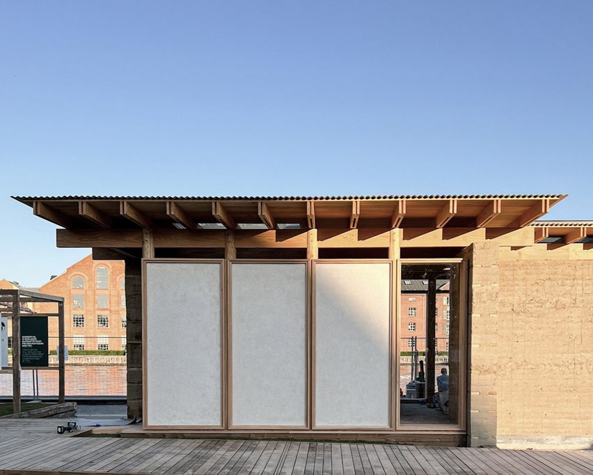
One demonstrates the potential of rammed earth, a second combines a thatched exterior with a clay-block interior, and a third suggests how homes could be more space-efficient.

They were among 15 SDG Pavilions created as part of the programme for the UIA World Congress of Architects earlier this month, to explore themes relating to the UN’s Sustainable Development Goals.

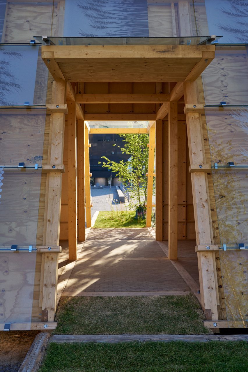
Thatched Brick Pavilion by Leth & Gori, Rønnow and CINARK
Thatched Brick Pavilion was designed by Leth & Gori and Rønnow, in collaboration with CINARK. Photo is by Kim Høltermand

They are located in Søren Kierkegaard’s Plads, next door to the Danish Architecture Center.

The three design teams were the winners of the Next Generation Architecture competition, which called for ideas into how affordable housing construction could become more eco-friendly.

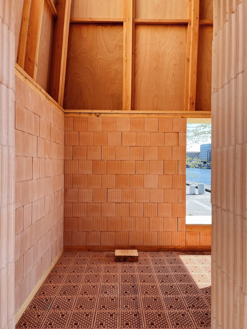
Thatched Brick Pavilion by Leth & Gori, Rønnow and CINARK
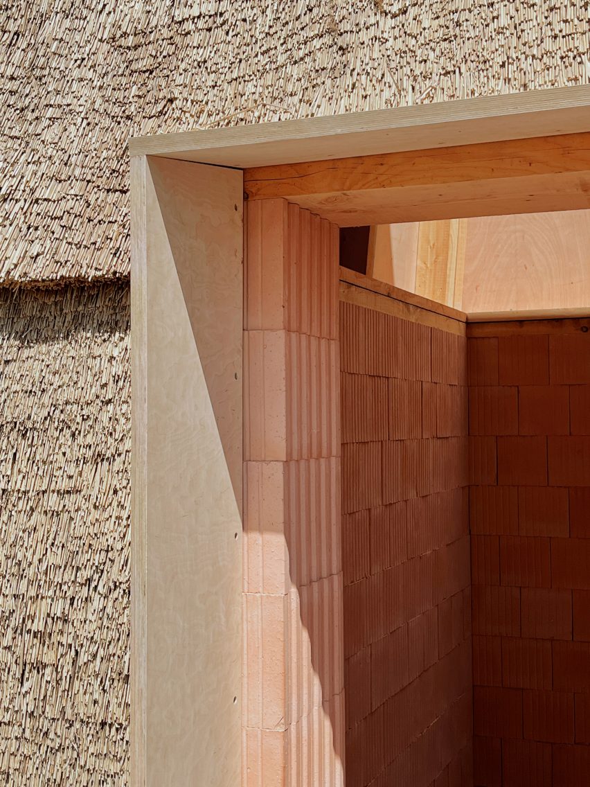
The design combined a thatched exterior with a clay-block interior. Photo is by Kim Høltermand

The architecture studios behind the three designs are ReVærk, Tegnestuen Lokal, and Leth & Gori and Rønnow.

Leth & Gori and Rønnow worked with the Center for Industrialised Architecture (CINARK), a research group at the Royal Danish Academy, on the design titled Thatched Brick Pavilion.

Thatched Brick Pavilion by Leth & Gori, Rønnow and CINARK
The design aims to show how combining these two materials can offer high levels of insulation and fire safety. Photo is by Kim Høltermand

The structure aims to show how thatch, made from straw, can be combined with porous clay blocks to create buildings with surprisingly high levels of insulation and fire safety.

“We discovered both aesthetic and technical potentials in the combination of these materials,” said Uffe Leth, a founding partner at Leth & Gori.

“If we build tall buildings with these brick blocks, the thatched facades help us with extra insulation,” he told Dezeen.

“That means we don’t need to invest energy and resources on using deeper blocks or two layers of blocks to live up to the building regulations.”

Quarter Pie Pavilion by Tegnestuen LOKAL
Quarter Pie Pavilion is designed by Tegnestuen Lokal. Photo is by Hampus Berndtson

Tegnestuen Lokal’s design, the Quarter Pie Pavilion, proposes how mass housing can facilitate new approaches to living, as well as new building techniques, to create homes that prioritise quality rather than quantity.

“In order for us to approach a more planetarily responsible building culture we cannot only rely on how we build, but also need to be critical about how much,” said studio founder Christopher Ketil Dehn Carlsen.

“In our opinion even the greenest building materials in the world cannot counteract our current overconsumption of space, which is why we need to make our housing market respond to both demographic changes as well as new and radical co-living alternatives,” he told Dezeen.

Quarter Pie Pavilion by Tegnestuen LOKAL
The design is accompanied by a list of 10 housing design principles. Photo is by Hampus Berndtson

The prototype was accompanied by a list of 10 key principles, offering a strategy that could potentially be adopted by the entire housing construction industry. Carlsen describes it as “a set of easy-to-apply rules for planetary responsible housing”.

This list advocates for homes that incorporate co-living and other forms of sharing, as well as flexibility.

Quarter Pie Pavilion by Tegnestuen LOKAL
The concept explores how massing housing can allow for sharing and flexibility. Photo is by Itchy

“Rather than showing one answer to our current challenges, we wanted to pose questions that could generate unforeseen and radical answers,” Carlsen said.

“Our pavilion and its overarching housing concept is just one example, in which we’ve focused on the tectonics of disassembly. But in our opinion, the ruleset itself is the real product of the initiative.”

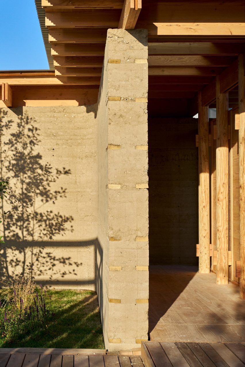
Natural Pavilion by ReVærk
Natural Pavilion is designed by ReVærk. Photo is by Itchy

ReVærk named its project Natural Pavilion, as it focuses on biomaterials.

One of the aims was to show how these types of materials are not just climate-friendly, but can also improve the sensory quality of a home’s interior.

Natural Pavilion by ReVærk
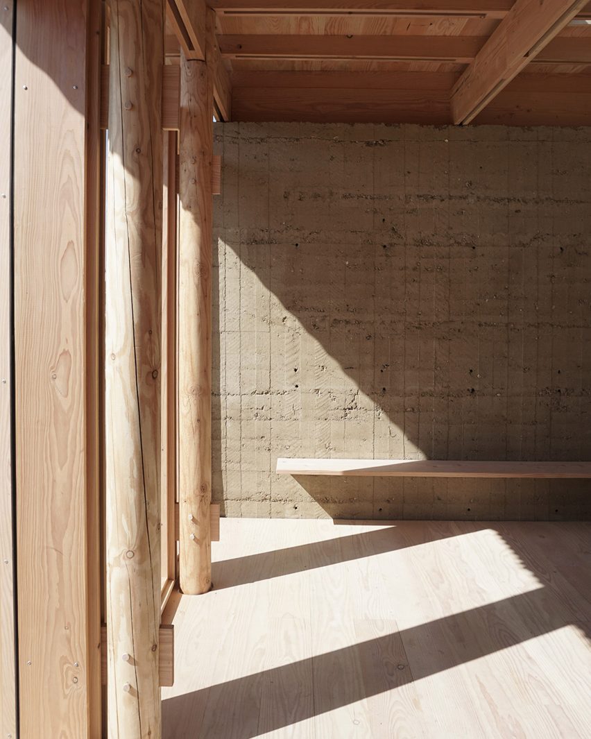
The structure combines rammed earth walls with a timber structure and wood fibre insulation cassettes. Photo is by Itchy

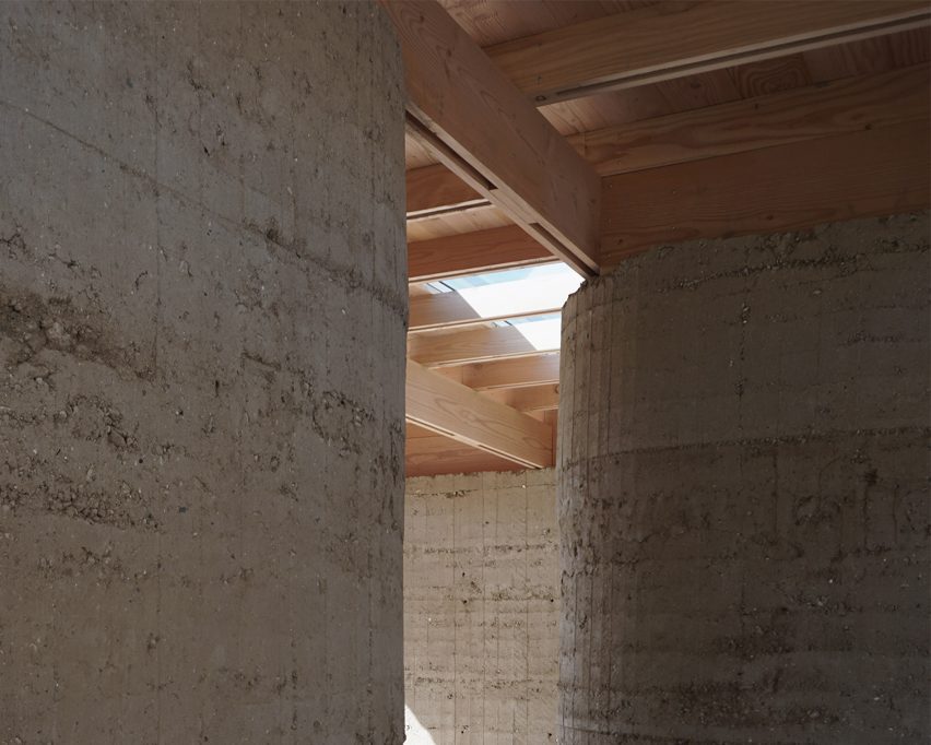
The structure features rammed earth walls, made using locally sourced clay soil, combined with a timber structure and biogenic insulation cassettes made from wood fibre.

“Construction materials account for about 70 per cent of a building’s carbon footprint,” said Simeon Østerlund Bamford, founding partner of ReVærk.

Natural Pavilion by ReVærk
The design looks at how these materials can improve the sensory quality of a home. Photo is by Itchy

“The answer to that has inevitably always been to look back in order to look forward,” he told Dezeen.

“We wanted to demonstrate how natural low-emission materials and old building techniques can create a new architectural experience, where the materials both provide natural indoor climate advantages as well as great aesthetic qualities.”

Natural Pavilion by ReVærk
From 4 to 1 Planet is on show in Søren Kierkegaard’s Plads. Photo is by Itchy

From 4 to 1 Planet is the result of an initiative spearheaded by Smith Innovation, a Danish research and development consultancy, supported by Realdania and Villum Fonden.

Once the exhibition is over, the pavilions will be relocated to new locations and repurposed.

From 4 to 1 Planet is on show at Søren Kierkegaard’s Plads from 10 June to 11 August 2023. See Dezeen Events Guide for an up-to-date list of architecture and design events taking place around the world.

Reference

edition office’s fenwick homes balance concrete & delicate copper
CategoriesArchitecture

edition office’s fenwick homes balance concrete & delicate copper

fenwick st: design-focused homes for hew, australia


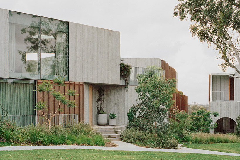
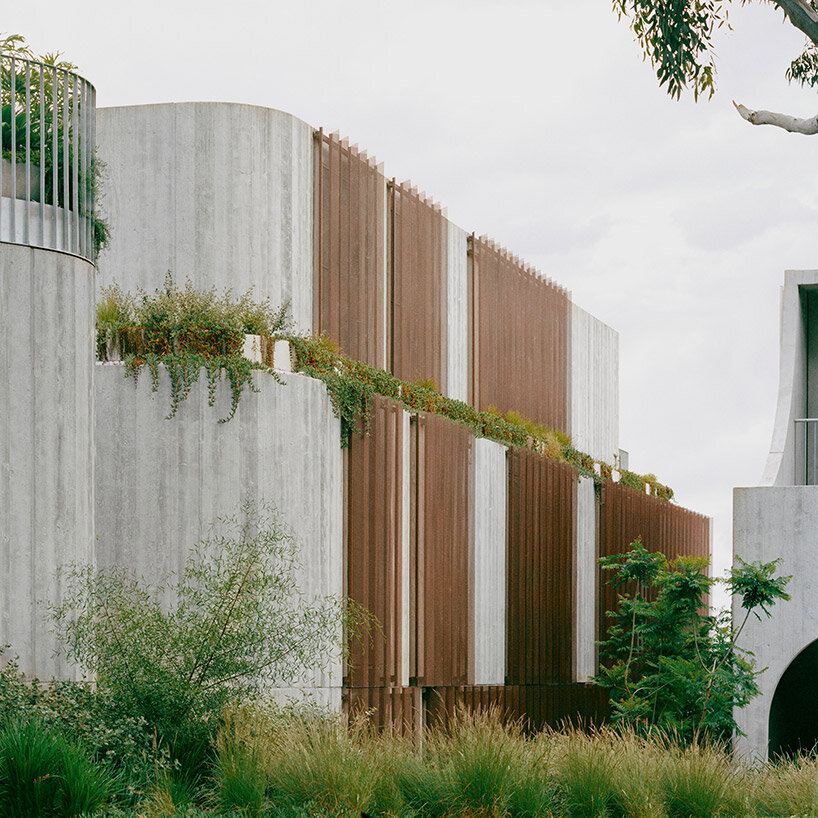
Melbourne-based architecture studio Edition Office presents Fenwick St, a newly completed residential development situated on the edge of the Birrarung/Yarra River in Kew, Australia. This location offers unobstructed connections to breathtaking landscapes rarely found in such close proximity to the city. With the site surrounded by well-preserved 1950’s and 1960’s post-war houses, the architects sought to create the concrete complex as a contextually sensitive addition that balances density with visual porosity, while ensuring a connection to the lush natural surroundings.

edition office fenwickimages © Rory Gardiner@arorygardiner


a trio of residential pavilions


To maintain a strong connection to the distant vista while preserving the link between Fenwick St and the public realm, Edition Office emphasized drawing these connections deep into the plan and through the site to the street. In order to achieve this, the architects designed three visually independent pavilions rather than a single large structure. This approach allowed for a balance of similar scaled forms with neighboring houses and enabled the framing of views within the site itself.


The pavilions, connected by a common basement, were strategically positioned to optimize the site’s characteristics. Located at a sharp bend in the street, the split between the pavilions occurs at the fulcrum, creating a dynamic arrangement. As the pavilions extend past the site, they lower in scale at the street level, aligning with the neighboring residences, while gradually increasing in height as they integrate with the terrain leading to the escarpment.

edition office fenwick
nine new dwellings are created on a site that previously accommodated only one


edition office Integrates the lush landscape


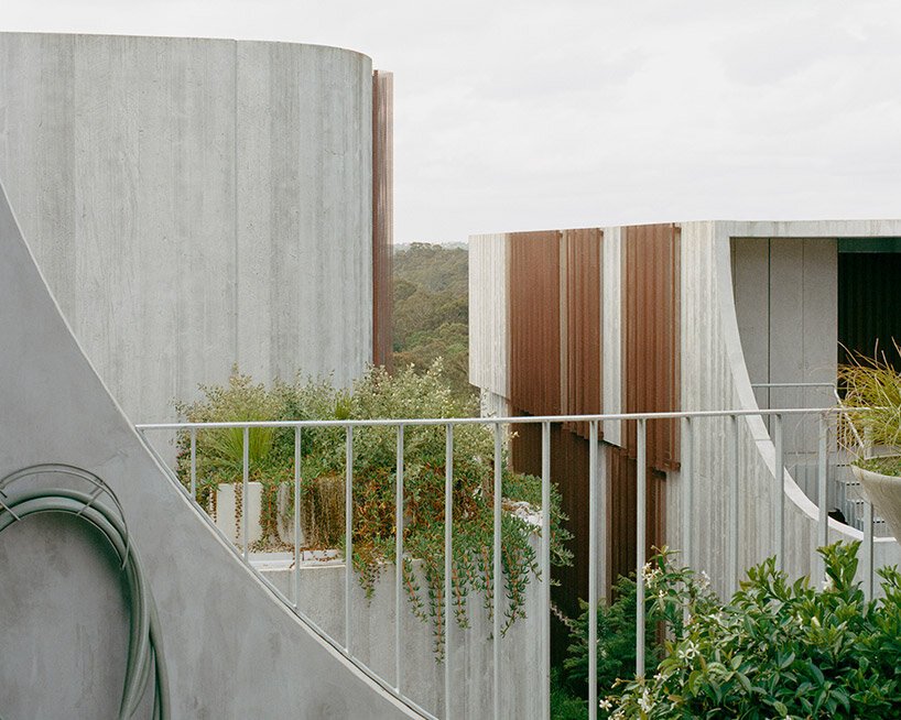
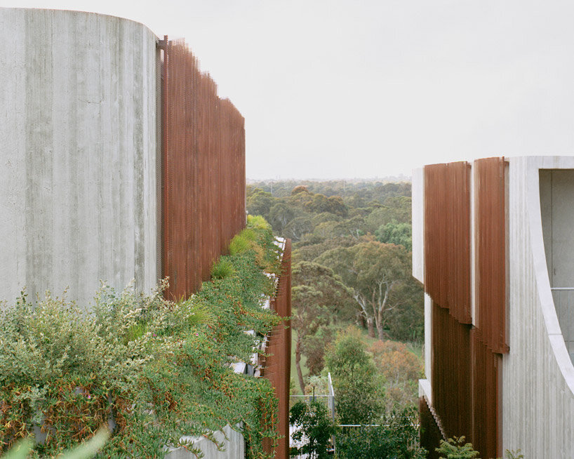
The living spaces within Fenwick St were carefully planned to open towards the north, the river, and the valley, allowing the distant landscape to become an integral part of the internal experience. Circulatory paths were strategically designed to draw the surrounding environment deep into the plan, while bedrooms and ancillary spaces opened to the green spaces between pavilions, offering views through a copper mesh privacy veil. This nature inspired the team to blend the architecture into into its surroundings, with landscape designed by Eckersley Garden Architecture.


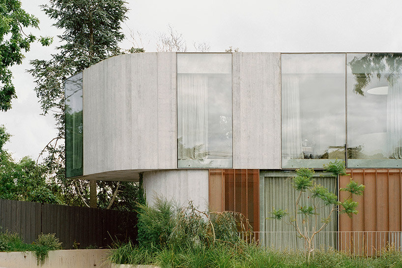
The need to anchor the building into the site led to a construction that appears rooted to the ground. By slightly shifting and rotating each floor plate, movement was introduced to the shear walls, softening the overall mass and scale. Copper screening was used to bring delicacy to the purposefully heavy pre-cast concrete construction, with the screens expected to age gracefully over time.

edition office fenwick
copper screening delicately balances the heavy pre-cast concrete construction


In addition to connecting with the landscape, creating light-filled private spaces filled with comfort and attention to detail was a key driver for Edition Office in the design of Fenwick St. Flack Studio, responsible for the interiors, imbued the spaces with warmth, calmness, and moments of dramatic nuance. Material tactility and the evolving patina of surfaces, such as the weathering copper screens and the maturation of the surrounding gardens, added depth and character to the interiors. The careful craftsmanship of junctions and thresholds enhanced the joy of navigation throughout the spaces.

edition office fenwick
the complex takes shape as three visually independent pavilions rather than a single large structure


The project brief called for the creation of nine new dwellings on a site that previously accommodated only one. In order to respect the immense environmental and cultural value of the location, Edition Office aimed to minimize the perceived mass of a single large volume. Instead, the design resulted in three distinct forms that conform to the domestic patterns and scale of the existing streetscape. These wedge-shaped pavilions meet at their narrowest points, creating moments of architectural exuberance and unobstructed sight-lines both within the site and towards the horizon.

edition office fenwick
the environment is drawn deep into the plan, while interiors open to the in-between green spaces


Reference

Eight homes where wardrobes are used as a focal point
CategoriesInterior Design

Eight homes where wardrobes are used as a focal point

Statement wardrobes with red-leather doors and bright yellow shelving feature in this lookbook, which proves clothes storage does not have to be a blight on the interior.

It’s not unusual for wardrobes to be pared-back and concealed in residential interiors, often in an attempt to hide clutter and retain focus on other furnishings and finishes.

However, this lookbook spotlights the works of architects challenging this idea and using essential clothing storage as an opportunity to create a focal point in a home.

This is the latest in our lookbooks series, which provides visual inspiration from Dezeen’s archive. For more inspiration see previous lookbooks featuring pergolas, guesthouse interiors and bedrooms with bathtubs.


leather-lined wardrobes
Photo by Nick Worley

Leather Dressing, UK, by Simon Astridge

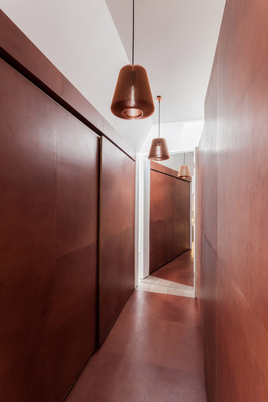
Rust-coloured leather lines the floor and sliding wardrobe doors of this dressing room, which architect Simon Astridge designed as an eye-catching centrepiece in a refurbished London house.

“The best part of the leather tunnel is the lovely fresh leather smell you get every time you get out of bed to get dressed,” said Astridge.

Find out more about Leather Dressing ›


yellow wardrobe
Photo by Studio Noju

Casa Triana, Spain, by Studio Noju

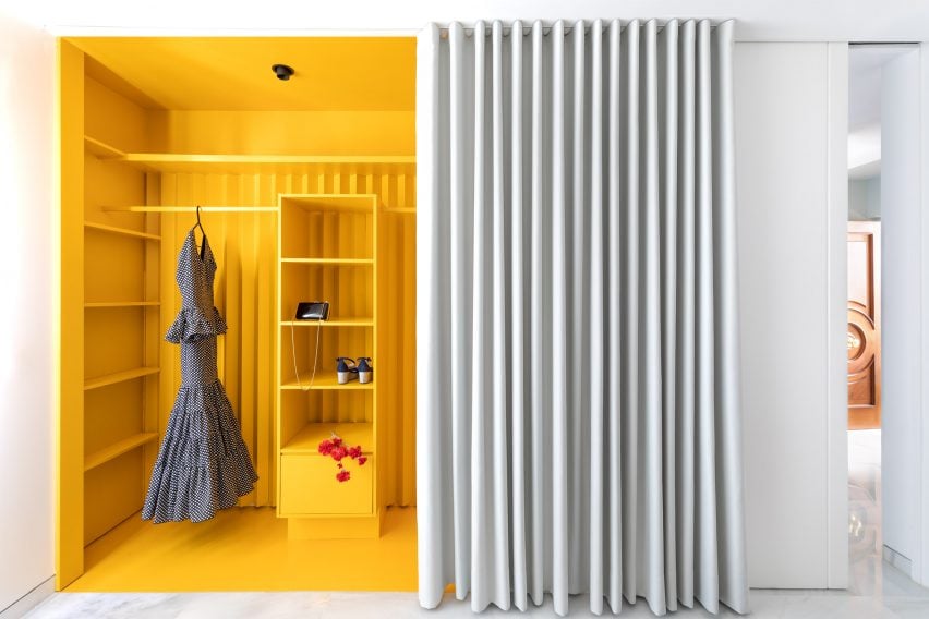
This vivid yellow wardrobe is among the brightly coloured spaces in Casa Triana, an open-plan apartment by Studio Noju in Seville.

Its bright shelves and surfaces pop against its white surroundings and form a striking backdrop to the owner’s clothes. While forming a feature of the home, it also helps to create the illusion of having separate spaces within its open plan.

Find out more about Casa Triana ›


Golden wardrobes in The Magic Box Apartment
Photo by José Hevia

The Magic Box Apartment, Spain, by Raúl Sánchez Architects

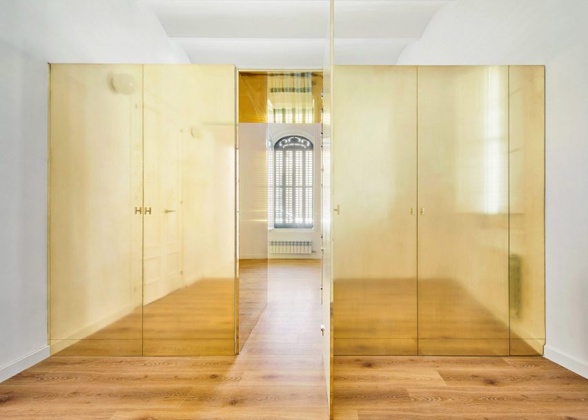
This shiny brass wardrobe at the centre of an apartment near Barcelona in Spain was intended to resemble a precious jewellery box. It also acts as a partition between two rooms, featuring a “secret passageway” in its middle.

“I love brass, and in this precise project it gave that magic look, that look of a precious object,” said architect Raúl Sánchez.

Find out more about The Magic Box Apartment ›


Yellow wardrobes by Pedro Varela & Renata Pinho
Photo by José Campos

Yellow Apartment Renovation, Portugal, by Pedro Varela & Renata Pinho

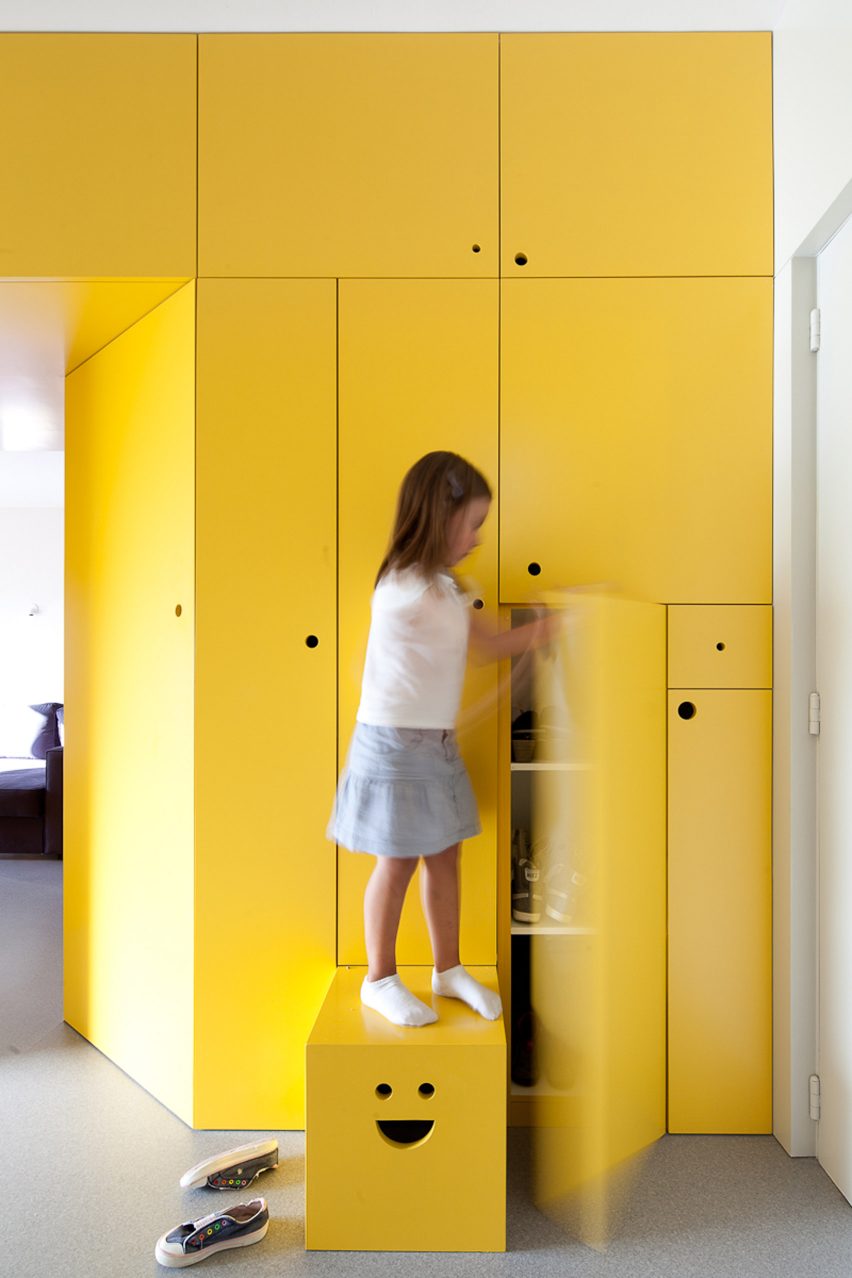
Yellow was also used by architects Pedro Varela & Renata Pinho to colour this wardrobe, which is located in an apartment in Portugal.

The wardrobe forms part of a wall of storage that divides the apartment. Finishing touches include different-sized circular openings for use as handles and a step that is pulled out of the wall with a smiley-face cut-out.

Find out more about Yellow Apartment Renovation ›


Wood Ribbon apartment by Toledano + Architects
Photo by Salem Mostefaoui

Wood Ribbon, Paris, by Toledano + Architects

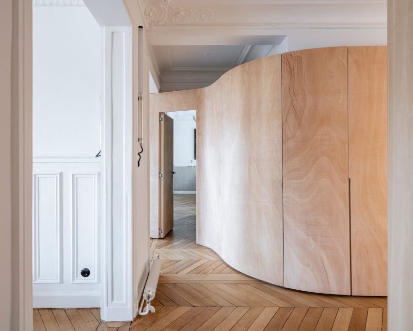
This Parisian apartment is named Wood Ribbon after the sinuous plywood wall that snakes through its interior.

While dividing the residence into three zones, the structure also incorporates several doorways, a dressing room and storage areas for clothes, including one in the hallway.

Find out more about Wood Ribbon ›


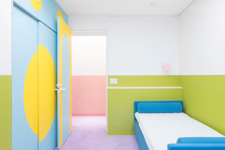
Nagatachō Apartment by Adam Nathaniel Furman
Photo by Jan Vranovsky

Nagatachō Apartment, Tokyo, by Adam Nathaniel Furman

A sugar-sweet colour palette fills every corner of the Nagatachō Apartment, which designer Adam Nathaniel Furman created for a retired expat couple in Tokyo.

This includes the bedroom, where a built-in wardrobe is outlined by bright baby-blue doors and yellow semicircular motifs that stand out against the white and green walls on either side.

Find out more about Nagatachō Apartment ›


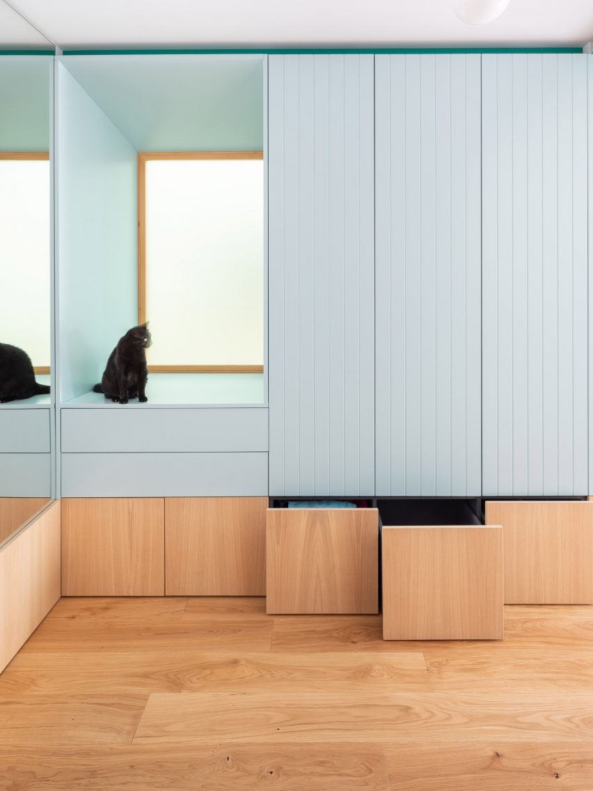
Blue wardrobe with built-in window seat
Photo by Filippo Poli

Galla House, Spain, by Cavaa

Though it sits seamlessly against the wall, the detailed design of this wardrobe ensures makes it a standout feature of the Galla House in Spain.

It features wooden drawers for shoes and taller blue-painted cupboards for hanging clothes, alongside a deep window seat that is enjoyed by the home’s feline occupants.

Find out more about Galla House ›


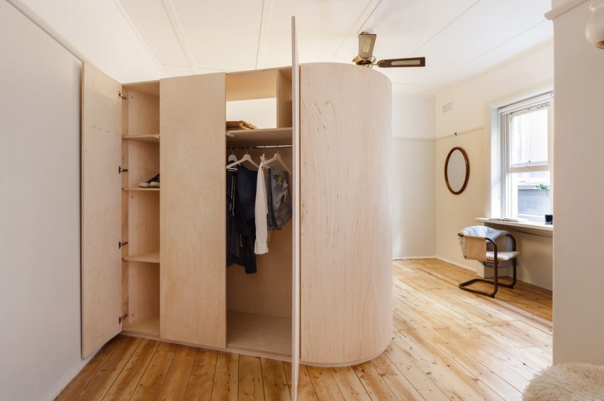
Diagonal wardrobe

Versailles Studio Apartment, Australia, by Catseye Bay Design

Catseye Bay Design designed the wooden wardrobe of Versailles Studio Apartment to double as a privacy screen for the bed.

Projecting diagonally from one of the bedroom walls, the two-metre-high structure incorporates clothes storage and shelving on the other side. Alongside the bed, it conceals an upholstered bench that looks out to a window.

Find out more about Versailles Studio Apartment ›

This is the latest in our lookbooks series, which provides visual inspiration from Dezeen’s archive. For more inspiration see previous lookbooks featuring pergolas, guesthouse interiors and bedrooms with bathtubs.

Reference

sealand architects’ australis takes after noosa’s traditional homes
CategoriesArchitecture

sealand architects’ australis takes after noosa’s traditional homes

Australis: a family home that opens to the australian bush


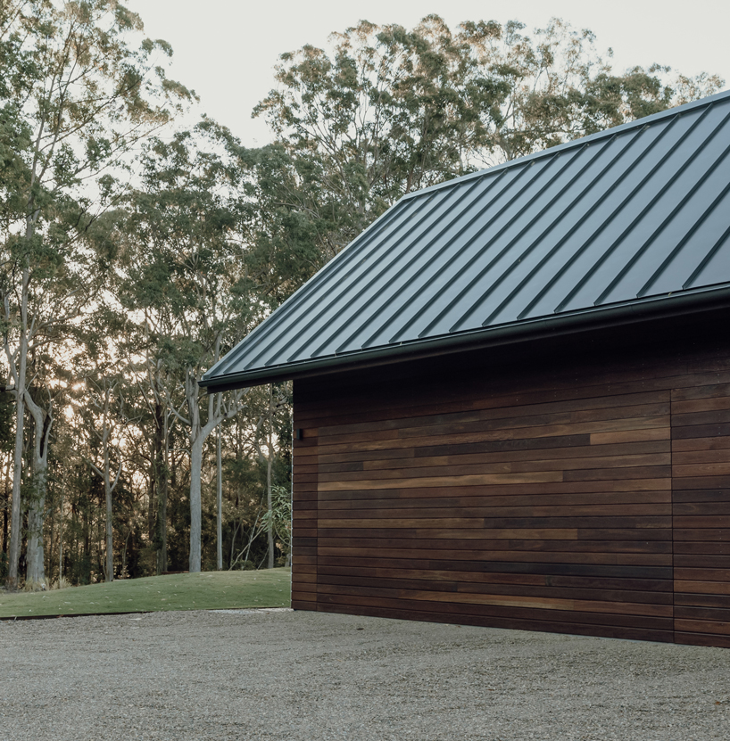
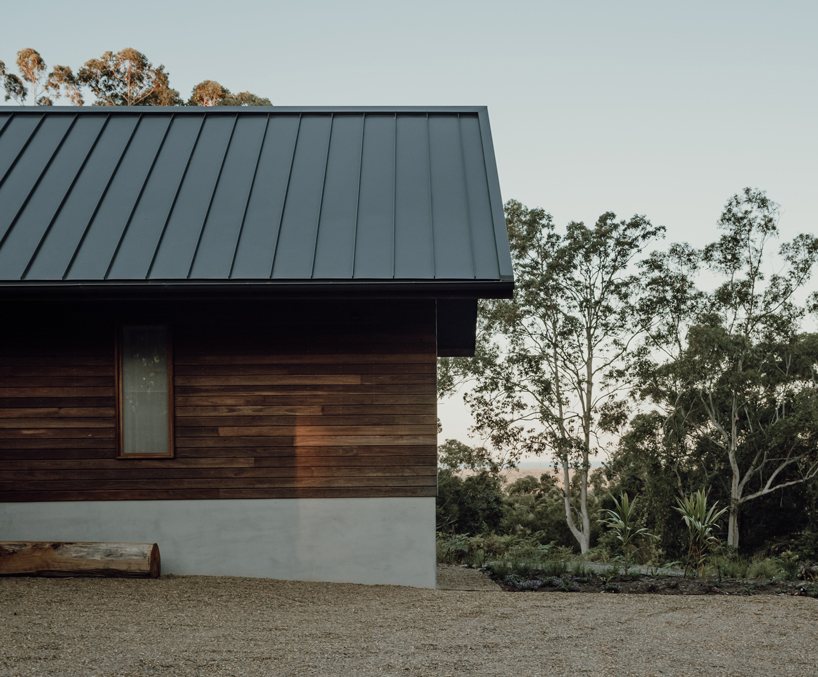
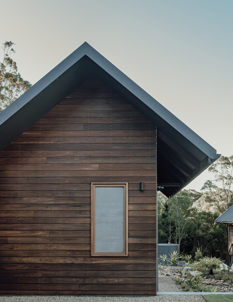
Australis House by Queensland-based sealand architects is designed to foster users’ family and friends connections and blend with the surrounding landscape of the Australian bush. The project allows for flexibility in the design to accommodate the changing requirements of the family’s living conditions. The concept follows a traditional character and draws from early Noosa building structures that present elegant roof forms and timber construction. Externally the facade applies materials such as local hardwood, stone, and metal roof sheeting that are relatively low maintenance and bushfire resistant.


The layout forms large central areas in the house for gathering, cooking, dining, and relaxing. The more intimate zones nestle at either end of the house. The architecture provides a strong connection to the surrounding landscape and responds to the local climate and lifestyle. Large sliding glass doors and windows set up in every room open onto the gardens and landscape beyond. The apertures allow natural light and ventilation throughout the interior.

sealand architects' timber residence australis takes after noosa's traditional homes
all images by David Chatfield and Emma Bourne


Australian hardwood, stone, concrete adorn the interior


Internally, the project primarily applies local hardwood, stone, concrete, and plaster. The design team‘s selection of robust materials provides a warm feel throughout and ease in maintenance and cleaning. The design references the farmhouse typology that characterizes the Noosa hinterland, traditionally made up of rural properties. Modeling on the typical layout of a central main house, that was surrounded by a series of smaller buildings, the architecture breaks up the structure into a series of smaller pavilions that follow the natural topography, and connect to the landscape. As the house is surrounded by Australian native forests, the bushfire risk is one of the principal challenges of the design. To reduce the risk, the flammable eucalyptus trees are removed from around the house and replaced with native rainforest plants that have higher water content and will create a natural bushfire buffer around the construction. 

sealand architects' timber residence australis takes after noosa's traditional homes
the design draws from early Noosa timber building structures

sealand architects' timber residence australis takes after noosa's traditional homes
traditional Queensland gable roofs and bushfire-resistant Australian hardwood cladding

sealand architects' timber residence australis takes after noosa's traditional homes
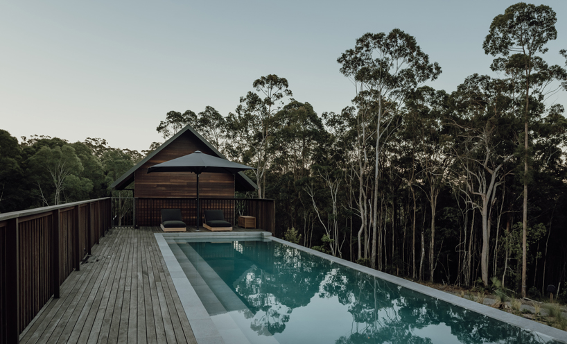
the large pool looking interacts with the natural surroundings

Reference

Eight homes with pergolas where residents can make the most of summer
CategoriesInterior Design

Eight homes with pergolas where residents can make the most of summer

An oak pergola that protrudes from a glazed extension in a conservation area and a concrete pergola covered in shrubbery are included in our latest lookbook.

A pergola is a structure that is attached to a home to protect and shelter it from the elements. Pergolas can provide shade to the interior or outdoor area they cover, as well as create some protection from rain.

Outdoor spaces covered by pergolas are often used as dining or lounge spaces, which means residents can spend time outside while being less exposed to the sun.

This is the latest in our lookbooks series, which provides visual inspiration from Dezeen’s archive. For more inspiration see previous lookbooks featuring cherry red interiors, lavish bedrooms with bathtubs and concrete kitchens.


Pergola House by Will Gamble Architects
Photo is by Rory Gardiner

Pergola House, UK, by Will Gamble Architects

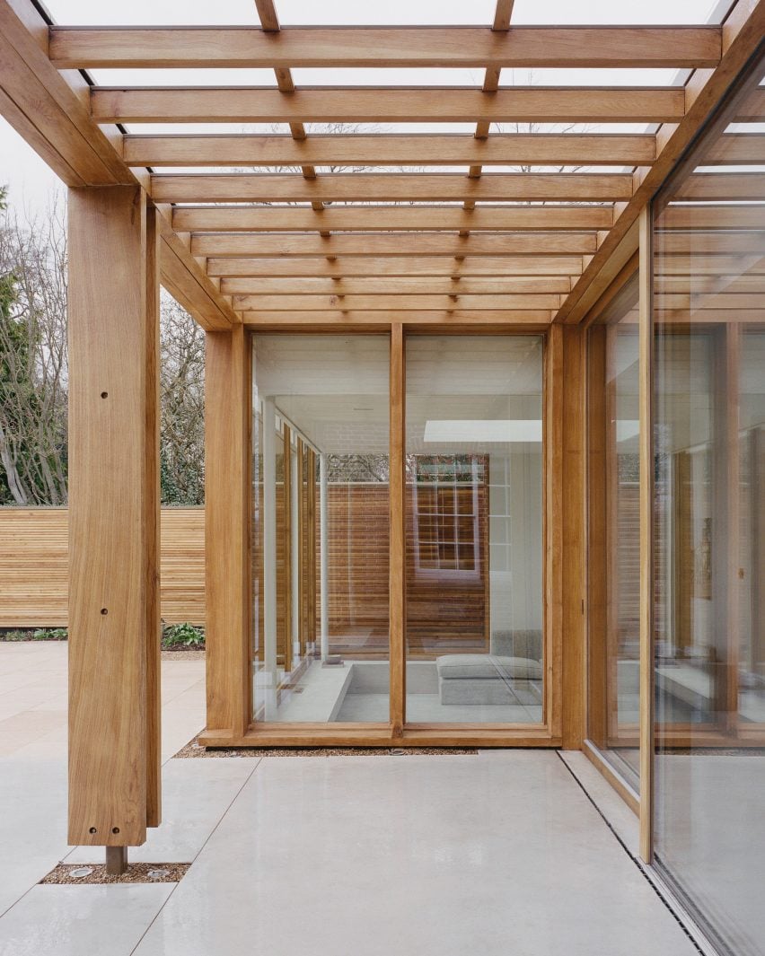
British architecture studio Will Gamble Architects renovated this Georgian home in a conservation area in Leicestershire that now includes a glass-walled extension surrounded by a wooden pergola.

When designing the extension, the studio looked to garden pergolas to create a contemporary contrast to the existing Georgian structure. The oak framework extends past the perimeters of the extension to form a shaded pergola.

Find out more about Pergola House ›


Monticello House by di Gregorio Associati Architetti
Photo is by Hèlén Binet

Monticello house, Italy, by Di Gregorio Associati Architetti

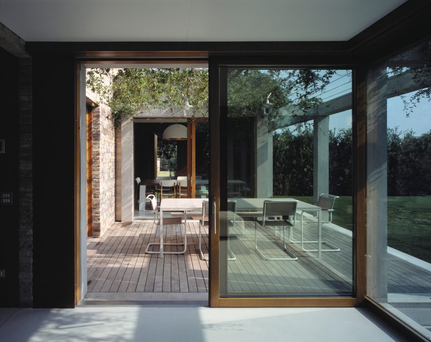
Concrete pergolas covered in overgrown shrubbery were added to this brick home in northern Italy, completed by architecture studio Di Gregorio Associati Architetti.

The concrete pergola shields and surrounds an extension that was added to the house, as well as an outdoor seating area that sits at the centre of the new building. Floor-to-ceiling windows line the interior of the home.

Find out more about Monticello house ›


Casa di ConFine by Simone Subissati Architects
Photo is by Magi Galluzzi

Casa di Confine, Italy, by Simone Subissati Architects

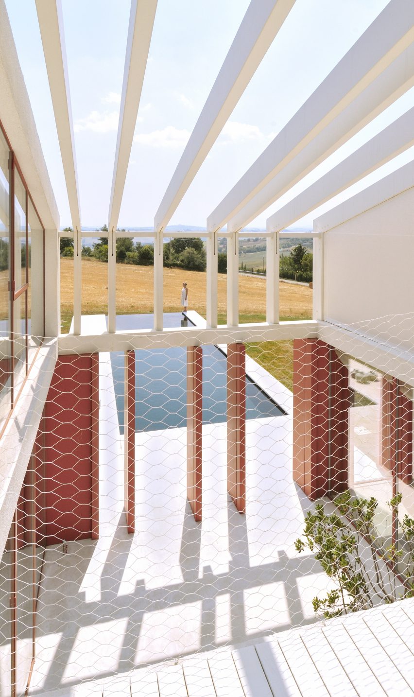
Italian architecture firm Simone Subissati Architects designed this home in Le Marche that aims to immerse its residents in the surrounding landscape.

The studio created a fragmented frame that follows the long and narrow profile of the home. A void at the centre of the building sees the fragmented frame carried over to form a pergola between two volumes of the home. The pergola-covered courtyard leads out to a pool.

Find out more about Casa di Confine ›


NCaved by Mold Architects
Photo is by Yiorgis Yerolympos

NCaved, Greece, by Mold Architects

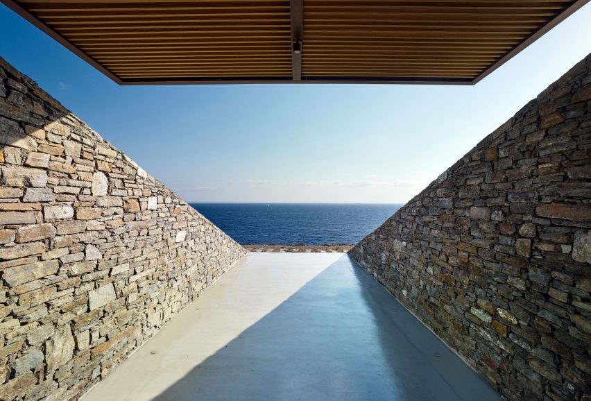
On the island of Serifos in Greece, Mold Architects built a partially submerged home on a rocky hillside that features large glazed openings, walled terraces and a large swimming pool.

The terraces are flanked by stone walls that follow the topography of the landscape and partially covered by slatted pergolas that cantilever from the main structure and help to shade the interior.

Find out more about NCaved ›


Avándaro 333 by Zozaya Arquitectos
Photo is by Cesar Belio

Avándaro 333, Mexico, by Zozaya Arquitectos

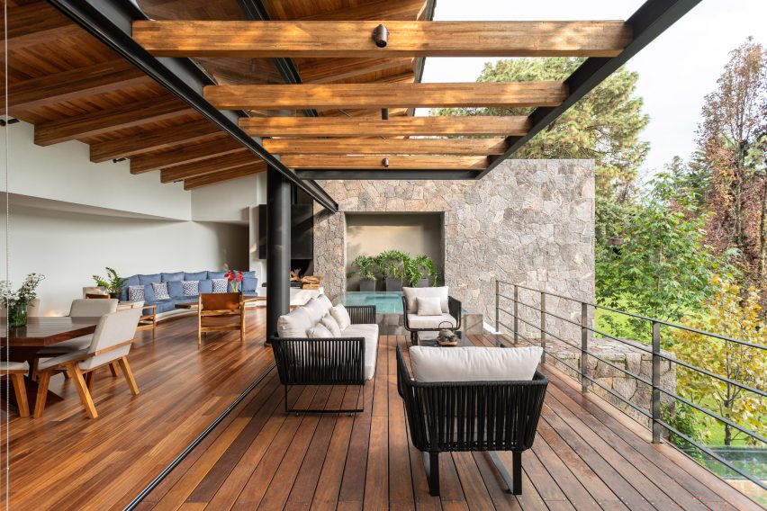
Located in Valle de Bravo, Mexico, this home is part of a 27-house complex that was named after a nearby lake.

Architecture studio Zozaya Arquitectos used masonry and clay across the exterior of the home, which was then contrasted with contemporary additions such as wood and steel pergolas.

A balcony on the upper levels of a home is accessed through retractable glazed walls and sits beneath a wooden pergola.

Find out more about Lake Avándaro ›


Villa Mandra by K-Studio
Photo is by Claus Brechenmacher and Reiner Baumann

Villa Mandra, Greece, by K-studio

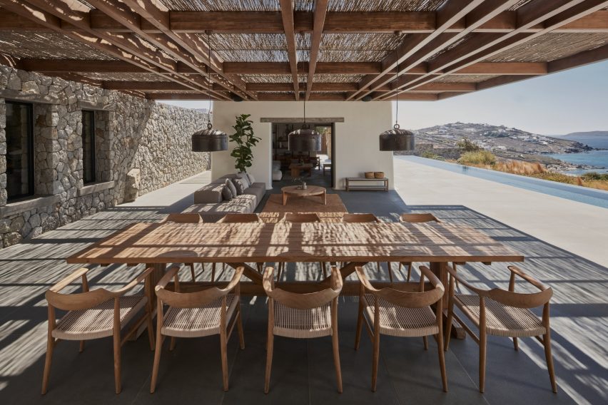
A latticed chestnut-wood pergola covers an outdoor dining area Villa Mandra, a holiday home on the Greek island of Mykonos that was designed by Greek architecture practice K-studio.

Alongside covering an outdoor dining area, the large pergola also shades a lounge area. Metal pendant lights were fixed to the pergola and provide the shaded area with light at night.

Find out more about Villa Mandra ›


Exterior of The Weathered House by Selencky Parsons
Photo is by Felix Mooneer

The Weathered House, UK, by Selencky Parsons

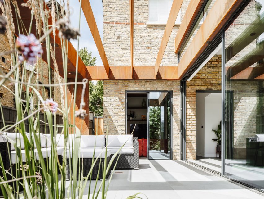
Architecture studio Selencky Parsons extended a Victorian home in south London and added a steel-framed structure and large sliding doors that better link the interior with the outdoors.

The extension is characterised by the weathered-steel structure. This begins at the kitchen area and forms a pergola over an outdoor dining space that is directly accessed via glass sliding doors from the interior.

Find out more about The Weathered House ›


Pergola House by Apollo Architects & Associates
Photo is Masao Nishikawa

Pergola House, Japan, by Apollo Architects & Associates

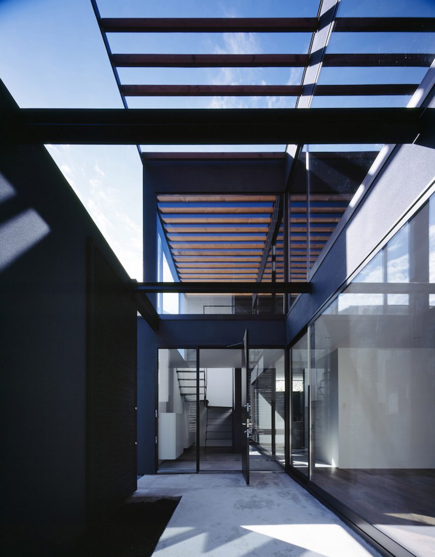
Designed by Apollo Architects & Associates and located in Kawaguchi, a city just north of Tokyo, Pergola House is a two-storey home that has an L-shaped plan with courtyards covered by pergolas.

The pergolas are formed of wooden ceiling beams that extend beyond the walls of the interior. Expanses of glass line the walls and double-height spaces help to create an open-plan design and blur the boundaries of the interior.

Find out more about Pergola House ›

This is the latest in our lookbooks series, which provides visual inspiration from Dezeen’s archive. For more inspiration see previous lookbooks featuring cherry red interiors, lavish bedrooms with bathtubs and concrete kitchens.

Reference