Timber exterior of Two Sisters holiday home in Finland
CategoriesArchitecture

MNY Arkitekter completes “down-to-earth” house for two sisters in Finland

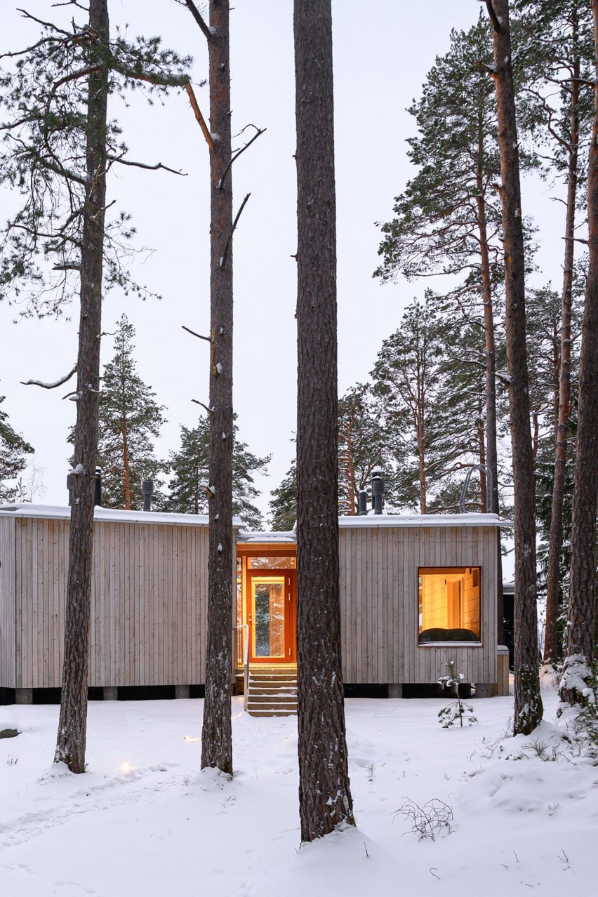
Finnish studio MNY Arkitekter has completed Two Sisters, a timber holiday home in Salo that is designed to allow two siblings to live “together separately”.

To create a dedicated space for each of the two sisters, MNY Arkitekter divided the home into two standalone units joined by a central terrace overlooking the surrounding rocks and pine trees on Finland’s west coast.

Timber exterior of Two Sisters holiday home in FinlandTimber exterior of Two Sisters holiday home in Finland
The two units are joined by a central terrace

“In many ways the site is one of typical Finnish inner archipelago terrain and vegetation, and one of the main goals was to preserve as many trees and visible rocks as possible,” MNY Arkitekter founder Mathias Nyström told Dezeen.

“Equality of the views from the two units was also important and had a significant impact on the layout.”

Living area within Two Sisters in FinlandLiving area within Two Sisters in Finland
Each unit has large windows. Photo by Mathias Nyström

The home’s two units “fan out” to provide privacy and avoid the surrounding trees, while making space for an existing sauna, utility room and overnight shelter on the site.

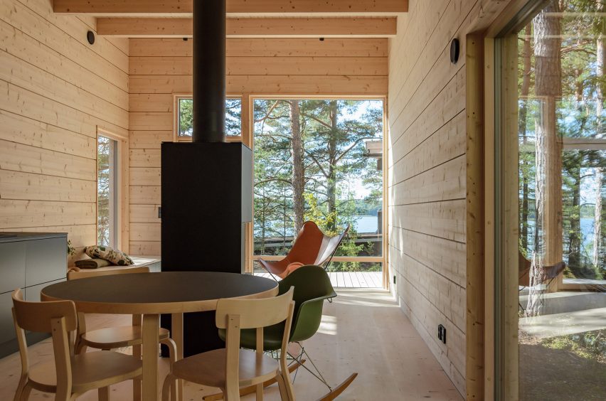
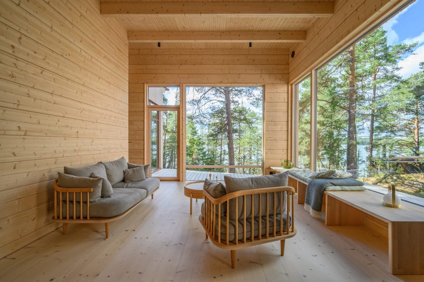
Each block features large windows at its western end, looking towards the sea and pine trees to the west. Openings facing the central terrace have been placed to minimise overlooking.

Kitchen interior of holiday home by MNY ArkitekterKitchen interior of holiday home by MNY Arkitekter
Black kitchen counters feature in each living space

“Being in one of the units you can only see the other from certain points, otherwise you mostly sense the existence of the other part,” said Nyström.

“You are on your own, but feel part of a bigger entity,” he added.

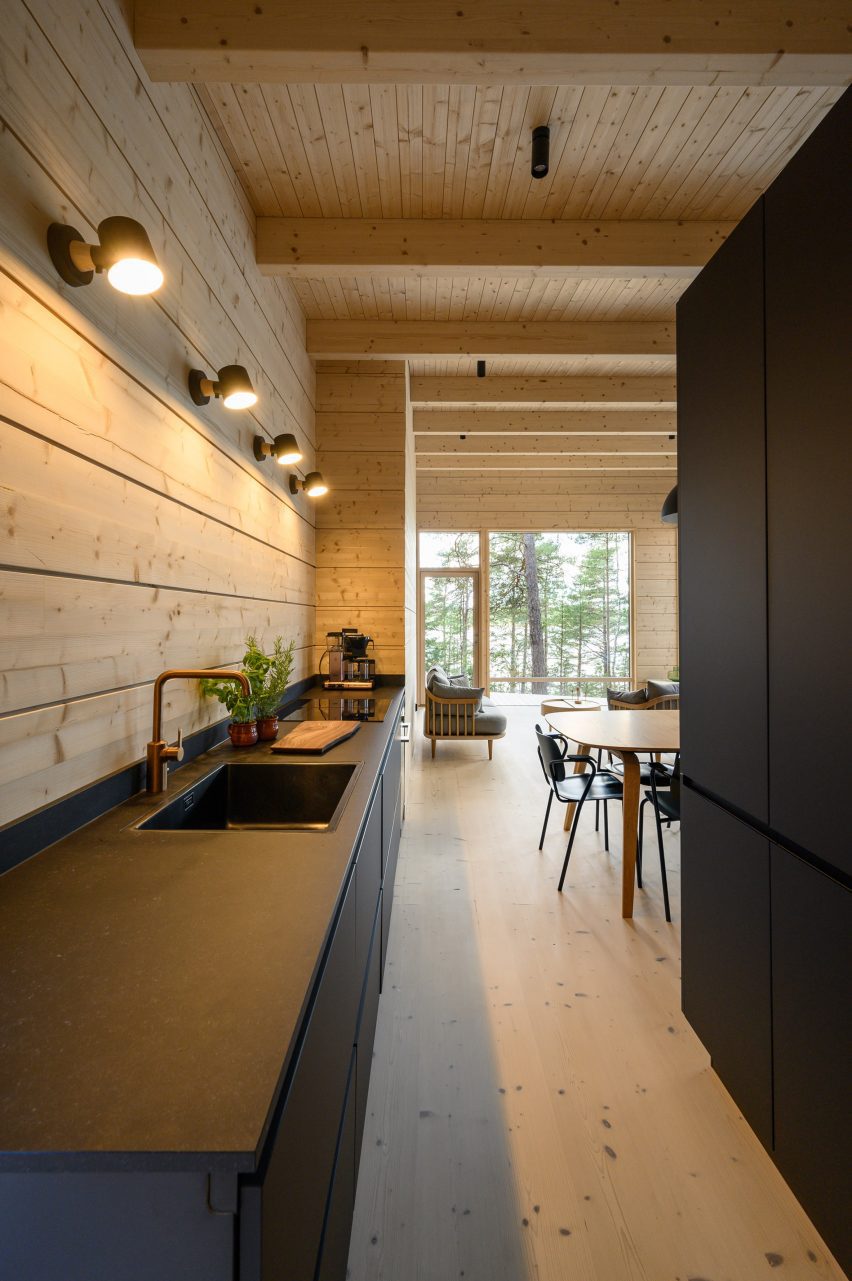
Each living space at Two Sisters has been finished with black kitchen counters, a dining table and a large freestanding fireplace. Built-in bench seating provides space to sit and look out over the landscape.

In the northern block, a bed is housed in a small nook off this living space backed by a full-height window, while to the south the slightly larger unit provides a double bedroom and two single bedrooms alongside the living space.

Bedroom interior within timber holiday home in Finland by MNY ArkitekterBedroom interior within timber holiday home in Finland by MNY Arkitekter
A small bed is backed by a full-height window in the larger unit

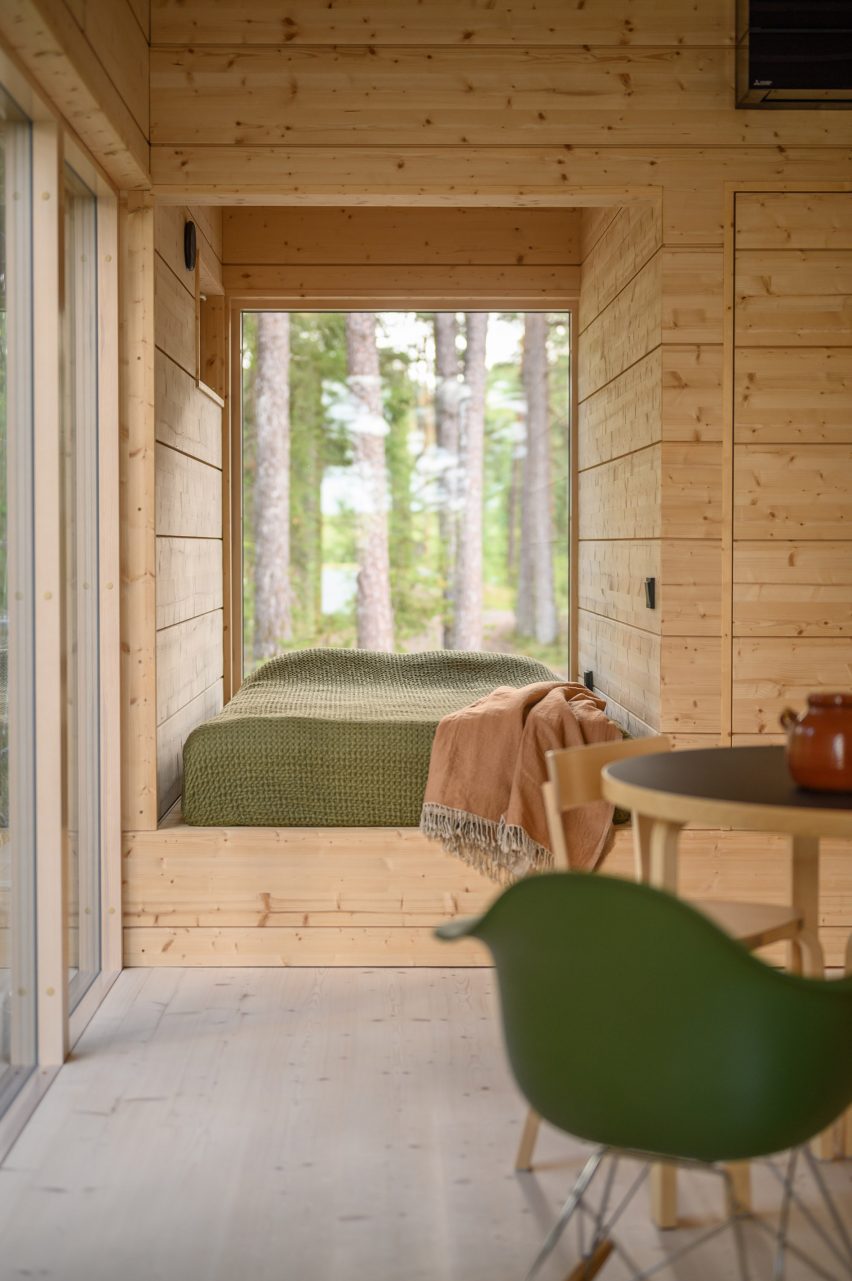
Two Sisters has a prefabricated structure of glue-laminated timber, finished externally with vertical planks of spruce. Internally, pale timber walls, floors and ceilings are treated with lye.

“The aim for the atmosphere was to create a uniform, serene space where nature plays a big part – the end result is very uplifting,” said Nyström.

“The weathered silver-grey wood will fuse the building in the landscape with rocks and pines. All in all it is a down to earth and subtle building,” he added.

Living space interior within Two Sisters holiday homeLiving space interior within Two Sisters holiday home
The home is constructed from glued-laminated timber

Elsewhere in Finland, MNY Arkitekter created a home on the shoreline of a small lake in Tenala using seven different varieties of timber.

Other recent projects in the country include a sauna and restaurant on the edge of Lake Saimaa by Studio Puisto and the steel-clad Dance House by JKMM and ILO architects in Helsinki.

The photography is by Multifoto Ab unless otherwise stated.

Reference

Exterior view of home by Wallmakers
CategoriesArchitecture

Wallmakers uses discarded toys to construct Toy Storey home in Kerala

Architecture studio Wallmakers has repurposed approximately 6,200 discarded toys to construct the walls of Toy Storey, a circular home in Kerala, India.

The aptly named residence by Wallmakers uses toys discarded in the area, which are unsuitable for recycling, as structural components and decoration within the external walls.

Exterior view of home by WallmakersExterior view of home by Wallmakers
A cantilevered verandah wraps around the circular home

“The main concept of Toy Storey revolves around the idea of using discarded toys and effectively conveying a message through this,” studio founder Vinu Daniel told Dezeen.

“By repurposing around 6,200 discarded toys, the residence in Kerala becomes a living monument to nostalgia and childhood, while addressing environmental concerns,” he added.

View of exterior wall of Toy Storey homeView of exterior wall of Toy Storey home
Approximately 6,200 discarded toys are used in the home’s walls

Toy Storey is wrapped by perforated, curved walls composed of compressed stabilised earth blocks, Mangalore tiles and toys, designed to draw in light and enable cross ventilation through the home. A ferrocement roof sits on top.

Four evenly-spaced entrances puncture the facade, which is wrapped by a cantilevered verandah offering outdoor space overlooking the surrounding greenery.

Living space within Kerala home Living space within Kerala home
Perforated walls draw light and ventilation through the interior

Inside, the home’s first floor is divided into public and private segments. The public half is defined by a large living room while the private half contains an open-plan kitchen and dining area flanked by bedrooms.

“One of the things that the client mentioned was they often host their neighbours and members of the community, which means there are often many people in the house,” Daniel said.

“Hence we decided to make the area the people frequented separate from that of the client’s family’s personal spaces,” he continued.

Japanese-style shoji screens are used as partitions throughout the interior to enable light into each space and connectivity between the private and public areas.

Kitchen interior within Toy Storey home in IndiaKitchen interior within Toy Storey home in India
An open-plan kitchen and dining area are flanked by bedrooms

The site’s topography enabled the addition of a secluded basement level containing a library and bedroom, accessed from the upper floor by a central staircase.

An internal courtyard topped with a glass ceiling slices through the building providing additional daylight for the interior.

Bedroom interior within Toy Storey in IndiaBedroom interior within Toy Storey in India
Japanese-style shoji screens are used as internal partitions

Wallmakers is an architecture studio established by Daniel in 2007. Elsewhere in India, Wallmakers has also recently completed an arts centre with rooftop seating and a house that resembles “snake curling up under a rock”.

Last year, Daniel faced criticism on social media for his studio’s use of unpaid internships, which he claims have an important educational benefit.

The photography is by Syam Sreesylam and Althaf Rasheed.

Reference

Portal House by Svima
CategoriesInterior Design

Portal House by Svima features brass details and curved oak ribbons

Brass ribbons line the asymmetric portals that connect the kitchen and dining room of this Toronto residence, renovated by local architecture and art studio Svima.

The Portal House was designed for a couple who had wanted to refresh their home for 10 years, but have very different aesthetic tastes.

Portal House by SvimaPortal House by Svima
Two portals connect the renovated kitchen and dining areas of this Toronto home

Toronto-based studio Svima found a compromise by combining his desire for “tenebrous minimalism” and her love of “bright French country kitchens” into the design.

The resulting “denlike cosiness” pairs dark oak across the lower half of the ground-floor spaces and clean white surfaces on the upper half.

Brass-edged asymmetric portal looking into a kitchenBrass-edged asymmetric portal looking into a kitchen
The curved, asymmetric portal over the deep counter acts as a pass-through

The snaked kitchen layout is tight, so Svima curved the corners of cabinetry and counter surfaces to steal extra space for circulation.

This theme continues to the living room millwork: a bookcase is filleted at the corner and meets the wall at an angle, while a built-in sofa beneath the window also softly angles inward.

Open doorway with brass edges looking into the kitchenOpen doorway with brass edges looking into the kitchen
The other portal, mirrored in shape, forms a doorway between the two spaces

“The design hinges on ‘ribbons’ flowing through the space, guiding the motion through the rooms,” said Svima.

“The ribbons curve in areas where sharp corners would not fit, or would stop the flow of movement.”

Detail of a brass-lined portal with a kitchen counter behindDetail of a brass-lined portal with a kitchen counter behind
Brass edges around the portals were artfully installed to perfectly fit the curved drywall

In the kitchen, the curved oak doors were handmade by a cabinetmaker who created a special jig to kerf-bend the oak into a radius.

Tiles that offer a contemporary take on Dutch Delft porcelain form the backsplash, adding small touches of blue to the otherwise neutral space.

Kitchen with white upper cabinets, blue and white tiled backsplash, and dark oak lower cabinetsKitchen with white upper cabinets, blue and white tiled backsplash, and dark oak lower cabinets
To add touches of colour to the dark oak and bright white palette, tiles influenced by Delft porcelain were added to the backsplash

Two portals provide connections between the kitchen and adjacent dining room, both with a mirrored asymmetric shape and edged in brass.

One acts as a doorway, while the other over the deep counter is used as a pass-through for food, drinks and tableware.

“It was an artful process for the contractor to lay the brass into the wall, as it had to fit into the curved drywall perfectly with no tolerance for error,” the architects said.

The living room, located at the front of the house, was furnished with mid-century pieces such as a chair, a coffee table and a media console.

Hallway with dark oak flooring and a staircaseHallway with dark oak flooring and a staircase
Dark oak flooring throughout the home’s ground floor matches the other millwork

The closed and open shelving unit organises the family’s books and possessions, and its shape allows more light to enter from a side window.

Opposite, the built-in sofa helps to resolve an awkward space under a bay window and orients the sitter towards the TV to one side.

Living room featuring a dark oak storage unit with a filleted sideLiving room featuring a dark oak storage unit with a filleted side
In the living room, the curved kitchen cabinetry is translated as a storage unit with a filleted side

“The custom sofa sweeps into the space to provide seating at precisely the right sideways angle for viewing the media unit, for lounge reading, and for gathering,” Svima said.

The floors throughout the home match the other millwork, grounding the spaces with a rich dark hue.

A built-in sofa under a living room bay windowA built-in sofa under a living room bay window
A built-in sofa under the living room’s bay window similarly features softly curved angles

Svima, founded by architects Anamarija Korolj and Leon Lai, is not the only studio that’s had to get creative with a tight Toronto floor plan.

When Studio Vaaro overhauled a house in the city, the firm created a series of volumes with minimally detailed millwork to form kitchen cabinetry, the staircase and a feature bookcase in the living room.

The photography is by Scott Norsworthy.

Reference

Black house by Michael Hennessey Architecture
CategoriesArchitecture

Michael Hennessey Architecture clads renovated California house in cedar

US studio Michael Hennessey Architecture has revitalised an ageing suburban house near San Francisco, adding black cladding and bright finishes to form a family home that bridges the past, present and future.

The residence is located in Mill Valley, a town just north of San Francisco that is known for its natural terrain and cultural offerings.

Black house by Michael Hennessey ArchitectureBlack house by Michael Hennessey Architecture
Michael Hennessey Architecture created Courtyard Hous

Designed for a couple with two young children, the budget-conscious project involved the renovation of a suburban-style house that was “in sore need of upgrades”.

The aim was to create a dwelling that supported the family’s current needs while being mindful of what might be needed in the future.

Courtyard House living spaceCourtyard House living space
The home is U-shaped in plan

“The home was thought not only as a shelter, but also as a bridge: from past to present, from one landscape condition to another, and from what a family wanted to what they could have,” said Michael Hennessey Architecture, which is based in San Francisco.

Built into a hillside, the home is U-shaped in plan, with gabled volumes organised around a central courtyard.

Vertical cedar sidingVertical cedar siding
Vertical cedar siding that adds a sense of gravitas

The team opted to preserve certain elements while adding contemporary interventions.

The building’s beige exterior was replaced with black, vertical cedar siding that adds a sense of gravitas, the studio said. The roof is covered in standing-seam metal.

Open-plan kitchen Open-plan kitchen
Inside there is a clear division between public and private zones

Inside, the 1,870-square-foot (174-square-metre) house features a clear division between public and private zones.

On the main level, one side holds an open-concept kitchen, dining area, and living room, while the other encompasses three bedrooms. The ground level contains a family room and a garage.

South-facing deckSouth-facing deck
A south-facing deck features outside

“Clearly delineated programmatic areas work in harmony with each other, the outside and the family’s needs,” the team said.

Interior finishes include ash cabinetry, large-format porcelain floor tiles, and ceramic tiles around the fireplace. Lofty ceilings and large stretches of glass provide an airy feel.

The outdoor spaces include a spacious, south-facing deck that receives bright sunlight. Softer light flows in through the courtyard on the north.

Proving a connection to the forested, hilly landscape was a guiding concern for the team.

Outdoor showersOutdoor showers
Outdoor showers were also included in the design

“Every part of the house is oriented towards the landscape thanks to carefully framed views of the lush immediate vegetation, as well as the more distant valleys, resulting in a comprehensive, thoughtful and sensitive approach to creating an extraordinary daily life,” the team said.

Other projects by Michael Hennessey Architecture include a townhouse with modern bay windows that was designed to offer alternatives to “conventional building strategies” and the refurbishment of a 1960s house that was originally built by Joseph Eichler, known for his modernist housing subdivisions.

The photography is by Adam Rouse.


Project credits:

Architect: Michael Hennessey Architecture
Architecture team: Michael Hennessey, Claudia Merzario, Jason Laudat
Contractor: New Dimension Builders (Dirk Von Rueben)
Structural engineer: Berkeley Structural Design (Bill Lynch)
Landscape architect: George Loew
Title 24 consultant: EnergySoft, LLC (Hayley Monahan)
Sustainability consultant: Arcturus HD (Jeff Aalfs)

Reference

House in the Fields Stef Claes
CategoriesInterior Design

Dezeen Debate features rural Belgian home that achieves “such a clean result”

House in the Fields Stef Claes

The latest edition of our Dezeen Debate newsletter features House in the Fields, a rural home in the Belgian countryside. Subscribe to Dezeen Debate now.

Geneva-based architect Stef Claes looked to mid-century and local architecture to create the low-lying home in Belgium. The residence, named House in the Fields, features white-painted walls and black accents.

Readers discussed the project, with one commending the architects for achieving “such a clean result” and another agreeing, claiming that they “could quite happily live there”.

Architects using AI RIBA reportArchitects using AI RIBA report
“Forty-one per cent of architects now using AI” says RIBA report

Other stories in this week’s newsletter that fired up the comments section included the findings of a report by the Royal Insitute of British Architects which found that close to half of UK architects are now using AI for their projects, the announcement that Foster + Partners is designing a two-kilometre-high skyscraper in Saudi Arabia and an opinion piece by Catherine Slessor about architects working into their older years.

Dezeen Debate

Dezeen Debate is sent every Thursday and features a selection of the best reader comments and most talked-about stories. Read the latest edition of Dezeen Debate or subscribe here.

You can also subscribe to our other newsletters; Dezeen Agenda is sent every Tuesday containing a selection of the most important news highlights from the week, Dezeen Daily is our daily bulletin that contains every story published in the preceding 24 hours and Dezeen In Depth is sent on the last Friday of every month and delves deeper into the major stories shaping architecture and design.

Reference

Kresta Garden House doubles as home office
CategoriesInterior Design

Lucas y Hernández Gil adds multi-use greenhouse to Casamontesa

A renovated 1970s bungalow with “kitsch character” and a greenhouse that doubles as a living room feature in Casamontesa – a weekend home designed by Spanish studio Lucas y Hernández Gil.

The project began when a couple asked the studio to overhaul a single-storey house that was once part of a hotel complex on the outskirts of Madrid.

Kresta Garden House doubles as home officeKresta Garden House doubles as home office
The renovated bungalow and a multifunctional greenhouse (above) make up Casamontesa

The brief later expanded to include a multifunctional greenhouse that can be used as a workspace, a guest bedroom, a gym or simply as a garden room.

Lucas y Hernández Gil, led by architects Cristina Domínguez Lucas and Fernando Hernández-Gil Ruano, developed a distinct character for each building.

Casamontesa renovation of 1970s bungalowCasamontesa renovation of 1970s bungalow
The main house is a bungalow built in the 1970s

Casamontesa’s renovated bungalow has a warm, playful style that draws on the 1970s aesthetic while the garden pavilion has a more utilitarian feel.

“The owners, a young urban couple who love design and live and work in the centre of Madrid, were looking for a functional and compact getaway within a fantastic garden,” Lucas told Dezeen.

“They wanted a very comfortable and flexible home that would be useful for both working and getting together with friends.”

Casamontesa house kitchen islandCasamontesa house kitchen island
The interior centres around a new kitchen island

The bungalow renovation involved simplifying the interior layout to create a combined kitchen, dining room and living room, with a bedroom and bathroom off to one side.

“The house, in addition to being small, was very compartmentalised,” explained Lucas.

Casamontesa house kitchen islandCasamontesa house kitchen island
The materials palette includes pink marble and handmade tiles

To unify the newly open-plan living space, the designers installed an island that serves as a worktop, dining table and social gathering place.

This island features a countertop made from Portuguese pink marble while its sides are covered in the same handmade burgundy tiles that line an adjacent window recess.

Casamontesa house with arched fireplaceCasamontesa house with arched fireplace
An arched fireplace provides a focal point in the living room

“The rest of the surfaces – Campaspero stone floors and waxed tinted plaster walls – establish a dialogue by contrast with the colourful and shiny surface of the tiles,” added Lucas.

Key details in the living room include an arched fireplace and a tadelakt plaster coffee table, while the bedroom features semi-circular marble nightstands.

For Casamontesa’s garden room, the design team customised a prefabricated greenhouse.

A pergola extends the building volume outwards in a bid to blur the boundary between inside and out, and is topped with wooden blinds to provide shade.

Kresta Garden House greenhouse with pergolaKresta Garden House greenhouse with pergola
A pergola extends the width of the greenhouse

A wooden box on wheels provides an additional bedroom, described as a “small Shigeru Ban-style mobile room”.

Other additions include thermal curtains and an automatic shading and ventilation system, which allow for versatile use of the space throughout the year.

Kresta Garden House creates extra living room with mobile sleep spaceKresta Garden House creates extra living room with mobile sleep space
A “Shigeru Ban-style mobile room” provides an additional sleeping space

“By complementing the programme of the original bungalow, a more complete and flexible program is achieved, overcoming the limitations of a weekend house,” added Lucas.

Other recent projects by Lucas y Hernández Gil include a bar featuring extreme colour blocking and an apartment with a hidden closet.

The photography is by José Hevia.

Reference

Living space with a green marble feature wall
CategoriesInterior Design

Kingston Lafferty Design includes “sensual” red kitchen in home renovation

Dublin studio Kingston Lafferty Design has transformed the architecture and interiors of this family home in Cork, Ireland, which features 1970s-style shapes and colours informed by the work of designer Verner Panton.

Positioned on Lovers Walk hill overlooking the city of Cork, the townhouse – called Lovers Walk – was renovated by Kingston Lafferty Design.

Living space with a green marble feature wallLiving space with a green marble feature wall
Kingston Lafferty Design completed the renovation in Cork

The studio originally planned to just update the interiors, but decided that a more extensive architectural transformation was needed after discovering structural instabilities in the home.

Kingston Lafferty Design removed all of the floors, which lacked foundations and insulation in their concrete slab, and completely reconfigured the two-storey property’s layout.

Oak-lined hallway with colourful accentsOak-lined hallway with colourful accents
Rooms on the ground floor were designed around an oak-lined hallway

“As the building was originally built in the 1970s, we wanted to return to its roots,” studio founder Róisín Lafferty told Dezeen.

“We thrived on inspiration from Verner Panton with his use of strong clashing colour, playful shapes and oversized elements,” she added.

Quartzite-clad kitchen by Kingston Lafferty DesignQuartzite-clad kitchen by Kingston Lafferty Design
One of these spaces is a “sensual” red kitchen

The ground floor was adapted to include an open-plan kitchen defined by a counter, island and splashback finished in veiny red quartzite.

Ruby-toned timber was used to create the geometric cabinets. When layered with the quartzite, “it sounds like a disaster, but it’s a delight,” said the designer.

Living space with floor-to-ceiling curtainsLiving space with floor-to-ceiling curtains
The living room follows a similar design to the kitchen

The space, described by the studio as a “sensual red-toned jewel kitchen”, is one of several rooms on the ground floor of Lovers Walk that were designed around the central, oak-lined hallway.

“We used the hallway as the core of the house, which grounded the space with pops of colour stemming from it. Each room leading from the core appears like a framed view or window of colour,” explained Lafferty.

Marble feature wall designed by Kingston Lafferty DesignMarble feature wall designed by Kingston Lafferty Design
It includes a green feature wall that takes cues from Mies van der Rohe’s iconic Barcelona Pavilion

The living room includes blue velvet sofas and a green feature wall clad in swirly book-matched marble, which was fitted with an alcove reserved for a subtle fireplace.

When creating the polished stone wall, the studio took cues from the seminal Barcelona Pavilion, completed in 1929 by modernist architect Mies van der Rohe.

Green headboard in the main bedroomGreen headboard in the main bedroom
A floor-to-ceiling headboard takes centre stage in the main bedroom

“We used green as an overall thread throughout the house, inspired by the surrounding landscape,” added Lafferty.

“Although depending on the time of year, the colours tend to change and so we were able to add in other rich colours that anchor the green such as burgundies and bright oranges,” she added.

En-suite marble-clad bathroomEn-suite marble-clad bathroom
Stonework also defines the en-suite bathroom

“One would assume this mix of colours would clash, but we choose the tones and textures of each to ensure that all of them would blend harmoniously,” Lafferty said.

Upstairs, the main bedroom and en-suite bathroom were dressed in the same eclectic interiors as the communal spaces. A floor-to-ceiling headboard, finished in diamond-shaped green tiles originally designed by 20th-century architect Gio Ponti, frames the bed.

Playful bed design in Lovers Walk by Kingston Lafferty DesignsPlayful bed design in Lovers Walk by Kingston Lafferty Designs
A playful bed was added to the bedroom created for the occupants’ child

Balloon-like coloured glass vases were positioned on two bedside tables, which were topped with the same slabs of Rosso Levanto marble as the geometric vanity desk.

The bedroom designed for the occupants’ child features an alternative bed – a playful green structure with two stacked levels and half-moon openings that reveal a cosy sleeping area on the bottom level.

Other accents featured throughout the home include burl wood, terrazzo, plaster and brass. The repetition of 1970s-style thick pile carpets emphasises the dwelling’s textured material palette.

Lovers Walk is the studio’s “closest nod” to the work of Panton, explained Lafferty – “down to the selection of every tile, light fitting and exquisite piece of designer furniture”.

Deep blue-coloured guest bedroom by Kingston Lafferty DesignDeep blue-coloured guest bedroom by Kingston Lafferty Design
Deep blues characterise the guest bedroom

“Although there is such an array of materiality, it is balanced by repeated colour, shape and form,” she said.

“Every space in this house is an assault on the senses, in the best way possible.”

Lovers Walk by Kingston Lafferty DesignLovers Walk by Kingston Lafferty Design
Lovers Walk was informed by the work of Verner Panton

Founded in 2010, Kingston Lafferty Design has completed projects ranging from a Dublin restaurant with oversized lollipop-like lamps and a co-working office in Belfast that includes a yoga studio.

The photography is by Ruth Maria Murphy


Project credits:

Interior architecture and design: Kingston Lafferty Design
Woodwork: DFL
Stonework: Miller Brothers


Reference

Exterior of Masná 130 house in Český Krumlov, Czech Republic by ORA
CategoriesInterior Design

ORA creates modern home in 500-year-old Czech Renaissance building

Czech architecture studio ORA has renovated a Renaissance-era house in the town of Český Krumlov, preserving original features like its carved wooden beams while adding free-standing contemporary furniture.

Local entrepreneurs Petra Hanáková and Radek Techlovský purchased the dilapidated house in the town centre in 2016 and asked ORA to oversee a modernisation process that retains the interior’s historical character.

Exterior of Masná 130 house in Český Krumlov, Czech Republic by ORAExterior of Masná 130 house in Český Krumlov, Czech Republic by ORA
Masná 130 is a renovated home by ORA in Český Krumlov

The 500-year-old building, now called Masná 130, had been neglected for decades and was not even connected to the town’s sewage system. It also had flood-damaged foundations and a roof in need of major repairs.

Despite its issues, the owners saw potential in the property and spent two years transforming its ground floor into a cafe that has become a gathering place for the local community.

Entrance of Masná 130 houseEntrance of Masná 130 house
The architects added bespoke furniture made from dark-stained birch plywood

The latest phase of the project involved renovating the first-floor living spaces. The original intention was to redevelop them as rental flats, but Hanáková and Techlovský eventually decided to create a single apartment that they could occupy themselves.

ORA’s design for the apartment reveals aspects of the building’s past while introducing modern features that reflect the owners’ love for contemporary design and minimalist style.

Living room of house in Český Krumlov, Czech Republic by ORALiving room of house in Český Krumlov, Czech Republic by ORA
The building’s original carved wooden ceiling beams are left exposed

“We did not want to create a historical ‘museum’ interior, nor a design showroom,” said Hanáková and Techlovský. “We wanted to organically connect the historical and contemporary layers.”

The architects began by removing an existing partition wall in the main living space and reinstating the original open layout. This created a large salon that reveals the full splendour of the Renaissance-era wooden ceiling.

Kitchen of Masná 130 houseKitchen of Masná 130 house
The kitchen was designed as a standalone unit that is raised above the floor

The restoration process also uncovered original stone walls that were painted a deep crimson colour. Together with the wooden rafters, this informed a material palette that complements these dark, saturated tones and creates a cosy atmosphere.

The apartment’s bedroom features a small remnant of the original ceiling fresco. The rest of the room is painted a cream colour to lend the space a calm and relaxing feel.

In the bathroom, ORA chose to combine cool colours with white tiles and large mirrors to brighten the space. Playful details such as the irregularly shaped bathtub, curved sinks and tiles with rounded edges help to soften the overall aesthetic.

Throughout the apartment, the architects added bespoke freestanding furniture that performs the necessary functions without disturbing or concealing the existing heritage features.

View to bedroom of house in Český Krumlov, Czech Republic by ORAView to bedroom of house in Český Krumlov, Czech Republic by ORA
The bed is dominated by an oversized headboard

“The interior design is approached as a collage of motifs,” said ORA. “The furniture is inserted into the historical space in the form of separate objects that create distance from the historical elements.”

The kitchen, for example, was designed as a standalone unit that is raised above the floor and stops well short of the ceiling. Its sink, hob and countertop occupy a central void, with all other functions concealed within the cabinetry.

Bedroom of Masná 130 houseBedroom of Masná 130 house
It takes pride of place in the centre of the bedroom

The bed features an oversized headboard that connects with a wardrobe on its reverse side. It is placed in the centre of the bedroom and is angled to provide the best view of the window and the original painted ceiling.

Custom-made furniture is built from dark-stained birch plywood with contrasting brass legs that help to enhance the sense of separation from the existing spaces.

Lighting is either freestanding or integrated into furniture such as the kitchen unit and bed. An overhead light above the dining table is mounted on a bracket so it does not touch the historical ceiling.

Bathroom of house in Český Krumlov, Czech Republic by ORABathroom of house in Český Krumlov, Czech Republic by ORA
ORA combined cool colours with white tiles in the bathroom

ORA, which stands for Original Regional Architecture, was founded in 2014 by Jan Veisser, Jan Hora and Barbora Hora. The studio is based in the small town of Znojmo, with previous projects including the conversion of a 16th-century home in Mikulov to create a modern guesthouse.

Other recent attempts at revamping the historical residences of the Czech Republic include a 1920s villa in Prague that was renovated by No Architects and a 100-year-old apartment in Karlovy Vary, where Plus One Architects uncovered the building’s original paintwork.

The photography is by BoysPlayNice.

Reference

Aerial view of Sabater House by Fran Silvestre Arquitectos
CategoriesArchitecture

​​Fran Silvestre Arquitectos references pathways for Sabater House in Spain

Spanish studio Fran Silvestre Arquitectos has created a minimalist white house in Alicante, which winds through the landscape to enhance its relationship with the outdoors.

Named Sabater House, the Spanish dwelling unfolds through a series of intersecting, elongated forms that ascend upwards over its 780-square-metre site.

Its slim volumes adapt to the site’s natural topography, navigating existing large trees and framing a series of terraces and courtyards.

Aerial view of Sabater House by Fran Silvestre ArquitectosAerial view of Sabater House by Fran Silvestre Arquitectos
Fran Silvestre Arquitectos has created a minimalist white house in Alicante

According to Fran Silvestre Arquitectos, the sprawling design takes cues from local pathways that are carved into the terrain and lead to a hermitage.

“We were struck by how these winding paths adapt to the terrain, generating a very interesting architecture,” Fran Silvestre Arquitectos told Dezeen.

“This was the starting point to develop a home on a plot with similar characteristics in terms of width and slope of the land.”

Facade of Sabater House by Fran Silvestre ArquitectosFacade of Sabater House by Fran Silvestre Arquitectos
Sabater House winds through the landscape

Sabater House is designed for a client who wanted a home to accommodate his large family while ensuring “enough independence to guarantee the privacy of all family members”.

To accomplish this, each floor of the home features a distinct programme.

Aerial view of white home in AlicanteAerial view of white home in Alicante
Each floor of the home features a distinct programme

The highest level, described as the “nighttime area” of the home, features five bedrooms and bathrooms oriented to look out to the sea above the tree line.

Meanwhile, the middle floors contain an open-plan kitchen, dining and living area with floor-to-ceiling windows framing views out to the garden and outdoor swimming pool.

Exterior of white house in Spain by Fran Silvestre ArquitectosExterior of white house in Spain by Fran Silvestre Arquitectos
The house winds around existing trees

The living spaces are stretched across the long and narrow floor plan in a bid to avoid compacting them and open them up to the outdoors.

“The project is drawn with a very clear geometry of straight elements that are joined by a soft radius of curvature,” said the studio. “Each piece has a relationship with the environment.”

Accommodated on the lower level are the pool basin, a wine cellar, storage facilities and additional sleeping quarters.

With each floor stacked at an angle to create a zigzagging floor plan, a series of courtyards, terraces and bridges are created, further opening the relationship with the outdoors.

All-white interior of Spanish houseAll-white interior of Spanish house
The middle floor features open-plan living spaces

“Something unexpected about the house for us is the character of the interstitial spaces between the blocks and how they envelop you,” explained Fran Silvestre Arquitectos.

“The first acts as an access garden that directs you towards the entrance door, and the second as one of the main terraces. They are versatile spaces that allow you to make the most of the different orientations.”

Bedroom of Sabater House in AlicanteBedroom of Sabater House in Alicante
The top level contains the bedrooms

Fran Silvestre Arquitectos was founded in 2005 by architect Fran Silvestre. The studio is known for its minimalist style, which is applied throughout Sabater House.

Its previous projects that feature its signature pared-back style include an overhanging Hollywood Home and a residence with a T-shaped roof in Valencia.

The photography is by Fernando Guerra.

Reference

Concrete Hoji Gengneung houses in South Korea
CategoriesArchitecture

Concrete ring connects Hoji Gangneung homes by AOA Architects

Seoul studio AOA Architects has created Hoji Gangneung, a series of uniquely shaped concrete dwellings linked by a raised, circular path in the South Korean countryside.

Located in Gangwon-do, Hoji Gangneung includes a family house for the owner and three guesthouses, along with a communal building.

Concrete Hoji Gengneung houses in South KoreaConcrete Hoji Gengneung houses in South Korea
Five buildings are arranged around a raised concrete ring

AOA Architects designed one of the four homes with an octagonal shape and central courtyard while another, named the Round House, has a semi-circular end.

The remaining two dwellings and the communal building have rectangular floor plans and differ from each other by their roof shape.

Hoji Gangneung houses in South KoreaHoji Gangneung houses in South Korea
AOA Architects designed each structure with a different shape

The communal building has a mono-pitch roof and one rectangular house has a regular gable roof. The final house, named the Long House, features a gable roof with a raised central section topped with a skylight, creating an elongated light well.

“Every building has its own shape, size and character, allowing guests to enjoy each space distinctly through shadow play,” said AOA Architects principal Jaewon Suh.

Hoji Gangneung by AOA ArchitectsHoji Gangneung by AOA Architects
Hoji Gangneung is located in the countryside in South Korea

AOA Architects took cues from countryside structures, such as warehouses and cabins, when designing Hoji Gangneung, aiming to create a project that references its surroundings while establishing itself as something new.

“The main concept and goal of the design is to build something familiar and also unfamiliar in a rural area,” Suh told Dezeen.

“For some, the Octagonal House looks like a nomadic tent and feels like an octagonal pavilion, the Long House looks like a milk carton or a grain warehouse, and the Round House looks like a slender piece of wood or a face with a hat, but these associations do not matter.”

A concrete ring elevated above the grassy landscape connects the five buildings, a decision the studio made to prevent the need for multiple paths.

“A circular shape was the best gesture to connect the five buildings at once,” Suh said. “As a result, while avoiding typical countryside alley shape and showing the main concept of the design, an artificial circular raised walkway was created.”

Concrete house in South Korea by AOA ArchitectsConcrete house in South Korea by AOA Architects
The buildings are made from textured concrete

According to the studio, the choice of concrete also deliberately juxtaposes the grassy landscape below.

“By raising a walkway slightly from the land, a tension between the gently floated concrete walkway and weak grasses of the land occurs,” said Suh.

Concrete home interior with a pitched roof and light wellConcrete home interior with a pitched roof and light well
AOA Architects covered the interiors of the homes in wood

The buildings are all built from textured concrete and topped by corrugated metal roofs.

In the communal building, the concrete structure is left exposed. Large glass doors spanning one wall open onto the concrete walkway and give views of the dwellings.

Communal dining area with a concrete structureCommunal dining area with a concrete structure
The concrete structure of the communal building is left exposed inside

The interiors of the houses are finished with wood to add a sense of warmth and “make one feel that they have entered a box of musical instruments”, according to Suh.

AOA Architects was founded in 2013 by Jaewon Suh and Euihaing Lee. The studio previously designed a Minecraft-themed apartment in Seoul with a stepped roof and red- and white-tiled exterior.

Elsewhere in South Korea, architecture studio Atelier Koma recently created a concrete chapel and YounghanChung Architects designed a two-storey study space for a retired university lecturer.

The photography is by Chin Hyosook.


Reference