Linehouse creates greenhouse-informed food market in Shanghai
CategoriesInterior Design

Linehouse creates greenhouse-informed food market in Shanghai

Architecture studio Linehouse has wrapped a food market in a Shanghai laneway neighbourhood around a central atrium informed by Victorian greenhouses.

Named Foodie Social, the 2,000-square-metre food market is located within the Hong Shou Fang community – a residential area in Shanghai’s Putuo district known for its classic “longtang” laneway architecture.
Linehouse Foodie SocialLinehouse Foodie Social
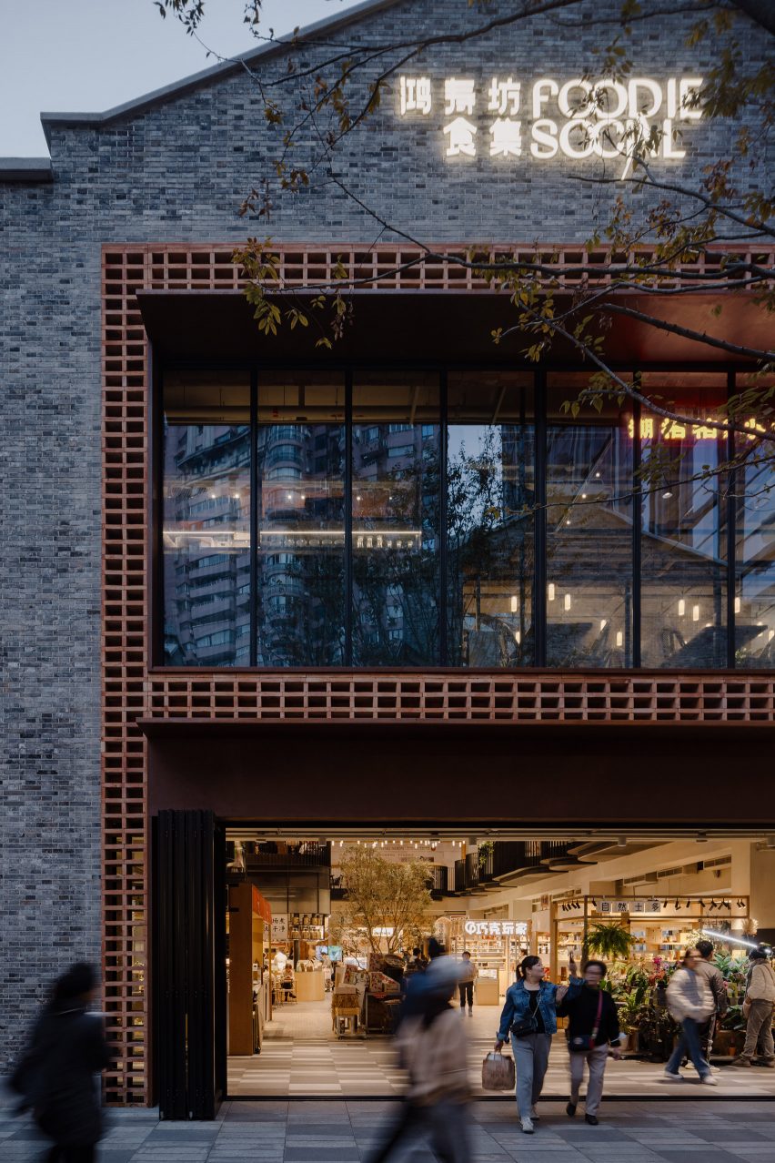
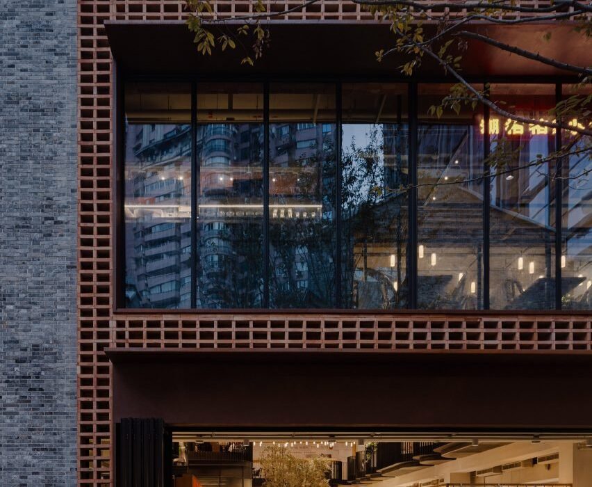
The food market is in a two-storey grey brick building in Shanghai

The entrance to the two-storey market was framed by a double-height arrangement of stacked recycled red bricks, with a corten steel canopy added to provide shelter.

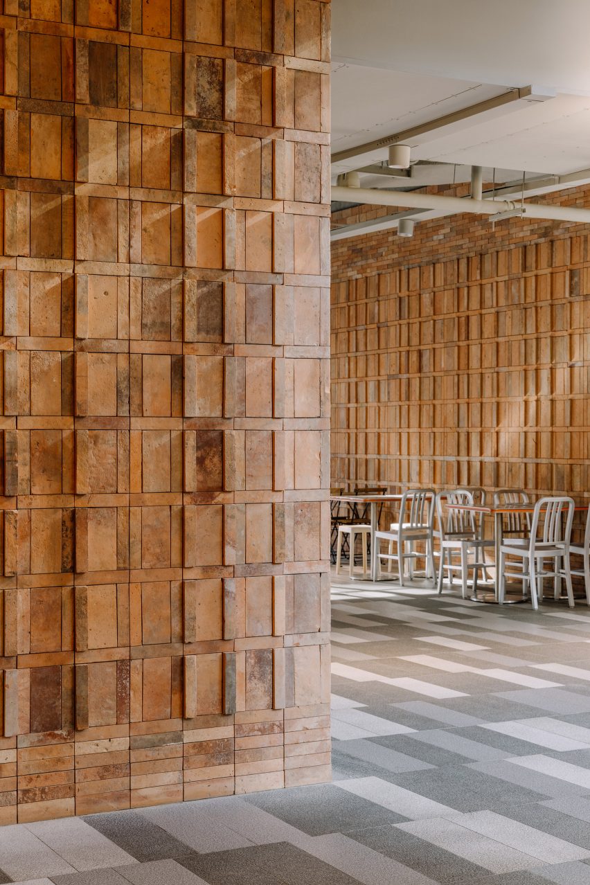
The same recycled red bricks sourced from demolished houses in China can also be found on the interior walls, stacked to create three dimensional patterns.
Linehouse Foodie SocialLinehouse Foodie Social
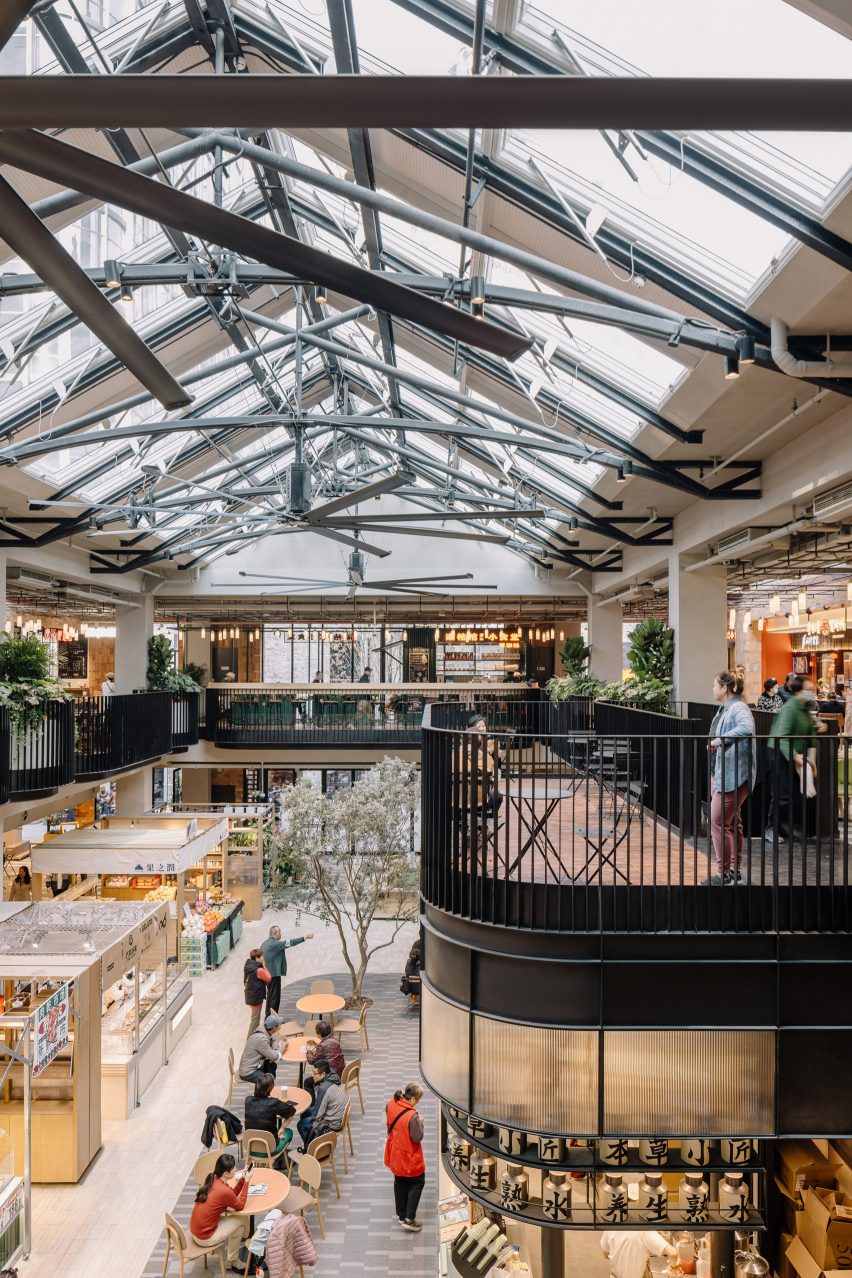
The glass pitched roof is lined with a gently curved metal truss

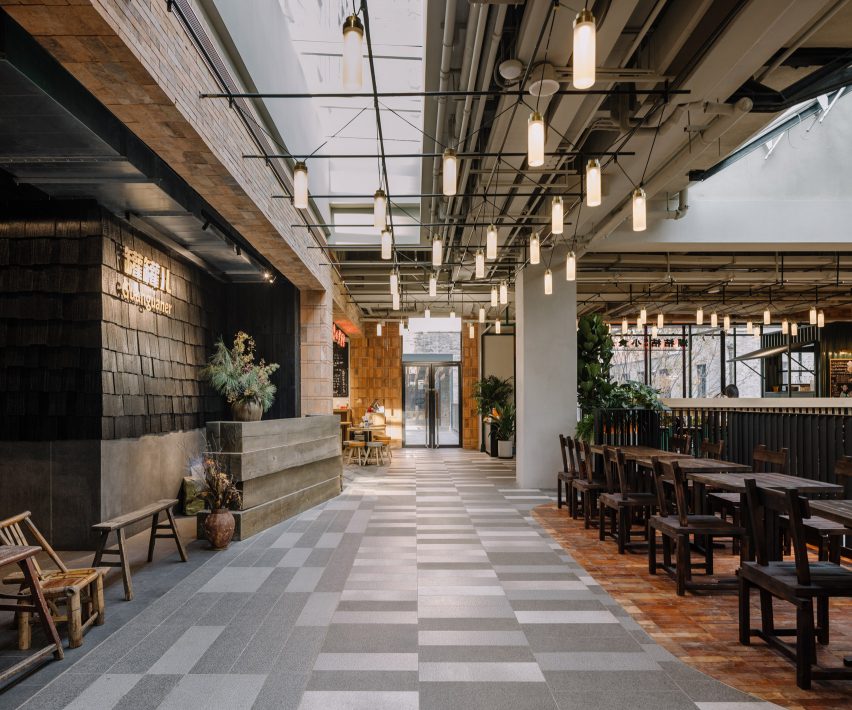
A large glass door can be pulled open on warm days, with patterned paving from the laneway outside extending to the interior of the market, fully connecting the interior and exterior.

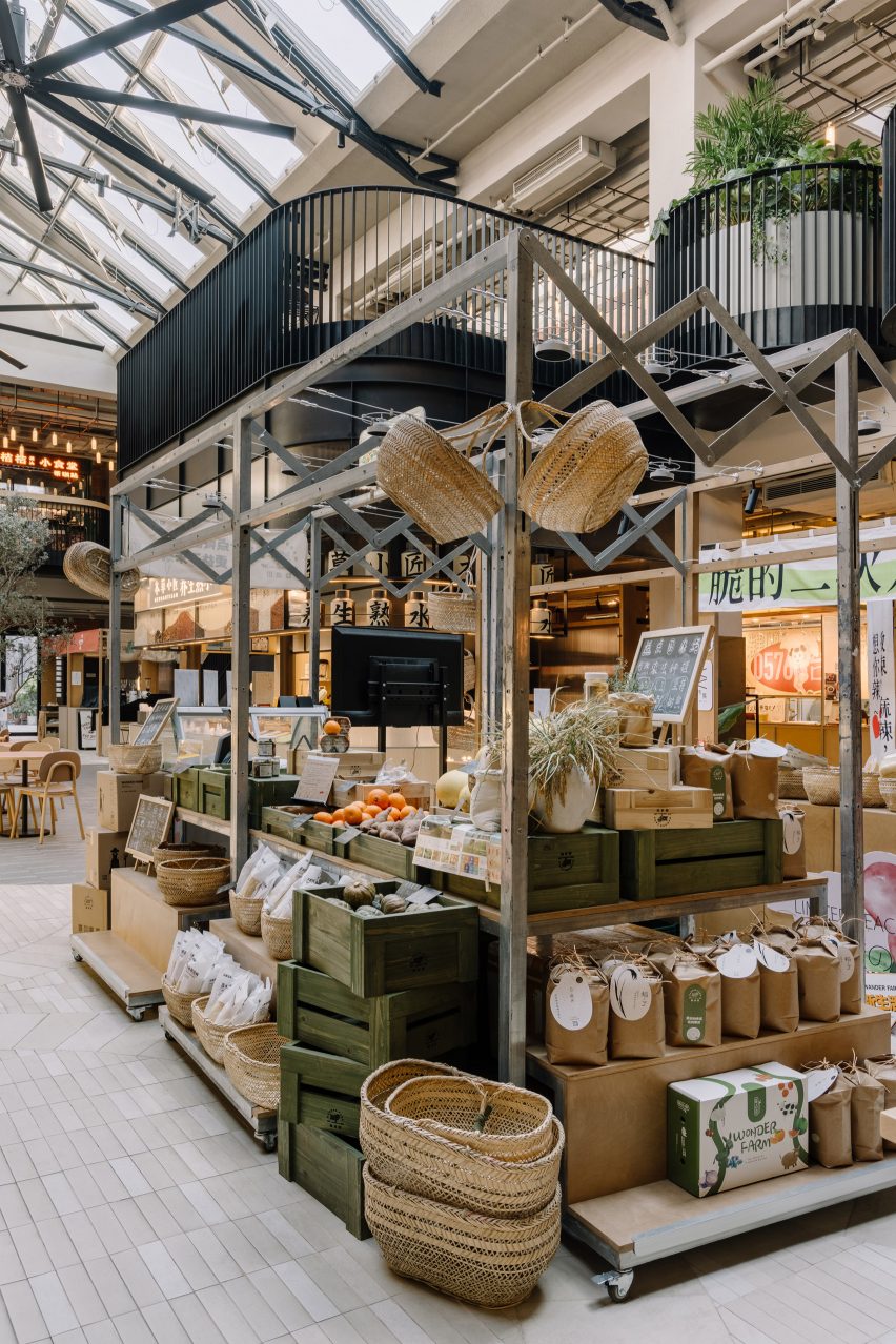
The interior of the market was designed to resemble a greenhouse, with shops and cafe’s arrranged around a central, double-height atrium.

The glass pitched roof above the atrium was lined with gently curved metal truss, in reference to Victorian greenhouses, with three large fans hanging from the metal truss to improve the air circulation.
Linehouse Foodie SocialLinehouse Foodie Social
Some vendors are designed to be retractable to allow flexibility

A cafe in the atrium, which contains an olive tree planted into the ground, integrates a metal staircase that leads to the upper floor.

A area describes as a “stage” is located by the staircase with a series of undulating balconies wrapped around the atrium on the upper floor.

Various typologies of food vendors are arranged in the open atrium on the ground floor, some of which are designed to be retractable, allowing flexibility for different types of vendors as well as a large open event space to be formed at the centre.

“This new typology brings together the local with more curated food offerings in a contemporary yet humble and sustainable way,” explained Linehouse‘s Shanghai team who are responsible for the design.
Linehouse Foodie SocialLinehouse Foodie Social
Recycled red bricks can be found both on the facade and interior walls

Smaller snack shops were positioned on the ground floor, while larger restaurants occupy the upper floor.

Each stall was assembled from a kit of parts, so that the vendors are able to create their own signage and layout, but maintain a consistent material and lighting palette.
Linehouse Foodie SocialLinehouse Foodie Social
Larger restaurants are located on the upper floor

Linehouse is a Hong Kong and Shanghai-based architecture and interior design studio established in 2013 by Alex Mok and Briar Hickling. The duo won the emerging interior designer of the year category at the 2019 Dezeen Awards.

The studio has also recently designed the facade of a shopping centre in Bangkok and the interiors for a Hong Kong residence that respond to coastal views.

The photography is by Wen Studio.


Project credits:

Design principal: Alex Mok
Associate-in-charge: Cherngyu Chen
Design team: Yeling Guo, Fei Wang, Wang Jue, Norman Wang, Aiwen Shao, Mia Zhou, Yunbin Lou, Xiaoxi Chen, Tom Grannells

Reference

Side Angle Side transforms Austin post office into restaurant
CategoriesInterior Design

Side Angle Side transforms Austin post office into restaurant

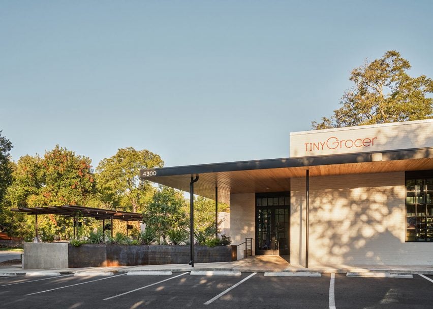
Texas architecture studio Side Angle Side has adapted a 1960s post office into a food market and restaurant in Austin.

Opened in October 2023 in the Hyde Park area, Tiny Grocer serves as a speciality market, bar and cafe while Bureau de Poste is a modern French bistro led by celebrity chef Jo Chan.

The exterior of a small, modern grocery storeThe exterior of a small, modern grocery store
Side Angle Side has transformed a 1960s post office into a food market and restaurant

Austin-based commercial and residential architecture firm Side Angle Side renovated the 3,500-square foot (325-square metre) 1967 US Post Office building and added a 1,500-square foot (140-square metre) outdoor dining patio.

“The Hyde Park U.S. Post Office was an important neighborhood hub in the 1960s – so we were especially careful to keep the integrity and spirit of the mid-century-utilitarian design,” Arthur Furman, founding partner of Side Angle Side, told Dezeen.

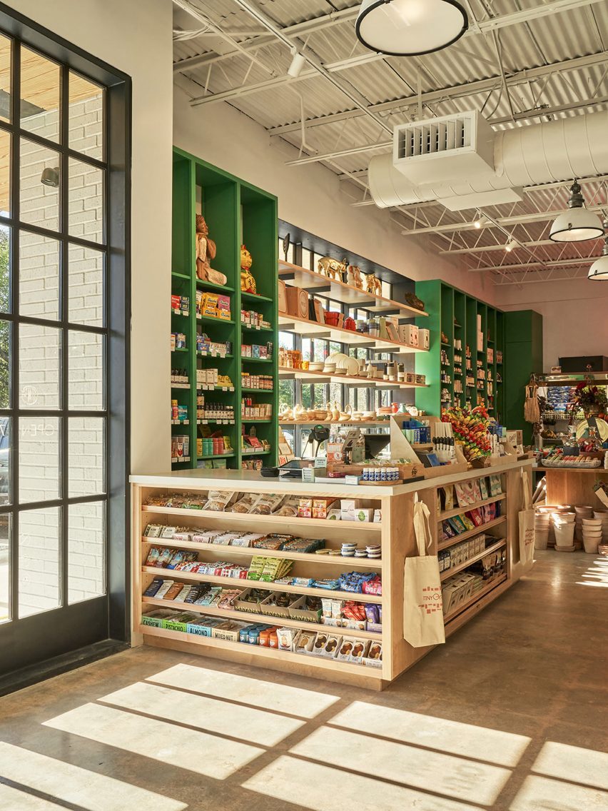
A grocery market with green shelvingA grocery market with green shelving
The team sought to preserve the building’s history as a community hub

“As the anchor tenant in the space, Tiny Grocer continues to be the centre of the community, a place to gather, shop, eat and drink.”

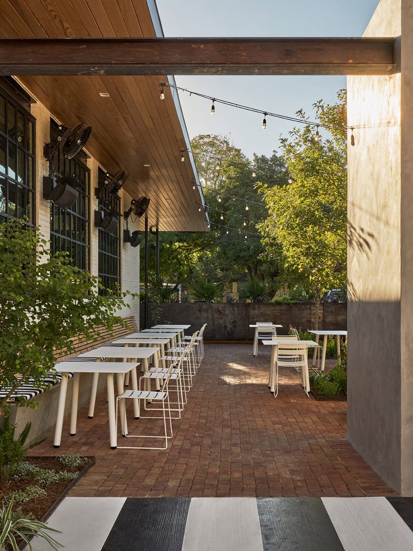
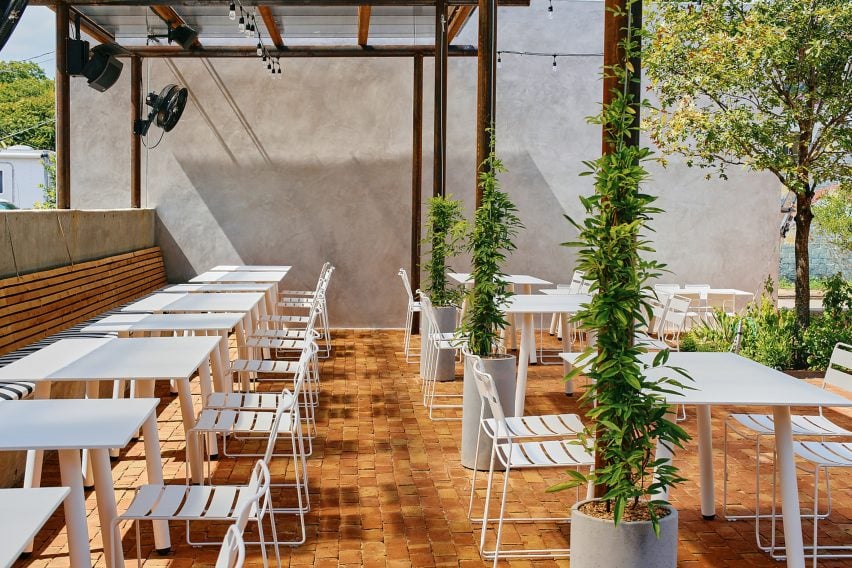
The shell of the white brick building was left intact, but the street-facing facade was previously used as a loading dock so the team transformed the back-of-house edge into a welcoming patio for the neighbourhood by removing the asphalt and adding two large live oak trees and a steel trellis and planters.

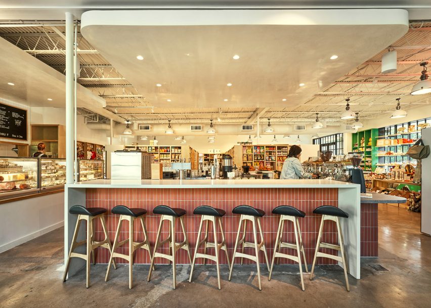
A bar in a grocery and marketA bar in a grocery and market
The exterior of the building was kept intact

A cast-in-place concrete banquette holds the edge of the patio that is paved with antique red brick.

The steel planter forms a boundary between the parking area and the dining space, while the other edge is held by a light grey-coloured stucco restroom building. White metal furniture from Isimar and Portofino was used to furnish the patio.

“The patio and wine garden is the real heart of the project,” the team said, mentioning that it wasn’t within the original scope of the project but added later when its larger value was realized. “This is where all the care and thought of the interior spills to the outside, creating a lively environment.”

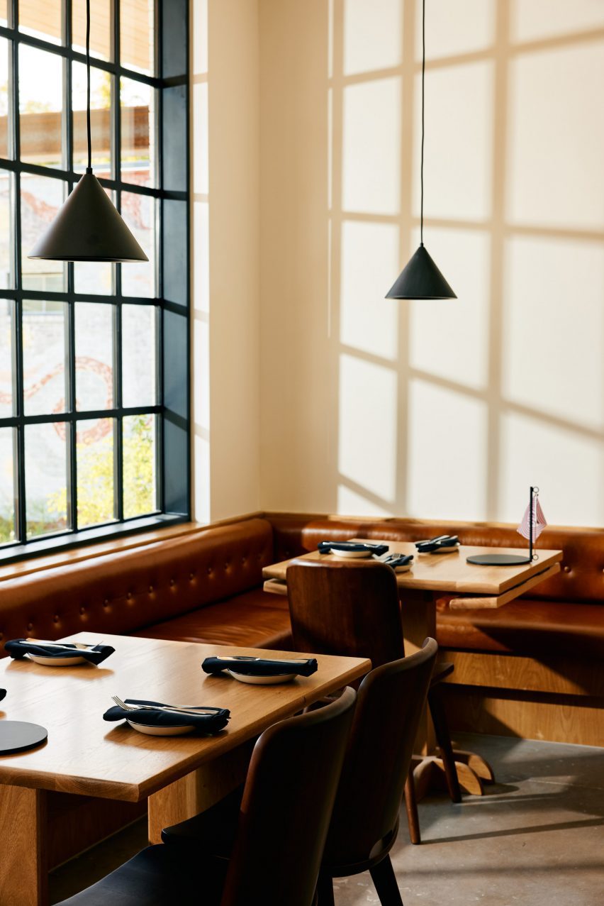
Wooden tables in front of a black framed windowWooden tables in front of a black framed window
The renovated building has exposed concrete floors from the original building

On the interior, Side Angle Side complemented the original ceiling and open web joists with metal decking and industrial warehouse pendants by AQ Lighting. The polished concrete floors expose the weathered imperfections and show the history of the building.

Upon entering, shoppers take in the colourful selection of curated products displayed on white oak mercantile shelving. Green millwork hugs one wall and the space widens to an open interior plan.

A patio with white metal seating and plantsA patio with white metal seating and plants
A patio and wine garden is at the heart of the project

A central deli and coffee bar floats in the middle of the room and creates a transition from the market to the bistro. The bar is wrapped in Seneca terracotta tile and topped with grey and white quartz countertops. Wooden Soule barstools are tucked under the waterfall counter.

The back-of-house spaces hold a kitchen office, storage, and bar equipment.

“Working closely with the owner, design finishes hint at the building’s midcentury past,” the team said, referencing the custom, built-in leather banquette by Undercover Austin Upholstery that lines the bistro’s back wall.

Above the banquette and Second Chance Custom wooden dining tables hang black cone light pendants by All Modern.

A patio with white metal seatingA patio with white metal seating
The patio features brick flooring and white metal furniture

“The single biggest sustainable feature of this project is one that is often overlooked,” the team said, noting the adaptation of the structure. “The ‘loose fit, long life’ style of these old buildings leads to more reuse and far less waste.”

Recent adaptive reuse projects in Austin include a 1900s house converted to a luxury office by Michael Hsu and commercial units converted to an architecture studio by Baldridge Architects.

The photography is by Likeness Studio and Mackenzie Smith Kelly.


Project credits:

Structural engineer: Creative Engineering
MEP engineer: ATS Engineers
Builder: Archive Properties
Commercial interior design: Side Angle Side
Architects: Side Angle Side
Building shell: Thought Barn Studio
Landscape design: Side Angle Side & Wild Heart Dirt
Owner: Steph Steele


Reference