Schemata Architects embraces rough material finishes for gallery in Seoul
CategoriesArchitecture

Schemata Architects embraces rough material finishes for gallery in Seoul

The rough finishes of an existing concrete and brick structure are contrasted by white exhibition spaces at Arario Gallery in Seoul, completed by Japanese studio Schemata Architects.

The gallery is located at the rear of the Space Group Building, a modernist icon in South Korea that houses the Arario Museum.

Designed by architect Kim Swoo-geun, the grey-brick, heritage-listed building was completed in the 1970s and converted into the museum in 2014.
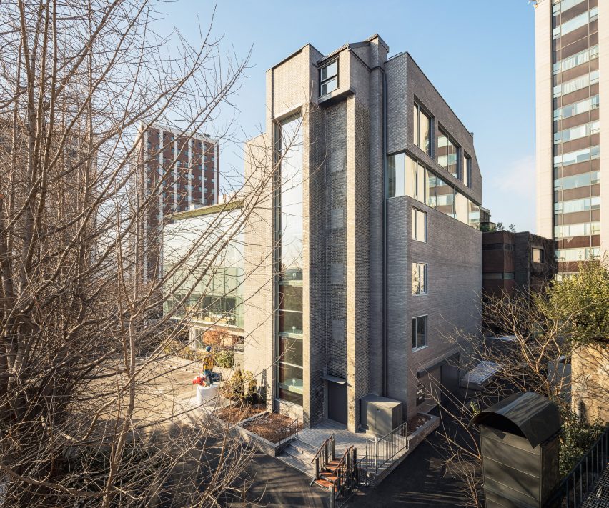
Exterior of the Arario Gallery in Seoul by Schemata ArchitectsExterior of the Arario Gallery in Seoul by Schemata Architects
Arario Gallery sits alongside the grey-brick Space Group Building

Alongside this building is a glazed extension from the 1990s by architect Jang Se-yang, a student of Swoo-geun, as well as a traditional South Korean home, or hanok, which was relocated to the site when it reopened in 2014.

Amid this architectural backdrop is a brick and concrete structure added to the site in the 1980s, which Schemata Architects was tasked with converting into the Arario Gallery.

“It was a great challenge for me, a Japanese architect, to work on the third building – excluding the hanok – especially after seeing the perfect contrast between the two buildings already created by the master and the disciple,” said Schemata Architects Principal Jo Nagasaka.
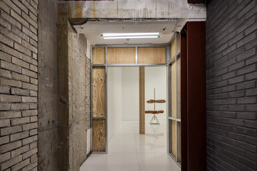
Interior of the Arario Gallery in Seoul by Schemata ArchitectsInterior of the Arario Gallery in Seoul by Schemata Architects
The gallery spaces are contained in white rooms

Looking to create a space that “looks unchanged on the outside”, the studio retained the building’s structural frame and dark brickwork, originally chosen to complement the Space Group Building.

“In this context, we thought that inserting another unique feature into the landscape would not be appropriate,” explained Nagasaka.
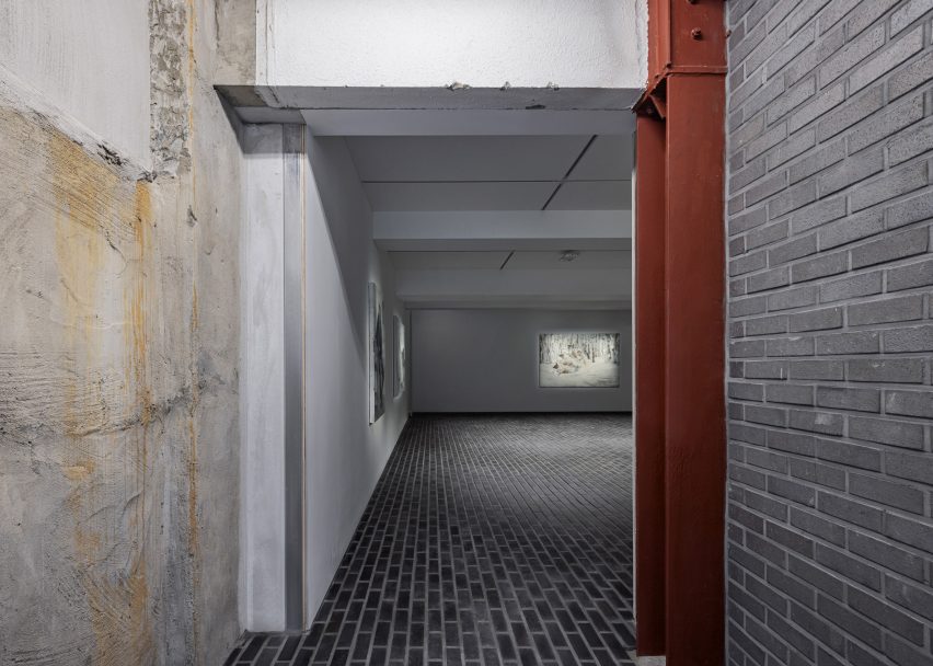
White gallery interior with grey brick floorsWhite gallery interior with grey brick floors
Brickwork extends across the floor of the basement

Organised across four floors and a basement level, the white-walled gallery spaces sit alongside the existing staircase, lift, service and storage areas, where the structure’s rough material finishes have been left exposed.

In these more industrial-feeling spaces, walls have been made using plywood on metal frames. Teamed with metal doors and white metal balustrades, they deliberately stand out against the “skeleton” of the existing building.

In the basement, the dark grey brickwork of the adjacent museum is mirrored in a brick floor that extends throughout the space.

On the third floor, sections of the exterior wall were removed to create a full-height glass wall in the VIP area. This looks out towards the nearby Changdeokgung Palace and a surrounding park, also visible through windows in the stairwell.
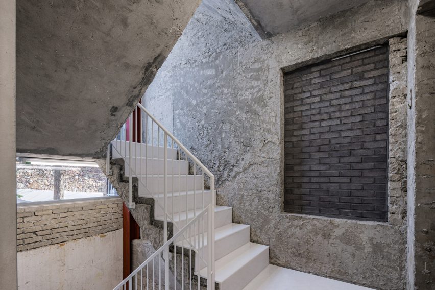
Concrete stairwell with white stairsConcrete stairwell with white stairs
White metal accents highlight new additions to the Arario Gallery

“In this way, we established repetitive patterns where visitors would emerge from the white cube into a skeleton space and see the palace beyond as they ascend to the upper floors,” said Nagasaka.
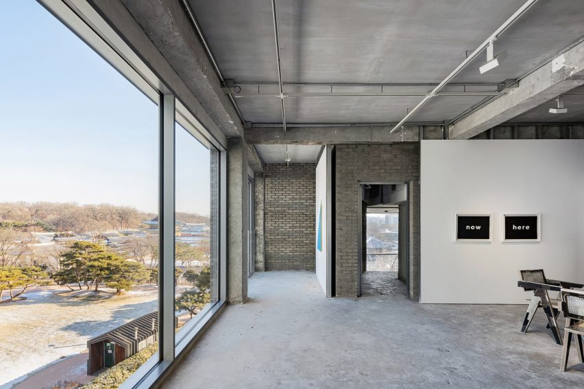
Lounge area in Seoul by Schemata ArchitectsLounge area in Seoul by Schemata Architects
Large windows in the Arario Gallery overlook Changdeokgung Palace

Schemata Architects is a Tokyo-based studio, Founded in 1998 by Nagasaka after he graduated from Tokyo University of the Arts.

Its previous projects include a public bathhouse in Tokyo finished with turquoise tiles and a hillside guesthouse and bar for a home on the coast of an island in the Seto Inland Sea.

The photography is by Yongjoon Choi.


Reference

Dekton Ukiyo: Cosentino’s New Material Collection Celebrates the Aesthetic Wisdom of Japan
CategoriesArchitecture

Dekton Ukiyo: Cosentino’s New Material Collection Celebrates the Aesthetic Wisdom of Japan

Most people who love design also love Japan. In fact, it is impossible to truly appreciate the modern history of Western art and design without recognizing Japan’s influence. From the woodblock prints of Hiroshige that inspired Van Gogh to the Zen tea rooms that laid the foundation for minimalist architecture, Japanese aesthetics paved the way for modernism.

It is not just that Japanese design is beautiful. The nation has a long tradition of thinking carefully about aesthetics, and how the contemplation of beauty contributes to human flourishing. Consider the concept of wabi-sabi, or the art of imperfection, that was recently explored in an Architzer op-ed. Centuries before American architects lamented the homogeneity of the clean and orderly suburbs, Japanese philosophers recognized the paradoxical truth about beauty: that it requires flaws.

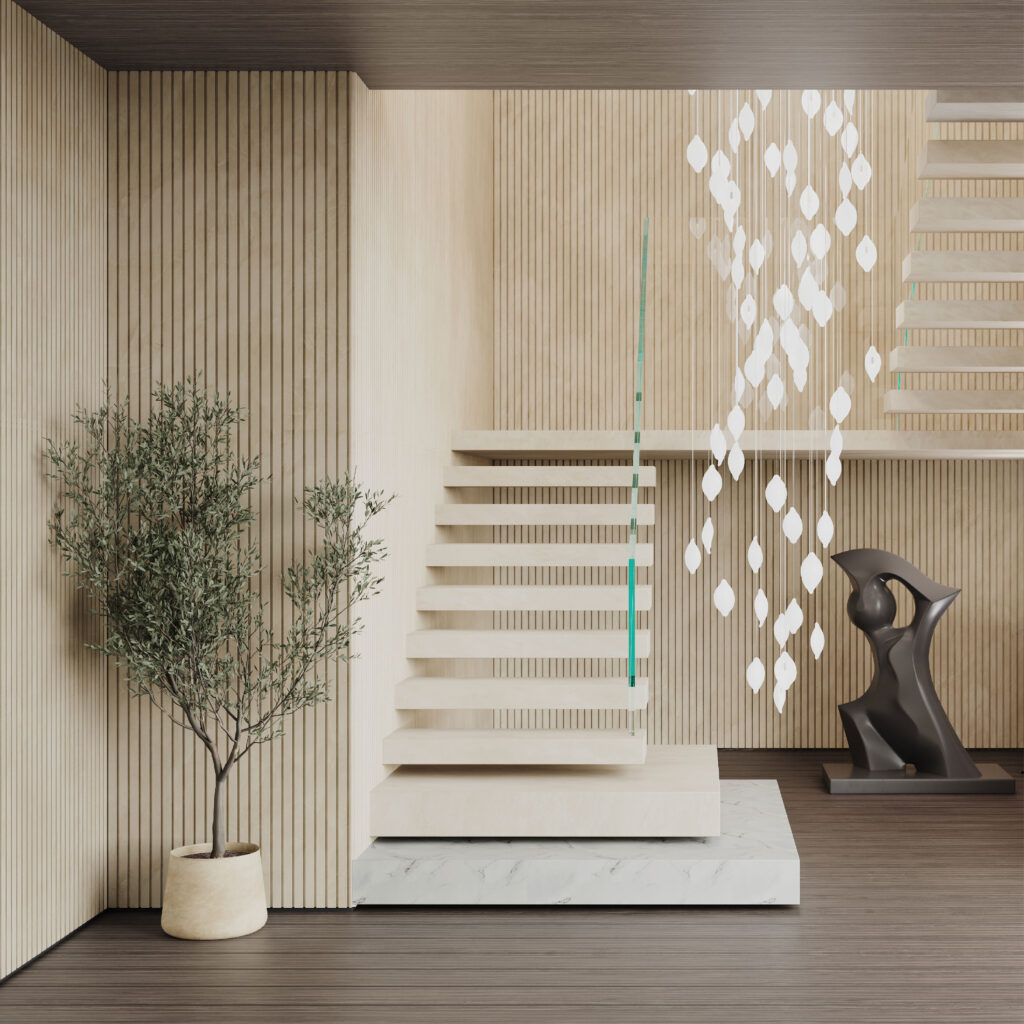
Dekton Ukiyo NACRE. Image courtesy Cosentino

It is this aspect of Japanese aesthetics — the theoretical side — that most inspired world-renowned interior designer Claudia Afshar in the development of her new collaborative collection with Cosentino, Ukiyo. The tagline for the series is “The Inner Texture,” which speaks to the Japanese understanding of interior design as an art that evokes a mental atmosphere of inner serenity. In the Japanese tradition, beauty and well-being go hand in hand.

The collaboration consists of a series of new patterns and textures for Cosentino’s versatile Dekton surfaces, a product we love and have profiled many times in the past. Scratch resistant, stain resistant, and able to endure the elements, Dekton is the surface of choice for designers looking for a material that is both resilient and visually alluring. The introduction of Dekton into the marketplace in 2013 completely upended the old conventional wisdom that natural materials are more beautiful than composites.

With Ukiyo, Claudia Afshar showcases the extraordinary potential of Dekton. Most Westerners recognize the term ukiyo as referring to a genre of woodblock prints that flourished in the 19th century, epitomized by the work of artists like Hokusai and Hiroshige. But in the promotional materials for this new collection, Afshar and Cosentino have chosen to emphasize the literal meaning of this term, listing the dictionary definition on the top of the collaboration webpage: “[u-key-yo], Japanese, (n). Living in the moment, detached from the bothers of life. ‘The floating world.’” The idea is drawn from Zen. It means that paradise is always at hand; all it takes is a choice to live in the moment.

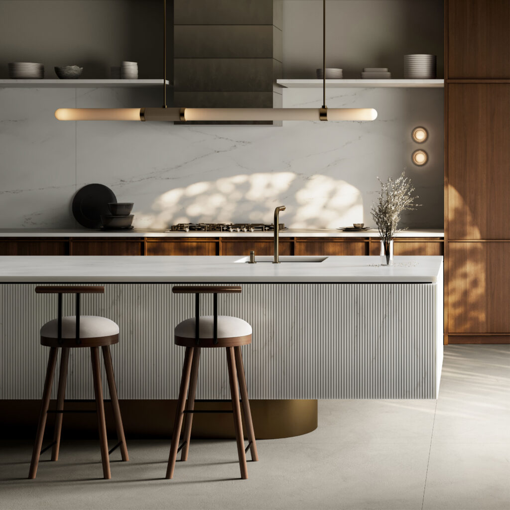
Dekton Ukiyo KRETA. Image courtesy Cosentino

In a recent webinar hosted by Architizer, Cosentino’s Lauren Dron quoted Coco Chanel’s statement that “An interior is the natural projection of the soul”, emphasizing the depth of the question architects and designers must ask every time they take on a project. “Meaningful design in the built environment continues to be rooted in our minds and in our emotions,” she declared. “Design is a reflection and enhancement of the human experience.”

This second part — enhancement  — is key, and it is the place where architects can really have an impact on the world. In a social environment dominated by stress, conflict, and speed, architects can create environments of serenity and calm. They can remind people that “the floating world” is alway at hand if one is willing to adjust their perspective.

This, then, is the noble aim of Ukiyo, which features textures and colors that are simple, yet rich. As lush as any natural stone, and as meditative as a pool of still water, these surfaces bring serenity into all sorts of interiors, from domestic to commercial. Each Dekton color features the same delicate ribbed texture, which is reminiscent of the wood slats one often finds in Japanese homes. The texture also evokes the delicate patterns one finds raked into the sands of Zen gardens.

There are two different options when it comes to the size and spacing of the grooves. Ukiyo GV2 is wider, with 25 mm slats and grooves that are 5 mm wide and 3 mm deep. GV3 is finer, with 11 mm slats and grooves that are 4 mm wide and 4 mm deep.

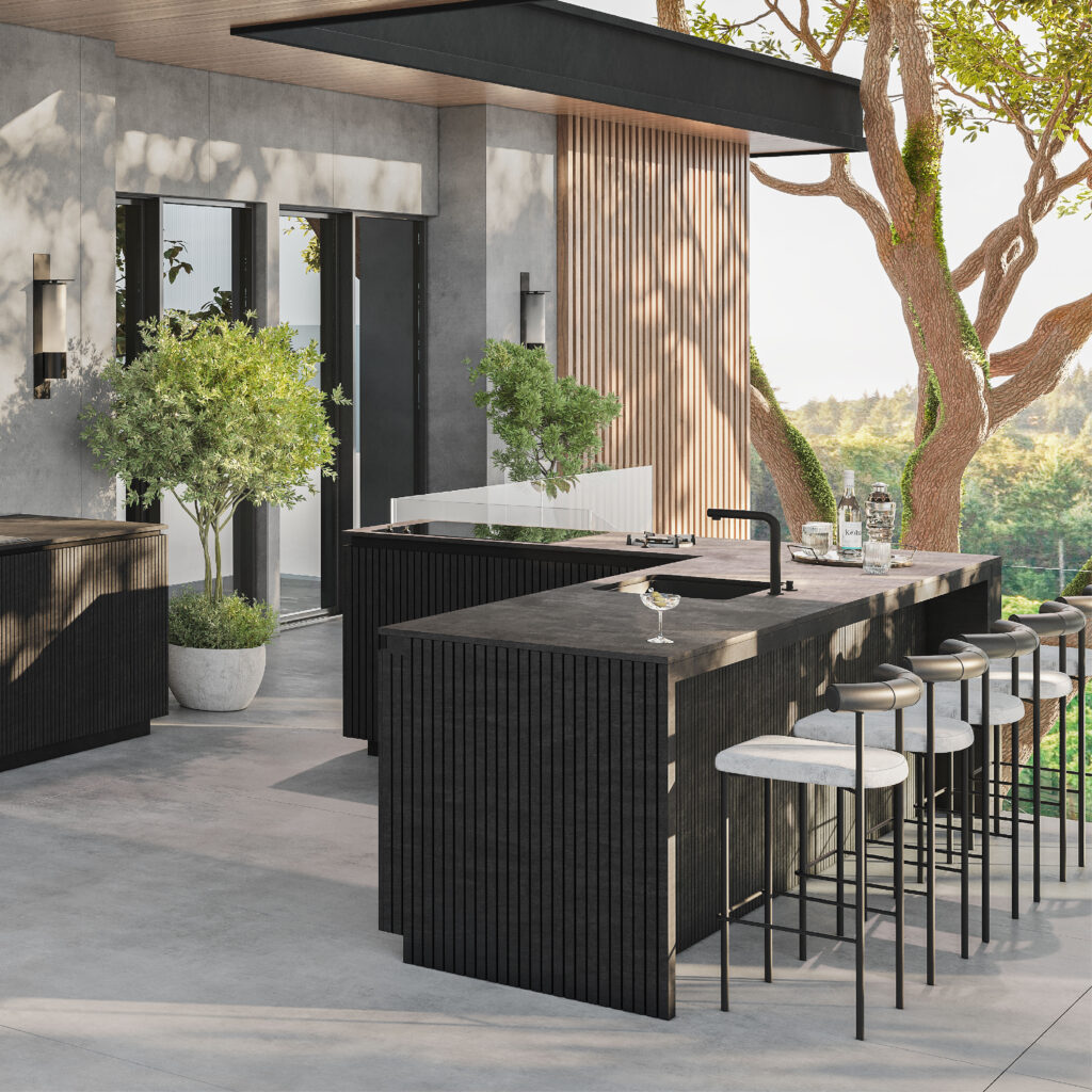
Dekton Ukiyo BROMO. Image courtesy Cosentino

BROMO is the first color in the series. It is described as “a dark gray shade inspired by slate featuring subtle faded graphics and a carefully crafted texture with a natural aesthetic.” The graphics are really key here. The material is actually deeper and richer than slate, yet it has the same soothing matte finish, exuding sophistication.

The next color, KRETA, is inspired by concrete, a material that retains modernist cache despite its ubiquity. Some of the most lyrical architecture ever made with raw concrete was created by Japanese architects, including Tadao Ando. Cosentino notes that KRETA can “create lighter or darker spaces.” In this way, it  plays off the light conditions in its environment, just like real concrete — a true neutral.

NACRE and REM are both shades of cream or beige. NACRE is the lighter of the two, and can even be considered an off-white. It is a great choice for designers looking for a minimalist finish but wary of stark brightness. This tone is both light and warm. REM has a similar impact but is marked by more dramatic veining patterns. There is a luxe quality here that is perfect for commercial interiors.

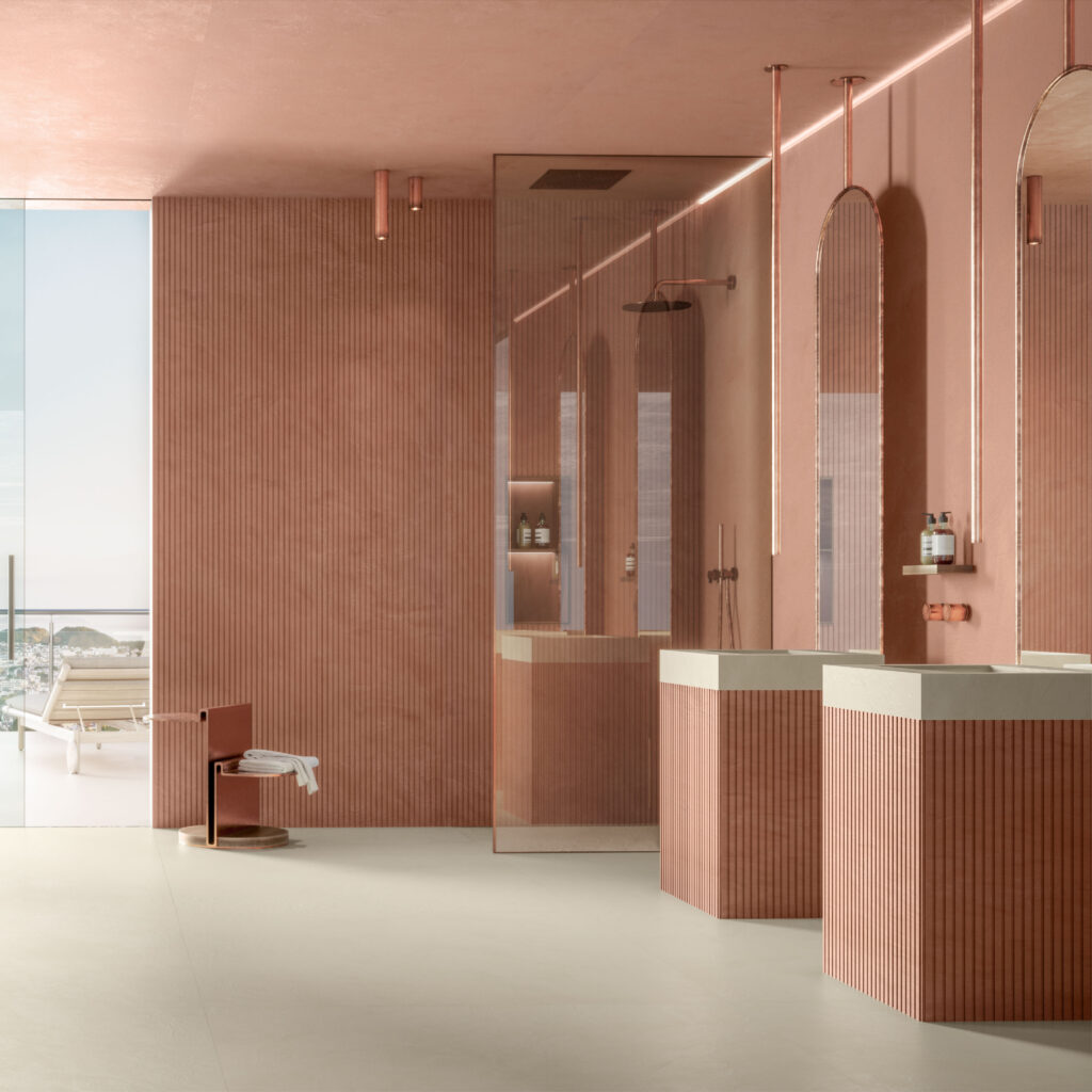
Dekton Ukiyo UMBER. Image courtesy Cosentino

Finally there is UMBER, the most adventurous and unique color in the series. It is hard to look at this delicately textured terracotta without imagining the rooms one could create with this tone. Unlike the other colors, which are notable for their versatility, UMBER is a showstopper. It is the kind of color you build a room around.

Ukiyo is a truly inspiring series of surfaces. It is also ethically manufactured. Dekton is  the only “Cradle-to-Grave Carbon Neutral surface” as Cosentino offsets 100% of their CO2 emissions over the product’s life cycle. This too is very Zen. Dekton exists in harmony with its surroundings.

To learn more about Dekton Ukiyo and talk with Cosentino about how to integrate it into your next project, visit their website.

Reference

Human Material Loop sets out to commercialise textiles made from hair
CategoriesSustainable News

Human Material Loop sets out to commercialise textiles made from hair

Dutch company Human Material Loop is using an unusual waste source to make a zero-carbon wool alternative that requires no land or water use: human hair.

Human Material Loop works with participating hairdressers to collect hair cuttings, which it processes into yarns and textiles and sometimes turns into garments.

Founder and CEO Zsofia Kollar was initially interested in human hair from what she describes as a “cultural and sociological” perspective before she began exploring its material properties.

Sweater made from hair
Human Material Loop turns human hair into yarn and textile for products. Photo courtesy of Schwarzkopf Professional

“Delving into scientific studies about hair revealed not only its unique characteristics but also the stark reality of excessive waste generated,” Kollar told Dezeen. “This realisation became a catalyst for a clear mission: finding sustainable ways to utilise hair waste.”

Elsewhere, human hair mats are being used to mop up oil spills and to create biodegradable stools, but Kollar honed in on the textile industry as the best target for her aspirations.

“Not only is the textile sector one of the largest markets in our economy, but it also ranks among the most environmentally taxing industries,” said Kollar.

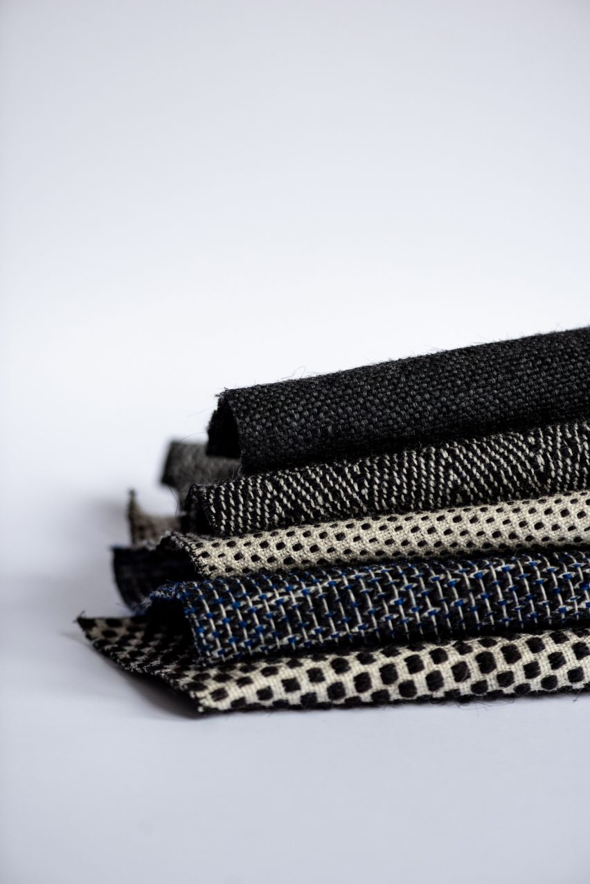
Photo of five fabrics made of human hair folded and stacked on top of each other. They each feature small geometric patterns in shades of black, white and dark blue
The company wants to tackle the environmental impacts of the textile industry. Photo by Medina Resic

“Throughout history, we’ve utilised a variety of animal fibres in textiles, yet our own hair, composed of the same keratin protein as wool, often goes overlooked,” she continued. “Why not treat human hair as we would any other valuable textile fibre?”

According to Kollar, the use of human hair eliminates one of the major sources of greenhouse gas emissions in the textile industry: the cultivation of raw materials like cotton plants or farming of sheep for wool.

Waste hair does not degrade any soil, require any pesticide, pollute any water or produce any greenhouse gas emissions, she points out.

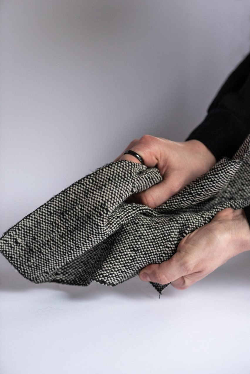
Photo of a pair of hands scrunching up a thick piece of black and white textured fabric
The textiles have many desirable attributes, says the company. Photo by Medina Resic

At the same time, hair has properties that make it highly desirable. It’s flexible, it has high tensile strength, it functions as a thermal insulator and it doesn’t irritate the skin.

Human Material Loop has focused on developing the technology to process hair so it can be integrated into standard machinery for yarn and textile production.

The company has made the waste hair into a staple fibre yarn – a type of yarn made by twisting short lengths of fibres together – and has several textiles in development.

It has also made a few complete garments, most recently a red sweater-like dress created in collaboration with the company Henkel, owner of the Schwartzkopf haircare brand.

Photo of a woman's torso wearing a deep red knit sweater
Human Material Loop’s collaborations have yielded products such as this knit dress, made with the company Henkel. Photo courtesy of Schwarzkopf Professional

The dress is intended for display at hairdressing events, as part of an initiative to foster discussion about alternative salon waste-management ideas.

Seeing completed products like these, Kollar said, helps to ease the discomfort or disgust that many people feel around using products derived from humans.

“Surprisingly, the material looks utterly ordinary, akin to any other textile,” she said. “A fascinating transformation occurs when individuals touch and feel the fabric. Their initial scepticism dissolves, giving way to a subconscious acceptance of the material.”

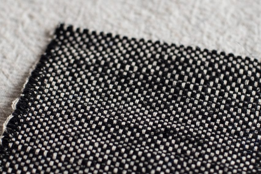
Photo of a piece of black and white thick woven fabric lying flat on a surface
People’s discomfort around the use of human hair is said to fade when they see the fabric

“The rejection usually stems from those who’ve merely heard about it without ever laying eyes on the garments themselves,” she continued. “It’s a testament to the power of firsthand experience in reshaping perceptions”

Kollar says Human Material Loop will also be targeting the architecture and interiors products market, for which she believes hair’s moisture resistance, antibacterial properties, and acoustic and thermal attributes will make it an attractive proposition.

The company has a commercial pilot scheduled for 2024 and also aims to create a comprehensive fabric library for brands and designers.

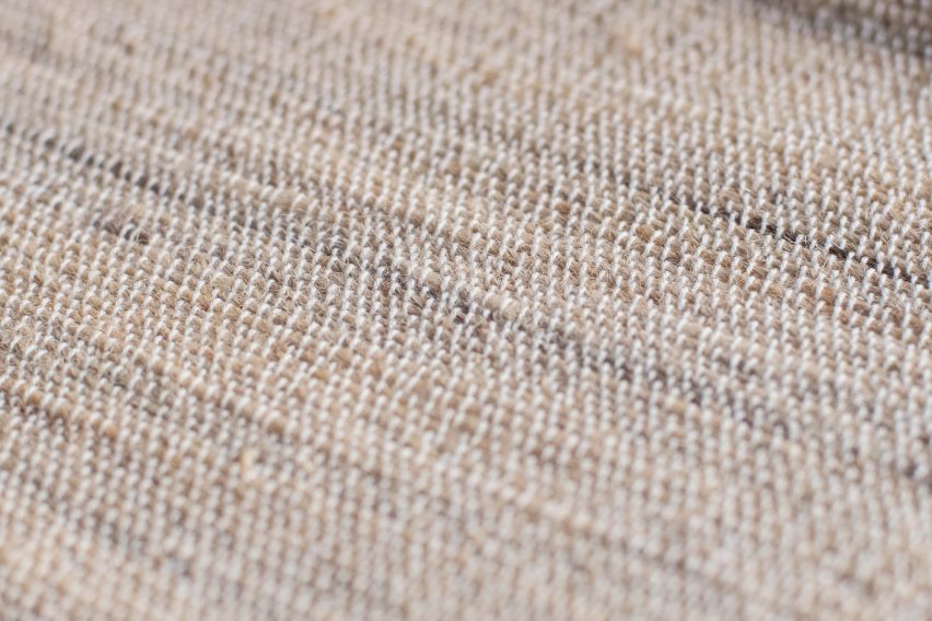
Photo of a pale woven textile made of hair by Human Material Loop
The company plans to make a build a full fabric library

Kollar had been making experimental textiles like a golden, scented tapestry woven from blonde hair for many years before setting out to commercialise the venture with Human Material Loop in 2021.

She is not the only designer to have attempted to utilise wasted hair cuttings. In recent years, Ellie Birkhead incorporated the material into region-specific bricks and hair was used to measure urban pollution in Bangkok.

Reference

Seven cosy living rooms with industrial material palettes
CategoriesInterior Design

Seven cosy living rooms with industrial material palettes

Living rooms with tactile brick, concrete and wood surfaces feature in this lookbook, which shows that opting for industrial materials doesn’t have to sacrifice cosiness.

Typically informed by old and unrefined factories, lofts and warehouses, industrial-style interiors are a go-to for many contemporary designers.

Homes of this style are often characterised by a combination of man-made and natural materials, including brick, wood, concrete and metal, and the exposure of details that are usually concealed, such as ductwork.

While, for some, the image of industrial spaces can conjure up feelings of being cold and unwelcome, this list of living rooms proves that with the right finishes, the style can actually be warm and inviting.

This is the latest in our lookbooks series, which provides visual inspiration from Dezeen’s archive. For more inspiration see previous lookbooks featuring interiors with furry walls, sculptural wooden staircases and rustic Italian interiors.


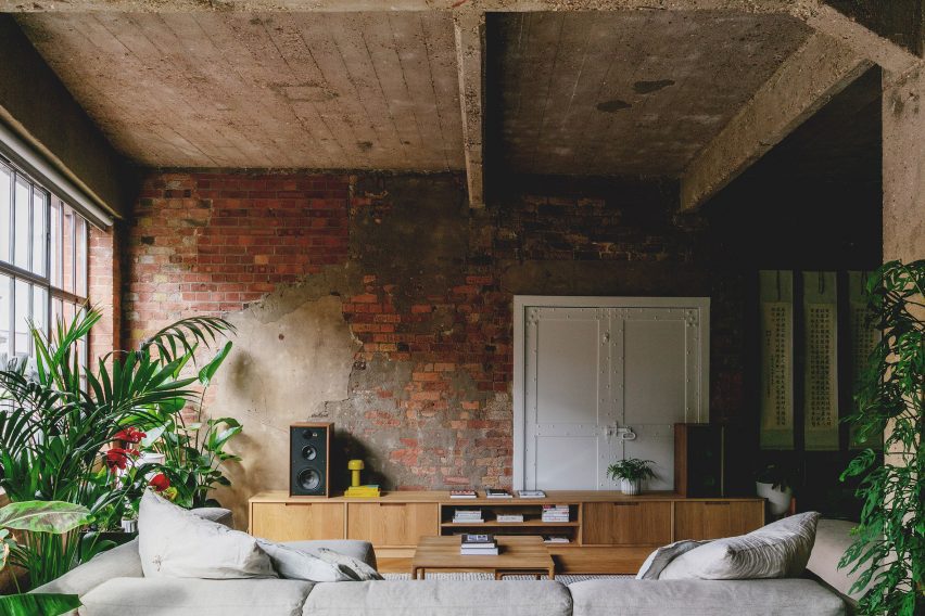
St John Street, UK, by Emil Eve Architects
Photo by Mariell Lind Hansen

St John Street, UK, by Emil Eve Architects

Emil Eve Architects retained the raw aesthetic of this former warehouse while transforming it into a warm and inviting home.

In the living room, old brick walls, metal window frames and a rough concrete ceiling form a tactile backdrop to contemporary wooden furnishings and an abundance of tall plants.

Find out more about St John Street ›


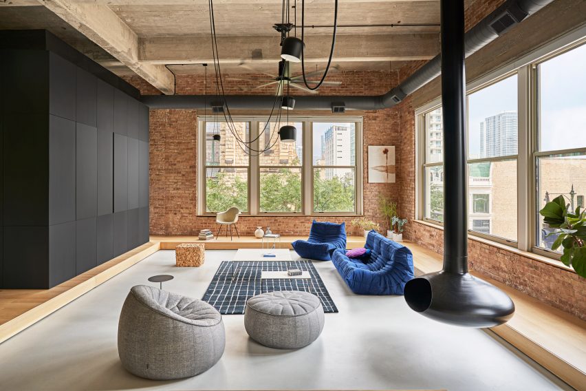
Living room of Michigan Loft by Vladimir Radutny
Photo by Mike Schwartz

Michigan Loft, USA, by Vladimir Radutny Architects

A suspended black-metal fireplace is the centrepiece of this lofty apartment, which is located in Chicago and dotted with floor furnishings including a Toga sofa.

The fireplace is complemented by exposed black ducting and hanging lights, which pop against the surrounding brick, warm wood and concrete elements.

Find out more about Michigan Loft ›


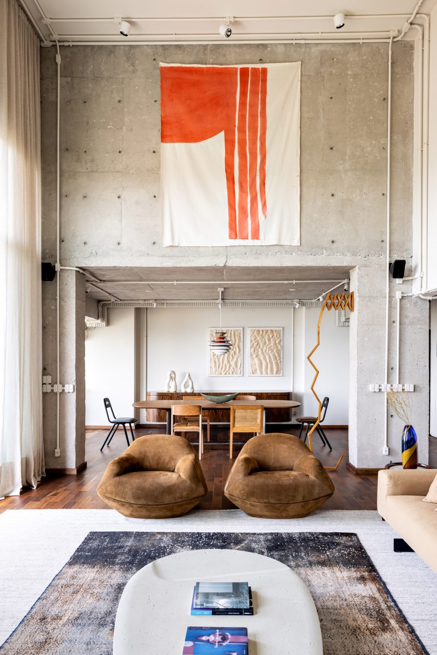
Gale Apartment living room with brown lounge chairs and concrete walls
Photo by Fran Parente

Gale Apartment, Brazil, by Memola Estudio

Exposed services, ducting and concrete help achieve an industrial look in this living room, which is located in a Brazilian apartment designed by Memola Estudio.

To add warmth to the space, these finishes are balanced with natural details including dark wooden floorboards and furniture, suede chairs and a textile wall tapestry.

Find out more about Gale Apartment ›


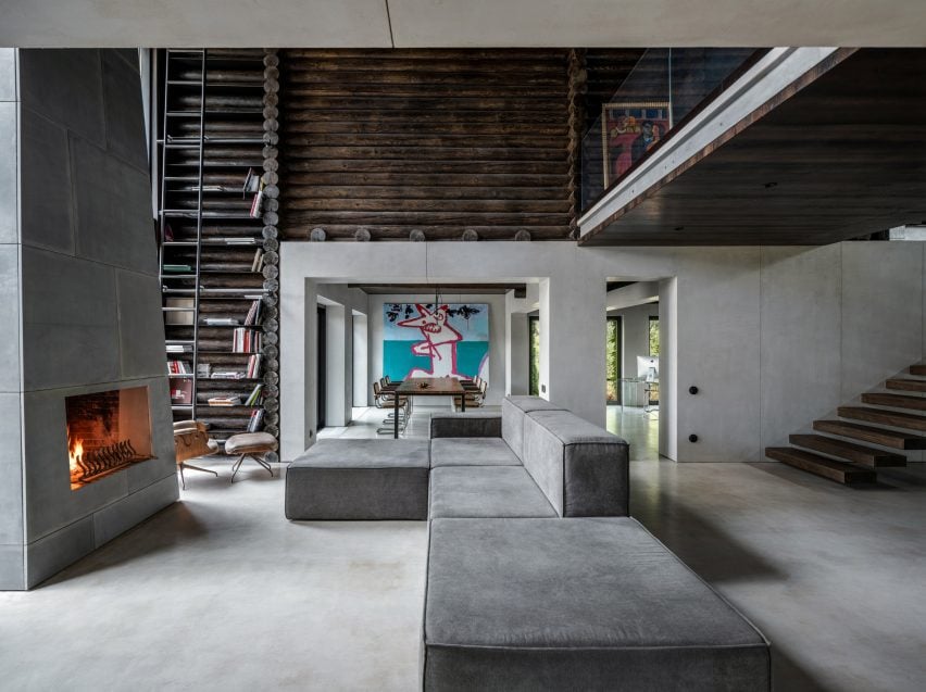
Photograph showing large sofa in living area looking into dining area
Photo by Andrey Bezuglov and Maryan Beresh

Relogged House, Ukraine, by Balbek Bureau

This living room belongs to a Ukrainian cabin, designed by Balbek Bureau with a utilitarian aesthetic that aims to challenge conventional cabin interiors.

Concrete is the predominant material, but stainless steel and wooden elements such as horizontally stacked logs also feature throughout. To add warmth, a giant fireplace takes centre stage and is positioned opposite a modular sofa on which visitors can cosy up.

Find out more about Relogged House ›


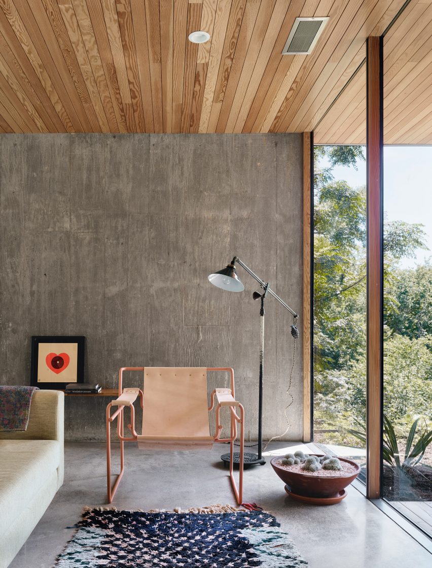
Living room of South 5th Residence by Alterstudio
Photo by Casey Dunn

South 5th Residence, USA, by Alterstudio Architecture

In this lounge, the stripped-back material palette helps to draw attention to the “dramatic vistas” over a valley in Austin, Texas.

Rough-textured concrete forms the walls of the space, while polished concrete lines the floor. Window frames made of wood and steel add to the room’s industrial look, and colour is introduced through furnishings including a tubular pink-metal armchair.

Find out more about South 5th Residence ›


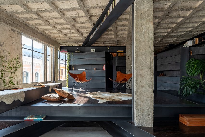
Living room of A Forest House by Aquiles Jarrín
Photo by JAG studio

A Forest House, Ecuador, by Aquiles Jarrín

Aquiles Jarrín married dark Chonta wood with black-steel beams and rough concrete for the design of this textural living room, found in A Forest House in Quito.

The wooden elements help break up the open-plan interior, carving out cosy nooks and storage spaces for the owner. The seating area is warmed by a cowhide rug and tan butterfly chairs.

Find out more about A Forest House ›


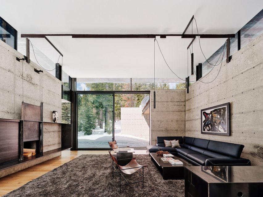
Kundig faulkner Analog House Truckee
Photo by Joe Fletcher

Analog House, USA, by Olson Kundig Architects

A tactile material palette of metal, concrete and glass tones was used for the living room of Analog House, a home in a Californian forest created by Olson Kundig Architects with the ​​founder of Faulkner Architects – the client for the project.

In the lounge, these materials are paired with light wooden floors and minimalist furnishings including hanging lights, a sleek black sofa and tubular chairs.

Find out more about Analog House ›

This is the latest in our lookbooks series, which provides visual inspiration from Dezeen’s archive. For more inspiration see previous lookbooks featuring interiors with furry walls, sculptural wooden staircases and rustic Italian interiors.

Reference

Architectural Details: Why Metal Is the Perfect Material for Dynamic Educational Projects
CategoriesArchitecture

Architectural Details: Why Metal Is the Perfect Material for Dynamic Educational Projects

As designers imagine the future of educational buildings, the values and materials of today will inform school environments for decades to come. With priorities around durability, longevity, cost-efficiency, and ease of installation, metal plays a starring role in high-traffic education spaces.

For its renewability, durability, and ever-evolving versatility, architectural metal offers long-term solutions that bring beauty, reliability and safety to schools. At Presidio Knolls School in San Francisco, and the Seattle Academy of Arts and Sciences in Seattle, Washington, leading metal manufacturer BŌK Modern’s solutions have set a new standard for how educational spaces are designed and experienced.

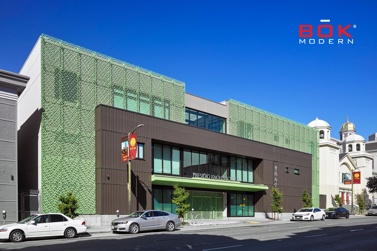
Presidio Knolls School. Photo by Ken Gutmaker

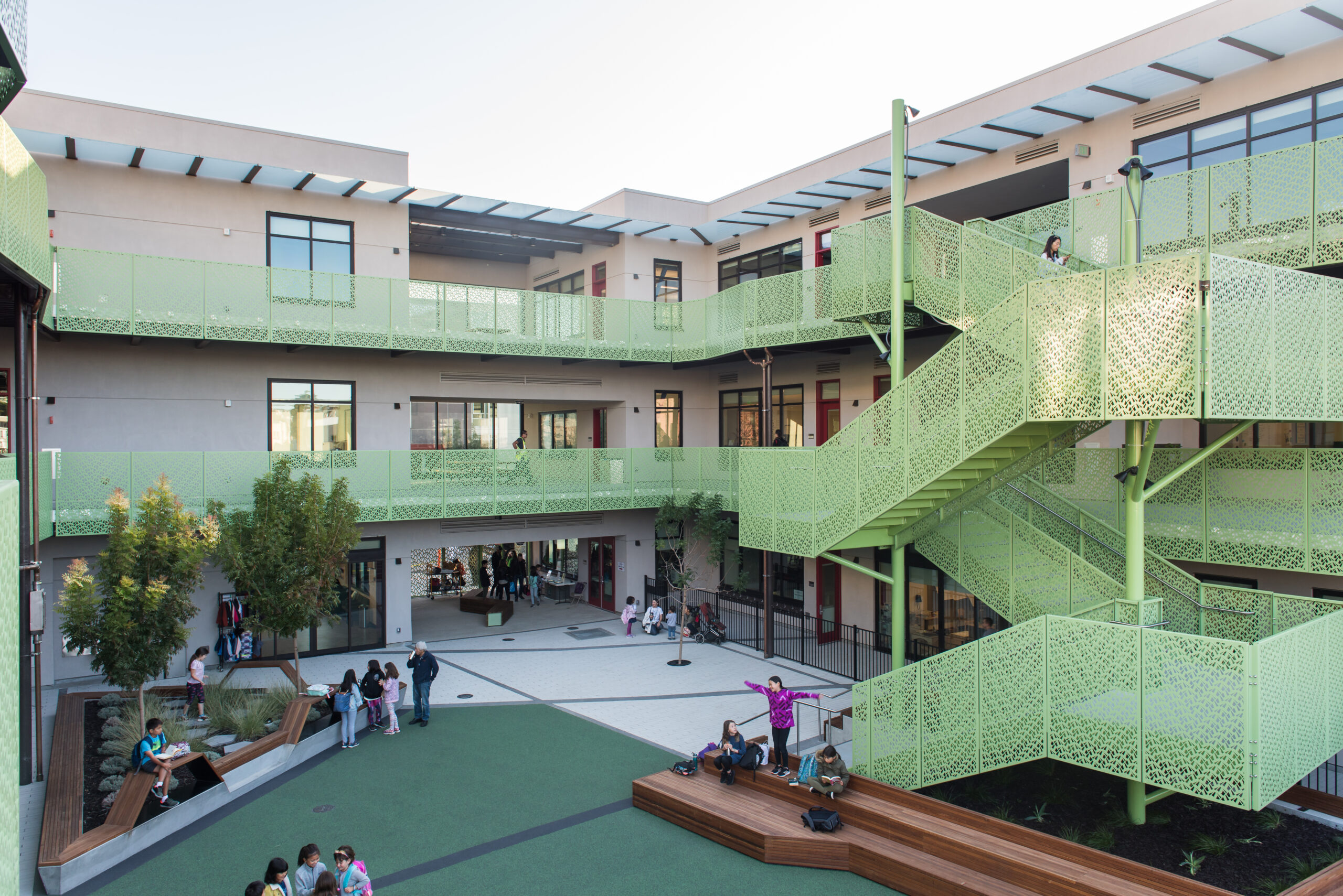
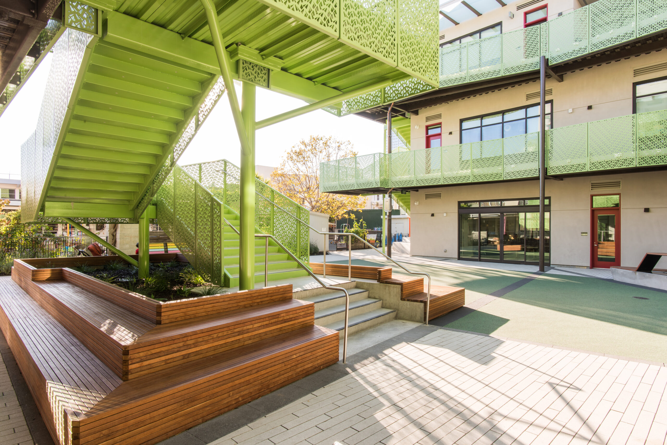
Nestled in San Francisco’s SoMa District, Presidio Knolls School is a serene escape from the bustling city. Studio Bondy Architecture was tasked with renovating the PKS campus, including two historic buildings and the main U-Wing building containing the interior courtyard.

The team wanted to design a new public-facing identity while creating a safe, enduring environment for kindergarten through eighth-grade students. They called on BŌK Modern to design custom metal treatments for the building’s exterior façade, front gate, interior stairs, and balcony guardrails to strike that balance.

Presidio Knolls School. Photo by Kevin Quach

The distinctive element of the façade and interior courtyard is the perforated metal screen used across all solutions. The pattern is based on a Chinese ice-ray design, a common motif in wood lattice window designs in the Ming and Qing Dynasties,” says Laura Rambin, Principal at Studio Bondy Architecture. “On the street-facing façade, the pattern decreases in density as it rises to the third story of the building, giving a feeling of lightness. Within the interior courtyard, the pattern creates dynamic shadows and has the effect of standing in a bamboo forest.”

Presidio Knolls School. Photo by Kevin Quach

Designing patterns for kid-centric environments can be challenging, so BŌK and Studio Bondy Architecture carefully selected a pattern that didn’t prohibit climbing but naturally discouraged them from doing so. The custom ice-ray design also has holes too small for toes and feet to fit, and narrow vertical openings prevent anyone from crawling through.

Seattle Academy of Arts & Sciences. Photo by Rachel Godbe

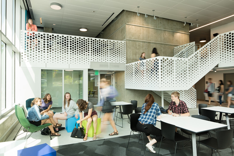
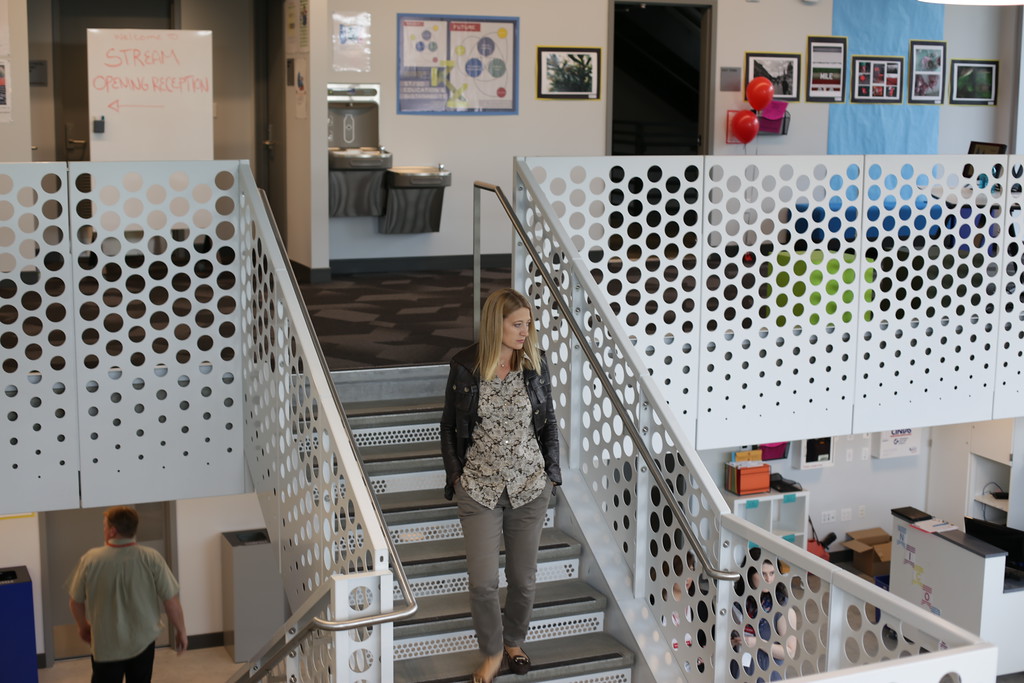
In the common areas of the Seattle Academy of Arts and Sciences’ new STREAM building, The Miller Hull Partnership tapped BŌK Modern to collaborate on guardrails, stairs, and louver covers for the school’s interior. The fun and open patterning, combined with a consistent look, helped to unify the space for students and faculty alike.

Seattle Academy of Arts & Sciences. Photo by Rachel Godbe

Turning structural staircases into textural focal points, BŌK Modern fabricated their panels from 14GA steel with a primer and powder-coated finish for durability. Specified in the A26 pattern across all solutions, the finished products elevate the staircases beyond essential elements of the complex while letting the student’s art installations shine.

Providing architects and designers with endless possibilities to create engaging and resilient educational environments that can withstand the test of time, architectural metal provides sustainable, cost-saving solutions that will be part of a school’s identity for decades to come. Inspiring creativity and enhancing learning, BŌK Modern’s educational projects embrace metal materials as catalysts for resilient structures and compelling design.

To see more architectural case studies and learn more about how metal could be utilized in your next project, visit BŌK Modern’s website.

Credits & Key Information

Presidio Knolls School

  • Architect / Designer: Studio Bondy Architecture
  • Contractor: Plant
  • Construction Photography: Ken Gutmaker and Kevin Quach
  • Location: San Francisco, CA
  • Product Type: Wallscreen, Stair Guardrail, Gate, Balcony Guardrail

Seattle Academy of Arts & Sciences

  • Architect / Designer: Miller Hull General
  • Contractor: GLY Construction
  • Photography: Rachel Godbe
  • Product Type: Stair Guardrail, Balcony Guardrail, Louver Cover
  • Location: Seattle, WA

Reference

What’s So Luxurious About Luxury Vinyl Tile, Part I: The Dirty Secret Behind a DIYer’s Dream Material
CategoriesArchitecture

What’s So Luxurious About Luxury Vinyl Tile, Part I: The Dirty Secret Behind a DIYer’s Dream Material

This article was written by Burgess Brown. Healthy Materials Lab is a design research lab at Parsons School of Design with a mission to place health at the center of every design decision. HML is changing the future of the built environment by creating resources for designers, architects, teachers, and students to make healthier places for all people to live. Check out their podcast, Trace Material.

This is Part I of a three-part series on the hazards of vinyl flooring. In Part II we’ll explore the long history of worker endangerment by the vinyl industry and the ways that legacy continues in China today.


If you’ve stayed in a recently renovated AirBnB, stumbled upon quickly-flipped properties on Zillow, or tuned into the DIY corner of YouTube in the last couple of years, you’ll recognize a common interior design trend: imitation wood or stone floors branded as “Luxury Vinyl Tile.” These floors are everywhere and for good reason. LVT is affordable, durable, easy to maintain and quick to install — a DIYer’s dream! But it’s not just DIYers that have hopped on the LVT train —vast numbers of high-end hotels, schools, affordable housing units and office buildings have plasticized their floors.

Behind the slick rebrand and influencers’ stamp of approval, LVT manufacturers are hiding a “dirty climate secret,” according to a recent report from the Center for Environmental Health, Material Research L3C, and Autocase Economic Advisory.

What’s in a Name?

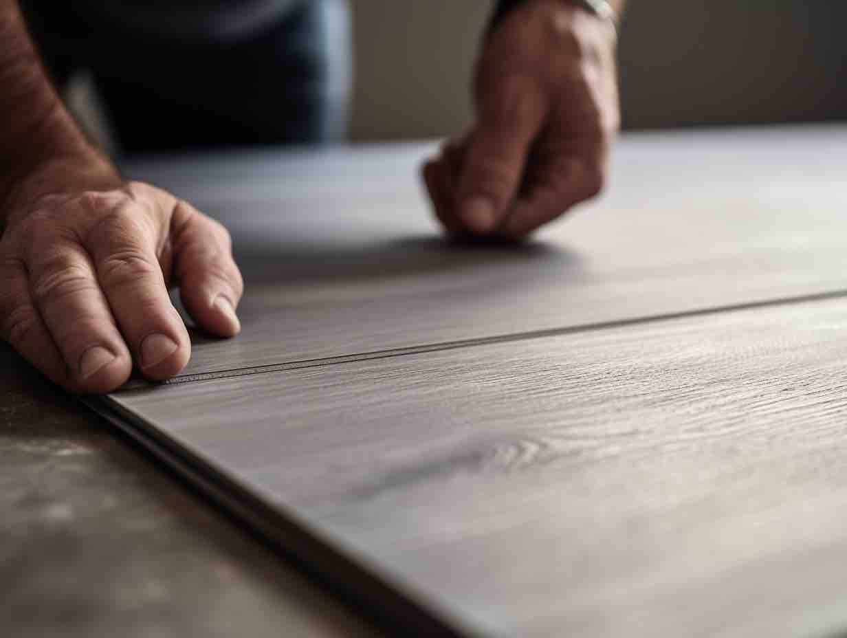
Image generated by Architizer using Midjourney

Vinyl flooring has been around in some form since the plastics revolution of the early 20th century. It became a residential interior staple during the postwar housing boom. Sheet vinyl was a quick and affordable option for developers racing to house a growing population. Today’s vinyl can look quite different, but at its core, it’s still a petrochemical product made with chemicals of serious health and climate concern. The addition of the luxury classification in vinyl branding is a recent marketing term, and it is hoodwinking hordes of purchasers. It typically designates vinyl tiles or panels (LVT or LVP) that are made to imitate the look of wood, stone or ceramic.

The popularity of these tiles and panels, particularly of the loose lay variety, have exploded thanks to another boom period: pandemic renovations. In 2021, LVT sales grew by a whopping 37.4%. By 2022, vinyl flooring made in China alone became the most common flooring sold in the United States, accounting for over one- quarter of all flooring sold in the U.S. According to the report from Center for Environmental Health, there are serious issues with lack of transparency and accuracy around the human and environmental toll of the LVT boom.

A Dirty Climate Secret

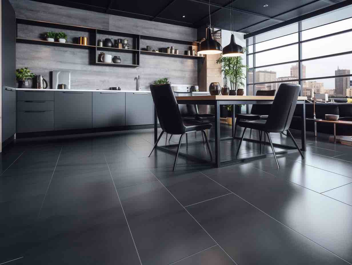
Image generated by Architizer using Midjourney

CEH’s report, titled “Flooring’s Dirty Climate Secret”, uncovers issues with the accuracy of reported carbon emissions by manufacturers of LVT and a lack of transparency around toxic chemicals used in production of vinyl flooring. Here are the four key findings from the report:

1. Carbon Emissions from producing PVC are underestimated by between 8% and 180% in Manufacturer Environmental Product Declarations (EPDs).

According to the report, manufacturer EPDs use outdated data and rely on carbon emission estimates from a single U.S. based production plant that doesn’t accurately reflect global emissions.

2. Workers all along the supply chain, along with frontline and fenceline communities in the U.S. and abroad are endangered by exposure to hazardous chemicals used to make LVT; Vinyl flooring manufacturers use significant quantities of highly toxic chemicals like PFAS and mercury to produce PVC.

PFAS, Per- and Polyfluoroalkyl Substances also known as “forever chemicals,” are toxic to humans at extremely low levels of exposure. The production of PFAS chemicals releases greenhouse gasses that degrade the ozone layer while mercury, also used in PVC production, produces climate warming greenhouse gas emissions. You may have seen recent coverage of a report from the U.S. Geological Survey that found PFAS in nearly half of the tap water in the U.S.

3. Asbestos is used to produce chlorine to make PVC flooring in the United States – importing asbestos for PVC production represents the last remaining legal use of this toxic mineral fiber.

Yes, you read that right: asbestos. The U.S. imports approximately 373 metric tons of asbestos from mines in Russia and Brazil each year specifically to fuel the production of PVC. There is risk of exposure and release into the environment at all stages of this global supply chain. The EPA, which has partially restricted asbestos use in the U.S., proposed a ban on asbestos in 2022 that has been met with fierce opposition from the chemical industry.

4. Increased use of coal has resulted in higher carbon dioxide emissions because US manufacturers have shifted the majority of vinyl flooring production to China.

U.S. vinyl flooring manufacturers have shifted the bulk of production to China where coal is used to produce PVC instead of natural gas, which is used in the U.S. The use of coal as a feedstock releases massive amounts of carbon dioxide into the atmosphere.

So, according to the CEH report, the LVT boom is causing an enormous increase in carbon emissions and is exposing workers, fenceline communities and residents to extremely toxic chemicals. All of this is under or mis-reported by vinyl manufacturers. Where does this leave architects, designers, and DIYers choosing flooring? We have to ask what is the true cost of this “inexpensive” product and why would we ever want to use this product? Fortunately, there are plenty of beautiful, healthy, and affordable alternatives to LVT.

Healthier, Affordable Alternatives

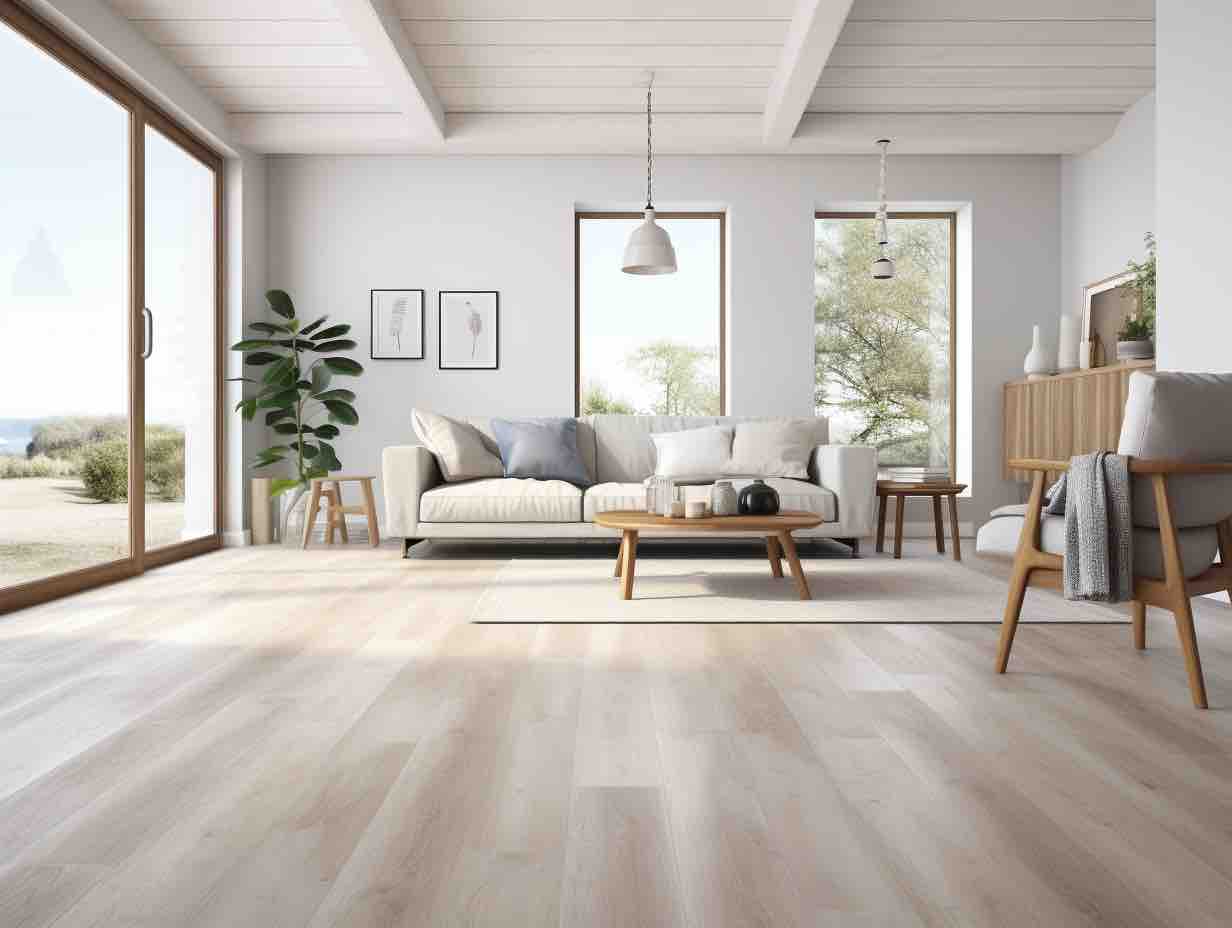
Image generated by Architizer using Midjourney

When choosing flooring materials, look for materials containing benign, regenerative ingredients and use non-toxic finishes. Here are some options to specify instead of vinyl:

  1. Linoleum (tiles, planks, and poured) is made primarily from plants—linseed oil from the flax plant and wood flour from trees. Other ingredients are added to ensure durability.
  2. Cork comes from the bark of the Cork Oak tree, which is harvested and regenerates without injuring the tree.
  3. Hempwood is a plant-based option that supports carbon sequestration through growing hemp. Its durability is equivalent to hardwood.
  4. Solid hardwood can be finished using products free of toxic solvents, allowing it to breathe and help regulate the interior climate and improve indoor air quality.
  5. Engineered hardwood made with soy-based binders is often more affordable than a solid wood option.
  6. Porcelain tile is benign and fully vitrified, making it highly durable and chemical-resistant.
  7. Reclaimed flooring, when made from healthy materials and found locally, saves materials that would end up in landfills and reduces carbon emissions and health impacts.

For more in-depth guidance on healthier flooring, check out the Healthy Materials Lab flooring materials collection. You’ll find detailed spec guidance and a list of rigorously vetted flooring products that have been holistically evaluated by our team for their content and performance.

This is Part I of a three-part series on the hazards of vinyl flooring. In Part II we’ll explore the long history of worker endangerment by the vinyl industry and the ways that legacy continues in China today.

Reference

Material researchers create biodegradable concrete casting using sawdust
CategoriesArchitecture

Material researchers create biodegradable concrete casting using sawdust

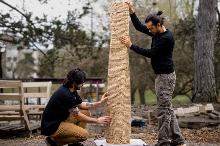
A research team at the University of Michigan has created biodegradable formwork out of sawdust in an attempt to mitigate wood waste in the process of laying concrete.

The wood-based material is a result of the BioMatters project by the Digital Architecture Research and Technologies (DART) Lab at Taubman College of Architecture and Urban Planning.

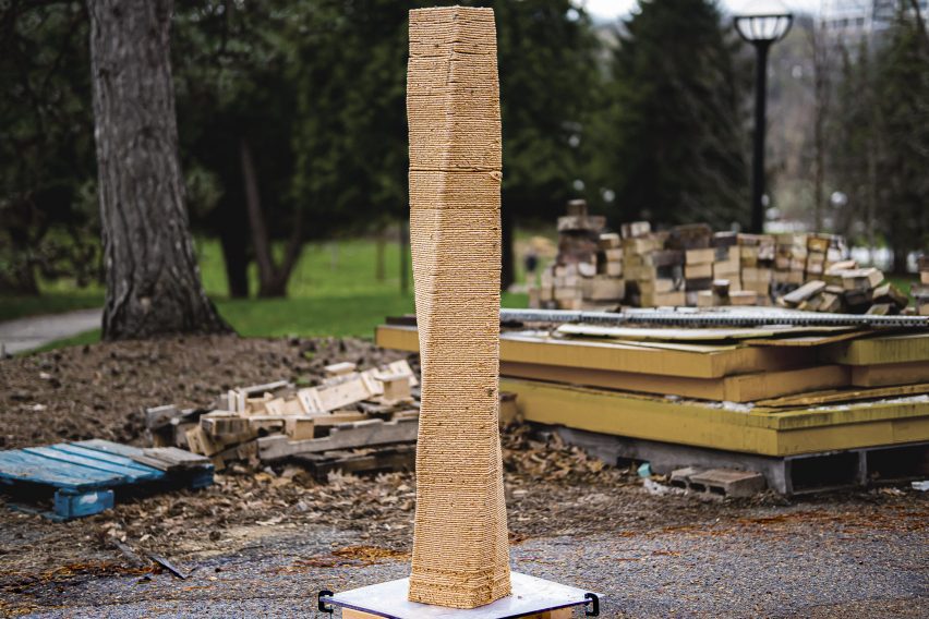
A 3D-printed column made of sawdust
A research team at the University of Michigan has created a sawdust material for concrete formwork

Led by DART director Mania Aghaei Meibodi along with researchers Muhammad Dayyem Khan and Tharanesh Varadharajan, the team sought to create a material to reuse industrial sawdust in order to lessen the waste created by formwork used in concrete construction.

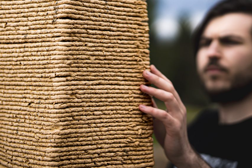
The team mixed sawdust with biopolymers and additives to create its material, which can be moulded or 3D-printed into various shapes. In order to demonstrate its capabilities, the team used the material to create concrete formwork.

Two people hold a 3D-printed sawdust column
The material can be 3D-printed in order to create structural columns

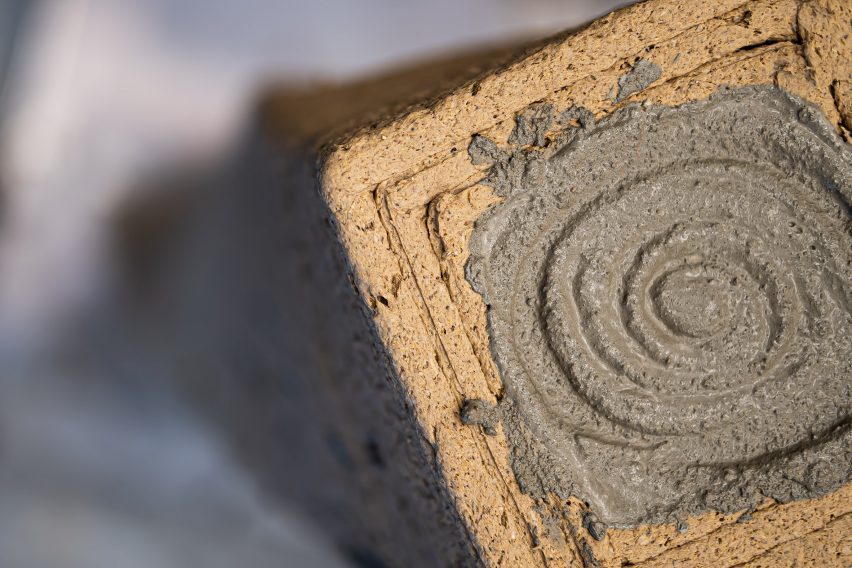
The team 3D-printed a 1.8-metre structural column, pouring concrete into its centre incrementally. After the concrete was dry, the sawdust formwork was peeled off to reveal the column.

The sawdust material was then saved and recycled by adding water in order to recreate the viscosity level required for 3D printing. Using this process, the team successfully reused the same material over 25 times to create additional columns.

Concrete poured into a a column of sawdust casting
The material is created using a mixture of sawdust and biopolymers

According to the team, 15 billion trees are cut down worldwide per year, which results in three million pounds of sawdust dumped into landfills in the United States.

The sawdust may often be burned as an alternative, which can cause environmental pollution.

A column made of sawdust and bio polymers
It can be recycled by adding water

“It’s like a precious material for me because you’re cutting down a tree,” said researcher Muhammad Dayyem Khan. “I think every particle of that tree should be reused if you’re cutting it down.”

According to DART Lab, formwork contributes to up to 40 per cent of concrete construction expenses and is usually constructed from wood. After its use on construction sites, the formwork is often discarded.

The team also plans to experiment with making larger structures with the material.

“For example, some structures can be printed in a big warehouse and then you just turn them back up,” said Khan. “Just rotate them 90 degrees and you’ve got a bigger structure.”

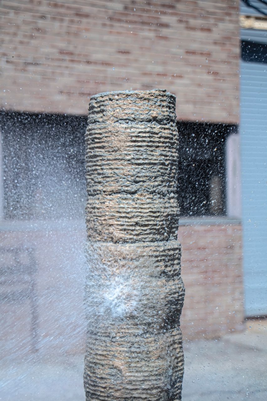
A concrete column getting sprayed with water
The material is used to mitigate waste produced by the concrete industry

While the BioMatters team initially experimented with the material for formwork, it suggested that the potential reaches beyond just concrete construction.

“It can be anything,” said Khan. “It can be small, decorative items. It can be furniture. It can be your walls, doors, windows.”

The material can also be sanded and stained similar to wood in order to create a smoother finish. The team has yet to explore what woods perform best for the material.

For more projects that utilize sawdust, Designer Oh Geon also used it to create a blocky stool while Mater Design utilised the material for a re-released version of the Conscious Chair. 

Photography courtesy of DART Lab. 

Reference

These Terracotta Experts Are Redefining the Architectural Possibilities of an Ancient Material
CategoriesArchitecture

These Terracotta Experts Are Redefining the Architectural Possibilities of an Ancient Material

The One Rendering Challenge is now part of the Architizer Vision Awards, honoring the best architectural photography, film, visualizations, drawings, models and the talented creators behind them. Winners are published in print! Start your entry >

Great architecture marries function with aesthetics. Often, the expression of this negotiation between form and use plays out in materials, the many assemblies and combinations that define what we experience. Terracotta is a clay-based ceramic that can be glazed and has been used throughout history. But it wasn’t until the 19th century that the material began gaining new architectural applications outside roofing. With varying colors and textures depending on the type of clay, terracotta is now produced in a vast array of shapes, styles and varieties.

Shildan has become known for its rainscreens and terracotta products, which bring iconic and energy-efficient building façades to life. With over 300 institutional projects, they specialize in designing and engineering systems for high-performing facades. While a large majority of contemporary terracotta buildings include cultural institutions and arts facilities, the material can also be used in residential and commercial construction. Durable as it is beautiful, Shildan’s terracotta is used in contemporary architecture to redefine building envelopes in both rainscreens and cladding. Each of the following projects explores how Shildan rethinks terracotta and its application in diverse building types.


Mercy Corps Global Headquarters

By Hacker, Portland, OR, United States

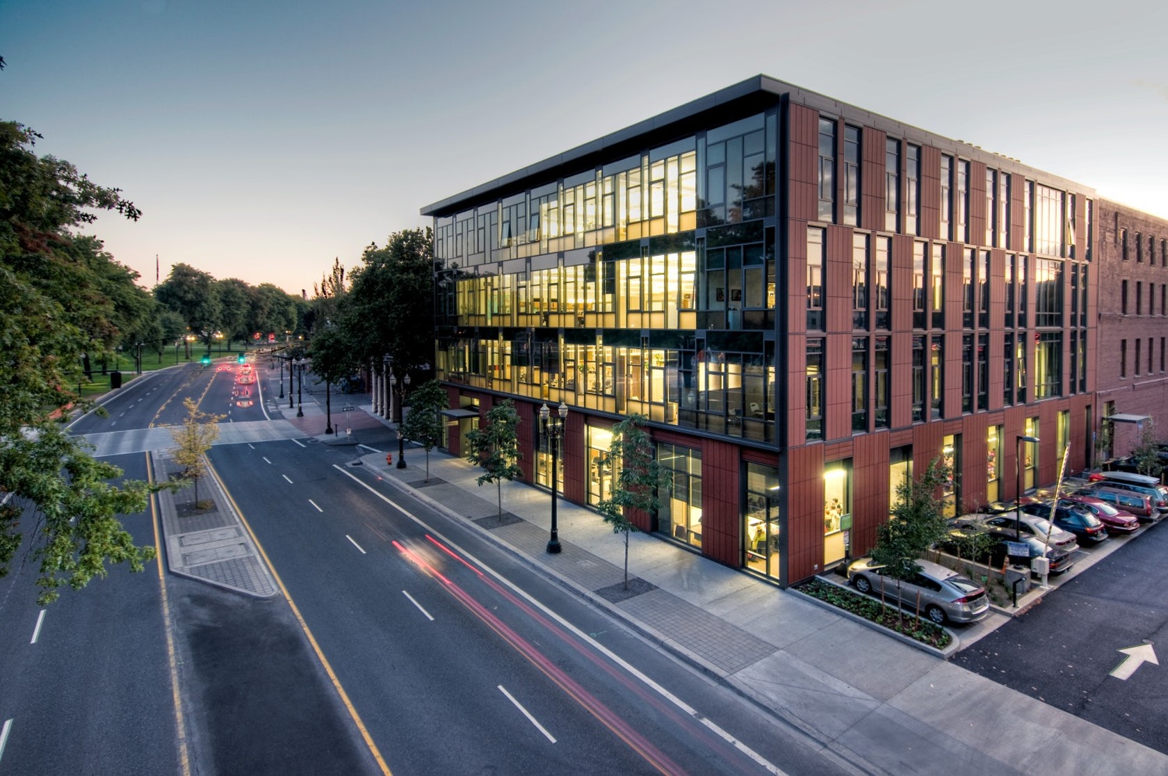
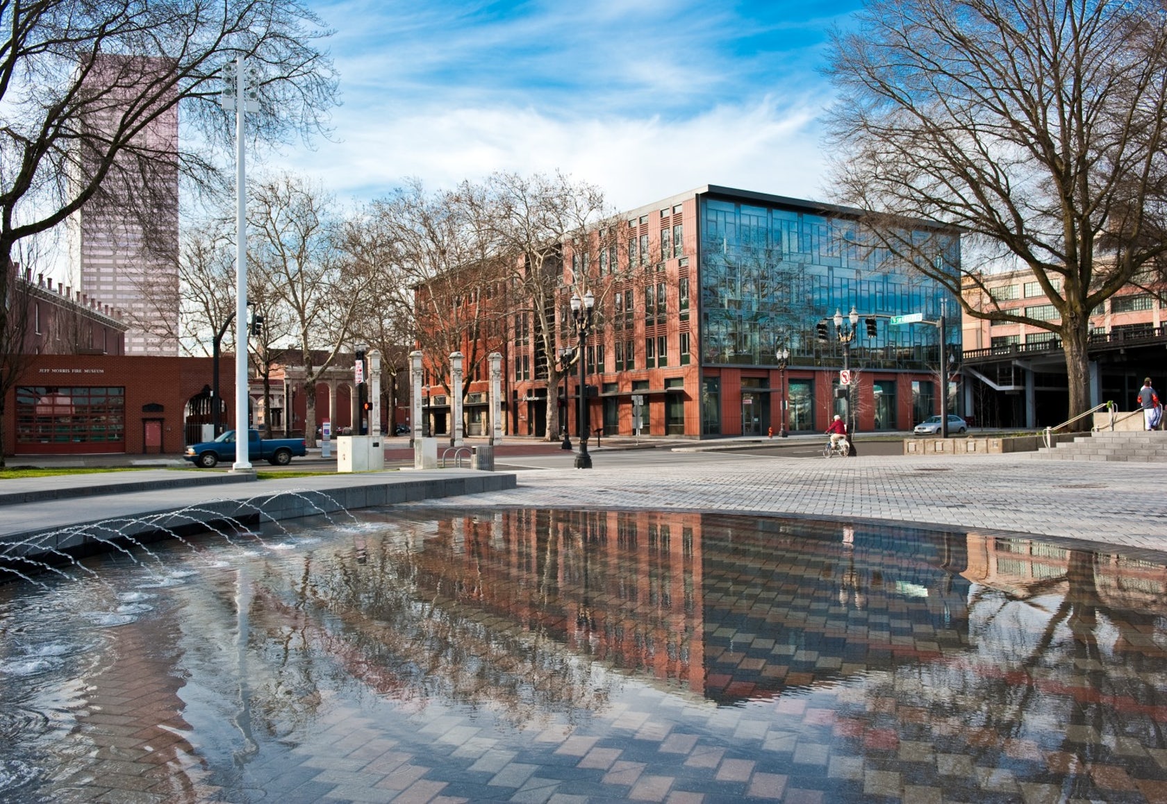
Designed to teach and encourage visitors to engage with contemporary issues, the Mercy Corps building was built to exemplify a sustainable, community-focused approach. Doubling the size of the historic Portland Packer-Scott Building, the landmark project combined a green roof, with resource-friendly landscaping and a glass and terracotta envelope.
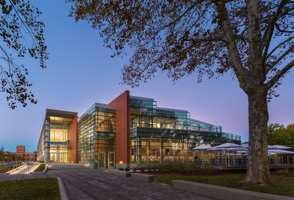
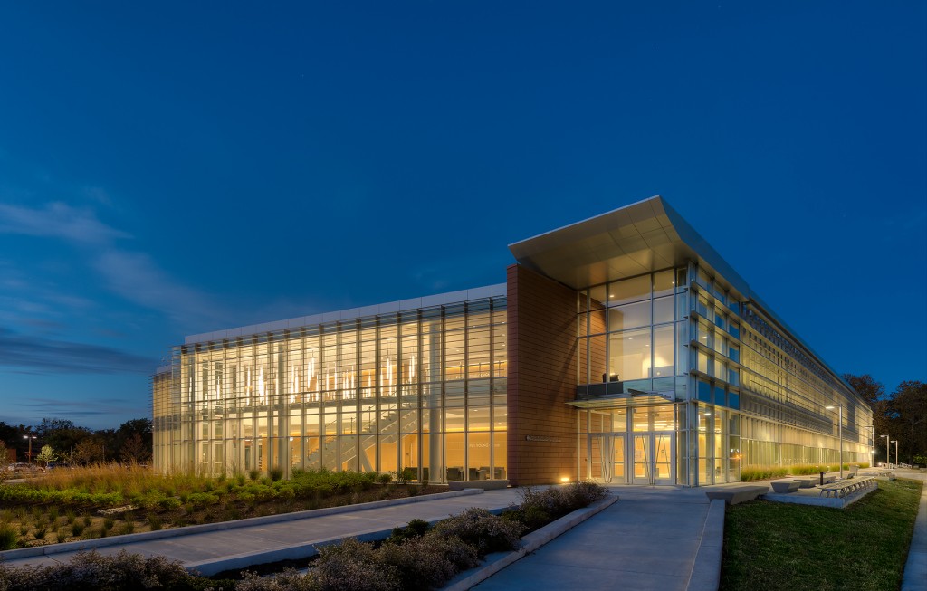
Certified LEED Platinum, the project uses the LONGOTON Terracotta Rainscreen Panels with extruded, double leaf, 1.6 inch (40 mm) panels. The panel has increased strength from a chain of internal I-beam supports. The panels were chosen because of their flexibility in being able to be incorporated in both horizontal and vertical support systems, as well as a flexible orientation in layout. The headquarters also includes the Action Center — a “window to the world” — featuring interactive exhibits that educate visitors about the changing nature of relief and development work.


NASA Langley Research Center – Headquarters Building

By AECOM, Hampton, VA, United States

For NASA’s Langley Research Center, a $23 million, 72,000-square foot administrative office building, AECOM provided full bridging architectural and engineering services for the headquarters. The building is conceptualized as a parallelogram on a triangular site with a two-sided entry at ground level linked by a continuous lobby. The southern entrance plaza links both through the lobby and around the building to the north plaza, which is oriented to the heart of the campus.

The headquarters building was required to achieve LEED-NC Gold certification but achieved LEED-NC Platinum certification, focusing on the reduction of operating and maintenance costs, energy efficiency, comfort for the occupants, and a low environmental impact. The project features the Shildan/Moeding ALPHATON Panel, an extruded, double leaf, 30 mm (1.18”) terracotta panel. The ALPHATON panels can be incorporated in both horizontal and vertical support systems, and they were used in the Langley project to for durability and to denote the change in building form.


NOAA Southwest Fisheries Science Center

By Multistudio, San Diego, CA, United States

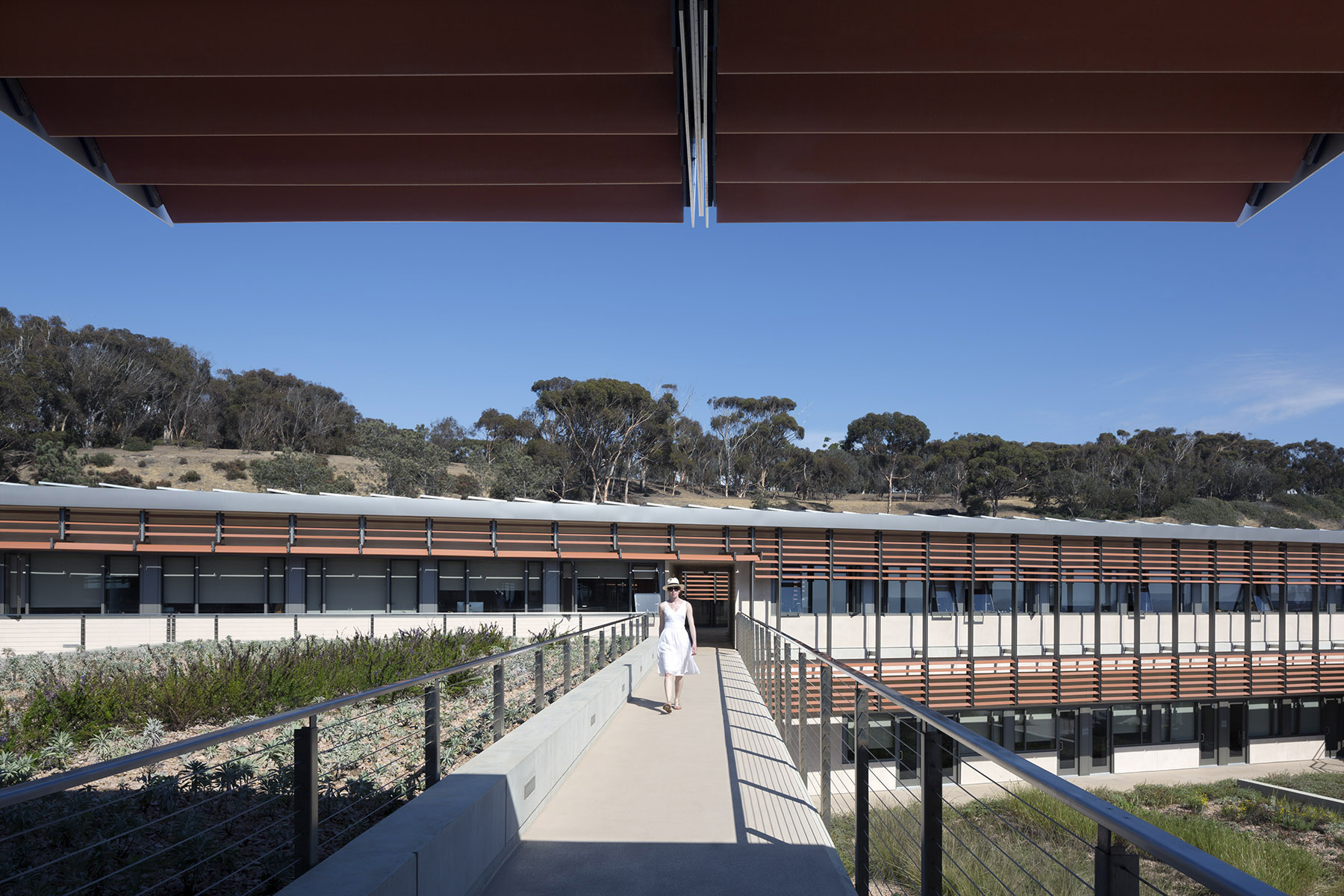
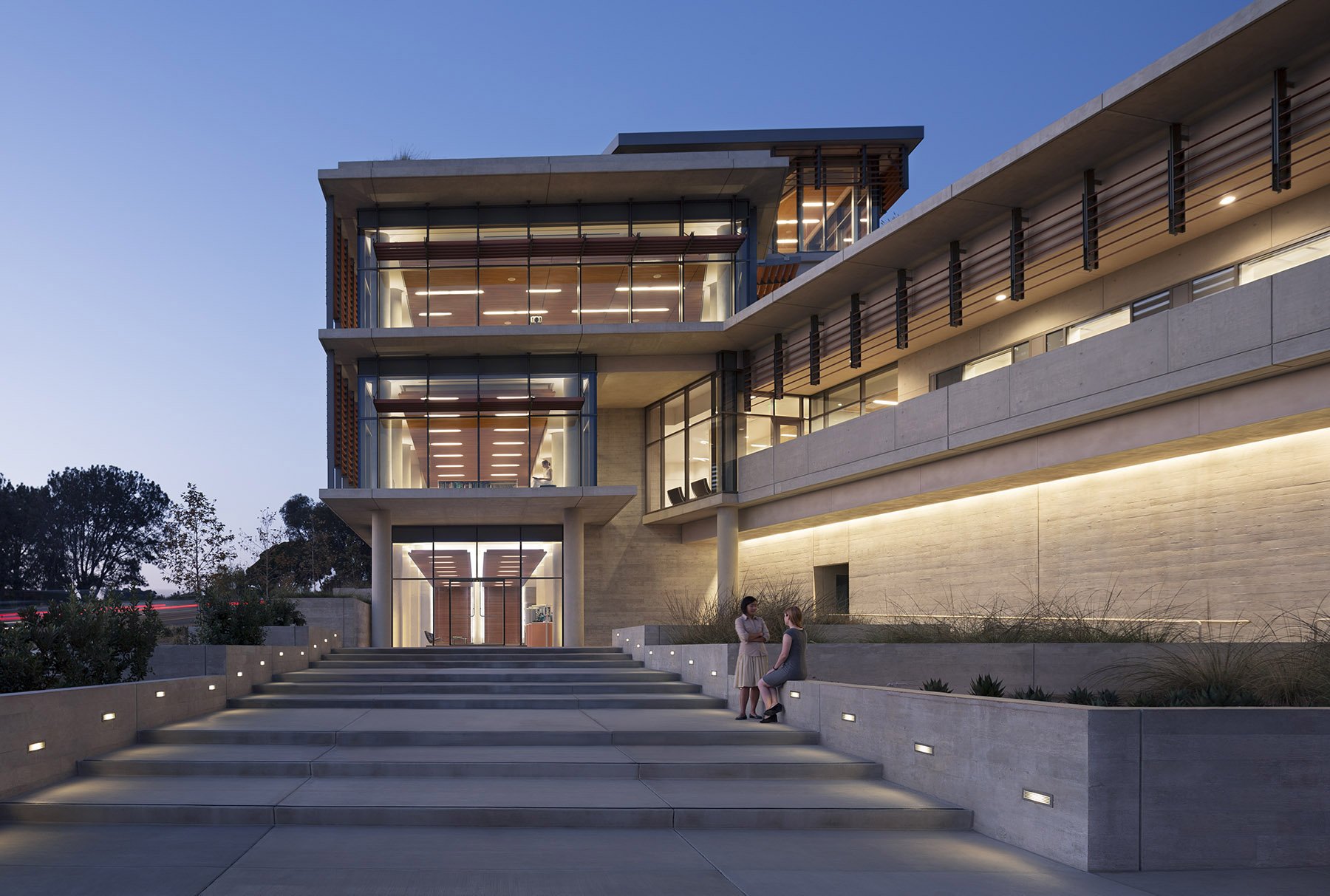
For the design of the National Oceanic and Atmospheric Administration (NOAA)’s Southwest Fisheries building, the team partnered with the University of California San Diego to design a facility that would pay homage to a world-class site and create a sustainable building for environmental stewards of the ocean.
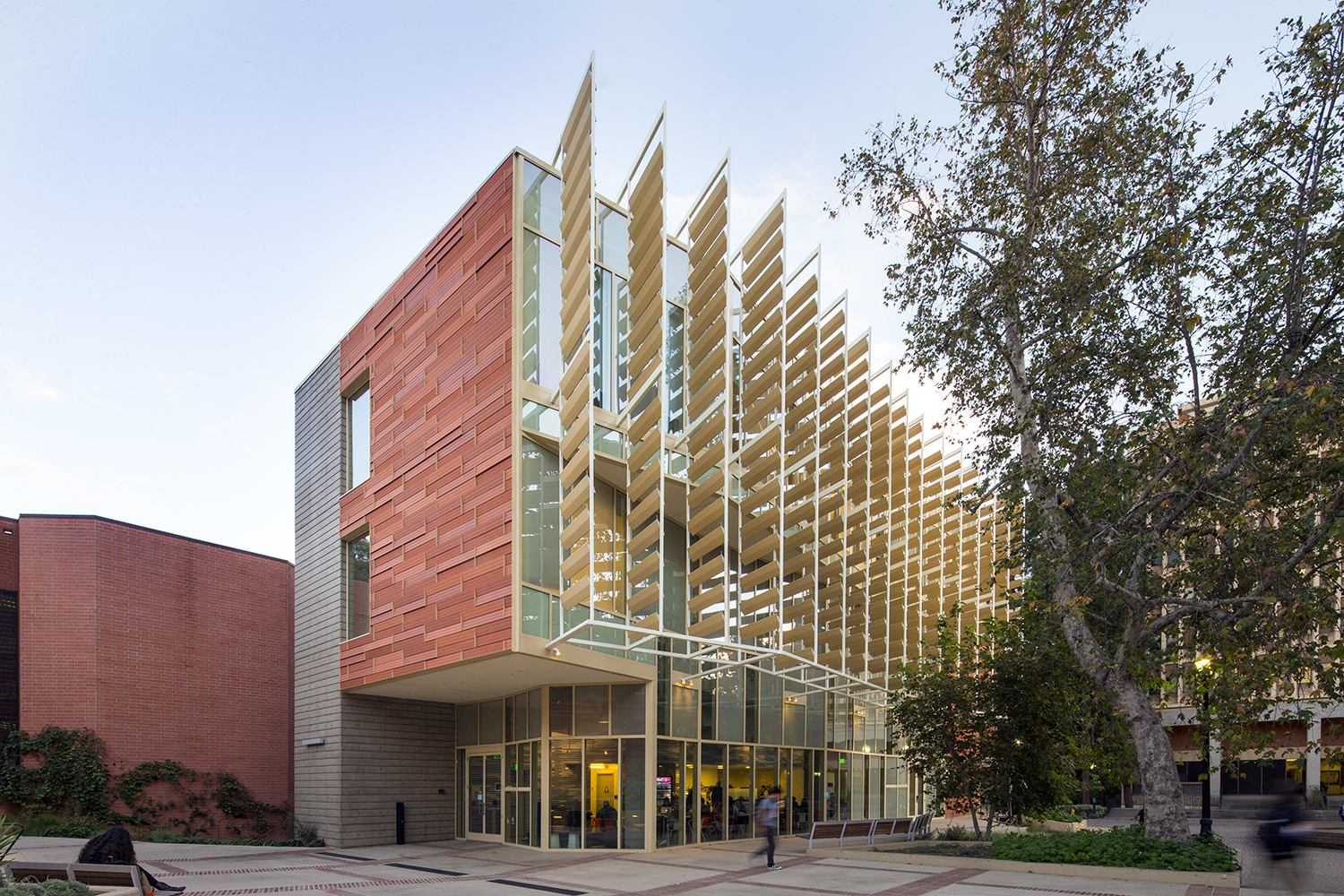
The Southwest Fisheries building takes advantage of the local microclimate while respecting the ever changing needs of the research scientists. The new facility continues the California-style legacy of an open architectural environment, and courtyards encourage interactions among researchers from different disciplines. Terracotta sun shades, green roofs, photo-voltaic panels, and a state-of-the-art 528,000 gallon ocean technology tank help this building rethink scientific building design.


UCLA Evelyn & Mo Ostin Music Center

By Kevin Daly Architects, Los Angeles, CA, United States

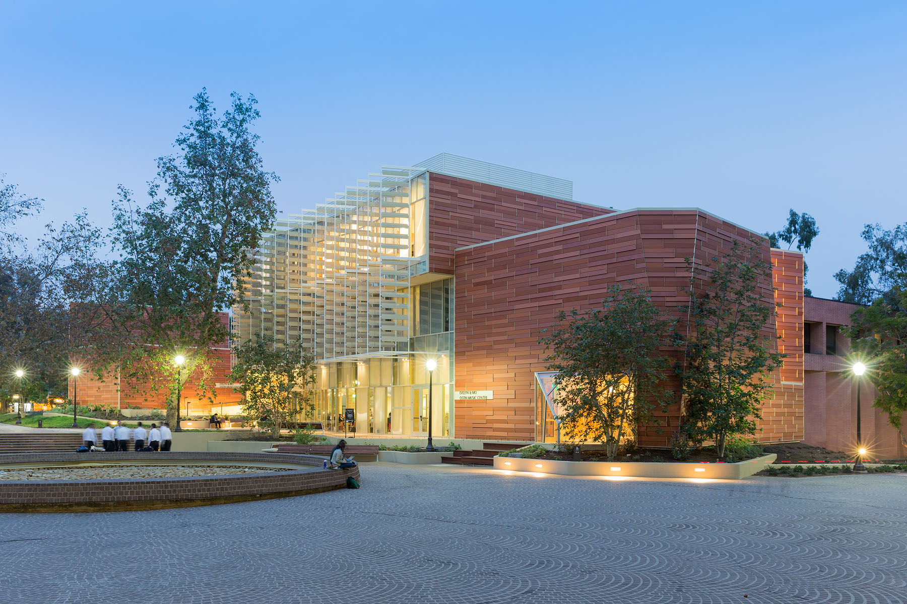
For this music center in Los Angeles ,the project includes a high-tech recording studio, spaces for rehearsal and teaching, a café and social space for students, and an Internet-based music production center. Music industry executive and philanthropist Morris “Mo” Ostin donated $10 million to UCLA for the music facility, now known as the Evelyn and Mo Ostin Music Center. Adjacent to the Schoenberg Music Building and the Inverted Fountain, the new structures provide faculty and students access to the latest advances in music technology, research and technology.
The design utilized Shildan’s Terracotta Baguette Sunscreen to provide subtle variation and add texture to a building. This was combined with the ALPHATON terracotta panel. Kevin Daly Architects utilized these materials and assemblies, as well as proposed a series of additions, subtractions, and modifications to the existing facilities that transformed the building into a dynamic complex that supports a new vision for music education at UCLA.


Lesley University, Lunder Arts Center

By Bruner/Cott & Associates, Inc., MA, United States

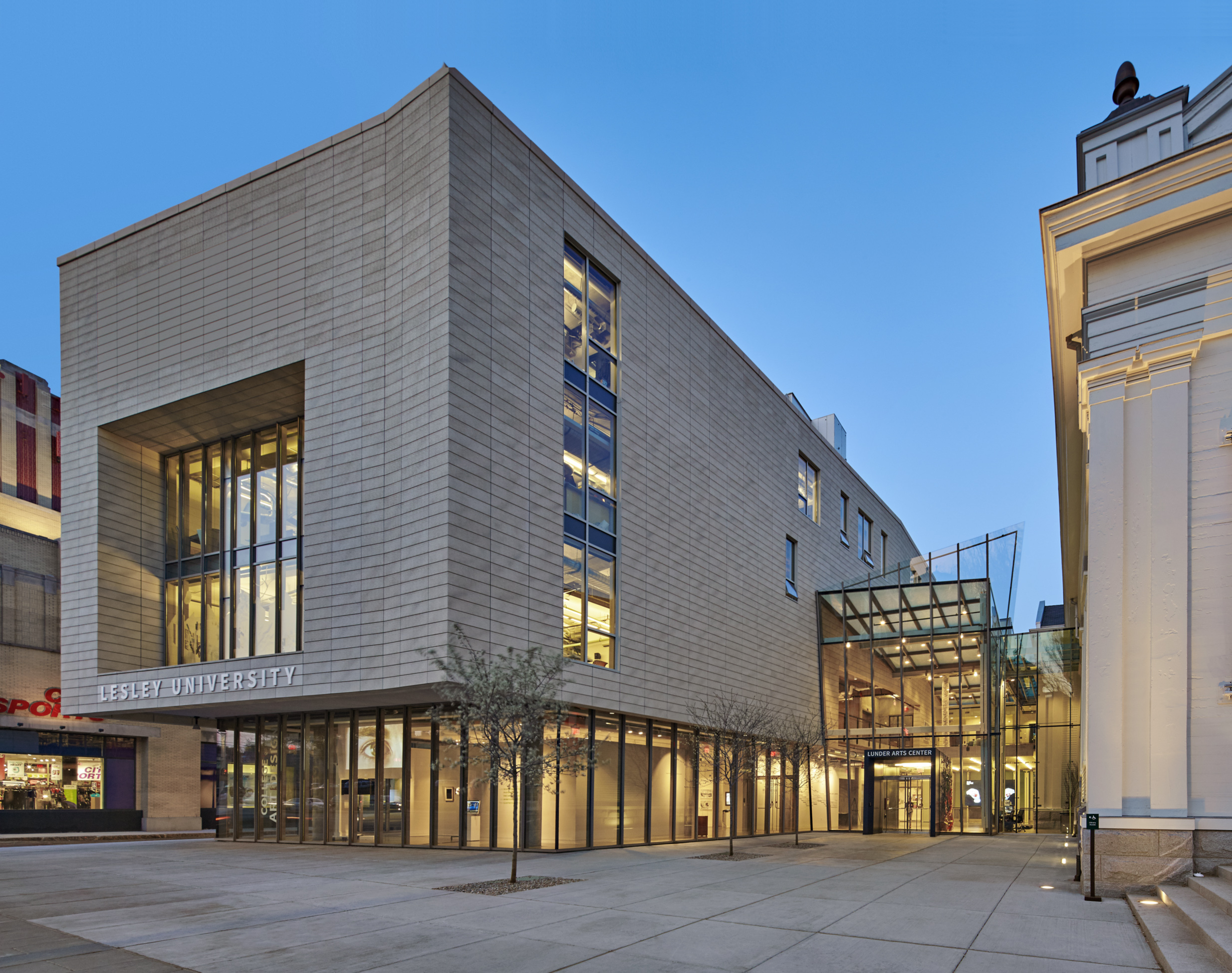
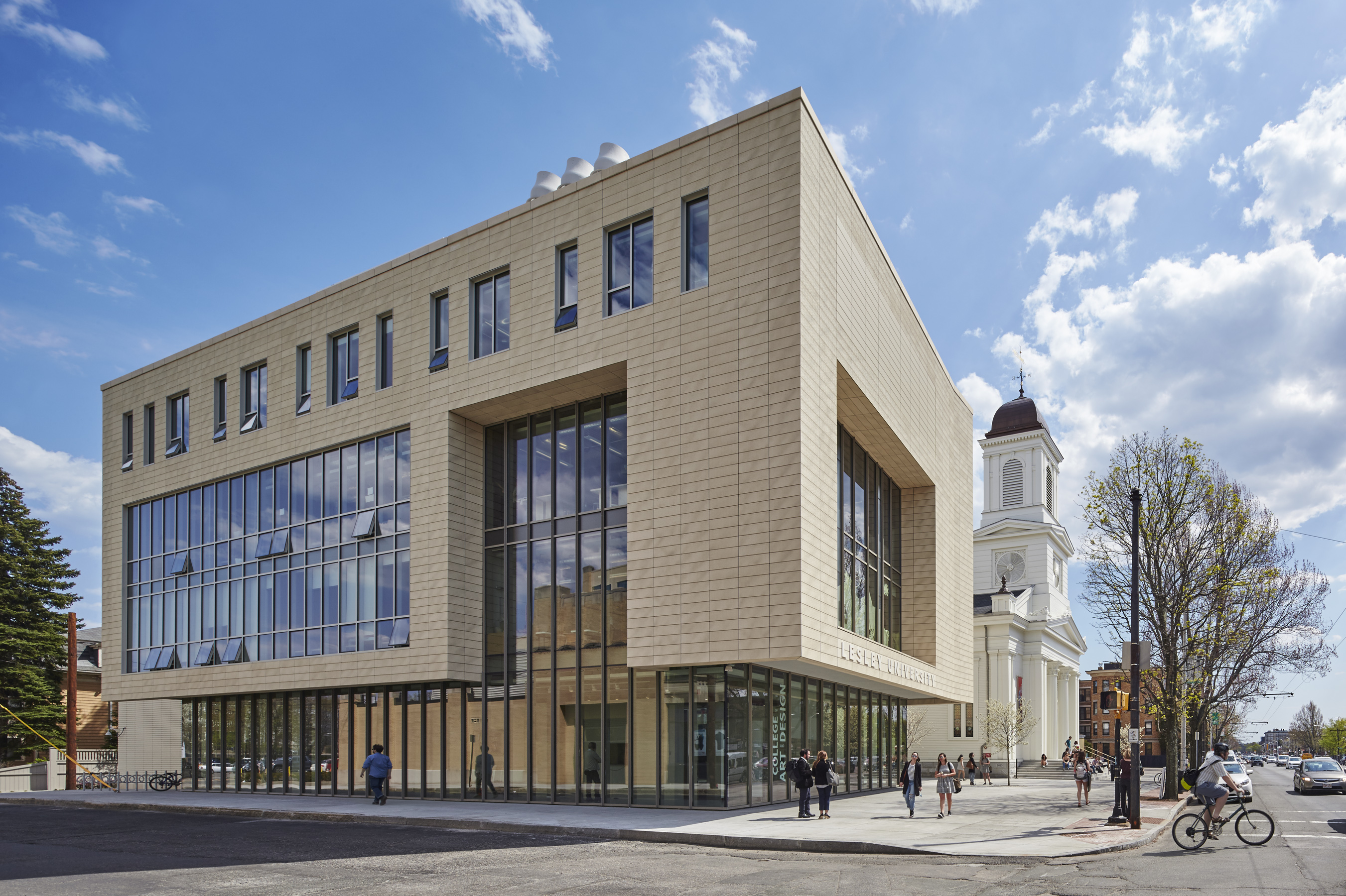
The Lunder Arts Center at Lesley was designed to be the new heart of the College of Art and Design. A center for art teaching and making, the campus is a crossroads for academic, artistic, and neighborhood communities. The terra-cotta and glass design foregrounds the site’s important historic church, initiating a dialog between 19th century religious and 21st century educational icons. An art gallery in the new glass building and a library in the historic church anchor the building at both ends; both are open to the public.
The complex is a transition from Porter Square’s large-scale industrial buildings to the smaller, finer-scaled residences and stores along the avenue. The scale and detail of the historic church inform the new building; terra cotta reflects back neighboring brick and clapboard. Registered for LEED Gold, the complex exceeds Cambridge’s strict new Stretch Energy Code. The project team used both the ALPHATON terracotta panel system, as well as Shildan’s Patinated Terracotta Rainscreen Panels.


Stephen M. Ross School of Business

By Kohn Pedersen Fox Associates, Ann Arbor, MI, United States

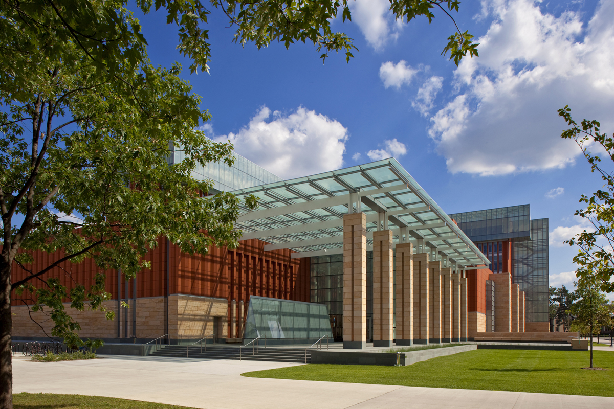
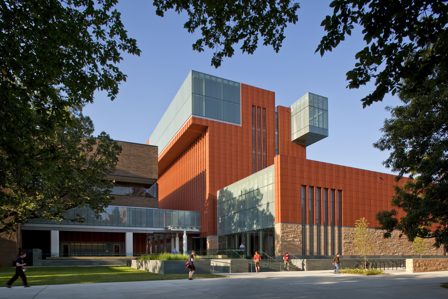
Key to the success of the design of the new Stephen M. Ross School building was relating the typical tiered classroom to group study spaces. To do so, the design team developed a model for early site planning studies to address the pedagogical needs of the school, which focused on assessing the capacity of existing buildings to accommodate new teaching spaces. Equally important was a sense of local identity, both for the building on the university campus and for distinct groups within the school.

Respect for the language and history of nearby buildings on campus had to be balanced with the goal of projecting a forward-looking image for the school. The new building meets these challenges set by the Ross School with an organization of elements around a central winter garden which opens directly to the street, providing a distinctive presence and a new “front door” for the school on the University of Michigan campus. Through both phases, glass, terracotta, and warm sandstone define the material vocabulary of the building. The mixture of textures offers smooth glass that is clear and fritted, machined terracotta, split-faced sandstone and water-jet finished granite to provide a contrast in color, texture and feel. Terracotta is the building’s most prominent material.

The One Rendering Challenge is now part of the Architizer Vision Awards, honoring the best architectural photography, film, visualizations, drawings, models and the talented creators behind them. Winners are published in print! Start your entry >

Reference

An algae-based material for use in personal care products and solar panels
CategoriesSustainable News

An algae-based material for use in personal care products and solar panels

Spotted: Biotechnology has been rapidly gaining momentum in recent years, with manufacturers increasingly turning to the natural world both for its unique qualities and sustainability. One of those manufacturers is Swedish Algae Factory, which uses diatoms – a type of unicellular microscopic algae – to produce its new advanced materials. 

The company’s first products are a skin cleanser called Algica and a protective coating for photovoltaic (PV) panels. The products are manufactured via a sustainable, circular process that uses wastewater from other local businesses as an energy source, with the cleaned water is returned to its partner organisations for reuse. According to the company, producing one kilogramme of Algica helps clean the atmosphere of at least eight kilogrammes of carbon dioxide and one kilogramme of nitrogen. 

The shells of algae diatoms contain silicon dioxide and are extremely efficient at absorbing light and carbon dioxide. By replacing some of the chemicals traditionally used in skincare products, Algica not only reduces the carbon emissions of production, it also makes the products themselves healthier and more effective. In a controlled, double-blind study, external assessors found Algica’s moisturising capability to be the same as hyaluronic acid.  

Because the algae grow in salt as well as wastewater, production processes are accessible to communities without a consistent supply of clean water. By eliminating the need for potable water to grow algae, areas can more easily and quickly engage with new opportunities for economic growth, particularly as Swedish Algae Factory continues to explore additional and improved uses of the plant.  

A recipient of an EU LIFE grant, Swedish Algae Factory also has a project called Life Sunalgae for large-scale industrial production of an algae-based silicon film that blocks UV light. When applied to PV panels, the film slows the degradation of materials while increasing the solar cells’ efficiency in converting light into power. 

Springwise has spotted the versatility of algae being used in a range of innovations in the archive, including in limestone and to power a microprocessor.

Written By: Keely Khoury

Reference

Natural Material Studio designs floor-to-ceiling biotextiles
CategoriesSustainable News

Natural Material Studio designs floor-to-ceiling biotextiles

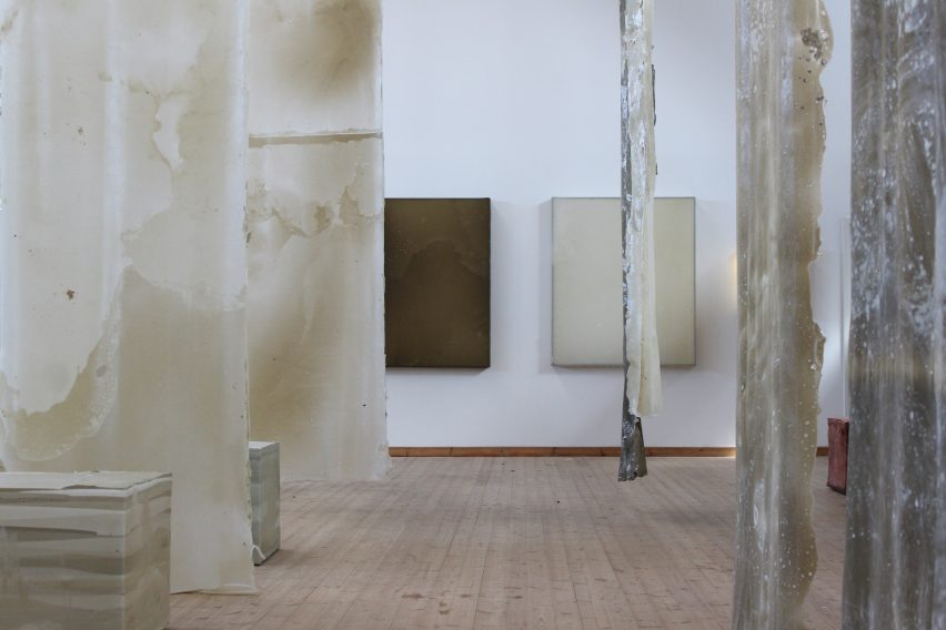
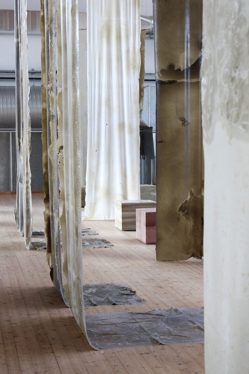
Danish design practice Natural Material Studio has unveiled its Human Nature exhibition, which featured compostable biofoam seating and biomaterial textiles, at 3 Days of Design.

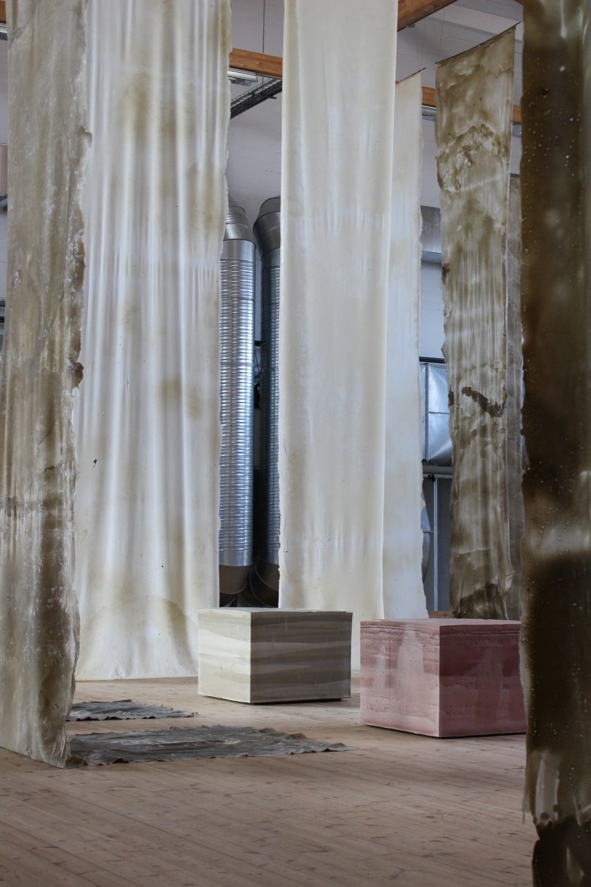
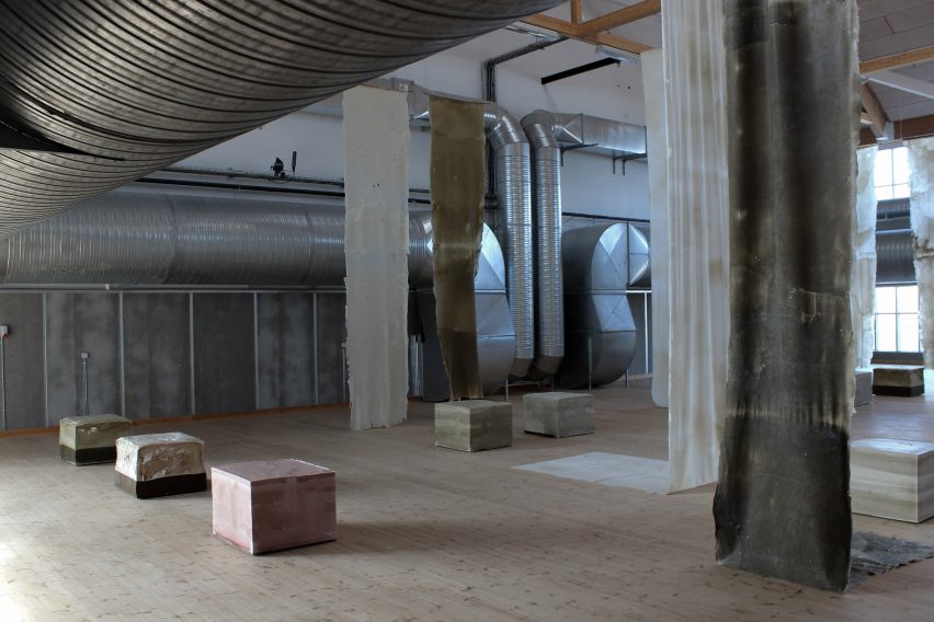
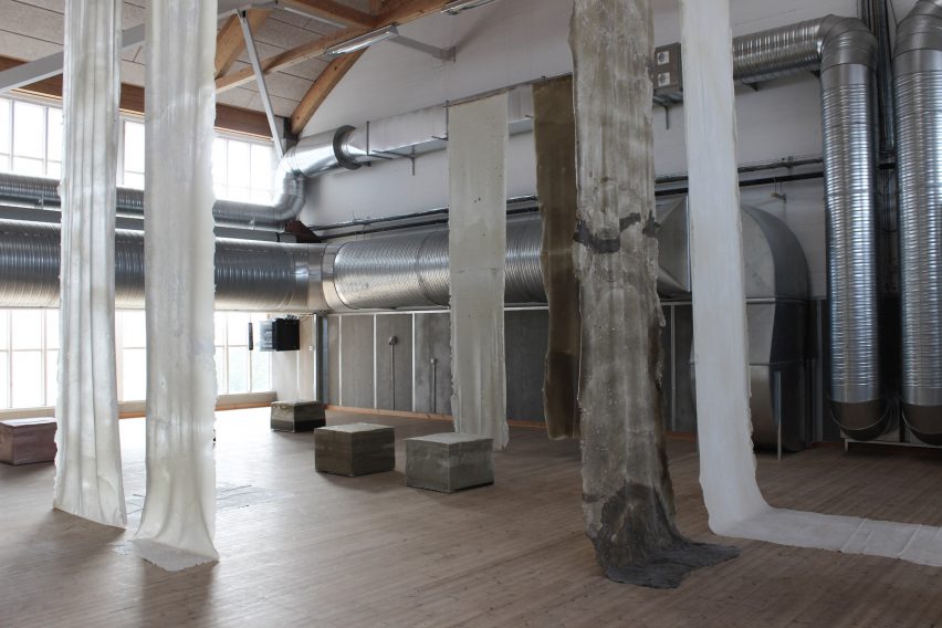
The studio designed the Human Nature installation to take full advantage of the large vaulted space at art gallery Copenhagen Contemporary, hanging handcrafted biotextiles that were up to seven metres long from its ceilings.

“We created a lot of materials for this exhibition, I think around 150 square metres,” Natural Material Studio founder Bonnie Hvillum told Dezeen.

“But what’s been really exciting has been the length and height that we have managed to work with – the textiles are over seven metres long.”

Biomaterials at Human Nature exhibition
Human Nature features metres-long biotextile installations

“It’s something that we are curious about, expanding the scale,” she added. “Spatially, it creates a completely different experience when the textiles come up in the scale and surround us, almost like trees.”

Natural Material Studio uses its own material processes to create its biomaterials. Among the ingredients used for the materials in Human Nature were natural softeners mixed with biopolymers, chalk and clay.

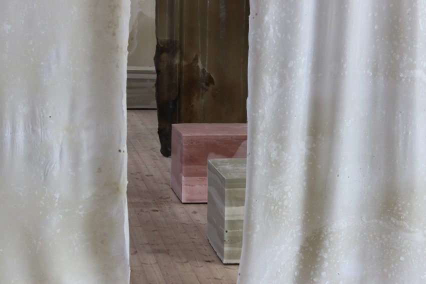
The textiles that were dyed with chalk had a fittingly chalky white hue, while those dyed with clay become greenish.

Chalk-dyed biomaterials by Natural Material Studio
White textiles were dyed with chalk

As part of the exhibition, which was on show during annual design festival 3 Days of Design, Natural Material Studio wanted to showcase how humans and nature interact in the creation of the materials.

To that end, the biotextile pieces were cast in wooden frames to be handled as they were drying, but were otherwise were left to develop naturally.

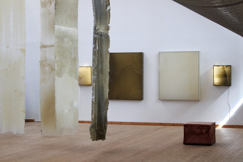
Human Nature also featured sculptural seating designs that were made by casting Natural Material Studio’s self-developed biofoam in a three-dimensional frame, within which it was allowed to shape itself.

The resulting square seats come in a variety of colours, including pinkish ones made by using red clay.

Red-clay biofoam seating at Human Nature
Compostable biofoam forms sculptural seating

The material can be composted at the end of its life and will biodegrade in about a month, according to Hvillum.

“The material is biodegradable – you can give it to your chickens,” Hvillum said. “My chickens eat it, I can’t leave it outside!”

The exhibition also includes lighting works, which were constructed by attaching the biotextiles to a metal frame above an LED light, and which mark the first time Natural Material Studio has created lighting designs.

“For a long time we were trying to bring the materials onto the wall,” Hvillum explained.

“This is basically the material suspended over material frames and then we use a LED light to try to work with them like this.”

Lighting designs by Natural Material Studio
Natural Material Studio designed lights for the first time

Describing the installation as a “spatial art piece”, Natural Material Studio said the idea was also to allow visitors to touch and interact with the biomaterials, which represent years of research and prototyping.

The handcrafted nature of the biomaterial process comes through in the finished design, with the seats and textiles having kept their rough surfaces and textural qualities.

Natural Material Studio at 3 Days of Design
The natural materials were showcased in an industrial setting

The company is currently working with the Danish National Museum, which conducts research into the longevity of materials such as plastic, to look at how the biomaterials will age.

“They have taken in my materials and we’re going to be having a look at how they age over time,” Hvillum said.

“They can speed the process up so that one month is equivalent to 30 years, so we can very easily see what happens with these materials.”

Interiors at Human Nature exhibition at 3 Days of Design
The installation was on show at Copenhagen Contemporary

Hvillum is also interested in how the biomaterials can be “kept alive”.

“With this research project we try to understand how they change over time and what we can do to prolong life, for example, moisturising them,” she said.

“It’s keeping them alive, basically, which is mind-blowing – actually thinking that we need to water them, just like I water my plants because it’s organic material. You give them a little spritz to moisturise them.”

Biotextiles hanging from ceiling
Bioxtextiles surround visitors “like trees”

Hvillum hopes that the Human Nature exhibition will showcase more of the process of working with different materials, as well as what the materials can do.

“I feel like we sometimes as designers want to force the materials into certain things, and I wanted to really be honest about the process and about what the materials actually do,” she said.

“I think it works quite well as an installation to come in and really start living with these materials, experiencing them and slowly start building these relations.”

Other projects on show at 3 Days of Design include a farmers market inside the Frama store in an old apothecary and an exhibition of emerging designers inside a woodworking factory.

Human Nature was on show from 7 to 9 June 2023 as part of 3 Days of Design. See Dezeen Events Guide for information about the event, plus a list of other architecture and design events taking place around the world.

Reference