mwworks hides longbranch house in the pacific northwest woods
CategoriesArchitecture

mwworks hides longbranch house in the pacific northwest woods

longbranch house: Architecture Embracing Nature


The Key Peninsula in Washington state sees a transformation on a once-neglected plot of land with this Longbranch House by architecture studio mwworks. Previously marred by a series of retaining walls and an outdated home, the site has been given a new lease on life with the clients’ long-standing love for the area. Having frequented a nearby beach cabin for thirty-five years, they dreamt of a new home that would accommodate their family, foster dogs, horses, and visiting loved ones. But their vision extended beyond simple construction — they desired a dwelling that harmonizes with the surrounding landscape.
mwworks longbranch houseimages © Andrew Pogue


mwworks opens the home onto the forest


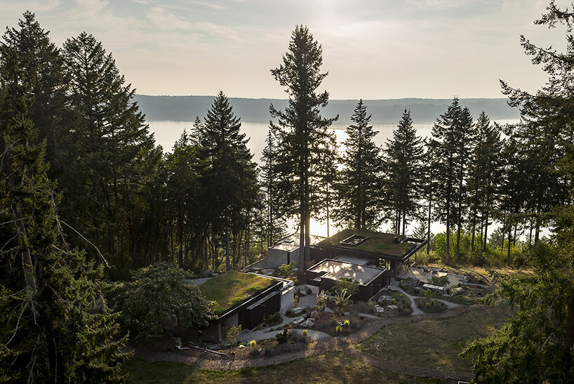
Following this vision, mwworks created a home that is anything but ostentatious. Approaching from the road, visitors are greeted by a gravel driveway that winds past an unassuming barn. The house itself remains concealed until the very last moment. Only a glimpse of its planted roof peeks through the rolling hills, mimicking the natural meadow and creating a sense of continuity. This subtle design prioritizes the landscape, allowing the natural world to take center stage.


The architects took great care to ensure minimal disruption to the existing environment. Towering fir trees were incorporated into the design, acting as grand pillars at the entrance. The building itself rests on carefully positioned pin piles and grade beams, allowing the roots of these giants to flourish undisturbed. A bridge leading into the house further opens the interiors onto the forests and views beyond, emphasizing the intended harmony.
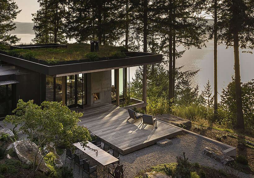
mwworks longbranch house
the Longbranch House by mwworks replaces an outdated home on a neglected plot in Key Peninsula


a contemporary frame for nature beyond


Stepping inside the Longbranch House is akin to stepping into a framed landscape vista. The open floor plan offers unobstructed views of the surrounding meadows and the Case Inlet beyond. Each room is designed to foster a unique connection with the outdoors, ranging from intimate nooks to expansive living spaces. The materials used throughout the house echo the natural surroundings. The main structure is cast from a rough concrete mix, mirroring the fluidity of the landscape. This contrasts with the dark-stained cedar cladding in private areas, while exposed Douglas Fir beams create a pavilion-like feel in the living space. Large windows are delicately framed, minimizing their visual impact and emphasizing the honest construction methods.
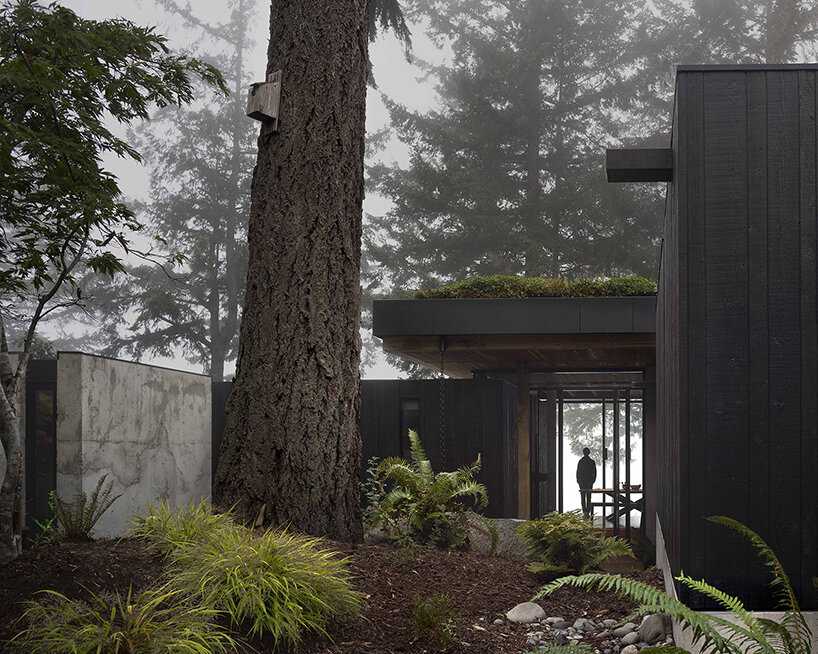
mwworks hides this longbranch house among the pacific northwest woods
designed for a family and their animals, the house prioritizes integration with the surrounding landscape


With the completion of the Longbranch House, the once-fragmented land has been brought back together. The forest and meadow now embrace the dwelling, creating a calming retreat in the woods. The use of natural materials and attention to detail further enhance the sense of timelessness. This way, the home exemplifies a successful relationship between built space and the beauty of the natural world.
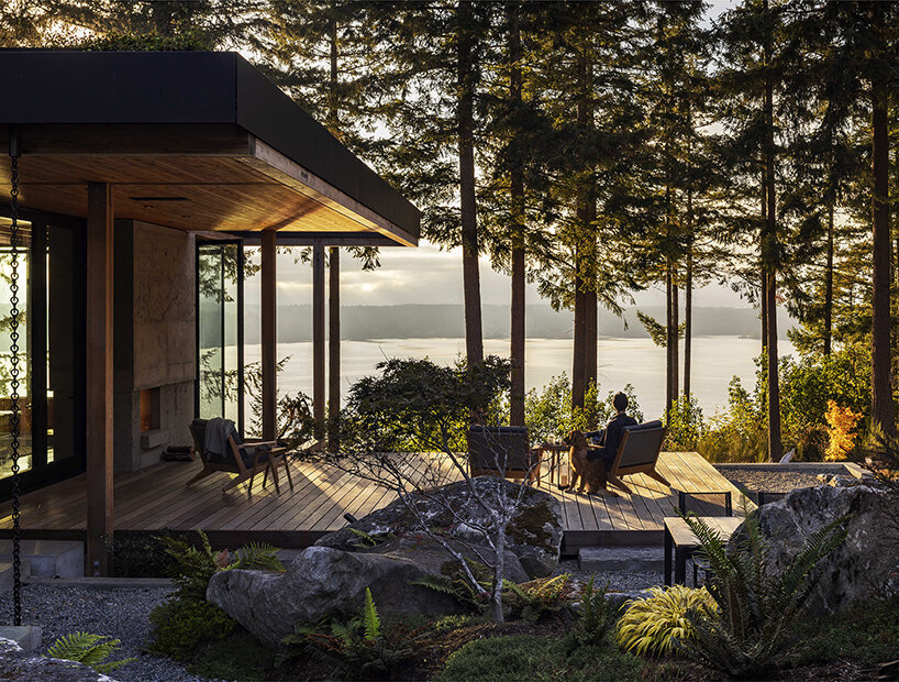
mwworks longbranch house
a gravel driveway leads past a barn, revealing only glimpses of the house that blends with the meadow mwworks hides this longbranch house among the pacific northwest woods
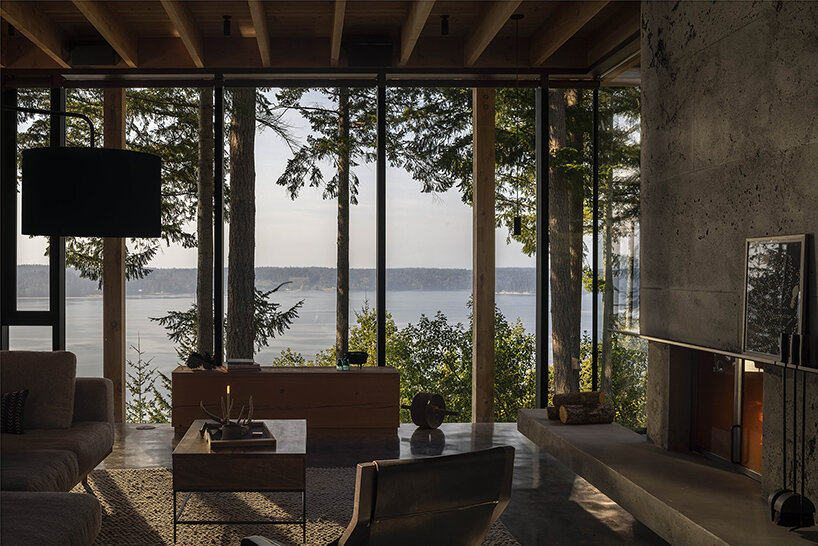
towering fir trees are prominent features, with the house built around them to minimize disruption

Reference

Studio Gang nestles Kresge College expansion in Pacific forest
CategoriesArchitecture

Studio Gang nestles Kresge College expansion in Pacific forest

Chicago architecture firm Studio Gang has expanded a California college through the addition of mass-timber structures that were informed by how fungi grow in the wild.

Kresge College is a part of the University of California, Santa Cruz. Most of its campus was originally designed by American architects Charles Moore and William Turnbull in the early 1970s.

White topped roofs of buildings in California forestWhite topped roofs of buildings in California forest
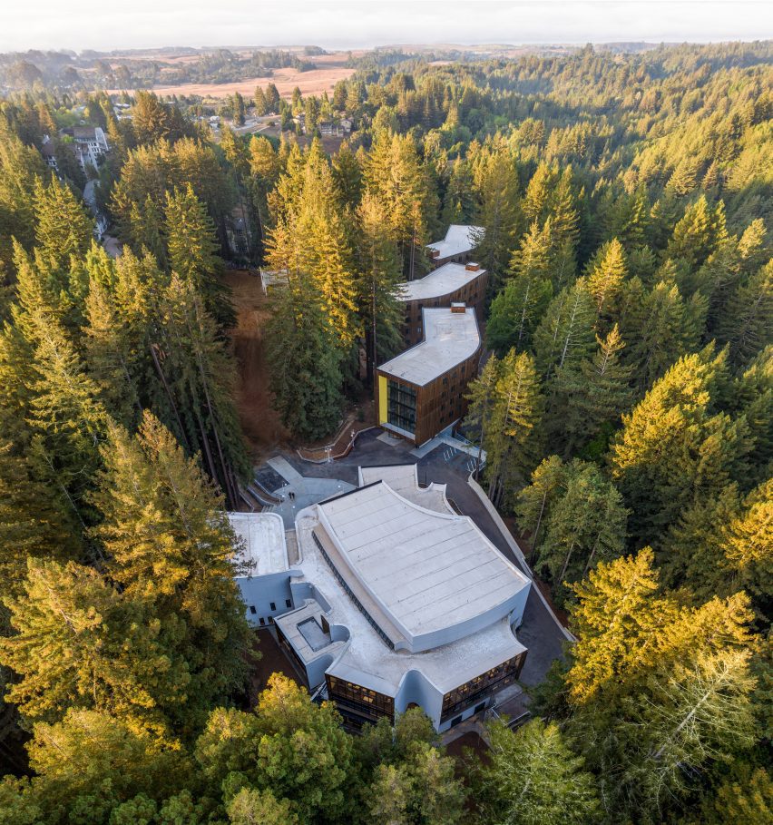
Studio Gang has created an expansion of Kresge College in California

Studio Gang was tasked with expanding the footprint of the project along the northwest extent of its property, nestled in a lush Pacific forest.

Four buildings were designed to complement the existing structures – California modern-style buildings with stucco walls and splashes of colour – and the woodland environment. All of the buildings feature concrete podiums, which support load-bearing timber walls.

Glass window back lit with trees in the forestGlass window back lit with trees in the forest
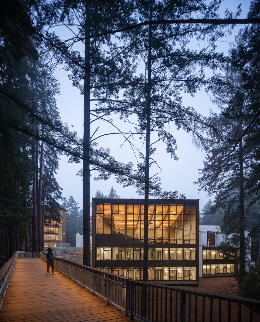
The expansion includes four structures with mass-timber elements

“Our goal was to add new qualities to the sense of place offered by Moore and Turnbull’s design, rather than to replicate the architecture,” said studio founding principal Jeanne Gang.

“We wanted our expansion to retain the qualities of surprise and free-spiritedness that have defined Kresge College, while at the same time opening it up to students of all abilities, the incredible natural ecology of its site, and the larger university community beyond.”

The expansion’s centrepiece is an academic centre with a series of protrusions that jut out asymmetrically from a core. Three simple, bow-shaped structures were placed to its southeast to house students.

Timber facing Timber facing
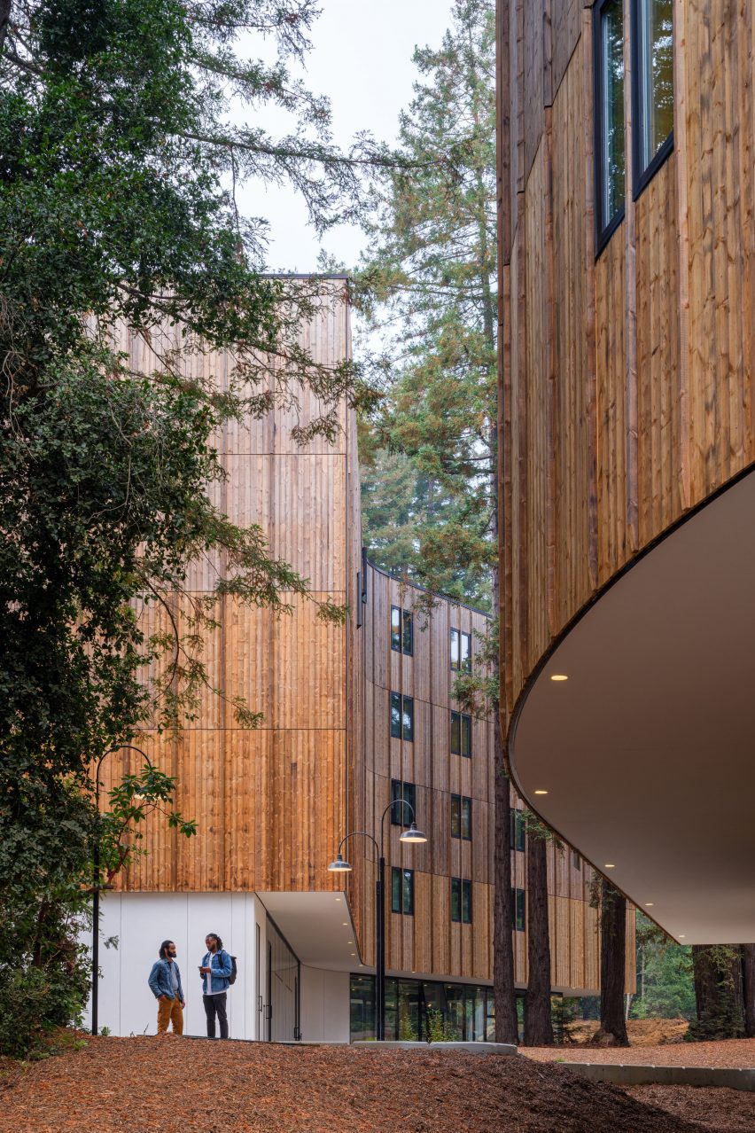
The residential buildings were clad in timber

The Kresge College Academic Center sits on an uneven site next to a steep ravine. To navigate this site, the studio used methods it said were inspired by the growth patterns of polypore fungi, by simultaneously “stepping down the slope and flaring out”.

The centre’s flared form was clad in a metal curtain wall, rendered in a light colour to reflect the mid-century buildings, while the faces of each protrusion feature floor-to-ceiling glass trimmed with timber.

Wooden buildings among the treesWooden buildings among the trees
The residential buildings have a bow-form to preserve trees

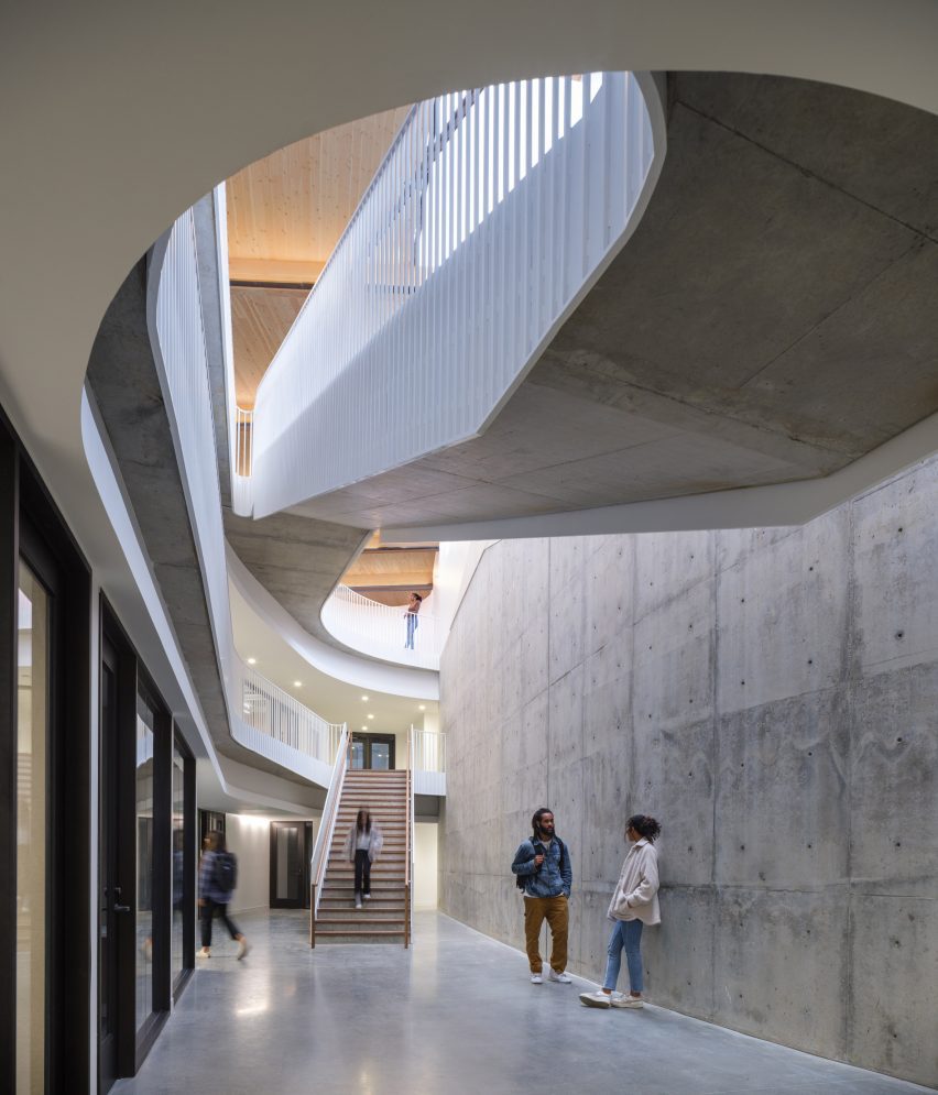
At the centre is a large lecture hall, surrounded by a triple-space atrium with smooth concrete hallways and elevated walkways that connect to the four protruding spaces.

These hold classrooms and utilise the slope with three storeys that line up with the two-storey central structure.

The largest of these protrusions features a smaller lecture hall on the top level, with a roof that slopes up and out in a sizeable lip.

Three storey atriumThree storey atrium
The academic centre has a three-storey atrium

The smaller residential buildings are all bow-shaped, a move the studio said was implemented to preserve as much of the redwood tree groves on the site as possible.

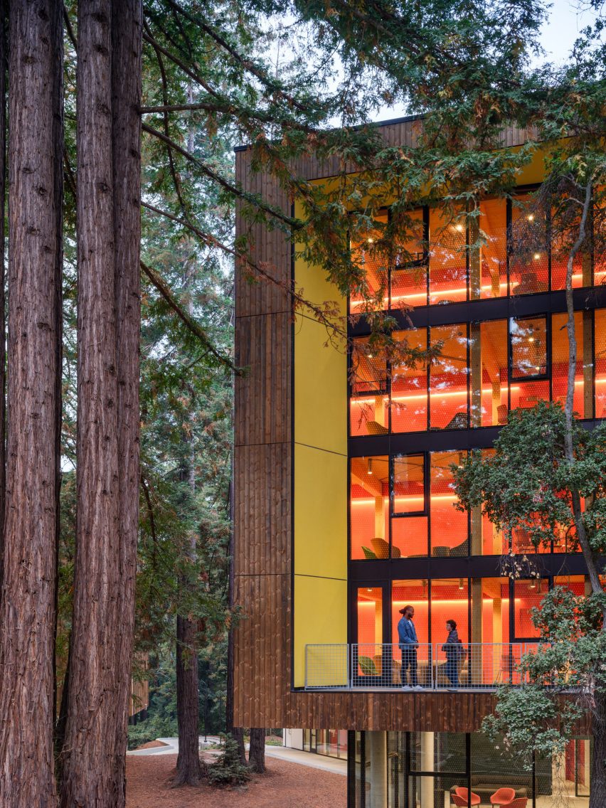
These buildings are five storeys tall and have a central core set back from the wood-clad exterior, with large window boxes on each end that create sheltered patios on the second storey.

The recesses between the window and the facade were painted bright yellow, which resonates with the colours used in the Moore and Turnbull designs.

Like the academic centre, these structures have concrete podiums with load-bearing timber walls. However, cross-laminated ceilings were included and in many places, these elements were left exposed.

The bottom floors of these residential structures were left open for social spaces and amenities, while the top floors hold habitations: about 100 students can live in each structure.

Mass timber student centerMass timber student center
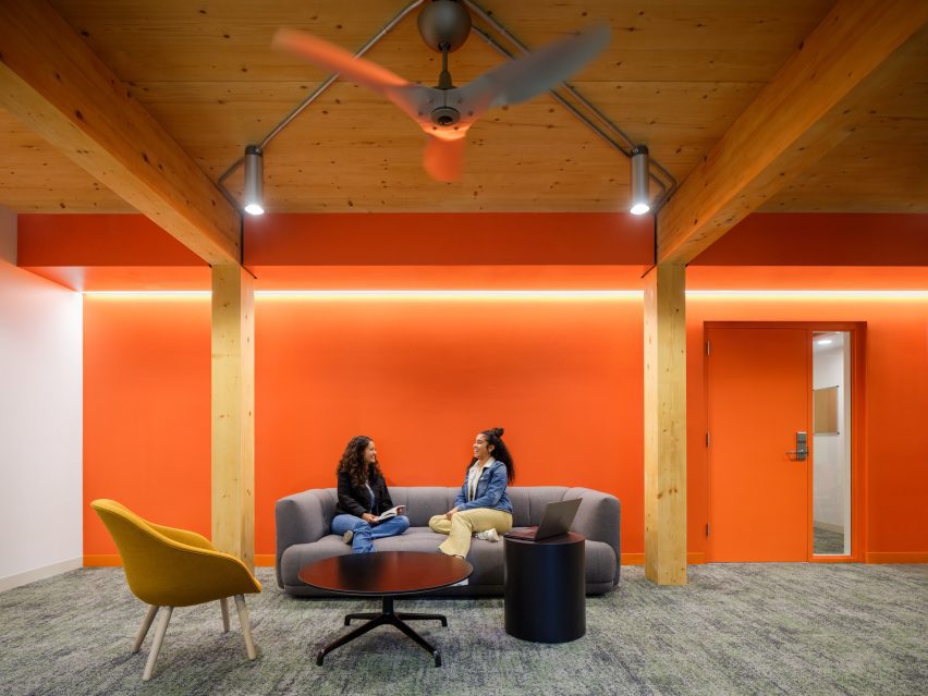
Mass-timber elements were left exposed

Studio Gang also made interventions in the landscape, restoring and expanding the paths already connecting the campus and a long pedestrian bridge that crosses the ravine next to the academic centre. It also added a square at the building’s primary entry.

Studio Gang has completed a number of high-profile projects this year, including museum expansions in Arkansas and New York City. Kresge College is part of the studio’s move towards using more mass timber, and it has been selected to complete a theatre using this material in the Hudson Valley.

The photography is by Jason O’Rear.


Project credits: 

Design architect and architect of record: Studio Gang
Contractor: Swinterton
Expansion plan associate architect: TEF Design
Interior designer: Studio Gang
Structural engineer: Magnusson Klemencic Associates
Structural engineer: MME Civil + Structural Engineering
Landscape architect: Joni L Janecki and Associates Landscape Architects
Landscape architect: Office of Cheryl Barton
Civil engineer: Sherwood Design Engineers
MEPFP: Introba
Sustainability consultant: Atelier Ten
Lighting consultant: Horton Lees Brogden Lighting Design
Acoustic consultant: Salter
Envelope consultant: Simpson Gumpertz & Heger
Wayfinding and graphics: Cheng+Snyder
Code consultant: Holmes Fire
Quantity surveyor: Directional Logic
Accessibility consultant: Jensen Hughes
Elevator consultant: Elevator Consulting Associates
Technology consultant: TEECOM
Theater consultant (for Kresge College Academic Center): The Shalleck Collaborative
Food service consultant (for residential buildings): Ricca Design Studios

Reference

Luchetti Krelle brings laid-back luxury to social spaces of Manly Pacific
CategoriesInterior Design

Luchetti Krelle brings laid-back luxury to social spaces of Manly Pacific

Spicy shades of turmeric, cinnamon and ginger feature alongside mosaic tiles and hand-painted murals in the public spaces of this hotel in Sydney, following a makeover from local studio Luchetti Krelle.

The renovation encompassed Manly Pacific‘s lobby as well as its 55 North bar and a few neighbouring lounge areas, all located on the hotel’s ground floor, which opens directly onto Manly Beach.

Lobby of Manly Pacific hotel
Luchetti Krelle has overhauled the lobby of Sydney’s Manly Pacific hotel

In the reception area, Luchetti Krelle created an intimate lounge setting to bring a sense of warmth and welcome into the otherwise vast white space while creating a link to the more richly decorated drinking spaces beyond.

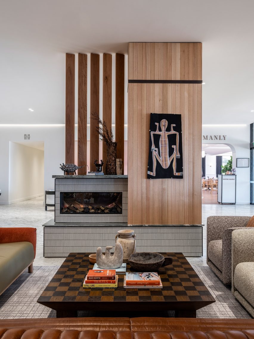
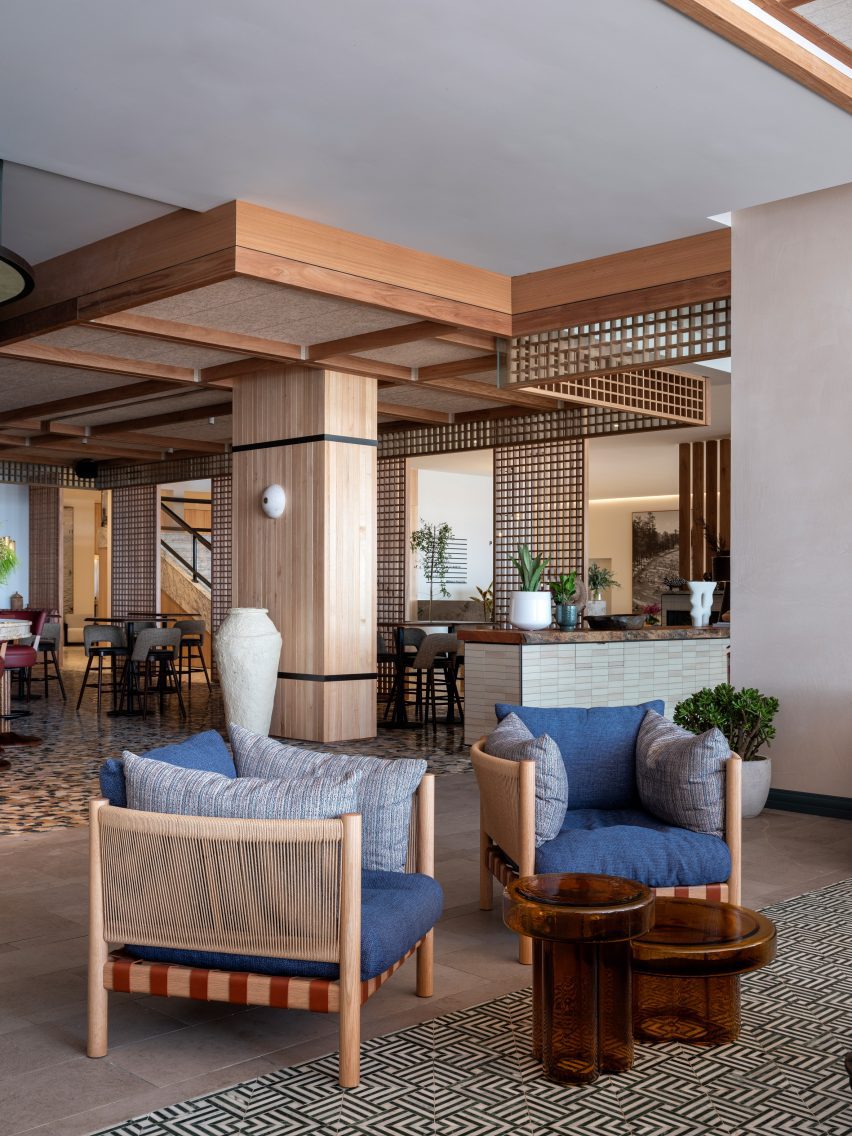
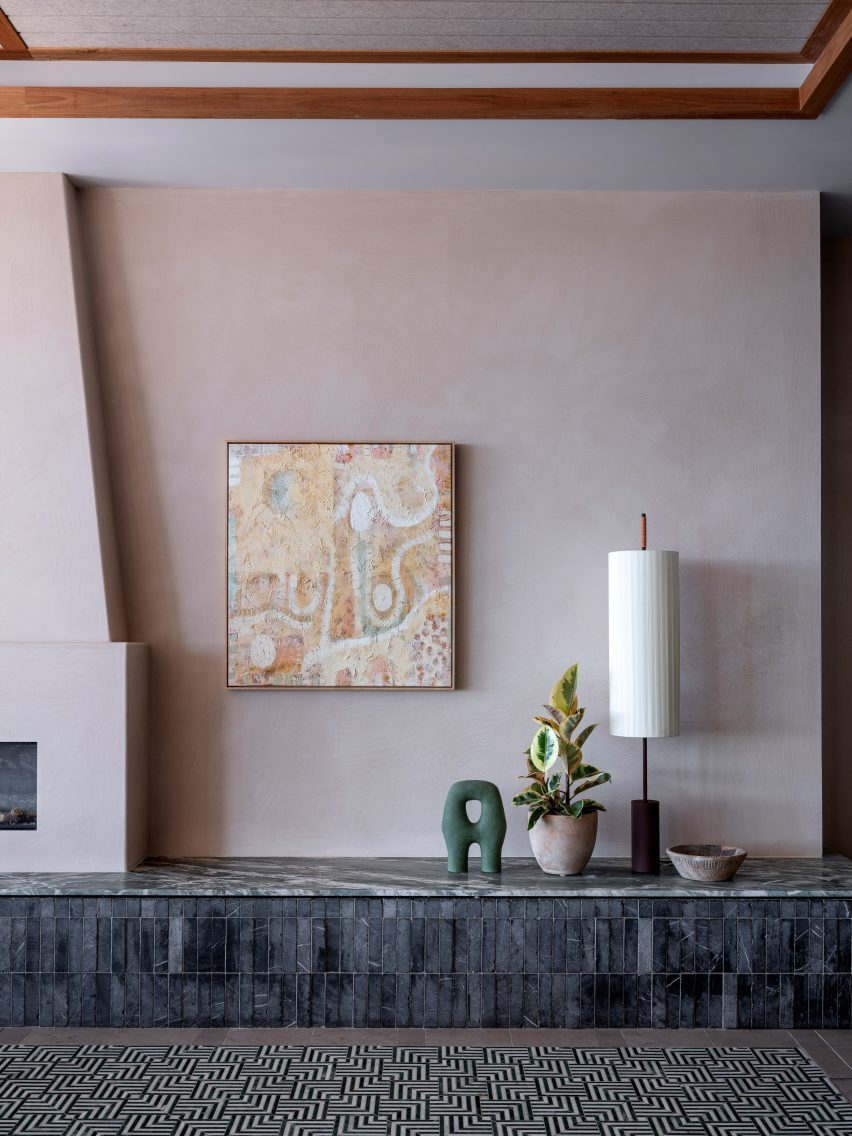
Tactile sofas and clubby armchairs are clustered around a chequerboard table looking onto a fireplace that mixes tile and timber in a mid-century-influenced design.

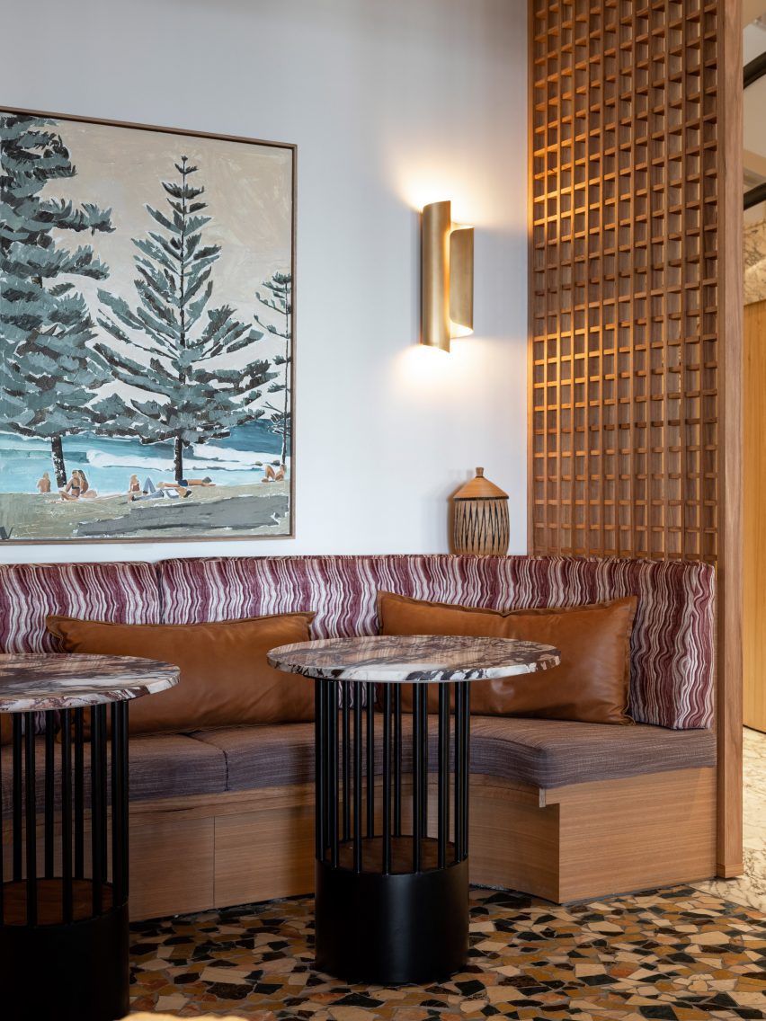
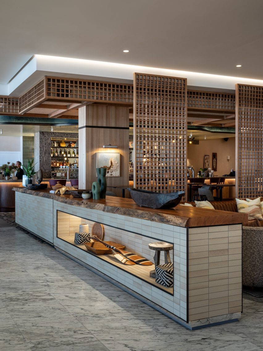
Latticed screens create a loose separation between Manly Pacific’s reception and the adjoining bar area, which introduces a richer palette of colours and materials to forge a sense of laid-back luxury.

55 North bar by Luchetti Krelle
The studio also renovated the adjoining bar

“A loose luxury defines our approach to the reappointment of the bar and neighbouring lounge areas,” Luchetti Krelle said.

“Layered textures, spiced tonal triggers and punchy patterns were selected to energise the drinking spaces with a graceful attitude that prioritised home comfort.”

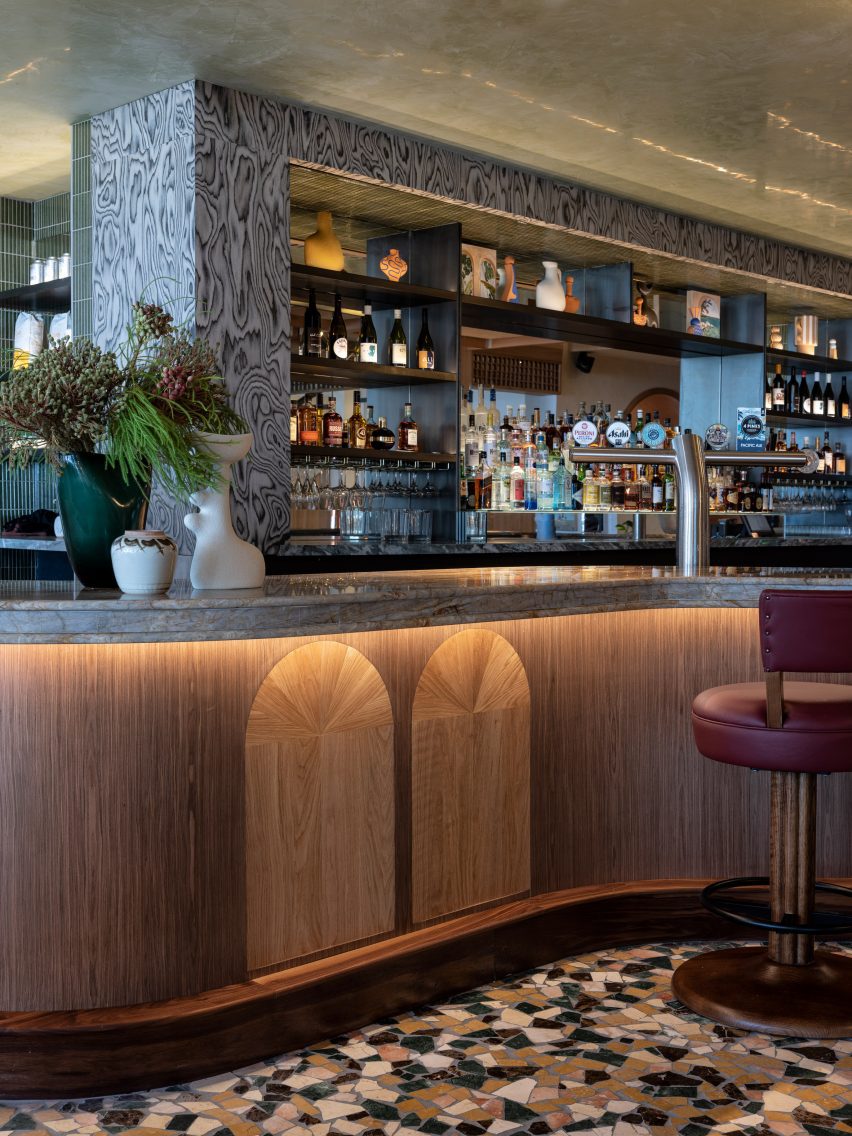
55 North is centred on an impressive island bar that curves outwards into the room to create a sense of welcome.

Counter of Manly Pacific hotel bar
Crazy paving in autumnal hues defines the bar area

The bar’s outlines are mirrored by the lines of the bulkhead ceiling above, creating a shape reminiscent of a clamshell that draws the eye across the room and brings a cosy intimacy to the bar area.

“Hospitality design is about making people feel welcome, relaxed and confident so less noticeable elements drove our process,” the studio said.

“We lowered the bar’s original height so smaller guests didn’t feel intimidated by its stature, adding custom leather swivel stools with curved returns to encourage lengthier sittings.”

55 North bar by Luchetti Krelle
Lattice screens help to loosely divide the space

The client had originally requested a new bar closer to the lobby. But Luchetti Krelle chose instead to improve the existing design to conserve waste and save valuable build time.

“As with all hospitality projects, there is an added pressure to complete the build and installation within deadline, given commercial pressures to open for business,” the studio said.

“So we saved time finding creative solutions to transform existing elements, avoiding demolition and the waste of materials.”

Seating area inside Manly Pacific hotel
A series of lounge spaces lead off the bar

Opening off the main bar area is a series of lounges.

Through the careful use of curves, arches and latticed screens, Luchetti Krelle designed these spaces to flow from one to another with a clear sense of continuity, while each area maintains its own distinct character and sense of purpose.

“We created adjoining rooms to encourage hotel guests to treat the space like an extension of their home during the day,” the studio said.

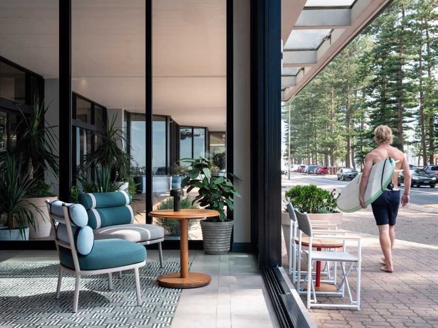
On the beach side, a sunroom takes its cues from the vista with striped and patterned upholstery in a palette of cooling blues that tether the space to the seascape beyond.

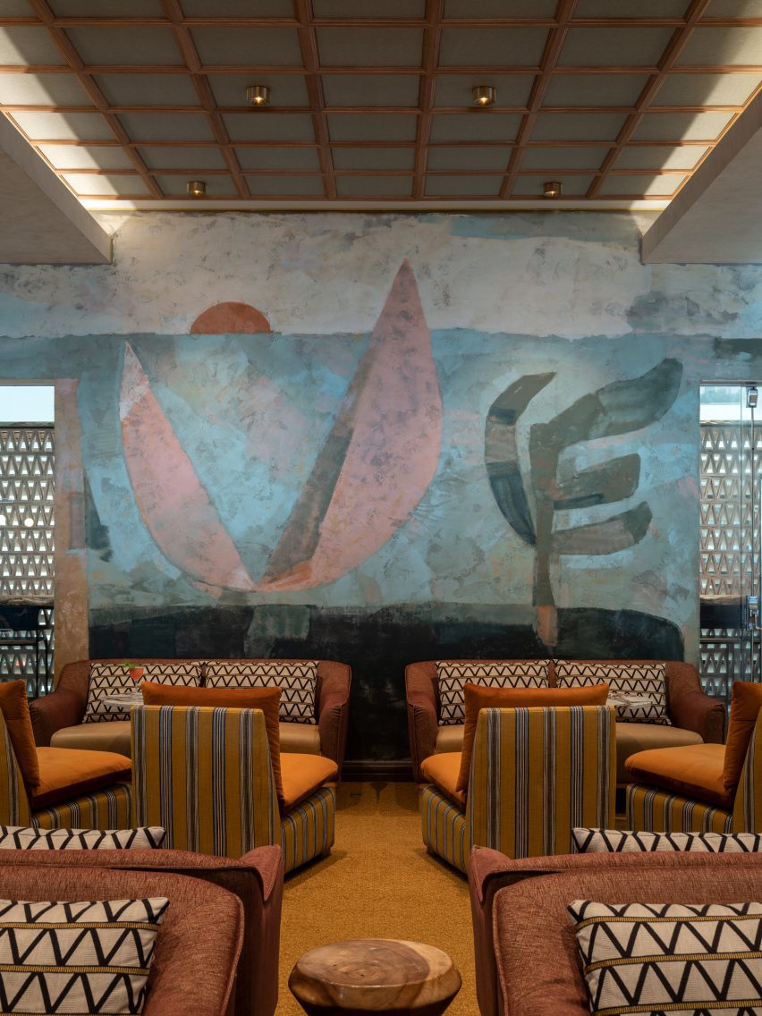
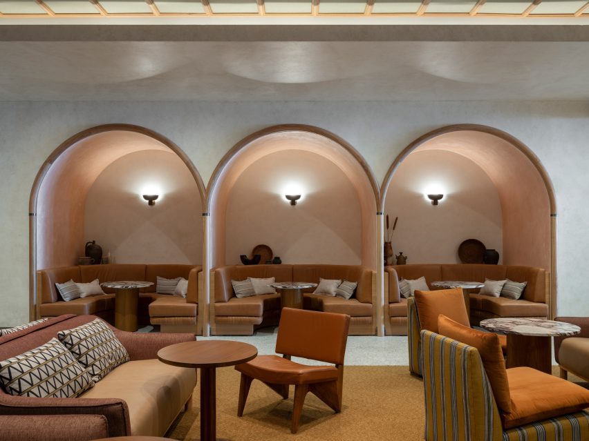
To the rear of the bar, a former gaming room has become an expansive cocktail lounge, where arches frame three intimate booths and the eye is led across the room by an underwater scene, painted onto Venetian plaster by local mural studio Steady Hand Studio.

Fireplace inside lounge of Manly Pacific hotel
Cool blue tones connect the sunroom to Manly Pacific’s beachside setting

Tiles are the protagonist material of this project, defining each area.

“Intricate autumnal crazy paving lures eyes through latticed screens that lightly separate the lobby and bar,” said Luchetti Krelle.

“Waves of fanned pearl-hued marble mosaics accentuate the rear lounge’s sophistication. Within the front sun lounge, tessellated Indian green and Carrara marble mosaic arrangements mimic the effect of a rug.”

Street-facing hotel lounge designed by Luchetti Krelle
The sunroom opens straight onto Manly Beach

Timber, too, plays a large part in the design, used across walls, ceilings, arches and booths – particularly in the bar.

“It was important to use varied timber species, including Blackbutt and walnut, to add textural depth and warm shades,” the studio said.

A variety of plaster finishes introduce another level of texture while helping to convey a sense of history and permanence, according to Luchetti Krelle.

Mural inside cocktail lounge of Manly Pacific hotel
A hand-painted mural dominates the cocktail lounge in the rear

These include the teal plaster applied to the bulkhead surround of the main bar, which features a glossy underside to bring a sense of lightness to the structure.

And in the ocean-side lounge, the pale sand shade of the fireplace wall cools the space during summer, reflecting the sunlight.

Booths in cocktail lounge of hotel designed by Luchetti Krelle
Seating booths are enveloped in cosy arches

The Manly Pacific is among a number of hospitality projects that Luchetti Krelle has completed in Sydney over the last two years.

Among them is a bar set inside a former butcher shop as well as the restaurant RAFI, characterised by vivid abstract paintings and patterned floors.

The photography is by Tom Ferguson.

Reference

ERRE Arquitectos designs Chilean house overlooking the Pacific Oceans
CategoriesArchitecture

ERRE Arquitectos designs Chilean house overlooking the Pacific Oceans

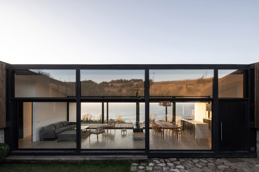
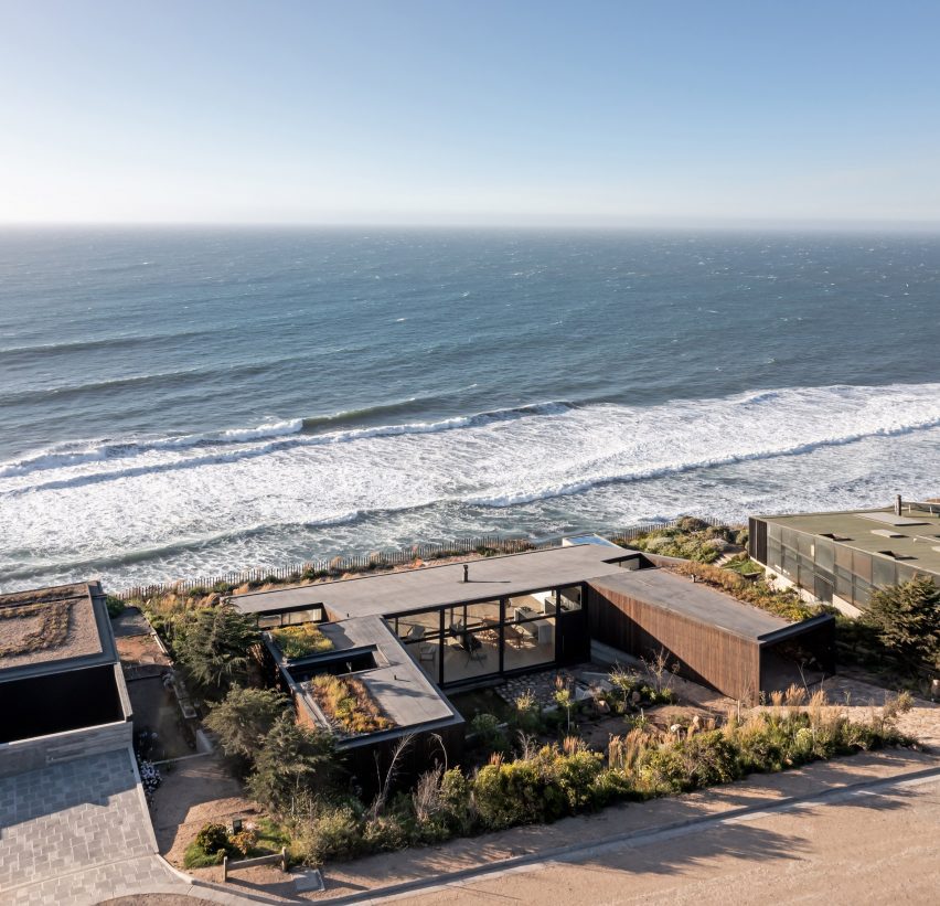
Chilean studio ERRE Arquitectos has constructed Casa Ferran, a low-profile holiday house in Matanzas on the coast of Chile.

Raimundo Gutiérrez of ERRE Arquitectos designed the 240-square-metre (2,580-square-foot) residence as a U-shape on the edge of a cliff that limits the buildable area of the 2,200-square-metre site, as it drops steeply down to the Pacific Ocean.

Exterior of a one-storey open-plan home with glazed walls overlooking the sea
The home is located on a cliff overlooking the Pacific Ocean

Gutiérrez considered three main factors when laying out the plan: creating an exterior zone that is protected from the prevailing southwestern wind, maintaining privacy on the north and south sides, and taking full advantage of the sea views.

To accomplish this, the U-shaped plan points away from the ocean with a protected central courtyard on the high side of the slope, which connects to the sea through the fully glazed common area.

A U-shaped home on a hillside overlooking the sea
The home has a U-shaped layout

“What the project seeks is to generate a transversal and permeable axis in the east-west direction, which connects two exterior areas with dissimilar characteristics through the interior common area,” the studio told Dezeen.

“The rest of the program is arranged to contain and give shape to this axis.”

Interior of an open-plan home with large glass sliding doors opening to decking overlooking the sea
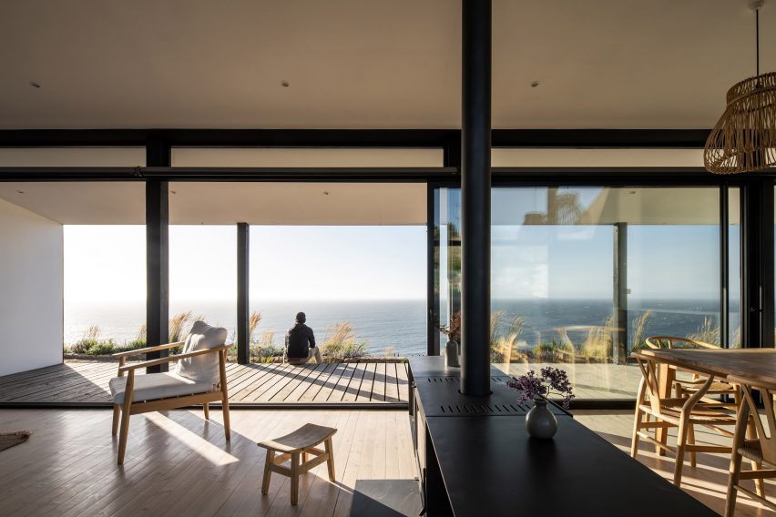
Sliding glass doors in the living area open onto a covered patio

Two wings are located on either side of the central volume – one containing three bedrooms and two planted atriums, the other angled outwards to catch the covered parking area that feeds into the service zones and guest bedroom.

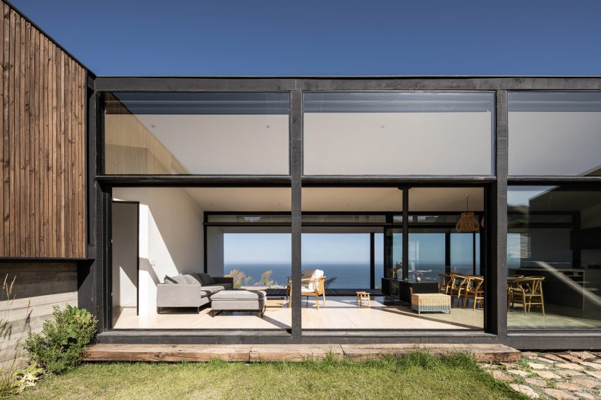
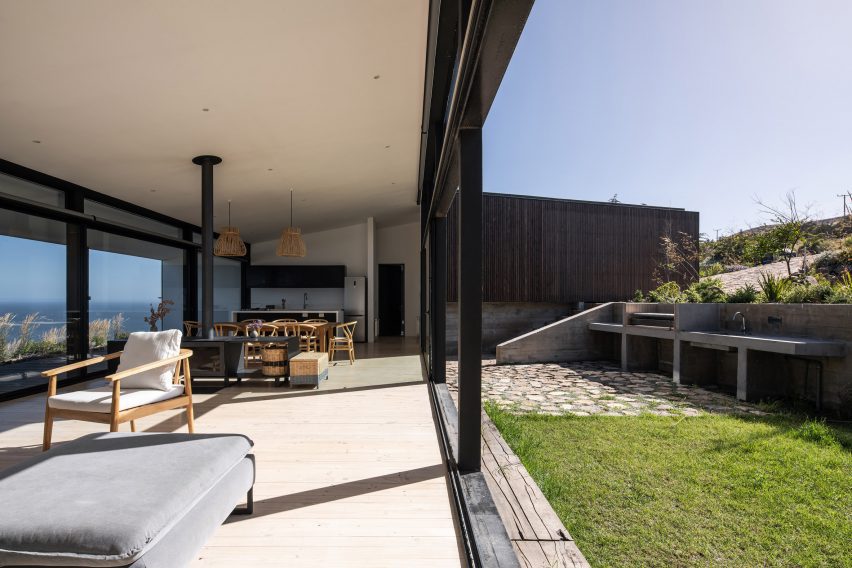
The central volume containing the kitchen, dining, and living spaces is see-through and light-filled, with floor-to-ceiling windows on both sides and sliding glass doors that extend the space onto a covered patio that runs parallel to the sea.

Set on a board-formed concrete foundation, the house is primarily constructed out of black-coloured steel, creating strong framing lines along the form and around the expansive glazing.

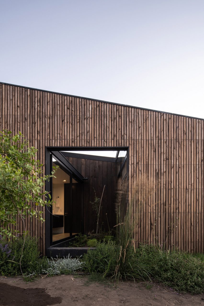
The exterior cladding is vertical one-inch by two-inch pine boards that provide a tonal variation along the north and south facades – which are a cut-off diamond shape as the house accommodates the sloped site – and transitions into a lattice for the parking area.

Outdoor garden of an open-plan home with large glass sliding doors overlooking the sea
Black steel forms the home’s structure

On the interior, a soft white palette and warm wood flooring amplify the scale of the rooms and allow the surrounding sea view to be the focal point of each space.

The home’s arrangement brings sunlight into each room, maximizing passive heating from the coastal climate in both the summer and winter.

Interior of an open-plan living space with sliding glass doors leading to a grass garden
Light wood flooring and white painted walls and ceilings finish the interior

“To complement and achieve higher temperatures during the coldest days, there is a wood-burning fireplace in the common space and central heating radiators throughout the house,” the studio said.

The end of each wing has a planted green roof.

“The design responds to elements of organic architecture,” the studio said. “However, formally rigid features appear, which are the result of several variables, conditions and demands that were presented.”

Exterior of a timber-clad home with a sloped roof and rectangular opening
Pine boards clad the exterior

Similar to Casa Ferran, Chilean architect Juan Pablo Ureta designed a beach house on Chile’s northern coast that is oriented around a central courtyard, however, this one opens toward the sea.

In El Pangue, architecture studios Combeau Arquitectura and Andrea Murtagh designed an ocean getaway with clustered gabled forms.

The photography is by Nicolás Saieh.


Project credits:

Architect and constructor: Raimundo Gutiérrez
Structure: Joaquin Valenzuela
Project Manager and carpenter: Guillermo Chamorro

Reference

Alexander & Co carves out spaces for calm and play inside Pacific House
CategoriesInterior Design

Alexander & Co carves out spaces for calm and play inside Pacific House

Australian architecture practice Alexander & Co has overhauled this oceanside home in Sydney to make it more suitable for family life.

Before its renovation, the five-bedroom house had a disjointed floor plan that was proving inefficient for its two young owners and their three children. Many of the rooms were also cut off from views of the garden and the ocean beyond.

Kitchen interior of Pacific House designed by Alexander & Co
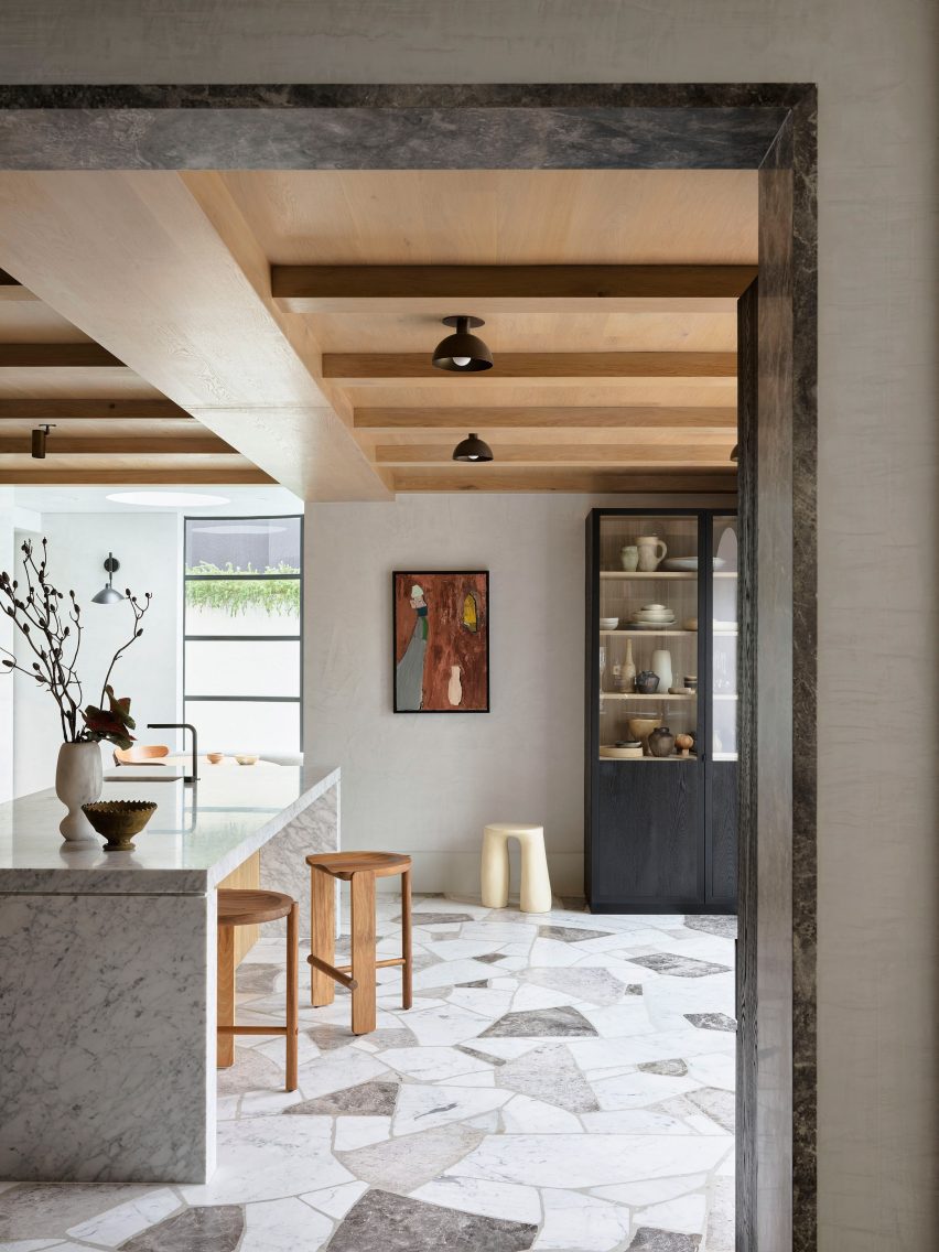
Pacific House’s kitchen is decked out with oakwood and different types of marble

“[Pacific House] was substantial in structure but devoid of spirit and certainly absent of any operational utility,” said Alexander & Co‘s principal architect Jeremy Bull.

Tasked with making the home a “functional engineer of family life”, the practice decided to carve out areas for activity and play, alongside spaces with a calmer, more contemplative ambience for the adults.

Breakfast nook in front of curved window
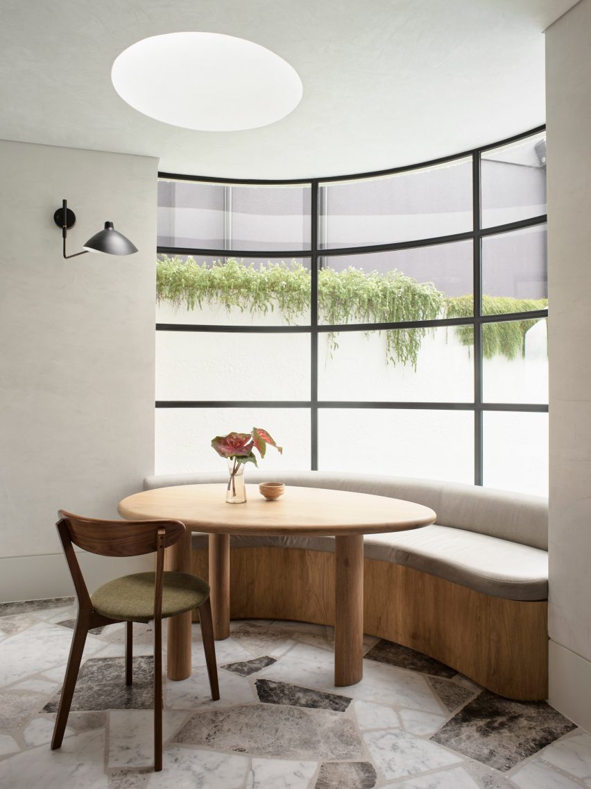
The cosy breakfast nook backs onto a curved window

At the heart of the plan now sits an expansive kitchen. All of the cabinetry is made from warm-hued American oak, while panels of a paler European oak were laid across the ceiling.

Jagged-edged pieces of Grigio Firma, Grigio Lana and Carrara marble were set into the kitchen floor.

Garden of Pacific House designed by Alexander & Co
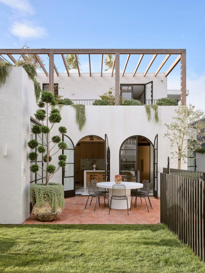
Arched doorways open onto the garden

Inhabitants can eat at the central island or take a seat at the breakfast nook, which is tucked against a huge concave window.

Its form nods to the architectural style of P&O – an offshoot of modernism that was popular in 1930s Sydney and drew on the streamlined curves of Pacific and Orient-line cruise ships.

Dining room by Alexander & Co with muted colour scheme
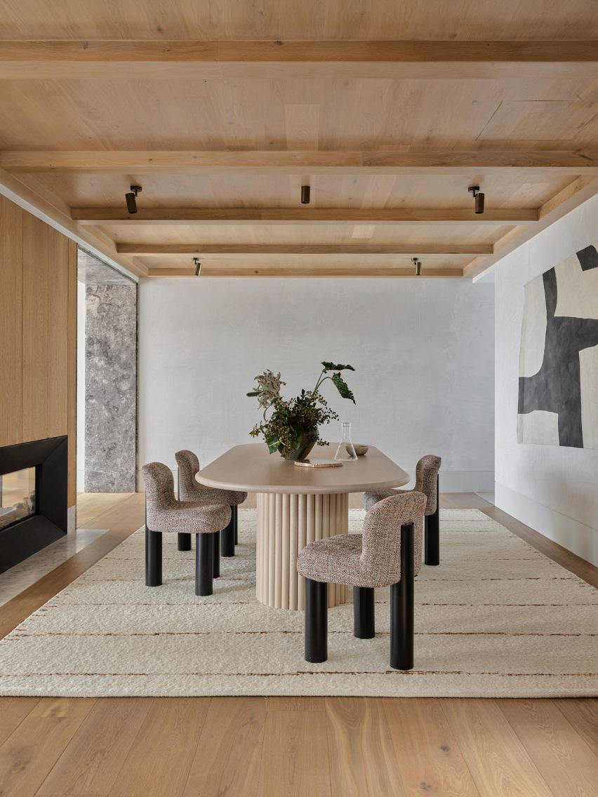
Neutral hues were applied throughout the formal dining area

Two arched doors at the front of the kitchen grant access to the garden, where there’s an alfresco seating area.

A new swimming pool was added in an excavation pit that had previously been created in the home’s driveway.

The rest of Pacific House’s ground floor includes a rumpus room for games, parties and recreation, plus a sophisticated dining area decked out in neutral hues.

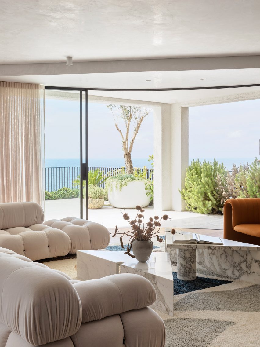
There’s also a spacious living area with Mario Bellini’s Camaleonda sofa for B&B Italia, which looks out across the ocean waves.

An Afghan rug printed with abstract shapes and a couple of triangular marble coffee tables add to the more fun, graphic look that the practice sought to establish in this room.

Living room interior of Pacific House designed by Alexander & Co
The living area is arranged to prioritise ocean vistas

Spaces become slightly more muted on the floor above, which is accessed via an oakwood staircase.

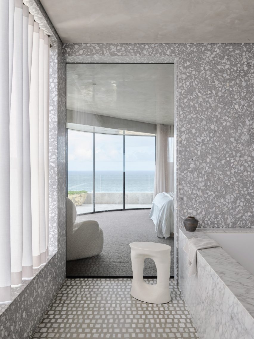
In the principal bedroom – which features another P&O-style curved window – walls are rendered in concrete.

Grey terrazzo and marble was used to cover surfaces in the bathroom, clashing against the pattern of the grey mosaic flooring.

Bathroom interior by Alexander & Co with pattern-clashing greyscale surfaces
The primary bedroom has a curved window and a greyscale en-suite

Alexander & Co has completed a number of other projects in Sydney including an Italian trattoria and most recently its own studio, which is housed in a converted Victorian-era residence.

Formal workstations are built into the building’s basement, but the remaining residential-style floors accommodate a kitchen, living room and library where staff can brainstorm ideas.

The photography is by Anson Smart.

Reference