The Sims is a key part of why I ended up in interior design
CategoriesInterior Design

The Sims is a key part of why I ended up in interior design

The Sims has been allowing players to act out their architecture and interior design fantasies for more than two decades. Jane Englefield finds out how the makers of the iconic life-simulation video game keep up with shifting trends.

“People laugh when I mention playing The Sims, but it was hugely significant in terms of spatial planning and was a key part of how and why I have ended up in the line of interior design work that I have,” interiors stylist and editor Rory Robertson told Dezeen.

“The Sims offered people the opportunity to get a feel for design,” he reflected. “You could be as extravagant and outrageous, or as briefed and restricted as you liked.”

A cluster of houses in The Sims 1A cluster of houses in The Sims 1
The Sims was first released in 2000 with three sequels since developed

Created in 2000 by American game designer Will Wright, The Sims is a video game where players make human characters – or “sims” – and build their virtual houses and lives from scratch, catering to their needs and desires.

With four iterations of the main game and dozens of themed expansion packs focussing on topics such as university, parenthood and cottage living, The Sims is one of the best-selling video-game franchises of all time.

“It’s really accessible”

Architecture and interior design has been a major part of The Sims experience from the very beginning.

Having previously created the city-building game SimCity in 1989 – which itself has been credited with inspiring a generation of urban planners – Wright was originally motivated to develop The Sims after losing his home in the Oakland firestorm of 1991 in California.

In fact, early designs were for an architecture game, with the shift to focus on people a relatively late addition to the concept, according to one of the game’s first art directors, Charles London.

Design remained a core part of the offering, however, and the interface features tools that allow players to instantly build structures and decorate and furnish them from an extensive inventory of items.
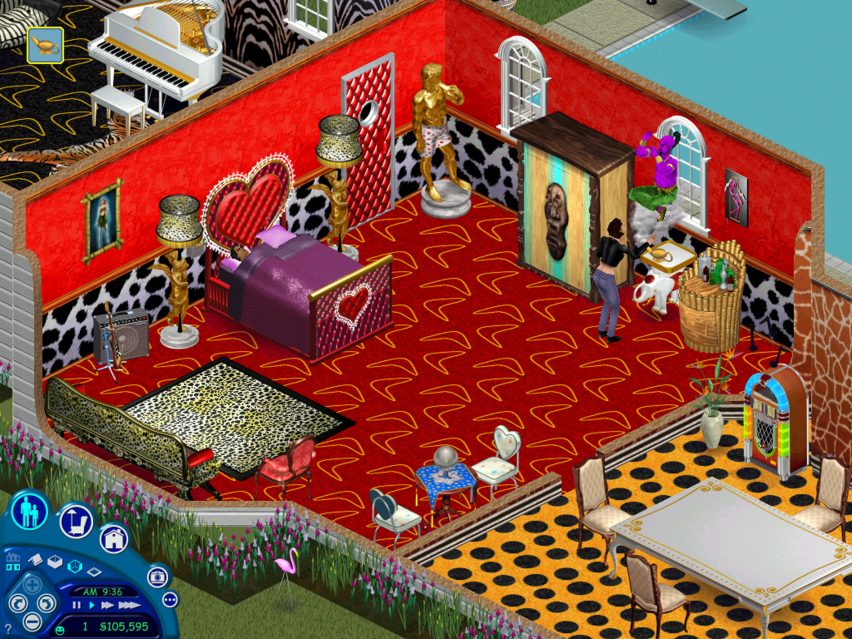
Decorated bedroom in a house in The Sims 1Decorated bedroom in a house in The Sims 1
Players can choose from a wide inventory of decor and furnishing options

“It’s really accessible, so I think a lot of people get into it without even realising that they’re playing with architecture and playing with space,” said video-games expert and historian Holly Nielsen.

“While it was like catnip for design budding minds, it was also just a wonderful opportunity for procrastination and frivolity for people who aren’t particularly confident or tuned in to interiors or architecture,” echoed Robertson.

Since the original The Sims, a broad set of options has been available for players to suit their tastes and imaginations.

Possibilities have ranged from minimalist bungalows filled with neutral furniture to more outlandish dwellings, such as castles defined by Dalmatian-print wallpaper or hot tubs parked in the middle of multiple living rooms.

“We’ll take any source”

The team behind these possibilities described how they ensure that the architecture and interior design options stay feeling fresh and contemporary with each new game in the series.

“Since we’re a game about real life, anytime we step outside our door we have inspiration by just looking at what’s in our immediate environment,” game designer Jessica Croft told Dezeen.

Art director Mike O’Connor added that he and his team scour the real world and the web for up-to-date references.

“We’ll take any source,” he said. “We’re looking for patterns. If we start to see round furniture, or bouclé, or whatever the trend is, [we ask] has it already gone?”

“The internet doesn’t scrub old ideas. So you know, it’s seeing if there’s a trend, is it sticking, does it apply to what we’re doing now?”
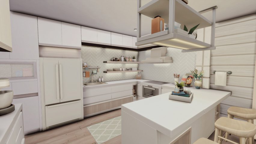
Minimal Sims kitchenMinimal Sims kitchen
The in-game design possibilities have evolved over time to keep up with trends

Furniture and appliances within the game are regularly revised over time to reflect cultural and technological progression in the real world, Croft explained.

“In Sims 2 [released in 2004] I would not be surprised if there was a landline phone – and there definitely isn’t a landline phone in my own house, or Sims 4,” she said.

“Even things like VR [virtual reality] didn’t really exist back in The Sims 2 days, so things like VR consoles, computers – we just added dual-monitor computers, and LEDs are now in most households,” she continued.

That in turn sees the team take a surprisingly deep dive into how interiors are changing, O’Connor acknowledged.

“Over the life of this game, you see an evolution,” he said. “Electronics are probably the biggest category [of change]. Even just how people use TVs, how they place them, has changed.”

The idea, says Croft, is to ensure that The Sims players feel a close connection to the world they are building for their sims.

“The most fun thing for me is being able to allow players to craft stories that are relatable to them,” she said. “So, looking for opportunities to make players feel seen.”

“An element of freedom and fantasy-building”

But, as Nielsen points out, there is an additional aspect to the game’s architecture and design possibilities that is central to its appeal.

“In one sense, it’s reflective of society, but in another way, it’s aspirational,” she said.

“There’s an element of freedom and fantasy-building to playing The Sims,” she continued. “Homeownership is a thing that a lot of us will not get to do.”

As in real life, everything you build or buy in The Sims has a cost.

However, unlike in real life, punching “motherlode” into The Sims cheat-code bar will immediately add a healthy 50,000 simoleons to your sim’s bank account, putting that luxury sofa easily within reach.
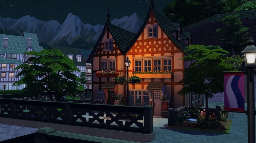
Low-lit house within The Sims 4Low-lit house within The Sims 4
The game offers people “the opportunity to get a feel for design”

That possibility remains central to Robertson’s nostalgia for playing The Sims as a young would-be interior designer.

“Once you double-clicked The Sims graphic on your Microsoft desktop, a multi-roomed mansion cost nothing to design,” he said.

This aspirational element has become an increasingly large part of The Sims’ commercial model over the years.

The Sims 4, as an example, is accompanied by 19 purchasable “Stuff Packs” that expand the options of items available to buy, including “Perfect Patio”, “Cool Kitchen” and one based on the products of Milan fashion label Moschino.

And the latest of the more extensive expansion packs is For Rent, which allows players to build rental houses where some sims are landlords and others are tenants.

Within the game, landlords encounter various true-to-life issues, including the potential for toxic mould build-up in their properties – although, unlike in the real world, the mould feature can be toggled on and off.

Inclusivity has also become an increasing focus of The Sims, with integral features now including options to choose sims’ sexual orientation, for instance.

For Nielsen, that traces back to a significant foundational element of the game’s widespread appeal – as well as being one of the reasons it has had such strong interior-design influence.

“It didn’t feel like it was aiming for anyone,” she explained. “One of the things that people bring up a lot is that it has a very female player base.”

“For me, it was a big turning point – it was getting to create the spaces but also play around with the people inside them. It felt like a socially acceptable way to play dollhouses.”

The images are courtesy of Electronic Arts.

Dezeen In Depth
If you enjoy reading Dezeen’s interviews, opinions and features, subscribe to Dezeen In Depth. Sent on the last Friday of each month, this newsletter provides a single place to read about the design and architecture stories behind the headlines.


Reference

We need to design for human behaviour to get rid of single-use plastics
CategoriesSustainable News

We need to design for human behaviour to get rid of single-use plastics

Packaging designs aimed at boosting recycling rates and reducing the prevalence of single-use plastics are destined to fail unless they help to change people’s behaviour, writes Matt Millington.


No one is particularly happy when they find out there’s plastic waste on Mount Everest, or in the deep oceans, or in human blood. It’s not controversial to say that we need to stop churning the stuff out and throwing it away.

One way for businesses to tackle single-use plastics is to design their packaging to be reusable, but so far efforts have not succeeded at scale.

For example, reusable McDonald’s cups are only getting a 40 per cent return rate from customers in Germany, despite consumers paying a €2 deposit. When Starbucks trialled reusable cups in the closed environment of its Seattle HQ, where returning them is presumably straightforward, the return rate still didn’t exceed 80 per cent.

We weren’t exactly succumbing to dehydration on the streets before coffee shops designed takeaway cups

It’s not that we don’t care: research suggests consumer motivation towards environmentally positive behaviour is high. It’s that as a society we have developed an expectation of convenience: to have what we want, when we want it, without any consequences.

This is entirely unreasonable – we weren’t exactly succumbing to dehydration on the streets before coffee shops designed takeaway cups – but while it persists, consumers are very unlikely to switch to reusable alternatives if it puts them out. And without a high return-and-reuse rate, reusable packaging is usually worse for the environment, owing to the much higher quantities of plastic involved.

This is why we need to design for human behaviour if we’re ever to get rid of single-use plastics. You cannot control what people will do with packaging once it leaves your premises, but you can influence them by factoring behavioural psychology into the design of the packaging itself.

The first step is understanding how consumers interact with the pack, throughout its lifecycle. Where are they and what are they doing when they open it? What’s their headspace? How about when they’re finished with it? There’s a big difference between how someone interacts with a reusable plate after a meal in a cafeteria, and how they interact with the reusable salad bowl they’re gobbling from on the lunchtime rush back to the office.

Then it’s about understanding the levers you can pull to nudge people towards more planet-positive decisions. Behavioural psychology shows there are three factors that work together to drive behavioural change: increasing consumer motivation to recycle or reuse, raising their ability to do so, and providing a trigger to remind them.

Take plastic bags. While usage of single-use bags has dramatically decreased in the UK since legislation requiring retailers to charge for them came into force in 2015, reusable alternatives have had mixed success. According to a report by the Environmental Investigation Agency and Greenpeace, 57 “bags for life” were sold for each household in the country in 2019 – more than one a week.

It’s possible to go too far in signalling that a pack isn’t disposable

Online grocer Ocado uses recyclable bags instead, but it has had success in achieving returns because it pulls all three behavioural psychology levers. Consumers are happy to receive bonus reward points for each bag they give back (motivation).

The bags are straightforward to return and customers know not to throw them away because of their clear messaging and distinct off-grey colour, which follows from not using harmful bleaching agents (ability). And because the driver usually asks for old bags after delivery, they’re unlikely to forget (trigger).

Ability is the key consideration. If you wanted to return the packaging from a takeaway burger meal, it would mean washing and then carrying around a bulky burger box, fries box and cup, and either making a special trip to the restaurant or waiting until you happen upon another branch.

New Zealand start-up FOLDPROJECT has done some interesting work here, trying to make boxes more portable. It’s a simple idea: a machine-washable lunch kit that packs down to a flat sheet. The challenge is that because it is so minimal, its form and material make it look disposable.

One way to ensure a reusable design communicates its intended purpose is through material choice. For example, using explicitly post-consumer recycled plastic could be a visual shorthand to communicate a planet-positive intent, as could using longer-lasting materials like glass or stoneware.

Interestingly, it’s possible to go too far in signalling that a pack isn’t disposable. When McDonald’s introduced reusable packaging in its restaurants in France, it found the packaging kept disappearing, only to reappear on eBay. It looked reusable and on-brand, but was too novel for some, defeating the object.

So long as we have bins on every street that lead directly to landfill, we are going to struggle

Businesses cannot just switch to reusable packaging – even when intelligently designed – and expect results. So long as we have bins on every street that lead directly to landfill we are going to struggle.

We therefore need to think beyond just designing the packaging to be sustainable, and think about how we design systems to be sustainable. In a circular economy that means service and experience design, packaging, industrial design, marketing, data, artificial intelligence and logistics all working hand-in-hand to keep the pack “in the loop”. It will therefore need to be an ecosystem effort.

We’re already seeing innovations that can help make reuse and return viable in the age of convenience. For example, when is a bin not a bin? When it’s a Bjarke Ingels Group-designed TURN system – a remote, digitally connected, RFID-enabled, packaging-asset reclaim and sorting network, which rejects unwanted trash.

Similarly, we’re seeing nudge messaging along the pack journey, and even packs that communicate their status themselves. Scottish start-up Insignia has designed colour-changing labels that reveal how long a pack has been exposed to the environment. Imagine taking this further, with reusable packaging telling you what to do with it, and offering prompts or rewards to encourage you.

Reusability hasn’t hit scale yet, but we should be optimistic that it can, not least because we’ve been there before. Milk deliveries were once the norm, with bottles returned, not discarded.

There’s no reason that we can’t get back to this more sustainable approach across the board, without having to endure too much inconvenience. All that’s required is a little ingenuity, and a lot of collaboration.

The photography is by Jas Min via Unsplash.

Matt Millington is a sustainable-design strategist at PA Consulting.

Dezeen In Depth
If you enjoy reading Dezeen’s interviews, opinions and features, subscribe to Dezeen In Depth. Sent on the last Friday of each month, this newsletter provides a single place to read about the design and architecture stories behind the headlines.
Reference

Plus One Architects uncovers paintwork of century-old Czech apartment
CategoriesInterior Design

Plus One Architects uncovers paintwork of century-old Czech apartment

Prague studio Plus One Architects has restored the “original splendour” of this 1902 apartment in Karlovy Vary, Czech Republic, by reinstating some of its original features.

Located in a turn-of-the-century apartment block, the two-bedroom flat was renovated by Plus One Architects, who exposed the original paintwork present on the walls and ceilings.

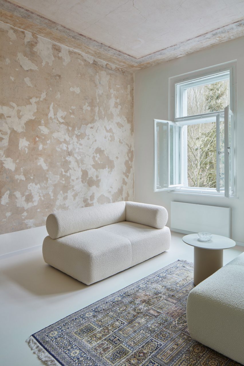
Living room with patchy brown and beige paintworkLiving room with patchy brown and beige paintwork
The Karlovy Vary Apartment features minimal furnishings

The studio also streamlined the circulation inside the apartment by removing doors to open up pathways, as well as undoing dated additions that had been installed over the top of the original walls and floors.

“We think the first renovation was probably done in the late 70s,” architect Kateřina Průchová told Dezeen. “It was full of wooden cladding on the walls, a lot of doors and carpet that covered the original floors.”

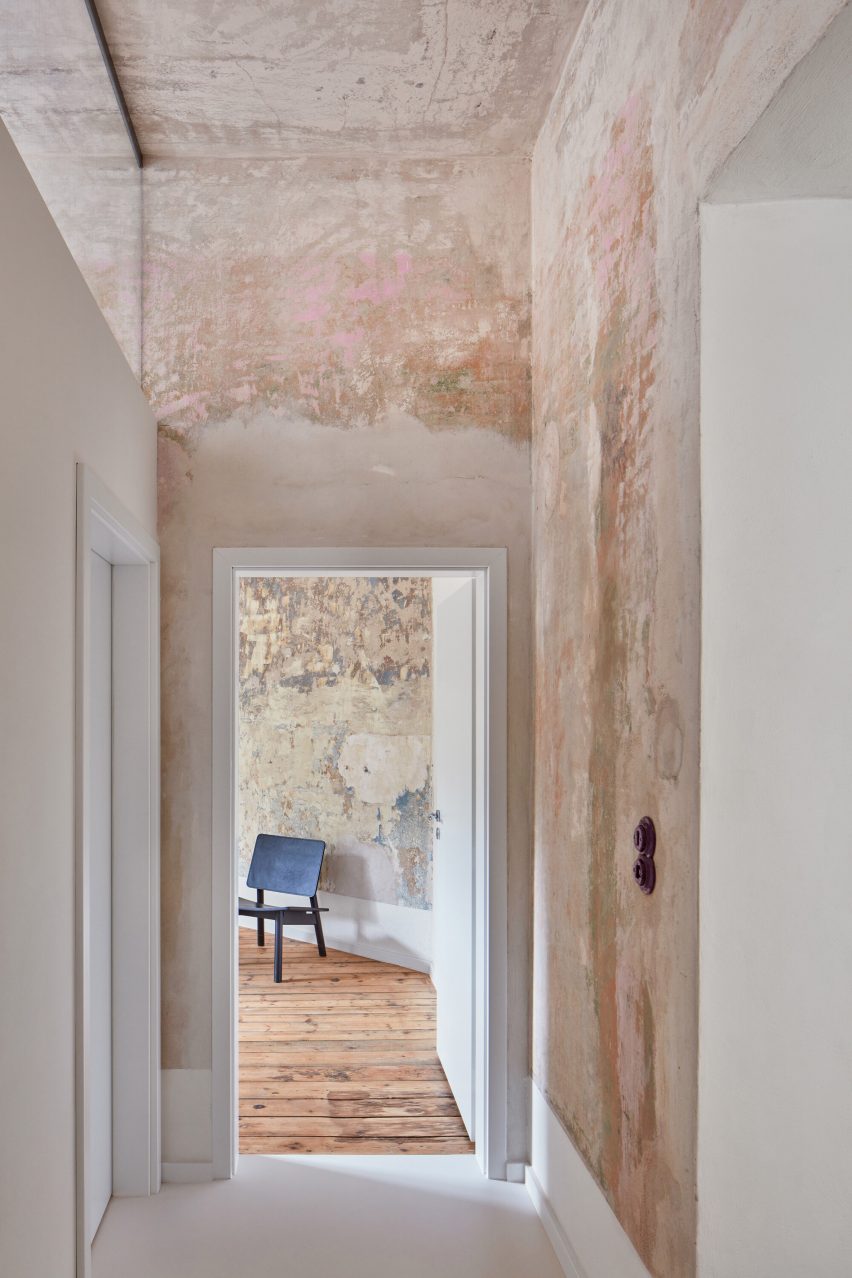
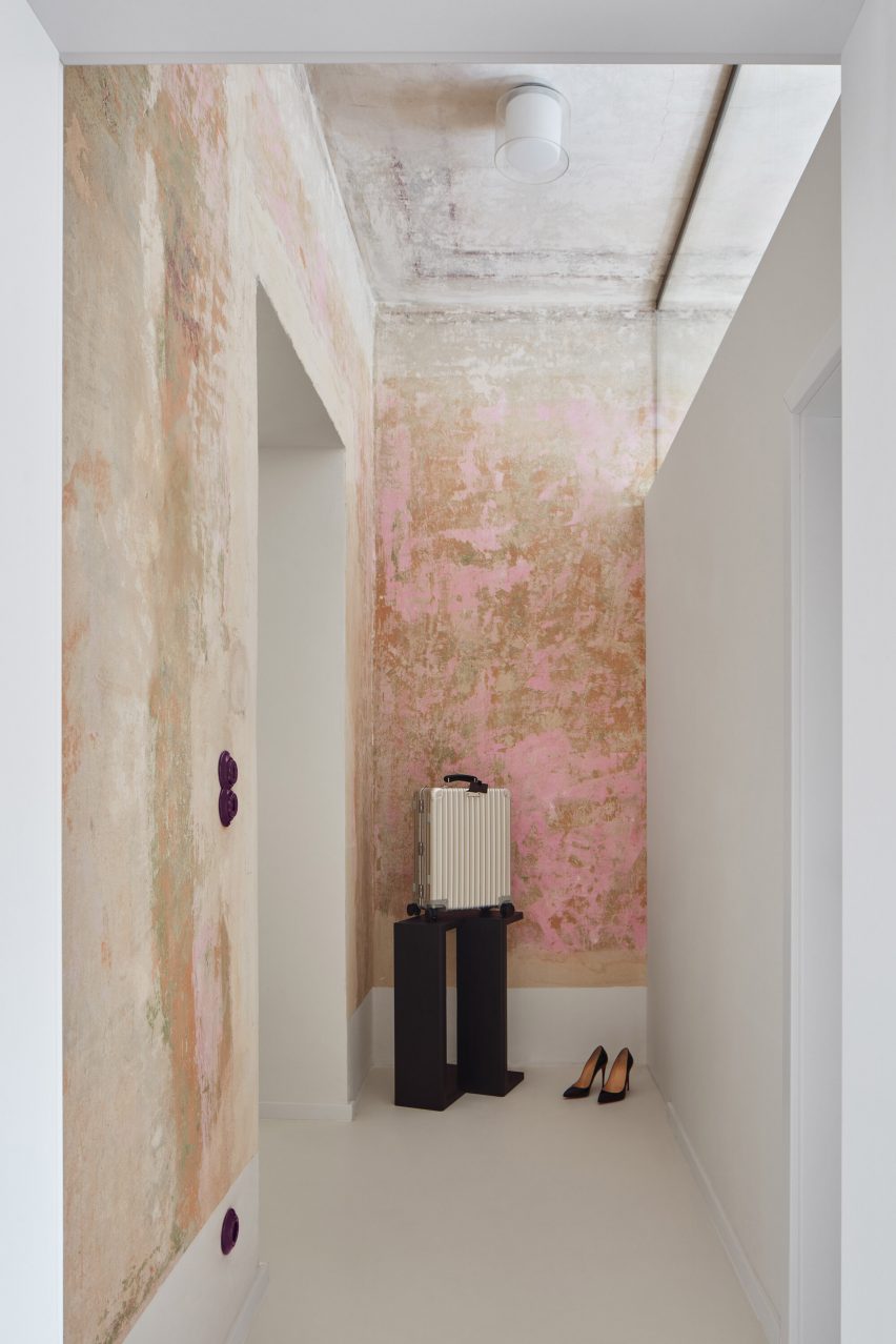
Corridor with flaky pink paintworkCorridor with flaky pink paintwork
Transom windows let light flood through the rooms

The revamped interior has a bright, airy atmosphere, as natural sunlight comes in through the large unobstructed windows and continues deeper into the rooms thanks to the addition of transom windows on some of the interior walls.

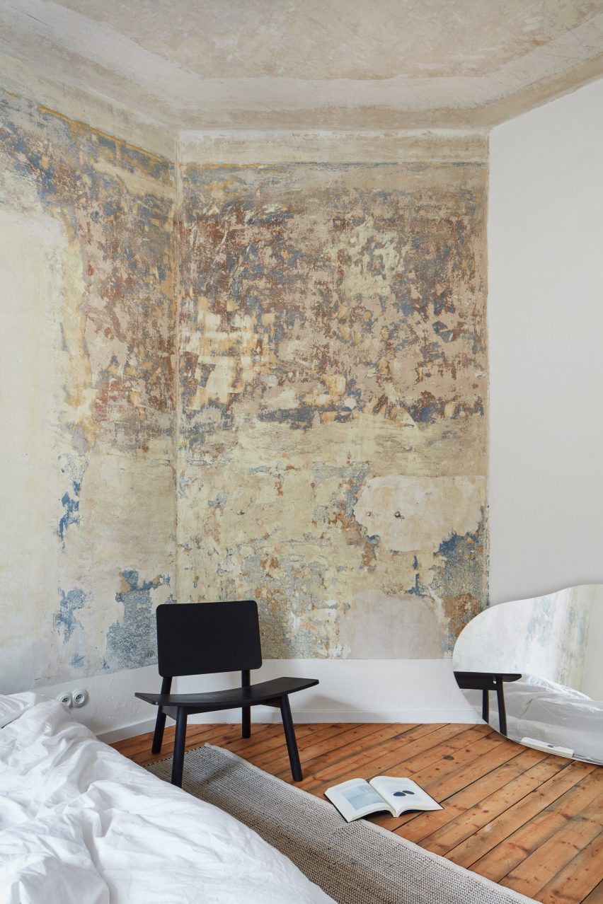
Remnants of colourful mottled paintwork appear on the walls and ceilings alongside brown and beige sections of plaster.

Chair in front of mottled painted wallChair in front of mottled painted wall
Mottled blue and yellow paintwork decorates the primary bedroom

Neutral-coloured paint and plasterwork feature in the kitchen and living room, where Plus One Architects retained the apartment’s original masonry heater clad in glossy brown tiles.

Painted details are also apparent on the ceiling, with concentric bands of red, blue and yellow delineating the perimeter of the room.

Doors were removed to improve the flow between spaces

Pink paint appears in the corridor and smaller bedroom while blue paintwork can be seen in the primary bedroom, complementing the restored wooden floorboards.

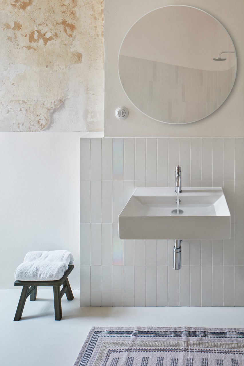
In the bathroom, white tiling lines the walls, interspersed with iridescent tiles and sections of exposed paintwork.

The rooms are sparingly furnished, allowing the paintwork to be the interior’s focal point.

Plus One Architects brought in furniture with minimalist forms by Czech design studio Janský & Dunděra alongside decorative pieces from local design brand Todus.

Photograph showing sink in bathroom with round mirror abovePhotograph showing sink in bathroom with round mirror above
The bathroom is fitted with white flooring, tiling and fixtures

“I hope we managed to return the apartment to the original splendour of the period, in which the house was built,” said Průchová.

“You can feel how the building looks from the outside – it is an old house in the historic part of a spa town.”

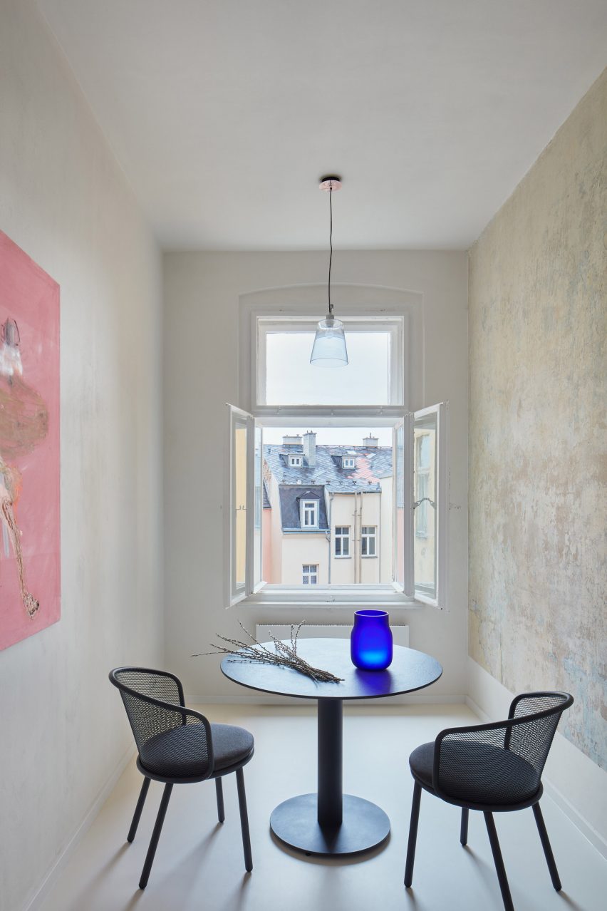
Round dining table and chairs in front of open window in narrow roomRound dining table and chairs in front of open window in narrow room
The kitchen and dining room overlook neighbouring rooftops

Kateřina Průchová and Petra Ciencialová founded Plus One Architects in 2019. The studio is based in Prague and works on projects across the Czech Republic.

Other apartment interiors that have recently been featured on Dezeen include a home in Milan centred around a monolithic green marble partition wall and a pastel-decorated apartment in Kraków.

The photography is by Radek Úlehla.


Reference

Dezeen Agenda features apartment building made from Lego-like blocks
CategoriesArchitecture

Dezeen Agenda features apartment building made from Lego-like blocks

Renco lego building

The latest edition of our weekly Dezeen Agenda newsletter features an apartment block in California constructed like a “real-life Lego-kit”. Subscribe to Dezeen Agenda now.

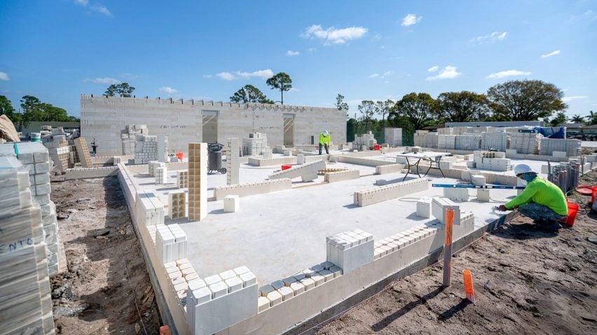
Florida-based manufacturer Renco has completed a Palm Springs apartment complex that was made using Lego-like blocks made of repurposed materials and designed by architecture studio Arquitectonica.

Constructed from a composite blend of glass fibres, resin, and stone, the blocks were designed to be stronger, less energy-intensive and more affordable than conventional materials.

Portrait of Lesley LokkoPortrait of Lesley Lokko
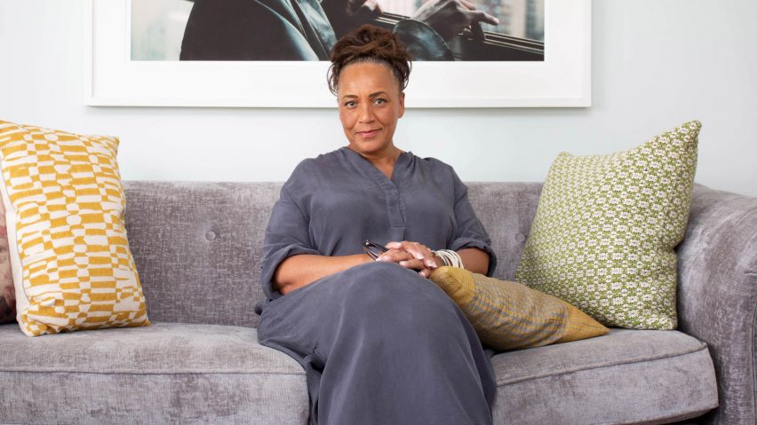
“Revolutionary force” Lesley Lokko wins 2024 RIBA Royal Gold Medal

This week’s newsletter also featured Ghanaian-Scottish architect Lesley Lokko being named the recipient of this year’s RIBA Royal Gold Medal, the reveal of plans and the architect for this year’s Serpentine Pavilion and a “first aid kit” for furniture designed by Yalan Dan.

Dezeen Agenda

Dezeen Agenda is a curated newsletter sent every Tuesday containing the most important news highlights from Dezeen. Read the latest edition of Dezeen Agenda or subscribe here.

You can also subscribe to our other newsletters; Dezeen Debate is sent every Thursday and features the hottest reader comments and most-debated stories, Dezeen Daily is our daily bulletin that contains every story published in the preceding 24 hours and Dezeen In Depth is sent on the last Friday of every month and delves deeper into the major stories shaping architecture and design. 

Reference

Eight interiors where burl wood provides natural texture
CategoriesInterior Design

Eight interiors where burl wood provides natural texture

This week’s lookbook rounds up eight interiors with furnishings and surfaces finished in burl-wood veneer, allowing its swirly, psychedelic graining to serve a decorative function.

Burl wood is a rare and expensive wood, often only available in thin sheets of veneer. That’s because it is derived from the knobbly outgrowths of tree trunks and branches – also known as burls.

Like the botanical equivalent of a callous, these outgrowths form in response to different stress factors and grow unpredictably, creating complex unexpected grain patterns behind their gnarled bark.

Burl wood has been experiencing a renaissance over the last few years, with interior designers including Kelly Wearstler using it to evoke the bohemian flair of its 1970s heyday.

Mixed and matched with other patterns, the material is now used to communicate a kind of organic understated luxury, much like natural stone.

From a Michelin-starred restaurant to a home that was designed to resemble a boutique hotel, read on for eight examples of how burl wood can provide textural richness to a modern interior.

This is the latest in our lookbook series, which provides visual inspiration from Dezeen’s archive. For more inspiration see previous lookbooks featuring rooms with net floors, interiors with furry walls and homes with mid-century modern furniture.


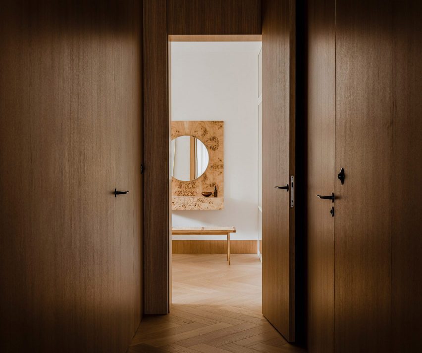
Botaniczna Apartment, Poland, by Agnieszka Owsiany StudioBotaniczna Apartment, Poland, by Agnieszka Owsiany Studio
Photo by Pion Studio

Botaniczna Apartment, Poland, by Agnieszka Owsiany Studio

This tranquil apartment in Poznań was designed by local firm Agnieszka Owsiany Studio to give the owners a reprise from their high-pressure medical jobs.

The interior combines a calming mix of pale marble and various kinds of wood, including oak cabinetry, chevron parquet flooring and a console and vanity, both finished in speckled burl.

“My clients asked for a high quality, almost hotel-like space, as they were in need of everyday comfort,” founder Agnieszka Owsiany told Dezeen.

Find out more about Botaniczna Apartment ›


Ulla Johnson flagship, USA, by Kelly WearstlerUlla Johnson flagship, USA, by Kelly Wearstler
Photo by Adrian Gaut

Ulla Johnson flagship, USA, by Kelly Wearstler

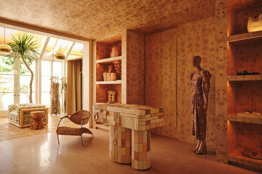
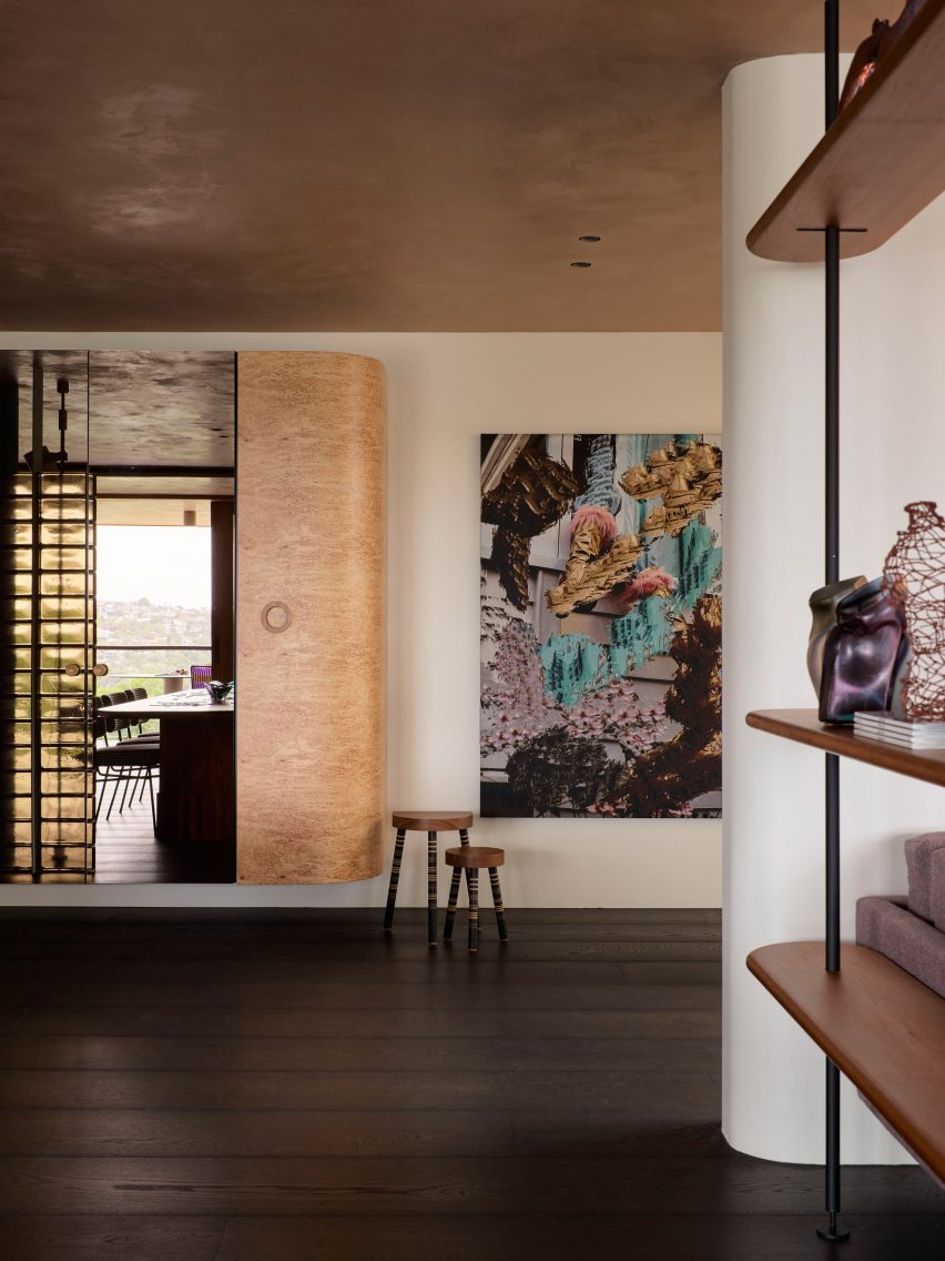
Burlwood brings “a touch of 1970s California nostalgia” to the Ulla Johnson flagship store in Los Angeles, courtesy of local designer Kelly Wearstler.

The unusual veneer was used liberally to cover walls, ceilings and shelves, as well as forming a statement display cabinet where the material’s natural wavy surface texture provides an added element of tactility (top image).

Find out more about the Ulla Johnson flagship ›


Koda hair salon by Arent & PykeKoda hair salon by Arent & Pyke
Photo by Prue Ruscoe

Koda hair salon, Australia, by Arent & Pyke

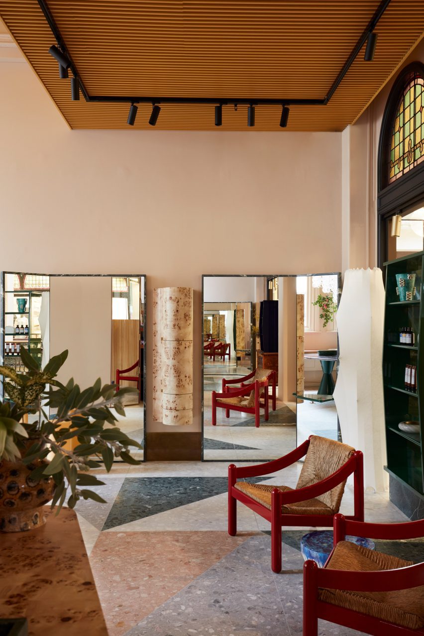
This hair salon in Sydney’s Queen Victoria Building was designed by Australian studio Arent & Pyke to be “best appreciated from seated height”.

Drawing attention away from the building’s extra-tall ceilings, freestanding quartzite-rimmed mirrors are placed at angles in front of the styling chairs, framing a vintage hanging cabinet made from pale burl.

Find out more about the Koda hair salon ›


Opasły Tom restaurant by Buck StudioOpasły Tom restaurant by Buck Studio
Photo by Pion Studio

Opasly Tom restaurant, Poland, by Buck Studio

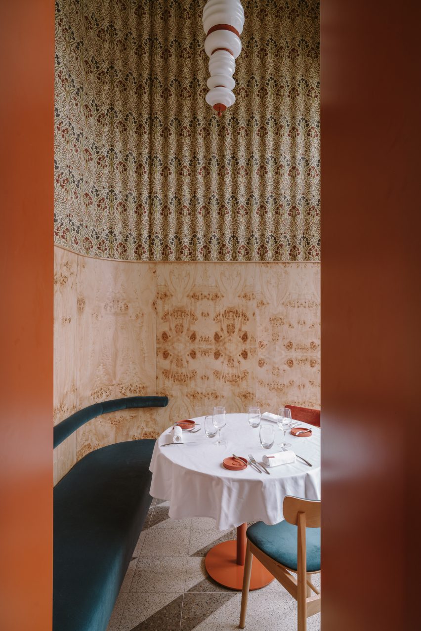
Buck Studio employed a limited palette of colours and materials to create visual continuity throughout Warsaw restaurant Opasly Tom, which occupies a split-level building that was broken up into a series of rooms of different sizes.

Coral-orange chair cushions mirror the hardware of the totem-like pendant lights, and several burl-clad cabinets are dotted throughout the eatery. These match the kaleidoscopically patterned panelling in the hallway and the private dining rooms.

“This contemporary, minimalistic design approach produces the impression of coherence while creating a powerful aesthetic impact,” explained the Polish studio, which is headed up by Dominika Buck and Pawel Buck.

Find out more about the Opasly Tom restaurant ›


Warsaw apartment by MistoviaWarsaw apartment by Mistovia
Photo by Oni Studio

Warsaw apartment, Poland, by Mistovia

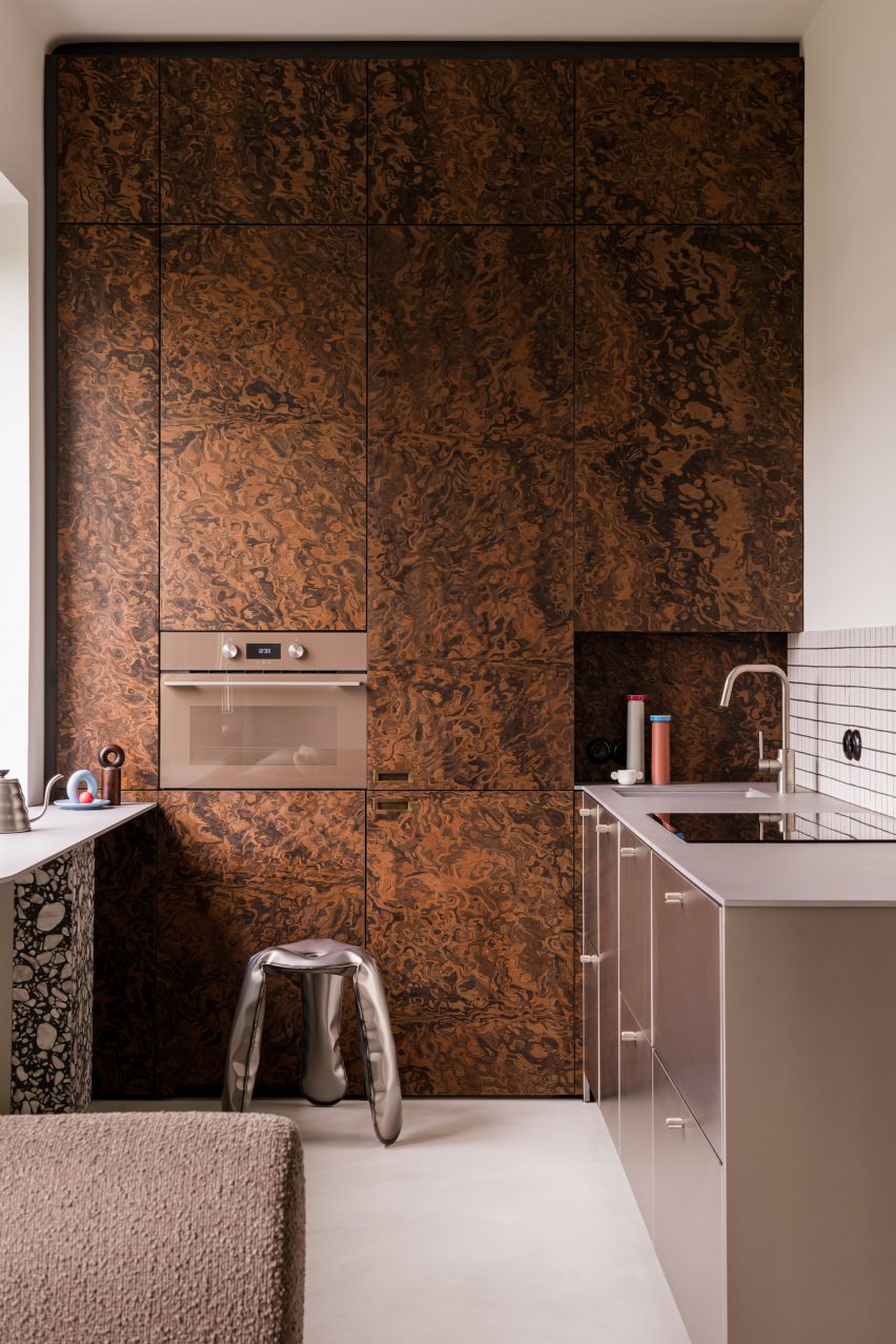
Elsewhere in Warsaw, Polish studio Mistovia designed an apartment for an art director and her pet dachshund to resemble an “elaborate puzzle” of contrasting patterns.

Walnut-burl cabinets dominate the kitchen, with their trippy swirling pattern offset against monochrome tiles, brushed-metal drawers and a terrazzo-legged breakfast bar.

Find out more about the Warsaw apartment ›


Imperfecto, USA, by OOAK ArchitectsImperfecto, USA, by OOAK Architects
Photo by Jennifer Chase and Yorgos Efthymiadis

Imperfecto, USA, by OOAK Architects

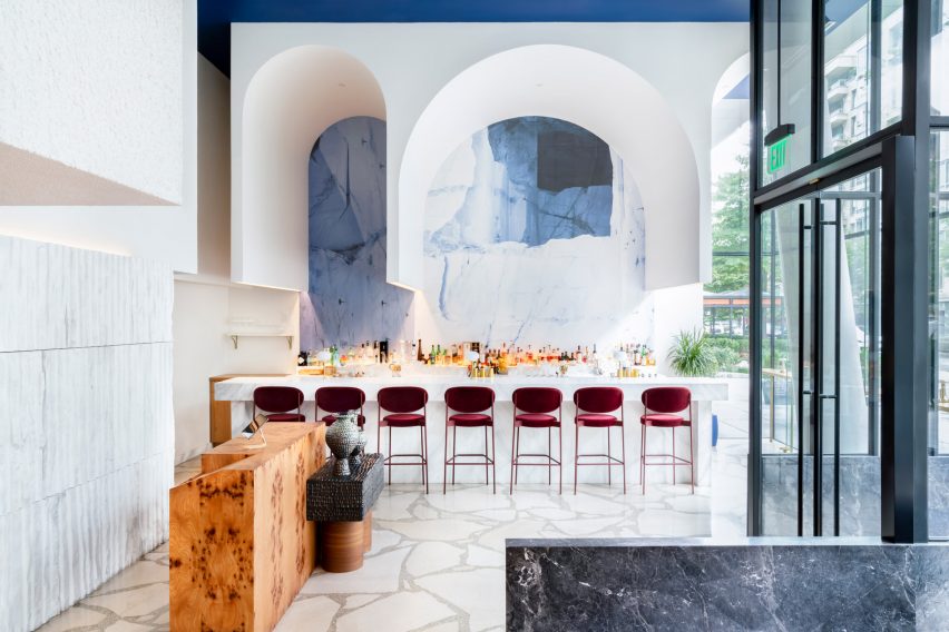
Upon entering Michelin-starred restaurant Imperfecto in Washington DC, diners are greeted by a custom-made maître-d stand clad in panels of burl-wood veneer, creating a mirrored tortoiseshell pattern across its surface.

The interior, designed by Greek-Swedish studio OOAK Architects, sees neutral tones paired with splashes of blue and white that nod to the restaurant’s Mediterranean menu.

“OOAK Architects has used varied, high-quality finishes and authentic materials including Greek and Italian marbles, as well as brass and wood from different parts of the world, creating contrasting textures across the space,” the team said.

Find out more about Imperfecto ›


Interior of Black Diamond house by YSGInterior of Black Diamond house by YSG
Photo by Anson Smart

Black Diamond house, Australia, by YSG

Australian interiors studio YSG introduced a sumptuous mix of materials to this house in Sydney’s Mosman suburb to evoke the feeling of staying in a luxury hotel.

This approach is evidenced by a number of custom furniture pieces dotted throughout the home, including a Tiberio marble vanity in the downstairs powder room and a poplar-burl cabinet with a bronzed mirror that looms over the nearby living room.

Find out more about Black Diamond house ›


Studio Frantzén, UK, by Joyn StudioStudio Frantzén, UK, by Joyn Studio
Photo by Åsa Liffner

Studio Frantzén, UK, by Joyn Studio

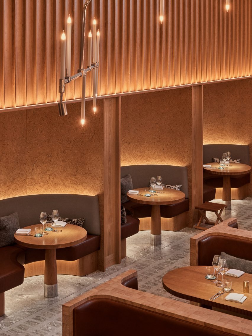
Restaurant Studio Frantzén in London’s Harrods department store serves a fusion of Nordic and Asian food that is also reflected in its Japandi interiors – taking cues from both Scandinavian and Japanese design.

Interiors practice Joyn Studio leaned heavily on both cultures’ penchant for wood, combining seating banquettes made from blocks of end-grain pine wood with gridded timber ceilings and seating booths framed by burl-wood wall panelling.

Find out more about Studio Frantzén ›

This is the latest in our lookbook series, which provides visual inspiration from Dezeen’s archive. For more inspiration see previous lookbooks featuring rooms with net floors, interiors with furry walls and homes with mid-century modern furniture.

Reference

Aro Archive store in Shoreditch features pastel-coloured rooms
CategoriesInterior Design

Aro Archive store in Shoreditch features pastel-coloured rooms

Fashion retailer Aro Archive’s pastel-hued east London store was designed by founder Ariana Waiata Sheehan to evoke “a sense of otherworldliness”.

The store, located in Shoreditch, replaces the brand’s previous, more industrial store on nearby Broadway Market and was intended to have a frivolous feel.

Pastel-coloured fashion storePastel-coloured fashion store
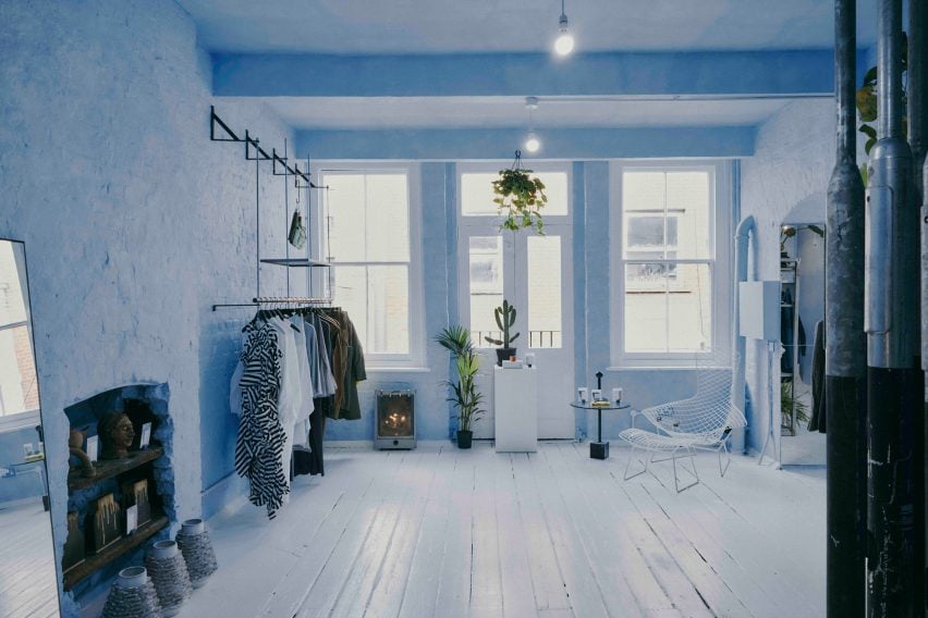
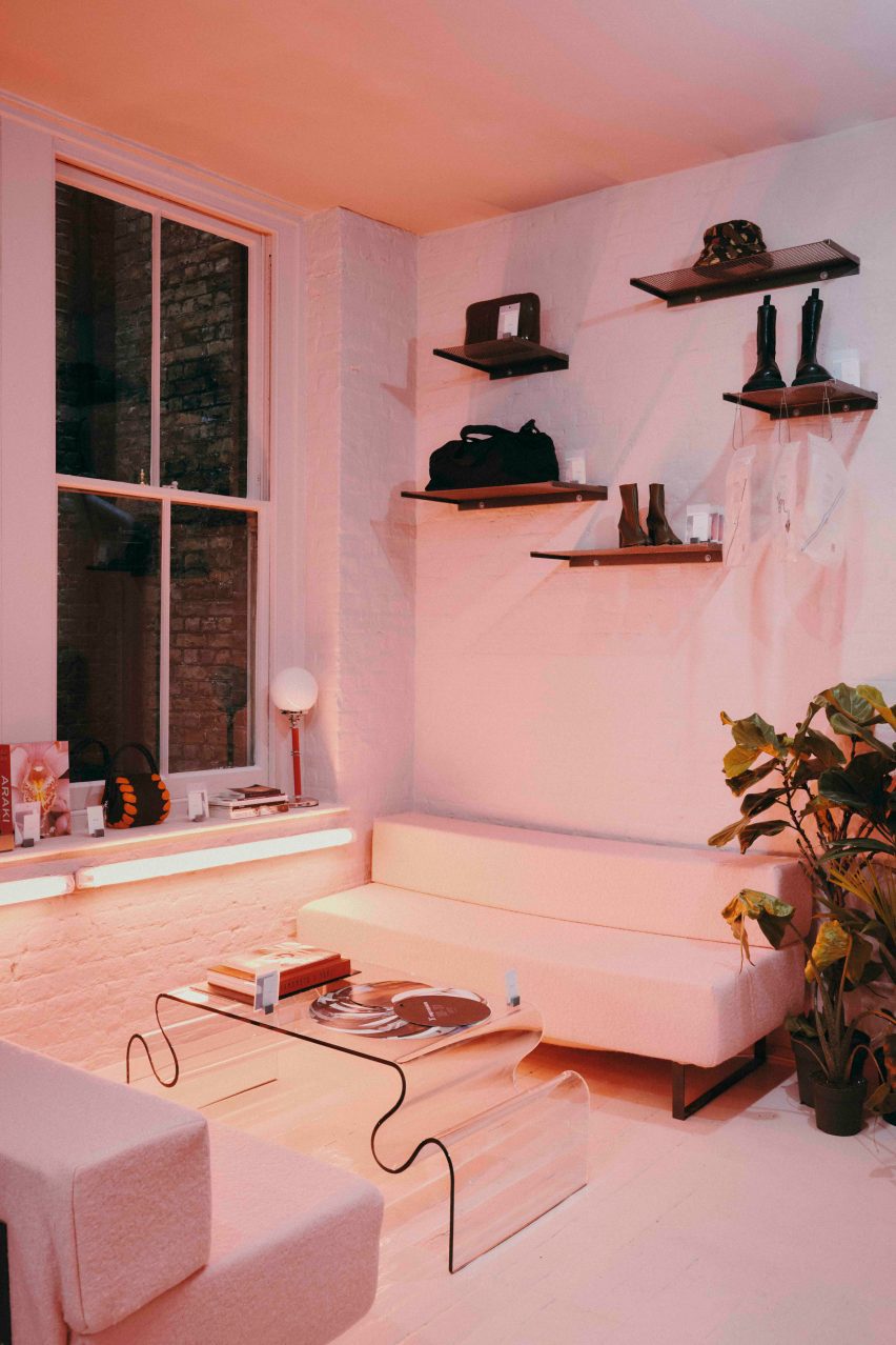
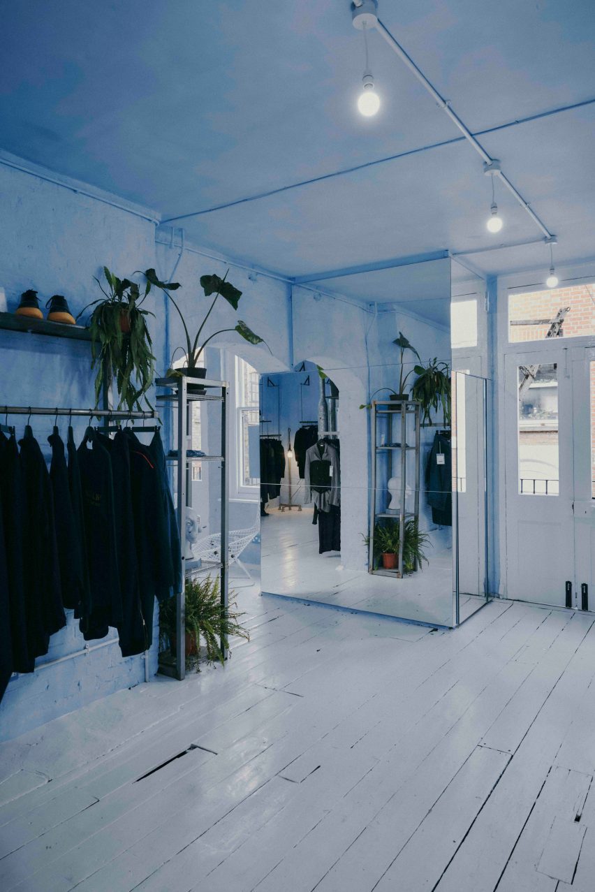
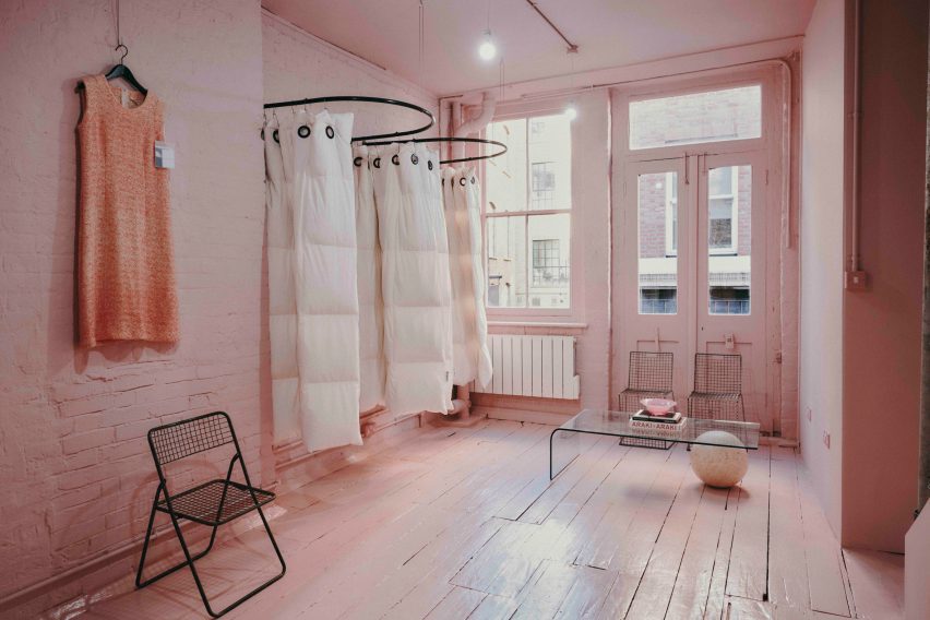
The Aro Archive store has pastel-coloured floors in pink and blue

The interior has “a sense of otherworldliness, escapism and fun,” Waiata Sheehan explains, comparing it to “a mixture between a mushroom trip and going to visit someone’s rich aunty who runs a gallery”.

“We’ve always had very neutral industrial spaces,” she told Dezeen. |But you can get an industrial Zara these days, so time to switch it up and go full personality, which has been scary but so worth it.”

Pink floor in Aro ArchivePink floor in Aro Archive
It is located inside an old Victorian warehouse

Located inside a five-storey former Victorian warehouse, Aro Archive, which sells pre-owned clothing by avant-garde designers, was organised so that each floor has a different colour.

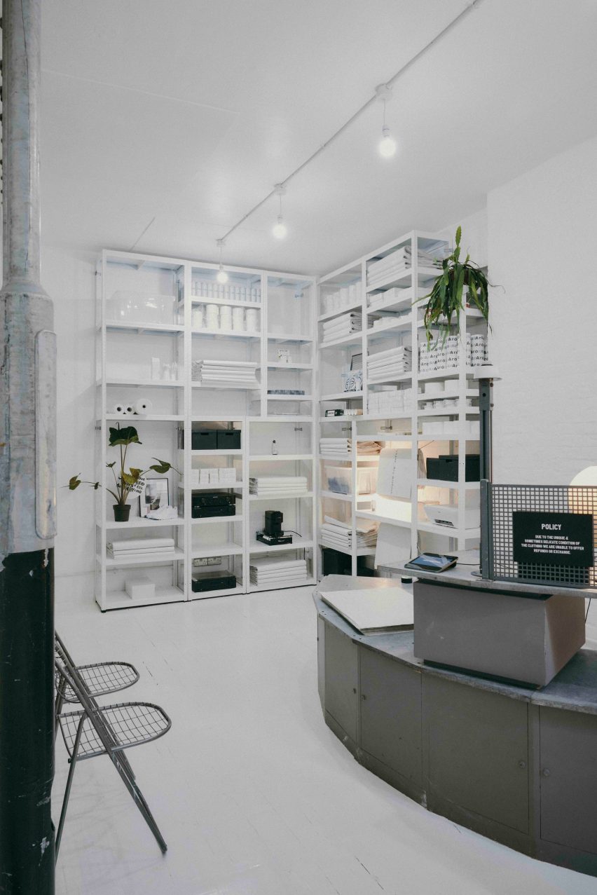
Monochrome pastel pink, blue and white hues decorate the different levels, which also feature a wide range of reclaimed and recycled materials, furniture and artworks.

Blue floor in Aro ArchiveBlue floor in Aro Archive
Founder Ariana Waiata Sheehan created the interior design

“The pink floor is supposed to feel very warm, womb-like and enclosed,” Waiata Sheehan said. “The blue floor is more light and otherworldly. And the two white floors are very ethereal and calm.”

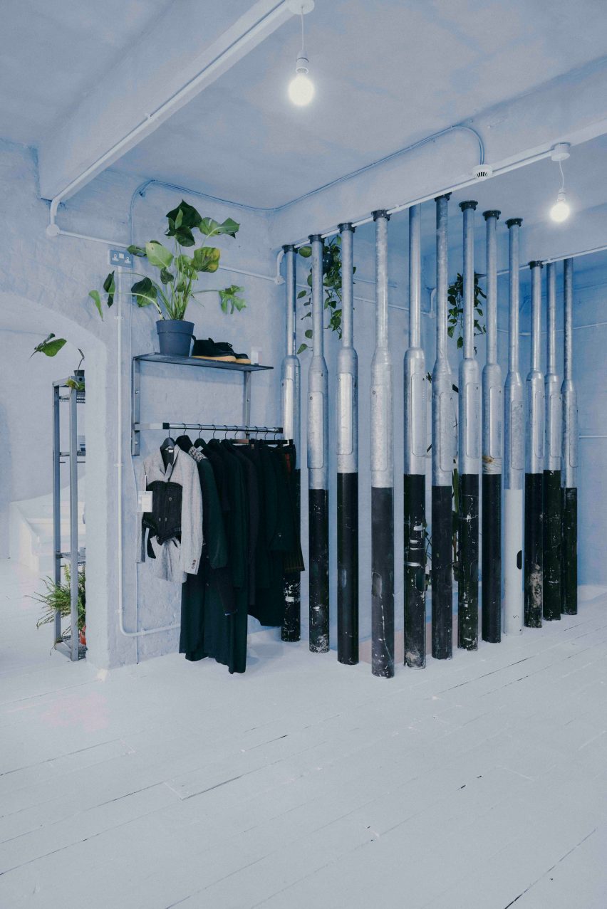
White duvet covers by fashion house Maison Martin Margiela were used to create curtains for the changing rooms, while interior pillars are made from reclaimed 1990s metal lamp posts that the designer sourced from a scrapyard in Preston.

Martin Margiela duvet-changing roomsMartin Margiela duvet-changing rooms
Duvet covers by Maison Martin Margiela frame the changing rooms

“The building and surrounding area feel very London, so we did want to bring in a sense of that for example with the lamp posts, metal works and details, bright neon lights and so forth,” Waiata Sheehan said.

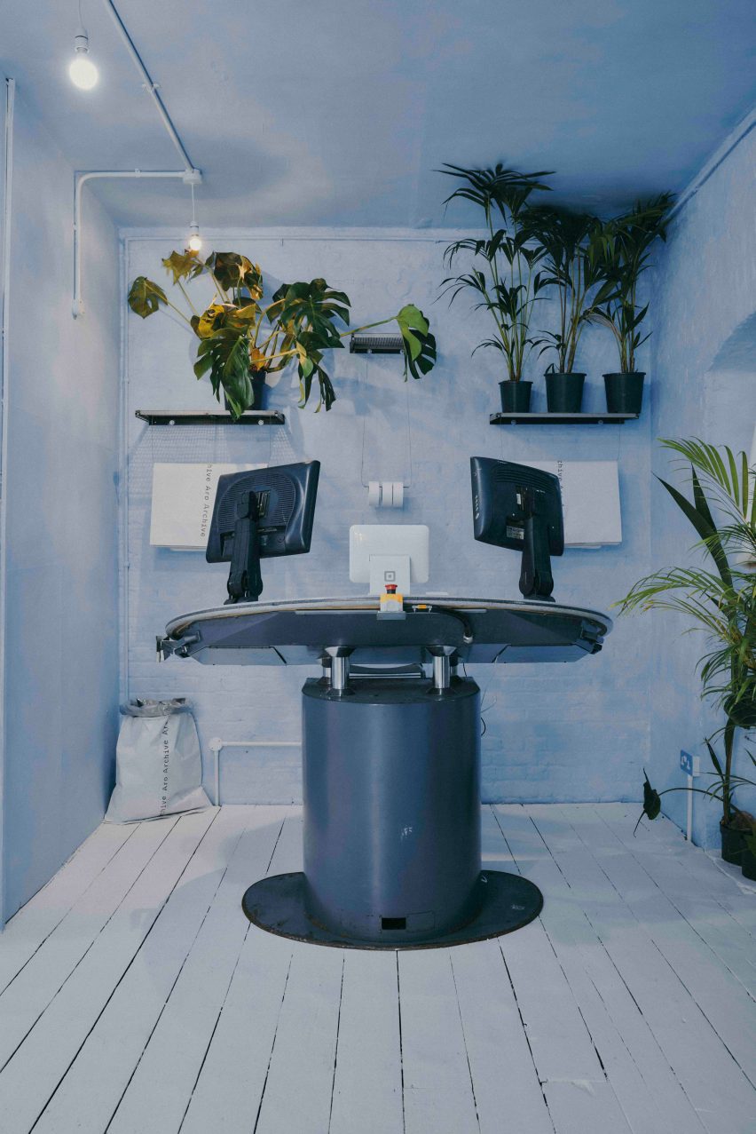
She sourced a number of unusual furnishings for the Aro Archive store, including an industrial control station from a paper-manufacturing plant that is now used as a till.

“The industrial paper control station I’ve been watching on eBay for nearly 4 years, waiting for a time I had the space to buy it,” Waiata Sheehan explained. “I wanted something different to the normal till, they’re all so boring and square.”

The store also has another large metal till and metal drawers that originally came from a 1980s Mary Quant store and were rescued from a squat in Hackney Wick.

Metal till from Mary QuantMetal till from Mary Quant
A large metal till was originally from a Mary Quant store

Waiata Sheehan also sourced several smaller pieces for the boutique, where customers can purchase everything down to the artwork, furniture and accessories.

“I do all the buying so everything is here because I love it in some way,” she explained. “But in terms of favourite pieces in store right now?”

“For fashion, it’s the Rick Owens orange shearling gimp mask gilet, for objects the Shirin Guild ceramic incense holders and for furniture the wobbly glass table with magazine racks.”

Industrial control stationIndustrial control station
Waiata Sheehan bought an old industrial control station from eBay

Waiata Sheehan hopes the Aro Archive boutique will feel like a home away from home and help to create a community feel in the area.

“I think Shoreditch is lacking a sense of community and I wanted to work that into the space,” she said. “The feeling of a chaotic family home and a feeling of togetherness.”

Pillars made from lampposts at Aro ArchivePillars made from lampposts at Aro Archive
Lampposts from a scrapyard form pillars inside the store

Other London stores with notable interior design recently covered on Dezeen include Swedish fashion brand Toteme’s newly-opened Mayfair store and a Coach pop-up store at Selfridges that had fixtures made from recyclable materials.

The photography is by John Munro.

Reference

Sam Crawford Architects tops Sydney home renovation with “garden oasis”
CategoriesInterior Design

Sam Crawford Architects tops Sydney home renovation with “garden oasis”

A private roof terrace enclosed by greenery features in Hidden Garden House, a Sydney home reconfigured by Australian studio Sam Crawford Architects.

Situated within a conservation zone, the home has been updated by Sam Crawford Architects to brighten its dark interior and transform it into an urban “sanctuary”.

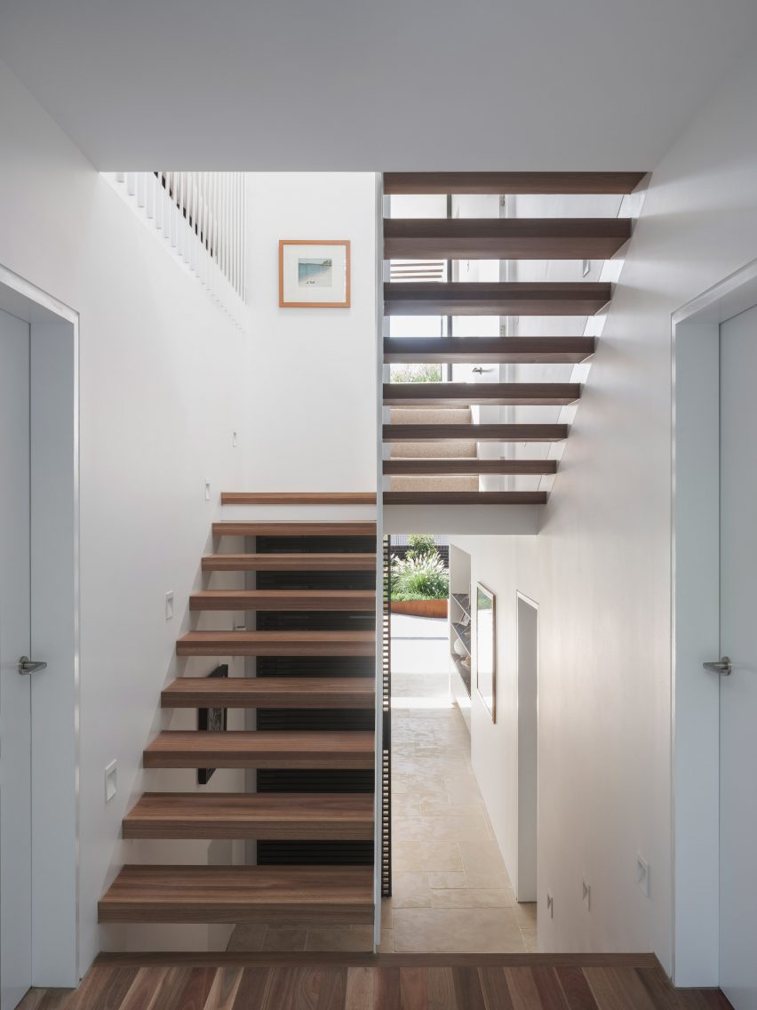
Entryway of Hidden Garden House by Sam Crawford ArchitectsEntryway of Hidden Garden House by Sam Crawford Architects
An open-tread staircase has been added to the hallway

Alterations to the 198-square-metre home’s interior are first seen in its entrance, where a stair with open treads and a white-steel balustrade replaces a solid timber structure that previously restricted light from a skylight above.

Down from the entry hall is a spacious ground-floor kitchen and dining area, which is illuminated by 4.5-metre-high glass openings that lead out to a landscaped patio. The patio is paved with limestone tiles that extend out from the interior.

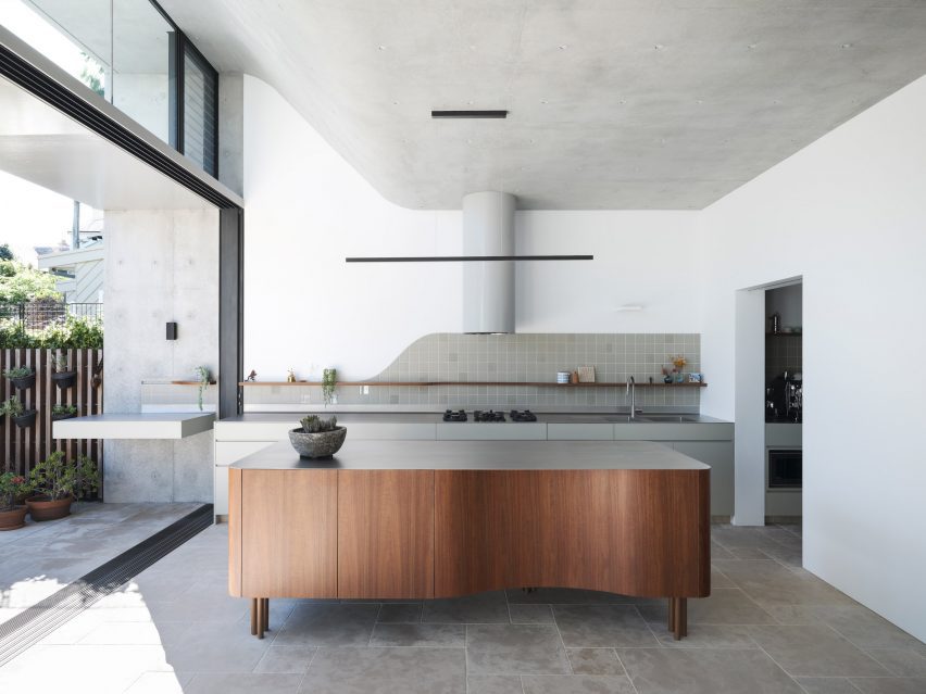
Renovated kitchen and dining area in Sydney home by Sam Crawford ArchitectsRenovated kitchen and dining area in Sydney home by Sam Crawford Architects
A curved concrete roof features in the kitchen

“By extending the ground floor finishes through the full-width doors into the rear yard, the garden and high-level green trellises at the rear of the site form the fourth wall to the rear wing,” studio director Sam Crawford told Dezeen.

“They create a sense of enclosure that draws the occupant’s eye up to the expanse of the sky rather than surrounding suburbia.”

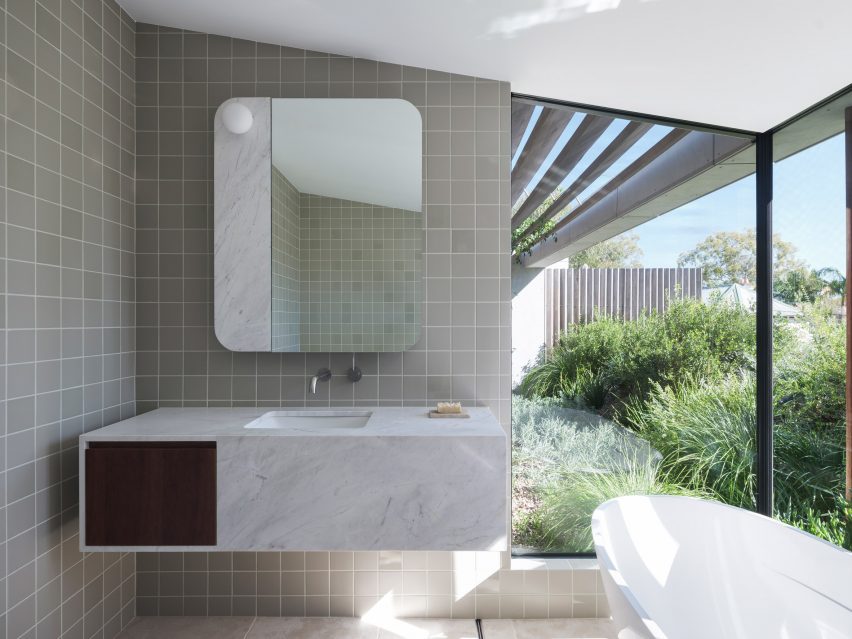
Bathroom interior at Hidden Garden House in AustraliaBathroom interior at Hidden Garden House in Australia
Angled timber screens and greenery ensure privacy for the bathroom

A concrete ceiling in Hidden Garden House’s kitchen curves upwards to help draw in the winter sun and provide summer shading, while operable clerestory windows allow natural ventilation.

Above, this curved ceiling forms a sloped roof terrace filled with plants, which is situated off the main bedroom on the upper floor.

An ensuite bathroom, also lined with limestone floor tiles, has expansive openings offering a scenic yet private bathing experience enabled by angled timber screens and the terrace’s greenery.

“The rolling green roof serves as a visual barrier to the surrounding suburb, whilst allowing the occupants to occupy their private garden oasis,” added Crawford.

Living space interior of Hidden Garden House in SydneyLiving space interior of Hidden Garden House in Sydney
White walls and wooden furniture feature throughout the interior

Hidden Garden House’s consistent material palette of bright white walls and wooden furniture ties its living spaces together, while decorative square tiles line both the kitchen and bathrooms.

Curved details, such as the patio’s shape and the kitchen island and splashback, also feature throughout.

Terrace of Hidden Garden House in Sydney designed by Sam Crawford ArchitectsTerrace of Hidden Garden House in Sydney designed by Sam Crawford Architects
The home aims to be an urban “sanctuary”

Other alterations that were made to improve Hidden Garden House’s layout include the relocation of entrances to the ground floor laundry room and bathroom.

Elsewhere, Sam Crawford Architects has also created a restaurant topped with an oversized steel roof and a bridge modelled on the curving shape of eels.

The photography is by Tom Ferguson.


Project credits:

Architect: Sam Crawford Architects
Builder:
Toki
Structural engineer: Cantilever Engineers
Civil & hydraulic engineer: Partridge
Acoustic engineer: Acoustic Logic
Heritage consultant: Damian O’Toole Town Planning
Quantity Surveyor: QS Plus
Landscape design: Gabrielle Pelletier, SCA
Roof garden supplier: Fytogreen Australia

Reference

Our biggest climate challenge is no longer denial, but despair
CategoriesSustainable News

Our biggest climate challenge is no longer denial, but despair

Climate fatalism stands in the way of a sustainable future but designers and architects are in an ideal position to overcome it, writes Katie Treggiden.


The mainstream media is finally waking up to the realities of climate change. As wildfires, floods and storms wreak havoc across the world, journalists and activists far braver than me are speaking truth to power to make sure we all know just how serious this thing is. And that is vital and right and proper.

However, fear doesn’t motivate action. The biggest obstacle for the environmental movement is no longer climate-change deniers – the evidence is incontrovertible to all but conspiracy theorists. It is those who are fully on board with the fact that humans are the root cause of some very real problems, but just don’t believe that we have what it takes to solve them. Our biggest climate challenge is no longer denial, but despair.

Fear doesn’t motivate action

To spark meaningful change, we need hope. We need to believe not only that a better world is possible, but that we each have the power to help bring it about.

I’m not talking about blind faith or passive optimism. I’m talking about active hope. I’m talking about waking up every morning and making a choice to believe that we can solve this wicked problem, and then choosing to act accordingly. And in today’s climate – political, economic and social as well as environmental – hope is an act of defiance.

So, how can architects and designers inspire defiant hope?

The Berkana Institute’s “two loops” model of systems change proposes multiple roles that people and institutions can play in the transition from a declining system to an emerging one. As the dominant system begins its decline, “stabilisers” keep what is required in place until something better is ready, while “hospice workers” support the process of decline, minimising harm to those still within it.

In turn, the emergent system gathers pace as “pioneers” come up with new ideas, products and systems and they are joined together into networks by “connectors”. Together, they form supportive “communities of practice” that enable them to grow their influence and, eventually, rise up to replace the old system.

In the transition from the declining linear take-make-waste economy to an emerging regenerative and circular economy, we might cast architects and designers in the role of “pioneers” – problem-solvers who can create pragmatic ways to move society towards a better world.

And that is valid; if architecture and design solve problems, then surely they should contribute genuine, impactful, and replicable solutions to arguably the biggest problem ever to have faced humanity.

In today’s climate – political, economic and social as well as environmental – hope is an act of defiance

However, I believe they can also play another part. On the emerging-system loop, there is a role for “illuminators”: people who paint a picture of what a better world might look like.

You see, there is no point in the model where the two loops touch, no simple juncture where people can step off one system and onto the next – they must take a leap of faith. Illuminators are the people who can give them the courage to do that.

One of the questions I get asked most often when I speak at conferences about craft and design in the transition to a circular economy is: “Okay, but how does it scale?”

Firstly, I would contend that scalability is what got us into this mess, and what we need instead are locally replicable solutions, but increasingly I am questioning whether everything we propose as an industry even needs to do that. Perhaps part of our role is simply to inspire hope – defiant, stubborn, active hope.

Kyloe Design’s kelp chair, showcased recently as part of Green Grads at the London Design Festival, may never make it into production and it’s highly unlikely that it will drive the wholesale replacement of leather across the furniture industry. But it does showcase the potential of this incredibly renewable, climate-positive, underutilised material, while provoking the curiosity to learn more.

From responsible material sourcing and advocating for worker welfare to using smartphone components anyone can switch out, Fairphone is offering real-world solutions. But its founder, Bas Van Abel, was realistic about what he could achieve directly, so launched the company with the stated aim of motivating the rest of the industry.

There is little doubt that his efforts have had a hand in both the incoming EU legislation that will require smartphone batteries to be “easily replaceable” and the recent launch of a repairable Nokia phone.

Part of our role is simply to inspire hope – defiant, stubborn, active hope

Zaha Hadid Architects principal Patrik Schumacher might have criticised the “lack of architecture” at last year’s Venice Architecture Biennale, but what if contributions such as the German pavilion (pictured), which he described as nothing more than “piles of construction material”, are exactly what we need to inspire alternative ways of working? Entitled Open for Maintenance, the exhibition was billed as “an action framework for a new building culture” and collated materials recovered from previous installations to be used for repairing and upgrading buildings and public spaces all over Venice.

One of my favourite quotes about hope is from the author Arundhati Roy, who says: “Another world is not only possible, she is on her way. On a quiet day, I can hear her breathing.” The question I would like to pose is: how can we, as an industry, help everyone to hear the sound of her breath?

Katie Treggiden is the founder and director of Making Design Circular, a membership community and online-learning platform for sustainable designers and makers, and the author of Broken: Mending and Repair in a Throwaway World (Ludion, 2023).

Dezeen In Depth
If you enjoy reading Dezeen’s interviews, opinions and features, subscribe to Dezeen In Depth. Sent on the last Friday of each month, this newsletter provides a single place to read about the design and architecture stories behind the headlines.
Reference