Interior Design Ideas for Living Big in Small Spaces
CategoriesSustainable News Zero Energy Homes

Interior Design Ideas for Living Big in Small Spaces

While some large-scale builders still cling to huge home floor plans and many upscale buyers still demand them, there is a rapidly growing interest in smaller homes. Small homes use less energy, require a lower carbon input, and cost less to maintain than the typical suburban estate. If you’re building a new home, you have many options for reducing size and living very comfortably (link to Part I). If you’re buying or living in an existing small home, you also have opportunities to make it live bigger without ripping into walls or raising the roof. It’s amazing how creative interior design can expand the visual space and increase the comfort and utility of a small home. Here are some tips.


Interior Design

Keep it light. Paint the walls a light color. Various shades of white or beige are classic choices. If you’re more adventurous, consider light yellow or pastels. Accent walls of brighter hues can add interest. To make a room seem brighter, select an eggshell finish that is slightly more reflective than flat wall paint. Use semi-gloss paint in bathrooms to reflect light and reduce vapor diffusion into walls. 

Choose flooring material. Using the same flooring material for connected spaces will tie the spaces together visually and make them look larger. For example, a kitchen and dining area could have the same tile flooring. Using different materials, distinguishes spaces without actually interrupting the view. A living room next to the dining area can be defined with a hardwood floor, but not blocked off. 

Install mirrors. Reflecting light and extending interior views can be accomplished with strategically placed mirrors

Occupy window sills. Most zero energy homes have thick walls, which brings the added benefit of wide window sills. Consider enhancing their interest with bold sill material, such as stone, tile, or another unique finish. Make the most of these built-in shelves to grow houseplants or display decorative items. 

Enhance trim and detail. High-quality trim and detail can be a key focus of a small house. For example, high-quality hardware and moulding, and other aesthetic touches, can draw attention to the details creating more visual interest with less need to clutter the room with knick-knacks.

Add a focal point. Each room should have one attractive attention-getting feature. This can be a building element, such as built-in furniture, a work of art, or an intriguing light fixture.


Furnishings

Choose quality. Too much clutter makes homes seem small. Small homes should have small comfortable furniture or a smaller amount of carefully selected larger furniture. 

Open up. Select chairs and sofas with open legs instead of those with enclosed bases. These pieces seem lighter and offer a bit more visual space in the room because you can see below them. 

Include storage. Some furniture pieces come with storage, such as an ottoman or footstool, that opens up and contains storage. Some bed frames come with storage below the mattress, either in drawers or the mattress itself may lift. 

Make it tall. Well-designed small homes have high ceilings. Much like clothes with vertical stripes make people look taller, tall furniture pieces will accentuate tall ceilings and draw the eye upward. Similarly, a tall plant will reach into the higher spaces and create visual interest.   

Fold it. Find furniture that transforms to different uses. A coffee table can become a dining table. Tables that hinge down from the wall will allow them to be deployed without moving objects sitting on the floor. The classic space-saving transformer is the Murphy bed. This allows the bedroom to have a day job, too. 

Hidden offices. There are many “hidden” desk ideas that allow for a home office to be discreetly hidden or camouflaged in a living area or bedroom.

Seek niche storage. Look for the small empty spaces that can hold your stuff and reduce clutter. Cabinets can hide less attractive household items, while open shelves can display your treasures. Examine the back side of the closet and pantry doors. Is there space for wall-mounted storage baskets or hooks that will be out of site, but easily accessible? 


Few small homes will use all these ideas, but each one has its merits. Apply the ones that make sense for your situation to make your small home look and live bigger. Be proud that your small home reduces your carbon footprint, has less upkeep, and saves you money without sacrificing comfort.

Reference

Ten living spaces that don't relegate tiles to the bathroom
CategoriesInterior Design

Ten living spaces that don’t relegate tiles to the bathroom

Our latest lookbook rounds up 10 living spaces that take tiling from practical to decorative, applying it to everything from bars and fireplaces to entire statement walls.

Tiles in the modern home are often consigned to the bathroom or kitchen, where their durable finish can protect walls from water damage.

But a growing cohort of designers are using the surfacing much like they would rugs or wallpapers, as a means of bringing colours and patterns into living spaces.

Whether made from ceramic, stone or concrete, this can help to imbue an otherwise cosy interior with a much-needed sense of depth and dimension.

This is the latest in our lookbooks series, which provides visual inspiration from Dezeen’s archive. For more inspiration see previous lookbooks featuring maximalist interiors, kitchens with polished granite surfaces and brutalist interiors with a surprisingly welcoming feel.


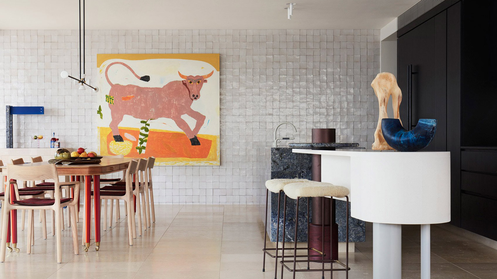
Bar area of Dream Weaver penthouse designed by YSG
Photo is by Prue Ruscoe

Dream Weaver penthouse, Australia, by YSG

Spanish tapas bars informed the design of this penthouse in Sydney, which belongs to a couple of empty nesters.

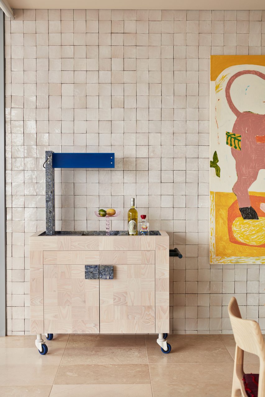
In the open-plan living space, this reference was translated into an entire wall of glossy off-white tiles, providing the backdrop for a custom bar trolley made from white ash and blue granite.

Find out more about Dream Weaver penthouse ›


Conde Duque apartment by Sierra + De La Higuera
Photo is by German Sáiz

Conde Duque apartment, Spain, by Sierra + De La Higuera

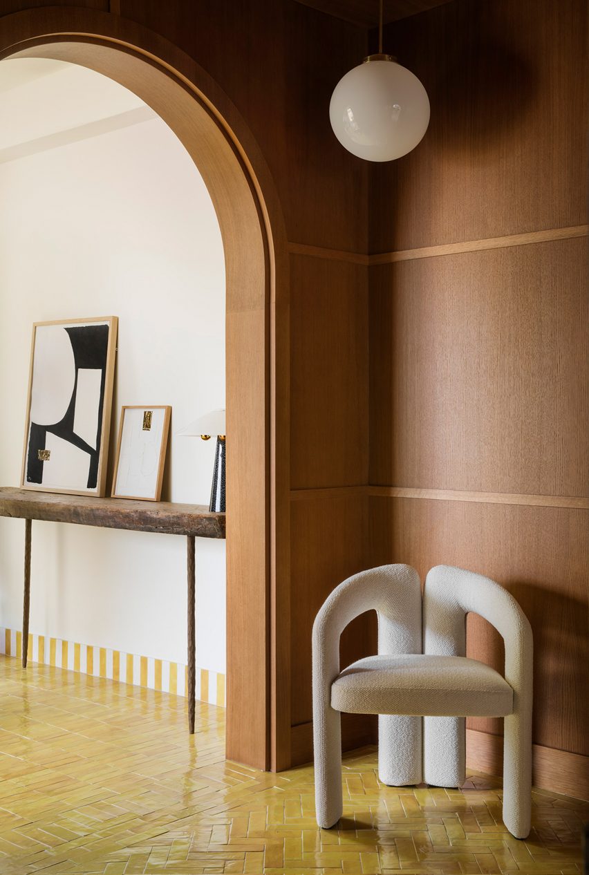
Vibrantly glazed tiles help to define the different zones in this apartment in Madrid, with green used in the kitchen, red and blue in the bathrooms and yellow in the living areas.

The traditional Moroccan zellige tiles are characterised by their tonal and textural variations, with imperfect surfaces that are moulded by hand.

Find out more about Conde Duque ›


Puro Hotel Stare Miasto Kraków by Studio Paradowski
Photo is by Pion Studio

Puro Hotel Kraków, Poland, by Paradowski Studio

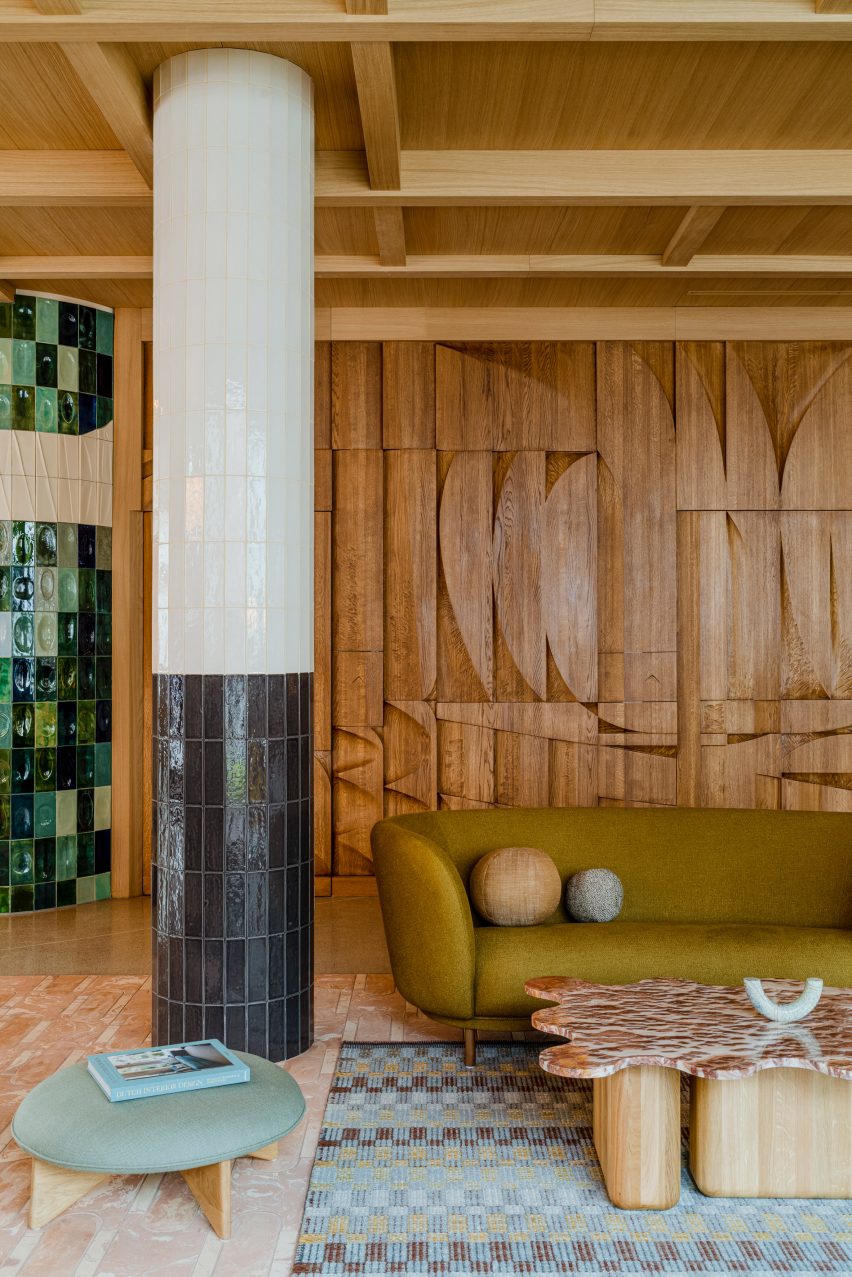
Polish practice Paradowski Studio mixed and matched different kinds of tiling throughout this lounge, covering everything from the floor to the columns to an entire wall, designed by artist Tomasz Opaliński based on the modernist mosaics of the 1970s.

To soften up these hard, glossy surfaces and add a sense of warmth, the studio added plenty of textiles plus a stained oak bas-relief, which a couple of doors.

Find out more about Puro Hotel Kraków ›


Green-tiled bar
Photo is by Joana França

São Paulo apartment, Brazil, by Casulo

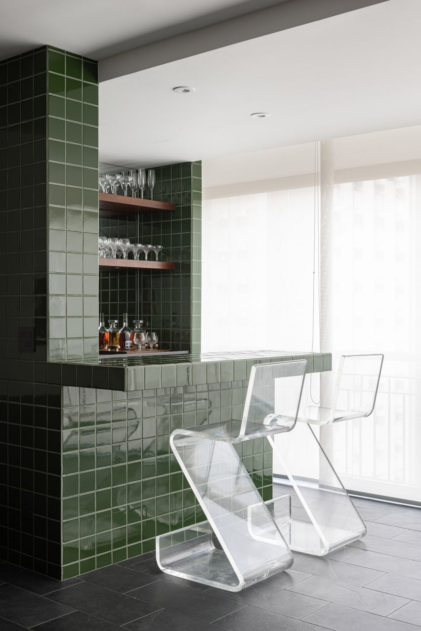
A bar clad in glossy green tiles forms the centrepiece of this living room, contrasted against the matt black slate on the floor.

Brazilian studio Casulo repeated this same material palette in the bathroom and kitchen of the São Paulo apartment, which the owners bought at a closed-door auction without seeing its interior.

Find out more about São Paulo apartment ›


Yurikago House by Mas-aqui
Photo is by José Hevia

Yurikago House, Spain, by Mas-aqui

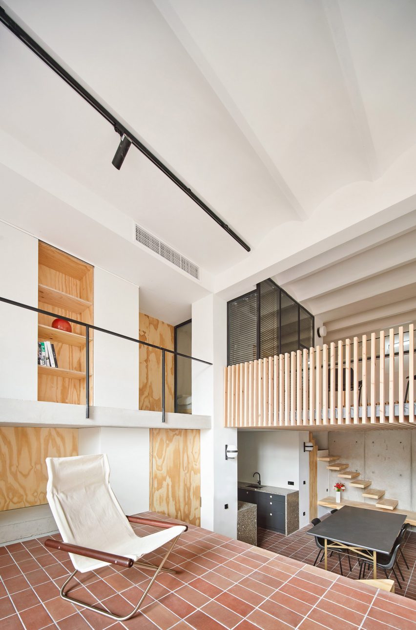
Hydraulic tiling helps to create a sense of continuity across the various different floors and half-levels of this apartment, designed by architecture studio Mas-aqui.

The natural tonal variations of the reddish-brown ceramics help to create a sense of depth and texture despite using only one material.

Find out more about Yurikago House ›


Interiors of Hotel Les Deux Gares in Paris
Photo is by Benoit Linero

Hotel Les Deux Gares, France, by Luke Edward Hall

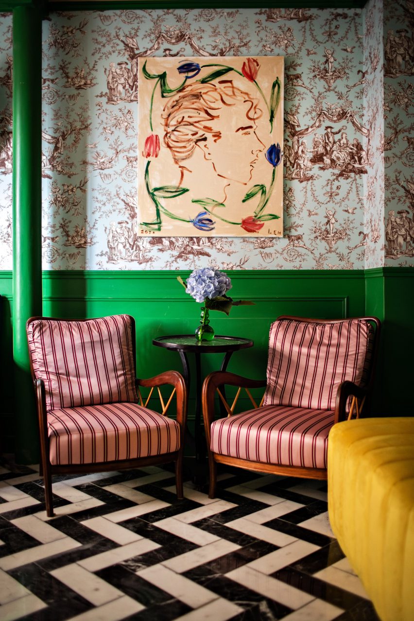
Chevron marble floors, striped pink-satin armchairs and chintzy duck-egg blue wallpaper create a riotous clash of patterns and colours in this lounge by British designer Luke Edward Hall.

“I really wanted this space to feel above all joyful and welcoming and alive, classic but a little bonkers at the same time,” he explained.

Find out more about Hotel Les Deux Gares ›


House in Girona, Barcelona by Arquitectura-G
Photo is by José Hevia

Reforma de una Vivienda en Ensanche, Spain, by Arquitectura-G

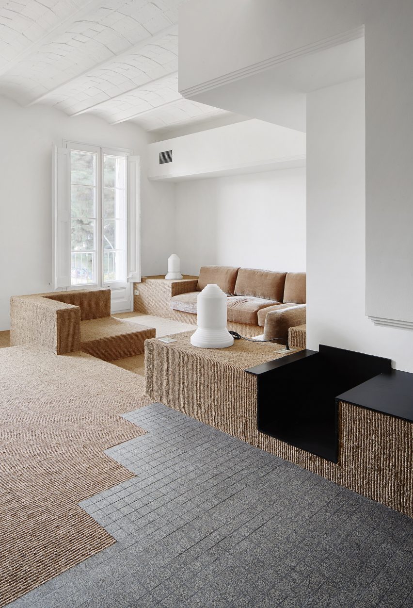
Barcelona practice Arquitectura-G removed a series of dividing walls from this apartment to let more light into the plan and relied on changing levels and flooring to denote different areas.

Here, the transition from the hallway to the lounge is signified by a zig-zagging junction between the gridded grey tiling and the neutral-toned carpet, which is made from coarse sisal plant fibres.

Find out more about Reforma de una Vivienda en Ensanche ›


Fireplace in Passeig de Grácia apartment by Jeanne Schultz
Photo is by Adrià Goula

Passeig de Grácia 97, Spain, by Jeanne Schultz

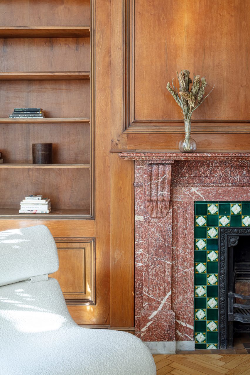
A pink stone fireplace with chequered tiling served as the starting point for the renovation of this old Barcelona apartment, with doors, window frames and ceiling mouldings throughout the home painted in a matching shade of green.

Designer Jeanne Schultz also introduced minimal yet characterful modern furnishings to keep the focus on the building’s period features, which also include traditional Catalan vault ceilings and wooden parquet flooring.

Find out more about Passeig de Grácia 97 ›


Point Supreme Athens apartment
Photo is by Yiannis Hadjiaslanis

Ilioupoli apartment, Greece, by Point Supreme

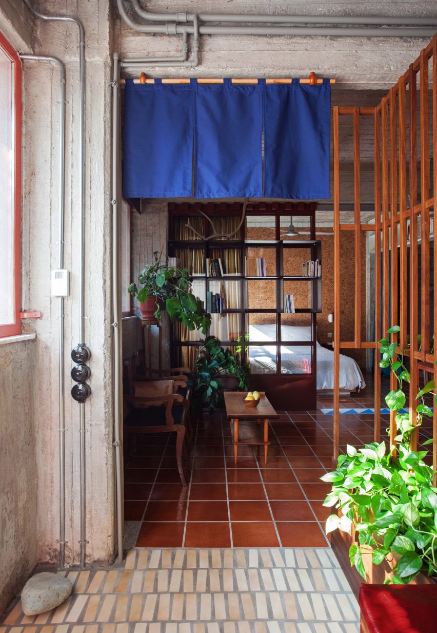
Originally popular in the 1970s, when they were used to cover verandas and porticos in holiday homes throughout Greece, these glazed terracotta tiles were salvaged from storage so they could be used to cover the floor of a one-bedroom home in Athens.

Formerly a semi-basement storage space, the apartment is located at the bottom of a typical Athenian polykatoikia – a concrete residential block with tiered balconies.

Find out more about Ilioupoli apartment ›


Casa AB by Victor Alavedra
Photo is by Eugeni Pons

Casa AB, Spain, by Built Architecture

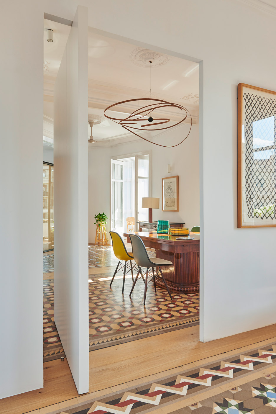
When Built Architecture renovated this 19th-century Barcelona apartment, the Spanish practice retained the traditional mosaic flooring laid throughout most of its rooms, including the hallway, bedroom, living and dining room.

The spaces between the tiling were filled with oak floorboards to match the custom oak cabinetry the studio installed to run longways through the apartment like a spine, dividing up the private and communal areas.

Find out more about Casa AB ›

This is the latest in our lookbooks series, which provides visual inspiration from Dezeen’s archive. For more inspiration see previous lookbooks featuring maximalist interiors, kitchens with polished granite surfaces and surprisingly welcoming brutalist interiors.

Reference

This Danish Firm Took Rainwater-Damaged Walls and Made Interactive Green Spaces
CategoriesArchitecture

This Danish Firm Took Rainwater-Damaged Walls and Made Interactive Green Spaces

How can architecture be a force for good in our ever-changing world? During Future Fest, we’ll pose this question to some of the world’s best architects. Launching in September, our three-week-long virtual event will be 100% free to attend. Register here!

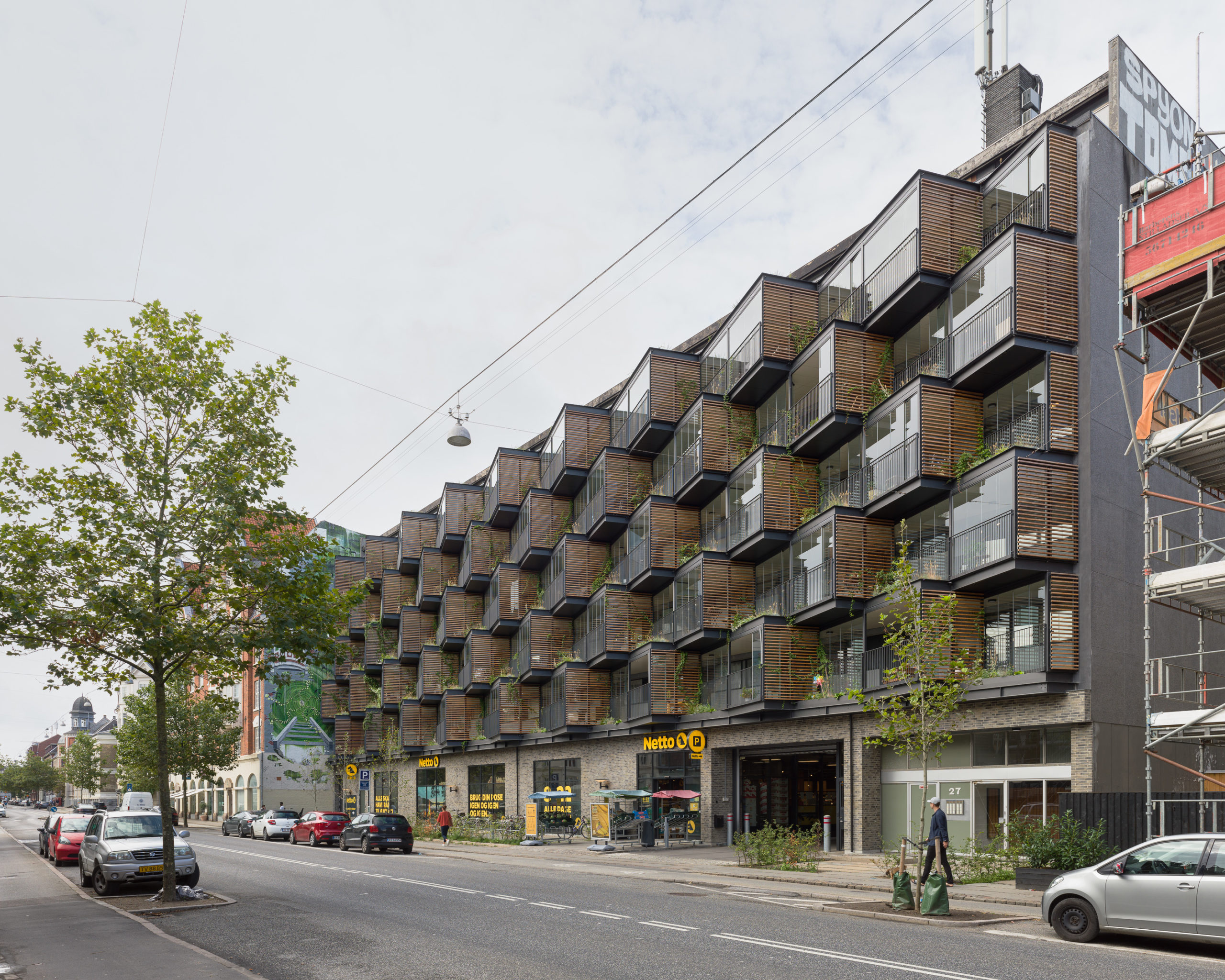
This is the story of an apartment building in Frederiksberg, Denmark, which was often called one of the ugliest buildings in the neighborhood over the past few decades. Its continuous concrete balconies and a stark grey façade might have been associated with efficient rental architecture when it was designed by Ole Hagen Arkitekter in the 1960s, but in the 2000s, it came across as cold and isolated. Over the years, residents became plagued with rainwater-damaged walls and constant nuisance from the heavy traffic on the street beyond.

Now, the old concrete edifice has been transformed into a spectacular award-winning building that has earned praises from both the locals and the government and stands as a source of inspiration for those with new visions to transform old buildings. In an interview with Renover Denmark, residents said that they now felt proud to call this building a home. So how did this dramatic transformation come to pass?

Instead of just addressing the water damage, Tegnestuen LOKAL came in with a vision to turn the existing façade of Ørsted Gardens into an interactive green space. “The main idea with the Ørsteds Haver project is to create a holistic environmental, social and architectural counterpoint to the pragmatic renovations that are carried out all over the country, and which often have a one-sided focus on energy,” they explain. This approach is one of the reasons that the building swept the Architecture +Renovation category in the 10th Annual A+Awards.
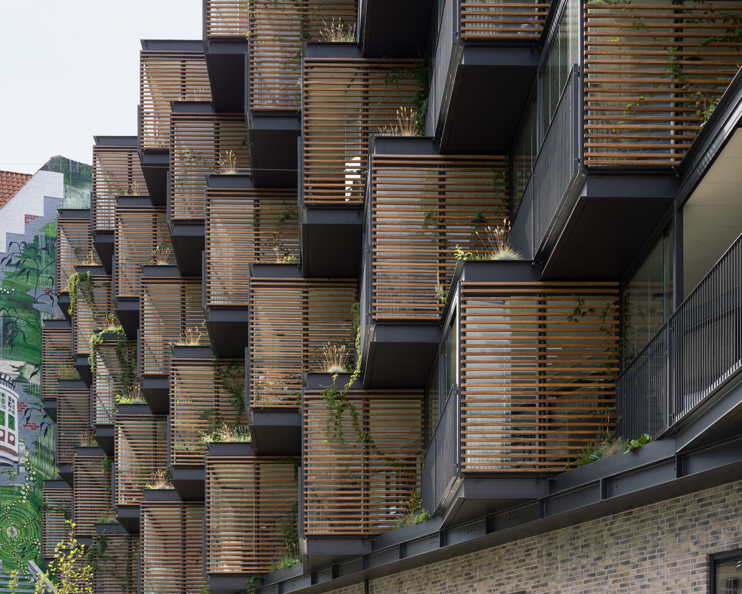
The idea was to create an environment that catalyzed random interactions, in turn generating new friendships between neighbors — which may sound idealistic, but has proven successful according to local residents. In addition to addressing the needs of future inhabitants, the design also takes into account the passersby and their experience of the building as they walk by it. The studio achieved this feat by creating triangular semi-private spaces to replace the older balconies. The system uses a mechanism similar to shelves where these boxes are fitted into the existing concrete structure. The bays on the bottom support the ones on the stop. Tension bands have been placed around to building to ensure that the additions don’t fall outwards.

These triangles are angled with glass on one side and a slatted screen on the other. The modules are staggered to break up a monotonous surface and also create space for planters within the gaps. Furthermore, the fifty small gardens also bleed into the interiors with small soil patches inside where residents have the option to plant their own saplings within these nooks. This helps them customize the space the way they would want it and introduces subtle differentiation between the modules. These bays also have openable glass panels to ensure that the space can be used through the different seasons. Another advantage is that this system acts as a buffer and dampens some of the noise from the busy street below.

The small gardens set between these balconies are made of welded steel boxes that come from the manufacturer and are placed directly into these gaps. They have an automatic irrigation system as well as spouts to ensure that the excess water from the garden falls directly into the garden below, indirectly enabling them to water themselves.
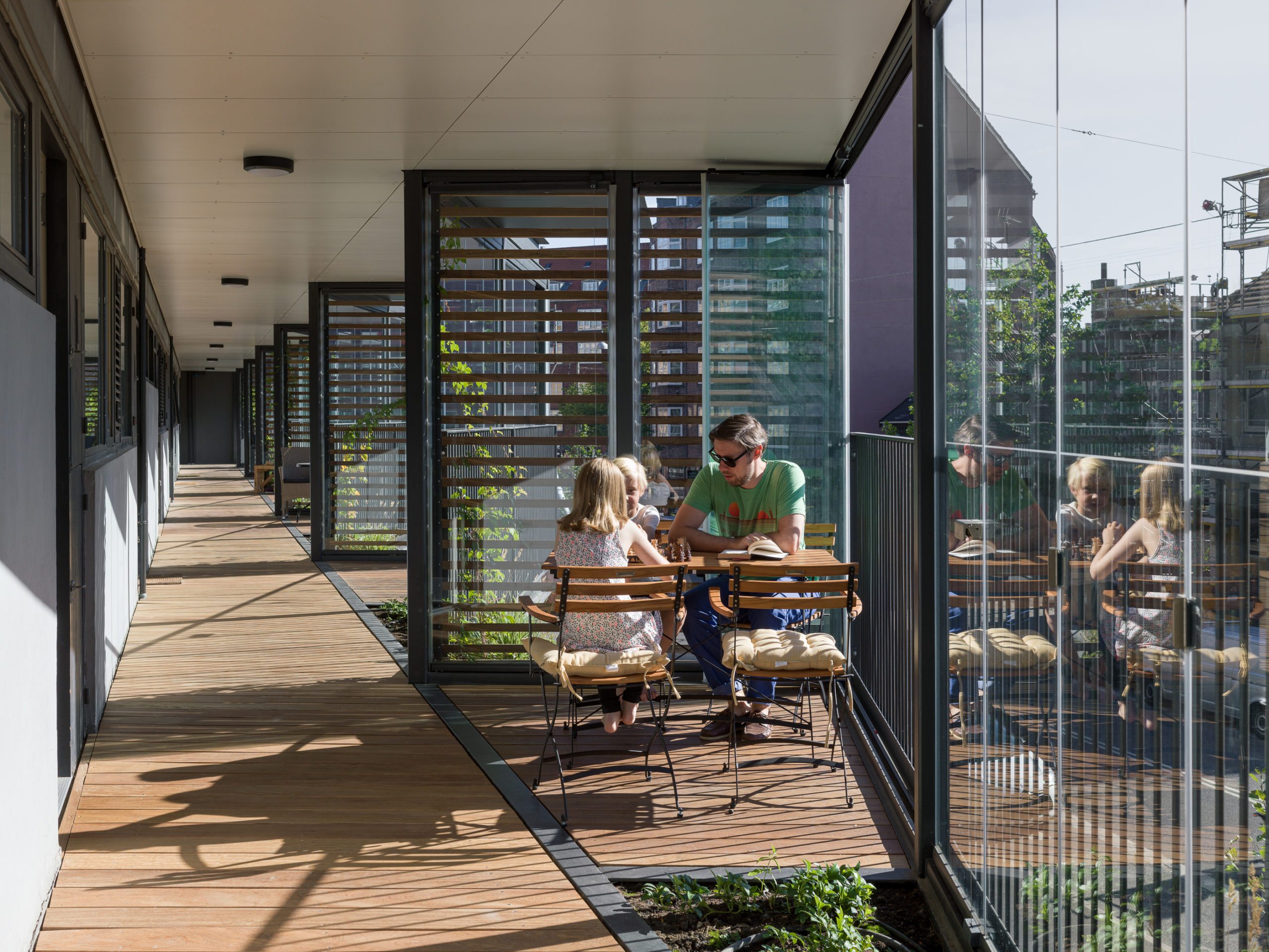
Introducing a social dimension to the building was more important to the studio than simply focusing on an energy-efficient model. “Energy renovations are effective from an economic and environmental point of view, but in their basic substance they do not take a critical view of the architecture being renovated,” they said. “Often, the architecture is simply repeated, without regard to the quality of the original project, and this unfortunately results in buildings with both poor social and environmental attributes being renovated solely with a better operating economy as the primary success criterion.”

Sustainability stands at the core of design decisions today. However, new additions might not solve the problems of current structures that consume too much power, have bad ventilation systems, don’t work with natural light and more. Additionally, the older buildings might not meet the changing needs of their residents. Think about the past two years; being locked at home during the pandemic has reminded people across the world of the importance of human contact, face-to-face conversations and the need to connect with nature for mental and physical wellbeing.

Finding innovative ways to radically transform current buildings is something many architects will have to look into in addition to planning new net zero energy homes and offices. In instances where building-level renovations might be impossible, there are still many opportunities to retrofit water collection, solar generation, green systems or spaces that boost connectivity into the outer envelope of the building that can dramatically change how the building functions and also contribute to the wellbeing of those using it. One single project might not change the world but it sure can make a difference one community at a time.

“If we want to achieve a sustainable future, we cannot rely on only building sustainable buildings going forward. We need to have a visionary method of transforming and adapting existing buildings to meet our changing needs,” said the firm.

How can architecture be a force for good in our ever-changing world? During Future Fest, we’ll pose this question to some of the world’s best architects. Launching in September, our three-week-long virtual event will be 100% free to attend. Register here!

Reference

An App for Everyone: Spaces Is the Conceptual Design Tool Architects Always Needed
CategoriesArchitecture

An App for Everyone: Spaces Is the Conceptual Design Tool Architects Always Needed

The key to a successful architectural project is the development of a strong conceptual model. Conceptual design is the foundation of architecture and oftentimes, determines the future success of a project. Architects are forever in search of reliable and effective design tools that will aid in bringing their ideas to life. However, finding the right tool isn’t always easy. Many applications available today are complicated, costly and don’t always align with the designer’s working rhythm. For the average on-the-go architect, reliable and straightforward tools are key. Thankfully, Cerulean Labs has delivered just what every architect is after: the Spaces iPad app.

Cerulean Labs comprises a global team that is dedicated to improving the conceptual stage of architecture. Back in October of 2021, the company released Spaces: a parametric conceptual design tool made for the iPad. Today, the brand celebrates its continual effort in improving the conceptual design stage with a new and improved version of the app: Spaces version 2.

This updated application has recently hit the market and boasts a comprehensive list of tools fit for architects of all levels and experiences. Spaces version 2 comes complete with improved editing tools, increased 2D viewing options, new sun studies, new sketching capabilities and additional workflow integration options. This application is well and truly built for the masses.

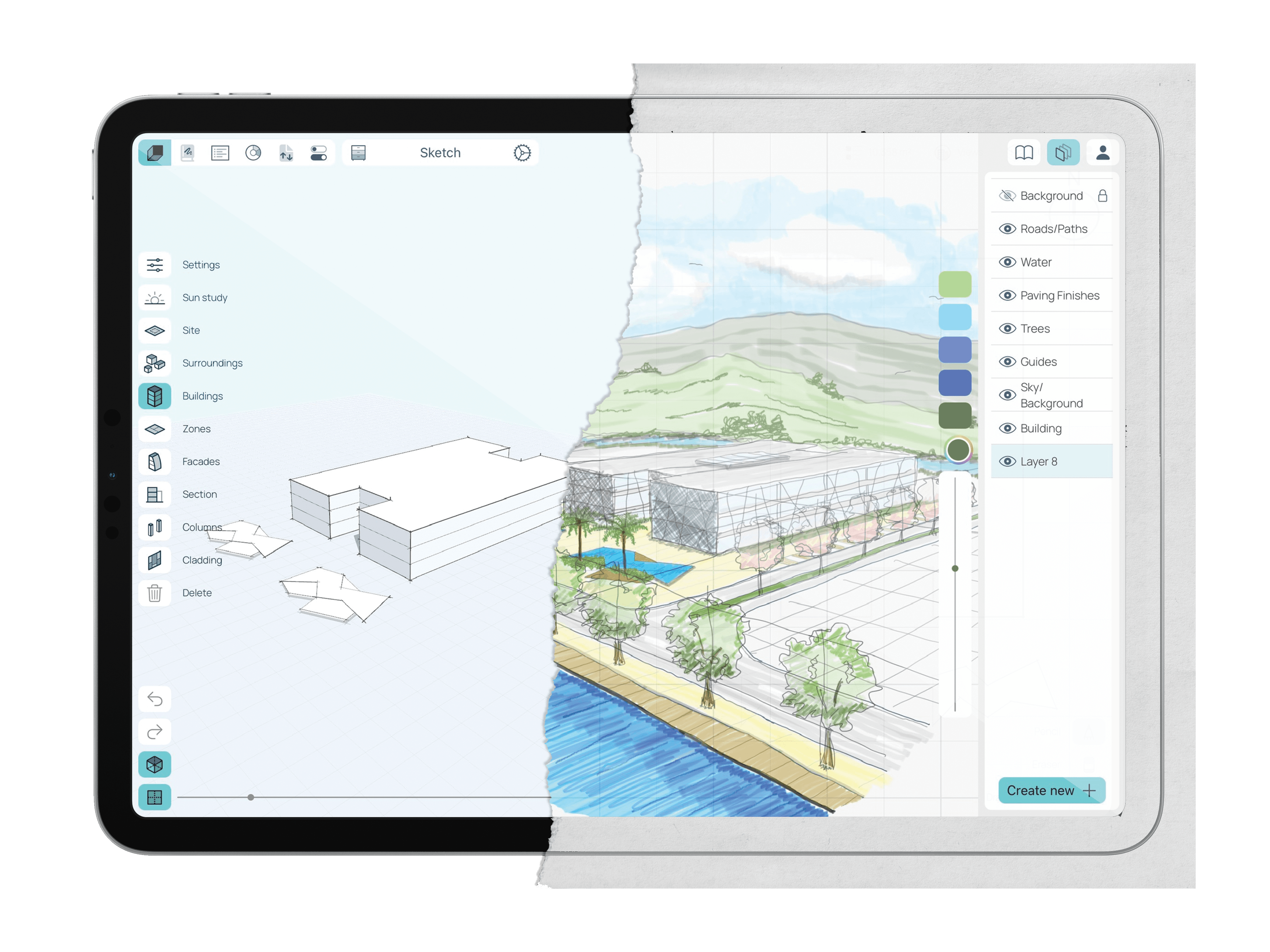
The Spaces version 2 app boasts an easy-to-use yet comprehensive set of design tools. The app merges old-school drawing techniques with modern-day computing technologies into a user-friendly interface. Its clean and clutter-free layout makes it especially useful for those designers who are constantly on the move.

The new digital sketchbook feature lets users swiftly document their ideas whenever — and wherever — they come to mind. The sketchbook encompasses new technologies, such as the Apple pencil, and allows designers to test their ideas out by sketching and note-taking. Moreover, users can send snapshots of their models directly to the sketchbook and trace them using the Apple pencil. This app celebrates architecture’s oldest and most useful tools – a simple pencil and paper.

The improved interface allows users to switch their screen between the Sketch and Modeling modes with ease.

Another fresh addition to Spaces version 2 is the sun study feature. Recognizing how invaluable solar analysis is to the conceptual design process, Cerulean Labs has developed a tool that allows users to specify the exact location and time of day for their model, and instantly see how shadows cast by their project might impact neighboring buildings. Users can impose an animated sun study directly onto their models in real-time, helping them to better understand how their design responds to its surroundings.

Additionally, Spaces version 2 has introduced IFC and OBJ exporting, which means that models can be exported and furthered in a secondary BIM tool. Moreover, the new space planning feature allows users to manage design briefs, create reports and develop project concepts directly on the app. The improved export options and new space planning features ensure that all models come out professional and presentable. In addition, users can import key site data to their design, thus producing a more precise and site-specific model.

Cerulean Labs is committed to growing and developing its Spaces app. iPads are continuing to dominate the AEC world and professional applications like Spaces version 2 offer increasingly powerful platforms to sketch, model and manage conceptual projects. The spaces app is available in both free and paid versions, with a new subscription recently becoming available: the Spaces Pro. Priced at $75 USD per month, the Spaces Pro subscription offers unlimited projects and comes with new and improved export features, reporting tools and modeling capabilities. The application can be downloaded via the Apple App Store and subscriptions can be managed directly through the Spaces website

Spaces by Cerulean Labs demonstrates the vast capabilities of iPad use in parametric conceptual design. The application offers great depth and flexibility, all the while remaining transportable and accessible. It celebrates traditional design tools while implementing the best modern-day technologies out there. The result is a brilliantly straightforward application suitable for all architects and designers.

Cerulean Labs is currently offering an extended free trial for the app, allowing users to try it out for 3 whole months — click here to find out more and download it (offer ends June 30th). To learn more about the Spaces application and all its offerings, check out the Spaces website.

Reference

5 Powerful Ways Lighting Can Transform Simple Architectural Spaces
CategoriesArchitecture

5 Powerful Ways Lighting Can Transform Simple Architectural Spaces

The A+Product Awards is open for entries, with a Main Entry Deadline of June 24th. Get started on your submission today! 

Good lighting can make or break a well-designed interior project. In addition to optimizing the availability of natural light in a space, selecting the right light fixtures can augment the furniture inside and cement a tone for the entire space. Bright white lights can make writing or chopping easier whereas warm yellow lights can make dinners an elevated experience. Similarly, colored lights can liven up parties and candle-lit wall sconces can be perfect for cozy nights.

Layering a variety of lights can add depth to any space and make it more comfortable. This technique also helps utilize different parts of a space in different ways. The scale and size of light fittings can also help fill up spaces or make them look more spacious.


Natural Light

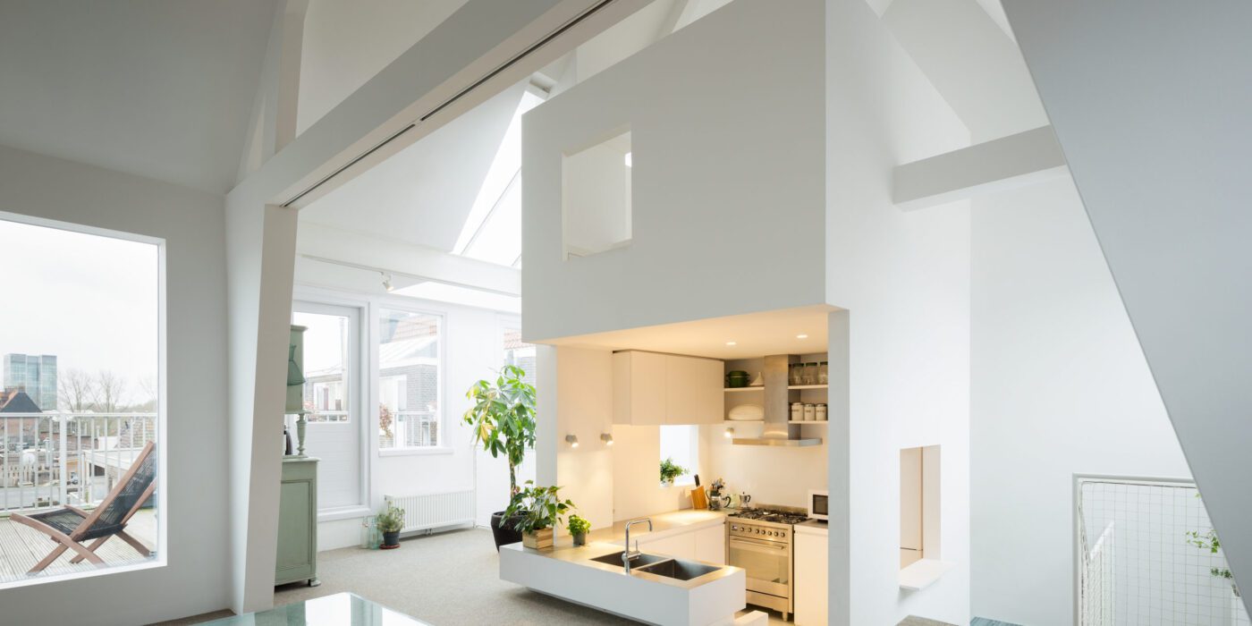
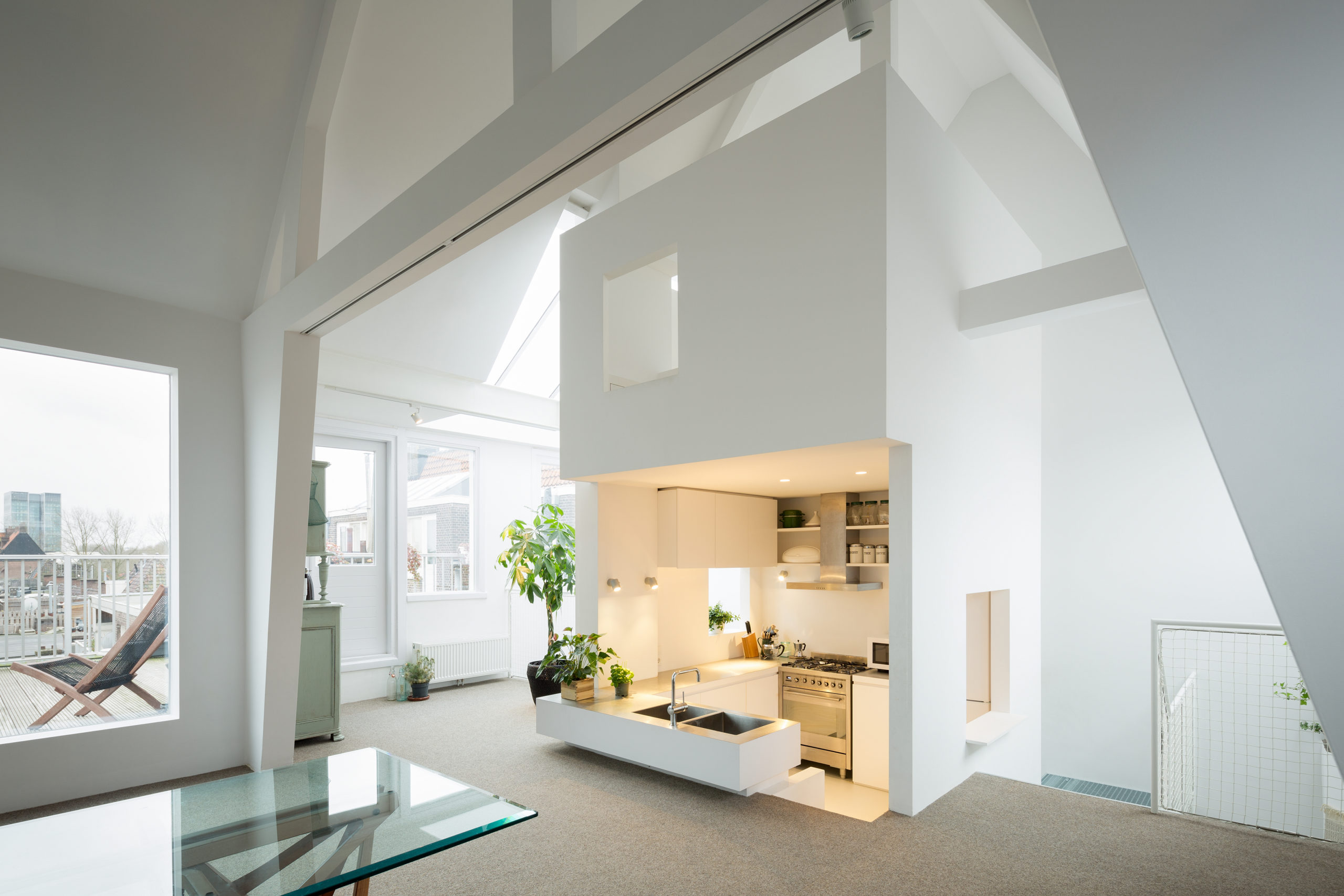
Apartment in Amsterdam by MAMM DESIGN, Amsterdam, The Netherlands | Image by Takumi Ota Photography

For years, designers have been trying to maximize the amount of natural light within a space. Having an abundance of sunlight pouring into a space can help make it feel bright, airy and comfortable (this is especially due to its soothing tone and physical warmth). Another check in favor of designing for natural light: it cuts down on power use.

Exposure to the sun’s rays also helps regulate the body’s sleep cycles as well as overall health. In addition to windows, skylights have become increasingly popular to draw in light in interior spaces. Some interior designers also use cleverly arranged reflective surfaces throughout the space to help the light bounce off of surfaces and make the space feel brighter. Translucent partitions or latticed screens in homes can also help draw light to interior spaces that might otherwise be blocked by solid walls.


Ambient Light

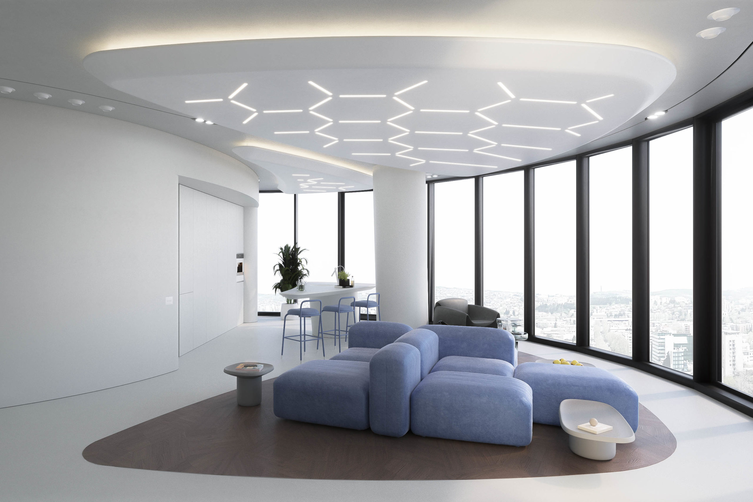
Lenvix by STIPFOLD

Peaches Rooftop Cocktail Bar by Pierce Widera, Melbourne, Australia

This is perhaps the most important selection of lights for a space. Ambient light refers to the fixtures that are used to brighten the entire space, more often than not in a uniform manner. The tone used for ambient light can also determine the overall mood of the space. Offices tend to use white light to help carry out tasks efficiently under the brightness. On the other hand, warmer lighting schemes are gaining popularity in restaurants and homes for the warm and cozy atmosphere they can create.

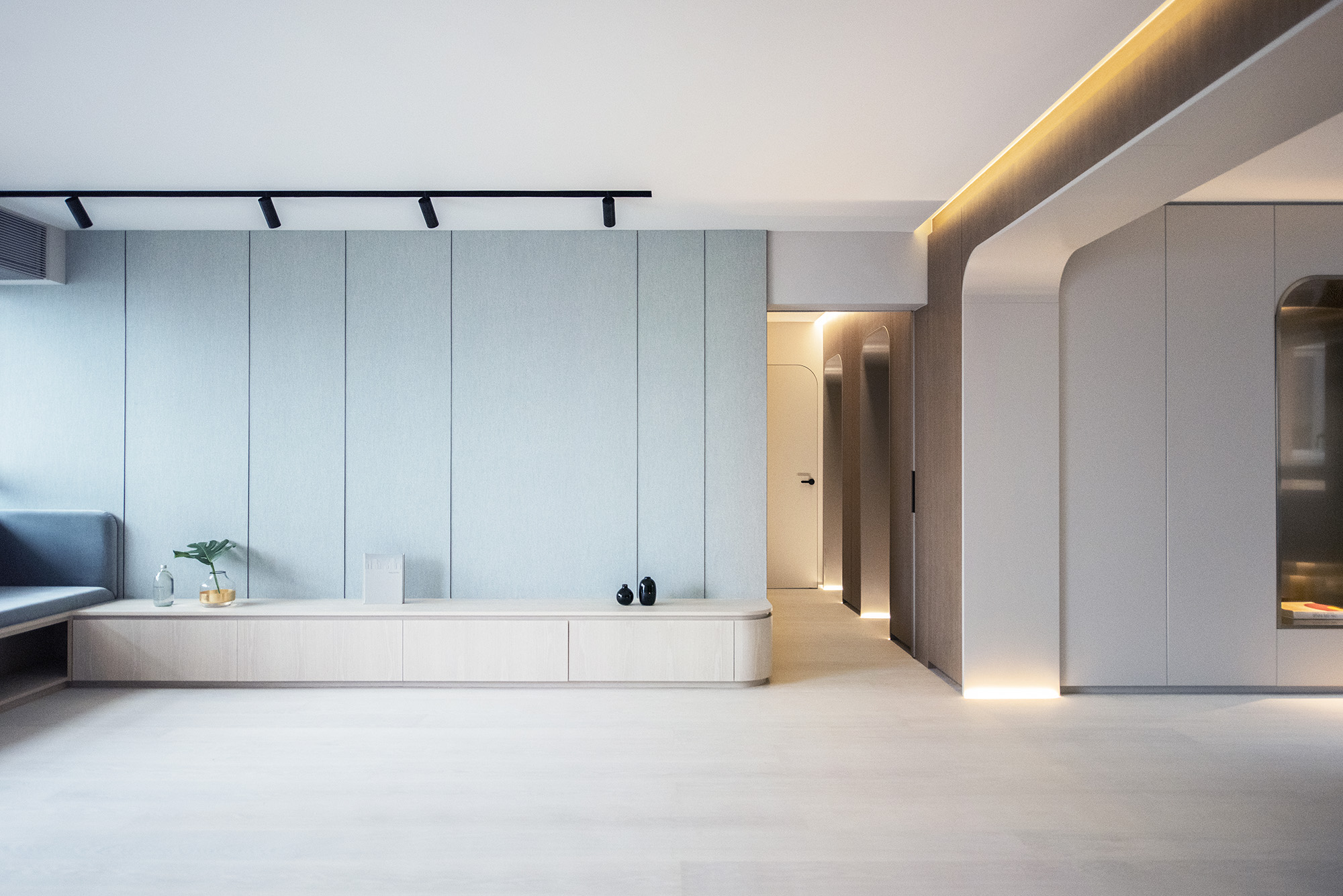
Ambient lighting can be designed in a variety of ways. It can range from ceiling lights, track lights, wall lights and chandeliers to recessed circular and strip lights. Using dimmable fittings for ambient light can also help adjust brightness levels for different activities. Now, there are a variety of options and illumination systems that are not only functional but also quirky and trendy.

In Lenvix, STIPFOLD composed a hexagonal pattern on the ceiling using slimmer light fixtures. This not only brightens the space but also adds an additional pattern to the space and helps demarcate the seating area. Alternatively, the Peaches Rooftop Cocktail Bar features a canopy of pink-toned spherical pendant lights hanging from the ceiling to mimic peaches.


Task Lighting

Coil Collection Naturals by LightArt

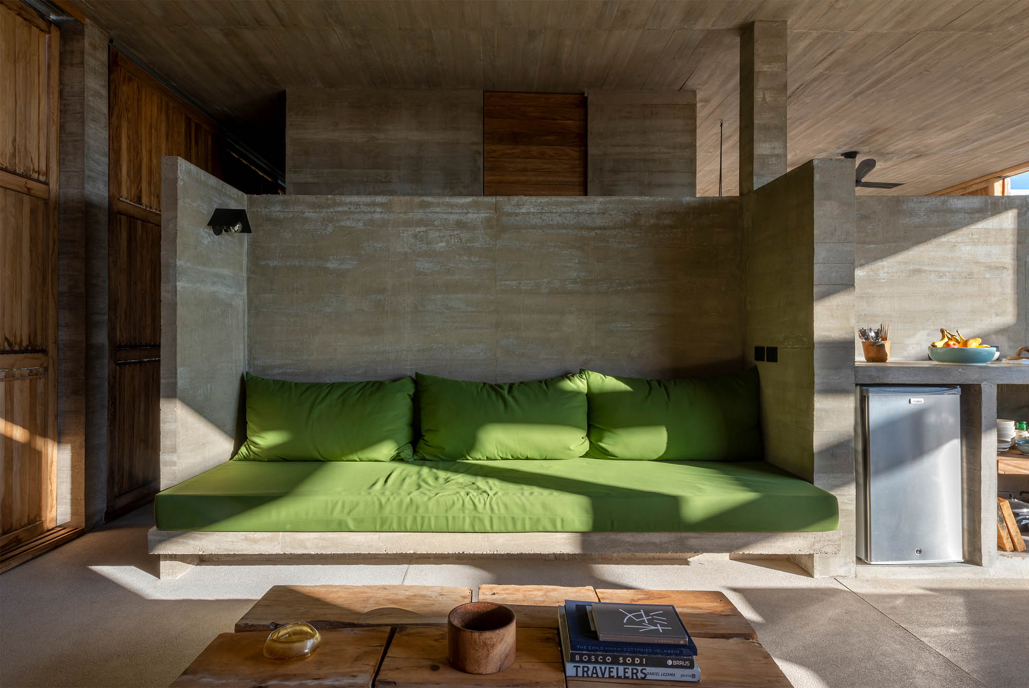
Casa Cosmos by S-AR, Oaxaca, Mexico

This could be considered a secondary source of lighting. Task lighting is referred to lighting fixtures with a very specific function. Desk lamps, bedside lights, wardrobe lights, strip lights under kitchen cabinets and even staircase guiders can come under this category. Task lighting can help carve out secluded nooks and can also help easy navigation during the night. It is ideal to isolate the switches for task lights from the overall ambient light connection so that they can be used only when needed.

Decorative additions like the A+Award-winning Coil Collection Naturals can make a great bedside companion for late-night reading and can also be used as an additional light source near desks or in hallways. In Casa Cosmos, S-AR used a focused light fixture to brighten the concrete-backed seating area. Unlike the above example, these lights can also help separate the multiple functions within a space without the use of partitions.


Accent Lights

Sticks by Vibia

Hong Kong Garden / Theatre House by Bean Buro, Hong Kong Island, Hong Kong

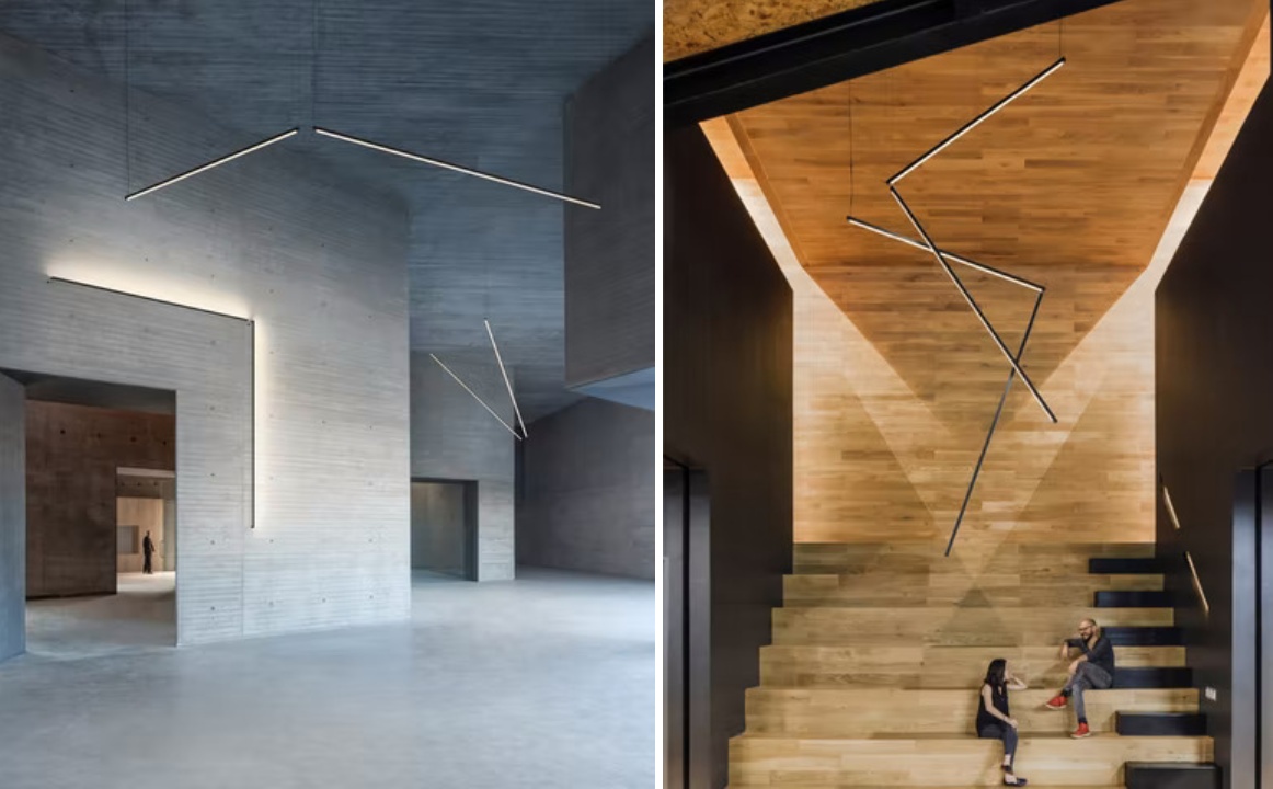
The aim of accent lights is to draw attention to a specific object or an element, even when the general lights are on. These can be direct or indirect sources of light that highlight artwork, wall textures, level differences, recesses, false ceilings or other architectural elements in a space. This also adds more dimension and drama to the space. Types of accent lights range from small spotlights to wall-grazing linear lights.

The A+Award Winning Sticks is a modular design that can be used in a variety of ways to either focus on specific objects or illuminate specific areas in spaces. In the image above, the light is used to mimic the space of the doorway to accent not only the passage but also the wall texture. It also becomes an additional spotlight for the sides of a small stepped seating area. Accent lights also help highlight doors and partitions in Hong Kong Garden / Theatre House.


Decorative and Mood Lighting

Lo-Fi by SYNECDOCHE, Ann Arbor, Michigan

Media Plaza by Liong Lie Architects | Image by Christiaan de Bruijne

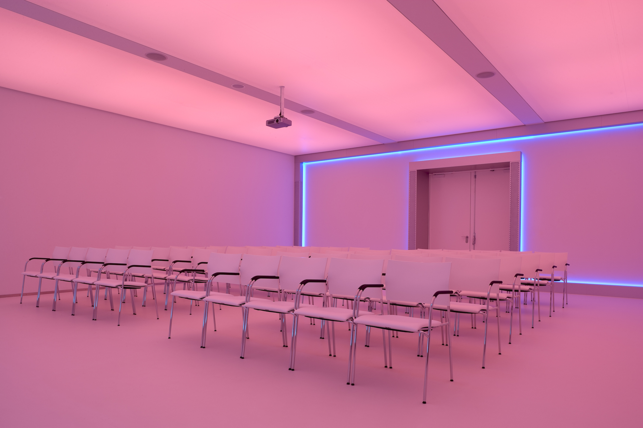
This category is often more to set a mood as opposed to being functional; it includes candle-based décor, string lights, lanterns, wall sconces and colored lights. These different techniques of illumination act as secondary light sources as they are not bright enough to help carry out everyday tasks without straining your eyes. There are extremely popular in restaurants and nightclubs as they help create an air of mystery and build tension without compromising the functionality of the furniture.

Neon blue and pink lights make up the interior of Lo-Fi in Michigan. The vibrancy of the lights energizes the otherwise dim space and also provides a great backdrop for photos, creating additional interest. In Media Plaza, a strip of blue wraps around the back wall of a projection room that is covered in foils that can change color when needed.

The A+Product Awards is open for entries, with a Main Entry Deadline of June 24th. Get started on your submission today! 

Reference

Ten inspiring outdoor dining spaces for spring
CategoriesInterior Design

Ten inspiring outdoor dining spaces for spring

As spring approaches in the northern hemisphere, it’s time to start preparing for sunnier days and warmer evenings. For this lookbook, we’ve rounded up ten inviting spaces featuring outdoor furniture for relaxed al-fresco dining and socialising.


Getting together in public spaces may still be restricted in much of the world over the coming months due to the coronavirus pandemic.

Domestic gardens, courtyards and patios could well be the best place for sharing quality time with friends and family this spring and summer. Read on for 10 inspiring ideas from the Dezeen archives.

This is the latest roundup in our Dezeen Lookbook series providing visual inspiration for the home. Previous articles in the series showcased living rooms with statement shelving, green kitchen interiors, peaceful bedrooms and designer bathrooms.


Mexican home with outdoor lounge area

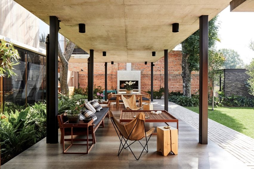
Guadalajara House, Mexico, by Alejandro Sticotti

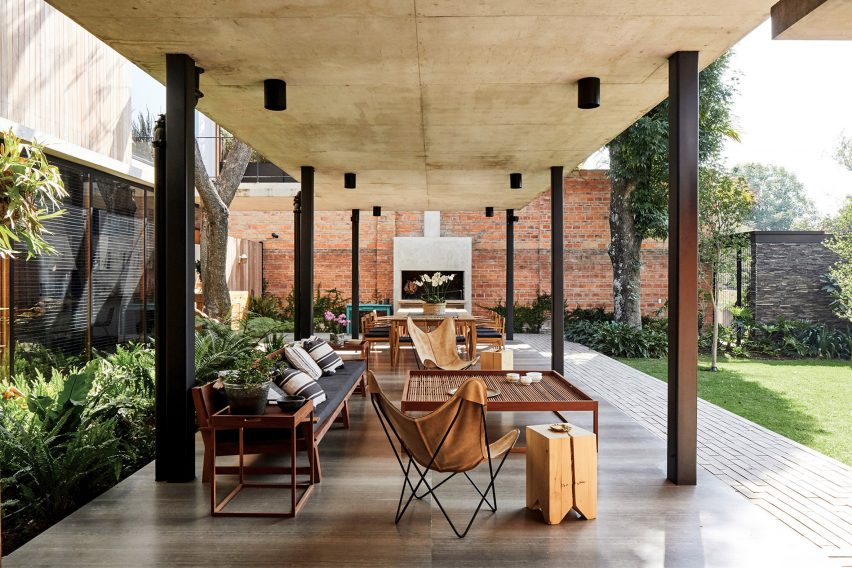
This house in Guadalajara, Mexico makes the most of the benign climate with an L-shaped, open-sided gallery that extends from the home to provide a cool space for dining and relaxing.

The gallery, which is paved in polished stone, features two zones. The dining area features a twelve-seater wooden table set next to an outdoor fireplace while the lounge area consists of a cushion-strewn, timber-framed sofa, leather Butterfly Chairs and a large, square coffee table.

Find out more about Guadalajara House ›


Dining tables at House of Flowers winery by Walker Warner Architects

House of Flowers, US, by Walker Warner

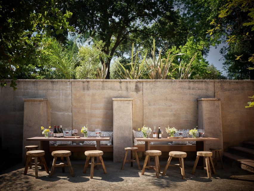
This plein-air dining zone is at a California winery but its rustic style could equally work in a domestic garden or courtyard. Here, visitors can enjoy a glass of wine in the sun while sitting against a warm adobe wall.
Built-in wooden benches are matched with sturdy tables and rough-hewn wooden stools. Tables are decorated with simple bouquets from the garden.

Find out more about House of Flowers ›


Courtyard dining spot in Old Jaffa House 4 by Pitsou Kedem

Jaffa apartment, Israel, by Pitsou Kedem

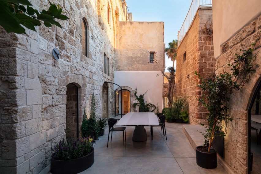
This sea-facing Jaffa apartment in a historic building has a narrow courtyard that is used for outdoor dining during the summer months. A glossy dining table is easy to wipe down and is complemented by practical plastic chairs.

The ancient stone walls and concrete floor are softened by shrubs and climbers set in oval planters.

Find out more about Jaffa apartment ›


White-painted garden pavilion with dining area

Garden pavilion, UK, by 2LG Studio

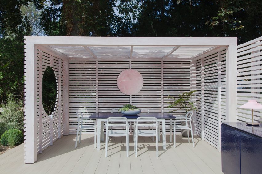
British interior designers Jordan Cluroe and Russell Whitehead of 2LG Studio built themselves a white-stained pavilion in their back garden that is used as a dining space and for socialising when the weather allows.

The raised pavilion is clad in slatted timber and serves as a covered dining area. Wide timber decking adds a touch of the seaside boardwalk to the ensemble.

Find out more about Garden pavilion ›


Outdoor dining space on granite terrace

Casa 4.1.4, Mexico, by AS/D

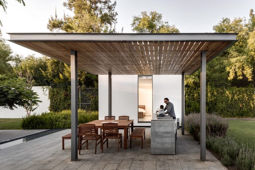
This multigenerational weekend retreat in Mexico features four separate dwellings arranged around a courtyard that is paved in granite and bisected by a shallow rivulet.

Extending from one of the lodges is a steel pergola with a canopy of slatted timber. This creates a shady spot for family dinners that is furnished with a teak table, dining chairs and benches. An outdoor kitchen allows prep and cooking to be done outside.

Find out more about Casa 4.1.4. ›


Dining table outdoors in Greek holiday home

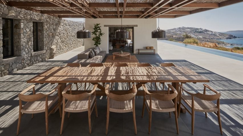
Mykonos holiday home, Greece, by K-studio

A walnut pergola covered in traditional reeds provides shade for the outdoor living space at this holiday home in Mykonos. Consisting of a lounge area and a ten-seater dining table, the generous stone terrace looks across an infinity pool towards the ocean.

“To create a house that would allow guests to enjoy being outside throughout the day we needed to filter the overwhelming intensity of the climate by providing shade and protection from the elements,” said architect K-studio.

Find out more about Mykonos holiday home ›


Outdoor dining area in Italy

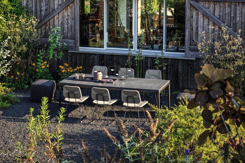
Country House, Italy, by Studio Koster

Studio Koster’s Italian Country House near Piacenza has an idyllic outdoor dining space set amid a cottage-style garden. The setting, close to a timber wall, provides shelter from breezes while lava gravel provides a rustic, low-maintenance touch.

Steel-framed chairs with rattan seats plus poufs with woven covers – both by Italian brand Flexform, which furnished the house for a photoshoot – give the space an eclectic feel.

Find out more about Country House ›


Wooden table and chairs on tiled floor surrounded by flower pots

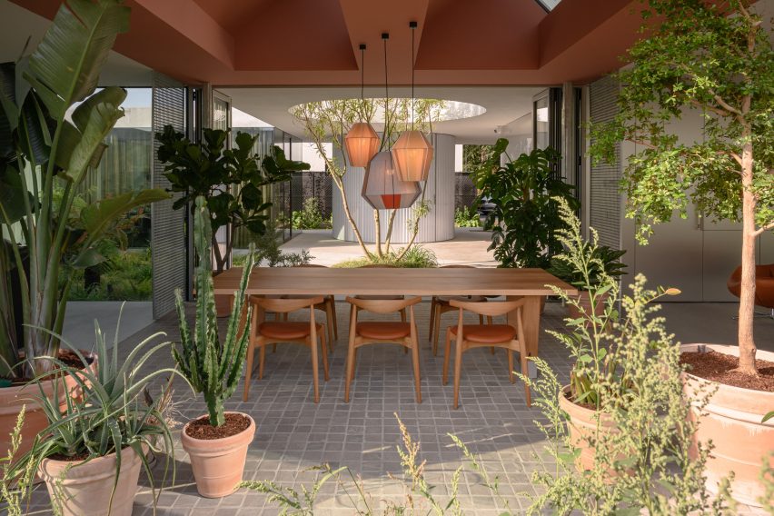
Villa Fifty-Fifty, The Netherlands, by Studioninedots

This dining space in Villa Fifty-Fifty in Eindhoven is both indoors and outdoors. Folding glass doors peel back to turn the room into a loggia that is open to a courtyard on one side and a densely planted border on the other.

Quarry tiles and statement plants in terra-cotta pots add a taste of sunnier climes while the only furniture is a chunky dining table and a set of Elbow Chairs designed by Hans J Wegner for Carl Hansen & Son.

Find out more about Villa Fifty-Fifty ›


Raised dining area on concrete terrace

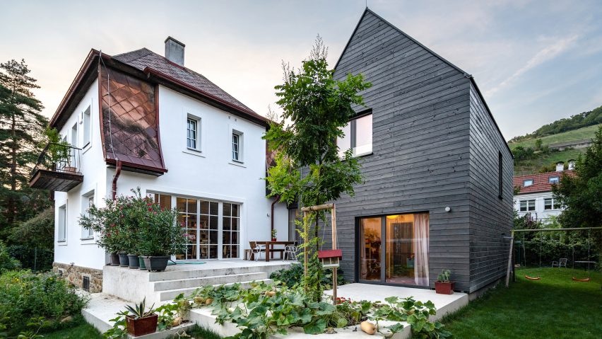
House B, Austria, by Smartvoll

An outdoor dining area sits on a split-level concrete terrace outside this house in Austria, which was an extension and renovation of an existing building. The dining table, made of dark wood to contrast with the pale cement, is set close to the house to protect it from the elements.

Large potted oleanders protect the dining space from view on the upper level of the patio while squash vines planted in a circular void spill over the lower level.

Find out more about House B ›


Sunny dining spot in Puglia house with white walls

The White Tower, Italy, by Dos Architects

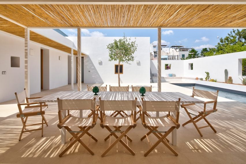
This bright white house in Puglia has an outdoor dining space with a simple, elegant design. Directors’ chairs with beige canvas seats give it an outdoorsy, camping-like feel and match the pale-wood table. A pergola made of slender steel columns is shaded with canes.

Two decorative table objects in green break up the beige colour scheme and add a simple but elegant touch.

Find out more about The White Tower ›


This is the latest in our series of lookbooks providing curated visual inspiration from Dezeen’s image archive. For more inspiration see previous lookbooks showcasing green kitchen interiors, peaceful bedrooms, calm living rooms and colourful kitchens.

Reference

Eleven stylish home-working spaces that complement the decor
CategoriesInterior Design

Eleven stylish home-working spaces that complement the decor

Home offices don’t have to look like work offices. For this lookbook, we’ve rounded up eleven remote workspaces that don’t compromise on style.


Our selection, all of which come from the Dezeen archives, includes compact setups from homes and hotels as well as more generous, dedicated home offices.

This is the latest roundup in our Dezeen Lookbooks series providing visual inspiration for the home. Previous articles in the series feature children’s bedrooms, inspiring outdoor living spaces, calming green kitchens, and living rooms with beautiful statement shelving.


Roksanda Ilincic penthouse apartment in London's King's Cross

London penthouse, UK, by Roksanda Ilincic

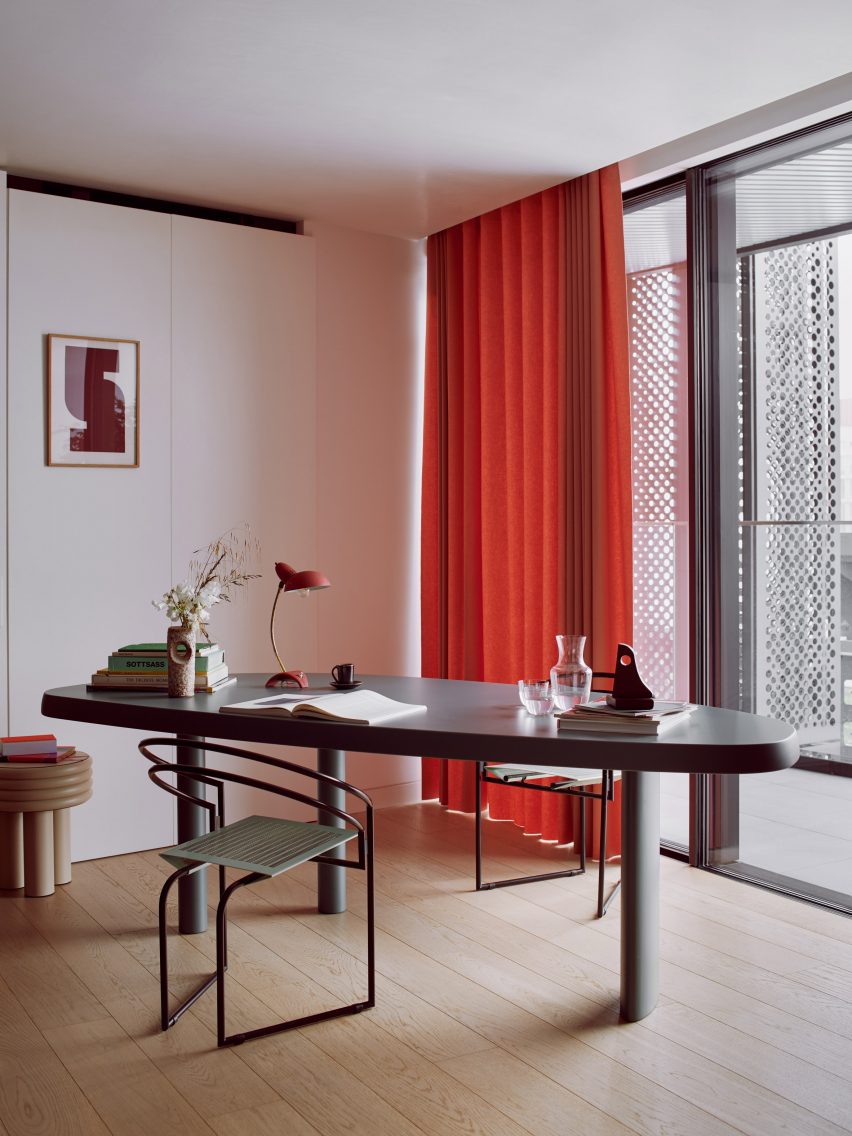
Fashion designer Roksanda Ilincic designed the interiors for this apartment in London’s King’s Cross filled with saturated colours and geometric shapes.

A quiet work corner has a grey oval table, black steel-framed tubular chairs and a wooden stool that functions as a small side table. A warm red curtain and table lamp and sculptural, abstract accessories add a friendly feel to the room.

Find out more about London penthouse ›


Strandhotel Zoomer in the Netherlands designed by The Other Season and HK Living

Strandhotel Zoomers, the Netherlands, by The Other Season

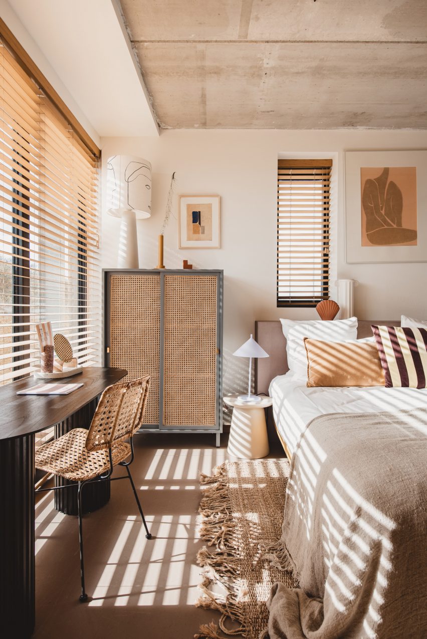
This bedroom in the Strandhotel Zoomers was designed in a natural, sandy colour palette that evokes the beach dunes beyond its walls.

A  shallow wooden desk sits in front of a window with views of the ocean and is complemented by a thin, steel-frame chair with a decorative wicker seat, creating a small but practical workspace.

Find out more about Strandhotel Zoomers ›


Home office with concrete walls

Casa Ventura, Mexico, by Tatiana Bilbao

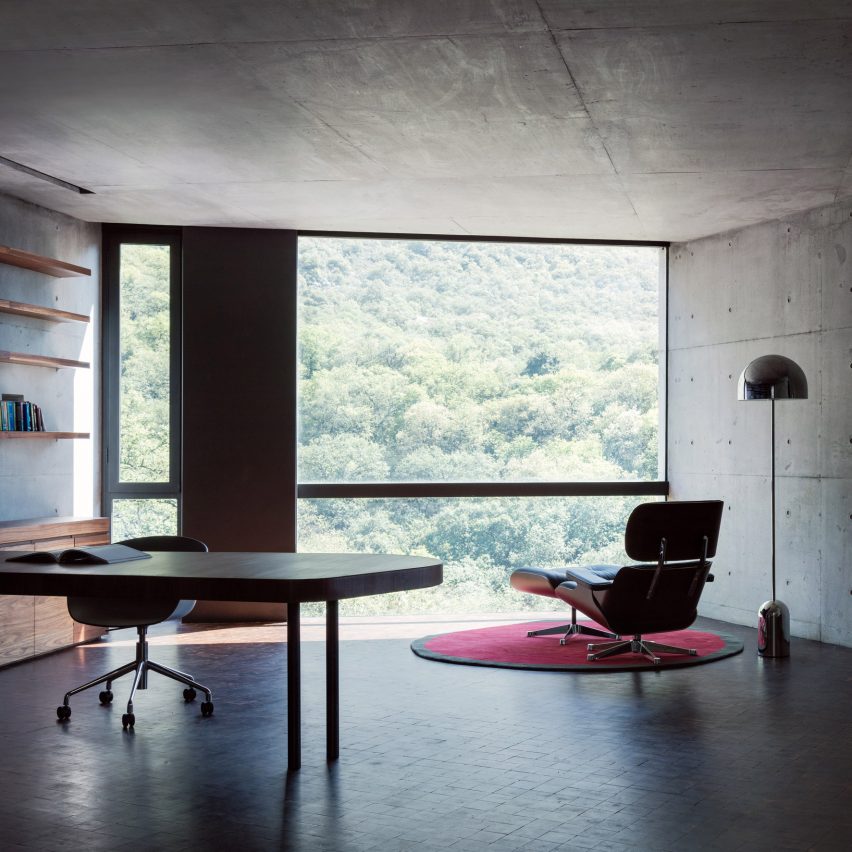
A concrete house on a forested hillside in Mexico is the setting for this panoramic home office, which has an elegant, solid wooden desk and shelving and cabinets in lighter wood.

An Eames lounge chair by the floor-to-ceiling window and a domed metal floor lamp function as a peaceful reading corner in the minimalist office.

Find out more about Casa Ventura ›


Gold desk in turquoise room

Television Centre apartment, UK, by Waldo Works

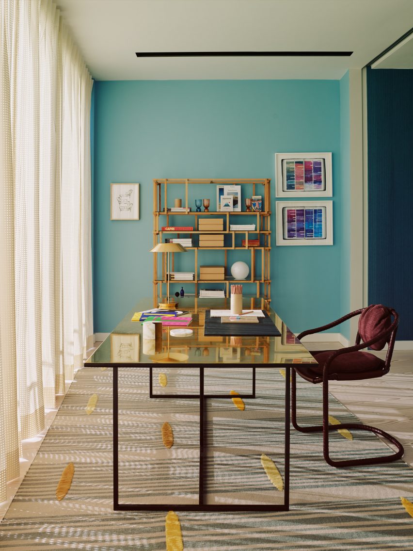
Waldo Works’ colourful interior design for this penthouse apartment inside London’s Television Centre includes a luxurious office space with a metal desk on graphic steel legs. Its gold colour creates a warm contrast against an eye-catching turquoise wall that has been hung with colourful prints.

A natural-wood bookshelf with asymmetrical shelving is filled with magazines, boxes, and decorative vases while a printed rug with yellow applique detailing makes the room feel inviting.

Find out more about Television Centre apartment ›


Workspace by mirror in Autor Rooms

Autor Rooms, Poland, by Mamastudio

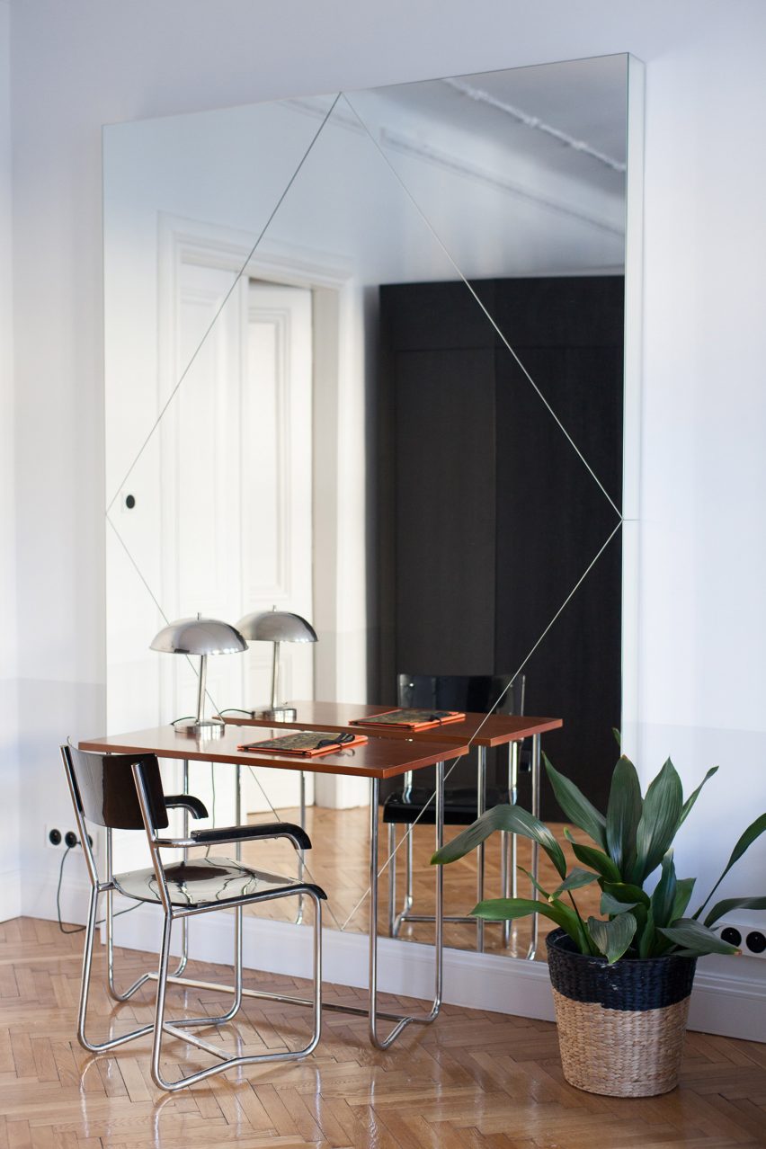
Pieces by local designers feature in the Autor Rooms hotel in Warsaw, including this small, clever wood-and-steel desk.

The streamlined, minimal design of both the desk and the chair is perfect for a discrete workspace, while the large mirror they face makes the room feel bigger. A metal lamp and plant in a woven basket are the only two accessories in this office corner.

Find out more about Autor Rooms ›


Interiors of 2LG Studio's Design House

2LG Studio home and workspace, UK, by 2LG Studio

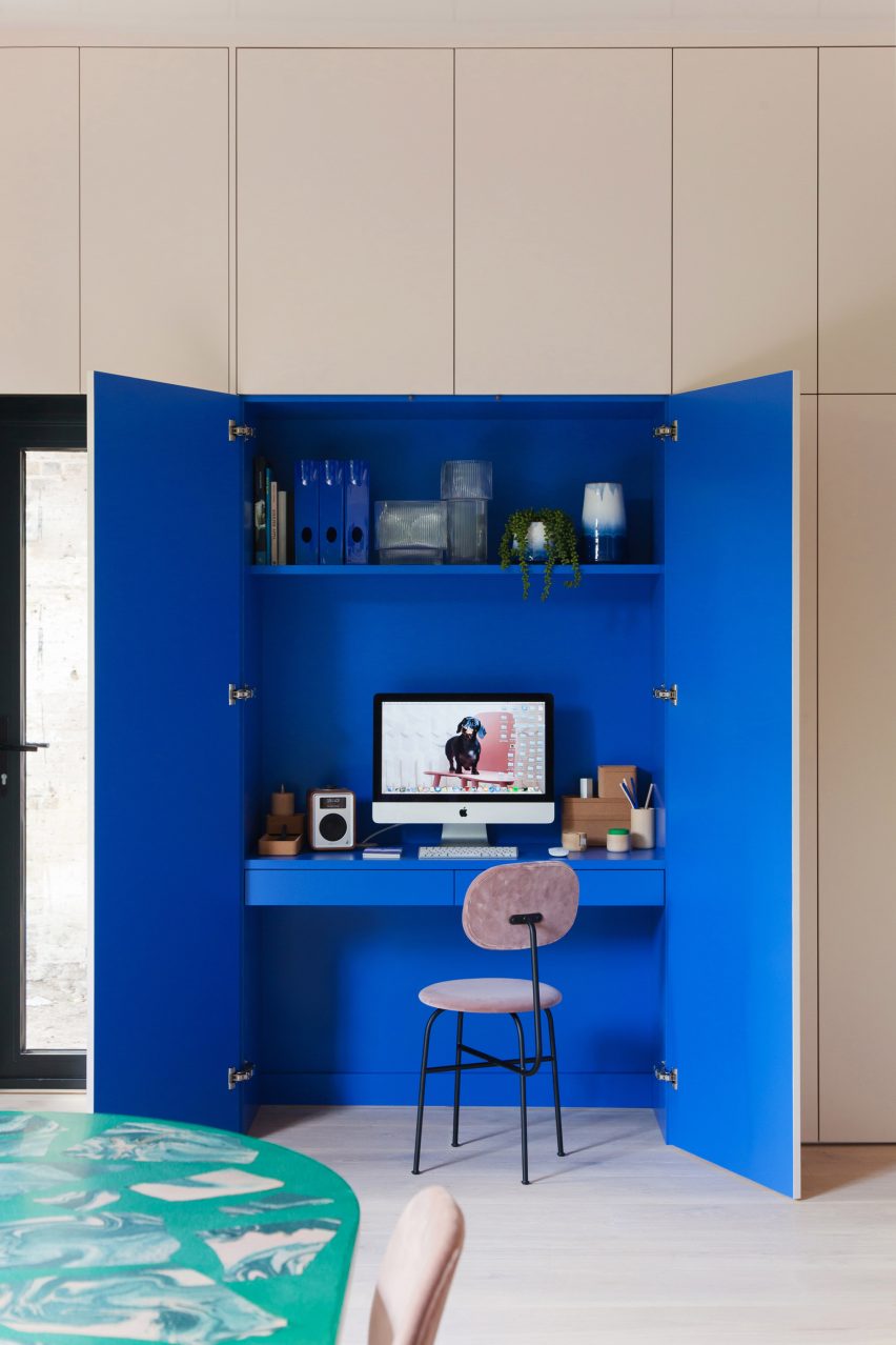
This clever, compact solution by 2LG Studio sees full-height white cupboards conceal a built-in computer desk. The cupboards’ bright, Klein-blue interior helps demarcate the space as a separate work area.

A shallow desk shelf is just big enough to hold a computer screen and keyboard, with drawers below providing storage. Practical filing folders share a shelf above the desk with glass vases and ceramics.

Find out more about 2LG’s workspace ›


Still Room in Antwerp is a silent refuge

Still Room, Belgium, by Studio Corkinho

The monastic interiors of this 19th-century Antwerp building include a wooden writing desk facing an arched window, creating a suitable space for contemplative creativity.

The desk has a matching wooden chair and a patinated leather chair sits next to it. Underneath the table, a selection of books on silent meditation and sacred architecture provide apt reading material.

Find out more about Still Room ›


Study of the Knightsbridge Mews House by Echlin

Knightsbridge mews house, UK, by Echlin

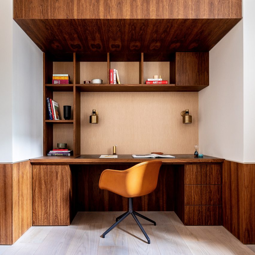
Echlin’s design for this London mews house includes a built-in study made using bespoke joinery.

Dark wood was used for both the desk and its discrete drawers, and continues above the desk where it forms roomy shelving and a wooden overhang that frames the compact home office. Brass detailing adds a luxurious touch and contrasts nicely against the wood.

Find out more about Knightsbridge mews house ›


Pinterest roundups skylights

Stockholm house, Sweden, by Förstberg Ling

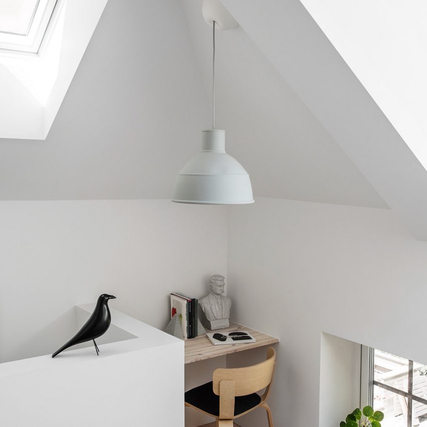
Sometimes the simple solutions are the best, like in this small work nook in a house in a former blacksmith’s workshop in Sweden. A corner space has been given an added floating desk to take full advantage of the space.

A matching wooden chair creates a practical space for working or studying, which has been decorated with a stone bust and matching bookends.

Find out more about Stockholm house ›


The Audo by Menu and Norm Architects

The Audo, Denmark, by Menu and Norm Architects

Norm Architects and Menu’s design for The Audo hotel in Copenhagen filled the concrete interior with wood, straw, stone and other natural materials.

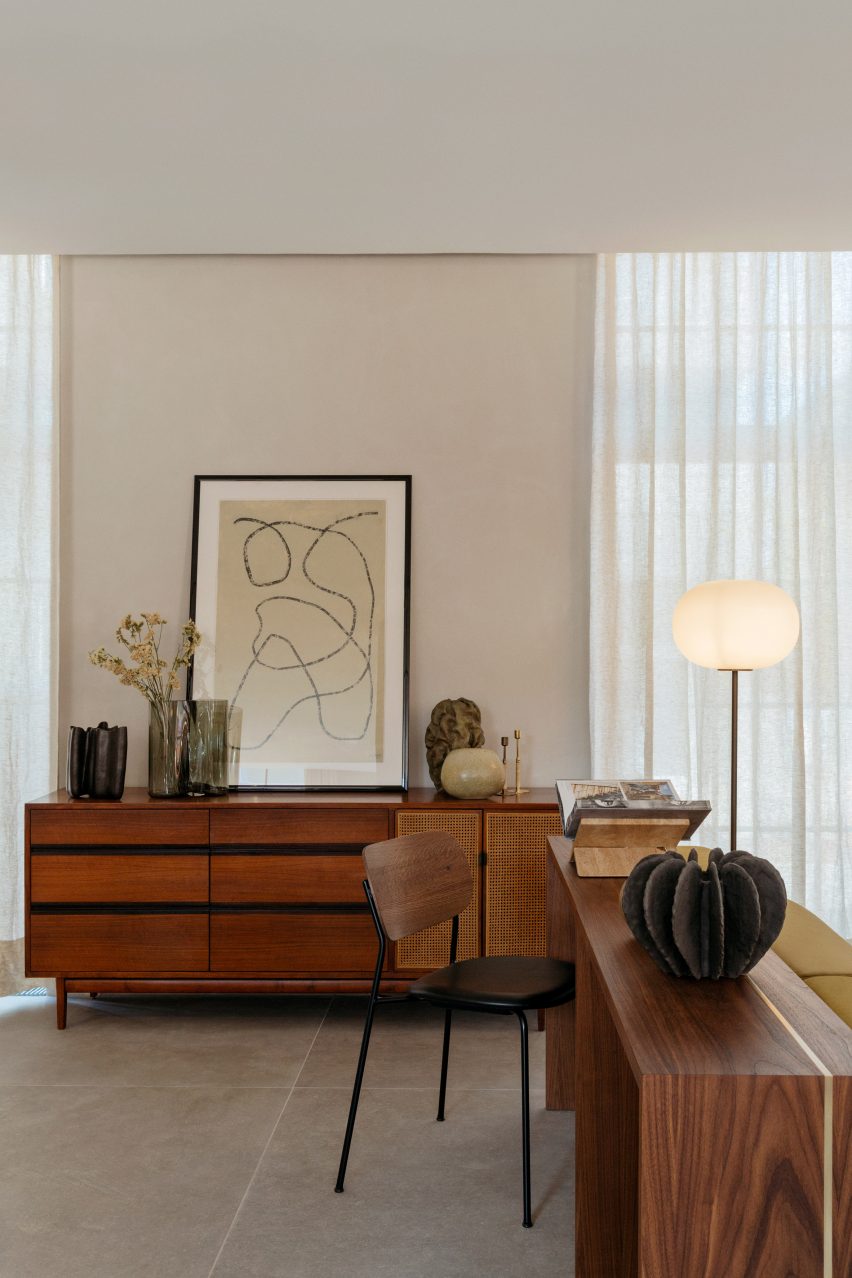
This work area uses the material palette to create an elegant, calming feeling. A wooden desk can function either as a writing desk or as a display space for the numerous decorative items that are strewn around the area. Storage is hidden in a matching cabinet with rattan doors.

Find out more about The Audo ›


Agate Pass Cabin by Olson Kundig Architects

Agate Pass Cabin, US, by Olson Kundig

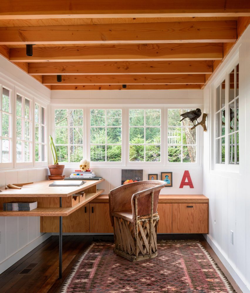
When Olson Kundig Architects principal Alan Maskin renovated a 1938 beach cabin to turn it into a house for himself, he added a study space on a former porch.

Here, the laidback bohemian feel of the house continues. A desk and cabinets made from Glulam wood match the wooden ceiling beams, while a rough-hewn chair adds a rustic note to the bright room.

Find out more about Agate Pass Cabin ›


This is the latest in our series of lookbooks providing curated visual inspiration from Dezeen’s image archive. For more inspiration see previous lookbooks showcasing children’s bedrooms, outdoor living spaces, calm living rooms and colourful kitchens.

Reference

Ten outdoor spaces with warming fireplaces and fire pits
CategoriesInterior Design

Ten outdoor spaces with warming fireplaces and fire pits

For our latest lookbook, we’ve rounded up ten outdoor seating areas that incorporate stylish fireplaces and roaring fire pits to warm yourself on chilly spring evenings.


This is the latest roundup in our Dezeen Lookbooks series providing visual inspiration for the home.

Previous articles in the series featured pastel interiors, bright kitchens, living rooms with statement shelving and interiors with statement plants.


Outdoor fire place in jungle home

House of the Big Arch, South Africa, by Frankie Pappas

Built within a South African nature reserve, House of the Big Arch was designed by architecture collective Frankie Pappas to avoid existing trees.

Supported on an arch that gives the house its name is an outdoor patio that contains a circular brick hearth, an oven and a small pool.

Find out more about House of the Big Arch ›


Outdoor dining area with fireplace

Guadalajara House, Mexico, by Alejandro Sticotti

Argentinian architect Alejandro Sticotti created a covered outdoor lounge and dining area alongside this house in the Mexican city of Guadalajara.

Connected to the home’s indoor, open-plan kitchen and dining room, the sheltered area contains a seating area with a timber-framed sofa and a dining table alongside an outdoor chiminea set against a wall.

Find out more about Guadalajara House ›


Covered fire place at glamping site in USA

AutoCamp, USA, by Anacapa Architecture

Created to be the social hub of a luxury campground in California designed by Anacapa Architecture, this open-air clubhouse is used for guest check-in and socialising.

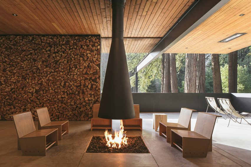
Within the clubhouse, chairs are gathered around a square floor-level hearth similar to a Japanese irori beneath a suspended conical steel flue.

Find out more about AutoCamp ›


Outdoor fireplace at home in USA

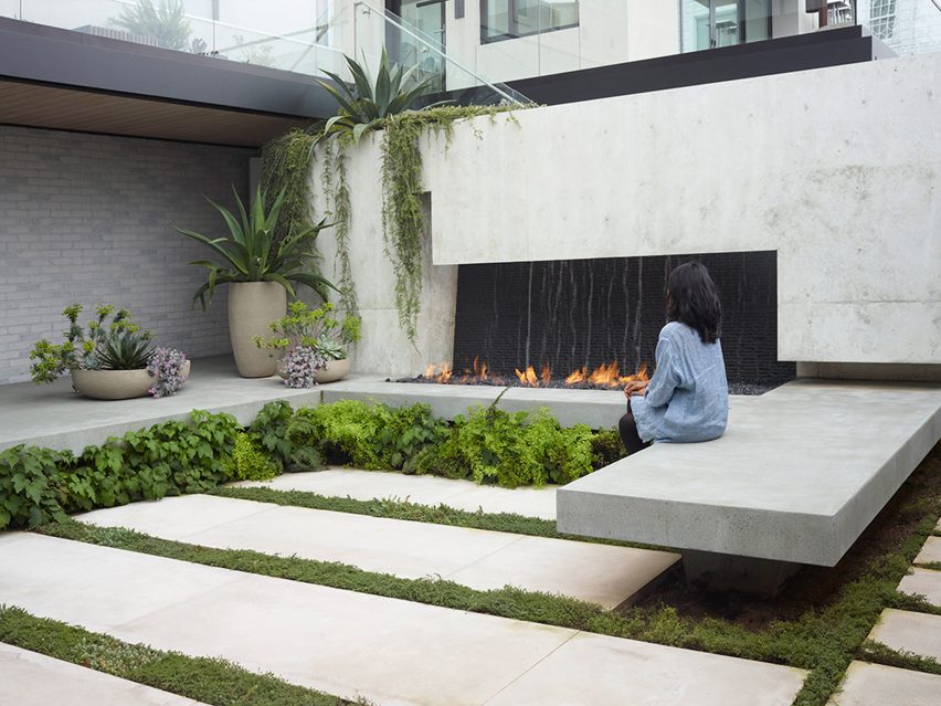
Butterfly House, USA, by Surface Design

Landscape architecture studio Surface Design created a series of planted terraces at this house in San Francisco to be “a serene respite from the city”.

A raised concrete hearth hosting an ethanol fire anchors the ground floor courtyard, which is completed with benches, ferns and anemones and pots containing agaves and euphorbias.

Find out more about Butterfly House ›


Equinox Hotel roof garden

Equinox Hotel, USA, by David Rockwell and Joyce Wang

Designed by Rockwell Group and Joyce Wang Studio, the Equinox Hotel occupies 14 floors of a skyscraper designed by architecture firm SOM in Hudson Yards.

The hotel has two large terraces – one with a pool overlooking Thomas Heatherwick’s Vessel, and one containing seating arranged around a water feature and a decorative ethanol fire.

Find out more about Equinox Hotel ›


Fire pit at contemporary house

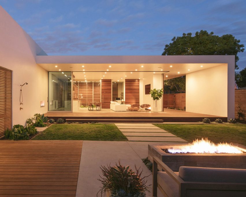
Minimalist Urban Residence, USA, by Anacapa Architecture

Anacapa Architecture designed this home for a residential neighbourhood in the Californian city of Santa Barbara.

The open-plan living space and main bedroom in the L-shaped house both open onto a backyard that has an outdoor fireplace set in a wall and a seating area arranged around a raised rectangular concrete fire pit.

Find out more about Minimalist Urban Residence ›


Outdoor seating area with fireplace

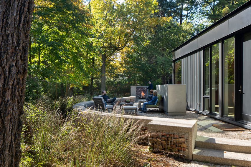
Ravine House, USA, by Wheeler Kearns

American studio Wheeler Kearns Architects designed this single-storey house on a wooded site on the outskirts of Chicago.

At the rear of the home is a seating area enclosed by a low, curved gabion wall made from rubble found on the site. A fireplace is integrated into this gabion wall.

Find out more about Ravine House ›


Outdoor fireplace in Midden Garden Pavilion

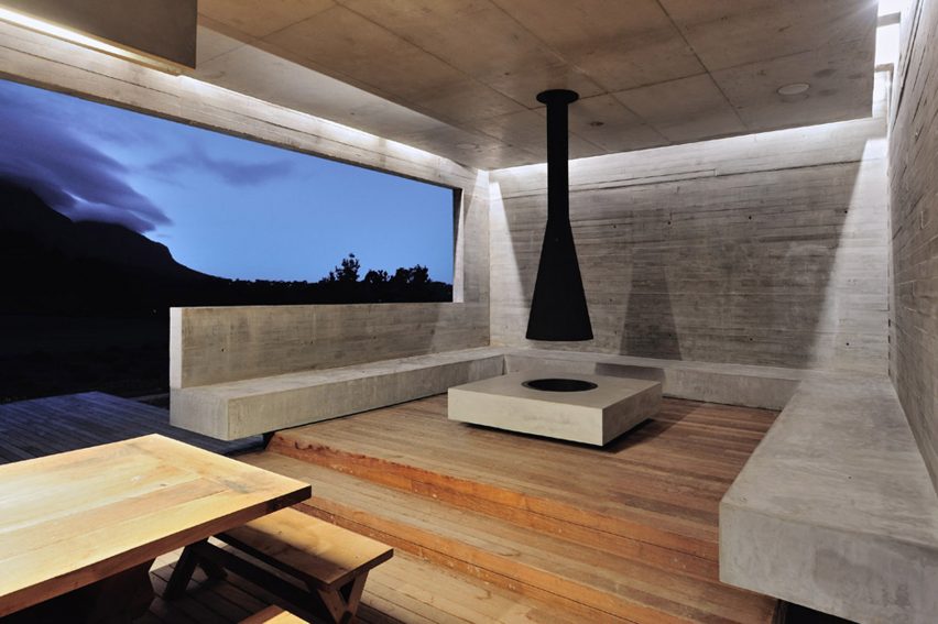
Midden Garden Pavilion, South Africa, by Metropolis

This concrete outdoor dining pavilion was designed by Metropolis as part of a renovation of a house in the Cape Town suburb of Constantia.

Designed to take advantage of views over nearby Table Mountain, the open-sided pavilion includes a square concrete hearth topped with a suspended funnel-shaped flue surrounded by concrete seating.

Find out more about Midden Garden Pavilion ›


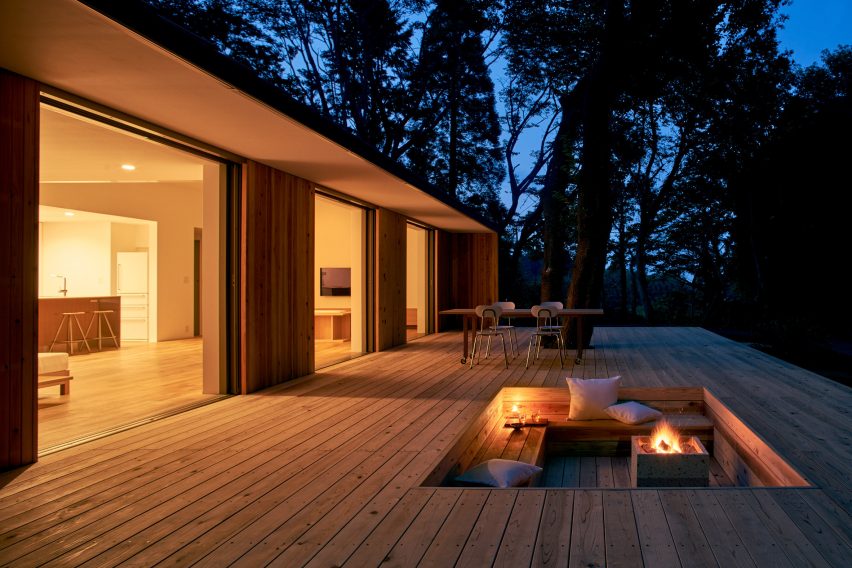
Yō no Ie, Japan, by Muji

This single-storey prefabricated home designed by Japanese retail company Muji is fronted by three full-height doors that open onto a large wooden deck.

The outdoor terrace contains a sunken seating area with a fire pit.

Find out more about Yō no Ie ›


Fire pit at Casa SS in Chile

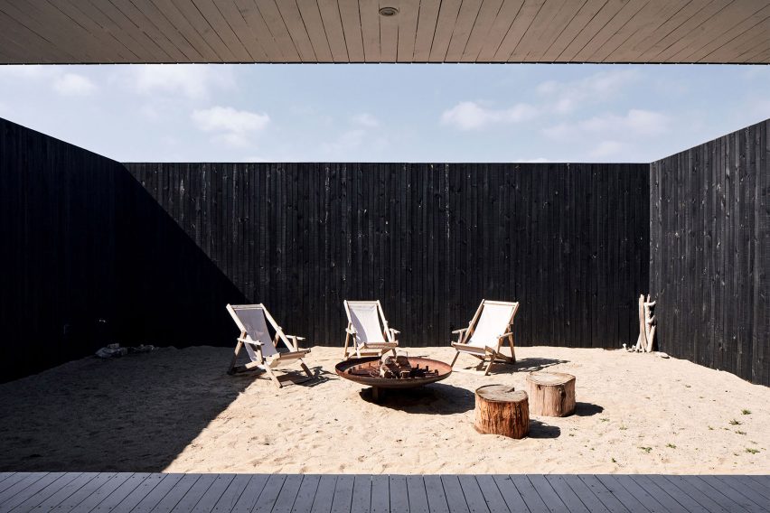
Casa SS, Chile, by Pablo Saric and Cristian Winckler

Designed by architects Pablo Saric and Cristian Winckler Perched, Casa SS is a blackened pine house perched above the Pacific Ocean in Chile.

The main living area has large glass windows facing the ocean and opens out onto an enclosed sandy courtyard with deck chairs arranged around a circular steel fire pit at the rear of the home.

Find out more about Casa SS ›


This is the latest in our series of lookbooks providing curated visual inspiration from Dezeen’s image archive. For more inspiration see previous lookbooks showcasing peaceful bedrooms, calm living rooms and colourful kitchens.

Reference