Building Health: How an Old Jailhouse in Toronto Became the Heart of Patient-Centered Care
CategoriesArchitecture

Building Health: How an Old Jailhouse in Toronto Became the Heart of Patient-Centered Care

The judging process for Architizer’s 12th Annual A+Awards is now away. Subscribe to our Awards Newsletter to receive updates about Public Voting, and stay tuned for winners announcements later this spring.   

In the realm of healthcare, where compassion intersects with cutting-edge medical science, lies a crucial element of healing: the environment itself. The Hennick Bridgepoint Hospital stands as a testament to the transformative power of architecture in nurturing wellness. Described as a “Village of Care,” this facility transcends being merely a structure of concrete and steel; it is a sanctuary meticulously crafted with the singular aim of nurturing healing and well-being, catering to individuals grappling with complex chronic diseases and disabilities.

A few years ago, I had the opportunity to visit the building and chat with a couple of nurses. One of them guided me through the building to the rooftop garden and shared an intriguing observation: patients who frequented the outdoor garden tended to experience faster healing. I found this insight quite fascinating.

The hospital’s design fully embraces the healing potential of nature and the surrounding landscape, with intentional efforts aimed at immersing patients in their surroundings. The hospital is intricately linked to prominent features of some of Toronto’s finest neighborhoods, including the Don River Valley, Riverdale Park, the downtown skyline, and Riverdale itself.

The site where the building stands holds its own narrative waiting to be told, embodying a narrative of transformative rehabilitation that mirrors the very mission of the hospital. Right next to the hospital, and central to the project’s significance is the historic 148-year-old Don Jail, occupying a prominent position on the site. Remarkably, the theme of wellness has been woven into the fabric of this site since its inception. From its inception as a reform prison in 1864, the liberal view of physical and mental wellness embedded in the building’s design led it to be nicknamed “Palace for Prisoners.”
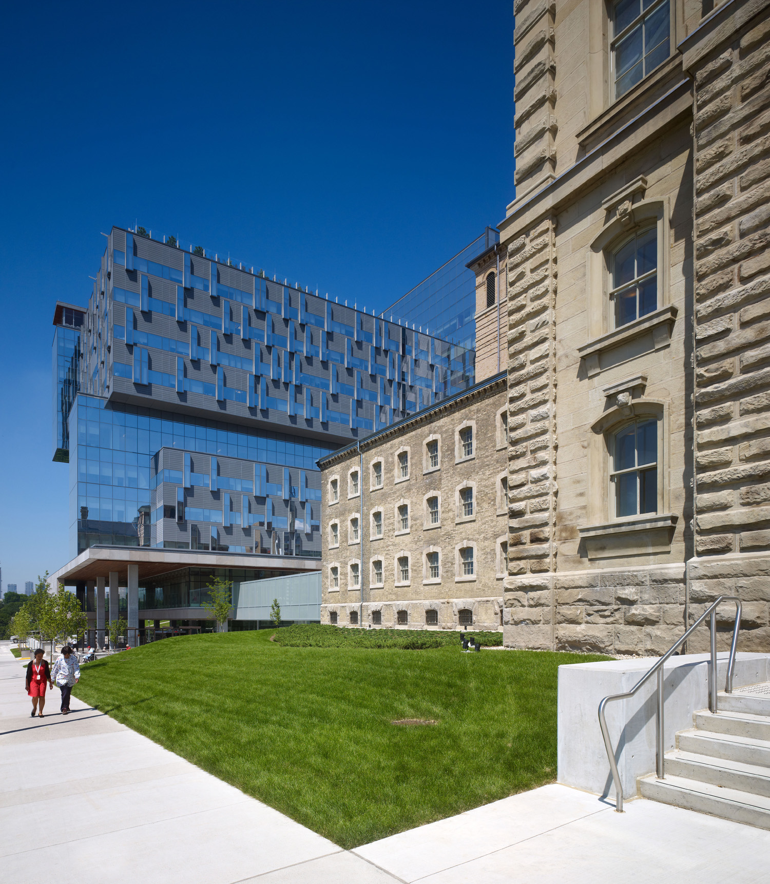
Bridgepoint Active Healthcare by Diamond Schmitt Architects, HDR Architecture, KPMB Architects, Stantec Architecture

The historic Don Jail, adjacent to the new hospital, was restored and repurposed into the hospital’s administrative offices.

While a jail is not a flawless representation of wellness, and this theme may not have endured throughout its entire operational history, it is evident that a lasting theme has persisted over time. Fast forward to the present day, the Don Jail has undergone a remarkable transformation, now serving as the administrative and educational hub of the hospital — a key facility central to fostering interdisciplinary collaboration to address patients’ physical and emotional needs.

The design and layout of the hospital was driven by the aspiration to establish a unique community hub — a hospital that not only prioritizes healthcare and wellness but also fosters a deep sense of connection to the community. This vision aimed to create an urban center that served as a beacon for health and well-being. It was intended to evoke a strong sense of belonging for both the patients and the surrounding neighborhood. While hospitals often carry weighty connotations, Hennick Bridgepoint was purposefully designed to embody an open, airy and, above all, welcoming community village for its patients.

Upon entering, the space greets visitors with an abundance of natural light streaming through expansive windows and glass panels, creating a bright and inviting atmosphere — feelings often associated with health and vitality. The light and bright atmosphere undoubtedly establishes a strong connection to the outdoors. Coupled with the incorporation of warm hues and natural materials, the space evokes feelings of comfort and tranquility.

As I toured the building, I learned additional finer details that underscored the thoroughness of the building’s design and attention to detail. I discovered that ensuring indoor air quality was a top priority throughout the design process, with the architects making extensive efforts to maximize it. This included implementing measures such as controlling scents within the building, utilizing low-to-no VOCs in adhesives, sealants, paints, and coatings, and enforcing a strict no-smoking policy in the vicinity of the building.

Furthermore, the hospital’s layout has been fine-tuned to encourage physical activity and mobility. Wide hallways and spacious areas encourage patients to navigate freely, thereby supporting their rehabilitation journey. The incorporation of accessible design features guarantees that individuals of varying abilities can effortlessly navigate the building, promoting a feeling of independence and empowerment. Moreover, every detail of the architectural design, ranging from the placement of amenities to the selection of materials, has been intentionally chosen to enhance the patient’s experience.

But perhaps the most profound impact of the Hennick Bridgepoint Hospital, lies in its ability to instill hope in its patients. The very sight of the building serves as a beacon of optimism, a symbol of possibility in the face of adversity. By creating a space that is conducive to healing, the architects behind Hennick Bridgepoint Hospital have given patients more than just a place to receive medical treatment, but a sanctuary that truly supports their journey towards wellness.

At its core, this building is a refuge of healing, exemplifying a commitment to patient-centered care that has been designed to address the holistic needs of its residents — both physical and emotional. Its environment is designed to inspire patients to leave their rooms, instilling motivation to confront their illnesses directly. The building has been thoughtfully crafted to facilitate patients’ access to nature, offering design elements like outdoor terraces, rooftop gardens and adjacency to a sprawling public park, all aimed at reconnecting them with the natural world.

Each individual room design includes 40% glazing, featuring a distinctive vertical window that subtly projects from the building’s exterior, spanning floor to ceiling in every treatment area. From the corridors to the corners, this intentional architectural decision strengthens the connection to nature, granting patients an unobstructed view of the outdoors, even from their beds, giving them direct access to the outside world. A patient can step up and into the window and feel as though they are virtually outdoors. Patient rooms are generously spaced to provide privacy, while communal areas are strategically positioned to promote social interaction and support among patients.
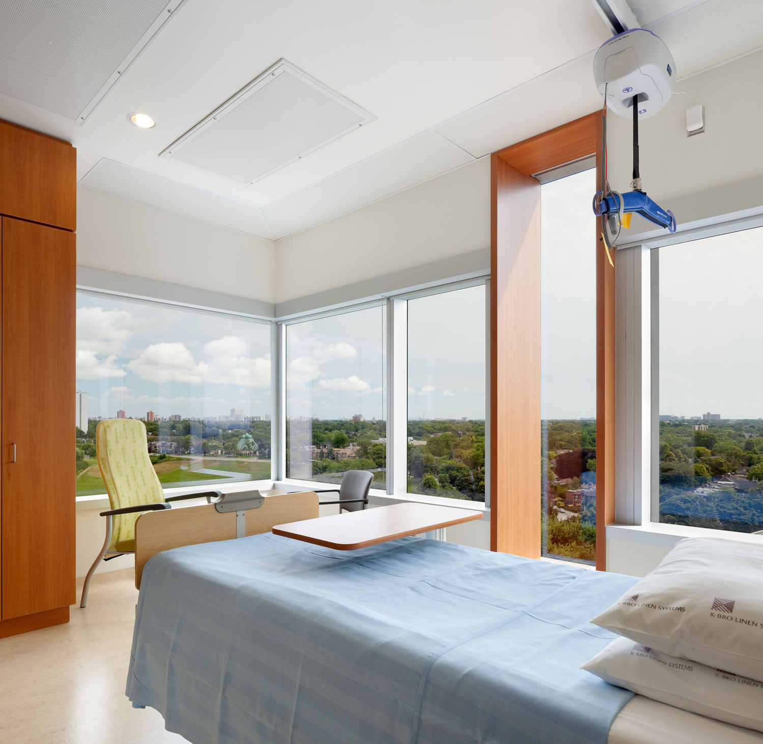
Bridgepoint Active Healthcare by Diamond Schmitt Architects, HDR Architecture, KPMB Architects, Stantec Architecture

The building’s design demonstrates a profound comprehension of the hurdles individuals encounter on their journey toward healing, encompassing everything from navigating intricate medical procedures to coping with chronic illness. This is where the healing garden and rooftop terrace truly demonstrate their power. As highlighted in this article, abundant research has showcased the therapeutic benefits of exposure to nature, ranging from stress and anxiety reduction to expediting healing processes. Indeed, each element spotlighted in that article represents design features that have been integrated into the hospital’s layout in their own unique manner, striving to harness the healing potential that architecture holds for its occupants.

In my opinion, the rooftop terrace at Hennick Bridgepoint Hospital stands as the apex of the building, harmonizing many of the aspects of healing and wellness into one space — a meticulously landscaped green roof covering 50% of the rooftop’s surface area. With lush gardens and pathways, patients have daily access to the outdoors, fostering a semblance of normalcy in their lives. The direct access to nature creates a highly therapeutic environment for both patients and staff alike, enabling them to engage not only in physical activity but in daily social interaction.
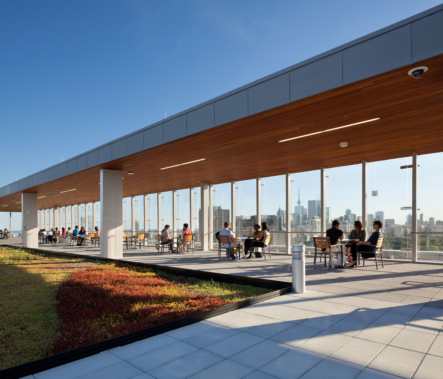
Rooftop Garden and Terrace at the Hennick Bridgepoint Hospital

Rooftop Garden and Terrace at the Hennick Bridgepoint Hospital with views over the city of Toronto, Canada

While many gardens rely on chemicals and fertilizers, the building employs native and highly resilient plants that require minimal maintenance, thus eliminating the necessity for additional chemicals. Having the opportunity to spend time outdoors in a nurturing garden environment, akin to one’s own backyard, can offer patients a comforting sense of familiarity and routine during their hospitalization. In fact, in 2013, Bridgepoint succeeded in reducing the average stay for rehabilitation patients by 20%, with a remarkable 100% of patients expressing their willingness to recommend the hospital to their friends and family.

This hospital is a shining example of the transformative power of architecture in healthcare. Through thoughtful design and careful consideration of the needs of its inhabitants, it has redefined the concept of what a hospital and healing space can be. From fostering a sense of calmness and serenity to promoting physical activity and social interaction, every aspect of the building has been optimized to nurture wellness. As we continue to explore the connection between architecture and health, the Hennick Bridgepoint Hospital serves as a beacon of inspiration, reminding us of the profound impact that the built environment can have on the lives of those who inhabit it.

The judging process for Architizer’s 12th Annual A+Awards is now away. Subscribe to our Awards Newsletter to receive updates about Public Voting, and stay tuned for winners announcements later this spring.   

Reference

Portal House by Svima features brass details and curved oak ribbons
CategoriesInterior Design

Portal House by Svima features brass details and curved oak ribbons

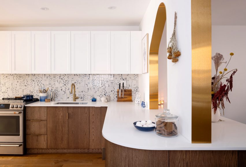
Brass ribbons line the asymmetric portals that connect the kitchen and dining room of this Toronto residence, renovated by local architecture and art studio Svima.

The Portal House was designed for a couple who had wanted to refresh their home for 10 years, but have very different aesthetic tastes.

Portal House by SvimaPortal House by Svima
Two portals connect the renovated kitchen and dining areas of this Toronto home

Toronto-based studio Svima found a compromise by combining his desire for “tenebrous minimalism” and her love of “bright French country kitchens” into the design.

The resulting “denlike cosiness” pairs dark oak across the lower half of the ground-floor spaces and clean white surfaces on the upper half.

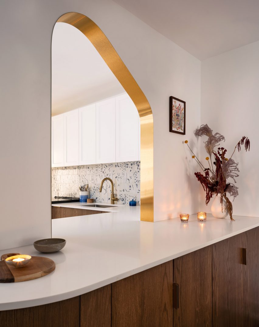
Brass-edged asymmetric portal looking into a kitchenBrass-edged asymmetric portal looking into a kitchen
The curved, asymmetric portal over the deep counter acts as a pass-through

The snaked kitchen layout is tight, so Svima curved the corners of cabinetry and counter surfaces to steal extra space for circulation.

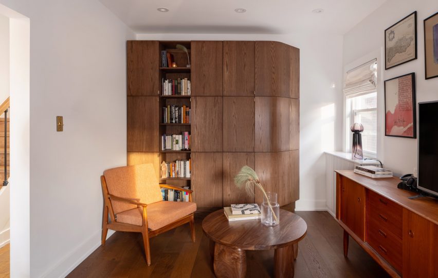
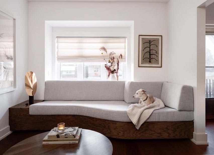
This theme continues to the living room millwork: a bookcase is filleted at the corner and meets the wall at an angle, while a built-in sofa beneath the window also softly angles inward.

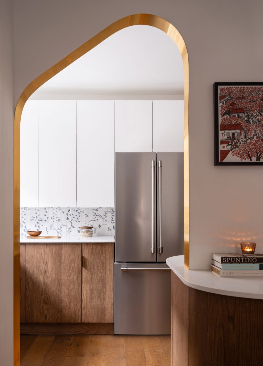
Open doorway with brass edges looking into the kitchenOpen doorway with brass edges looking into the kitchen
The other portal, mirrored in shape, forms a doorway between the two spaces

“The design hinges on ‘ribbons’ flowing through the space, guiding the motion through the rooms,” said Svima.

“The ribbons curve in areas where sharp corners would not fit, or would stop the flow of movement.”

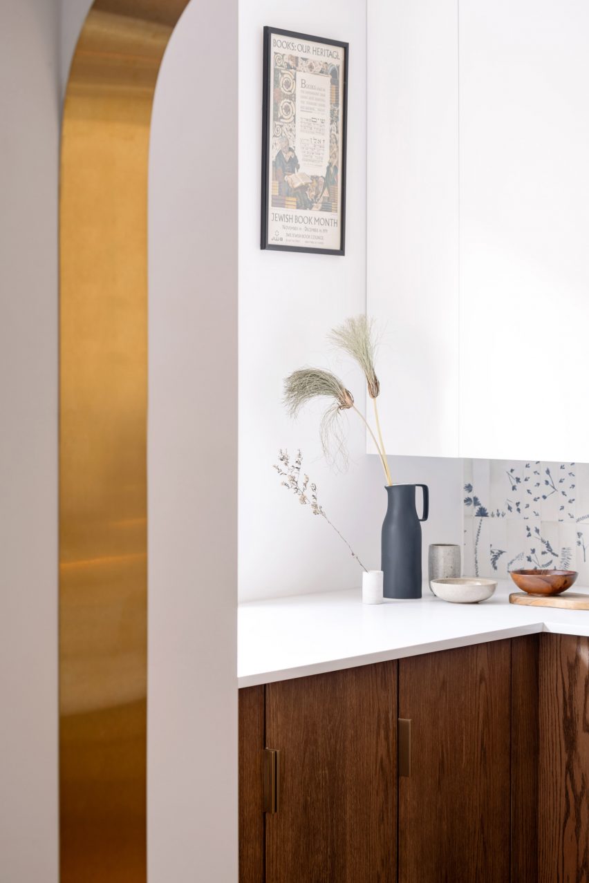
Detail of a brass-lined portal with a kitchen counter behindDetail of a brass-lined portal with a kitchen counter behind
Brass edges around the portals were artfully installed to perfectly fit the curved drywall

In the kitchen, the curved oak doors were handmade by a cabinetmaker who created a special jig to kerf-bend the oak into a radius.

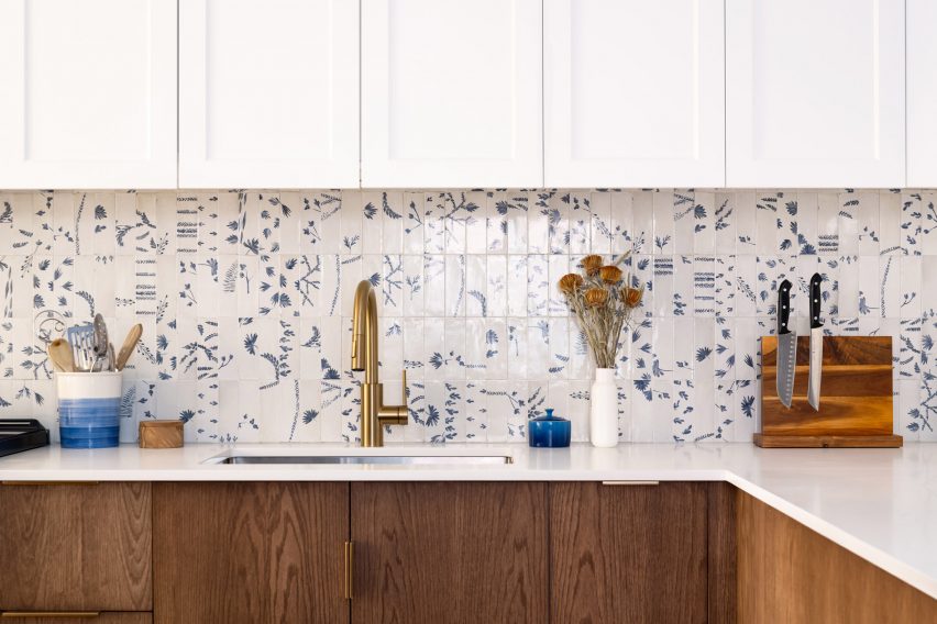
Tiles that offer a contemporary take on Dutch Delft porcelain form the backsplash, adding small touches of blue to the otherwise neutral space.

Kitchen with white upper cabinets, blue and white tiled backsplash, and dark oak lower cabinetsKitchen with white upper cabinets, blue and white tiled backsplash, and dark oak lower cabinets
To add touches of colour to the dark oak and bright white palette, tiles influenced by Delft porcelain were added to the backsplash

Two portals provide connections between the kitchen and adjacent dining room, both with a mirrored asymmetric shape and edged in brass.

One acts as a doorway, while the other over the deep counter is used as a pass-through for food, drinks and tableware.

“It was an artful process for the contractor to lay the brass into the wall, as it had to fit into the curved drywall perfectly with no tolerance for error,” the architects said.

The living room, located at the front of the house, was furnished with mid-century pieces such as a chair, a coffee table and a media console.

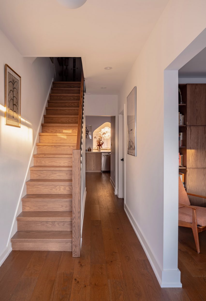
Hallway with dark oak flooring and a staircaseHallway with dark oak flooring and a staircase
Dark oak flooring throughout the home’s ground floor matches the other millwork

The closed and open shelving unit organises the family’s books and possessions, and its shape allows more light to enter from a side window.

Opposite, the built-in sofa helps to resolve an awkward space under a bay window and orients the sitter towards the TV to one side.

Living room featuring a dark oak storage unit with a filleted sideLiving room featuring a dark oak storage unit with a filleted side
In the living room, the curved kitchen cabinetry is translated as a storage unit with a filleted side

“The custom sofa sweeps into the space to provide seating at precisely the right sideways angle for viewing the media unit, for lounge reading, and for gathering,” Svima said.

The floors throughout the home match the other millwork, grounding the spaces with a rich dark hue.

A built-in sofa under a living room bay windowA built-in sofa under a living room bay window
A built-in sofa under the living room’s bay window similarly features softly curved angles

Svima, founded by architects Anamarija Korolj and Leon Lai, is not the only studio that’s had to get creative with a tight Toronto floor plan.

When Studio Vaaro overhauled a house in the city, the firm created a series of volumes with minimally detailed millwork to form kitchen cabinetry, the staircase and a feature bookcase in the living room.

The photography is by Scott Norsworthy.

Reference

Studio Paolo Ferrari designs Toronto restaurant as a “world unto itself”
CategoriesInterior Design

Studio Paolo Ferrari designs Toronto restaurant as a “world unto itself”

Toronto-based Studio Paolo Ferrari has created cinematic interiors for a restaurant in the city’s Downtown area, combining influences from filmmakers that range from Stanley Kubrick to Nancy Meyers.

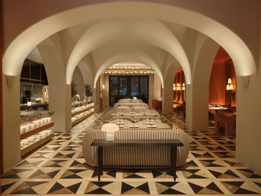
Unlike a typical restaurant layout, Daphne unfolds as a series of rooms with distinct identities, each borrowing references from different cinema styles.

Neutral-toned dining room with dramatic vaulted ceilings and a checkered floorNeutral-toned dining room with dramatic vaulted ceilings and a checkered floor
Daphne is laid out across several spaces, including a Great Room designed to feel like Nancy Meyers movie

Studio Paolo Ferrari intended each space to offer a different experience for guests, and custom-designed all of the furniture and lighting for the restaurant to make it feel even more unique.

“Daphne is an elevated and exceedingly creative take on the American bistro, fusing the nostalgia of New England prep with wonder and eccentricity,” said Studio Paolo Ferrari. “At once intimate and grand, eccentric and sculptural, convivial and experimental, the deeply imaginative space is reminiscent of a great residence that’s evolved over time.”

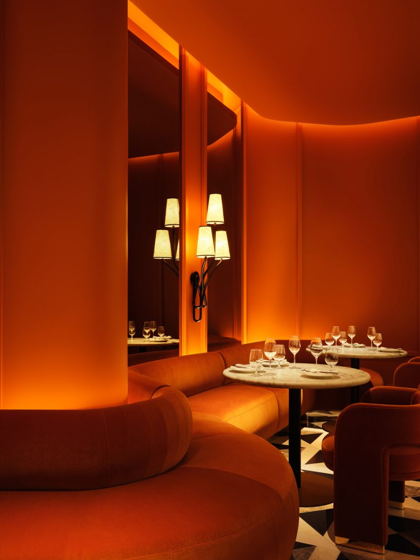
Burnt orange dining area with a wavy banquetteBurnt orange dining area with a wavy banquette
Studio Paolo Ferrari designed custom furniture and lighting throughout the restaurant

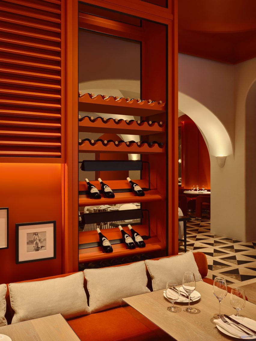
Guests arrive into an intimate space that features a transparent full-height wine cabinet, which offers glimpses of the dining area beyond.

They then move through to the Great Room, a cavernous room framed by a dramatic vaulted ceiling and decorated in a warm neutral palette.

Dining room fully enveloped in a burnt orange hueDining room fully enveloped in a burnt orange hue
The Drawing Room is fully enveloped in a burnt orange hue

Through the centre is a line of dining tables, each paired with a rounded striped sofa and two boucle-covered chairs.

The open kitchen is fully visible through the arches on one side, while a darker, cosier dining area coloured a burnt orange hue runs along the other.

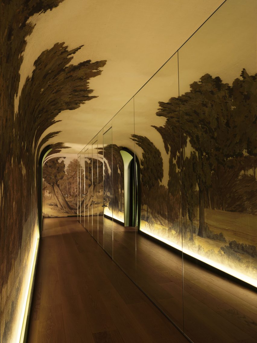
A mirrored corridor with a hand-painted landscape muralA mirrored corridor with a hand-painted landscape mural
A mirrored corridor with a hand-painted landscape mural leads to a separate bar area

“The grand space is reminiscent of the warmly luxurious spirit of a Nancy Meyers film, with custom furnishings that are deeply residential in feel and varsity-inspired checkerboard tiling,” said Studio Paolo Ferrari.

The Drawing Room beyond continues the burnt orange colour, fully enveloping the walls, ceiling and seating upholstery to create a monochromatic space.

Bar with wavy walls and green banquetteBar with wavy walls and green banquette
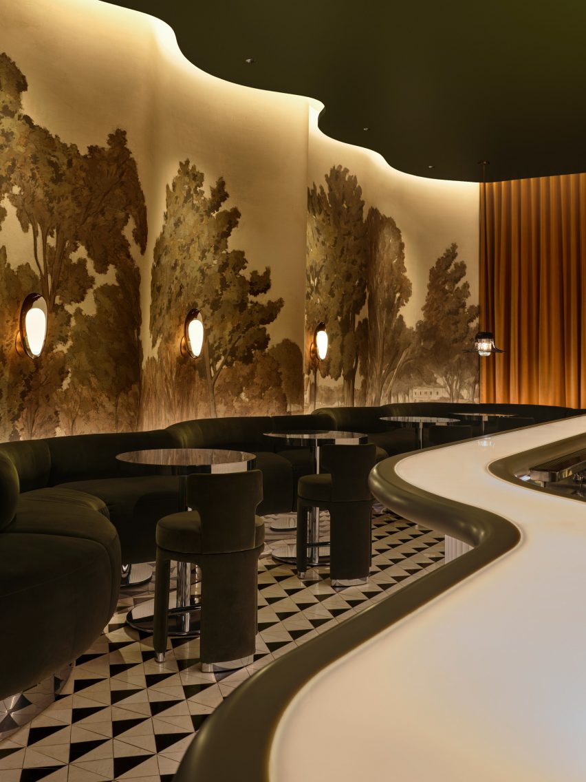
The mural continues across the wavy walls of the bar room and green banquette seating follow the curves

Cove lighting is installed behind louvres that cover the upper walls, adding texture and shadows as well as hint of “Cape Cod Americana”.

The bar area is reached via a long corridor that’s mirrored from floor to ceiling along one wall, and is lined with a hand-painted landscape mural across the opposite side.

Bar with glass countertop and fluted frontBar with glass countertop and fluted front
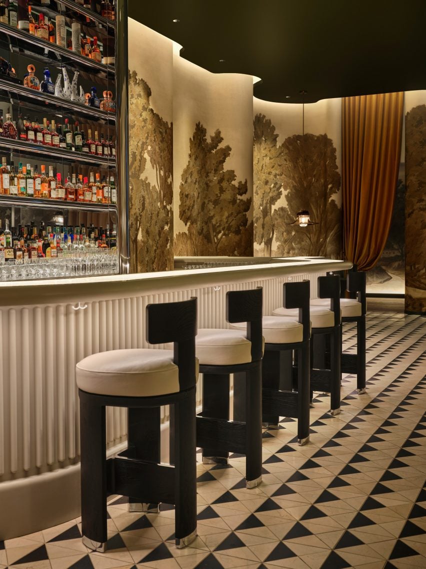
The glass bar countertop is illuminated from within, while the counter front is fluted

This verdant rural scene continues across the wavy surfaces in the bar room, above green banquettes that follow the flow of the wall.

“Daphne is a world unto itself, awaiting discovery,” the studio said. “Stepping into the bar is almost akin to stepping into an exquisitely-designed film set.”

The snaking glass-topped bar counter is illuminated from within, as a nod to the bar in the fictional Overlook Hotel from Stanley Kubrick’s movie The Shining.

The counter front is fluted in reverence to Beaux-Arts architect Henry Bacon, while reflective stainless steel across the back bar matches the circular tables and chair feet in the room.

Outdoor dining area between two brick buildingsOutdoor dining area between two brick buildings
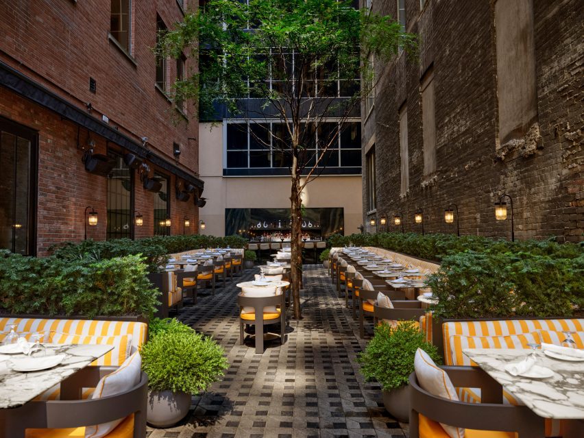
An adjacent dilapidated building was razed to create an expansive outdoor terrace

A dilapidated building adjacent to the restaurant was demolished to make way for an expansive outdoor Garden Terrace with a dining area and bar.

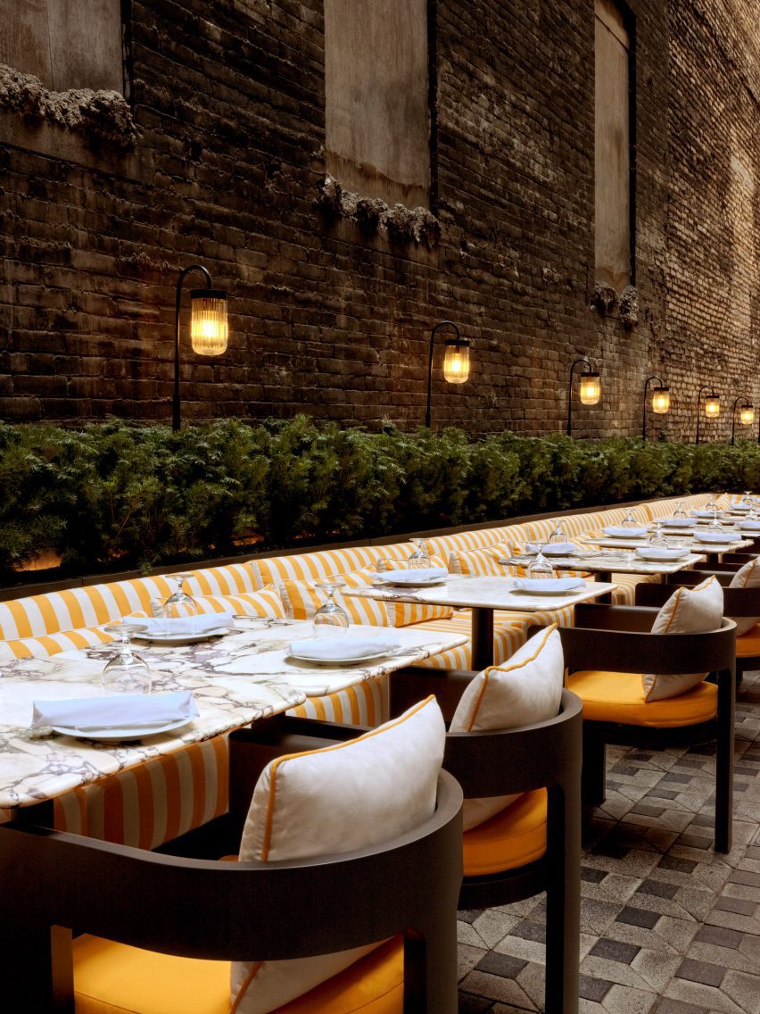
Sandwiched between two brick structures, this exterior space features comfy yellow and white-striped seating surrounded by plants, and a row of tall trees in the centre – continuing the botanical theme from inside.

Yellow and white-striped seating running along a brick walYellow and white-striped seating running along a brick wal
Plants behind the yellow and white-striped seating continue the botanical theme from inside

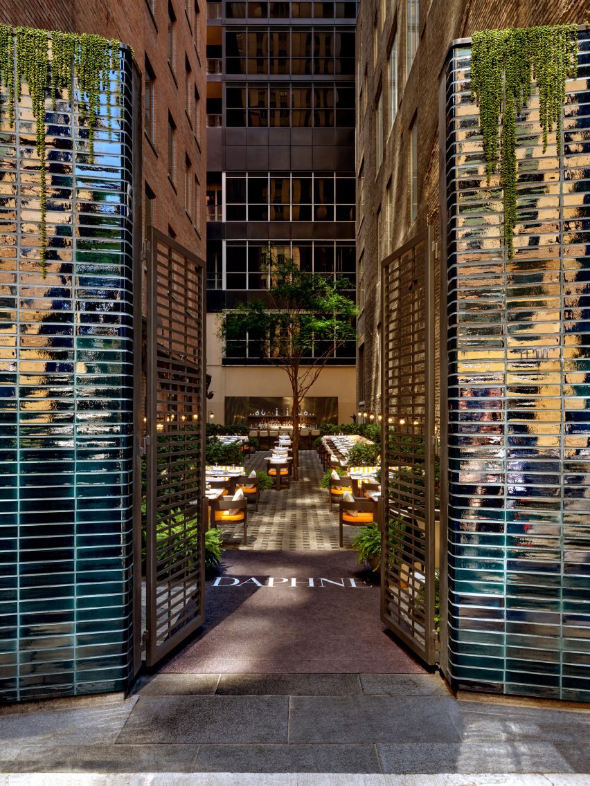
A separate entrance from the street leads guests between tall columns clad in dark blue-purple iridescent tiles into the alley-like space.

“It was important that the space had depth and a quality of experimentation,” said Paolo Ferrari, founder of his eponymous firm. “Daphne is truly an active experience of discovery, where guests can uncover thoughtful and innovative details throughout.”

Columns of blue-purple iridescent tiles form a gateway into an alley-like outdoor terraceColumns of blue-purple iridescent tiles form a gateway into an alley-like outdoor terrace
Columns of blue-purple iridescent tiles form a gateway from the street into the alley-like outdoor terrace

The designer’s earlier projects in Canada have included a lake house with wood and granite interiors, and a showroom for a development in Ottawa that appears more like a home than a sales gallery.

Other recent additions to Toronto’s dining scene include Prime Seafood Palace, which features a vaulted-wood interior by Omar Gandhi Architect.

The photography is by Joel Esposito.

Reference