Aro Archive store in Shoreditch features pastel-coloured rooms
CategoriesInterior Design

Aro Archive store in Shoreditch features pastel-coloured rooms

Fashion retailer Aro Archive’s pastel-hued east London store was designed by founder Ariana Waiata Sheehan to evoke “a sense of otherworldliness”.

The store, located in Shoreditch, replaces the brand’s previous, more industrial store on nearby Broadway Market and was intended to have a frivolous feel.
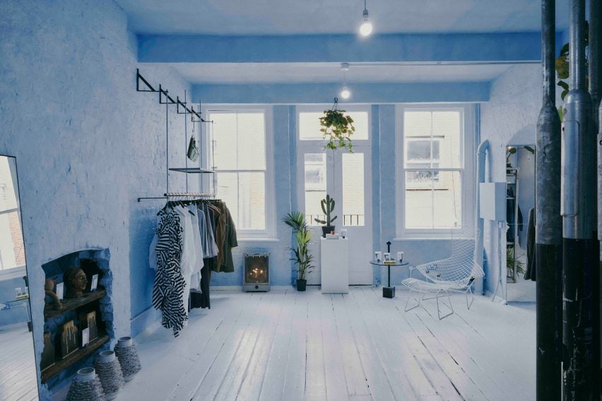
Pastel-coloured fashion storePastel-coloured fashion store
The Aro Archive store has pastel-coloured floors in pink and blue

The interior has “a sense of otherworldliness, escapism and fun,” Waiata Sheehan explains, comparing it to “a mixture between a mushroom trip and going to visit someone’s rich aunty who runs a gallery”.

“We’ve always had very neutral industrial spaces,” she told Dezeen. |But you can get an industrial Zara these days, so time to switch it up and go full personality, which has been scary but so worth it.”
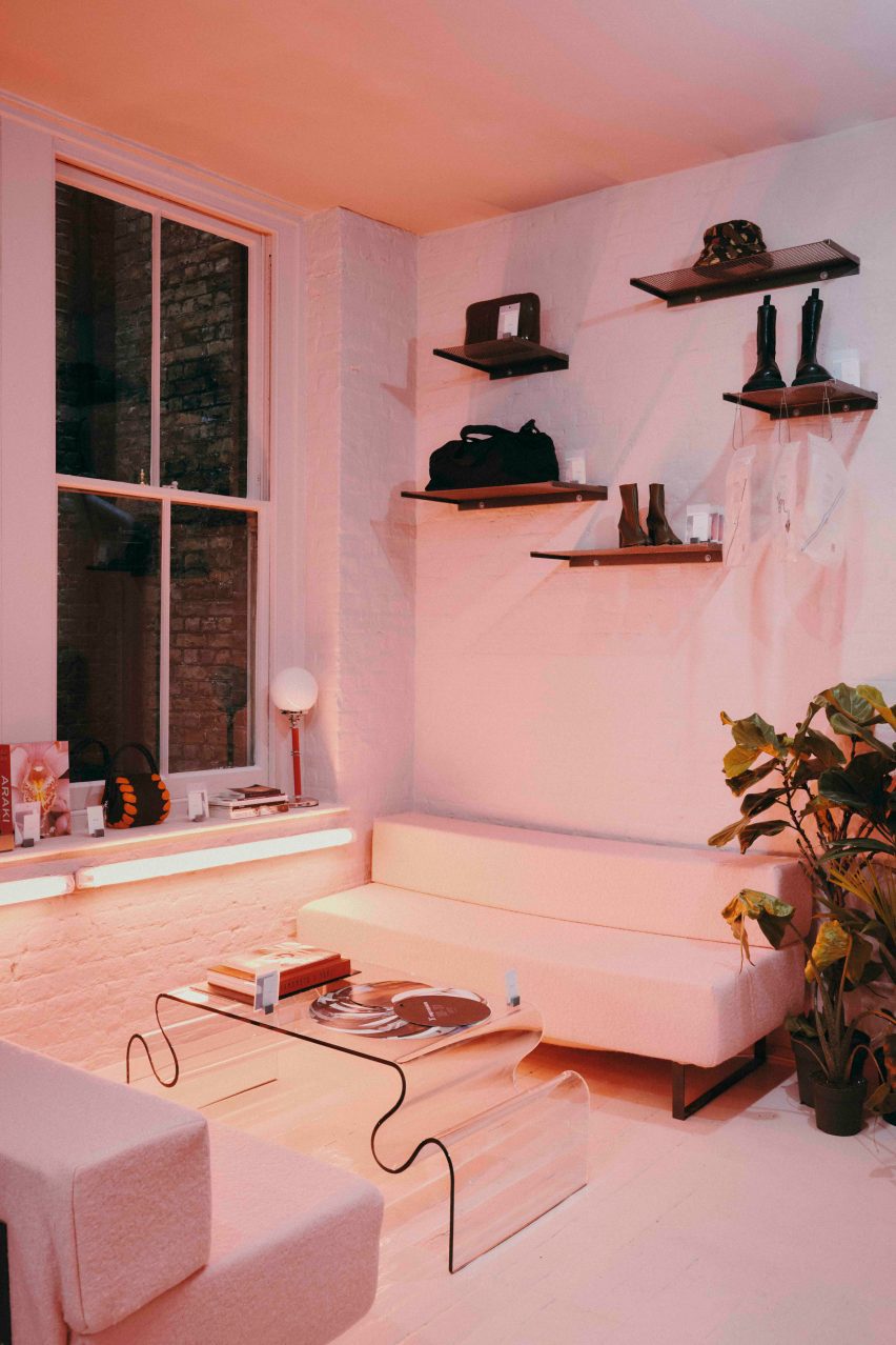
Pink floor in Aro ArchivePink floor in Aro Archive
It is located inside an old Victorian warehouse

Located inside a five-storey former Victorian warehouse, Aro Archive, which sells pre-owned clothing by avant-garde designers, was organised so that each floor has a different colour.

Monochrome pastel pink, blue and white hues decorate the different levels, which also feature a wide range of reclaimed and recycled materials, furniture and artworks.
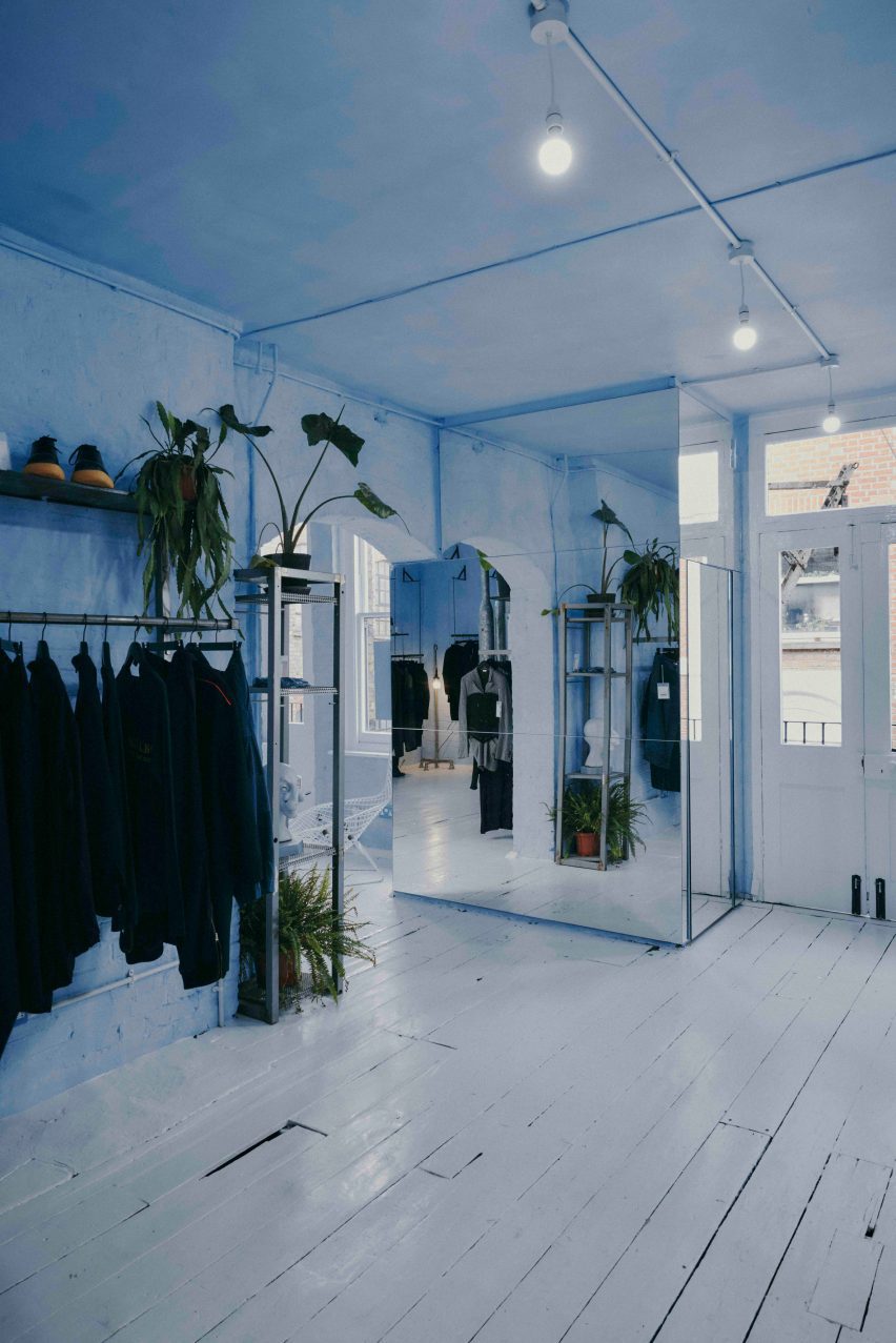
Blue floor in Aro ArchiveBlue floor in Aro Archive
Founder Ariana Waiata Sheehan created the interior design

“The pink floor is supposed to feel very warm, womb-like and enclosed,” Waiata Sheehan said. “The blue floor is more light and otherworldly. And the two white floors are very ethereal and calm.”

White duvet covers by fashion house Maison Martin Margiela were used to create curtains for the changing rooms, while interior pillars are made from reclaimed 1990s metal lamp posts that the designer sourced from a scrapyard in Preston.
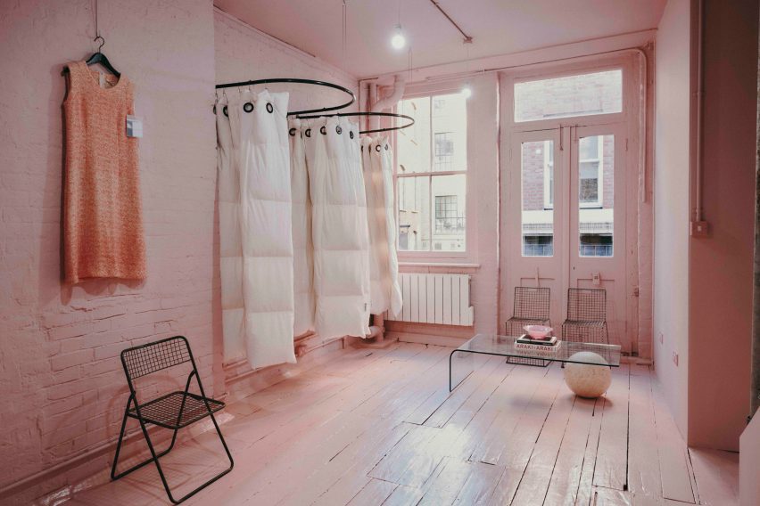
Martin Margiela duvet-changing roomsMartin Margiela duvet-changing rooms
Duvet covers by Maison Martin Margiela frame the changing rooms

“The building and surrounding area feel very London, so we did want to bring in a sense of that for example with the lamp posts, metal works and details, bright neon lights and so forth,” Waiata Sheehan said.

She sourced a number of unusual furnishings for the Aro Archive store, including an industrial control station from a paper-manufacturing plant that is now used as a till.

“The industrial paper control station I’ve been watching on eBay for nearly 4 years, waiting for a time I had the space to buy it,” Waiata Sheehan explained. “I wanted something different to the normal till, they’re all so boring and square.”

The store also has another large metal till and metal drawers that originally came from a 1980s Mary Quant store and were rescued from a squat in Hackney Wick.
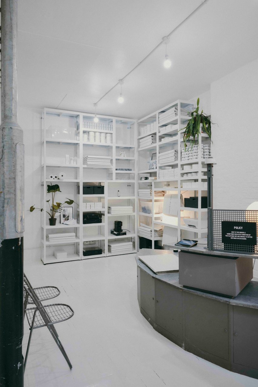
Metal till from Mary QuantMetal till from Mary Quant
A large metal till was originally from a Mary Quant store

Waiata Sheehan also sourced several smaller pieces for the boutique, where customers can purchase everything down to the artwork, furniture and accessories.

“I do all the buying so everything is here because I love it in some way,” she explained. “But in terms of favourite pieces in store right now?”

“For fashion, it’s the Rick Owens orange shearling gimp mask gilet, for objects the Shirin Guild ceramic incense holders and for furniture the wobbly glass table with magazine racks.”
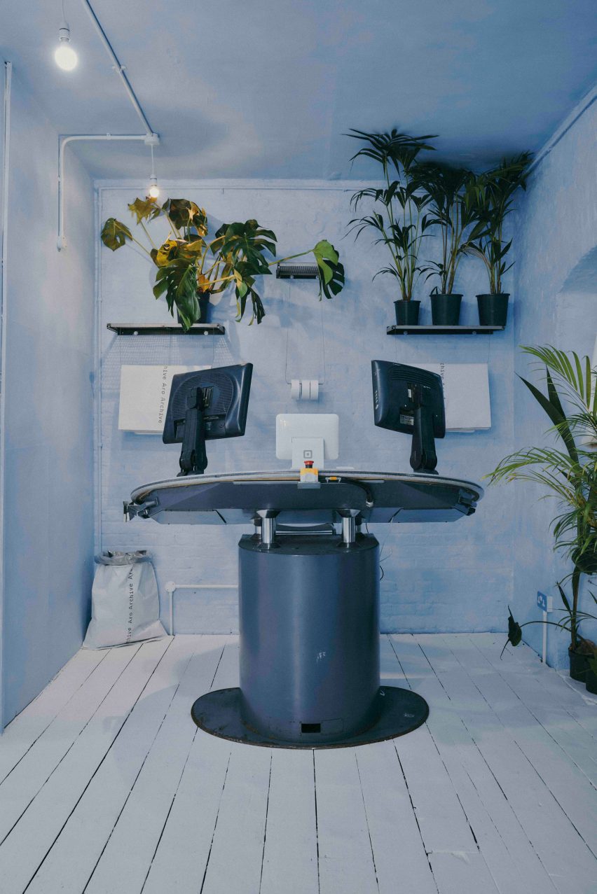
Industrial control stationIndustrial control station
Waiata Sheehan bought an old industrial control station from eBay

Waiata Sheehan hopes the Aro Archive boutique will feel like a home away from home and help to create a community feel in the area.

“I think Shoreditch is lacking a sense of community and I wanted to work that into the space,” she said. “The feeling of a chaotic family home and a feeling of togetherness.”
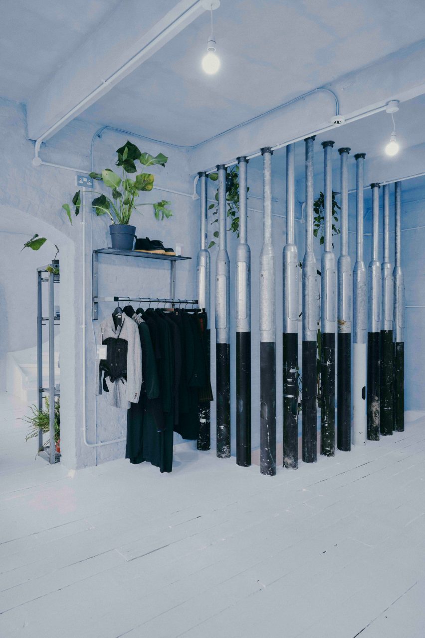
Pillars made from lampposts at Aro ArchivePillars made from lampposts at Aro Archive
Lampposts from a scrapyard form pillars inside the store

Other London stores with notable interior design recently covered on Dezeen include Swedish fashion brand Toteme’s newly-opened Mayfair store and a Coach pop-up store at Selfridges that had fixtures made from recyclable materials.

The photography is by John Munro.

Reference

Halleroed references Swedish Grace for Toteme flagship store
CategoriesInterior Design

Halleroed references Swedish Grace for Toteme flagship store

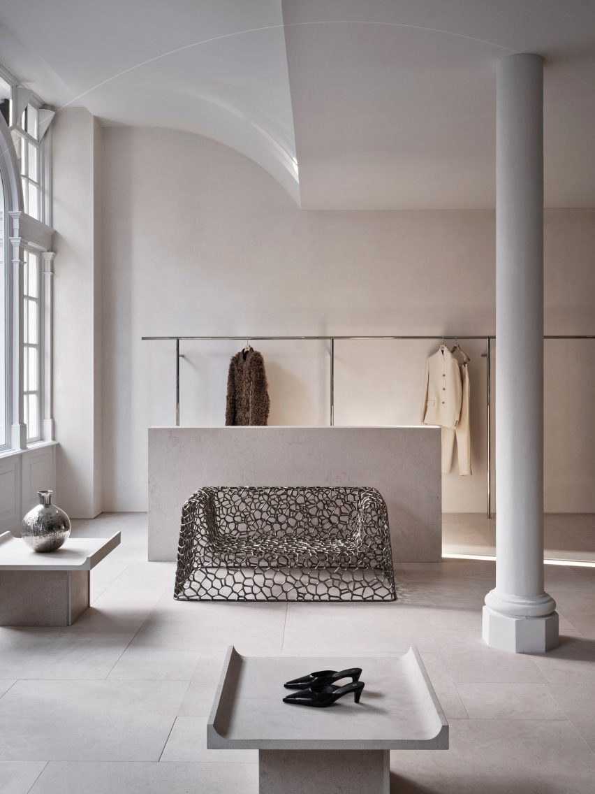
Stockholm studio Halleroed has designed fashion brand Toteme’s flagship store in London, which features a sculpture by artist Carl Milles and a steel sofa by designer Marc Newson.

Halleroed designed the store, located on Mount Street in the upmarket Mayfair area, together with Toteme founders Elin Kling and Karl Lindman. The duo wanted its third flagship to feature nods to the brand’s heritage.

“We like the idea of keeping certain elements that we find in our Swedish heritage,” Lindman told Dezeen at the store’s launch event.

“It can be by using certain vintage pieces, or like in [the brand’s Mercer Street store] in New York, we had a collaboration with Svenskt Tenn,” he added. “It’s about lifting this notion of Scandinavian design or Swedish design.”

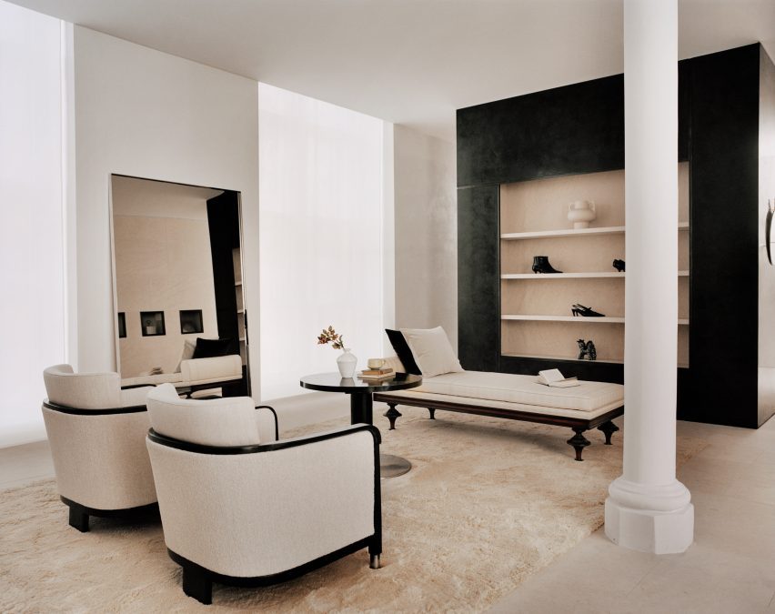
Interior of Totême store in LondonInterior of Totême store in London
A metal sofa by Marc Newson is among the sculptural details in the store

Halleroed drew on the space itself when designing the interior, focussing on how the light falls.

“We were inspired by the space itself with beautiful original windows letting the daylight in,” Halleored co-founder Ruxandra Halleroed told Dezeen.

“The upper part of the windows was partly hidden, which was a shame, so we redesigned the ceiling with a half vault towards the front to show the full height of the windows.”

Totême London storeTotême London store
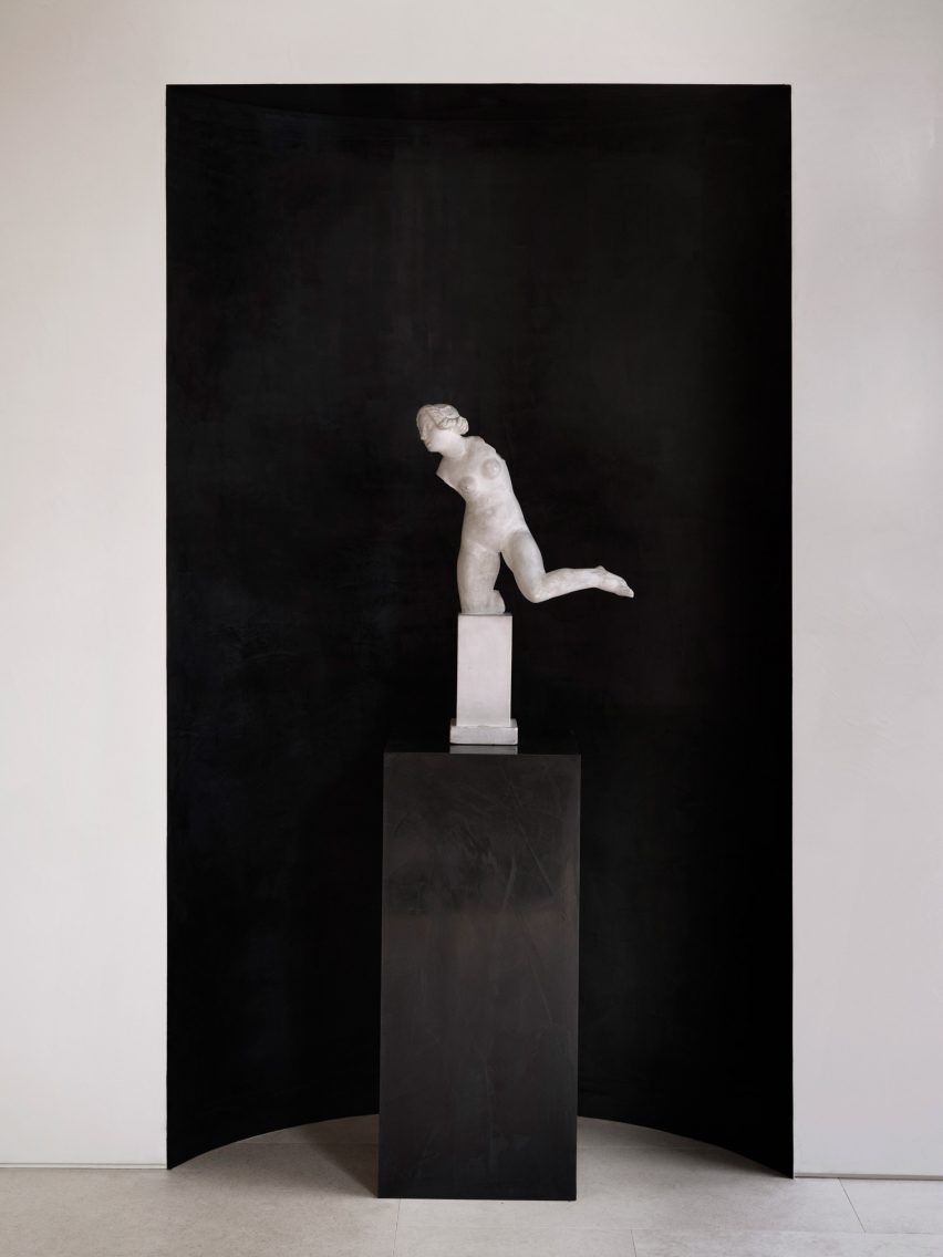
A piece by sculptor Carl Milles sits by the entrance

The design also references the work of Italian architect Carlo Scarpa as well as the Swedish Grace movement.

“We were also inspired by the Swedish Grace period – around 1920-30s – that has an elegant and pure design, something we think works well for Toteme as a brand,” Halleroed co-founder Christian Halleroed told Dezeen.

“Also the work of Carlo Scarpa we find interesting, more as a mindset on how to work with details and textures to create a subtle elegance and luxury.”

Cube inside fashion store in MayfairCube inside fashion store in Mayfair
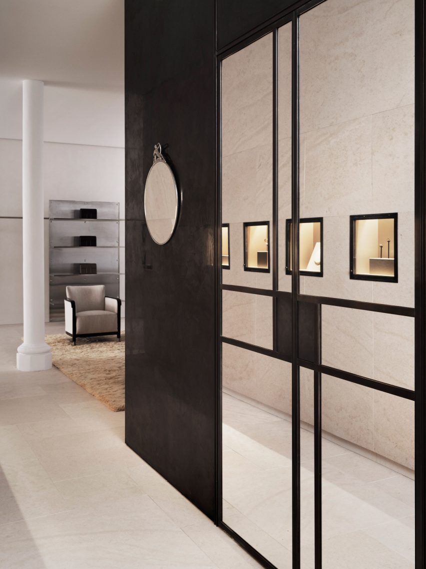
A black mirrored cube features at the rear of the store

Kling and Lindman wanted to keep the feel of “very posh” Mount Street where the store is located, while also underlining the space’s minimalist feel.

To do so, a lot of effort was put into the colour palette and different textured materials used for the flagship store.

“We worked with an off-white palette in different tones and different textures,” Ruxandra Halleroed said.

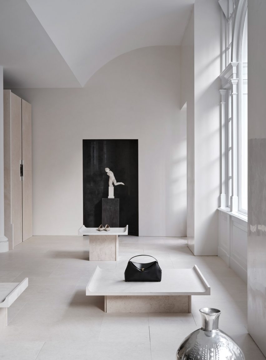
“The textures are as important as colour and materials. For walls, we have a glossy, off-white stucco, ceiling in same colour but matte. The floor is in a beige, honed limestone with a so-called Opus pattern.”

Milles sculpture inside Totême storeMilles sculpture inside Totême store
Halleroed chose to redesign the store’s ceiling to reveal its windows

In the middle of the Toteme shop, Halleroed created a stone-clad cube that holds shelves, vitrines and niches filled with artworks.

“The volume in the middle is clad with the same limestone, but in three different textures: honed, bush hammered and spiked texture, combined with oxidised dark brass,” Christian Halleroed said.

The store also features a square black volume in the back made from high-gloss stucco and dark brass.

Beige and white interior of London fashion storeBeige and white interior of London fashion store
The minimalist interior has a beige, white and black colour palette

To contrast the minimalist interior, the store is decorated with multiple artworks, including a sculpture by Milles and Newson’s intricately woven steel Random Pak Twin sofa, which Lindman found online.

“He’s a slave to auction houses,” Kling told Dezeen.

“So he found it and sent it to me and I loved it, and we also have a Marc Newsom piece in every store,” she added. “So we thought, ‘this one’s for the Mount Street store’. At that time we only had the signed contract, nothing else.”

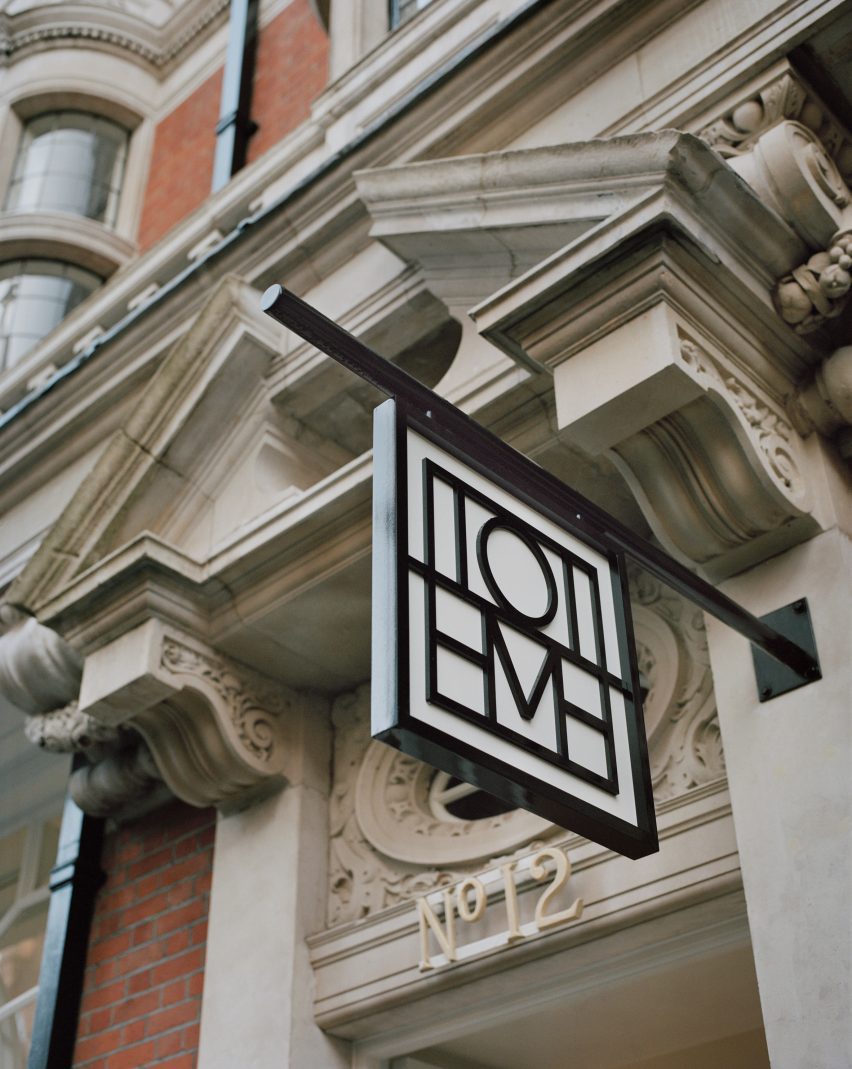
Sign outside Mount Street storeSign outside Mount Street store
The store is located on Mount Street in central London

The two founders and Halleroed decided on the gypsum Milles sculpture for the Toteme store together, with Halleroed designing a custom niche to place it in that is made from black high-gloss stucco to contrast the pale artwork.

Halleroed also added vintage Swedish Grace furniture to the store, including armchairs and a coffee table by furniture designer Otto Schulz, a daybed and a mirror in pewter made for the Stockholm Exhibition 1930.

The studio has designed a number of other store interiors, including a Paris boutique for French brand L/Uniform and an Acne Studios store in Chengdu that aimed to combine the futuristic and primitive.

Reference

The UK’s new biodiversity net gain rules explained
CategoriesSustainable News

The UK’s new biodiversity net gain rules explained

New planning legislation that aims to boost biodiversity in development projects will come into effect in England in January. Here, Dezeen explains what architects need to know.

What is biodiversity and why does it matter?

In this context, biodiversity usually refers to the variety of all species living within a certain area or ecosystem, including plants, animals, insects, bacteria and fungi.

Each species in an ecosystem has its own impact on the environment, affecting the availability of clean water and air, soil condition, pollination and other food sources and resources. Variety is necessary to keep all these elements in balance, maintaining a stable and resilient world for humans to survive in.

Many parts of the world are experiencing rapid biodiversity loss as a result of phenomena caused by human activities, such as pollution, climate change and habitat destruction. A Queen’s University Belfast study published earlier this year found that 48 per cent of the world’s animal species are experiencing population decline. The Worldwide Fund for Nature claims we are witnessing the sixth mass extinction event in the Earth’s history.

“We live in a time of mass extinction, where an alarming number of species are disappearing and where the impoverished ecology of the planet is having a detrimental effect, not only on our climate emergency, but also on pollination and in the production of food,” Adam Architecture director Hugh Petter told Dezeen. “It is a powder keg.”

Adam Architecture’s work includes Nansledan, an extension to the British city of Newquay that is being designed for the Duchy of Cornwall. The studio says it will surpass the new biodiversity net gain rules by adding “habitat ‘units’ of around 24 per cent and an increase in hedgerow ‘units’ of around 48 per cent”.

What are the new rules?

Construction can be a major cause of direct biodiversity loss, and the new planning rules for England aim to address that. They mandate that new developments deliver a “biodiversity net gain” – that is, a measurably positive impact on biodiversity compared to what existed before.

Specifically, the legislation requires developers to deliver a biodiversity net gain of 10 per cent. To calculate this, the UK government has produced a formula called the “statutory biodiversity metric” for counting what it terms “biodiversity units”, which are gained through work to create or improve natural habitats and lost through building.

As they strive to meet the 10 per cent requirement, developers must prioritise enhancing biodiversity on-site. If they cannot meet the threshold on the site being developed, they will be allowed also to make biodiversity gains on other plots of land, including by purchasing biodiversity units from other landowners.

As a last resort, they must buy “statutory biodiversity credits” from the government, which will use the money to invest in habitat creation. Biodiversity gains delivered must be maintained for a minimum of 30 years by whoever owns the land, bound by legal agreements.

Once planning permission is granted for a project, the developer must submit an evidenced biodiversity gain plan to the local planning authority (usually the council), which will approve it or refuse it. Development can only start once the biodiversity gain plan is approved. If the developer then fails to act in line with their biodiversity gain plan, the planning authority may take enforcement action.

Guidance on the new legislation, including a step-by-step guide to compliance, is available on the UK government’s website.

When do they come into effect?

The legislation was initially intended to come into effect for large developments of more than 10 dwellings in November, but that was pushed back to January 2024.

Smaller sites will also be subject to the new rules from April 2024, while major infrastructure projects will have to comply from late November 2025.

Some sites, such as small custom-built housing developments, will continue to be exempt.

What do architects and landscape architects need to know?

Architects and landscape architects will likely play a leadership role in ensuring that projects deliver on biodiversity requirements, working with ecologists and the authorities.

The most important thing, says Petter, is to understand the importance of biodiversity loss as an issue.

“The more architects can take a proper interest in the subject, the better placed they will be to work with the spirit of the new legislation and to think of imaginative ways that the minimum standards can be exceeded,” he said.

“It is crucial to engage with an ecologist as soon as possible,” added RSHP sustainability lead Michelle Sanchez. “It is also beneficial to evaluate the site as soon as you gain access.”

“This enables you to develop your designs based on the existing level of biodiversity, tailoring your strategy to local flora and fauna you particularly would like to support,” she said.

One thing to bear in mind is that the new rules aim to prioritise avoiding biodiversity loss in the first place.

“Avoiding biodiversity loss is the most effective way of reducing potential impacts, and it requires biodiversity to be considered at early design stages,” the guidance states.

To gain planning permission for a project that does cause biodiversity loss but proposes strategies to replace it, developers will need to explain, with evidence, why avoidance and minimisation is not possible.

Will this actually help to boost biodiversity?

The rules will mark the first time biodiversity enhancement has been a planning condition in England. According to University of Oxford researcher Sophus zu Ermgassen, it represents “one of the world’s most ambitious biodiversity policies”, but the exact impact is not yet certain.

But Sanchez is broadly optimistic. “Developers were not inclined to consider biodiversity enhancement in the past,” she told Dezeen.

“Only on projects attaining sustainability certificates such as BREEAM would biodiversity targets be discussed. Even then, it would sometimes more regarded as a tick-box exercise rather than an opportunity to make the building better and more appealing and to reduce the environmental impact that architectural projects have on the planet.”

However, she has warned in an opinion piece for Dezeen that a 10 per cent net gain on its own “is not enough to be able to reduce the negative impact that our way of life has had on biodiversity”.

The photo is by Free Steph via Unsplash.

Reference

Wooden elements “take centre stage” in Studio Frantzén restaurant
CategoriesInterior Design

Wooden elements “take centre stage” in Studio Frantzén restaurant

Scandinavian and Japanese influences come together at Studio Frantzén, a restaurant in London’s Harrods department store designed by Joyn Studio.

Stockholm-based Joyn Studio created the sleek interiors for Studio Frantzén – the latest restaurant opened by chef Björn Frantzén.

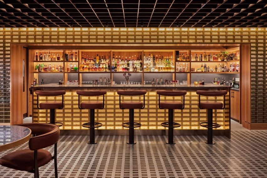
Back-lit glass brick bar at the Studio Frantzén restaurantBack-lit glass brick bar at the Studio Frantzén restaurant
Top: visitors enter via a domed reception area. Above: the bar is characterised by back-lit glass bricks

The two-storey eatery is arranged across a main restaurant and bar on the fifth floor, as well as on an additional mezzanine and rooftop terrace on the sixth floor of Harrods.

In stark contrast to the department store’s famed Edwardian baroque terracotta facade, Studio Frantzén features a contemporary palette that takes cues from both Scandinavian and Japanese design – a trend known as Japandi.

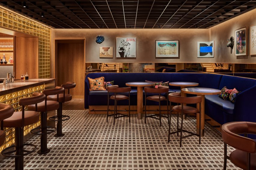
Bar at Harrods by Joyn StudioBar at Harrods by Joyn Studio
Studio Frantzén is located across two levels at Harrods

Visitors enter the restaurant at a domed reception area, which references Scandinavian churches and forest chapels, according to the studio.

The curved walls were clad with blocky cherry wood while illustrations of Nordic animals by Ragnar Persson decorate the ceiling and a Swedish wooden Dala horse was perched on the welcome desk.

“Undoubtedly, wood takes centre stage in this restaurant,” Joyn Studio founding partner Ida Wanler told Dezeen.

Main restaurant with bespoke timber seating by Joyn StudioMain restaurant with bespoke timber seating by Joyn Studio
The main restaurant is composed of two dining halls

The reception area gives way to a “glowing” bar composed of stacks of glass bricks bathed in amber light, which is mirrored by a ceiling of gridded copper.

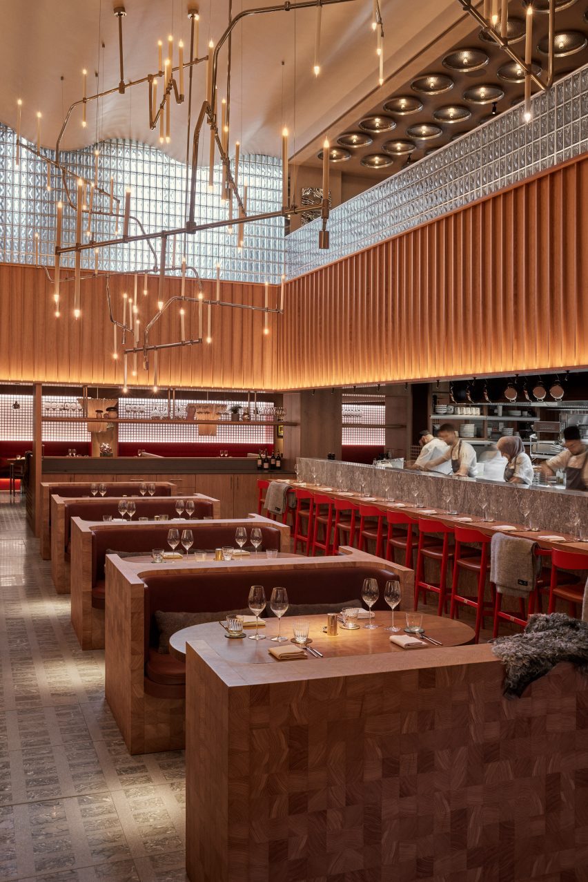
Informed by traditional Japanese izakaya – a type of casual watering hole serving snacks – the large main restaurant is composed of two dining halls with bespoke geometric terrazzo and marble flooring.

Bespoke timber seating illuminated by a chandelierBespoke timber seating illuminated by a chandelier
One features bespoke timber seating

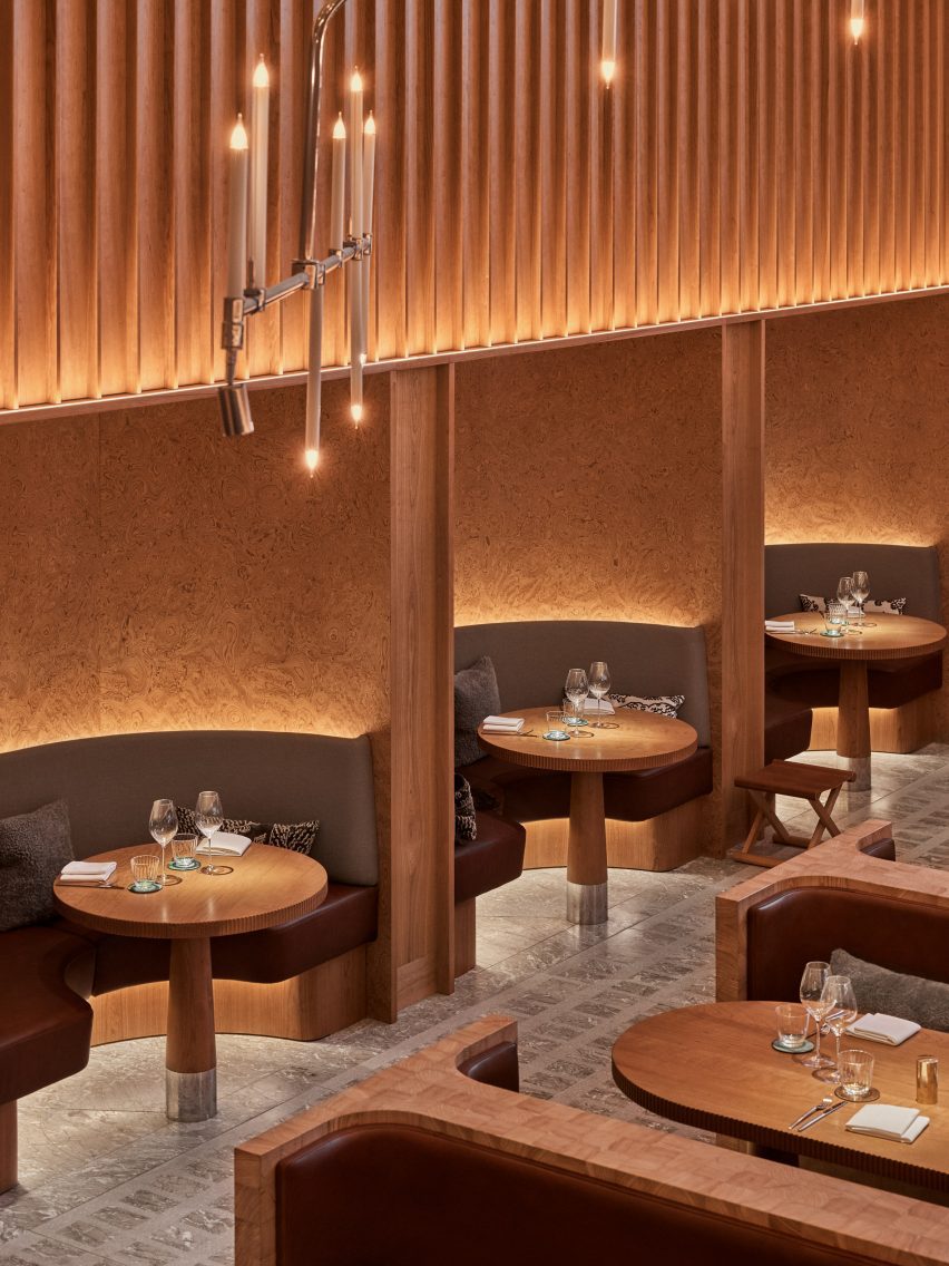
One hall features an open kitchen and Joyn Studio-designed chunky seating booths and sofas carved out of end-grain wood. This was sourced from a large Hungarian pine tree, cut into cubes and then glued together piece by piece.

This double-height space is illuminated by a spindly oversized chandelier by Swedish studio Front.

Gridded ceiling within dining hallGridded ceiling within dining hall
The other follows the same gridded geometry as the bar

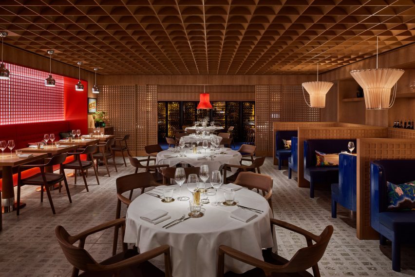
The other dining hall, tucked around the corner and connected to a wine cellar, follows the same geometry as the bar.

Sliding timber doors and a gridded wooden ceiling are interrupted by ultramarine benches in booths and delicate, ribbed paper lampshades.

“To create a distinctive Nordic dining experience with Asian influences within a historic London building, we delved into the architectural and design legacy of the early 20th century,” explained Wanler.

“Inspired by the journeys of our predecessors to the far east, where they assimilated influences and pioneered a style known as Swedish Grace, we embraced the resonances between traditional Japanese and Nordic architecture and craftsmanship,” she continued.

Mezzanine level by Joyn StudioMezzanine level by Joyn Studio
Mirrored artwork by Caia Leifsdotter was included in the mezzanine

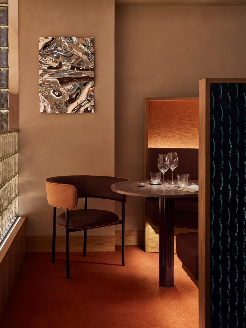
On the upper floor, the mezzanine includes three intimate dining booths accentuated by a burnt orange carpet and a wall-mounted Psychedelic Mirror by designer Caia Leifsdotter.

Characterised by marble, rattan and wooden accents, the rooftop terrace offers expansive city views.

Rooftop terraceRooftop terrace
The rooftop terrace offers views of London

“Aiming to infuse creativity into the traditional luxury context of Harrods, we envisioned a relaxed and comfortable ambiance with sparks of richness created in unexpected ways,” said Wanler.

In 2022, Joyn Studio was longlisted for the title of emerging interior design studio of the year at the Dezeen Awards.

Elsewhere at Harrods, fashion house Prada recently opened a green-hued pop-up cafe that referenced one of Milan’s oldest patisseries.

The photography is by Åsa Liffner.


Reference

Proctor & Shaw tops London home extension with serrated zinc roof
CategoriesArchitecture

Proctor & Shaw tops London home extension with serrated zinc roof

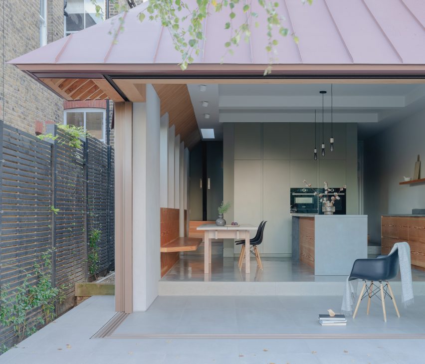
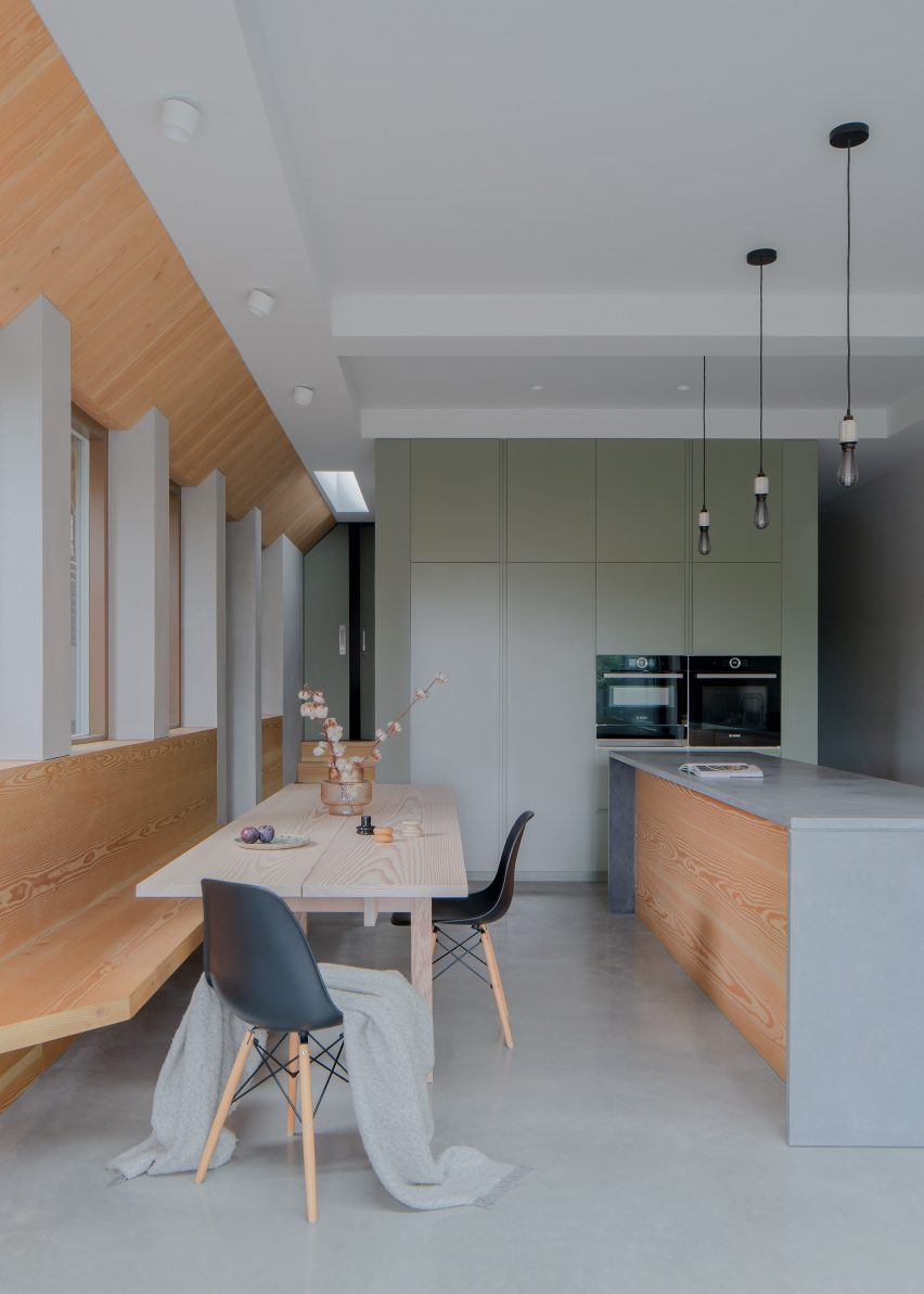
Architecture studio Proctor & Shaw has topped a home extension with a steeply-angled roof clad with red pigmented zinc in East Dulwich, London.

Home to a family of seven, Proctor & Shaw designed the project as an extension to an existing Edwardian house, extending the ground-floor kitchen and dining room.

Proctor & Shaw design London home extension with zinc roofProctor & Shaw design London home extension with zinc roof
Proctor & Shaw has designed a serrated roof edge for a London home extension

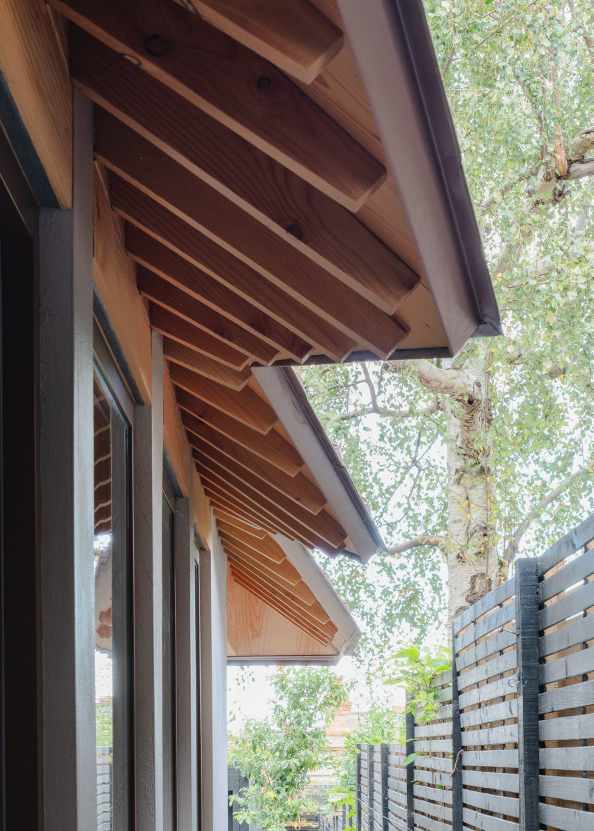
In order to restrict potential onlooking from neighbours, the studio crafted a unique serrated-edged roof with exposed rafter tails to run alongside the extension – enhancing both privacy and daylight access.

“From the side, the serrated edge blocks oblique views from the principal first-floor neighbouring windows,” Proctor & Shaw director John Proctor told Dezeen. “It is designed to be pulled back (with the shortest overhang) at the mid-window point to allow the maximum amount of light directly from above.”

Serrated roof edge designed for Edwardian house extensionSerrated roof edge designed for Edwardian house extension
The unique roof design features exposed rafter tails lined with Douglas fir

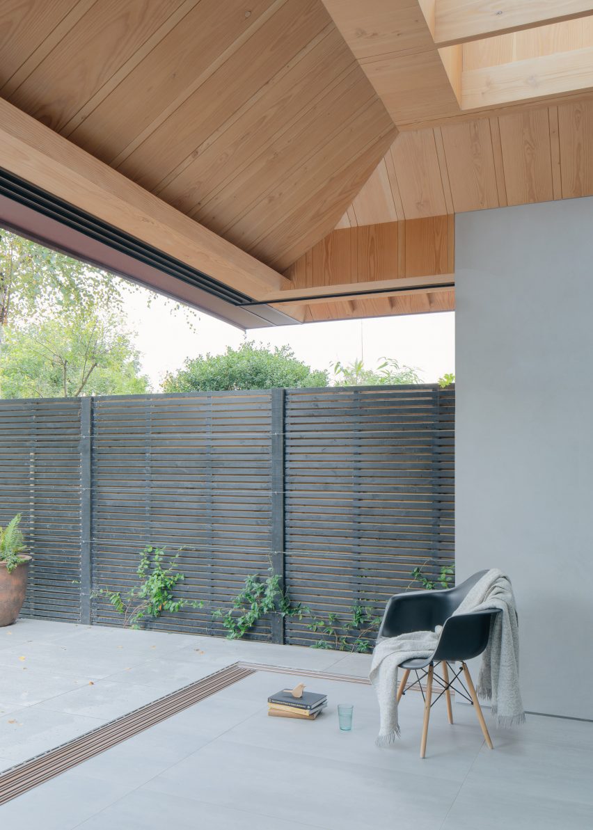
A newly built porcelain-tiled living space sits adjacent to the kitchen and dining room and is also sheltered by the roof’s large overhangs.

Deep skylights punctured into the roof draw daylight into the space below, while sliding doors seamlessly connect the interior with an outdoor patio.

View from newly built living space in London home extensionView from newly built living space in London home extension
Deep skylights draw daylight into the newly built living space

The interior space is defined by kitchen units and seating lined with warm-toned Douglas fir, which are contrasted by cool-toned concrete flooring and countertops.

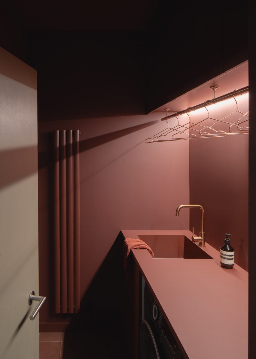
A centralised services unit nestled behind the kitchen provides a bathroom and utility space defined by bold, pink-hued walls and matching floor tiles.

Built into a sloping site, level changes pose as thresholds – dividing the open-plan interior and exterior spaces.

Externally, metal steps lead down to the landscaped garden, which comprises a paved outdoor kitchen, seating area and outbuilding, designed in collaboration with Barbara Samitier Garden Design.

London home extension with Douglas fir interiorLondon home extension with Douglas fir interior
The kitchen and dining room have a largely concrete and wooden interior

According to the studio, drainage from the gutter-less zinc roof, as well as the home’s existing pitched roof, is provided at ground level to allow for a finely detailed roof edge.

“[The gutter-less roof] required careful navigation of regulatory requirements for rainwater drainage, which was ultimately achieved with the side roofs being kept small,” Proctor said.

Services unit within Proctor & Shaw's home extensionServices unit within Proctor & Shaw's home extension
The services unit is defined by bold-coloured walls

Other London home extensions completed by Proctor & Shaw include a glazed extension added to Sky Lantern House and a micro-apartment with a translucent “sleeping cocoon”.

The photography is by Nick Deardon.


Project credits:

Architect and interior designer: Proctor & Shaw
Structural engineer: Constant Structural Design
Landscape designer: Barbara Samitier Landscape and Garden Design
Contractor: R & D Nunes (trading as Yorkland Stone)
Building control: Cook Brown Buildings Control Ltd

Reference

Cake Architecture draws on Bauhaus principles for Hoxton bar
CategoriesInterior Design

Cake Architecture draws on Bauhaus principles for Hoxton bar

Cake Architecture has renovated A Bar with Shapes for a Name, an east London cocktail bar featuring “utilitarian” interiors.

A Bar with Shapes for a Name owes its title to the yellow triangle, red square and blue circle that are emblazoned on its facade in a nod to the primary colours and understated geometry commonly associated with the Bauhaus.

Tall tubular chairs at A Bar with Shapes for a Name by Cake ArchitectureTall tubular chairs at A Bar with Shapes for a Name by Cake Architecture
Tall tubular chairs feature on the ground floor

When creating the bar’s minimalist interiors, Dalston-based Cake Architecture took cues from the influential German art and design school that was established in 1919 and advocated for an emphasis on functionality, among other similar principles.

Located at 232 Kingsland Road in Hoxton, the cocktail bar was renovated by the studio to serve as a multipurpose venue.

Reddish plywood barReddish plywood bar
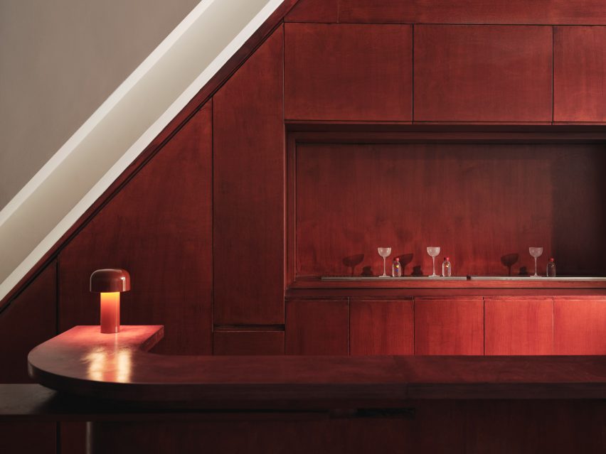
Cake Architecture created a smooth ground-floor bar from reddish plywood

Cake Architecture doubled the bar’s capacity by adding a basement, which acts as a “kitchen-bar” room, and refurbished the ground floor’s existing seating area as well as a classroom-style space that offers a location for rotating events or workshops.

“These spaces have specific functional requirements and we selected colours and materials to suit,” studio director Hugh Scott Moncrieff told Dezeen.

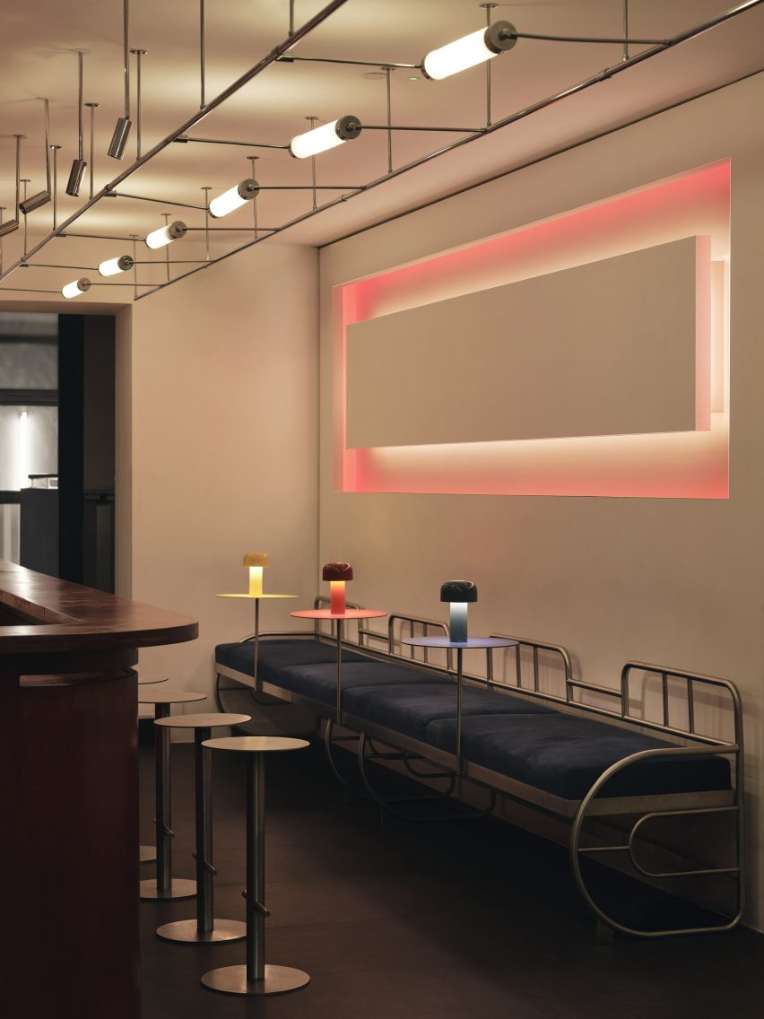
Rectilinear light installation within bar by Cake ArchitectureRectilinear light installation within bar by Cake Architecture
It was positioned opposite a rectilinear light installation

Upon entering the bar, visitors are greeted by the main seating area or “showroom”, which was designed to be warm and inviting.

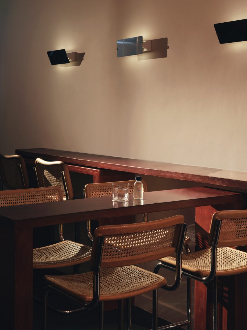
Tall tubular chairs finished with neutral rattan were positioned around chunky geometric tables made from birch ply stained to a rich, reddish-brown hue.

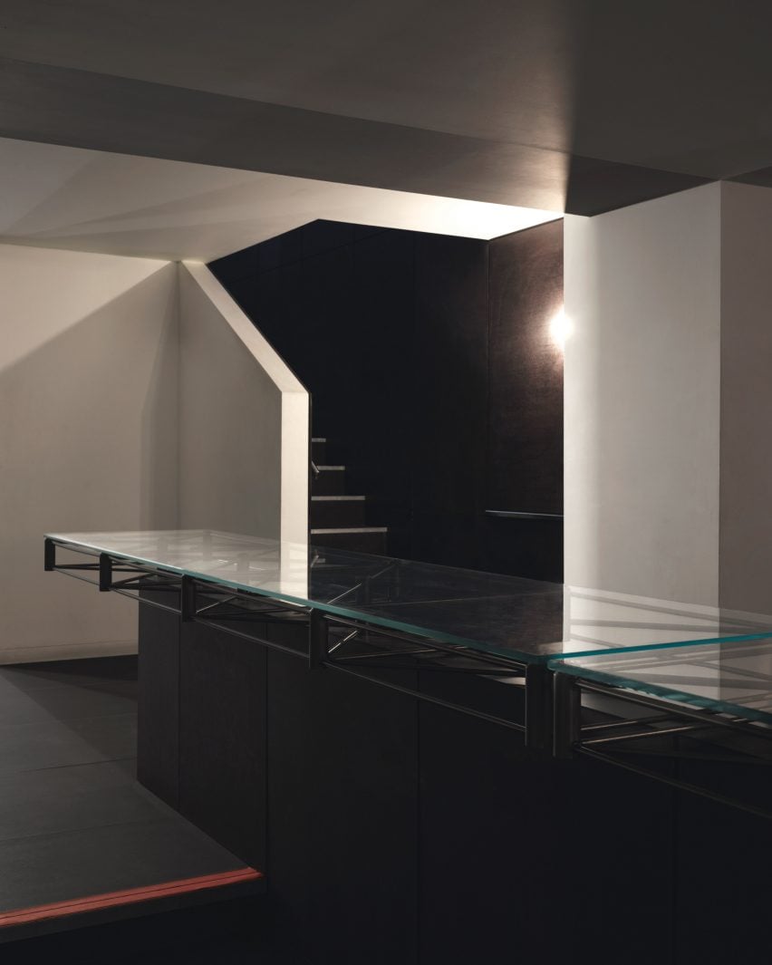
Glass-topped central table in the basementGlass-topped central table in the basement
The renovation included the addition of a new basement

The team also used the same timber to create the space’s curving bar, which is illuminated by a squat, cordless table lamp by lighting brand Flos.

Opposite the bar, a glowing rectilinear light installation by photographer Steve Braiden was fitted to the wall underneath bench-style seating reminiscent of early Bauhaus furniture designs.

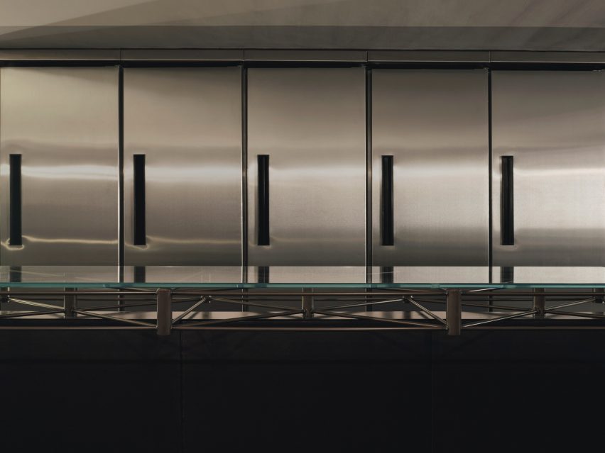
Close-up of the steel, glass-topped tableClose-up of the steel, glass-topped table
A steel, glass-topped table sets an industrial tone

“We looked in particular at projects by the Bauhaus founder Walter Gropius,” reflected Scott Moncrieff.

“Gropius is a master of this elegant zoning through the application of colour and form,” he added.

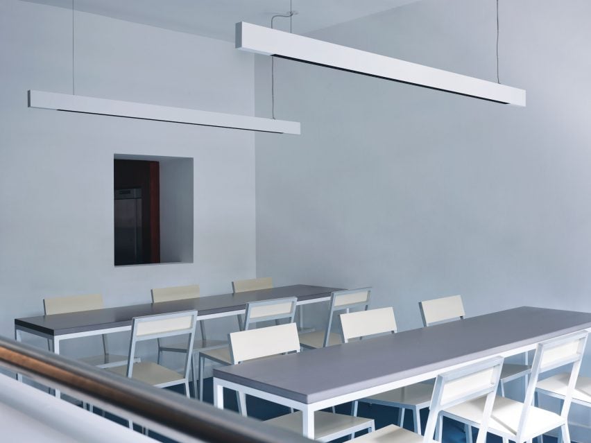
Steel-framed tables in the classroomSteel-framed tables in the classroom
The “classroom” includes steel-framed tables

Downstairs, the low-lit basement was created to house additional seating as well as “all of the crazy machinery they use to prepare the drinks,” the designer said.

The basement is characterised by a bespoke central table by Cake Architecture and furniture designer Eddie Olin.

Sculptural, colourful lampSculptural, colourful lamp
Red, yellow and blue accents define a sculptural lamp

Consisting of a steel frame that “floats” over a central leg, the table was topped with a glass surface and its base was clad in phenolic-coated plywood to match the floor and walls.

“This new basement is predominantly a production space – so the palette reflects this with hardwearing, utilitarian and industrial materials,” said Scott Moncrieff.

A thick, felt curtain in ultramarine adds a pop of colour to the otherwise pared-back space.

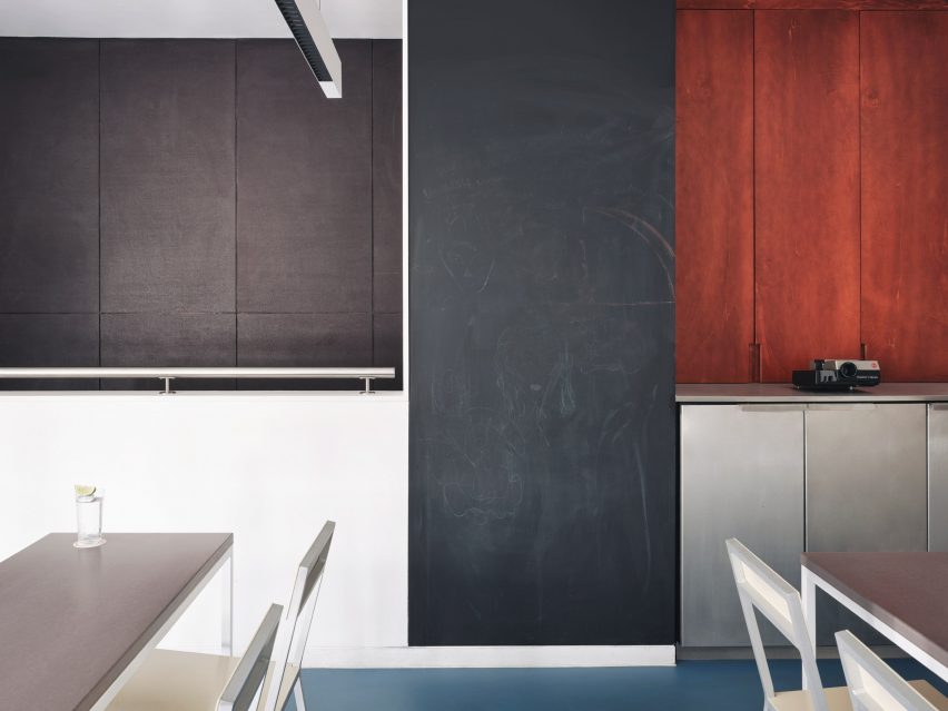
With its pale blue walls and Valchromat-topped, steel-framed tables, the ground-floor “classroom” pays homage to the Bauhaus as an educational institution.

Tall blackboard in the classroomTall blackboard in the classroom
A tall blackboard provides space to learn in the classroom

Brighter blue vinyl covers the floors while a sculptural lamp featuring red, yellow and blue circles echoes the bar’s logo.

A tall blackboard and overhead strip lighting add to the classroom feel of the space, which is used for various group events.

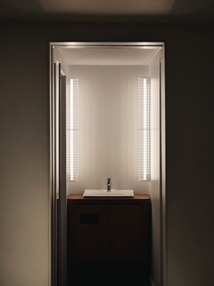
Illuminated bathroom sinkIlluminated bathroom sink
Thin vertical lights frame the bathroom sink

Cake Architecture worked closely with the bar’s founders Remy Savage and Paul Lougrat when creating the interiors, which were primarily informed by the duo’s way of working.

“The team has a conceptually driven ethos drawn from the theory and practice of Bauhaus embedded in everything they are doing. We found that incredibly exciting,” explained Scott Moncrieff.

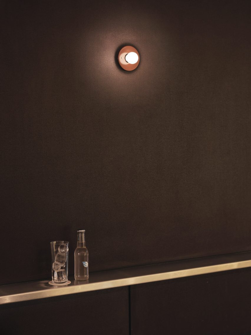
Sconce lighting on the wallSconce lighting on the wall
A Bar with Shapes for a Name is located on London’s Kingsland Road

“The Bauhaus phrase ‘party, work, play’ was pertinent to some early ideas and this carried through all our design discussions,” noted the designer.

“The space enables these three things. Separately as individual functions and simultaneously as a representation of the overall atmosphere of a bar!”

Cake Architecture previously worked with interior designer Max Radford to create a curtain-wrapped speakeasy in London’s Soho. The studio also designed a workspace for London agency Ask Us For Ideas in the same part of the city.

The photography is by Felix Speller


Reference