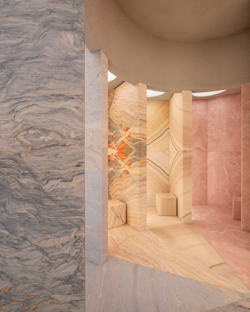
British architecture studio Al-Jawad Pike has used colourful marble for the interiors of trainer brand Athletic Propulsion Labs’ second flagship store in Soho, New York City.
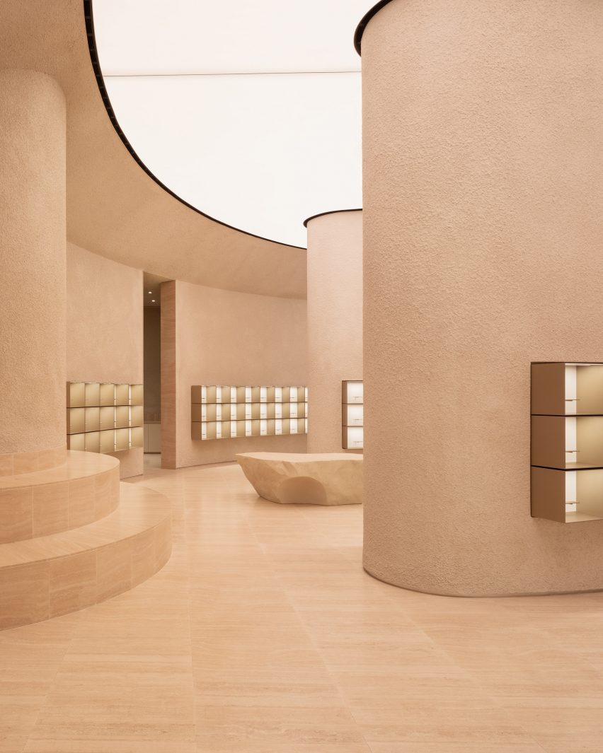
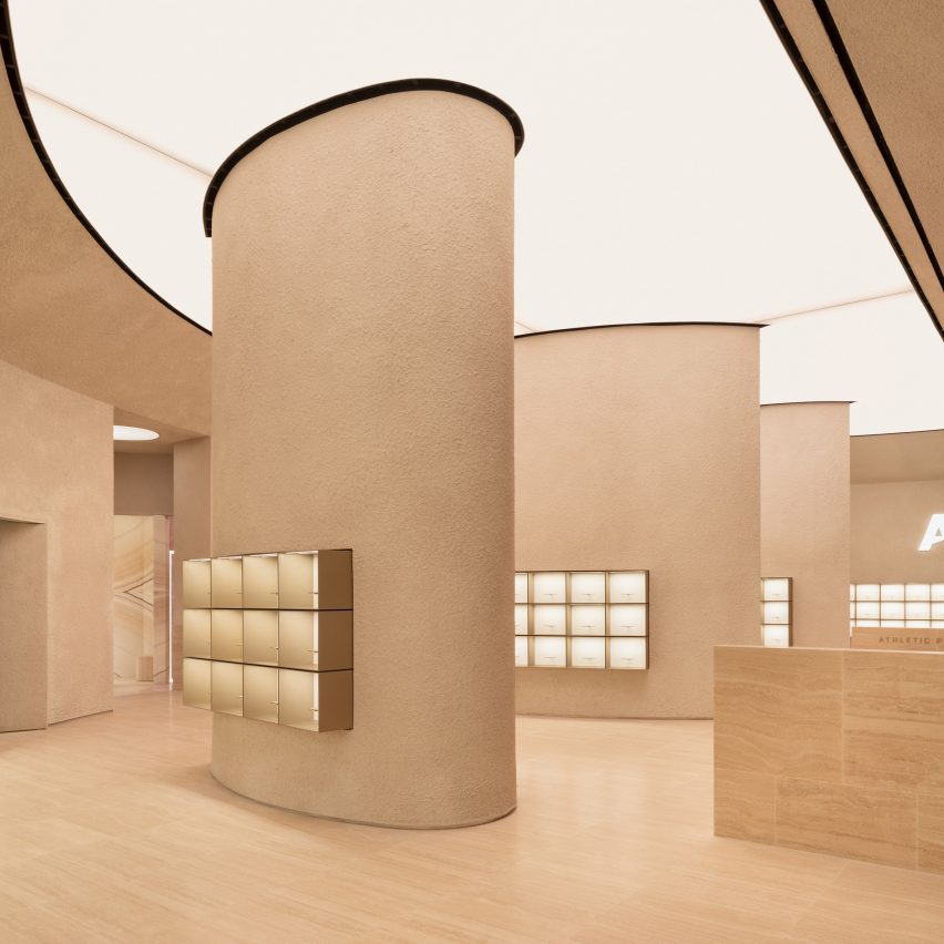
The interior of the 3,900-square-foot space (1,188 square metre) was laid out in a curving amphitheatre design, which the studio designed to be “simple yet severe” while creating a “completely immersive experience,” Al-Jawad Pike studio co-founder Jessam Al-Jawad told Dezeen.
The centrepiece of the Athletic Propulsion Labs (APL) store is five “vanity rooms” in a radial design, each clad in different-coloured onyx or marble stone with matching stone stools and back-lit mirrors.
The rainbow-colour array of stone, chosen by the client from different quarries, was “intended to represent the five boroughs of New York,” Al-Jawad said.
Five vanity rooms are each clad in distinctive coloured onyx or marble
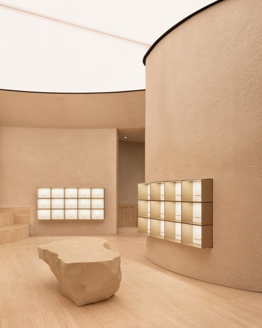
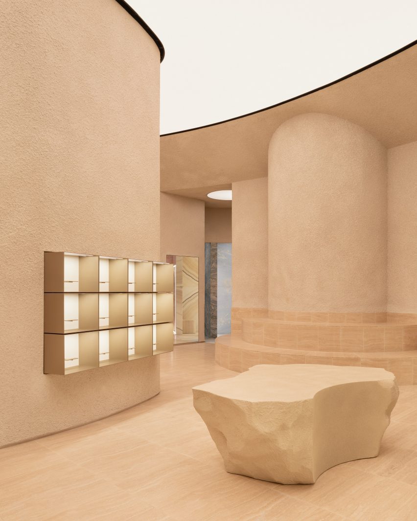
A teardrop-shaped column is located in the centre of the store, while boulder-like plinths positioned around the space are used for product displays.
The textured display plinths were developed with a bespoke fabricator based in New York, who CNC-carved the forms.
The studio incorporated various other materials into the scheme such as textured sprayed plaster on the walls, Romano travertine for the floor, and champagne-coloured anodised aluminium for the display boxes.
Al Jawad Pike completed the interiors for Athletic Propulsion Lab’s flagship store in New York
The aim of the store layout was to allow customers to see all the products from all parts of the store.
“We approached this by creating an architectural form that displays the product in a pan-optical array to provide visibility in completeness from almost any part of the store; whilst maintaining a seamless link between staff back-of-house functions at the basement level with the main retail space,” the studio explained.
The space features a layout designed in a curvilinear amphitheatre style
The shoes are displayed in simple box frames, which are raised and lit up like artwork in a gallery. Ensuring that the trainers on display were the focal point was a main objective for the architects.
“The goal was to make sure the products were the main attraction in the store, while also making everything work smoothly for both customers and staff,” Al-Jawad Pike said.
The studio devised a store layout enabling customers to view all products from any part of the store
The store’s semi-circular layout has street-facing windows that let in the light, and the studio also added adjustable warm lighting from the back-lit, semi-circular ceiling to provide additional illumination.
“We wanted to create a wash of light from above to bath the space in a warm and comfortable ambience,” said Al-Jawad.
“At its top, the perimeter wall banks into a semi-circular, back-lit stretch ceiling with adjustable warmth to dramatically alter the atmosphere in the space.”
Sculpted boulders are dotted around the store space
Al-Jawad Pike was founded in 2014 by Al-Jawad and Dean Pike and aims to create spaces that “engender a sense of well-being and intrigue, as well as fun”.
Other retail interiors recently featured on Dezeen include Bottega Veneta’s Avenue Montaigne flagship store in Paris and Cúpla’s design for a boutique in central London.
The judging process for Architizer’s 12th Annual A+Awards is now away. Subscribe to our Awards Newsletter to receive updates about Public Voting, and stay tuned for winners announcements later this spring.
“Islam is like a crystal-clear river that takes the color of the riverbed it flows over.”
Through those words, Dr. Umar Faruq Abd’Allah described the religion of Islam and the way it reflects the different cultures and regions it spreads in and flows through. In architectural terms, this analogy extends to mosques and their designs. Over time, mosque designs have been influenced by the diverse cultures, climates, building materials and traditions of the various regions in which mosques were built.
This amalgamation has led to a multitude of designs and typologies for mosques worldwide, evolving alongside cultures, populations and advancements in building technologies. These designs preserve core Muslim values while simultaneously celebrating the diversity of the different cultures and communities. Through this collection, six mosques from around the world are showcased to show how the design of Muslim sacred buildings has evolved and what mosques look like in this time and age.
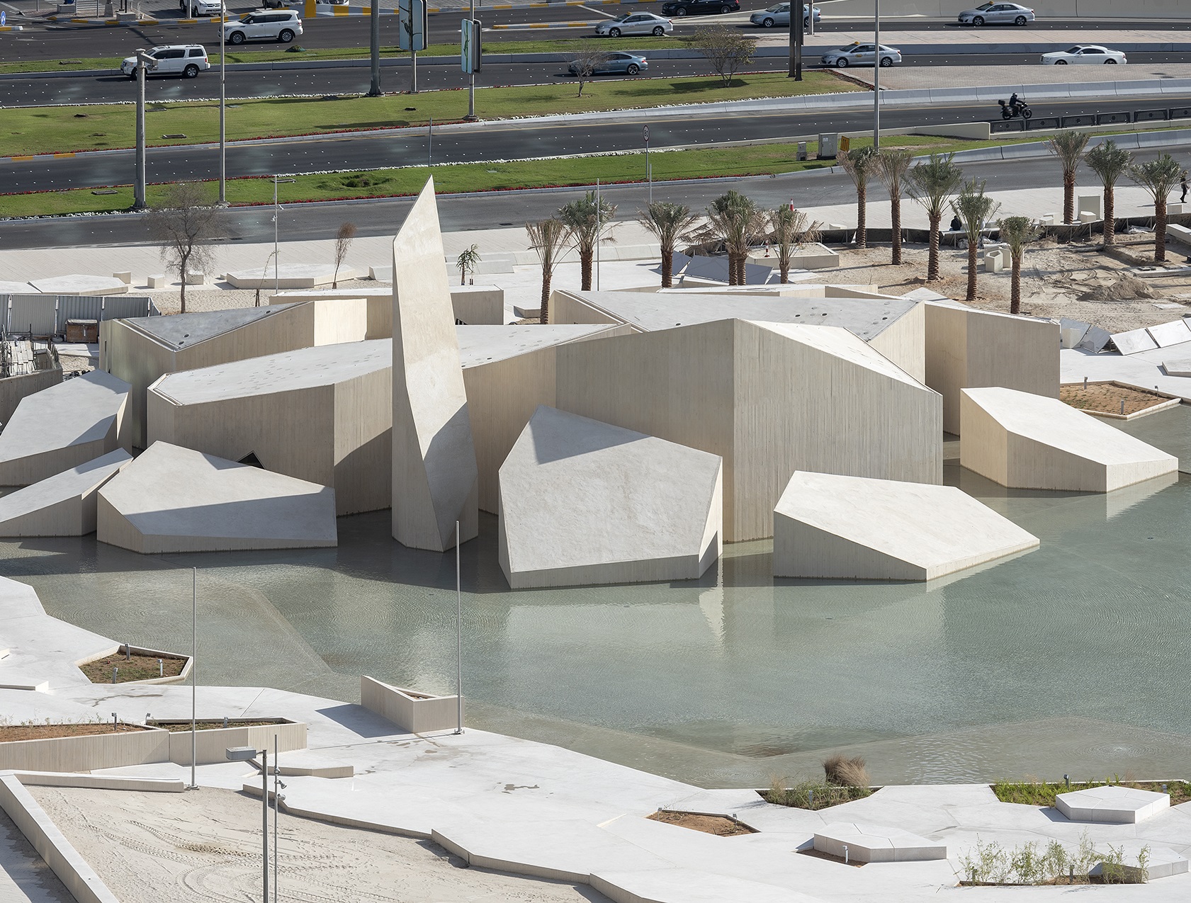
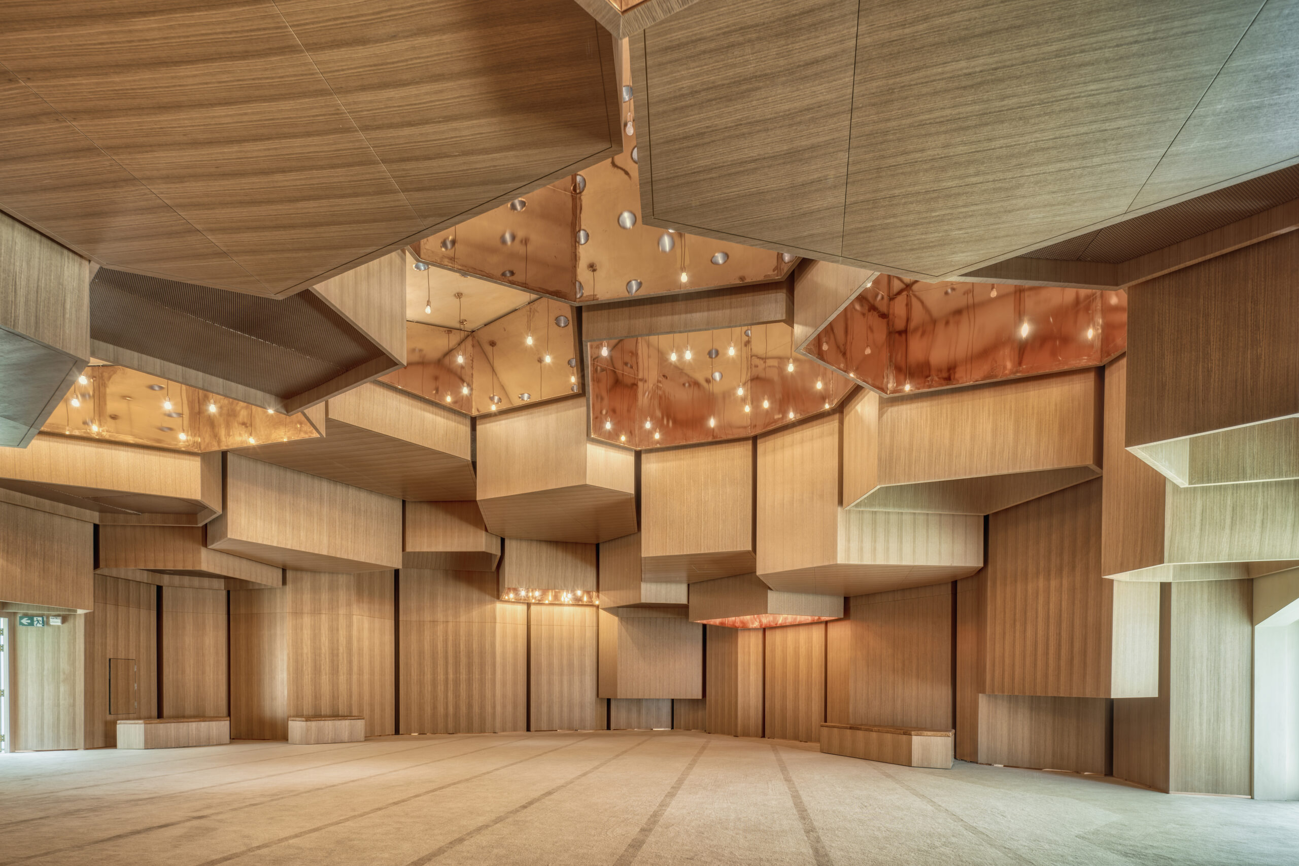
Al Musalla – The Mosque – Al Hosn Area
By CEBRA and DCT Abu Dhabi, Abu Dhabi, United Arab Emirates
Photo by Department of Culture and Tourism, DCT Abi Dhabi
Inspired by the geology of the area, this mosque has the design of what could be described as manmade nature, appearing as a group of rocks emerging out of water. To enter the mosque, worshippers traverse a network of pathways that wind around the water, symbolically cleansing them before prayer while also shielding them from the noise and commotion of the nearby streets.
The mosque is located within a historically significant site with a number of landmarks, managing to calmly integrate into the park while also offering a remarkable experience to its users. Inside, the distinctive geometrical shapes of the exterior are reflected on different elements of the design including the ceiling, complemented by lighting design that aimed to represent a desert sky adorned with stars, in a manner that does not only connect the mosque with earth and water, but also with the sky and what’s beyond.
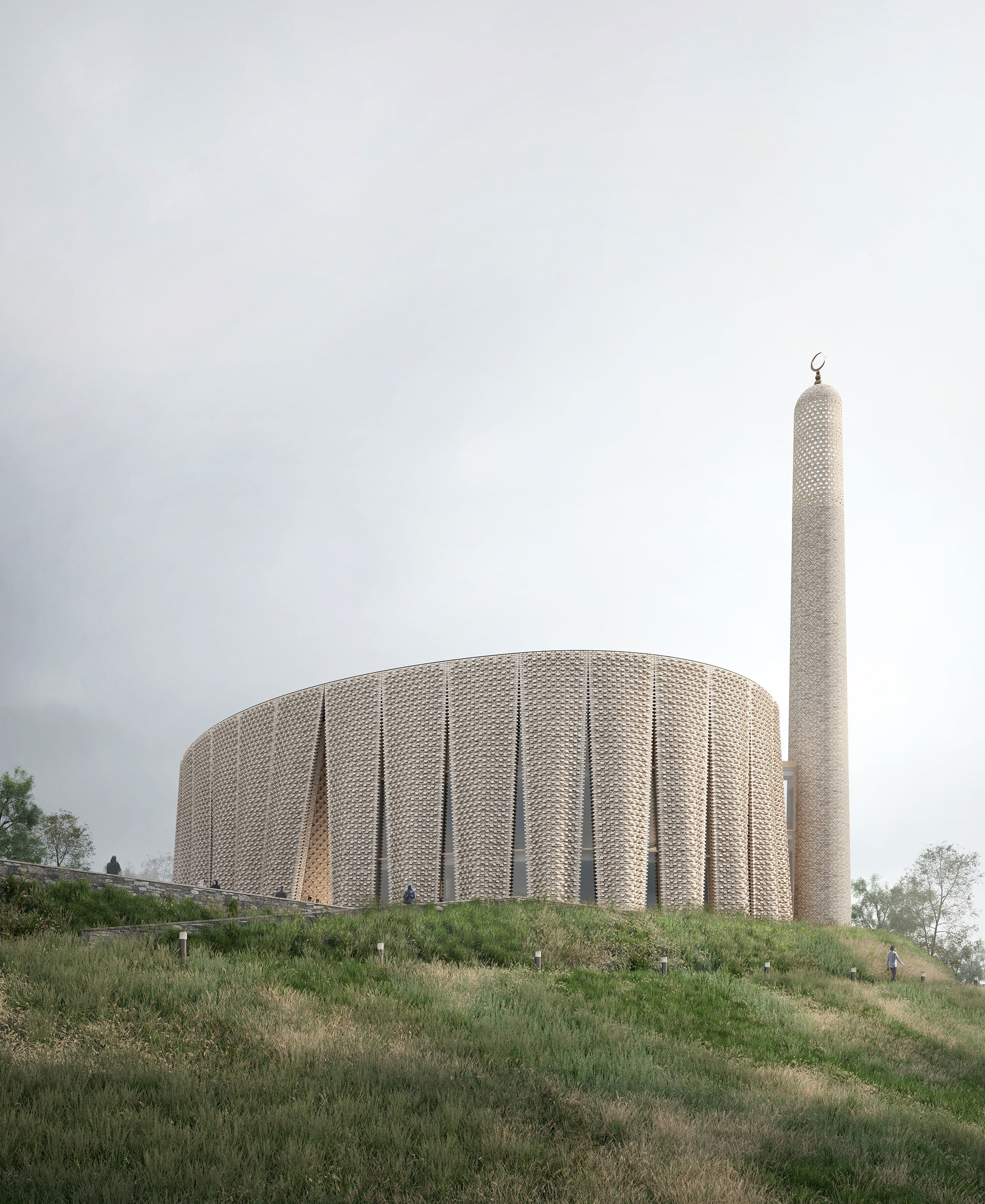
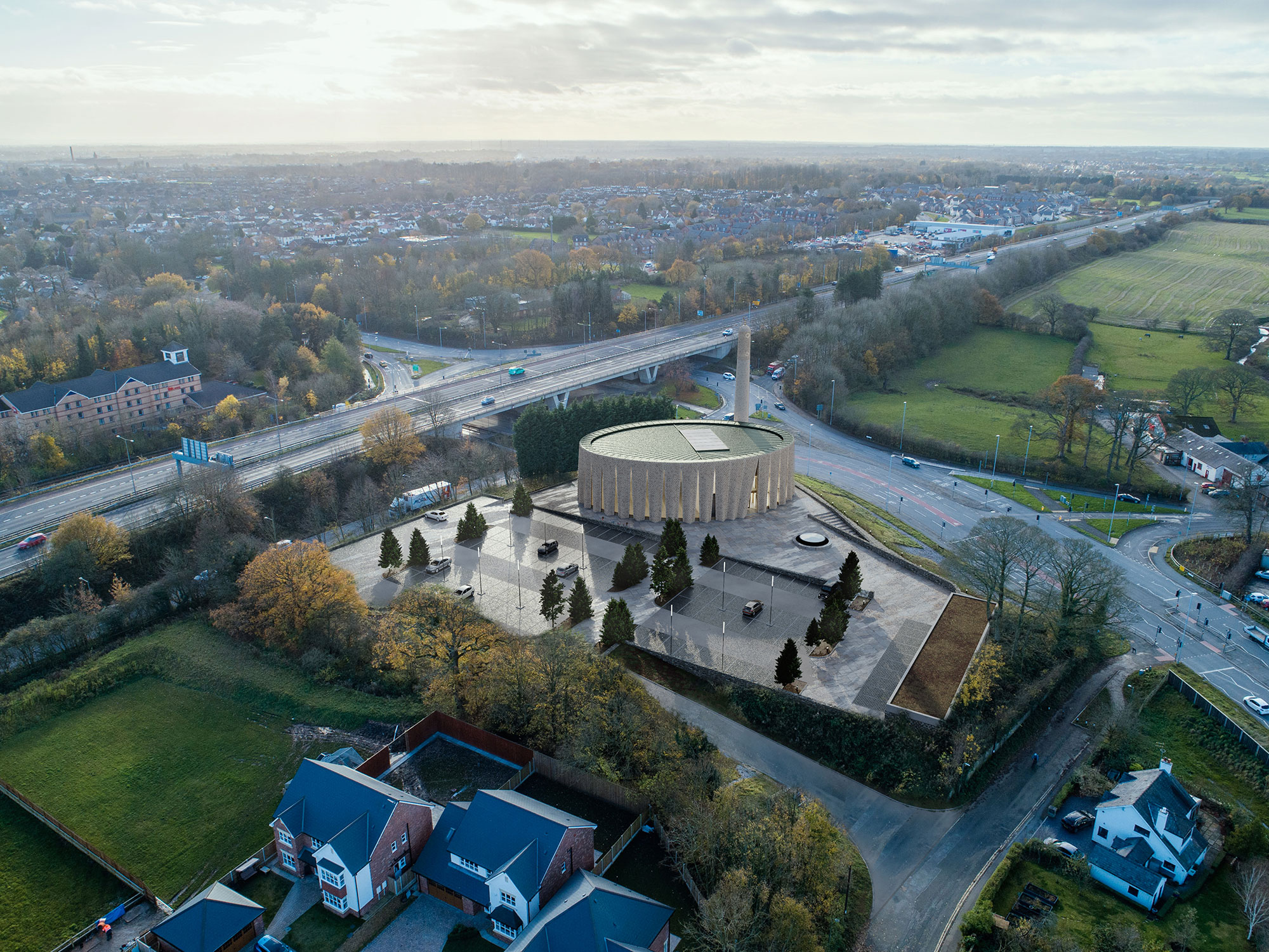
BRICK VEIL
By LUCA POIAN FORMS, Preston, United Kingdom
Produced through an artful stitching between the Islamic traditions and the history of the area, between the universal values and the local culture, this mosque design was conceptualized as a landmark within the existing site, through its scale, meticulous façade design, building materials and relationship with the surrounding.
Inspired by the textile manufacturing history of the region, the pleated brick façade gives the building a strong sculptural appearance, while also referencing the traditional design of Mashrabiyas, which is a traditional element in Islamic architecture used to enhance privacy. Erected at the south western end of the hill, the mosque is reached through a processional ramp that slowly disconnects the arriving worshippers from the city and the gradually welcomes them into the sacred space of the mosque.
Yesilvadi Mosque
By Adnan Kazmaoğlu Mimarlık Araştırma Merkezi, İstanbul, Turkey
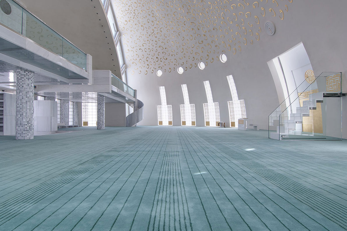
Harmoniously nested into the site, the Yesilvadi Mosque is conceptualized as a social space that gathers people and brings them together, through its variety of functions that include the prayer hall, a meeting hall, a library, a courtyard and a square, inspired by the social role mosques and their courtyards have traditionally played in the design of Islamic cities.
The bold geometry of the mosque, where the volume of the dome is also the volume of the building, is inspired by Ottoman mosques which typically have circular forms, while also symbolically using the shape of the circle to represent infinity and unity. The seamless use of white for the building’s exterior was achieved through the use of White Marmara marble, which aimed to represent purity and good virtue, standing in contrast with the green landscaping and the complexity of the surrounding context.
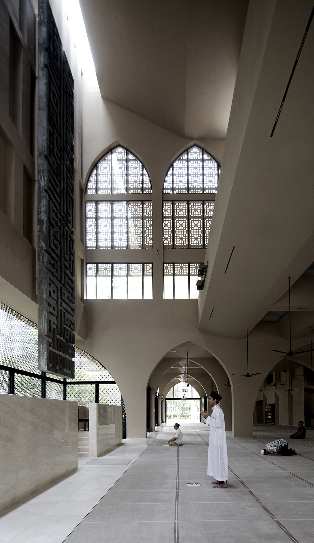
Al-Islah Mosque
By Formwerkz Architects, Punggol, Singapore
Photo by Albert Lim Koon Seng
Situated in a densely populated residential area, this mosque demonstrates a harmonious connection with its surroundings, achieved through a meticulously crafted façade adorned with a range of openings and perforations These features serve to regulate indoor climate and invite worshippers inside, while also reflecting the difference in functions in each building.
Comprising three distinct volumes, the mosque includes facilities such as a seminar building and an administrative center, in addition to the main prayer hall that flows dynamically with its open design and vast area. These architectural elements are thoughtfully designed to mirror the permeability of Islamic principles and aspirations within the context of Singapore today.
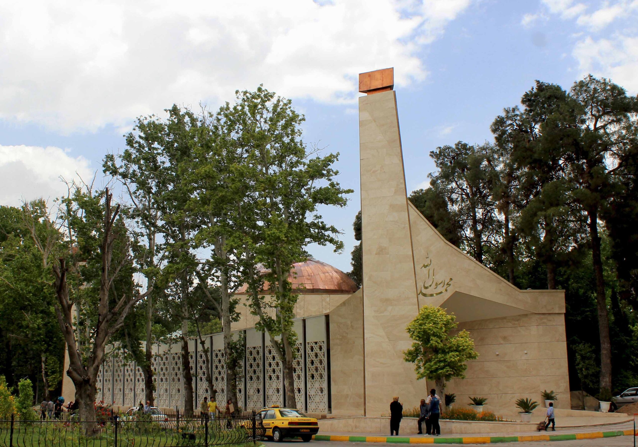
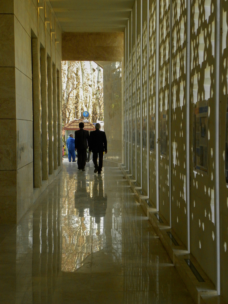
Mohammad Rasul- Allah Mosque
By Paya Payrang Architectural Group, Shiraz, Iran
Photo by Ahmad Mirzaee
Photo by Samaneh Motaghipishe
The new volume of this mosque grew in the space between an array of old trees and the existing historic prayer hall at the center of the site, delicately engaging in a conversation between the old and the new, the natural and the built, the communal and the religious, as well as solidity and openness.
A long spine connects the two entrances at the opposite sides, encompassing the traditional “Riwagh” element that is common in the design of mosques in Iran, adorned with two minarets that vertically extend parallel to the huge old trees, and generously welcoming prayers in from the busy main road. Built out of stone, the design of the mosque is simple yet sculptural, standing out within its context and making a statement with its dynamic geometry and copper dome.
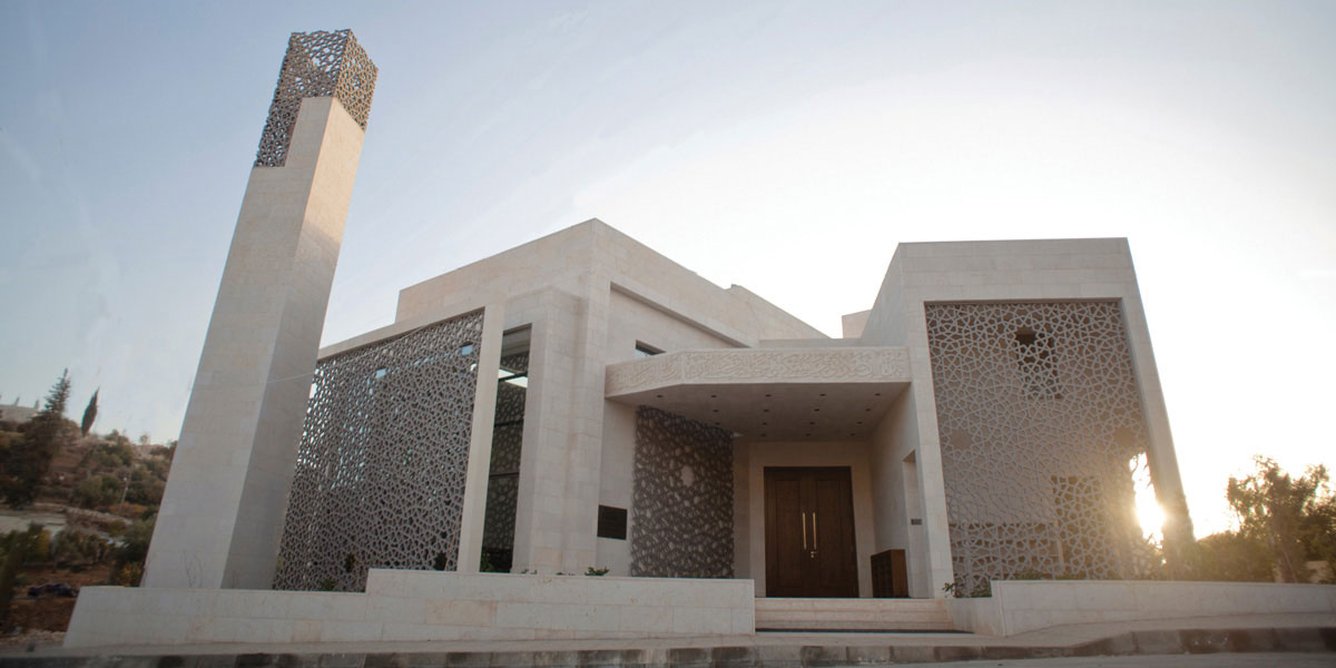
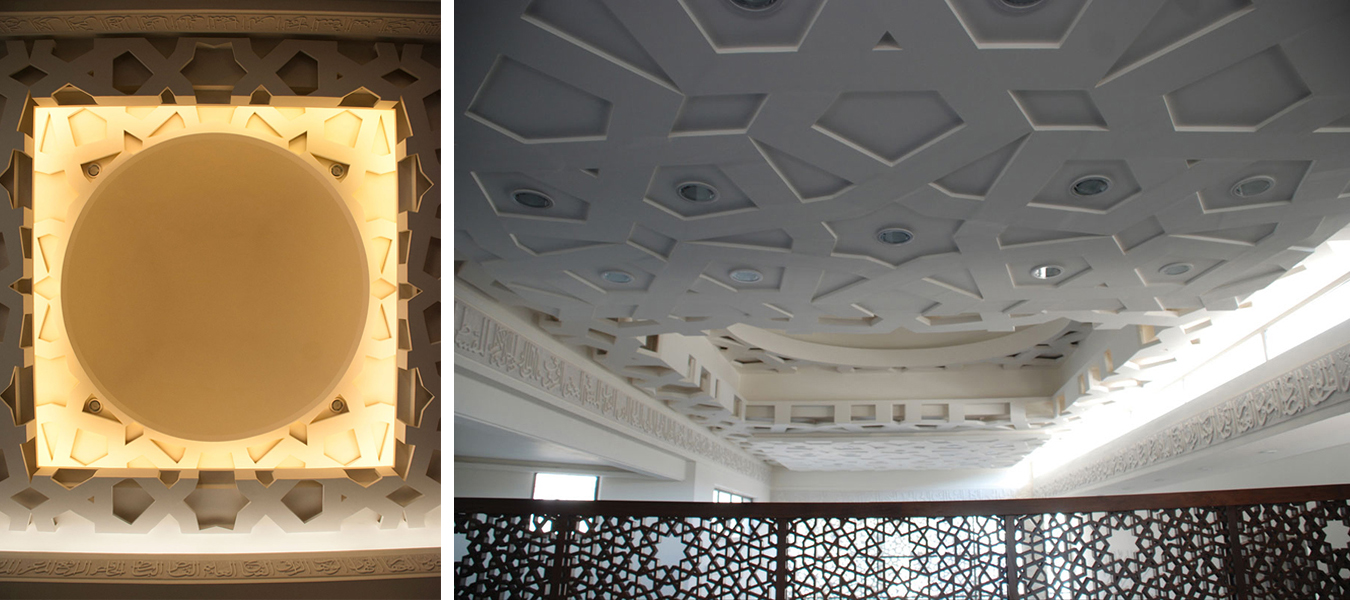
Al Rawda Mosque
By Uraiqat Architects, Amman, Jordan
The dynamic design of Al Rawda Mosque in Amman aimed to move beyond the limitations of the traditional mosque designs of the region and envision what a contemporary mosque could look like. Through a process of extensive research, the designing team engaged in an intellectual pursuit that studied and abstracted the different elements of a mosque, before reinterpreting them and combining them in this design.
The ornamented screens on the inside and the outside of the building created a rich interplay of shade and shadow and blurred the boundary between the inside and the outside, while also having environmental benefits that enhanced the indoor climate and user experience.
The judging process for Architizer’s 12th Annual A+Awards is now away. Subscribe to our Awards Newsletter to receive updates about Public Voting, and stay tuned for winners announcements later this spring.
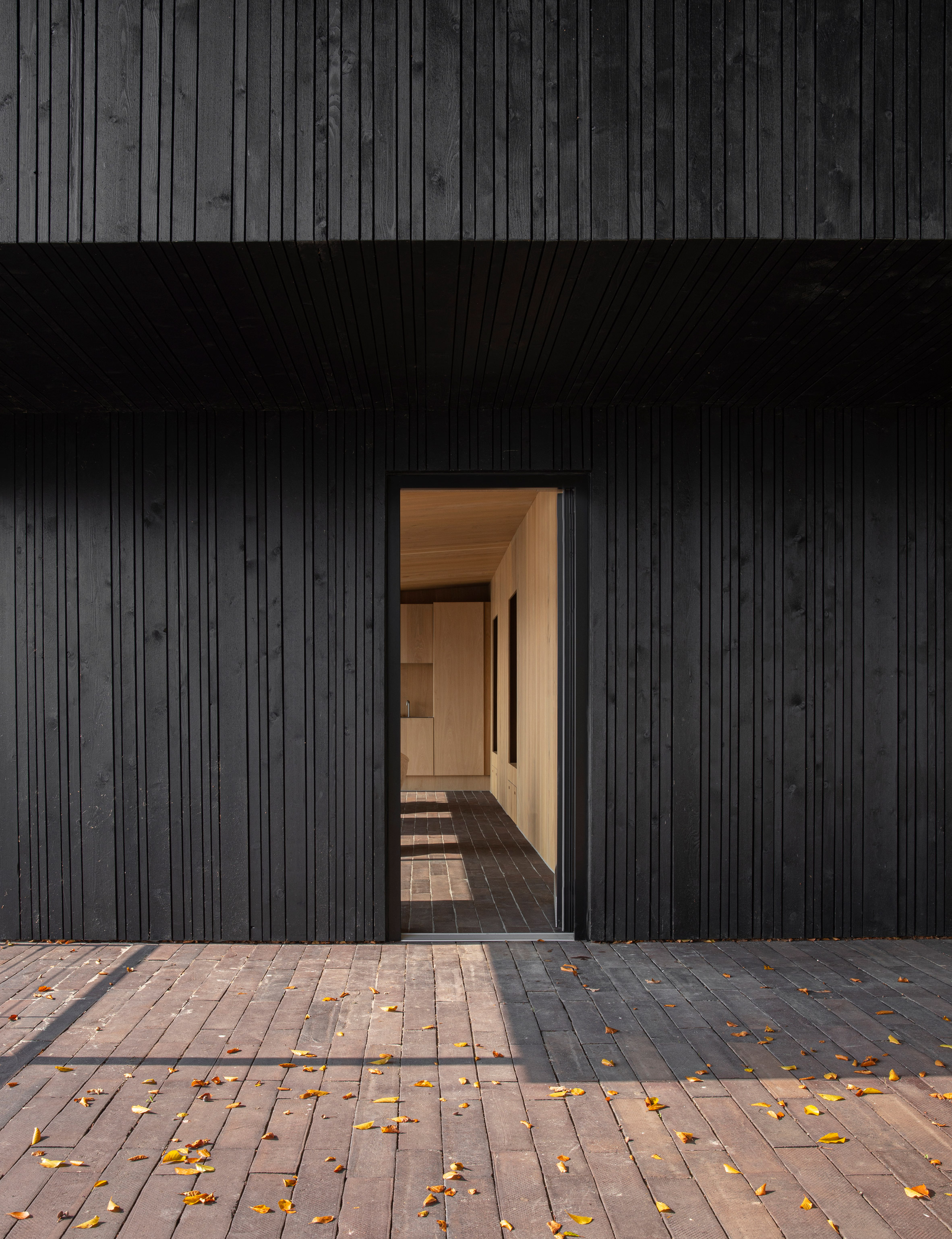
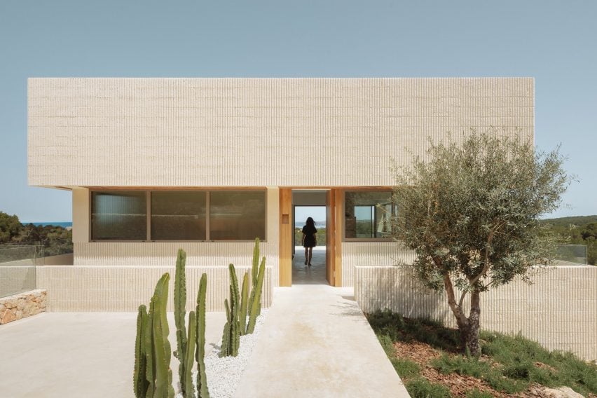
Our latest lookbook explores homes where flooring details and materials help to create the impression that a living space extends out beyond a house’s exterior walls.
A range of different techniques can be used to create the sense of a continuous floor surface.
The most obvious is to use the same flooring material, or one that looks very similar, for both interior and exterior spaces.
However, this isn’t always necessary. By combining level thresholds with floor-to-ceiling glazing, it’s also possible to create that sense of continuation by simply maintaining a consistent surface.
Here, we look at 10 examples that use one or more of these methods to create different effects, ranging from a forest home in Mexico’s Valle de Bravo to a waterside villa in Denmark.
Many of these examples use continuous floor surfaces to connect a living room with a garden or patio, but some explore other rooms where the effect can be applied.
This is the latest in our lookbooks series, which provides visual inspiration from Dezeen’s archive. For more inspiration, see previous lookbooks featuring chocolate-brown interiors and minimalist bathrooms.
Photography is by LGM Studio
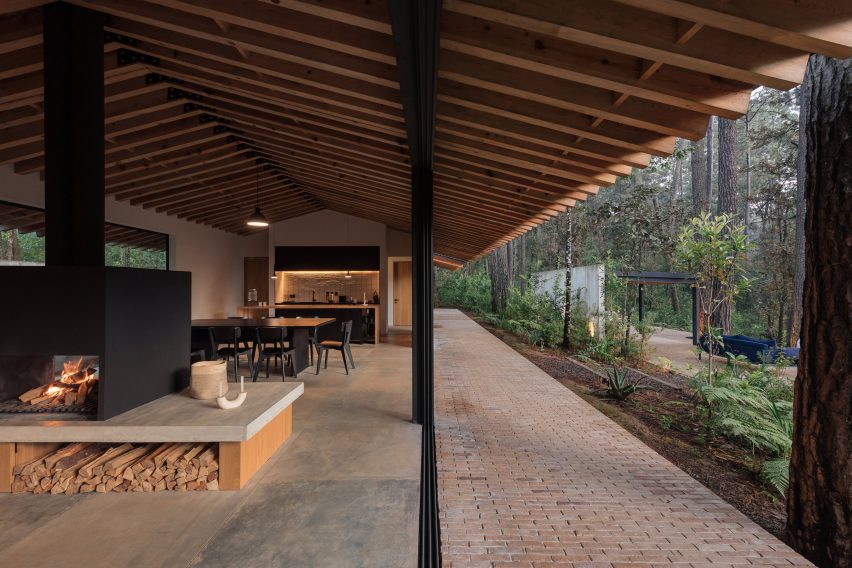
Casa Mola, Mexico, by Estudio Atemporal
Mexico City-based Estudio Atemporal designed this house in a densely forested area of Valle de Bravo with the aim of allowing residents to live “more organically”.
The large-format flooring tiles inside the house give way to brickwork paving outside, but sliding glass doors with level thresholds create a clean junction that allows the two spaces to feel connected.
Find out more about Casa Mola ›
Photo is by Agnese Sanvito
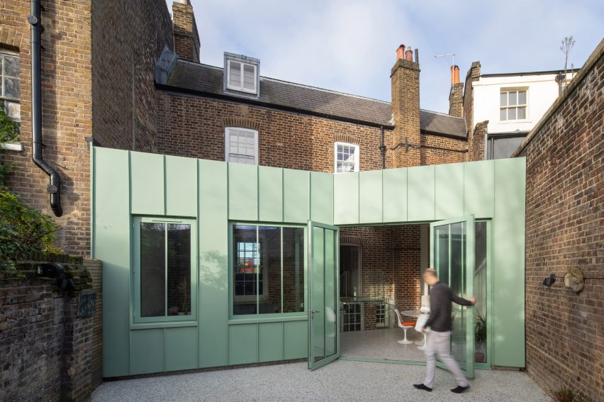
The Saddlery, UK, by Studio Octopi
Terrazzo flooring features both inside and outside this extension to a Georgian house in southeast London, designed by architecture office Studio Octopi.
Sourced from British manufacturer Diespeker, this material is speckled with colours that complement the mint-green tone of the building’s metal walls.
Find out more about The Saddlery ›
Photo is by Nick Deardon
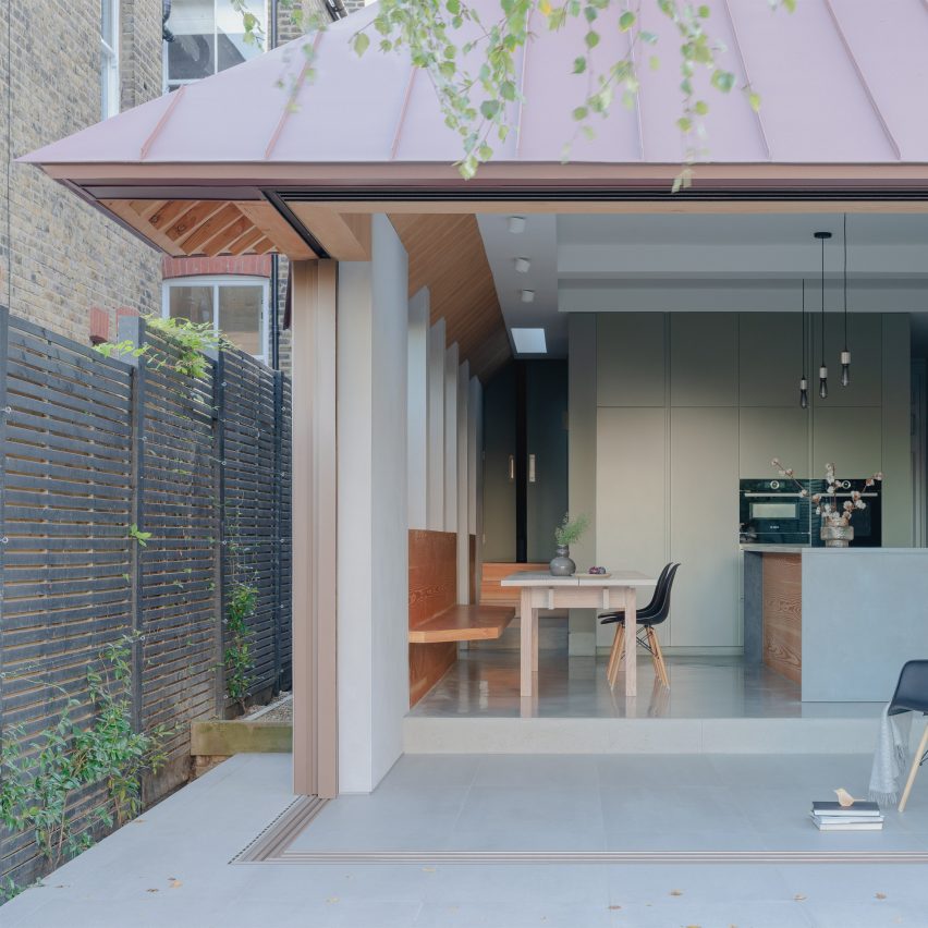
Dulwich House, UK, by Proctor & Shaw
Kitchen and terrace become a single space divided only by levels in this extension to a home in Dulwich, London, designed by architecture studio Proctor & Shaw.
Glass doors slide open on two sides – with one disappearing into a wall – to completely open up the building’s corner. The sliding mechanism is set into a continuous porcelain tile floor surface, resulting in a flush threshold.
Find out more about Dulwich House ›
Photo is by Maxime Delvaux
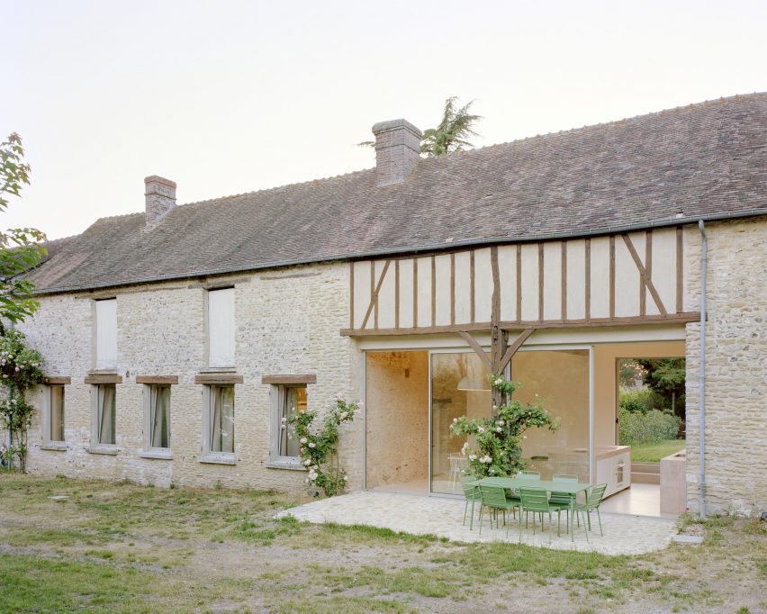
Maison Hercourt, France, Studio Guma
Minimal glazing plays a key role in connecting the kitchen of this renovated stone farmhouse in Normandy with an adjoining patio.
Designed by Paris-based Studio Guma, the renovation involved installing the kitchen in a space that previously functioned as a cart shed. Although the floor surface changes from concrete to stone from inside to outside, the slender-framed glass doors help the two surfaces to be read as one.
Find out more about Maison Hercourt ›
Photo is by Jonas Bjerre-Poulsen
Fjord Boat House, Denmark, by Norm Architects
Copenhagen-based Norm Architects chose handmade ceramic bricks for the flooring of this vacation house, built on the edge of a fjord just outside the city.
They form stairs that lead down from the main house to a terrace, then continue inside to give the interior living spaces a casual, rustic feel. At the main entrance, the linearity of the brickwork pattern acts to draw the eye.
Find out more about Fjord Boat House ›
Ederlezi, Mexico, Práctica Arquitectura
Using the same flooring surface for both indoors and outdoors can become costly, but this low-cost infill house in Monterrey offers a clever solution.
Designed by locally based Práctica Arquitectura, the house features a stepped living space with an adjoining courtyard.
Most of the courtyard is landscaped, but the edges are lined with the same square saltillo tiles that provide interior flooring. This helps to extend the living space outdoors without requiring quite as many tiles.
Find out more about Ederlezi ›
Photo is by Helen Cathcart
The Maker’s Barn, UK, by Hutch Design
Full-height glazing features in many of the rooms of this rural holiday rental on the outskirts of London, a former pig shed renovated by Hutch Design. This results in a strong connection with the surrounding patio.
The effect is particularly effective in the primary bedroom, which features a bath set into the floor. Here, it’s possible to observe the clean line running between the end-grain timber flooring inside and the paving tiles outside.
Find out more about The Maker’s Barn ›
Photo is by Rory Gardiner
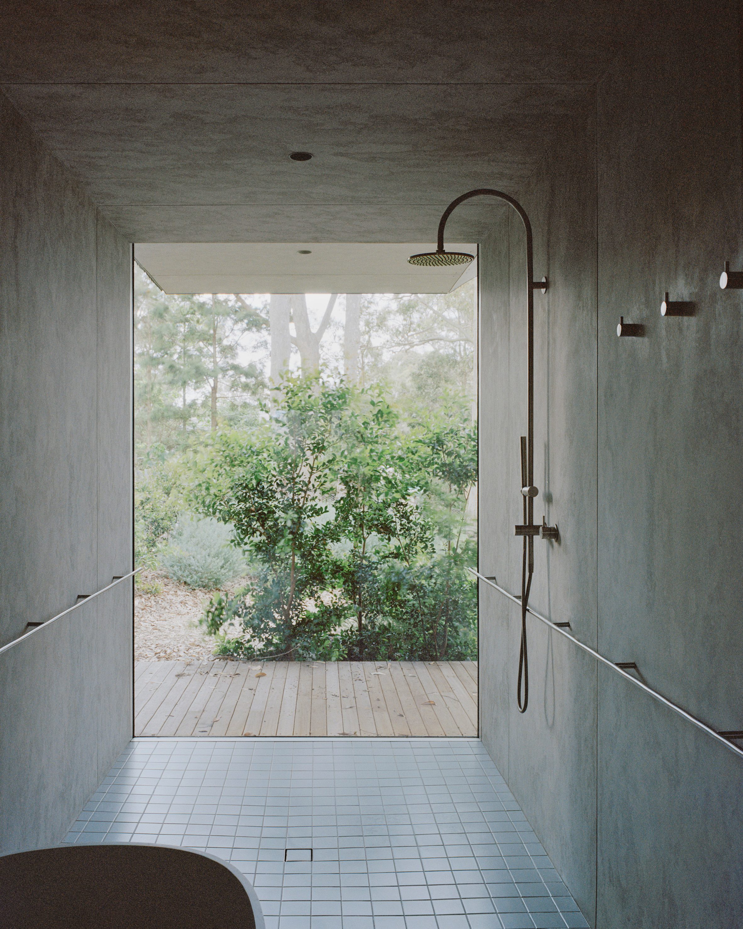
Mossy Point, Australia, by Edition Office
Melbourne-based Edition Office selected very different surfaces for the shower room of this house in Mossy Point, New South Wales, but they appear to merge thanks to the use of frameless glazing.
A similar effect can be found throughout the house, but the contrast between the wooden decking and the blue tiles of this room is the most striking.
Find out more about Mossy Point ›
Shift House, Spain, by Nomo Studio
Roughly polished white concrete flooring unites both the interior and exterior of this house on the island of Menorca, designed by Barcelona-based Nomo Studio.
This creates a feeling of continuity from the building’s entrance, located on the uppermost storey, all the way across to a balcony terrace on the opposite side of the main living room.
Find out more about Shift House ›
Photo is by Brotherton Lock
A Modern Oasis, UK, by Richard Parr Associates
The level thresholds of this house in Oxfordshire, England, create a visual connection between the polished concrete flooring inside and the paving tiles outside.
Architecture office Richard Parr Associates carefully matched the colours of these two surfaces so that they appear to be made of the same material.
Find out more about A Modern Oasis ›
This is the latest in our lookbooks series, which provides visual inspiration from Dezeen’s archive. For more inspiration, see previous lookbooks featuring chocolate-brown interiors and minimalist bathrooms.
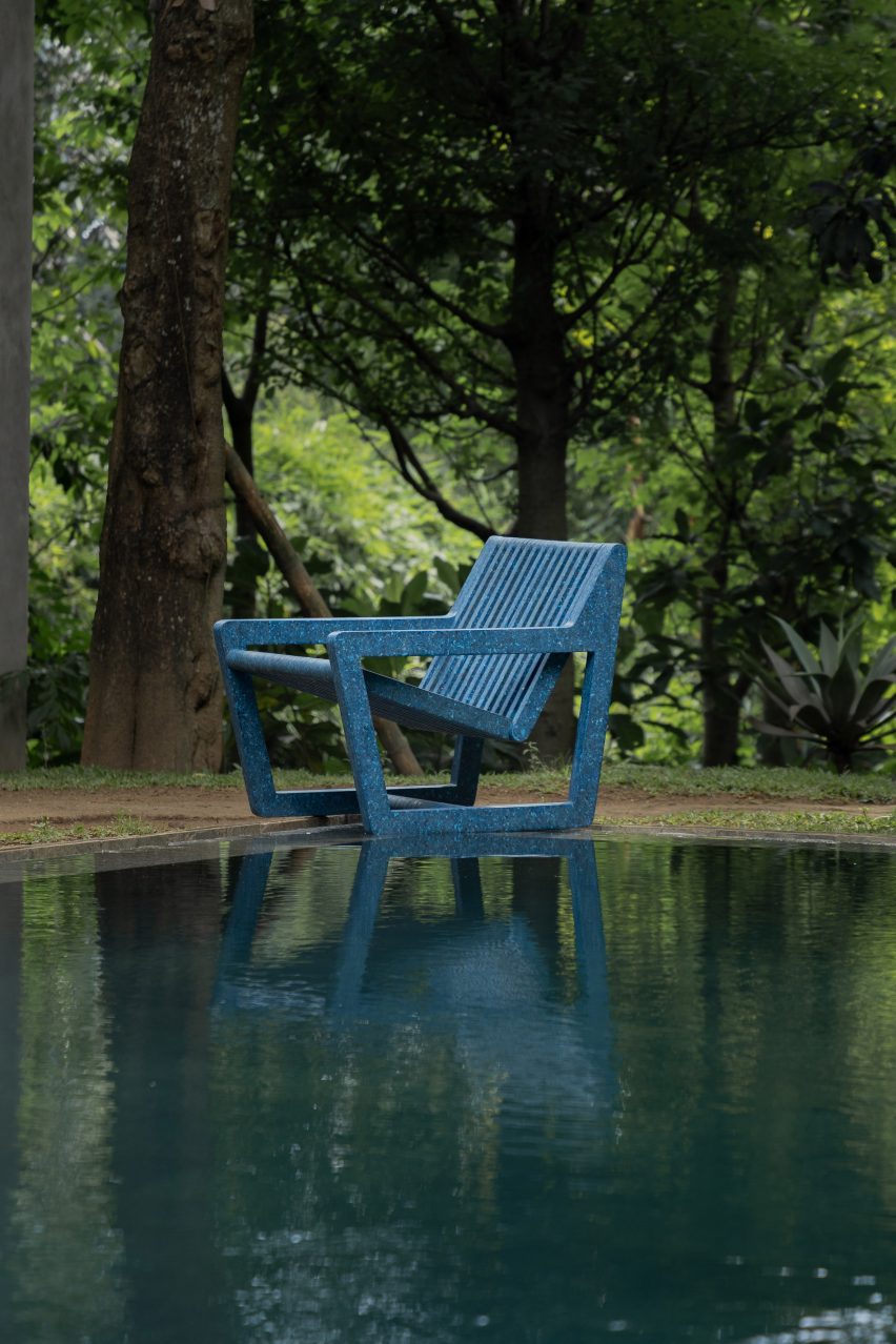
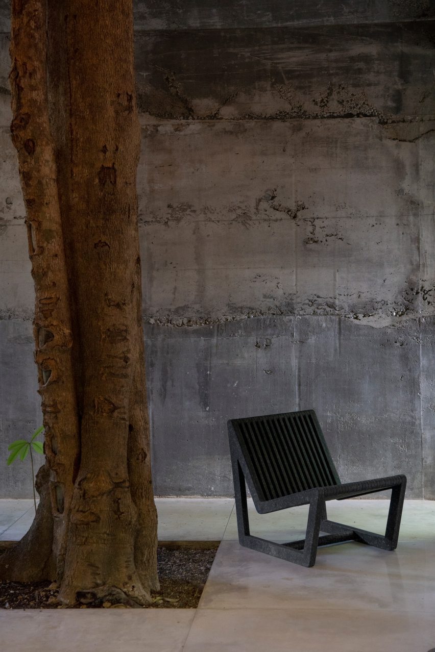
Indonesian non-profit Sungai Watch has unveiled the debut furniture launch from its design studio Sungai Design, aimed at creating useful products from the mountains of plastic waste that it fishes from Bali’s rivers every day.
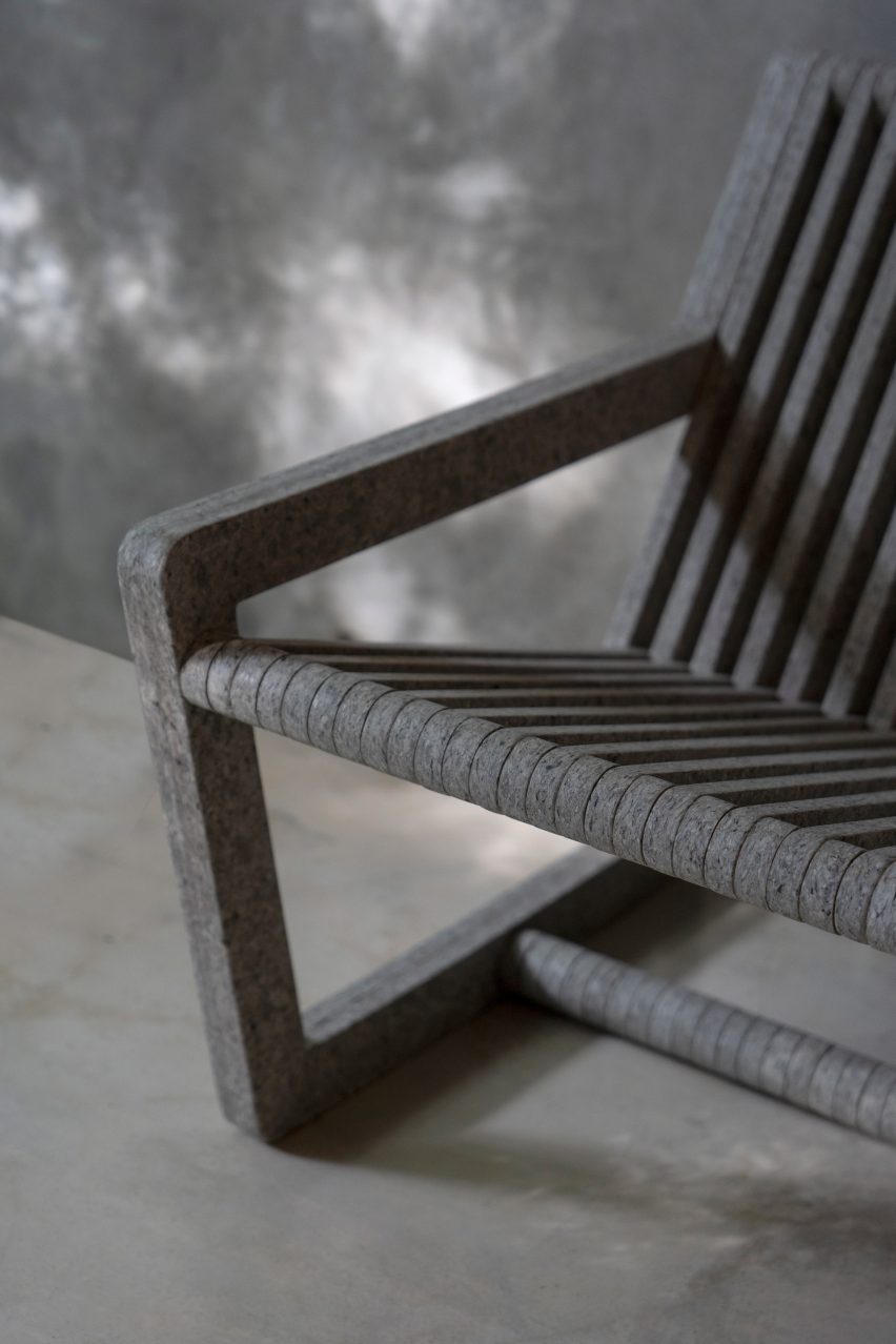
The Ombak lounge chair, created in collaboration with American designer Mike Russek, is made using a sheet material produced entirely from discarded plastic bags, with around 2,000 needed for every chair.
The bags are collected by Sungai Watch, which is on a mission to eliminate ocean plastic pollution using its own system of floating barriers to capture the waste as it flows along Indonesia’s rivers.
Sungai design has launched its first-ever product
Since its inception three years ago, the organisation has installed 270 barriers and collected more than 1.8 million kilograms of plastic, resulting in a huge stockpile of material.
Plastic bags are the most frequently collected item and also the least sought after in terms of future value, which led the team to focus on creating a product collection using this readily available resource.
“Collecting and amassing plastic waste solves one part of the problem of plastic pollution, the second challenge is what to actually do with all of this plastic,” said Kelly Bencheghib, who co-founded Sungai Watch with her brothers Sam and Gary.
The Ombak lounge chair is made from discarded plastic bags
“As we collected hundreds of thousands of kilograms of plastics, we started to look at plastic as an excellent source material for everyday products we all need and use, from furniture to small goods to even art,” she added.
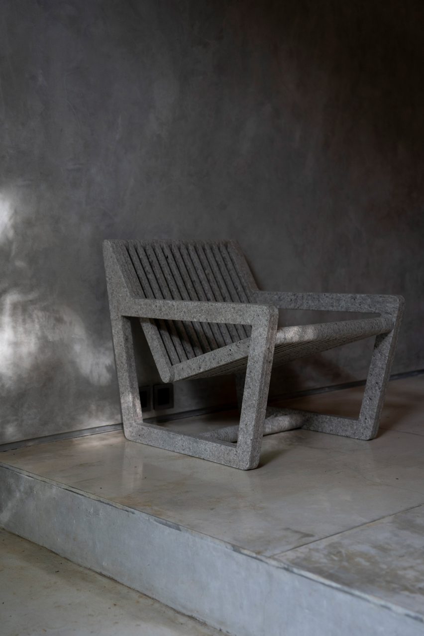
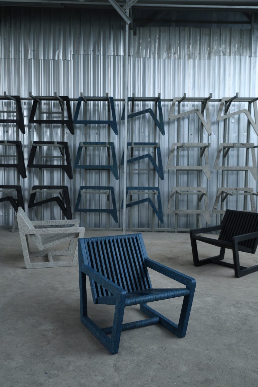
Sungai Design has created two variations of the Ombak lounge chair – with and without armrests – manufactured in Bali using processes that aim to minimise waste during production.
The plastic bags are thoroughly washed to remove any impurities before being shredded and heat-pressed to form hard, durable sheets.
The bags are heat-pressed to form sheets
Precision CNC cutting machinery is used to carve out the different components, which are carefully shaped to minimise material use and leave no offcuts.
The panels are connected by a concealed metal structure, resulting in a pure and visually lightweight form with a simple slatted construction.
Although the design is available in three distinct colourways – Granite Black, Ocean Blue and Concrete White – the upcycling process produces slight variations in the tone and texture of the material, meaning each chair has a unique quality.
Ombak means wave in Indonesian and the name references Sungai Design’s commitment to cleaning up rivers and oceans.
In line with this aim, Sundai Design has pledged to minimise its carbon footprint and put in place processes to audit and track the sources of the plastic used in its products.
The company is planning to release other products using the same material and, as a social enterprises, will donate part of its revenue to Sungai Watch to further the project as it seeks to clean up rivers in Indonesia and beyond.
The chair was designed to minimise material use and leave no offcuts
“There is so much potential with this material,” added Sam Bencheghib. “When you choose a chair from our collection, you’re not just selecting a piece of furniture; you’re embracing the transformation from waste to a beautiful, functional piece of art that has found its place in your home.”
Every year, Indonesia accounts for 1.3 million of the eight million tonnes of plastic that end up in our oceans, making it one of the world’s worst marine polluters.
Other attempts at collecting this waste and finding new uses for it have come from design studio Space Available, which set up a circular design museum with a recycling station and facade made of 200,000 plastic bottles in Bali in 2022.
The chair is available in three colours
The studio also teamed up with DJ Peggy Gou turn rubbish collected from streets and waterways in Indonesia into a chair with an integrated vinyl shelf.
“The trash is just everywhere, in the streets and rivers,” Space Available founder Daniel Mitchell told Dezeen.
“It’s not the fault of the people, there’s just very little structural support, waste collection or education,” he added. “Households are left to dispose of their own waste and most ends up in rivers or being burned.”
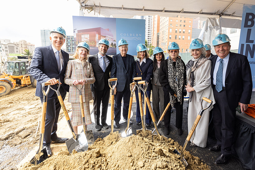
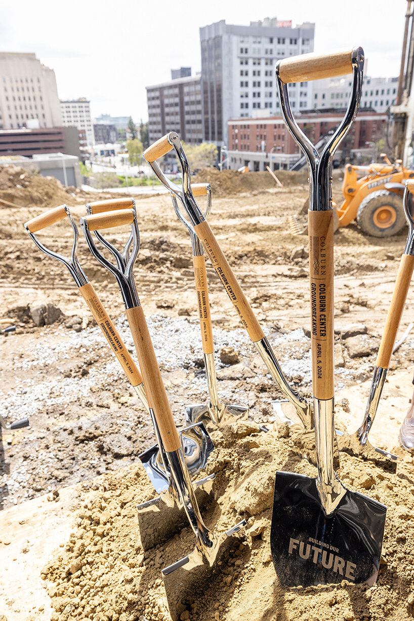
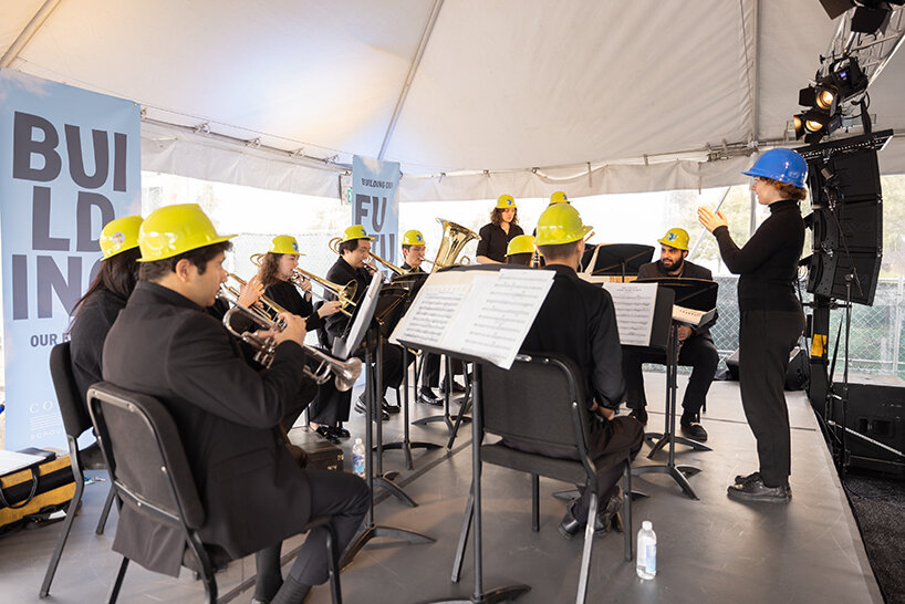
frank gehry-designed school: breaking ground ceremony
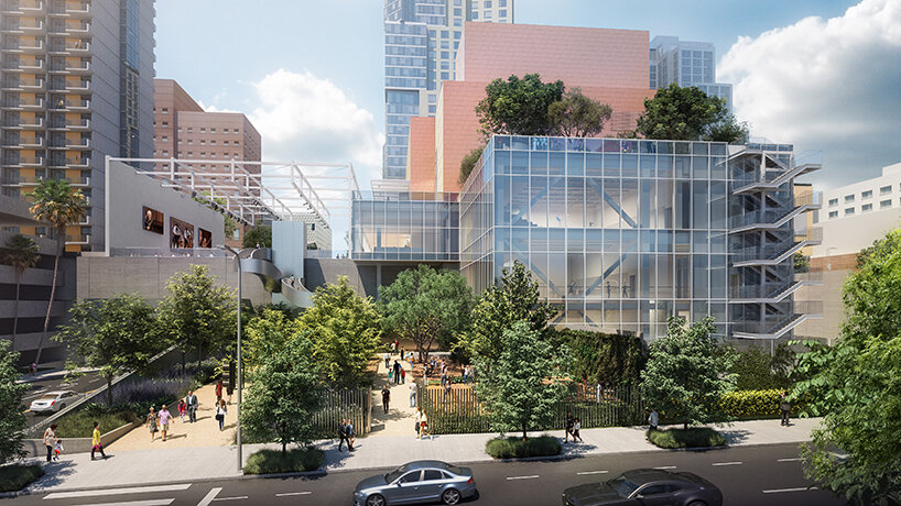
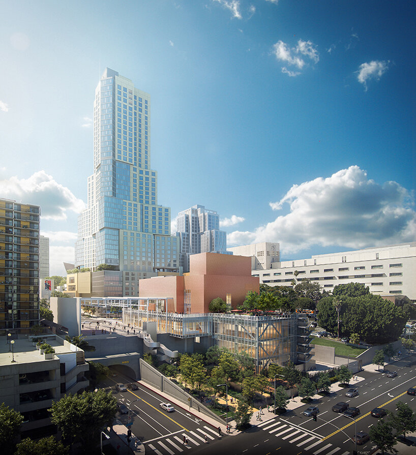
The Colburn School in Los Angeles, one of the world’s leading schools for music and dance, held a groundbreaking ceremony for its 100,000-square-foot expansion designed by Frank Gehry. The new Colburn Center will dramatically increase the school’s elite training and performance facilities and provide much-needed performance space, including a 1,000-seat, state-of-the-art concert hall, for young artists across LA. The groundbreaking ceremony took place adjacent to the construction site at 130 Olive Street, located within Downtown Los Angeles’s Bunker Hill area diagonally across the street from Colburn’s existing campus on Grand Avenue. The expansion will stand as an important addition to the cultural corridor which includes Gehry Partners’ Walt Disney Concert Hall, the Music Center, the Museum of Contemporary Art, and the Diller Scofidio + Renfro-designed broad. Anticipated completion is expected for the first quarter of 2027.
Designed by Frank Gehry (see more), the Colburn Center at the Colburn School (see more) will be a ‘hall for all,’ giving artists and students a place to shine. the center will stand at the crossroads of culture, education, and landmark architecture — marking frank gehry’s third project within three blocks to become the world’s greatest concentration of his architecture. The colburn school welcomes over 2,000 students from across los angeles and around the world, with ages ranging from seven months to adult. the new center will make the colburn campus an even livelier hub of artistic activity and enable the school to expand its mission of presenting programs for the public, which include performance and educational collaborations with acclaimed local and touring artists and ensembles. it will also provide much needed performance space in a mid-sized hall for the region’s established and emerging performing arts organizations.
the 1,000 seat theater, ‘terri and jerry kohl hall’
Frank Gehry’s Colburn Center will welcome students and audiences alike, with a dynamic composition of transparent and opaque interlocking blocks that step down into the natural contour of the site. A 1,000-seat concert hall uses an in-the-round design to create intimacy between the performers and the audience and removes the stage lip, putting front-row seats at eye-level with the performers. Orchestra, opera, dance, and musical theater will all be at home in the hall, which is equipped with an orchestra pit and a stage large enough to accommodate the grandest works and the largest orchestrations.
Four professional-sized dance studios and a 100-seat flexible studio theater are enveloped in glass and provide a literal window into the beauty and rigor of dance training and performance. Qith a separate entrance and distinct architectural character, the light-filled dance facilities will have their own identity while harmonizing with the larger project. The Colburn Center will be equipped to take a modern approach to multi-media technology and production. The facilities include commercial-quality recording and streaming capabilities, and performance spaces will be outfitted with state-of-the-art lighting. Public spaces include an outdoor plaza, giving visitors a front-row seat to the performing arts, and gardens which provide much-needed green space and pedestrian access to nearby public transit hubs.
view from Hill Street and 2nd Street intersection
colburn president sel kardan comments: ‘With great joy and excitement, we share the design of Frank Gehry’s multi-dimensional project, which will welcome our students, performing artists, and audiences from across los angeles.The Colburn Center is a physical manifestation of the school’s founding principle of ‘access to excellence,’ allowing Colburn to continue and expand our educational and performance activities in a design which breaks down barriers between audience and performer and reveals the educational process. We look forward to collaborating with our artistic partners in Terri and Jerry Kohl hall, which complements the other stellar performance spaces in Downtown Los Angeles.’
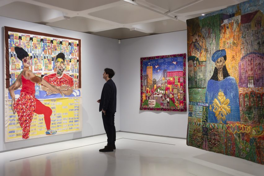
It features over 100 works that make use of textile, fibre and thread from over 50 artists from across the globe, spanning from the 1960s to the present day.
The exhibition explores how artists have used textiles to express their lived experience
The exhibition is designed to challenge the perception of textiles being solely domestic or craft practices and instead features textile works that relate a story of resistance and rebellion as well as pieces that present narratives of emancipation and joy.
Johnson explained that textiles offer a meaningful medium to express personal and political issues due to their tactile nature and intimate connection to daily life.
“Textiles are one of the most under-examined mediums in art history and in fact history itself,” Johnson said. “They are an intrinsic part of our everyday lives. When we’re born, we’re shrouded in a piece of fabric. Everyday we wrap ourselves in textiles,” she continued.
“They’re really this very intimate, tactile part of our lives and therefore perhaps the most intrinsic, meaningful way to express ourselves.”
Feminist artist Judy Chicago’s Birth Project depicts birth as a mystical and confrontational process
The exhibition is structured into six thematic sections. The first, called Subversive Stitch, presents works that challenge binary conceptions of gender and sexuality.
The section includes feminist artist Judy Chicago’s Birth Project, which vividly depicts the glory, pain and mysticism of giving birth, as well as a piece from South African artist Nicholas Hlobo, which, despite initially appearing as a painting, is made using ribbon and leather stitched into a canvas.
Another section of the exhibition is titled Bearing Witness, which brings together artists who employ textiles to confront and protest political injustices and systems of violent oppression.
Artist Teresa Margolles creates collective tapestries that trigger conversations on police brutality
Included in this section are tapestries by Mexican artist Teresa Margolles that commemorate the lives of individuals including Eric Garner and Jadeth Rosano López.
Garner was an African-American man killed in 2014 by NYPD police officer Daniel Pantaleo, who put Garner into a chokehold during arrest. López was a seventeen-year old-girl assassinated in Panama City.
Margolles used fabric that had been placed in contact with the victims’ deceased bodies and collaborated with embroiderers from their respective local communities to create the tapestries.
The Wound and Repair sections includes work from American artist and activist Harmony Hammond’s Bandaged Grid series, in which layered fabric is used to evoke imagery reminiscent of an injured body.
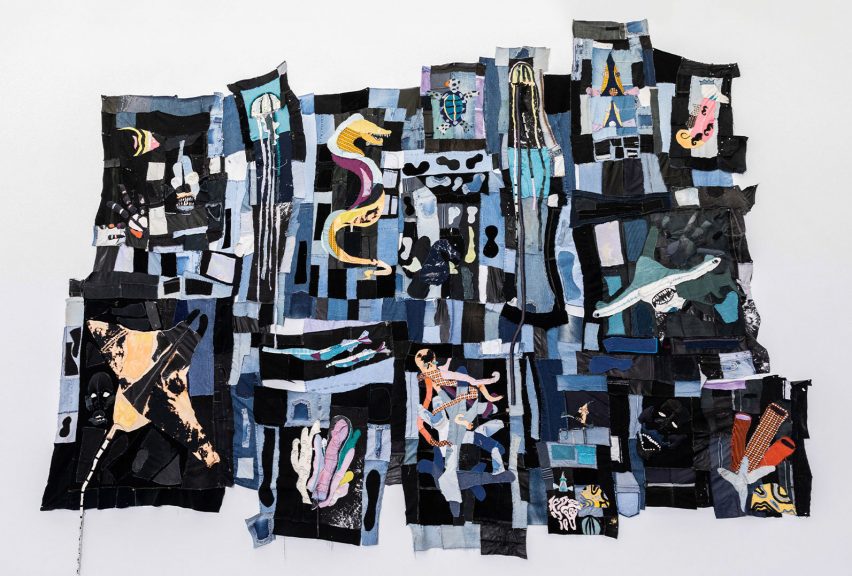
Tau Lewis’ fabric assemblages offer new narratives of black histories
While violence and brutality are key themes examined in the exhibition, it also showcases how textiles can be used to create narratives of hope. The final, most expansive section of the exhibition is titled Ancestral Threads, which encompasses works created to inspire a sense of optimism and reconnect with ancestral practices.
“This section not only explores artists processing exploitative and violent colonial and imperialist histories, but also celebrates the artists who are re-summoning and relearning ancient knowledge systems to imagine a different kind of future,” Johnson explained.
Canadian multimedia artist Tau Lewis’s work titled The Coral Reef Preservation Society is a patchwork assemblage of recycled fabrics and seashells including fragments of textured denim.
The work pays homage to the enslaved women and children thrown overboard in the Middle Passage, the historical transportation route used during the Atlantic slave trade. These women and children have been reimagined as underwater sea creatures to transform the narrative into one of regeneration.
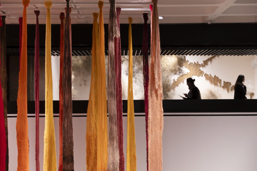
Vicuña revives the art of the quipu in her installation Quipu Austral
A large installation by Chilean artist Cecilia Vicuña titled Quipu Austral is situated towards the end of the exhibition. The installation takes the form of billowing ribbons hanging from the ceiling.
Vicuña references quipu, a form of recording used by a number cultures in Andean South America. Quipu was a ancient writing system which used knotted textile cords to communicate information.
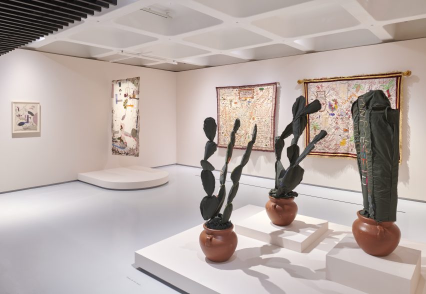
Other sections in the exhibition include Fabric of Everyday, which explores the daily uses of textiles, as well as Borderlands, which examines how textiles have been used to challenge ideas around belonging.
These sections feature works such as Shelia Hicks’ colourful woven bundles and Margarita Cabrera’s soft sculpture cacti crafted from reclaimed US border patrol uniforms.
Mexican-American artist Margarita Cabrera uses reclaimed border patrol uniforms in her work
“We hope that people might come out of this exhibition feeling invigorated and moved by the stories of resilience and rebellion embedded in the work but also hope and emancipation,” Johnson said.
“I hope that the show might inspire people to pick up a needle and thread themselves and use it to express their own lived experience.”
The show is a partnership between the Barbican and the Stedelijk Museum in Amsterdam and was co-curated by Barbican curators Johnson, Wells Fray-Smith and Diego Chocano, in collaboration with Amanda Pinatih from the Stedelijk.
Unravel: The Power and Politics of Textiles in Art is at the Barbican Centre until 26 May 2024. See Dezeen Events Guide for an up-to-date list of architecture and design events taking place around the world.
Partnership content
This video was produced by Dezeen for the Barbican Centre as part of a partnership. Find out more about Dezeen’s partnership content here.
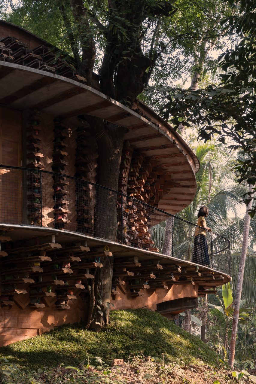
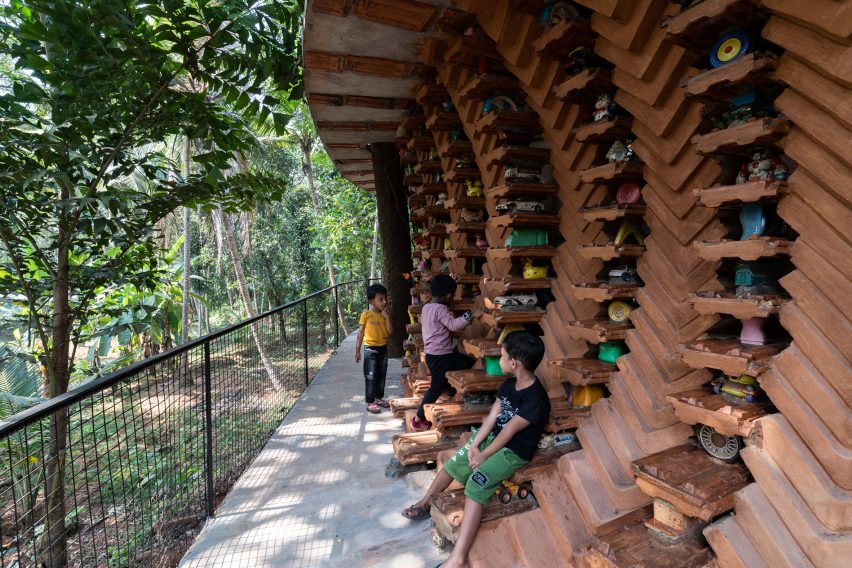
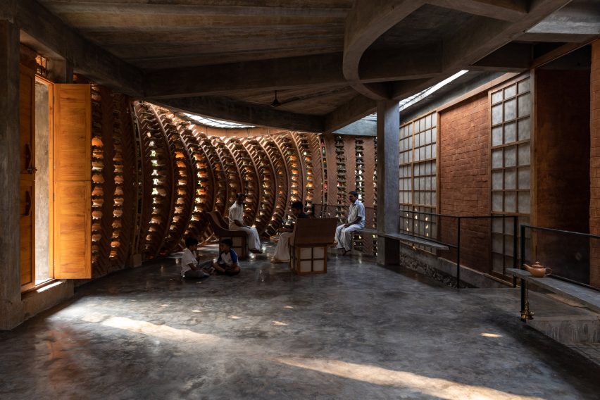
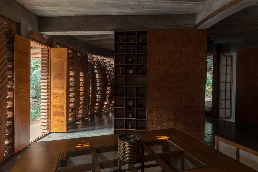
Architecture studio Wallmakers has repurposed approximately 6,200 discarded toys to construct the walls of Toy Storey, a circular home in Kerala, India.
The aptly named residence by Wallmakers uses toys discarded in the area, which are unsuitable for recycling, as structural components and decoration within the external walls.
A cantilevered verandah wraps around the circular home
“The main concept of Toy Storey revolves around the idea of using discarded toys and effectively conveying a message through this,” studio founder Vinu Daniel told Dezeen.
“By repurposing around 6,200 discarded toys, the residence in Kerala becomes a living monument to nostalgia and childhood, while addressing environmental concerns,” he added.
Approximately 6,200 discarded toys are used in the home’s walls
Toy Storey is wrapped by perforated, curved walls composed of compressed stabilised earth blocks, Mangalore tiles and toys, designed to draw in light and enable cross ventilation through the home. A ferrocement roof sits on top.
Four evenly-spaced entrances puncture the facade, which is wrapped by a cantilevered verandah offering outdoor space overlooking the surrounding greenery.
Perforated walls draw light and ventilation through the interior
Inside, the home’s first floor is divided into public and private segments. The public half is defined by a large living room while the private half contains an open-plan kitchen and dining area flanked by bedrooms.
“One of the things that the client mentioned was they often host their neighbours and members of the community, which means there are often many people in the house,” Daniel said.
“Hence we decided to make the area the people frequented separate from that of the client’s family’s personal spaces,” he continued.
Japanese-style shoji screens are used as partitions throughout the interior to enable light into each space and connectivity between the private and public areas.
An open-plan kitchen and dining area are flanked by bedrooms
The site’s topography enabled the addition of a secluded basement level containing a library and bedroom, accessed from the upper floor by a central staircase.
An internal courtyard topped with a glass ceiling slices through the building providing additional daylight for the interior.
Japanese-style shoji screens are used as internal partitions
Wallmakers is an architecture studio established by Daniel in 2007. Elsewhere in India, Wallmakers has also recently completed an arts centre with rooftop seating and a house that resembles “snake curling up under a rock”.
Last year, Daniel faced criticism on social media for his studio’s use of unpaid internships, which he claims have an important educational benefit.
The photography is by Syam Sreesylam and Althaf Rasheed.
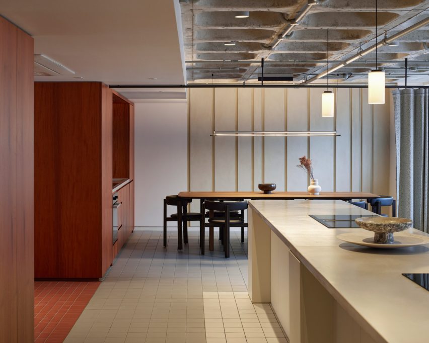
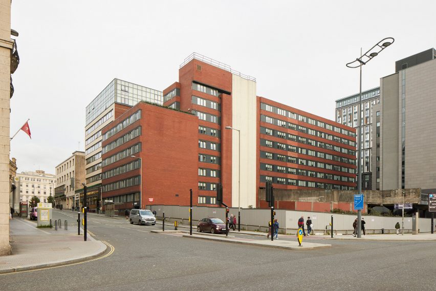
London studio SODA has converted a 1970s office block in Liverpool city centre into a residential building that includes co-working and wellness facilities.
The adaptive reuse project sees the 10-storey block, which spent decades as an office for HM Revenue and Customs, transformed into rental homes managed by operator Livingway.
Communal spaces take up most of the ground floor
Roca contains 120 one- and two-bedroom apartments, plus two floors of co-living-style amenities for residents. These include workspaces, a large kitchen, cinema room, gym and treatment rooms and a planted roof terrace.
Russell Potter, co-founding director at SODA, believes the project can serve as a model for office-to-residential conversions in city-centre locations.
The design includes mix of flexible lounge and workspaces
“The leaps that office design has made over the past decade or two have meant that certain period properties from the 1960s and 70s are perhaps not the most desirable from a commercial point of view,” he told Dezeen.
“But if they occupy prime city-centre locations, they can offer amazing opportunities to adapt and re-use, to reinvigorate city centres with genuinely flexible and crafted spaces.”
A timber “activity wall” provides surfaces, seating and storage
Livingway’s model is a version of co-living. By offering Roca residents access to communal spaces, in addition to their apartments, it aims to foster a sense of community.
Many of these shared spaces can be found on the ground floor. Here, various work, lounge and dining spaces are organised around a timber “activity wall” that provides surfaces, storage and seating.
A communal kitchen is often used for cooking classes and demonstrations
Other interior details, such as folding screens, curtains and fluted glass windows, allow the space to be casually divided into different activity zones when required.
Sometimes these spaces host workshops or classes, allowing residents to engage with local businesses.
“We’re introducing an element of communal activity to act as a hub at ground floor, in a similar fashion to what’s been happening in other co-living arrangements,” said Potter.
“It means you have the opportunity to create a genuine sense of community within a city centre.”
The building was previously an office block
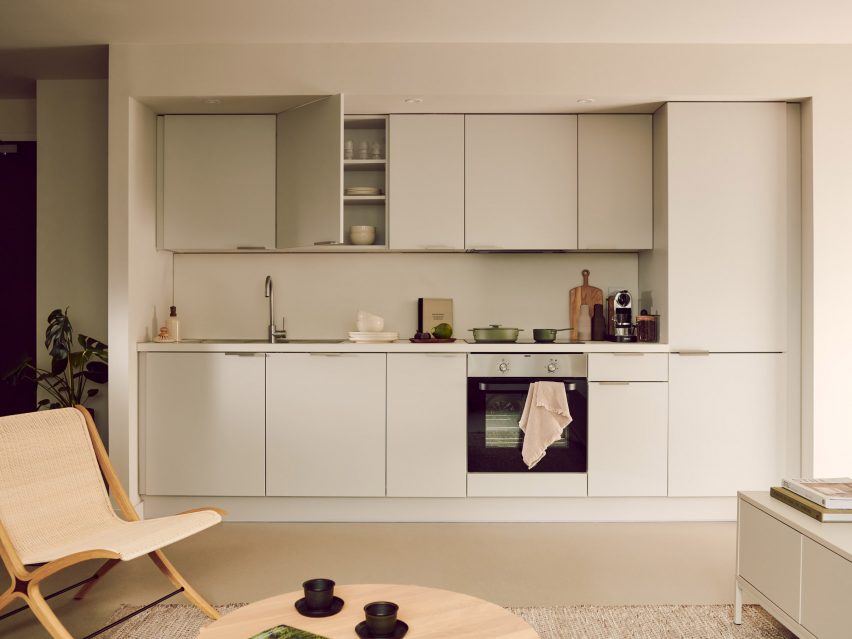
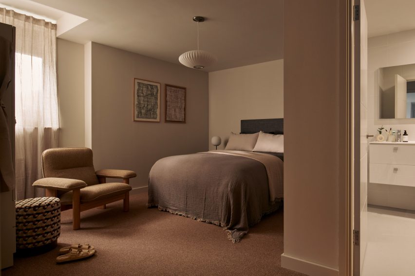
On the apartment floors, the existing floorplates made it possible to create larger homes than typical co-living units, arranged on opposite sides of a central corridor.
Apartments come fully furnished, with bedrooms and bathrooms separate from the living areas.
The renovation provides 120 apartments in total
“Office buildings typically have slim floor plates with decent floor spans and high proportions of glazing-to-floor area, so make ideal opportunities for residential conversion,” Potter explained.
“Likewise, floor-to-ceiling heights don’t tend to pose an issue for residential,” he added. “Typically, commercial floor heights are higher than what you expect in residential, meaning that you get better aspects of light into the spaces.”
The apartments are larger than is typical for co-living
Livingway offers five of these units as hotel rooms, available for short stay. But guests don’t have access to all of the communal facilities; most are reserved for residents.
Technology plays an important role in the building management. An app allows residents to book certain rooms or sign up for workshops and classes, while digital locks allow access to be controlled.
The communal spaces feature colours and patterns that reference the 1970s
The interior design approach reflects the building’s 1970s heritage, with furniture and finishes that don’t shy away from colour and pattern.
Standout spaces include the cinema room, an all-red space featuring large upholstered chairs, tubular wall lights and art-deco-style mouldings.
Across the rest of the ground floor, the exposed concrete waffle-slab overhead brings an industrial feel that contrasts with the warmth of the wood surfaces and soft furnishings.
Standout spaces include a cinema screening room
The homes feature a more subtle palette, with muted tones rather than white, to allow residents to bring their own personalities into the design.
A similar level of care was brought to the outdoor spaces. These include an informal courtyard on the ground floor and the seventh-floor roof terrace, which incorporates a trio of hot tubs.
A planted roof terrace includes three hot tubs
The project builds on SODA’s experience of designing shared spaces. The studio has designed various spaces for workplace provider The Office Group (TOG), including Liberty House and Thomas House.
The collaboration with Livingway came about after the company reached out to the studio via Instagram.
“It is amazing to see what a beautiful result has been produced and how much our residents truly enjoy calling Roco their home,” added Samantha Hay, CEO for Livingway.
Spotted: In the midst of a war for talent, security costs in real estate are rising. The good news, however, is that investment – including in new technologies – can help to keep these costs under control. AI is one such technology, and one area where it can help is in reducing the costs associated with monitoring security systems.
Animals, moving objects, and even the weather can trigger false alarms and, if these false alarms become repetitive, it can distract from real threats and necessitate large, labour-intensive, and costly monitoring centres. To combat this, startup promiseQ is harnessing advancements in AI to centralise video surveillance management and filter out false alarms.
Using computer vision and generative AI, the startup forwards only real threats to its customers. And on the rare occasions where the AI is uncertain whether a threat is real or false, the footage is forwarded to the company’s remote ‘crowdforce’ of expert human reviewers. The hybrid human-AI system has a fast learning rate, with the human feedback improving the quality of the AI continuously.
Meanwhile, a ‘Camera Integrity Check’ feature prevents equipment downtime, while ‘Privacy Zone Control’ enables companies to set parameters and exclude certain zones from surveillance. The system’s ‘Device Tree’ feature further enables companies to monitor multiple sites and cameras from a single dashboard. Finally, a reference picture of an area can be uploaded to the system, which is then continuously compared to the live footage to identify any deviations in real time.
Springwise has spotted other innovations boosting safety, including a security robot on wheels and computer vision tech that helps to prevent workplace accidents.
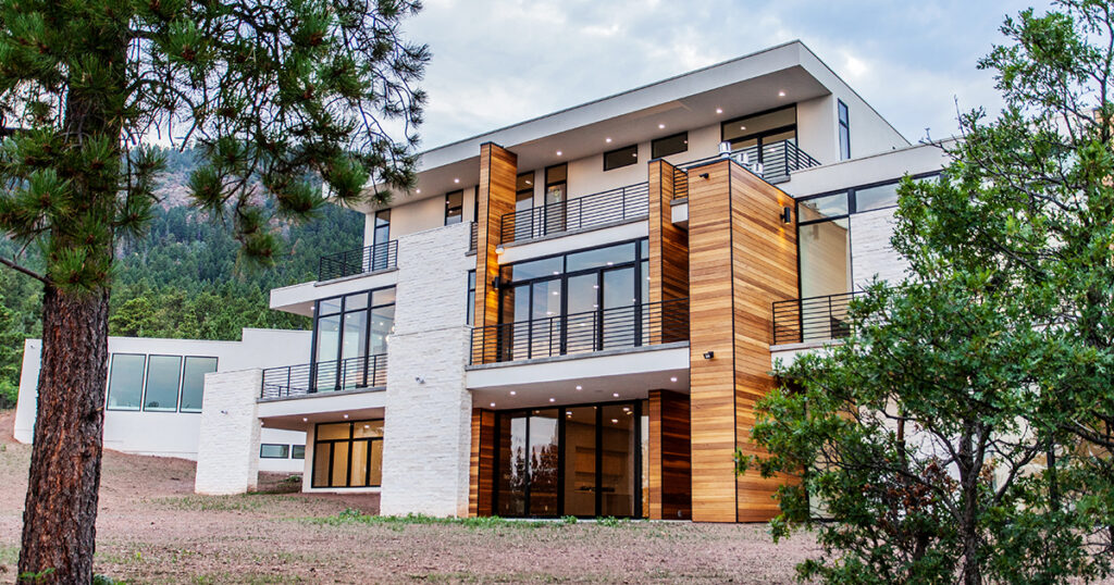
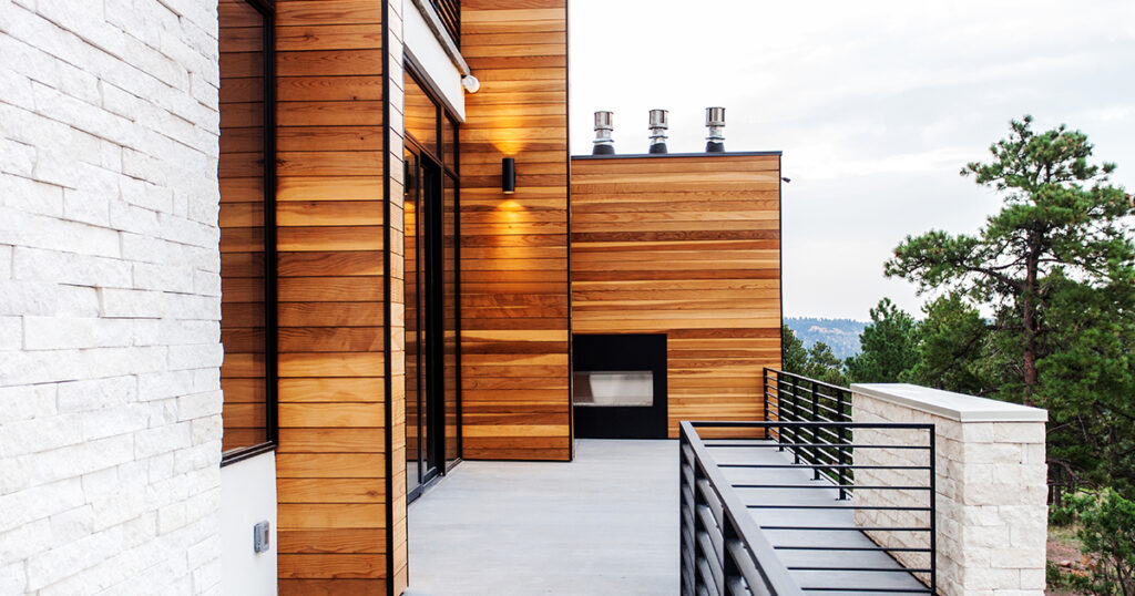
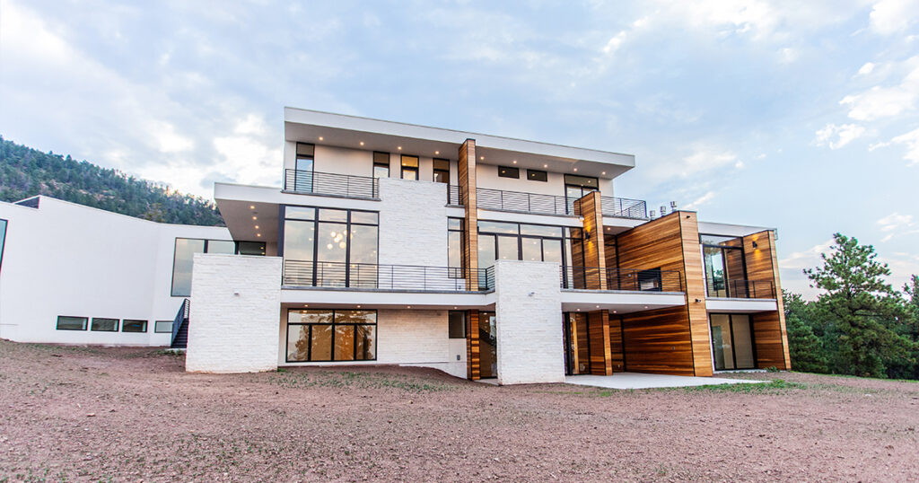
A home’s materials tell a story of how we live. Nestled in the picturesque mountains of Colorado stands a remarkable testament to sustainable material sourcing. Brought to fruition by Colorado Springs-based architect-engineer Scott Harvey, this mountain home was made to connect with the natural surroundings as an expansive and open retreat. In turn, the project’s redwood cladding reflects a family’s values as they built a home of their own.
A Family Home in the Mountains
Located in the mountains north of Colorado Springs in the town of Monument, this home was made for an active family with five children. The family was hoping for a home that embraced natural light and views out onto the landscape. Working together with builder Palmer Ridge Construction, the team brought the new, 10,538 square-foot home to life with seven bedrooms and expansive glazing. Outside, the home features an unadorned stucco finish and a continuous, seamless band of wood cladding. This warm, redwood band runs non-stop from the exterior through the interior.
The Colorado Mountain Home features an extensive use of redwood from Humboldt Sawmill. Humboldt Sawmill manufactures a full line of redwood and Douglas-fir wood products. Logs are sourced from nearly 450,000 acres of company-owned timberlands, where harvest levels are consistently below the forests’ annual growth rate and harvested trees are replanted. Logs are then processed into lumber.
For this home, the builder had Humboldt Sawmill transport the raw lumber to a dealer in Colorado where it was milled locally to the desired shiplap pattern. Local availability kept the cost within budget. In addition, it was easier to install than tropical hardwoods and no stain was required; only two coats of clear sealer. Redwood, known for its durability, beauty and sustainability, adds warmth to the design and creates a seamless transition from the interior to the exterior of the home.
Sustainable Sourcing
Photo by Kelly Edmondson
What sets this mountain home apart is not just its design but also its commitment to sustainability. The redwood from Humboldt Sawmill was sourced from company-owned Forest Stewardship Council® (FSC® C013133) certified timberlands in Northern California, where it is grown and harvested to the highest environmental standards in the world. FSC certification ensures that products come from forests that provide environmental, social and economic benefits. The FSC Principles and Criteria provide a foundation for all forest management standards globally, including the FSC® US National Standard (v1.0) that guides forest management certification in the U.S.
This commitment to sustainability not only reduces the home’s carbon footprint but also supports the conservation of forests for future generations.
Key Properties of Redwood
Photo by Kelly Edmondson
Redwood is renowned for its natural beauty and resilience, making it an ideal choice for this mountain home. Redwood is also native to the U.S., not imported. There are several key properties of redwood that make it a preferred building material:
Durability: Redwood heartwood from the center of the tree is naturally resistant to decay and insects, making it an excellent choice for outdoor applications such as siding, decking and fencing. As the team for the Colorado Mountain Home explain, “natural durability through tannins in the redwood heartwood render the wood resistant to termites and decay, an important factor in the home’s mountain environment.”
Aesthetic Appeal: Redwood’s rich color and grain patterns add a touch of elegance and warmth to homes and commercial projects alike. Its natural beauty only enhances over time, developing a patina that adds to the charm of a building.
Sustainability: Redwood is a renewable resource, with the ability to regrow from the stump after harvesting. When sourced from responsibly managed forests, redwood is a sustainable building material that helps reduce the environmental impact of construction.
Workability: Redwood is easy to work with, making it a favorite among architects and builders. It can be easily cut, shaped and installed, allowing for intricate designs and detailing that enhance the overall aesthetics of the home.
Built to Last: A Home for Future Generations
Photo by Kelly Edmondson
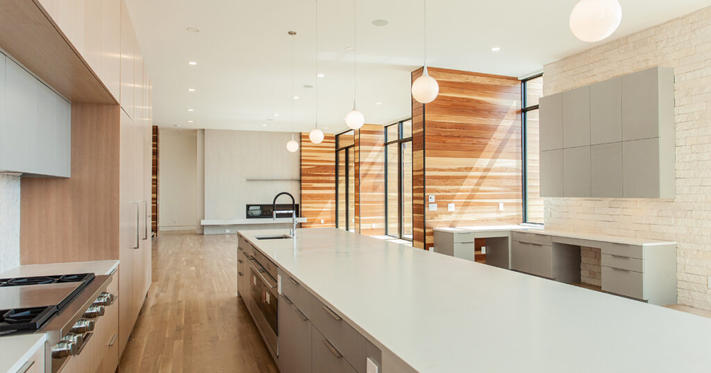
At the heart of this Colorado home is the contrast between materials: the natural white Brauer veneer stone and stark white stucco stand out against the warmth of the redwood. Expansive windows open up to views of ponderosa pines and scrub oaks, while inside, the home features white oak flooring and custom cabinets. From these rooms, multiple patios and decks flow together to bring the family outside and create connections to their surroundings.
Photo by Kelly Edmondson
The Colorado mountain home stands as a testament to the harmonious relationship between nature and design. Through the use of Humboldt Sawmill’s redwood sourced from responsibly managed forests, this home not only showcases the beauty and durability of this remarkable material but also highlights the importance of working with the right manufacturers and builders. Today, the home tells a story of family, warmth and connectedness through its details and construction.
To learn more about how you can harness the unique qualities of redwood for your next project, reach out to the experts at Humboldt Sawmill.


 Produced through an artful stitching between the Islamic traditions and the history of the area, between the universal values and the local culture, this mosque design was conceptualized as a landmark within the existing site, through its scale, meticulous façade design, building materials and relationship with the surrounding.
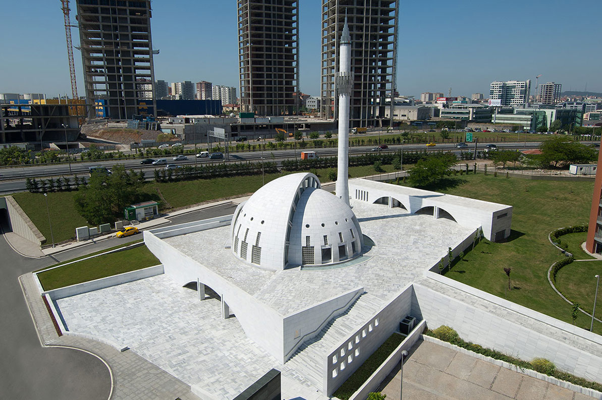
 Harmoniously nested into the site, the Yesilvadi Mosque is conceptualized as a social space that gathers people and brings them together, through its variety of functions that include the prayer hall, a meeting hall, a library, a courtyard and a square, inspired by the social role mosques and their courtyards have traditionally played in the design of Islamic cities.
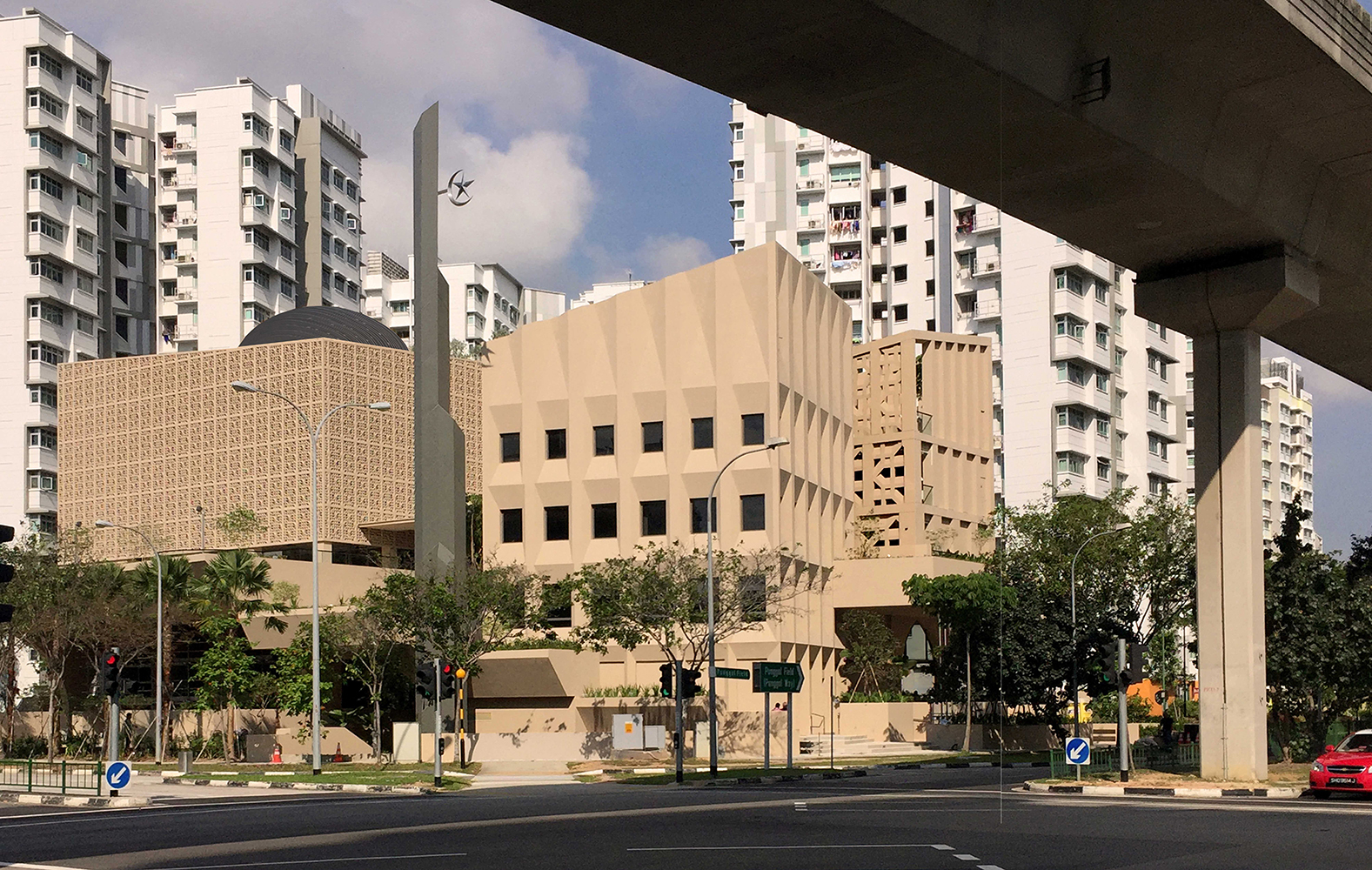
 The dynamic design of Al Rawda Mosque in Amman aimed to move beyond the limitations of the traditional mosque designs of the region and envision what a contemporary mosque could look like. Through a process of extensive research, the designing team engaged in an intellectual pursuit that studied and abstracted the different elements of a mosque, before reinterpreting them and combining them in this design.


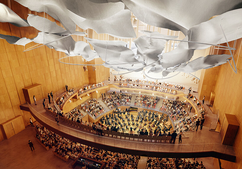 inside the 1,000-seat Terri and Jerry Kohl Hall | image © Gehry Partners